Far Eastern Derby: A New Look for the Rivalry
Friendly neighbors off the ice and fierce rivals on it, Amur and Admiral share the geography, history, and culture of the Russian Far East. Both clubs are based more than 6,000 kilometers from Russia’s capital, yet they frequently set the standard for visual identity across the KHL — both individually and together.
In 2023, the Far Eastern Derby received its own distinct visual identity. The rivalry between Khabarovsk and Region had long transcended the game itself, becoming an integral part of the region’s culture. Heading into the 2025–26 season, both clubs unveiled redesigned jerseys that celebrate the derby’s unique identity and the pioneering spirit of the Far East.
In 2023, the Far Eastern Derby received its own distinct visual identity. The rivalry between Khabarovsk and Region had long transcended the game itself, becoming an integral part of the region’s culture. Heading into the 2025–26 season, both clubs unveiled redesigned jerseys that celebrate the derby’s unique identity and the pioneering spirit of the Far East.
Медиа:


Медиа:
Заголовок:
Logos
Текст:
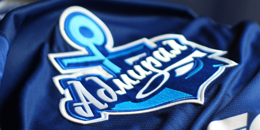
The concept of athletic rivalry comes to life through the geography of the two regions. The iconic snarling tiger and anchor are incorporated into the outlines of Khabarovsk Krai and Primorsky Krai, turning regional borders into defining elements of each club’s visual identity. Both logos feature circular frames displaying the teams’ names and their respective home regions.
Secondary logos and patterns
The tiger featured on Amur’s jersey inhabits the Far Eastern taiga, a distinctive ecosystem shaped by rugged terrain and a mix of coniferous and deciduous forests. Admiral’s jerseys draw on the region’s maritime heritage, featuring imagery of the Far Eastern crab, a sailboat, a lighthouse, and a compass rose.

Медиа:


Медиа:


Медиа:


Медиа:


Медиа:


Медиа:

Текст:
The patterns form continuous bands across the chest and sleeves, requiring modifications to the jersey construction. Deep embossing adds dimension and texture to the fabric, bringing out the intricate details of each design.
Numbers
The custom number typography reflects the derby’s bold, angular graphic style, while team-specific embroidery within the numbers echoes the embossed patterns found throughout the jerseys.

Медиа:


Медиа:


Finishing details
The captain’s letters incorporate tiger and crab motifs. Although the clubs represent different regions, they share a common Far Eastern identity — a connection reinforced by custom lettering on the inside of each jersey’s collar.
Медиа:


Referee jerseys
Медиа:
Текст:
The referee jerseys bring together design elements from both teams’ uniforms. Their placement mirrors the actual geography of the region, with Primorsky Krai bordering Khabarovsk Krai to the north.
Alongside recognizable regional symbols, the design incorporates pointillism — a visual reference to the Caviar Cup, the symbolic trophy awarded to the winner of the season series.
Alongside recognizable regional symbols, the design incorporates pointillism — a visual reference to the Caviar Cup, the symbolic trophy awarded to the winner of the season series.
Медиа:


Медиа:
Текст:
Amur and Admiral’s commitment to the derby’s visual identity turns every matchup into an event with a character all its own, bringing together fierce competition and the cultural heritage of the Russian Far East.
And bringing the Far East a little closer.
And bringing the Far East a little closer.