Logo and identity for Winstrike
LOGO · SUBLOGO · FONTS · PATTERNS · MERCHANDISE
Esports is a progressive industry, where most of the interactions with the audience take place digitally. The organisations can't afford to be seen with an outdated logo, this is dictated not only by aesthetic motives but also by practical ones: the logo must be adapted to small formats. The current Winstrike logo needed a rethink. It didn’t match the current design trends and looked oversaturated with illustrations.
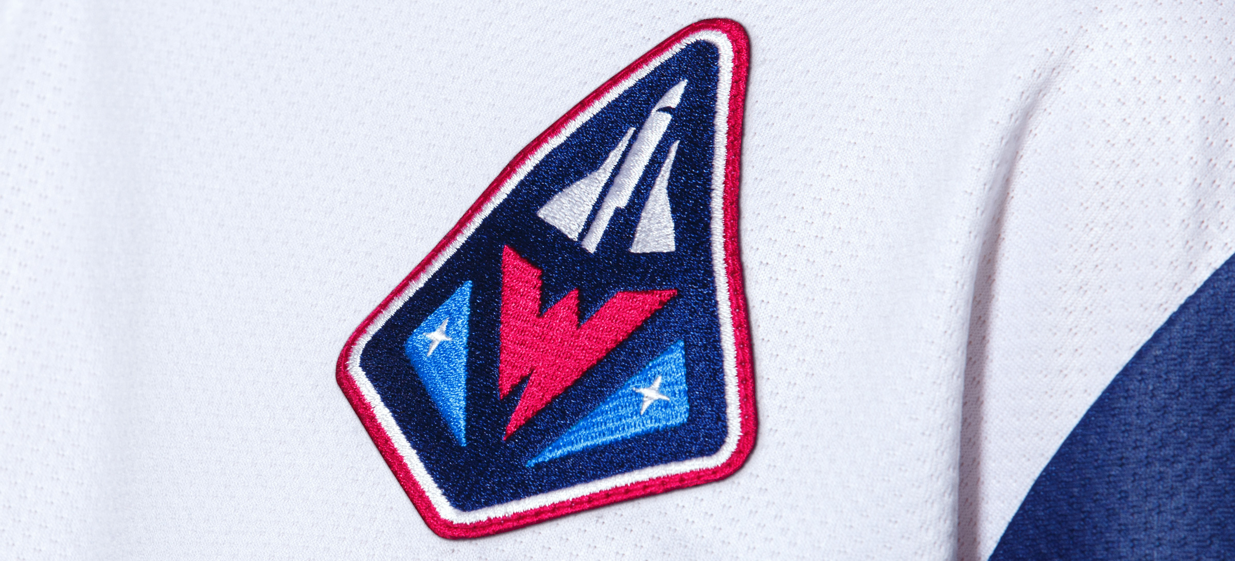
The concept of space thematic remained unchanged. It is perfectly suited to esports, as the spheres are united by progress, technology, innovation. Developing the space theme, we added details that would just enhance the recognition of Winstrike through such images.
So the rocket-shaped figure of the patch became not only the basis for the logo, but also for the entire updated Winstrike design system. There are always a lot of chevrons on the uniforms of pilots and astronauts, and there is traditionally a lot of advertising on the equipment of esports players. Sponsor blocks can also be made in the shape of patches, this will give the suit the right feel and connection with the astronauts, and most importantly it will harmoniously connect the aesthetics and practical usage.


Space attributes generate three logo formats
Space design uses the most unusual shapes. This was a good reason to embed non-standard figures in the identity and thus stand out from the rest of the organizations. Now the logo exists in three versions: in addition to the main one, you can also use simplified and elementary versions in different communications.
The composite elements of the logo work perfectly on their own: they become a flexible basis for the rebrand.
This flexibility allows the company to diversify merchandise and various marketing activities: the combination of elements makes the image of Winstrike more diverse and more complete.