PUMA × Quberten: Football unpacking
LOGO • SUBLOGO • LETTERING • FONTS • PATTERNS • GUIDES • MERCHANDISE • UNIFORM
The day before the start of EURO 2020, the sports brand launched the Spectra Club. This collection is part of the Only see great global campaign platform dedicated to the biggest events of 2021. Our studio has developed an identity of the Spectra line for members of the ‘private club’.
A wide range of brand identifiers
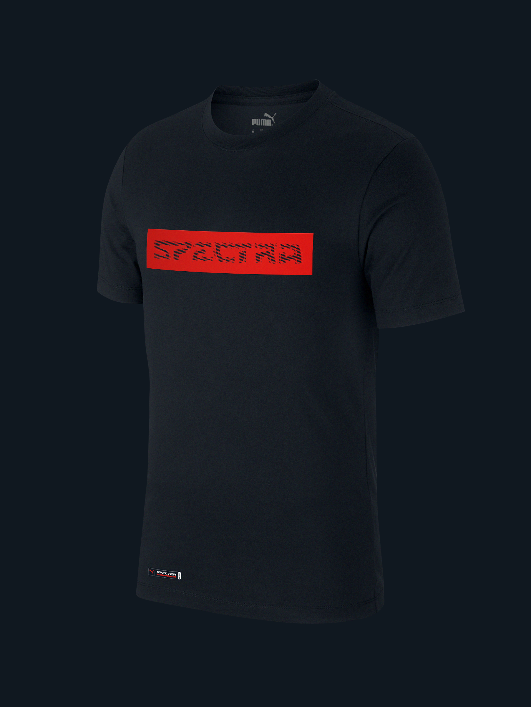
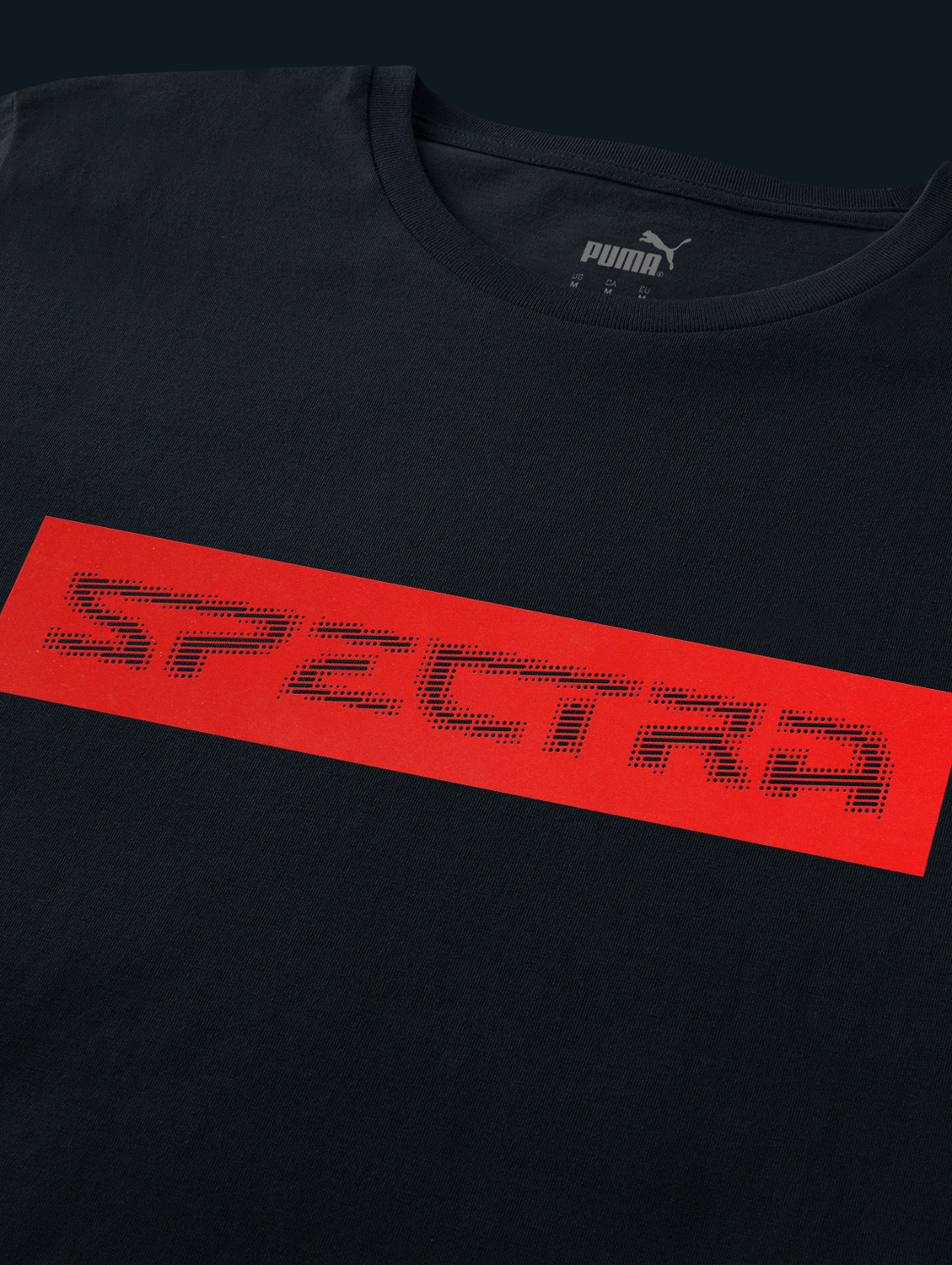
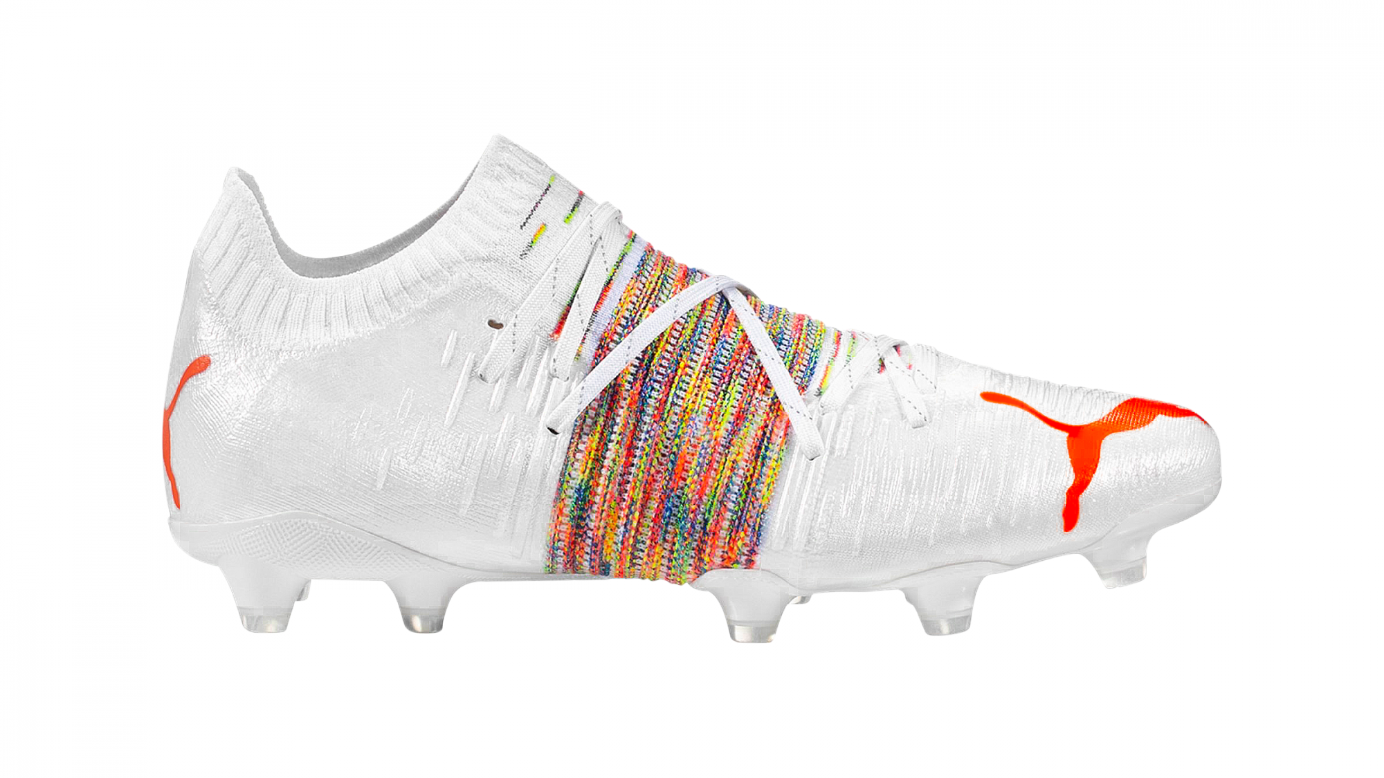
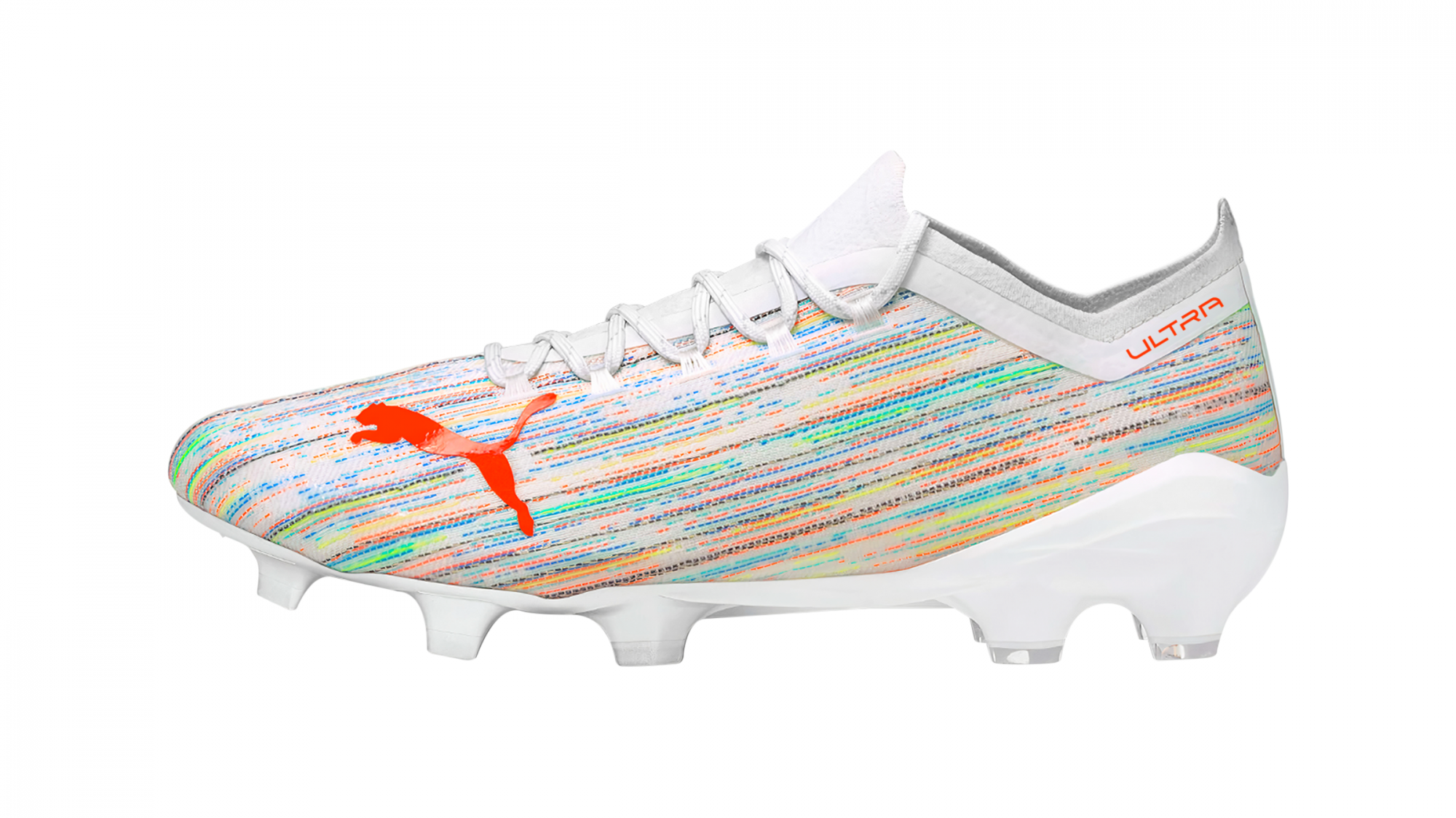
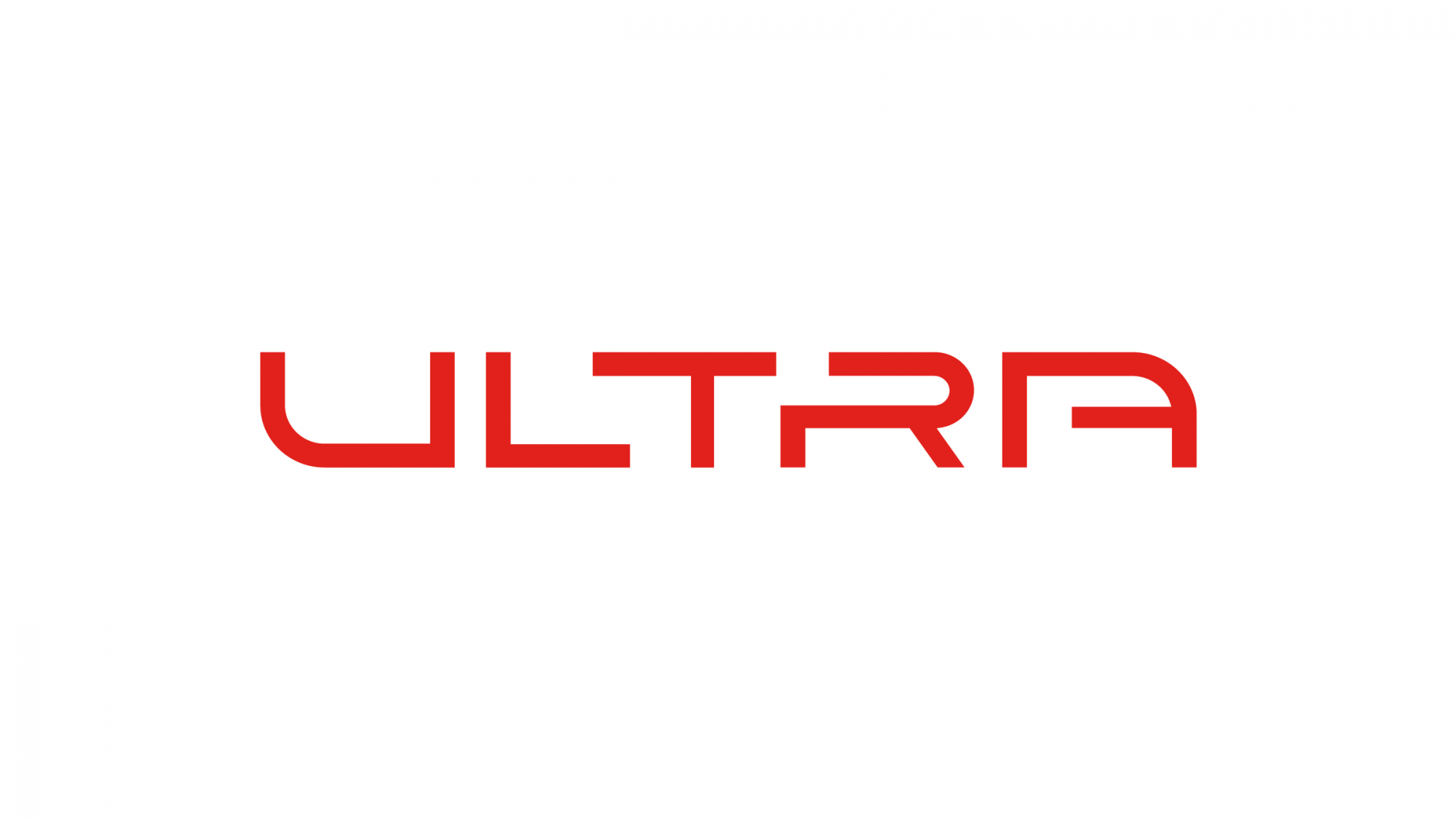
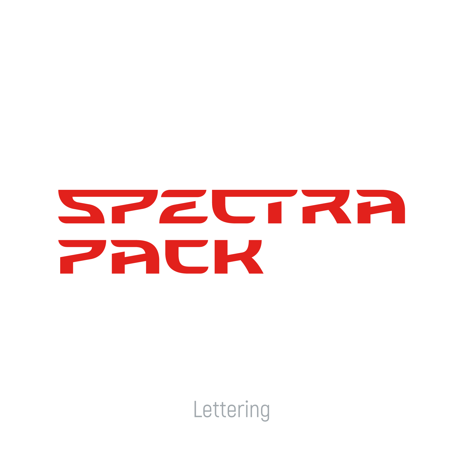
The identity is built around the Spectra lettering, which combines the Puma’s football collections stylishly, Future Z and Ultra; sports aggression with brevity and ease.
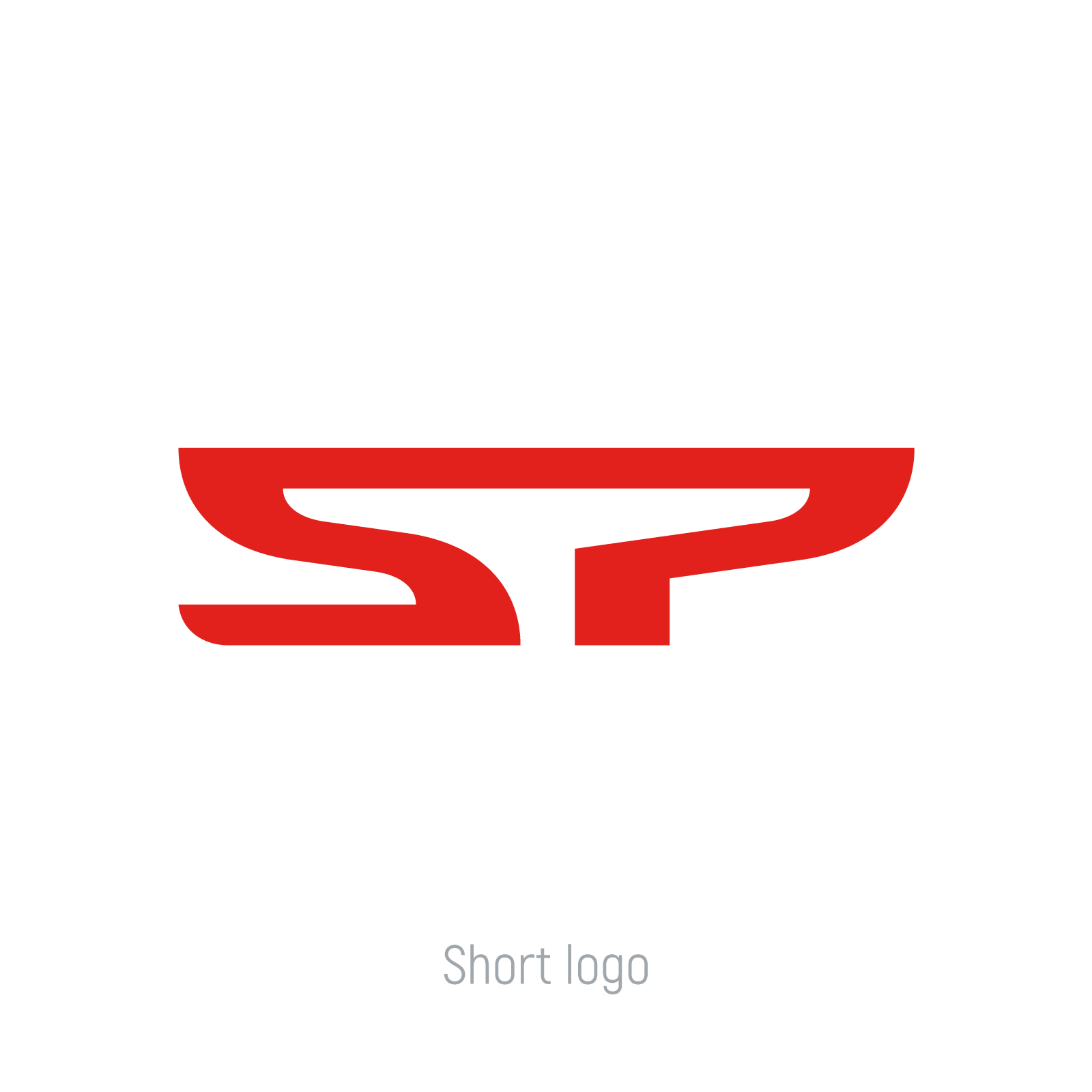
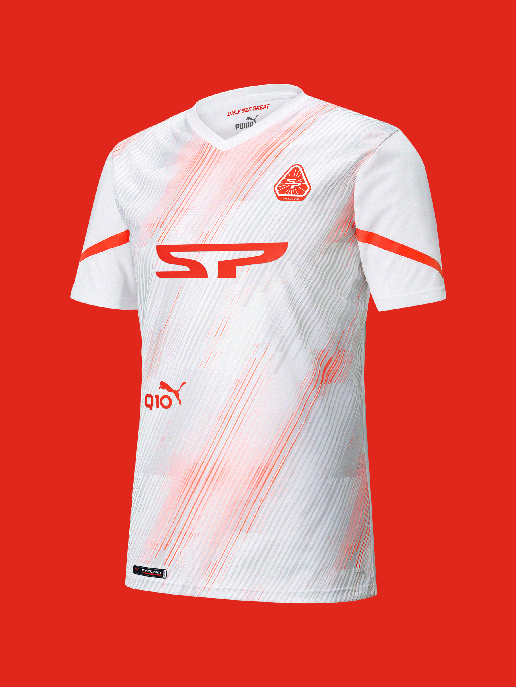
The boldest element in the lettering is the SP ligature, which can work separately as the main logo, just like the abbreviation of the Spectra Pack. There’s also a hidden meaning in the sign, which sends you to the only Russian city where number of matches will be played at EURO 2020: St. Petersburg.
Due to its simplicity, the style easily generates various sub-elements. So, with an alternative monogram-sign, the brand will be able to diversify its presence on different media platforms: from chevrons on T-shirts to stickers on social networks.


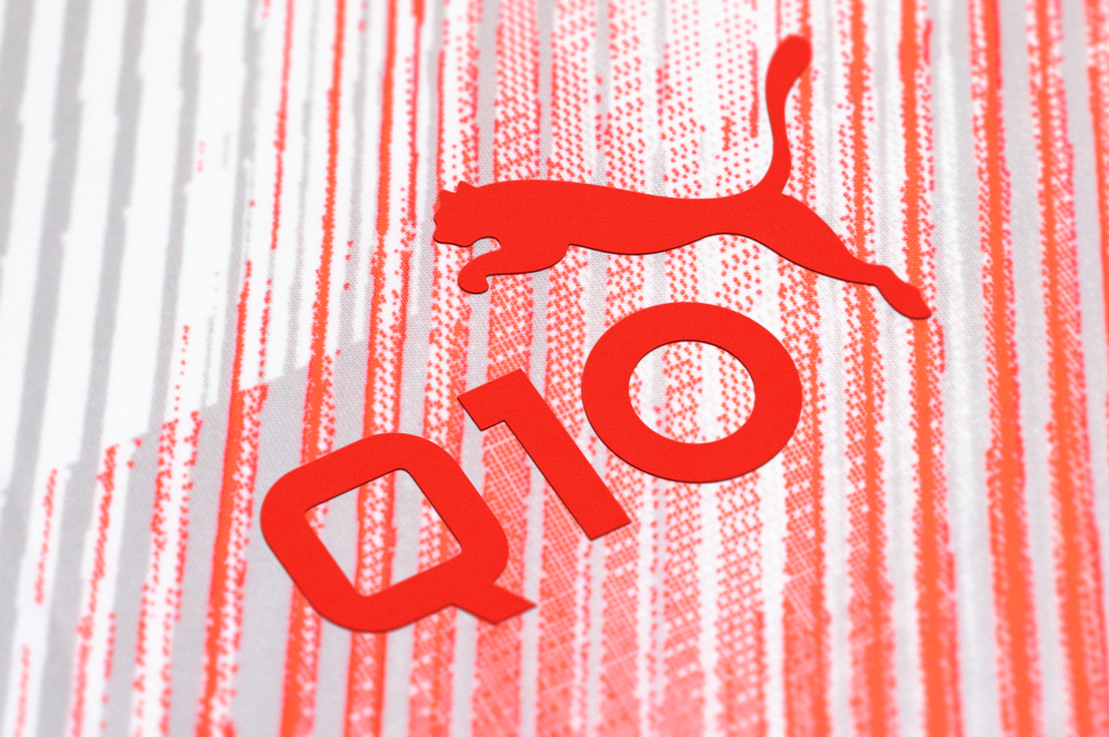
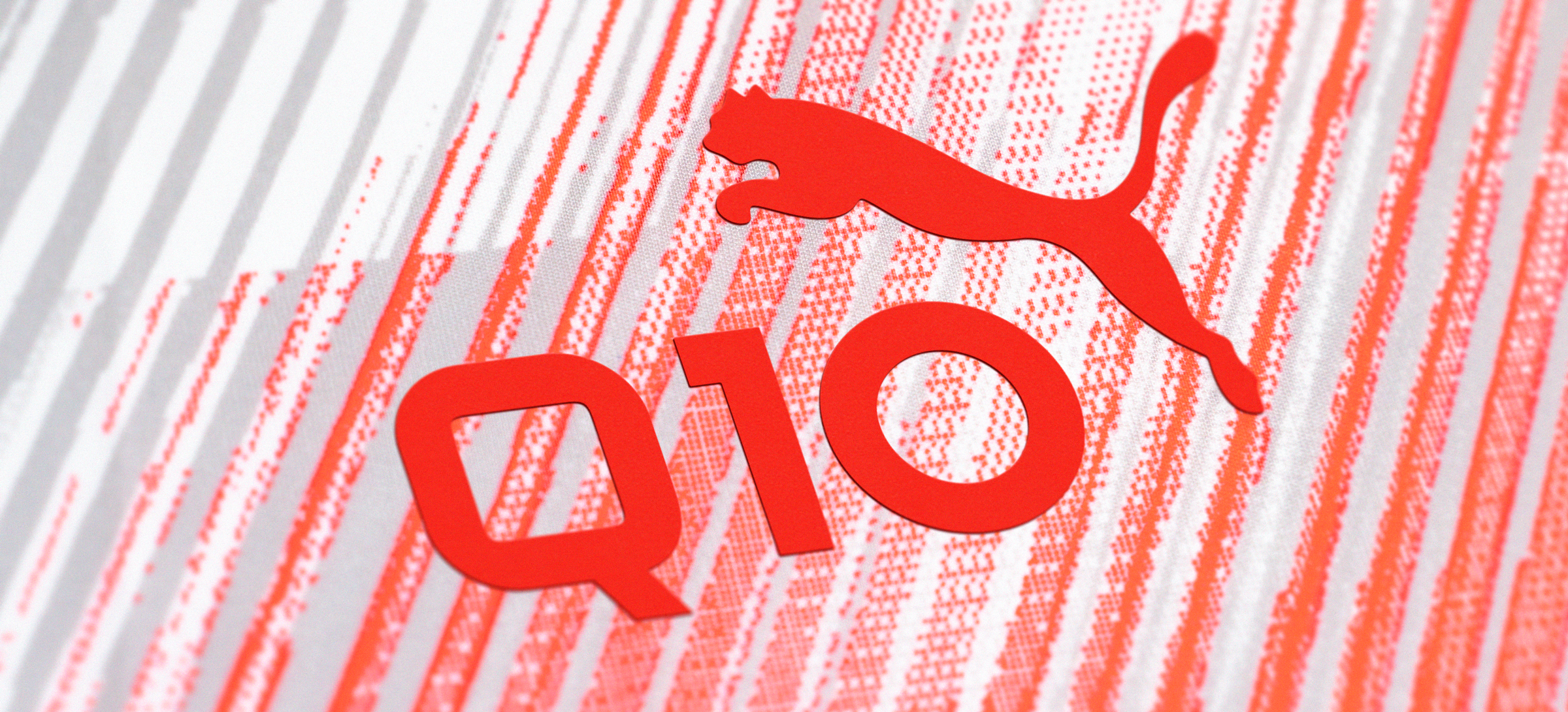
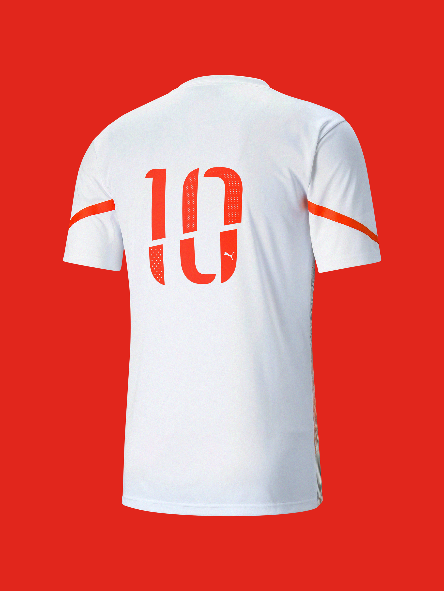
Mashup of numbers as a reference to EURO 2020
The custom kit is the special item in the set. Within the iconic number on the back, the Q10 studio has attached a piece of itself, not to mention ‘10’ is such an important number for every football team and a brand identity angle. Like a light beam, ’ten’ is cut into four parts: four teams equipped by the company at the upcoming European tournament. An individual package of Spectra numbers has been designed in a single style aesthetic.


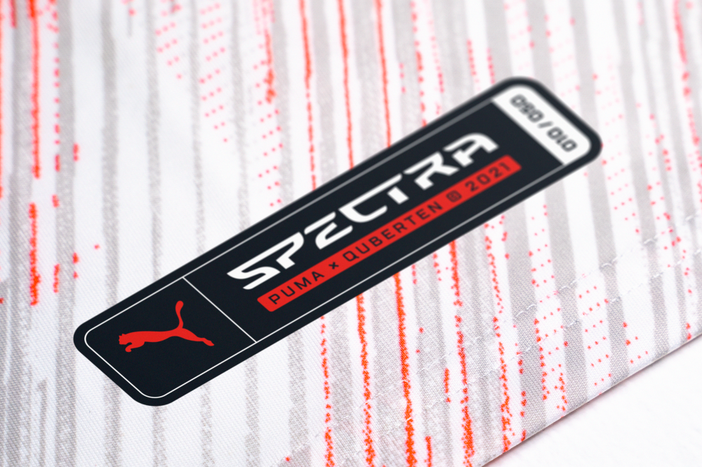
Limited edition and variation
A well-thought-out design always looks integral and solid. Such a small detail as the patch of the limited collection makes the merchandise even more desirable and exceptional. Now each member will have their own personal number on the patch.
The elements of the identity can interact with the branded prism, forming different patterns. This allows to diversify creatives in social networks and define new brand boundaries.