Major Pride Rebranding
LOGO • SUBLOGO • FONT WORKS • PATTERNS • GUIDES • MERCHANDISE • SMM TEMPLATES • VIDEOGRAPHICS • KITS
Major Pride are an esports team from the CIS, who play on the PlayerUnknown’s Battlegrounds Mobile platform and hold their own tournaments. Quberten studio reinvented the logo of the ‘lions’ and gave them a more progressive identity.

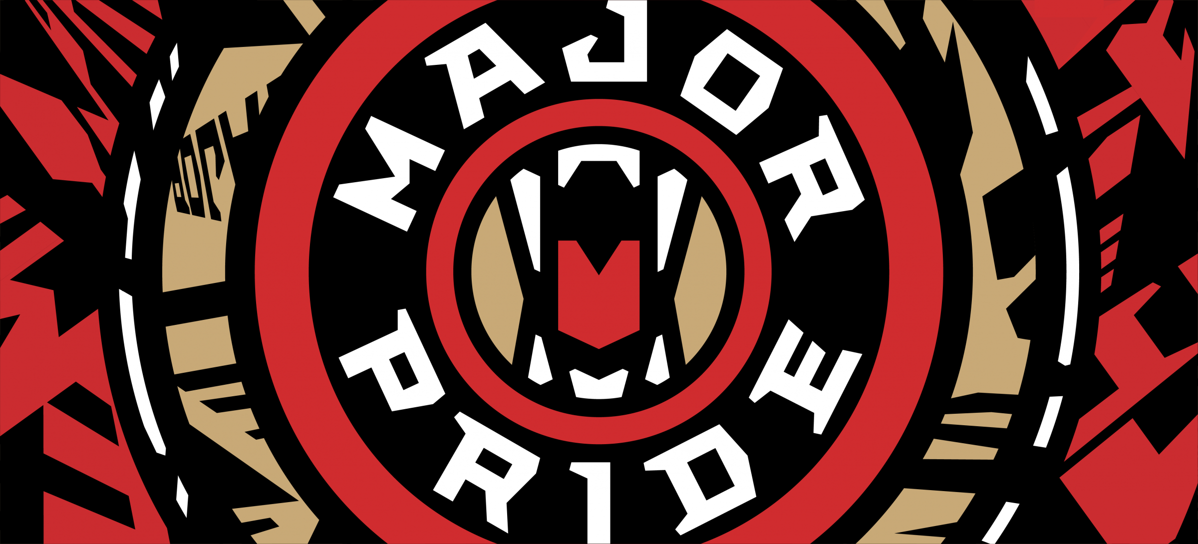
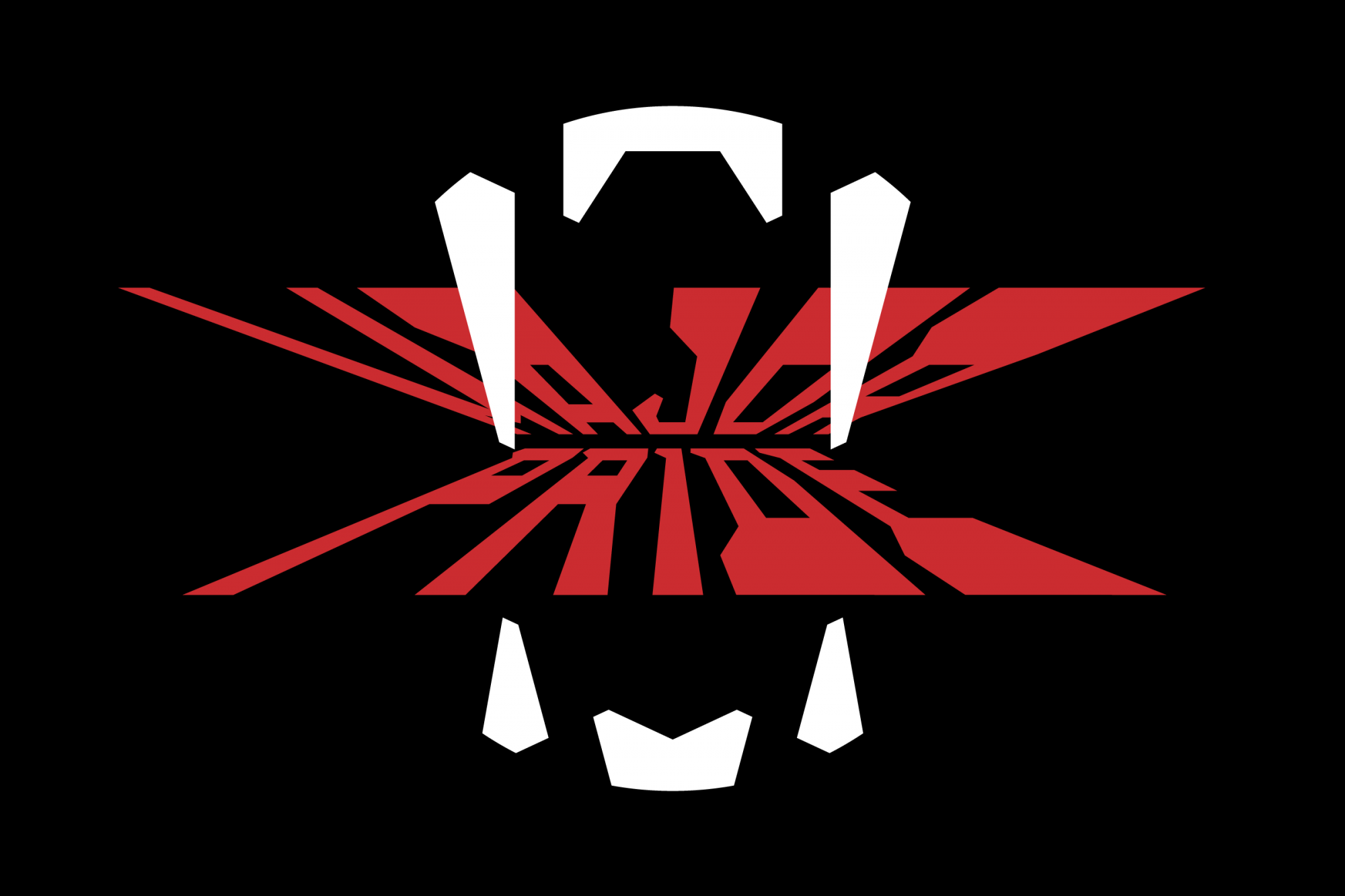
In the lion’s mouth. Ultra aggressive logo
The previous logo saw a classic image using the King of the Beasts. New one came together as a result of Major Pride’s desire to radically update their look, creating a significant informational occasion, whilst using our studio’s non-standard approach.
The emblem is far from the traditional logo with a lion and focuses on the jaws of the animal as a sense of danger: a mouth with fangs — the last thing the opponent/victim will see.
The rigid geometry in the graphics is the studio’s branded style, emphasizing aggression as the principle of the battle royale: the narrowing of the lines in the logo provokes players to do battle. The tongue highlighted in an accent color is a stylized ‘M’ from the name of the organization.
The proportions of the logo are ideal for any media and scales. PUBG Mobile is on small screens, this is what the logo detailing is aimed at: taking into account the conditions in which users will interact with images.

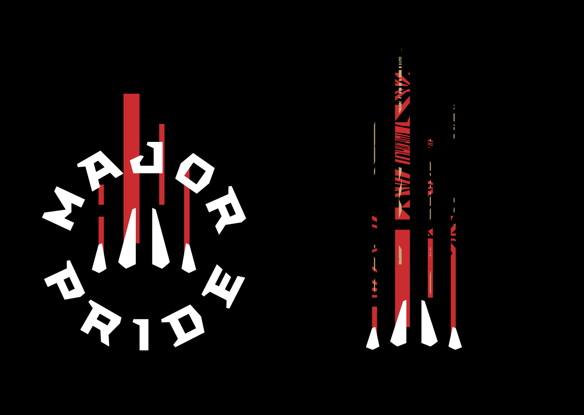
‘... chicken dinner’. Subelements
Changing the logo was great for the club, and Major Pride wanted to see this new look in with a bang. So we added branded lettering, video transitions, a line of merchandise and esports-specific equipment details to the logo to seal the deal.
Ring lettering is self-sufficient, but can be duplicated with lions’ claws: another aggressive symbol.
The main social media content Major Pride produces are videos: recordings of matches, letsplays, reviews, streams and teaching the nuances of the game, so special attention was paid to the possibilities of visual editing for transitions when developing patterns. Shots and bullets, frames with explosions, as well as a special Easter egg: the usual ‘i’ in the word ‘Win’ is replaced by a Roman numerical unit.

Медиа:
Медиа:
Медиа:
Медиа:
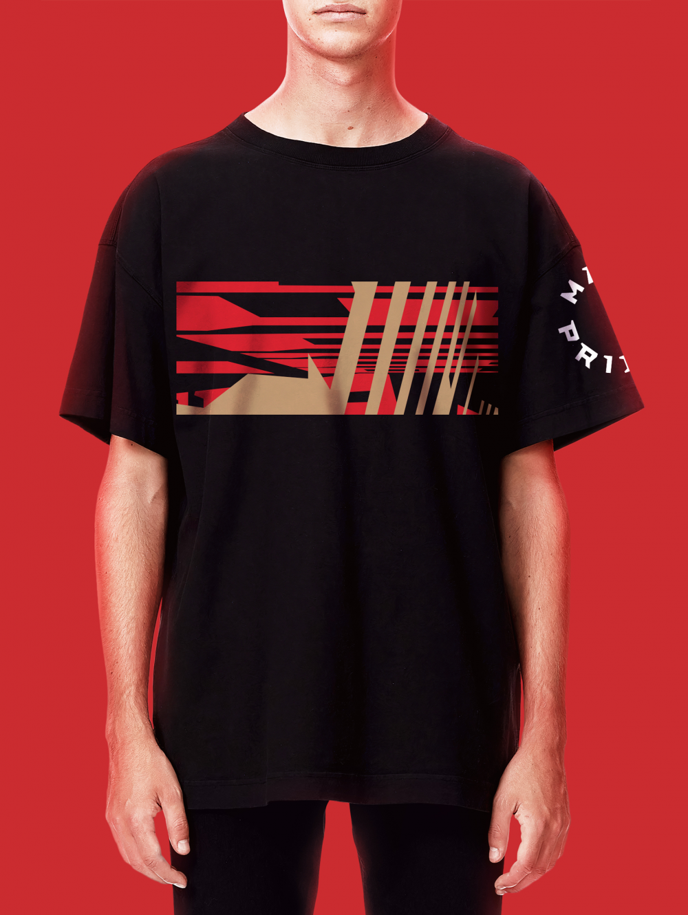
The pride is on the hunt. Generative patterns
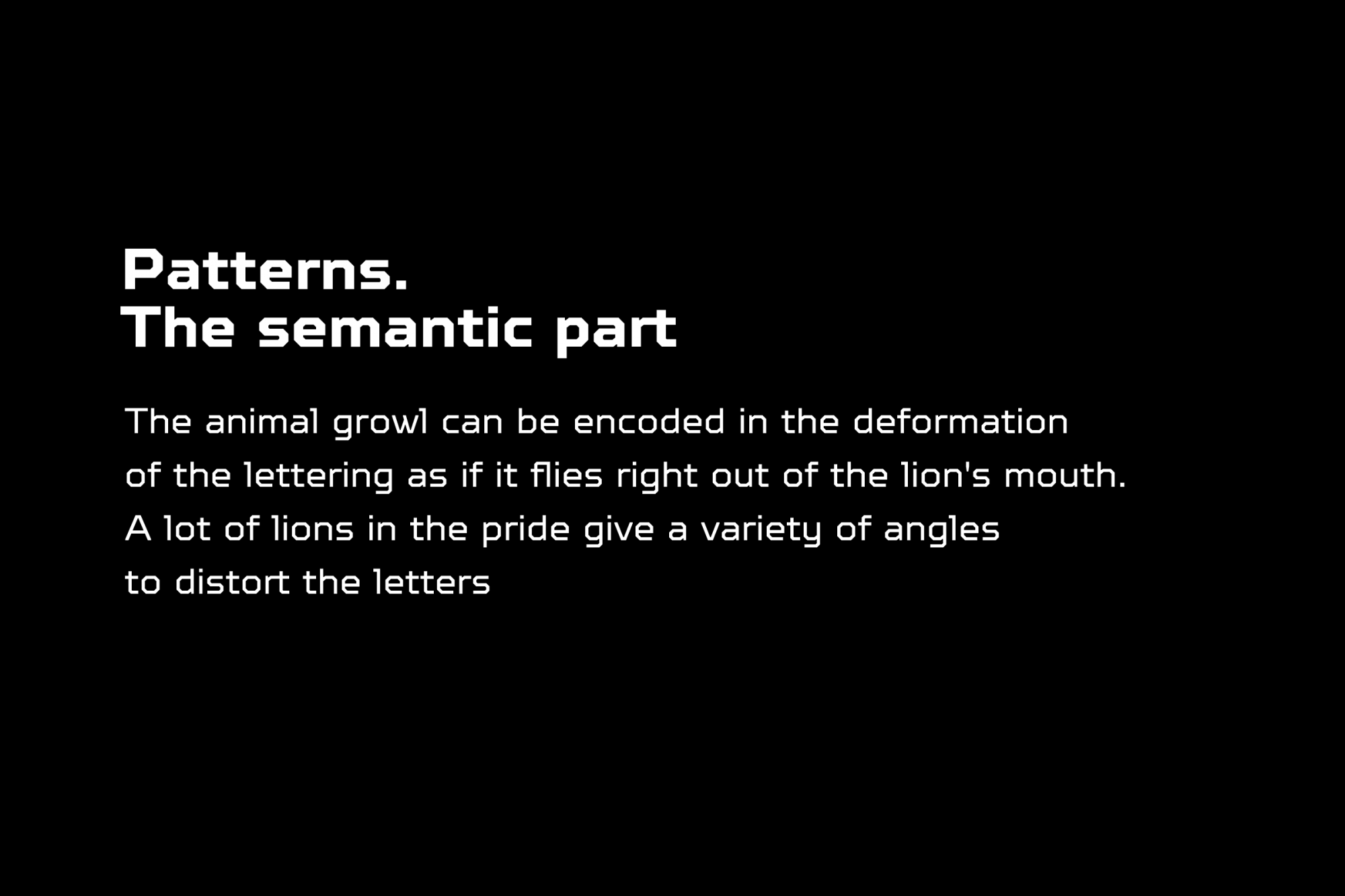
A distinctive feature of graphics for Major Pride is adaptability. The pattern is formed by the font, without losing its identity when it needs reshaping. Its individual elements can change color. The color palette and recognizable lettering complement each other and are an imitation of the lion’s roar.
The principle of transformable patterns is also applied in templates for social media: there, the pattern can be a background, or act as an independent element.


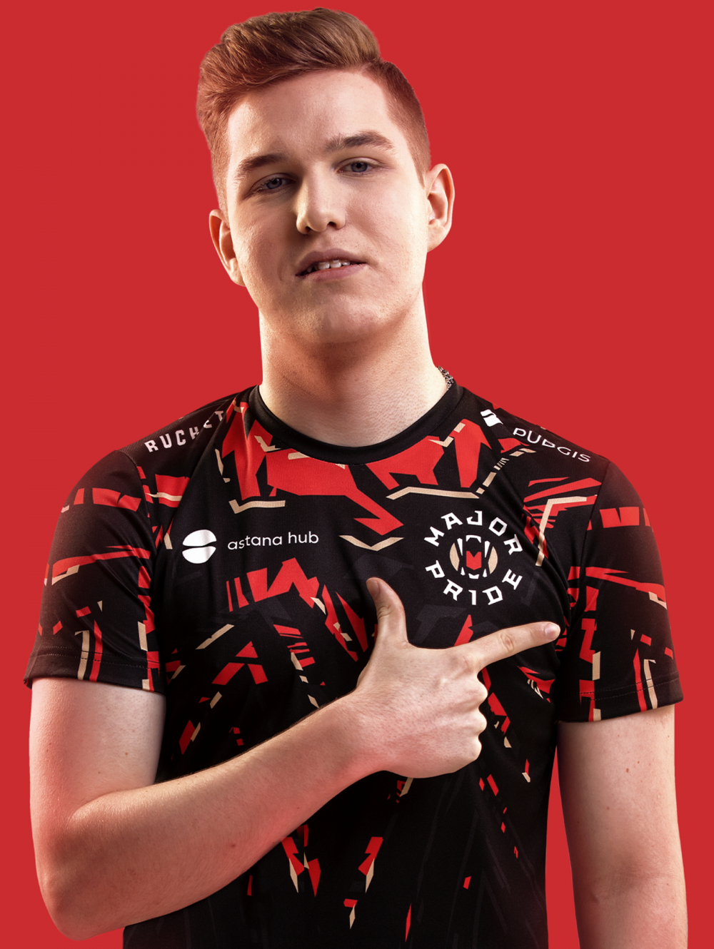
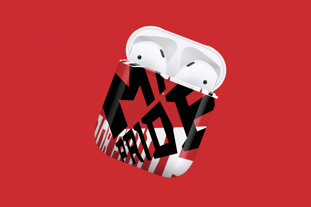
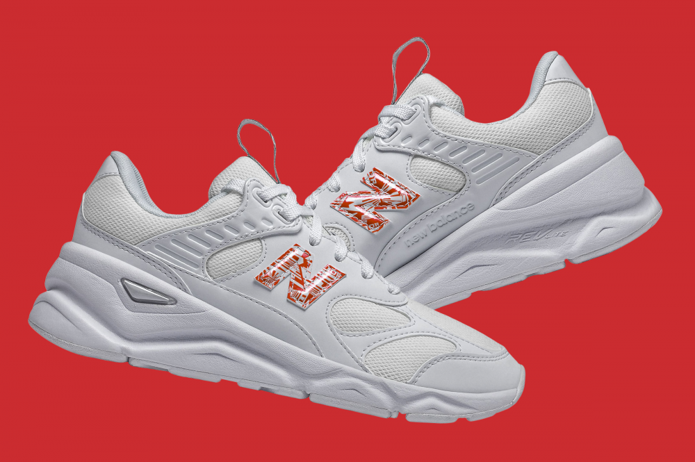
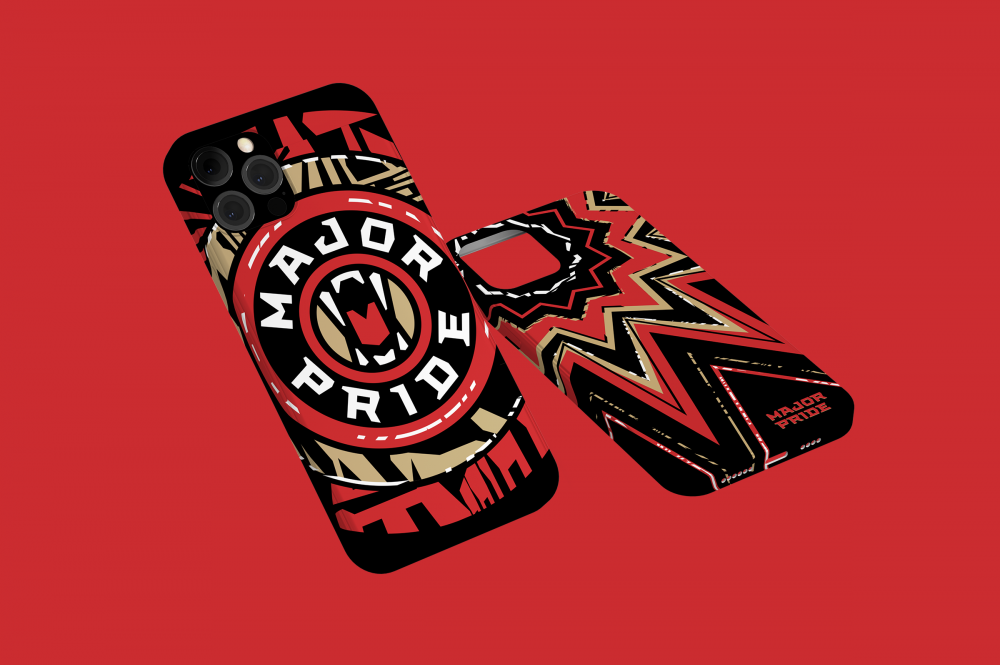
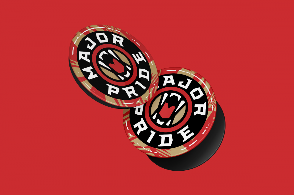
Totemic merchandise
The merchandise pack consists of traditional carriers of our time — jersey, hoodie, popsockets and masks. The clothing design is made by taking into account the totem animal of the team: the hood and shoulders differ in color, and the pattern repeats the silhouette of the lion’s mane.