Torpedo Century. The club's anniversary identity.
Torpedo Football Club was founded in 1924. One hundred years of the club’s history are firmly connected with the stages of football development in the country. “Avtozavodtsy” (car manufacturers) and their achievements have become not only an athletic, but also a social-cultural phenomenon. Throughout its history, the team performed in kits with more than a dozen different logos, but the emblem with the letter “T”, the gear-wheel and the outlines of a racing car became canonical. The authors of this sign were speed skater and sports official Yakov Melnikov and football player Vyacheslav Orlov.

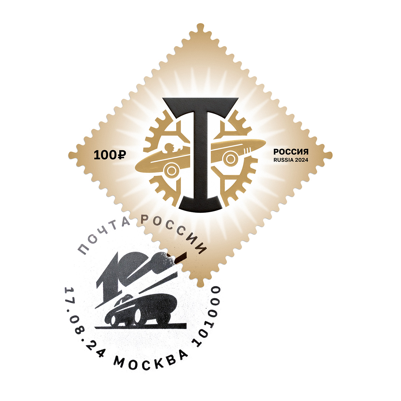
The Gear-wheel logo
The key elements of the logo — the gear and the silhouette of the car — have been graphically adjusted. As the main part of the mechanical transmission, the 32-gear wheel must be geometrically aligned. The studio paid special attention to these details: the angles of the teeth are multiples of the angles of the octagon. Now the gear is based on balance and dimensional logic. The dimensions of the car and the letters are adjusted strictly in the center of the gear.

Медиа:
Заголовок:
The Race car
Текст:
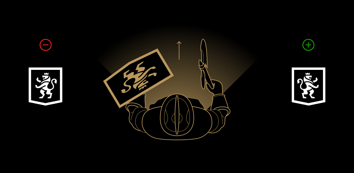
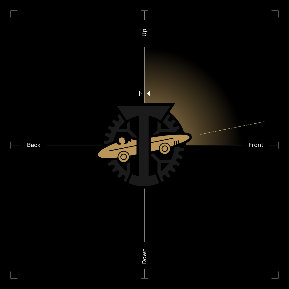
The logo follows the heraldic tradition, where the coat of arms “faces” back: In the Middle Ages, coats of arms were applied to shields, which right-handed warriors held in their left hands, pointing the image towards the enemy.
Медиа:
Текст:
However, modern emblem design is consistent with the emotional matrix. The forward motion is supported by the European writing tradition, where text is read left-to-right. An alternate version of the symbol suggests a car turning with a forward and upward movement vector.


Медиа:
Заголовок:
The Dovetail logo
Текст:
The name “Dovetail” was given to the classical letter “T” due to its elegant and balanced design. The logo was updated, and the curves were refined, replacing the previous radius rounding with additional control points.

Медиа:
Заголовок:
Lettering
Текст:
When creating the lettering for the Dovetail logo, a simplified version of the original design was used. The rounded corners, smooth curves of the letters, and the distinctive “D” shape all contribute to the overall mood of the logo, which is particularly evident in the corporate block where the letters and inscription are tightly packed together. Additional elements such as “Torpedo Century”, “VECTOR”, and “1924 TMFC” were also incorporated into the design.
Медиа:




Медиа:
Заголовок:
Palette
Текст:
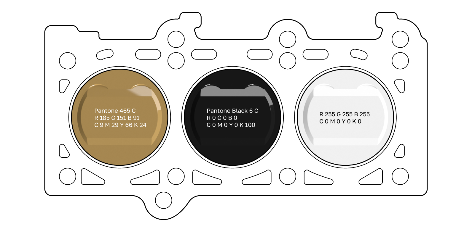
The color palette for the anniversary season was set by the club. The golden color emphasizes the importance of the anniversary date. At the end of the season, it is expected to return to traditional colors.
Anniversary logo
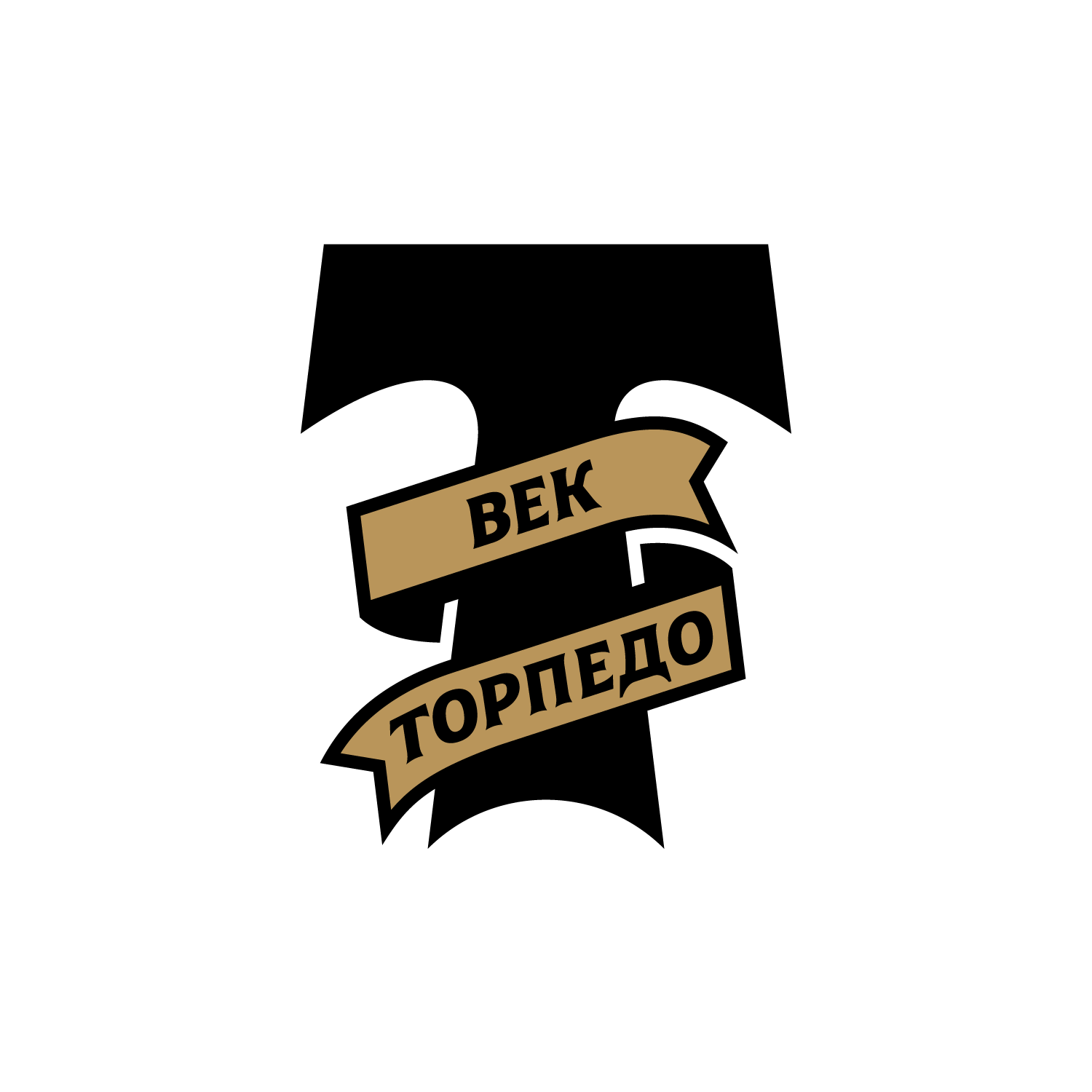
The anniversary logo combines a “Dovetail” with a branded lettering on the ribbon. The tilt angle of the ribbon repeats the tilt of the car direction.
Медиа:
Медиа:
Текст:
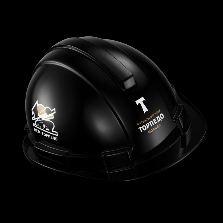
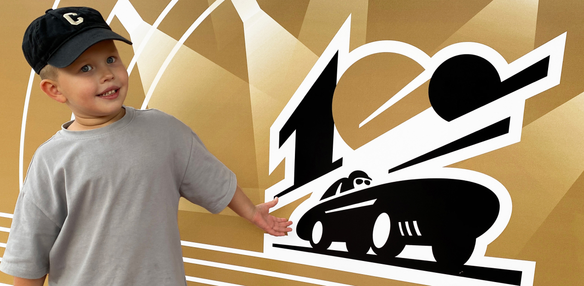
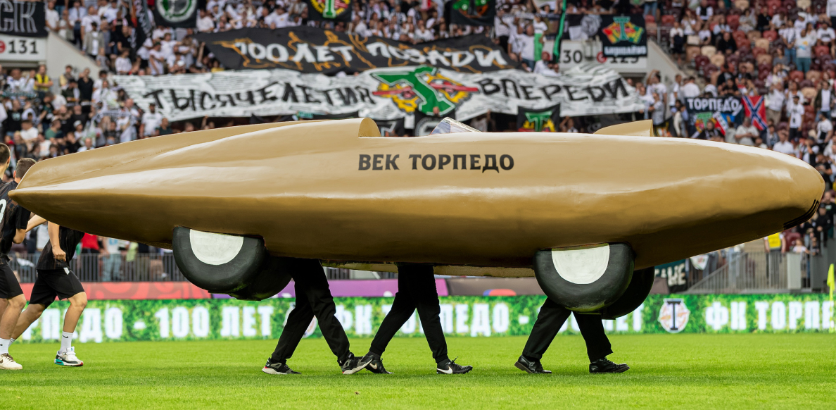
An additional version of the logo, created for the 100th anniversary, is a tribute to the classic “gear-wheel” and the silhouette of the car. The logo is based on the dynamic image of a moving car and the number 100, and the perspective lines emphasize the swiftness.

Медиа:
Медиа:
Медиа:
Медиа:
Медиа:
Медиа:
Медиа:

Медиа:
Медиа:
Медиа:
Key visual and SMM
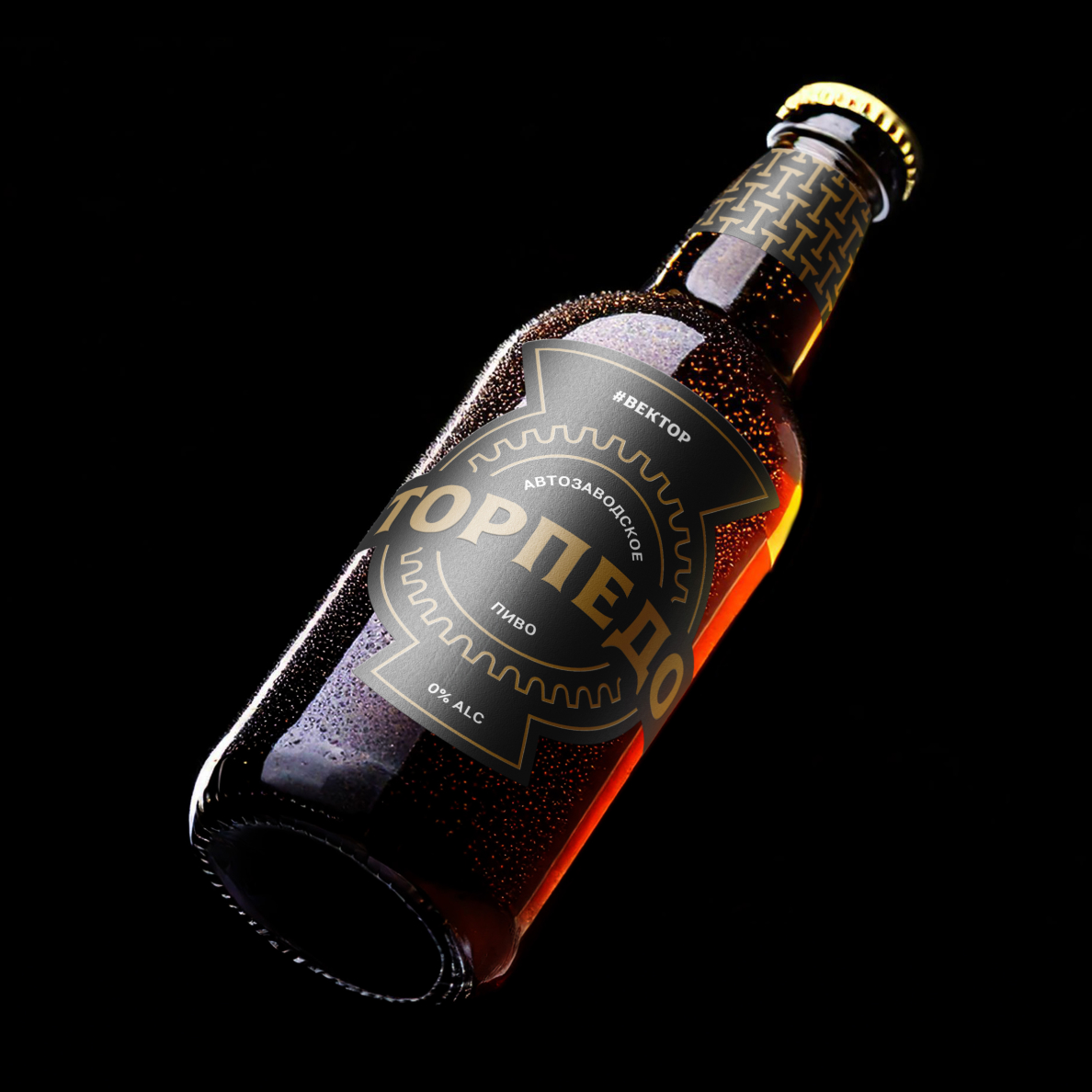
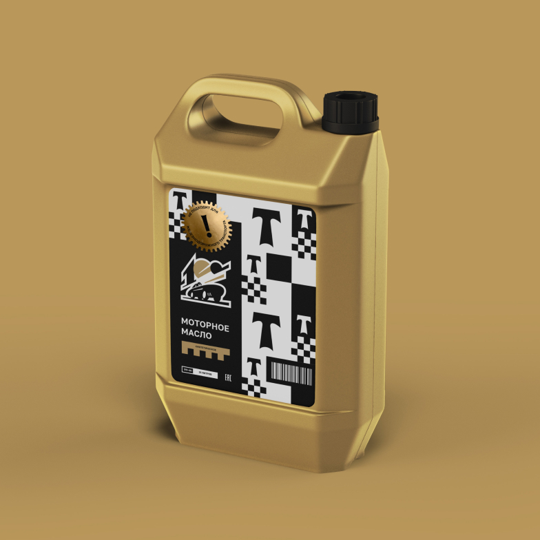
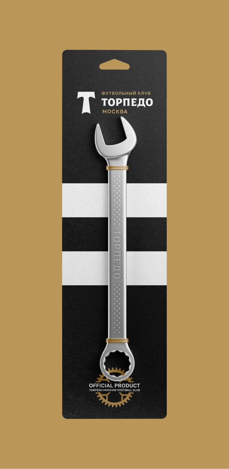
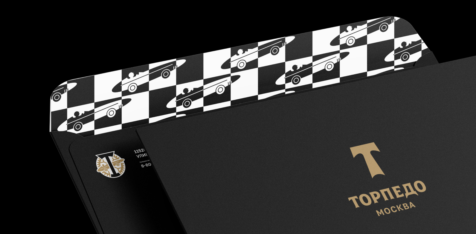
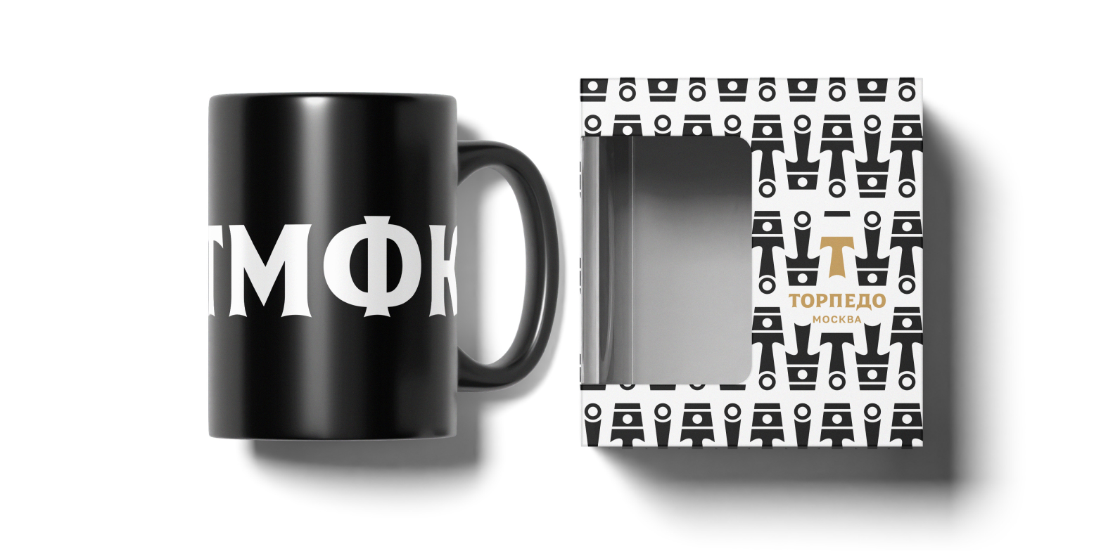
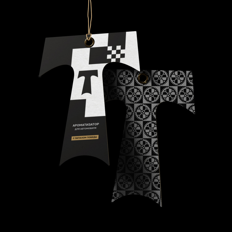
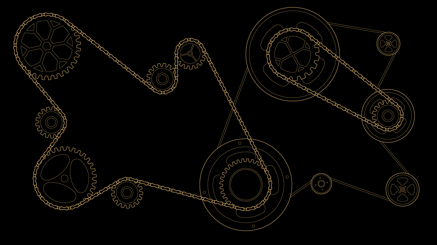
Key visual elements, such as the finishing tape and stylization for poster graphics, interact with the white and gold stripes of the background. These templates are used to design club social media. The illustrations are suitable for outdoor advertising, club merchandise and souvenir products. Patterns with pistons, gears, checkers and other elements have also been developed for these purposes.
Медиа:
Заголовок:
Motion-graphics for the scoreboard
Медиа:
Bus
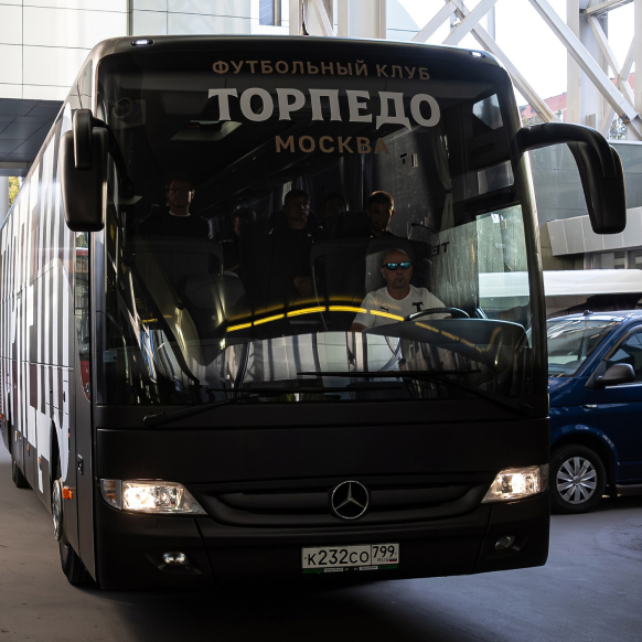
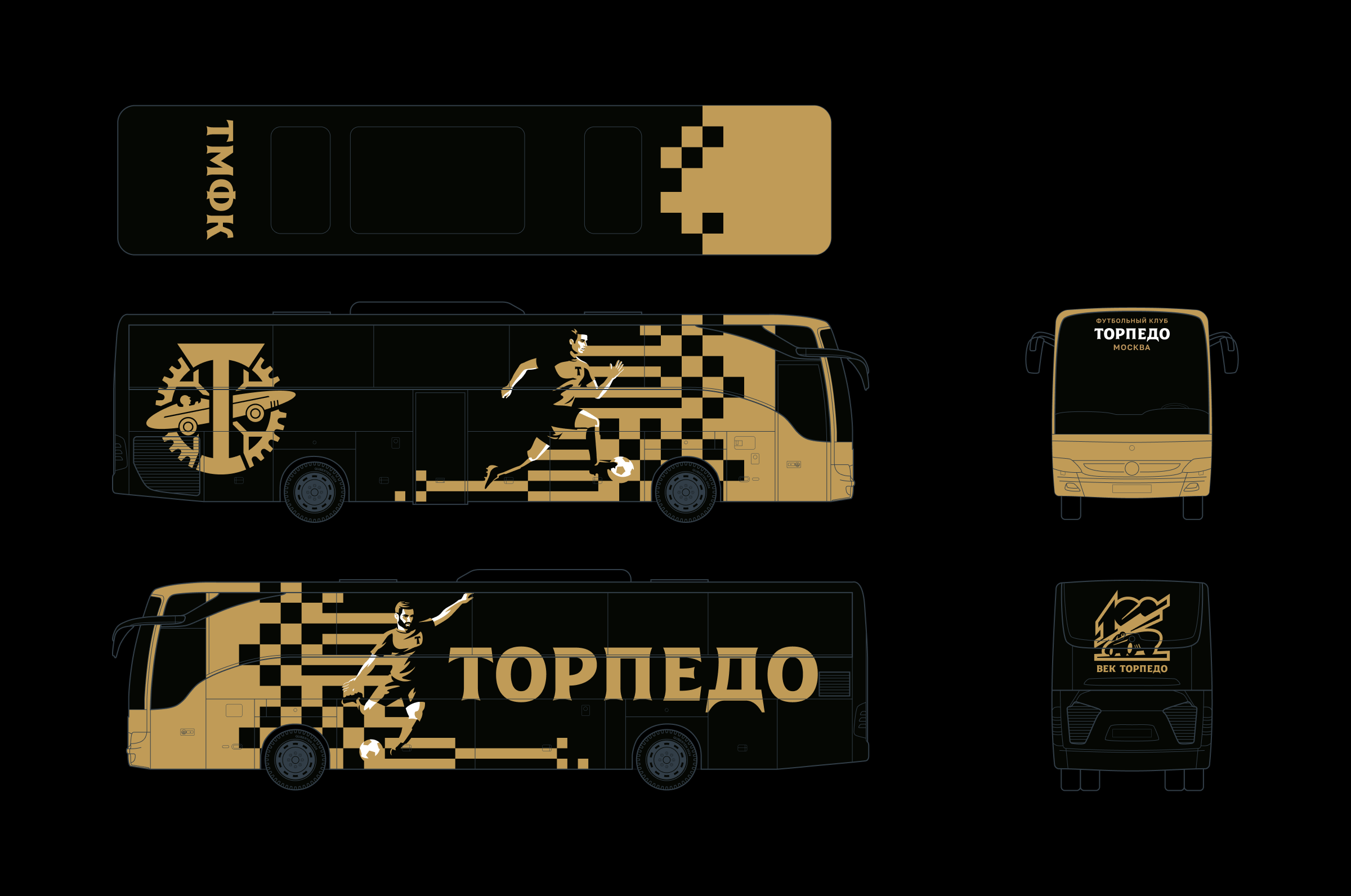
The design for the anniversary club bus features the use of football player figures in motion, enhanced by the digital glitch effect on a golden backdrop. The gear logo is located in the engine area, while a commemorative plaque for the club’s 100th anniversary is symbolically displayed on the rear window.
Медиа:
Медиа:
Mood board