Guarding the fortress. Style for Kronbars
LOGO • SUBLOGO • FONT WORK • PATTERNS • GUIDES • MERCHANDISE
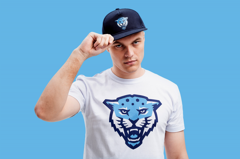
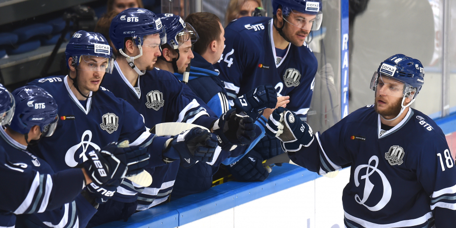
Student sport can be bright and fascinating. Kronbarses from ITMO University — are one of the most popular student athletic communities in Russia that follows this exciting trend. They keep accounts in different social networks, gain new sports to the organisation, arrange their own tournaments and collaborate with global brands. Such active lifestyle demands regular development, that’s why, «snow leopards» decided on one more bold and relevant step — rebranding the corporate style.
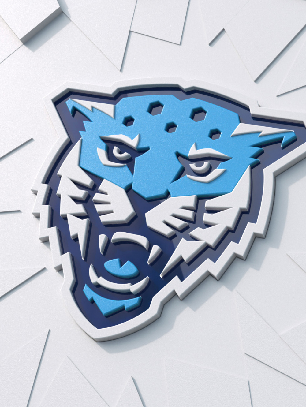
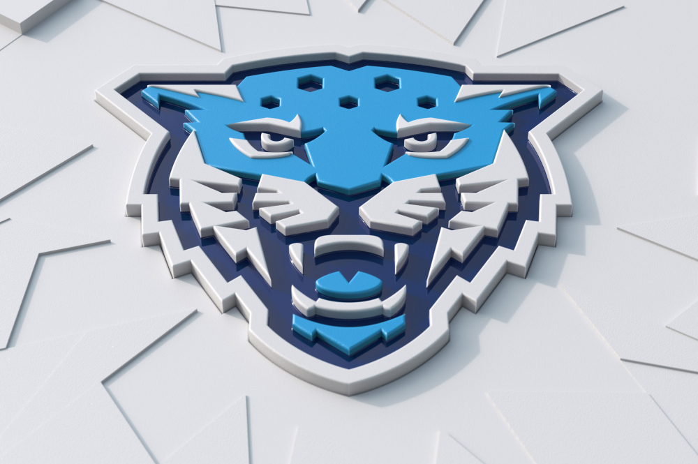
The protective element in the logo
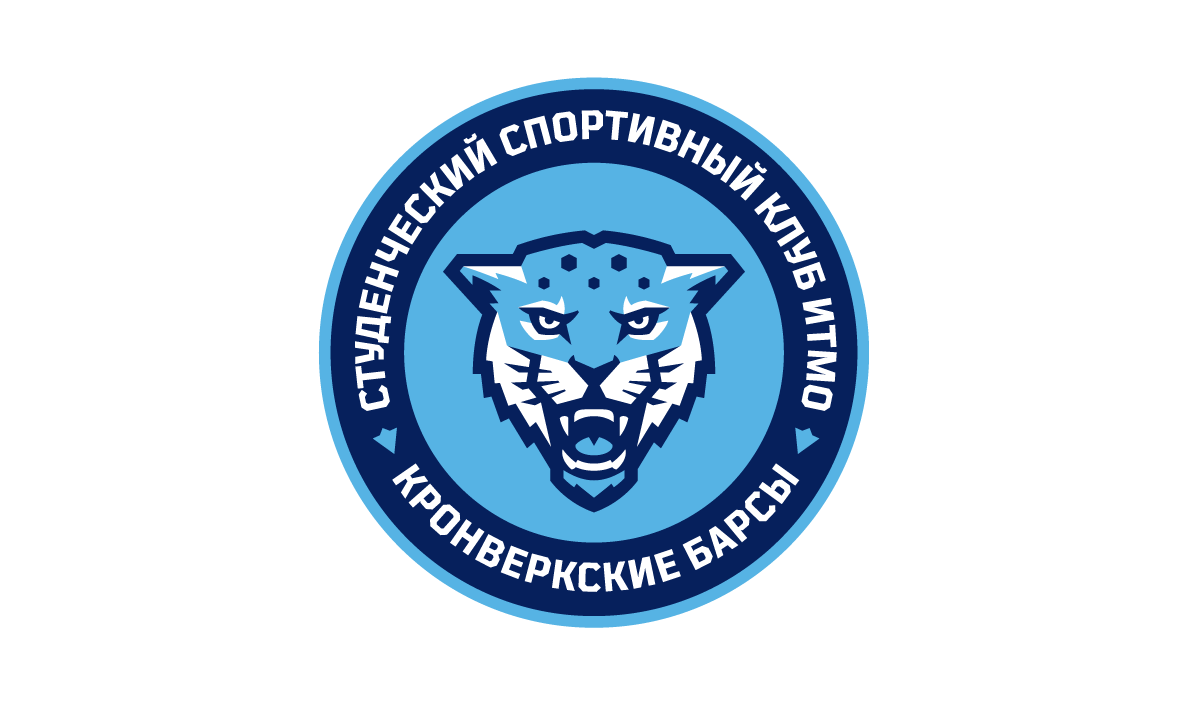
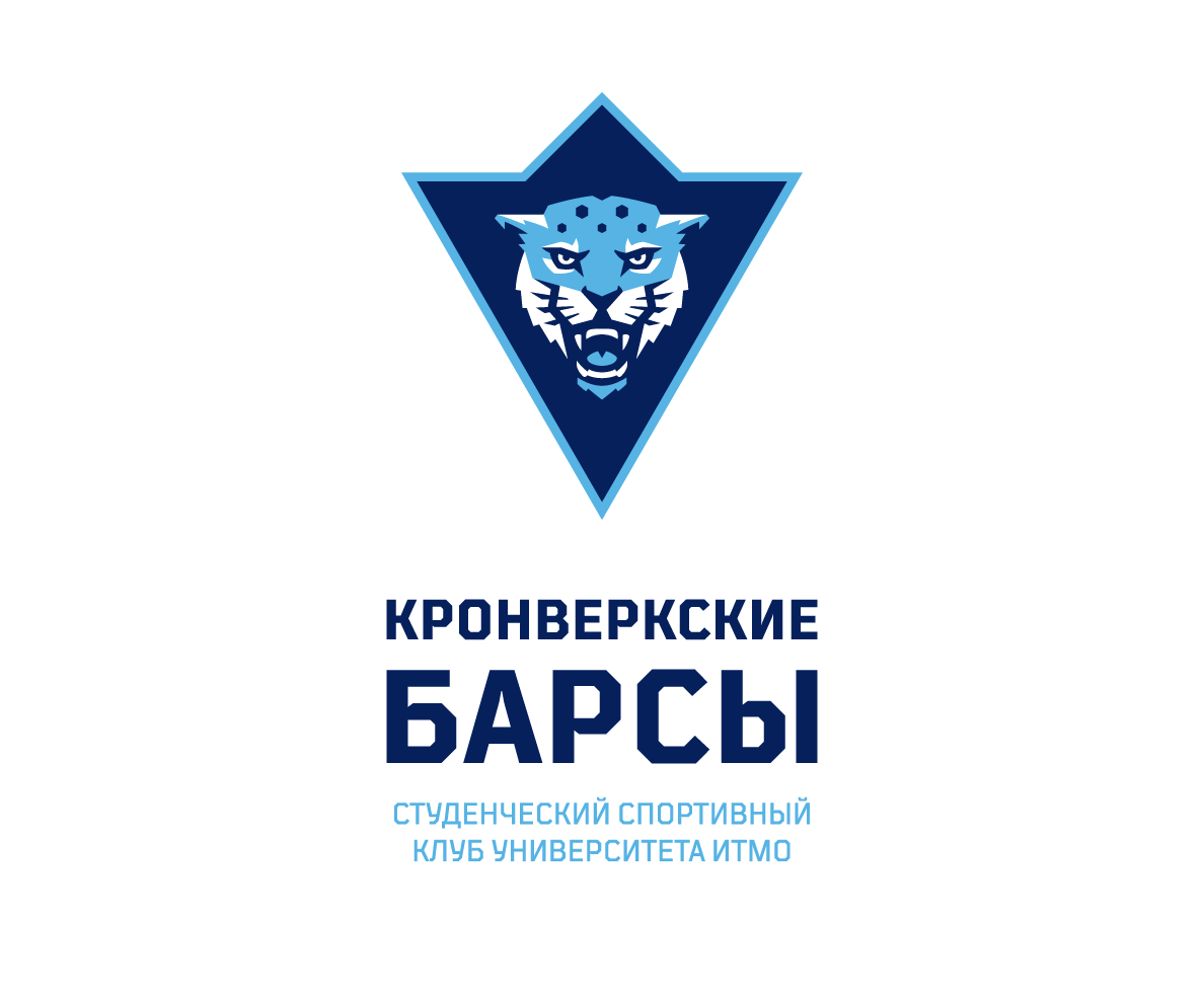
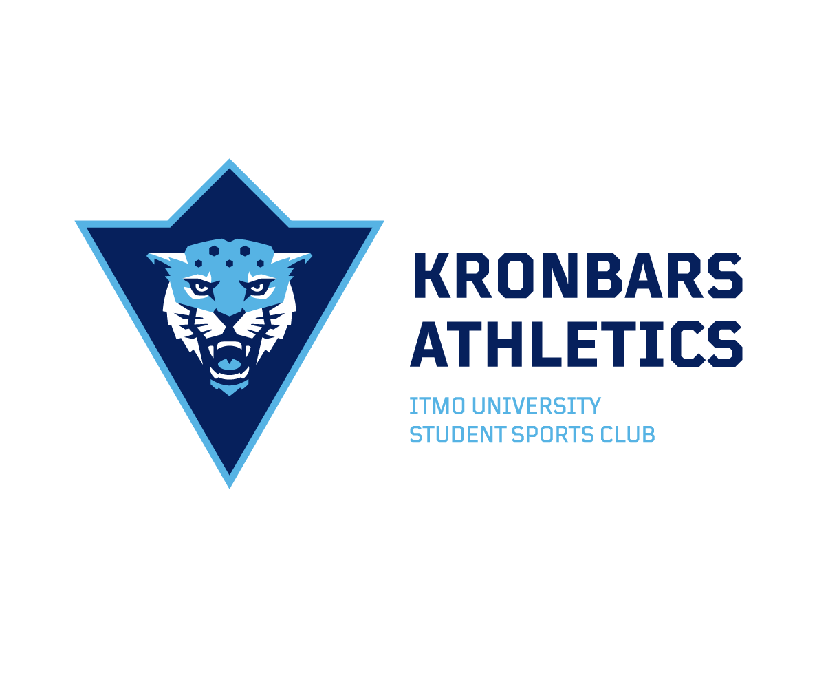
The new logo deeply redefines the club’s mascot — the snow leopard. Instead of the detailed illustration the club received the professionally designed predator. Its plasticity complies with the geometry of the sign’s external contour, the simplified image of a crownwork. This symbol was also used on the previous logo. In fact, the main building of the University is located in front of the Petropavlovsk fortress which is protected by the external structures — the crownwork. The shape became more geometric and formed the clear angles of 45 and 60 degrees that can be noticed in the whole corporate identity.
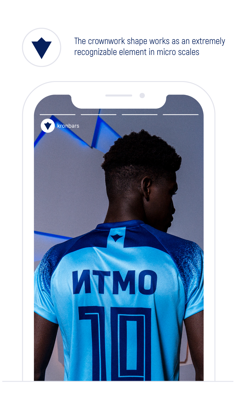
Like other technologic signs in sport the logo uses the responsive principle: depending on display sizes the logo adapts to the scale with its special versions with simplified graphics and decreased number of small elements. The most simplified option — a crownwork frame.
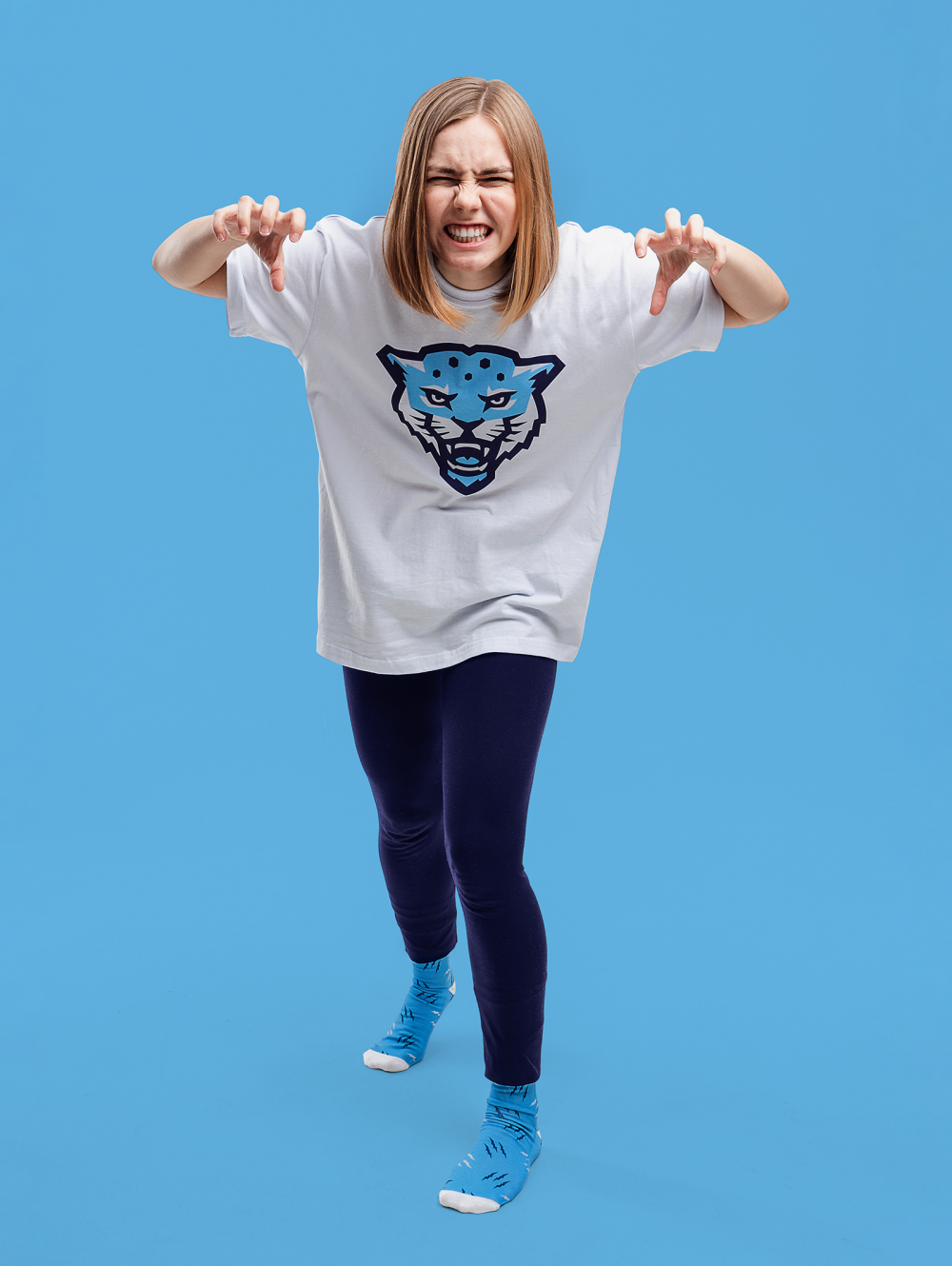
The vibrant style strengthens the snow leopard’s spirit
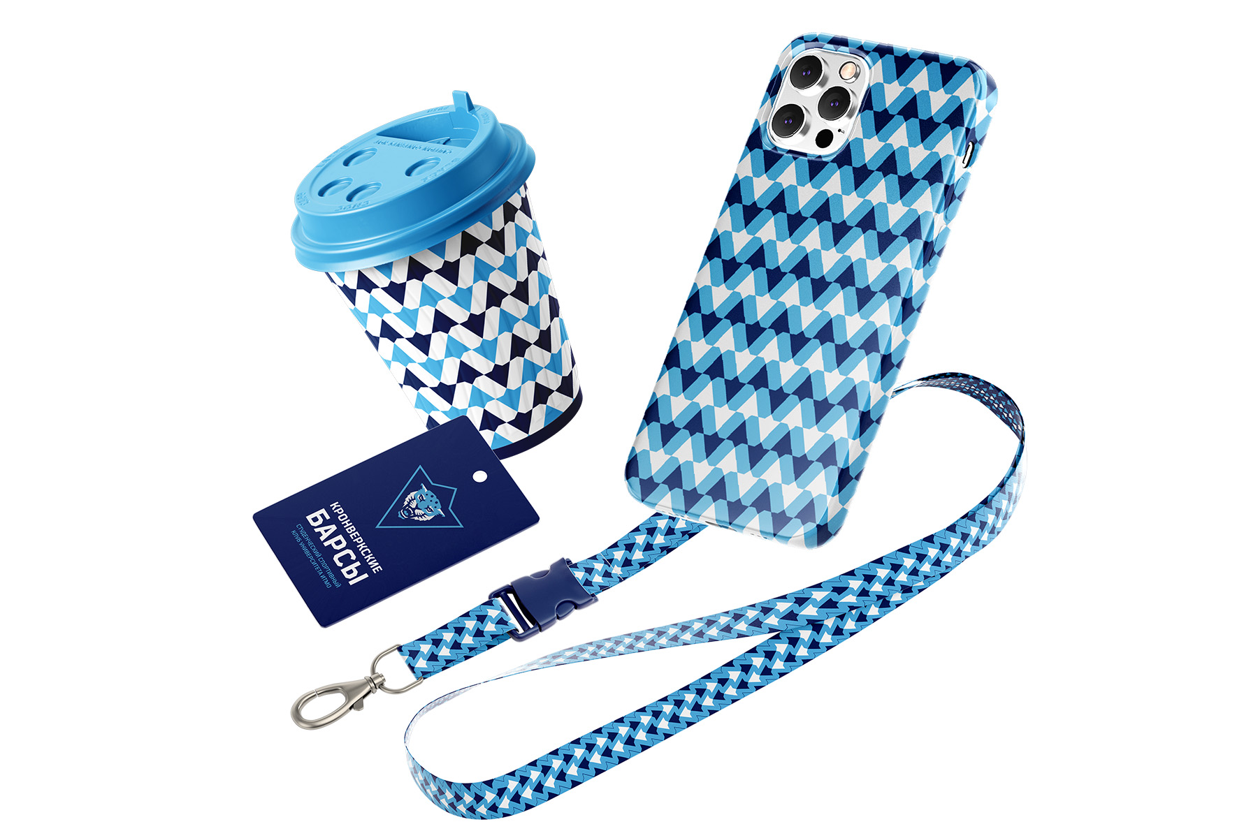
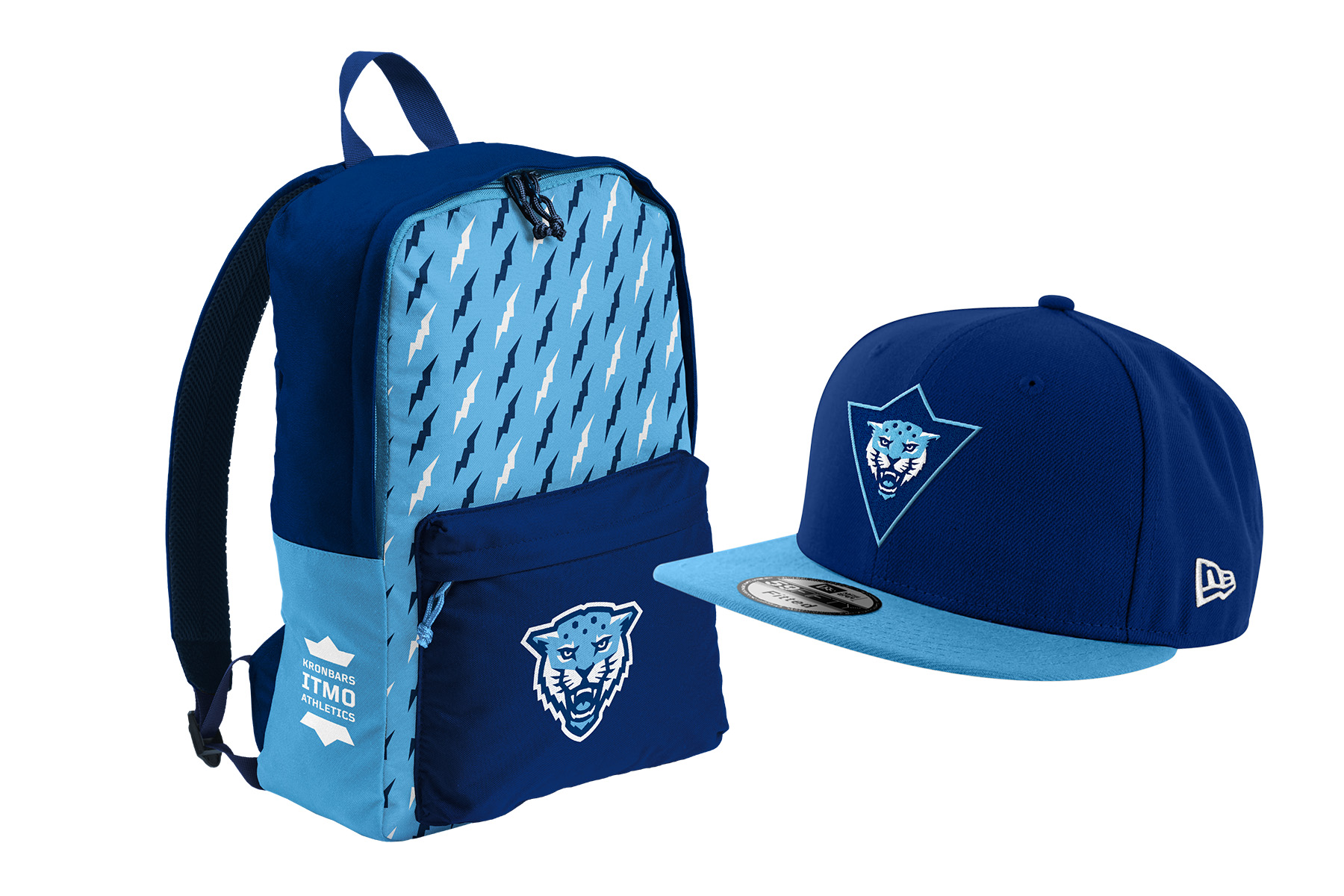
The corporate style of the community is built around the fortress topic and the attributes of the predator. The crown and the paw as sublogos should intersperse the current style and fill it with the new elements. Their harmonious mix with TT Mussels font set gives the opportunity to generate even more unusual ideas that could highlight exclusiveness of Kronbarses’ communication.
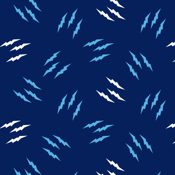
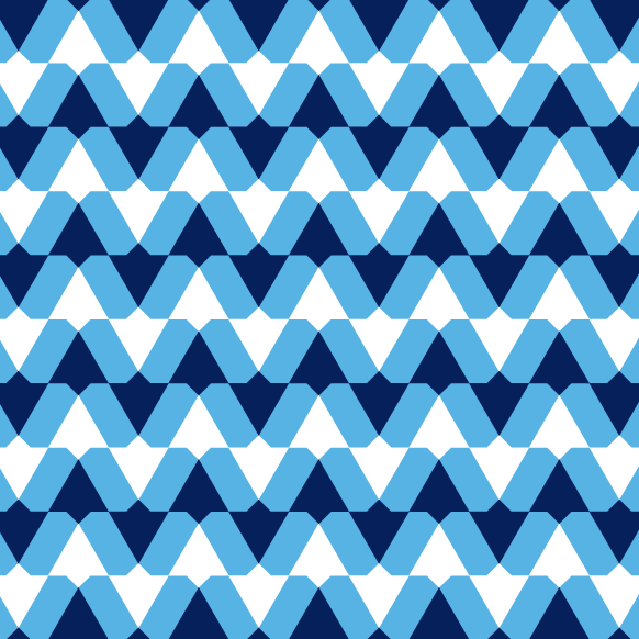
The «fortress» spirit can be seen in graphic patterns too. The graphics is based on the simplified crownwork while the cold navy blue palette refers to the waterway of St. Petersburg — the Neva river.


Медиа:


Медиа: