</>New Cybercats Code</>
LOGO • SUBLOGO • FONT WORK • PATTERNS • GUIDES • MERCHANDISE • SMM TEMPLATES • KITS
Cybercats — an ambitious esports team with a professional approach and big plans to play at the top tier of Dota 2. The Cats’ previous logo didn’t reflect the serious ambitions of the organization, that’s why the team needed to go for something brighter to make it perfect. Quberten made a full rebranding and redefined the team’s visual identity on social media platforms and in-game style.
Медиа:
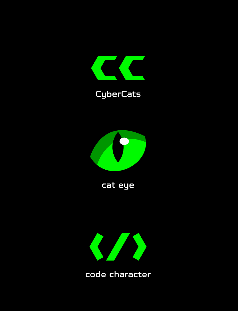

The eye of a predator
The previous logo was an illustration and was designed in a naive manner without appropriate attention to the details. It was replaced by the cat’s pupil. Such a bright element will definitely become the recognisable attribute of Cybercats. The designed eye is dynamic; it can narrow and focus depending on the context.
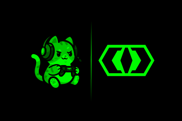
The logo has many easter eggs and symbolisms. For example, the pupil contains two symmetric letters CC (Cybercats) which resemble the code piktogramm. These elements refer to the team’s founders who work as the software engineers. One more easter egg is the silhouette of Dota 2 playing map when the logo turns 45 degrees.
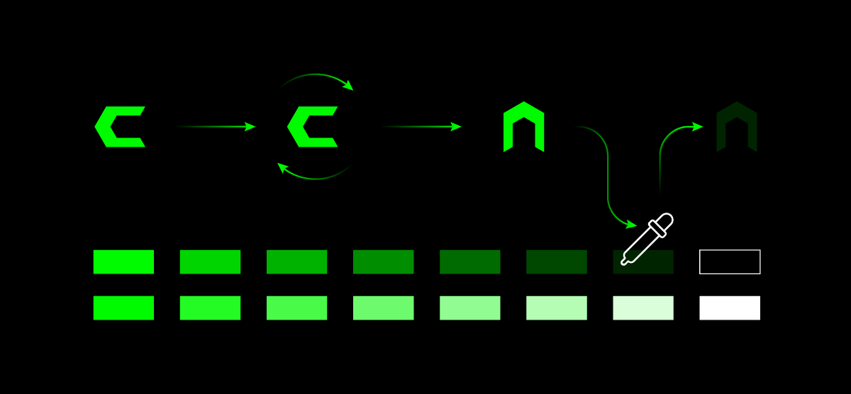
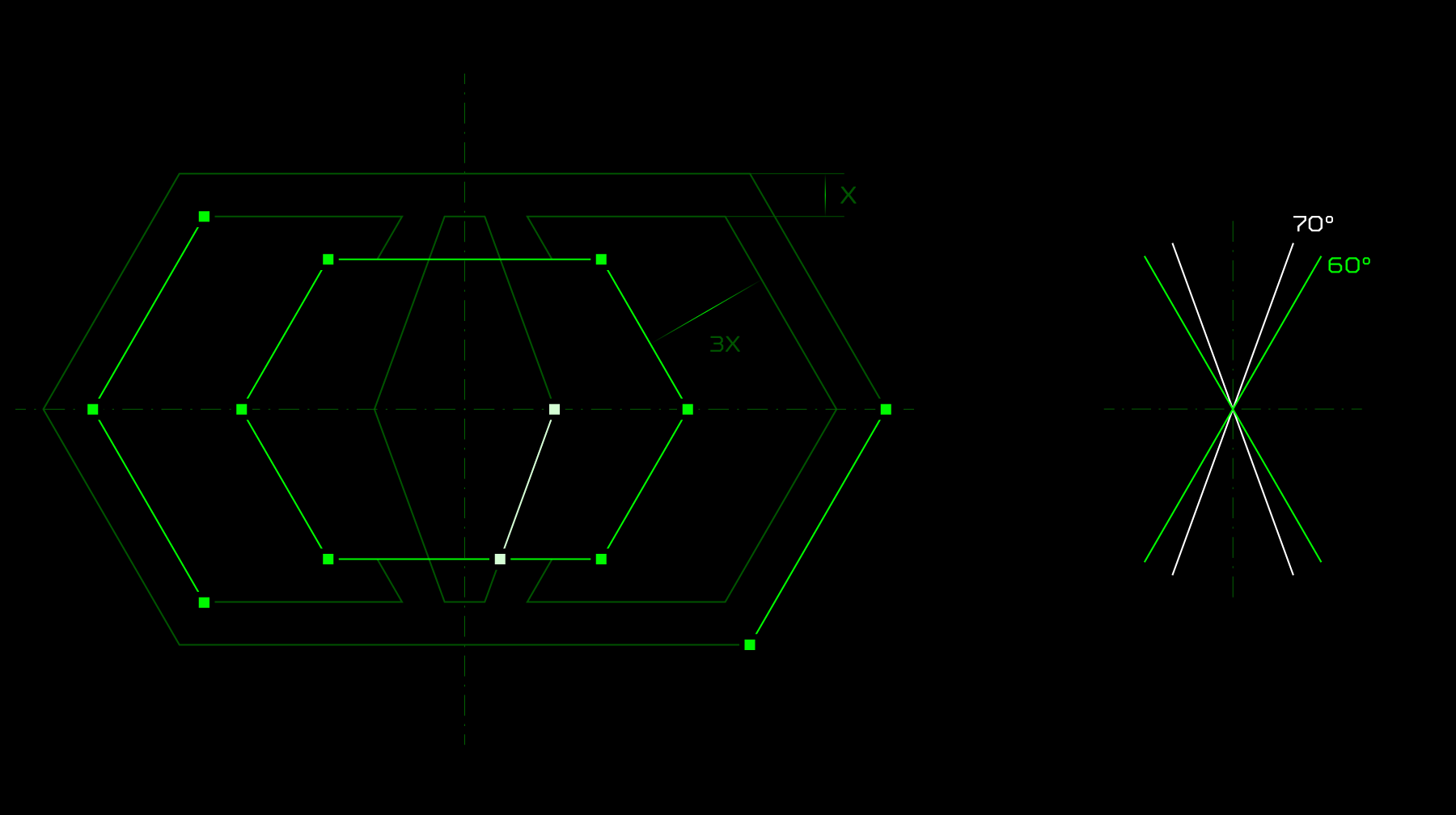
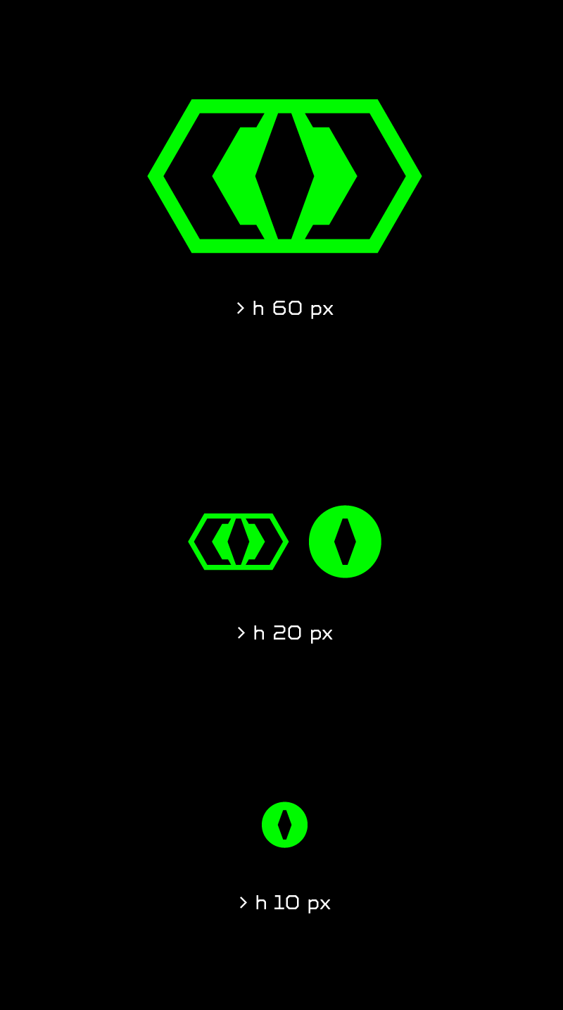
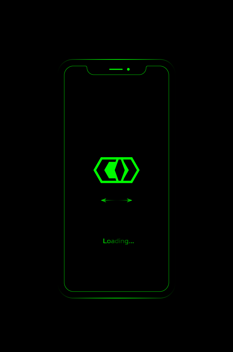
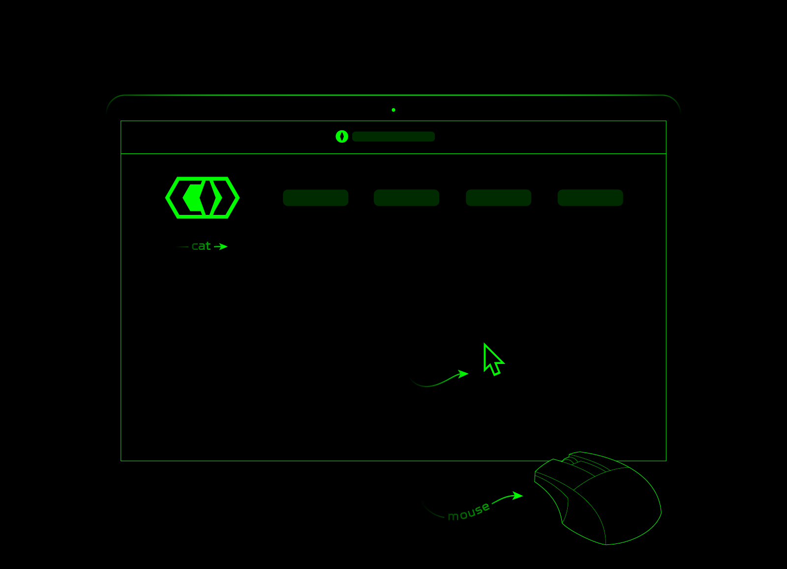
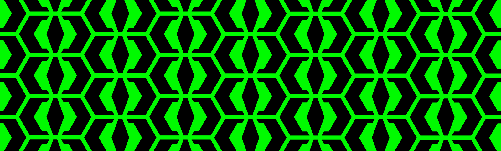
The minimalistic logo is based on a symmetric and flexible shape: a hexagon. Its geometry and 60 degrees angle can build many combinations when it comes to sublogos, patterns and other identity elements.
Медиа:
Медиа:
Медиа:
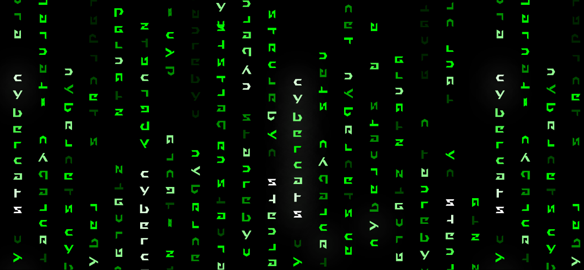
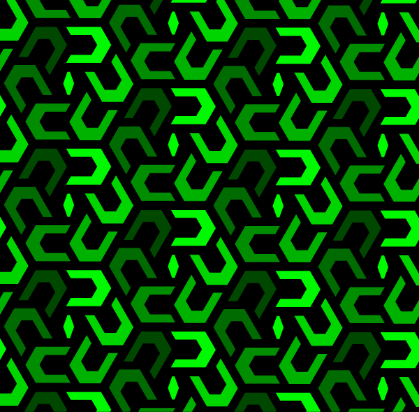
Cyberstyle: lettering and patterns
The corporate lettering is designed in the same logic as the logo. It looks futuristic and conveys the vibe of cyberpunk.
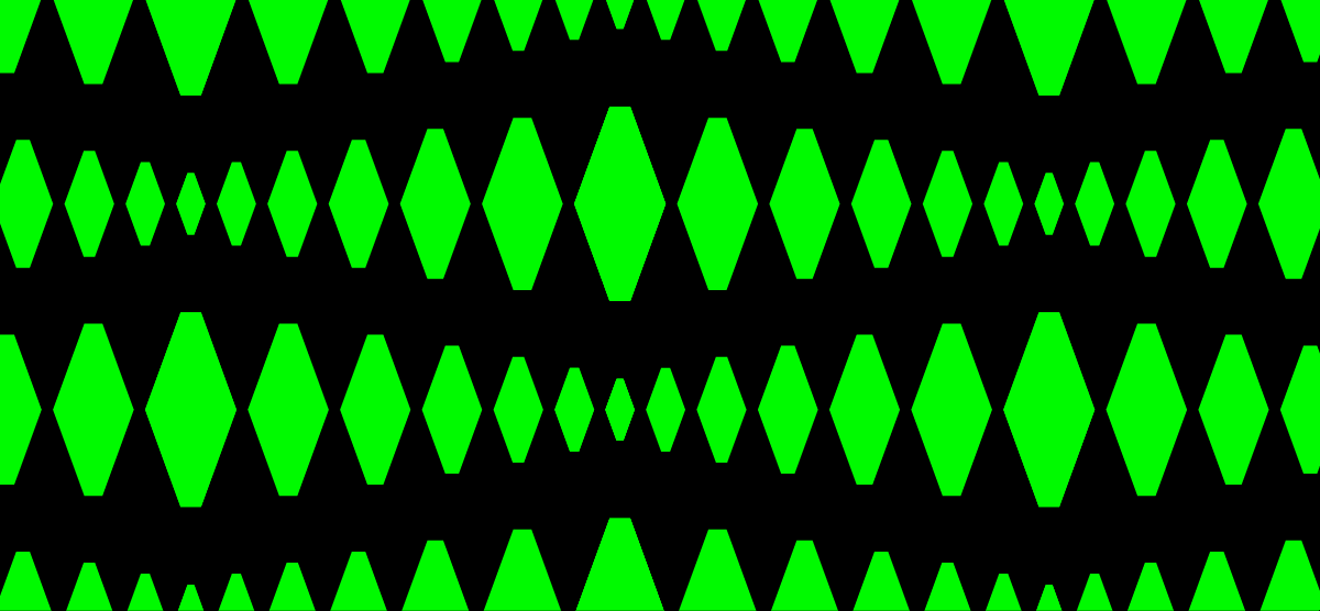
The flexible geometry of the hexagon helps to generate many backgrounds and active patterns. Some elements were created using a special matrix effect: every character of the corporate lettering can be inverted, turned or reflected. As a result, this technique provides a special pack of hieroglyphics for building bright patterns.


Медиа:

Медиа:

Медиа: