Design-system for The Football National League (FNL)
LOGO • SUBLOGO • FONTS • PATTERNS • GUIDES • PACKAGE • MERCHANDISE
The Russian Football National League (FNL) is the second level of Russian professional football. It’s good here and there in the FNL: there are new stadiums, private clubs, young up-coming players. However, the whole image of the league has not been solidified over the years. Fortunately, it’s time for a change. Quberten studio created a design system for the FNL, that works everywhere — from the pattern on the captain’s armband to the advertising boards.
Logo simplification
The FNL logo is heavily outdated. The ball with the colourful Russian shield-integrated flag is replete with strokes and simply informs about the football competition, but does not convey its nature. Modern emblems, on the contrary, get rid of heraldry, small fussy details and congestion with flowers so that nothing distracts from the main thing. The new FNL design system is developed exactly like that: being simple, instantly readable lettering + memorable symbol. Usually, the emblems depict either the moment of hitting or dribbling the ball, and we chose head-playing as an element that was underestimated in the graphics.
The symbol neatly blended into the lettering thanks to the counter-shape: the silhouette of a football player and the ball forms the letter N (and the F unobtrusively symbolizes a football field).

Features — neutrality and colour mimicry
The FNL logo must be neutral. The league has a title sponsor, and their emblems are woven into a coherent image through the partnership. Previously, this turned into a graphic conflict in which the league would dissolve due to the logo severity. And the simplified abbreviation fits well with the sponsor’s identity. The FNL, as befits a self-respecting league, has decided on its corporate colour — a complex shade of green. It doesn’t come in between with being flexible — the logo can be repainted in the colours of the sponsor or the club (and in an environment where there are many different emblems and colours, monochrome is used) depending on the circumstances. The MLS example proves that this approach does not taint the league’s identity in the least, but only emphasizes its unifying power.

Not just a logo, but a constructor
The new design system makes the FNL adaptive: its identity will be read equally well from a long distance on a shield near the field, and on a small smartphone screen. Different situations mean different layouts.
The heading player becomes a separate element — it’s a favicon, an app icon, an avatar for social networks. Moreover, the symbol can take any shape: the priority is the hexagon, symbolizing the cover of the ball, but it can be a square, a circle, and so on. Therefore, the name block is also extremely variable.


The league has its own set of numbers
In a healthy league, every element of a corporate identity works for brand awareness. The same goes for the FNL. Especially for the league, we have developed a set of numbers — now it is the same for all teams. The numbers smoothly rhyme with the logo taking on its sense of rhythm, plus at the base of each number, there is a silhouette of a player heading a ball.
The clubs will also receive new captain’s armbands, which of course, link back to the league.


The unity of style embraces fonts and solid areas in social networks
The league will use the TT SupermolotNeue typeface everywhere (from corporate communication to social media) — that means the rearrangement of the legendary typeface that reinterprets the Soviet-style.

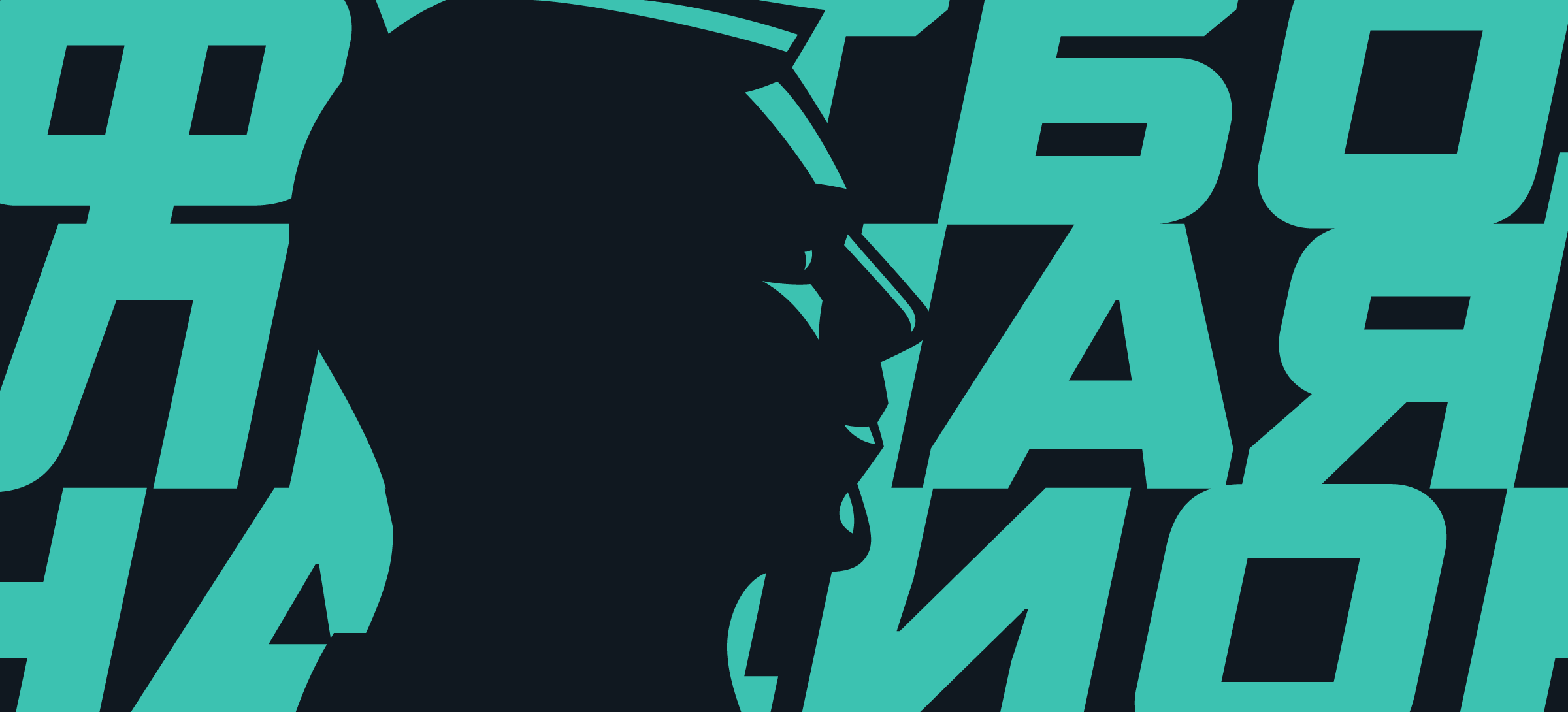
The FNL now has everything to become recognizable. In social networks, the league will use a pack of patterns and solid areas that are tightly connected to the logo even being skew. And each poster and picture chime with the logo: the main characters are highlighted with an accent shadow since the style is based on the player’s silhouettes and shadow.
This is how the movement towards the best leagues in the world begins.