Logo for handball Superleague Parimatch
LOGO • TYPEFACE DESIGN • PATTERNS
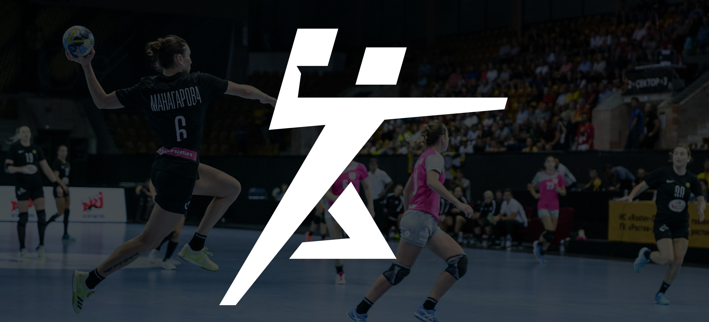
In 2019, the Russian Handball Championship was rebranded: it received a title sponsor (Parimatch) for the first time and completely changed its corporate identity, with it now meeting the requirements of a more modern era.

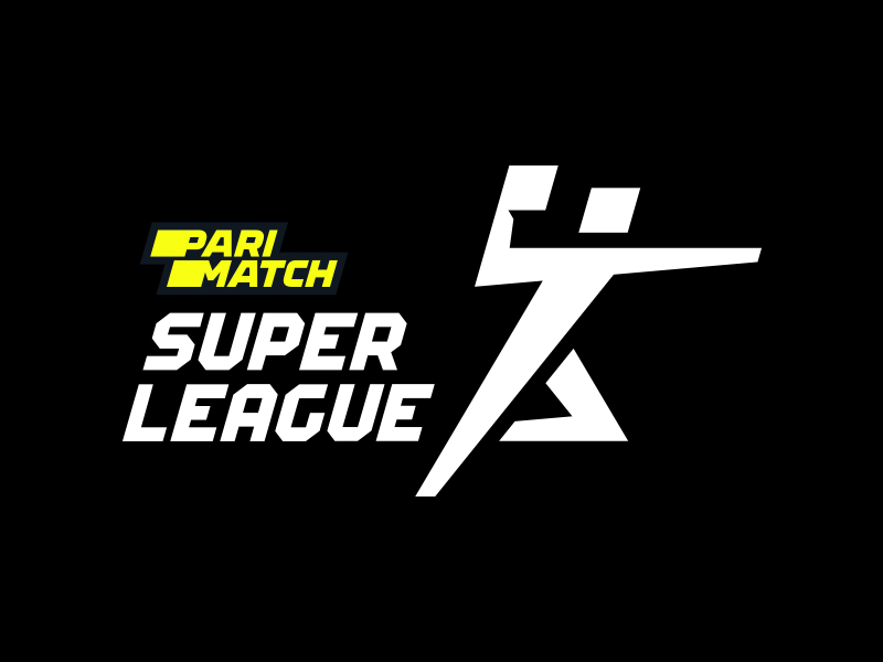
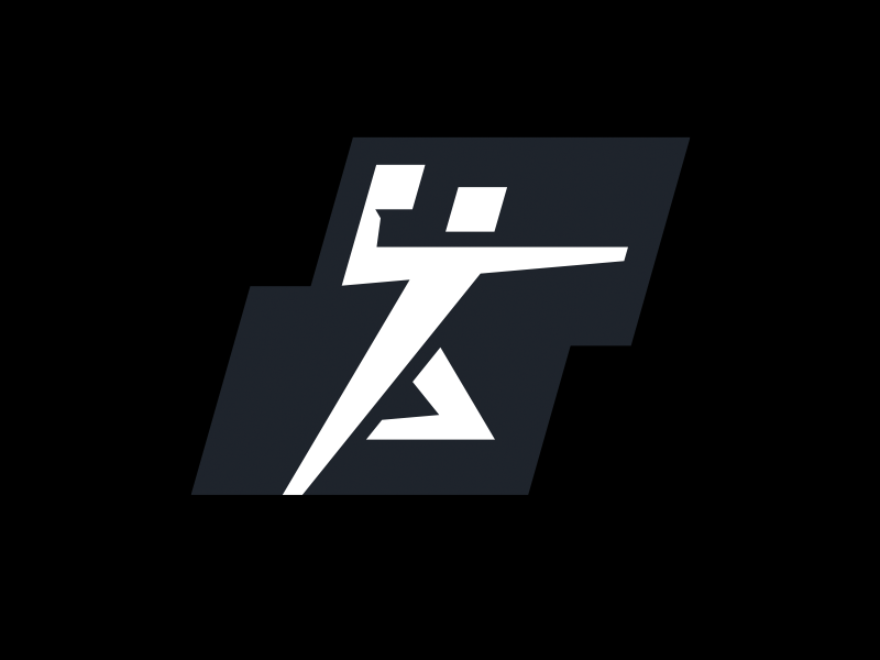
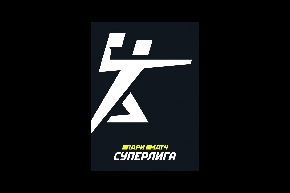
Minimalistic logo: a handball player — and nothing superfluous
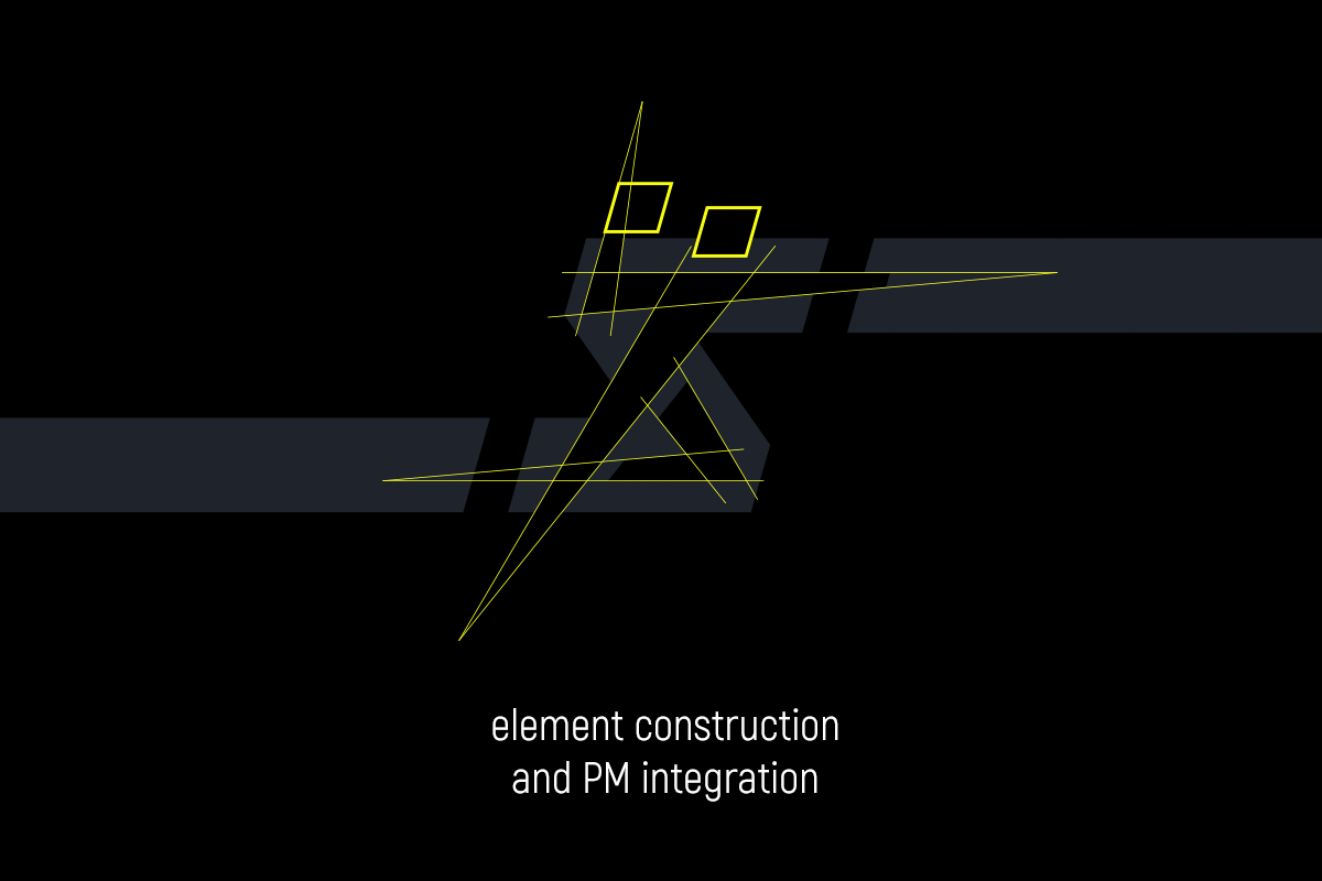
We have developed a flat logo from scratch, which performs two basic functions:
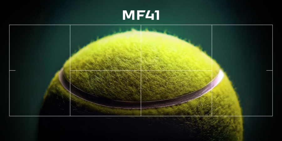
• Even an unprepared spectator instantly identifies the sport through the image of an attacking handball player, who is preparing to shoot at the opponent’s goal in a jump, his hand is already taken away for a throw. He isn’t to be confused with a football player, a basketball player, or any other athlete.
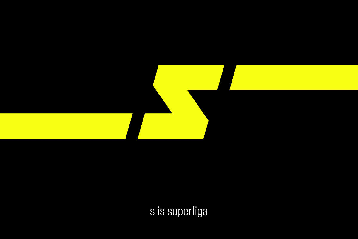
• Easy perception in all environments: there are no small, noisy details that distract attention. But there are some encrypted symbols. For example, in the strict geometry of the figure of a handball player, the letter S (Superleague) is present.

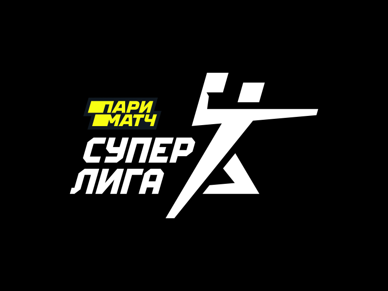
The logo is neatly connected to the identity of the sponsor
One of the features of the handball Super League logo was the smooth integration of the sponsor, Parimatch. Usually, combining the identities of partners turns out to be intrusive due to a stylistic conflict, but here the priority of all parties was the delivery.
The title sponsor in the logo is highlighted with the colour (yellow), the tilt (it echoes the plastic of the Parimatch logo) and the repetition of square modules (the ball and the head of the handball player). The signature font of the Superleague partly works well with the Parimatch lettering, making it look sharper, since it’s geometrically connected with an attacking handball player.
As a result, the integration of the sponsor doesn’t interfere with the brand of the tournament at all, only by making them visually connected. And even if this partnership ends sometime in the future?; the sign won’t have to be radically changed, it will remain recognizable and relevant.
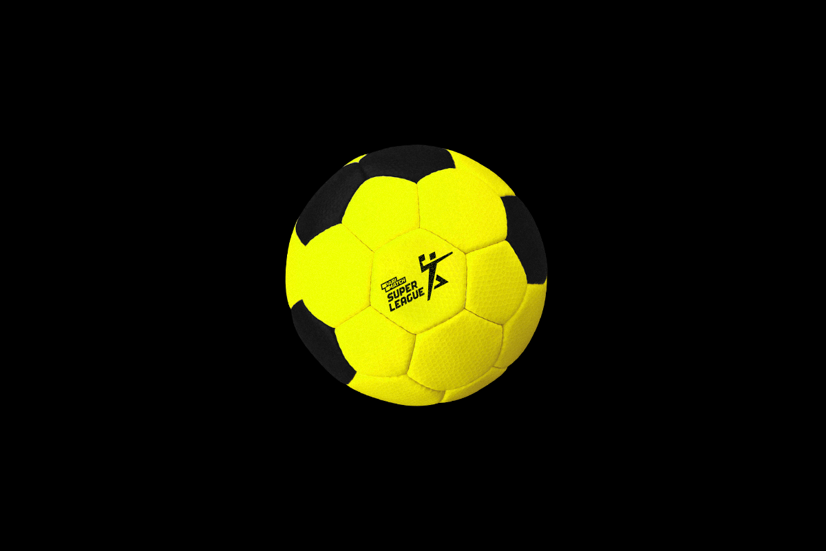
Also, thanks to the rebranding, the Superleague has a set of patterns. It complements the identity and can be used as an independent element everywhere, from merchandising, to video ads etc.