Vikings on top. PBC Runa identity
Runa stands out in the Russian basketball community with bold marketing aimed at youth audience, modern management and a bright visual style. The history of the Runa club began in 2004 with a kids team. It took only ten years to reach the VTB United League — the consistent strengthening of the roster transformed into sporting results. In 2020, the team moved to a new home arena. In 2023 the studio made an identity redesign for the only private professional club in Russia now playing in a major basketball league.

Медиа:
Заголовок:
Logo
Текст:
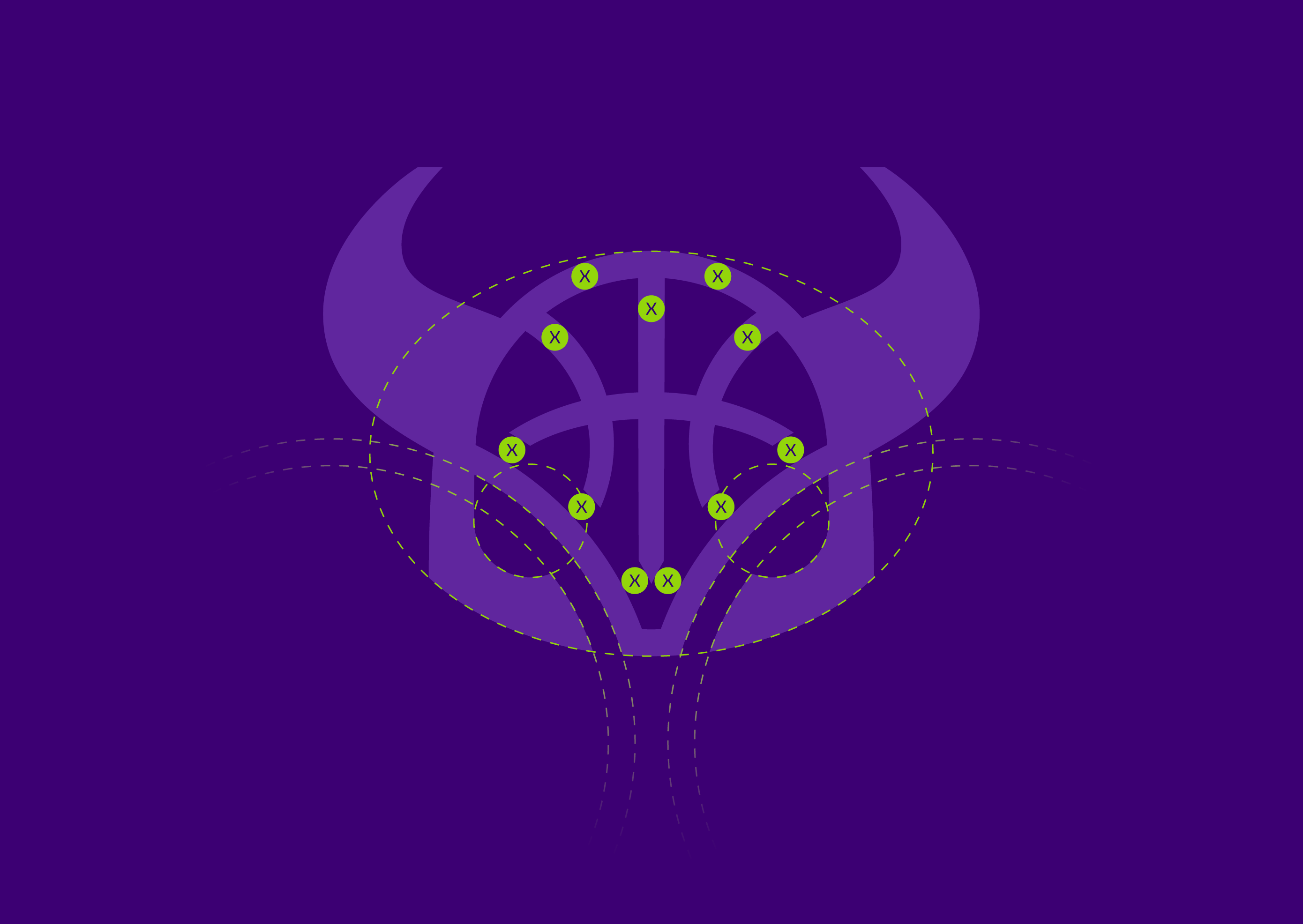
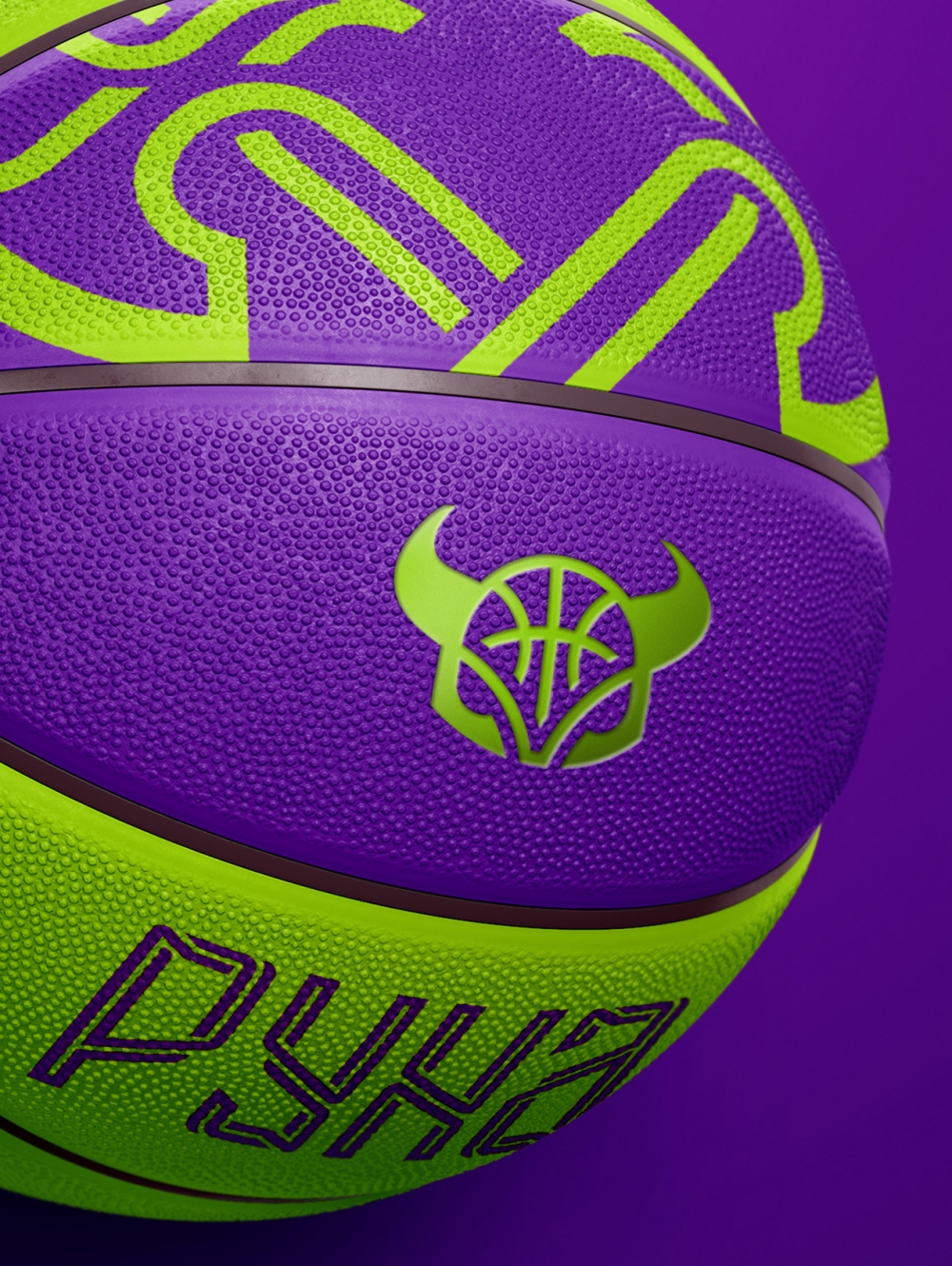
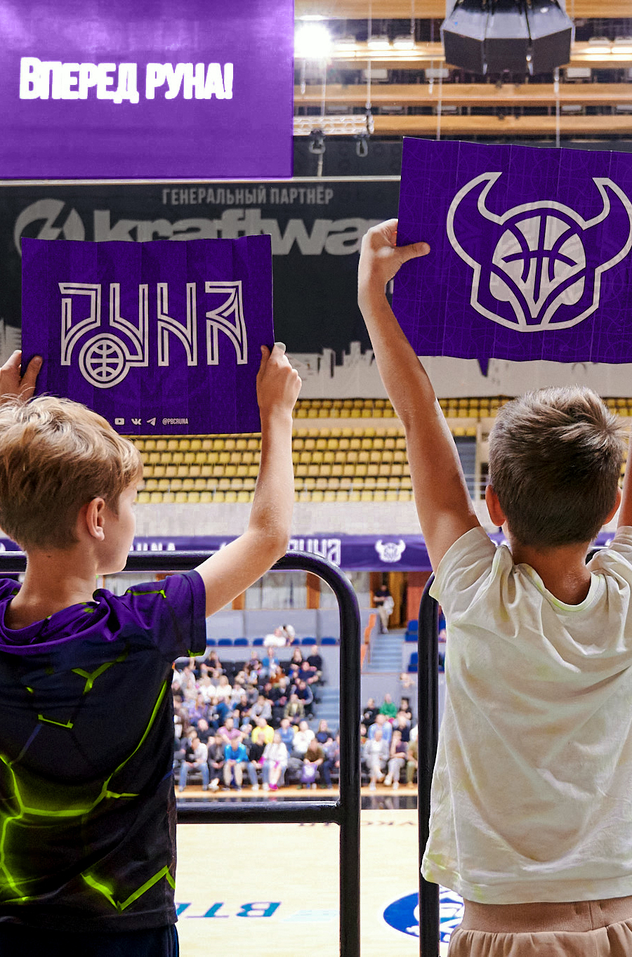
The logo has been rebuild in view of current trends. The famous horned helmet has been preserved while the image has been simplified: it has become flat with less details. The logo is made from Bezier curves reflecting the aesthetics of the Scandinavian pattern and strengthening associations with Viking culture. The lines on the helmet that define the logic of thicknesses are also forged elements. They continue the geometry of the horns and the veins of the ball panels. A white-edged version of the logo has also been developed for using on complex backgrounds.
Медиа:
Медиа:
Медиа:
Заголовок:
Lettering
Текст:
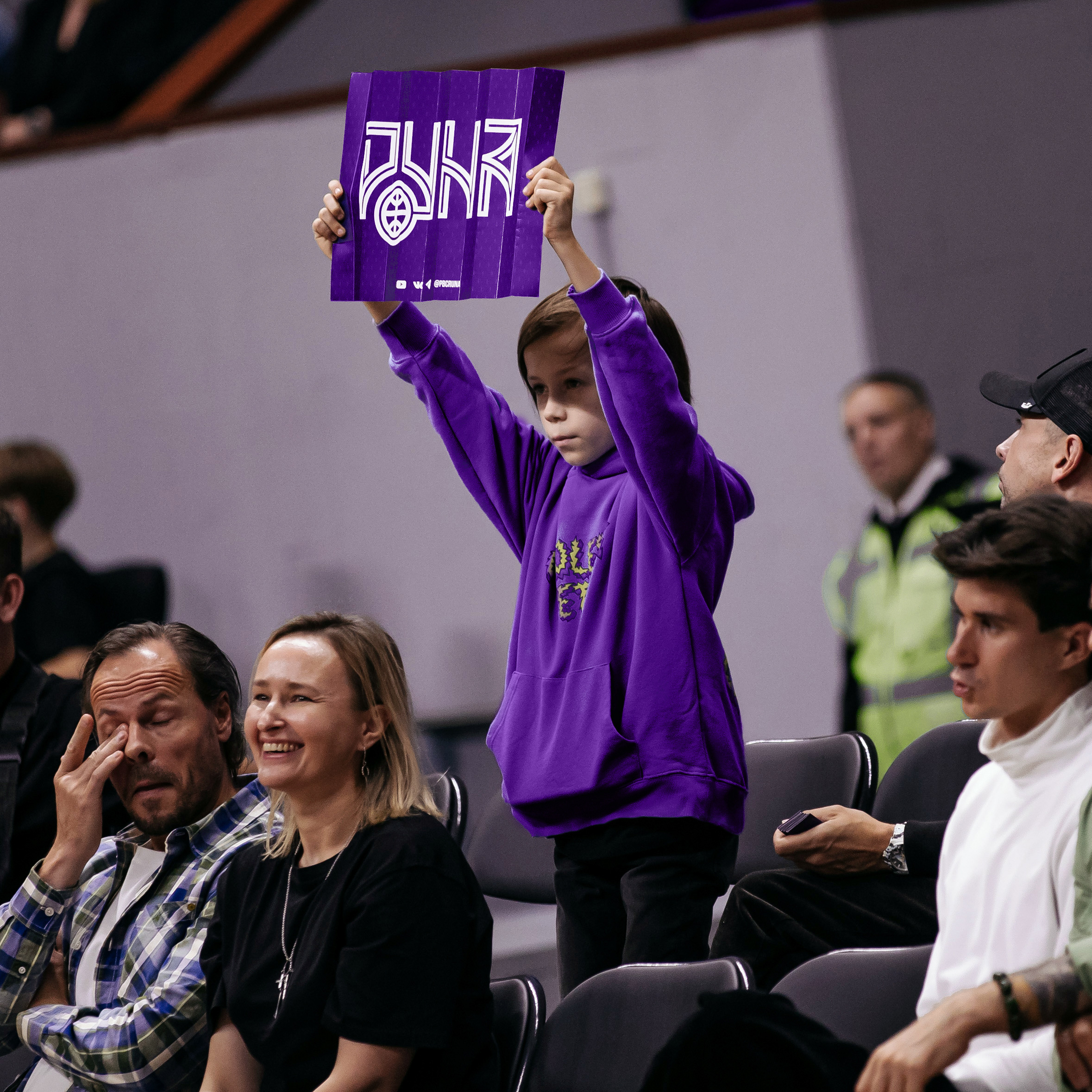
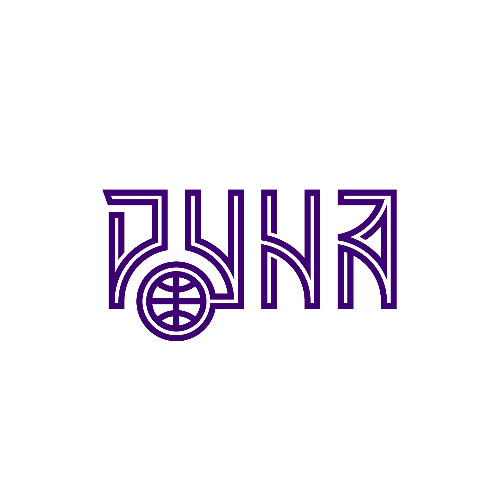
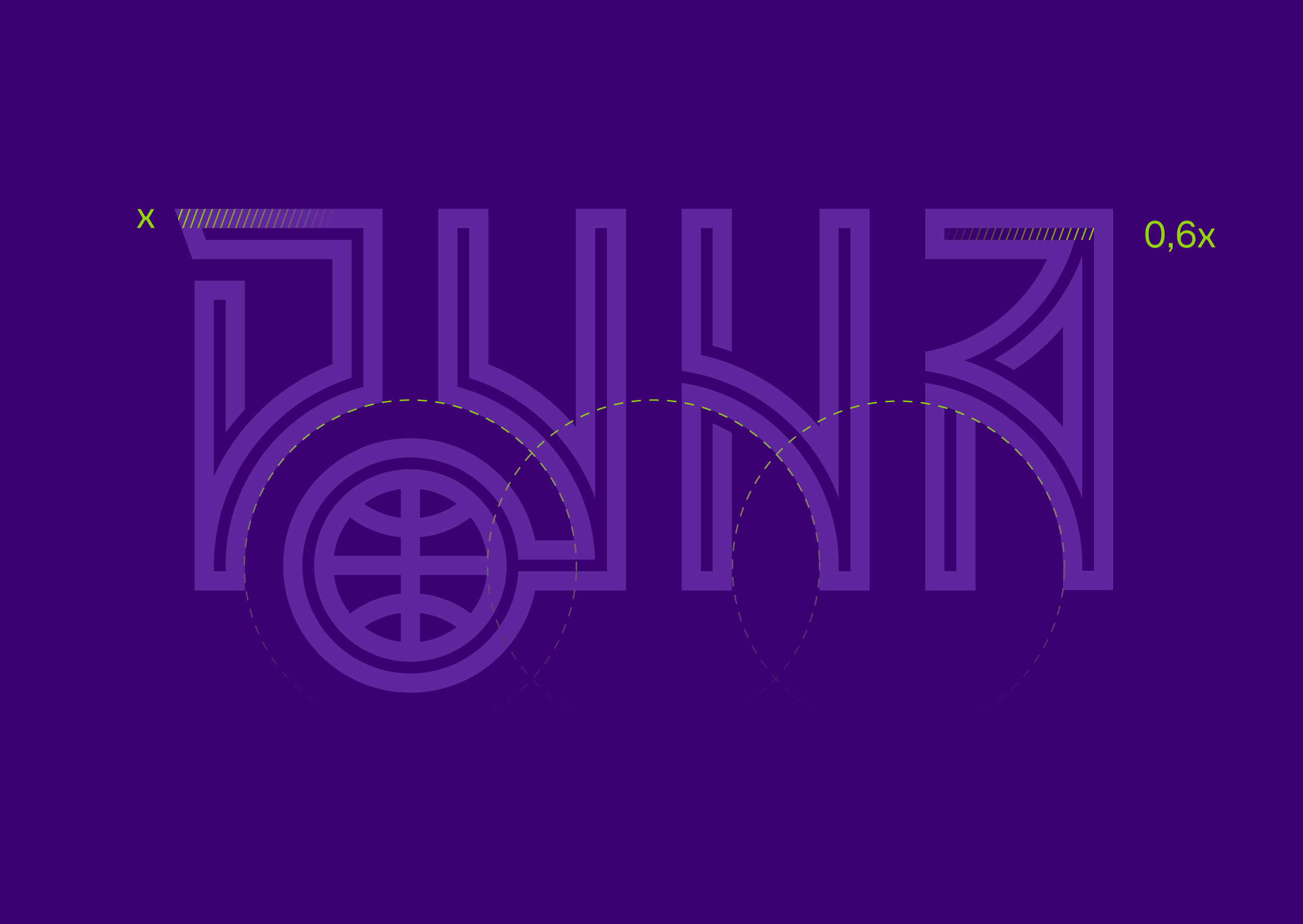
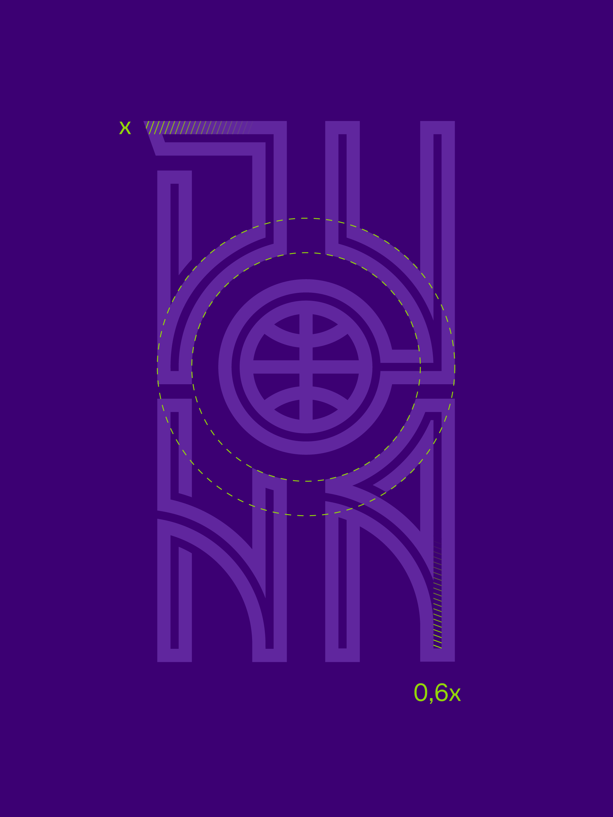
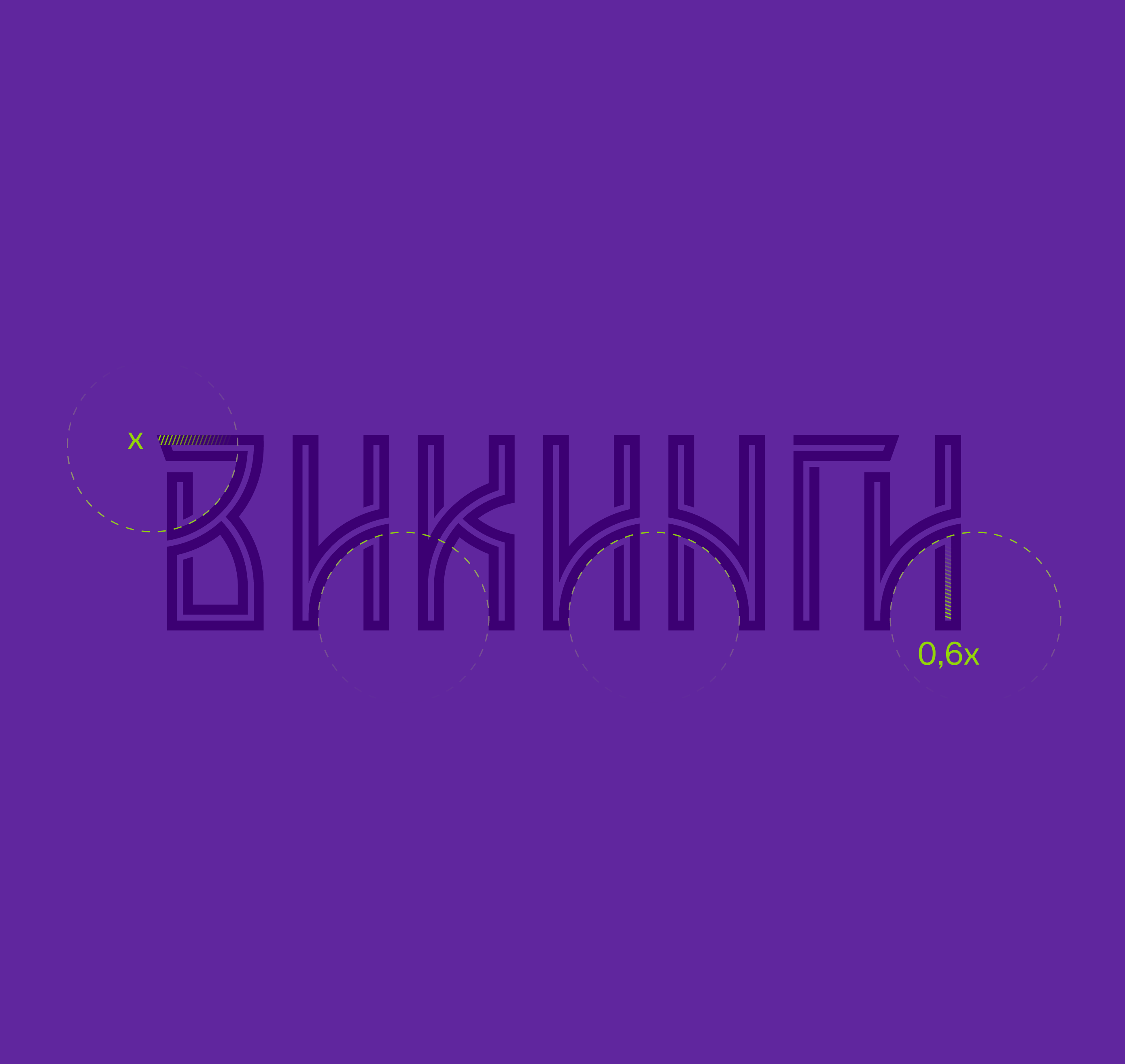
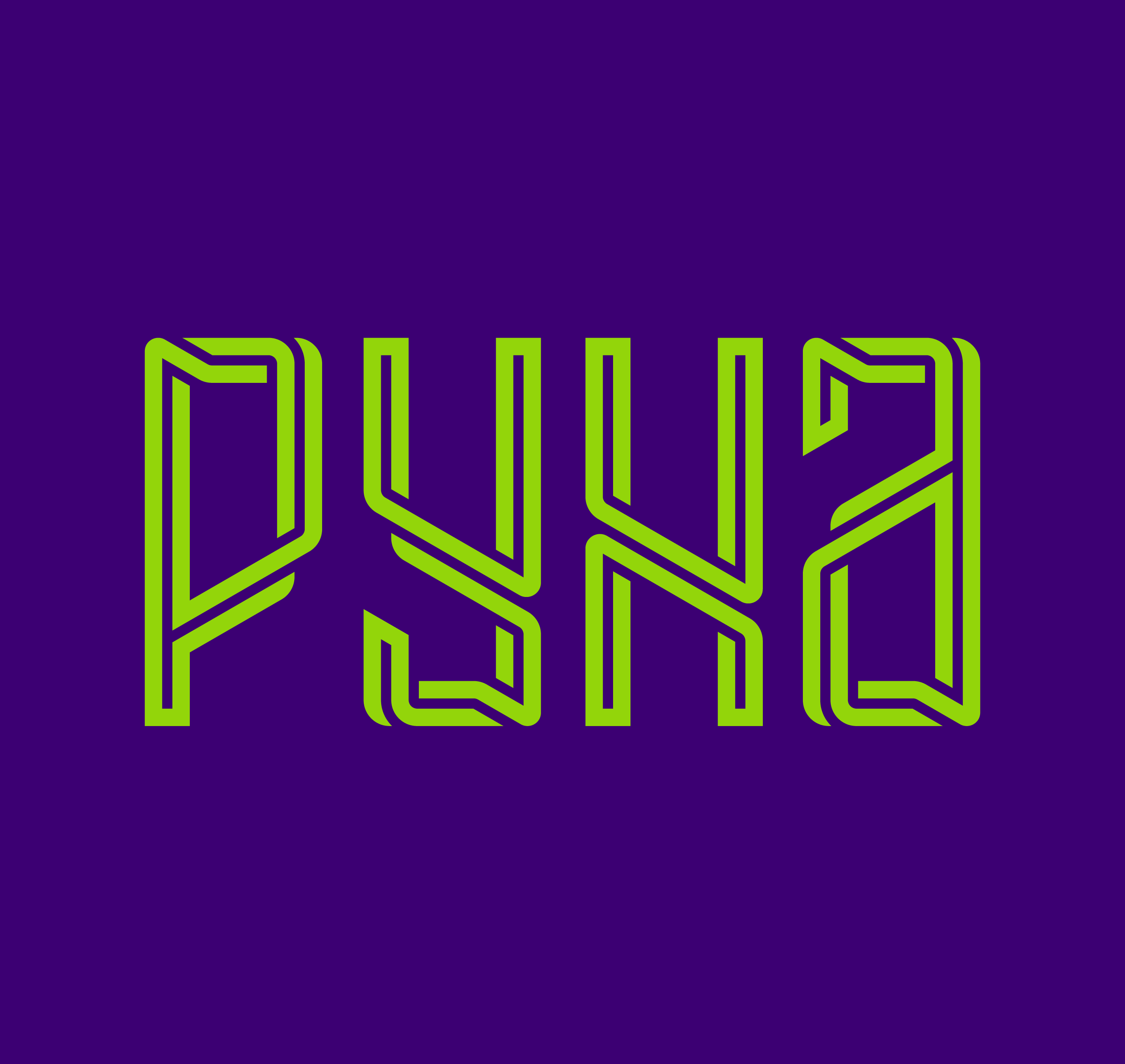
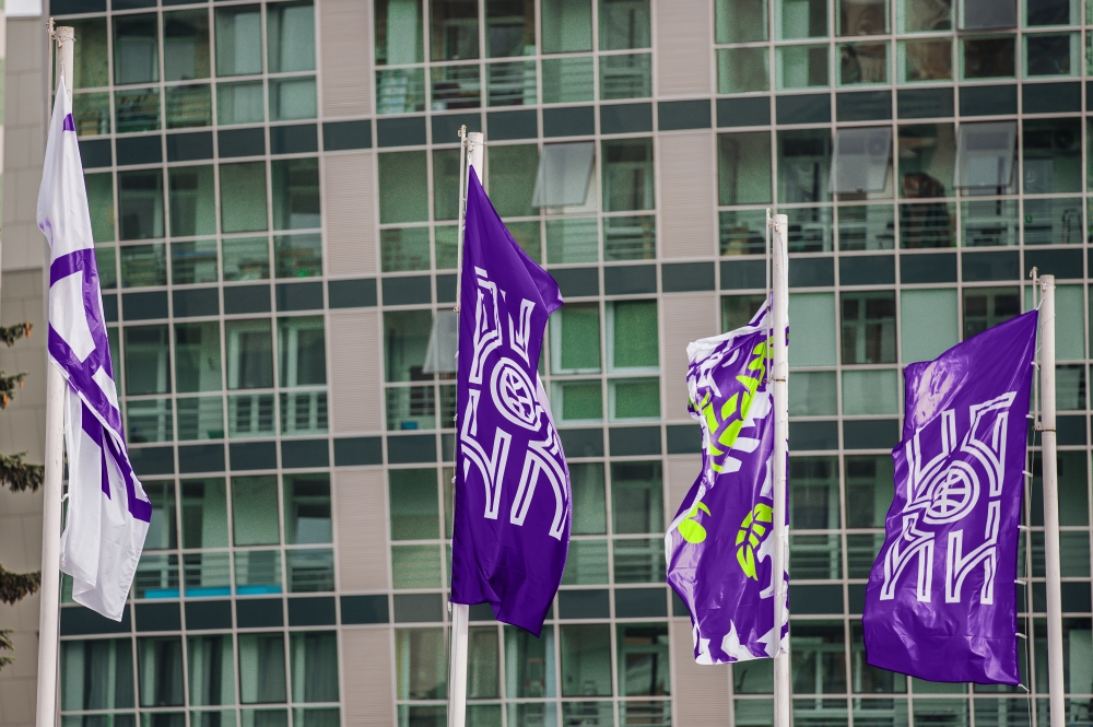
Taking into account the naming and the hometown of the team the studio relied on a combination of hard, straight letters and runes in the development of lettering. For the game kit usage, the main lettering has been supplemented with a Latin version.
Numbers
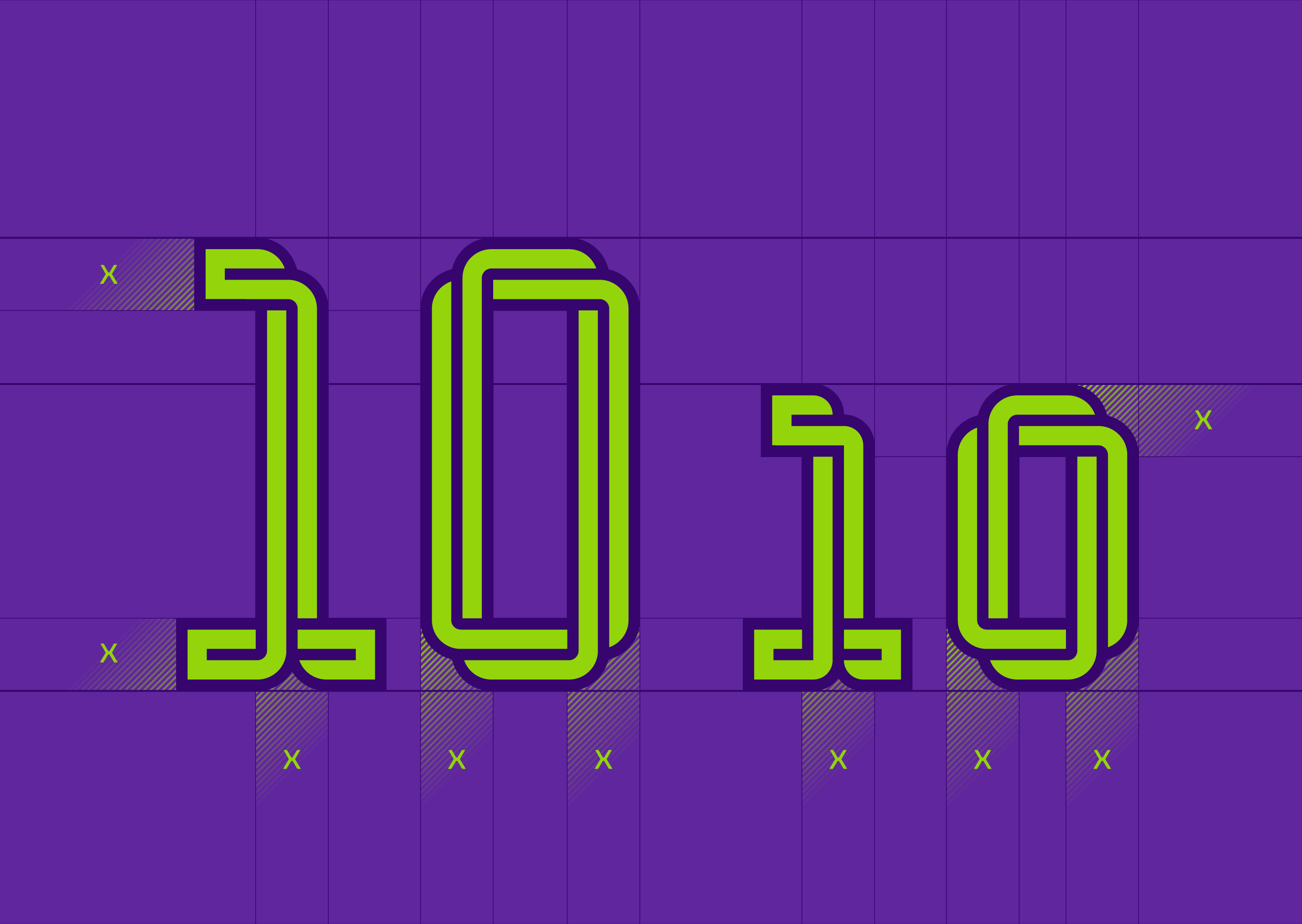
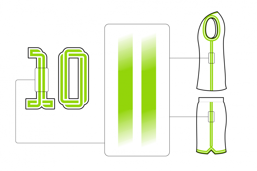
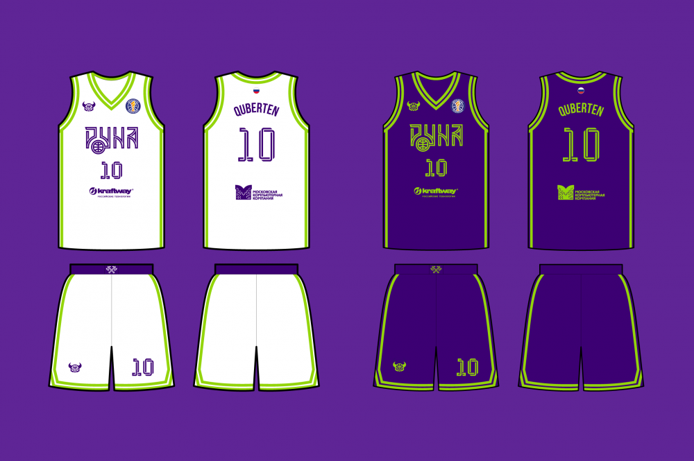
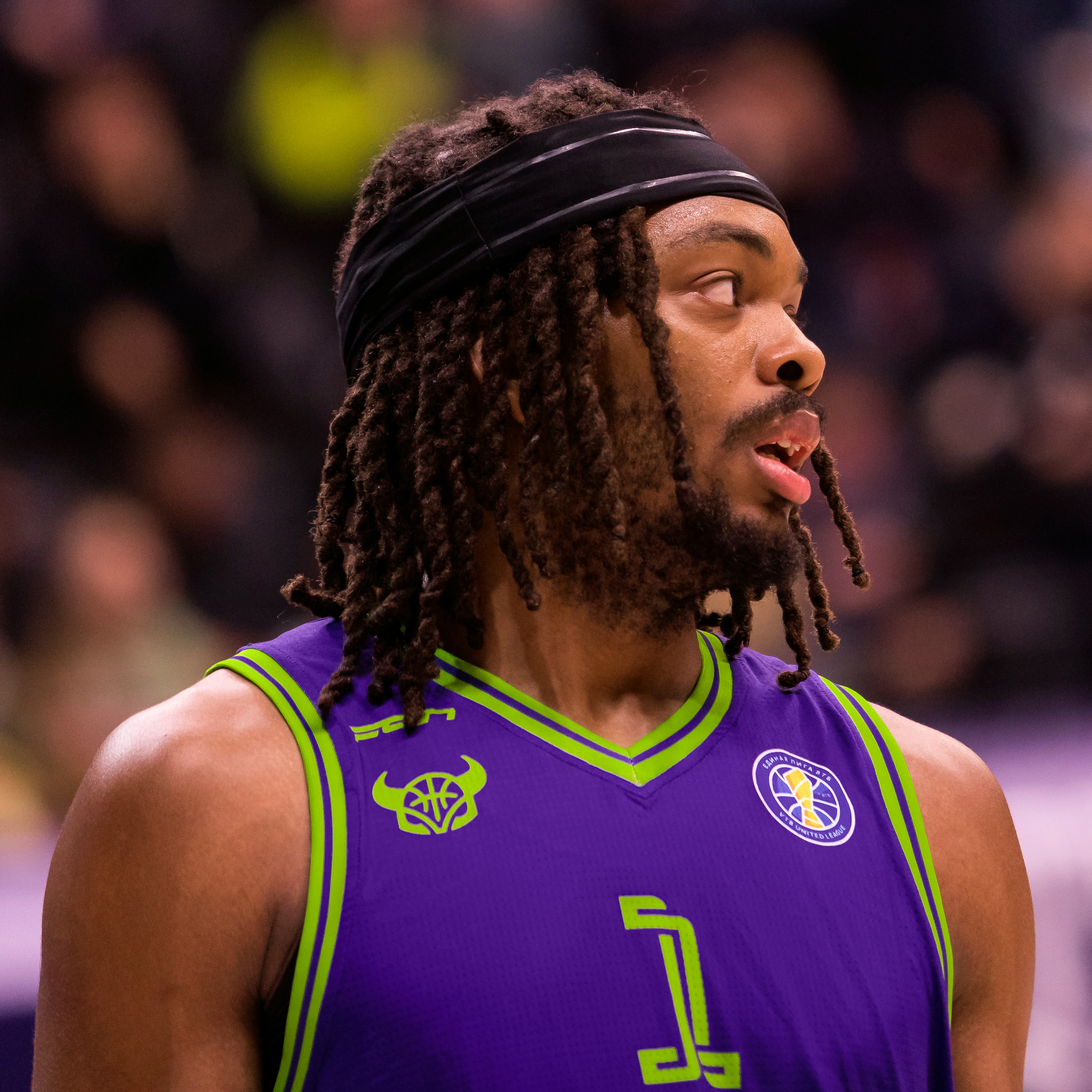
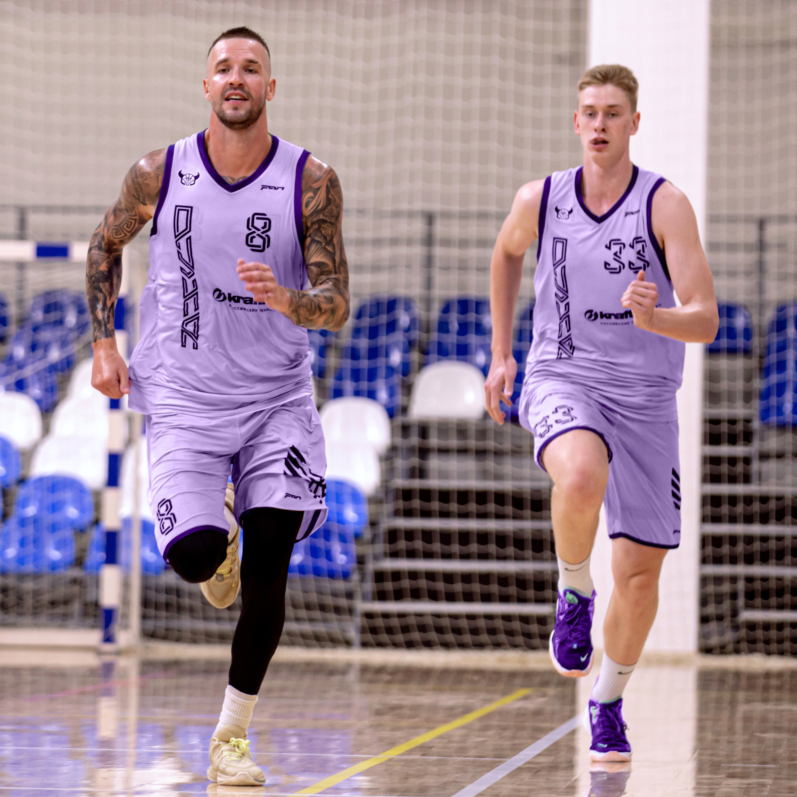
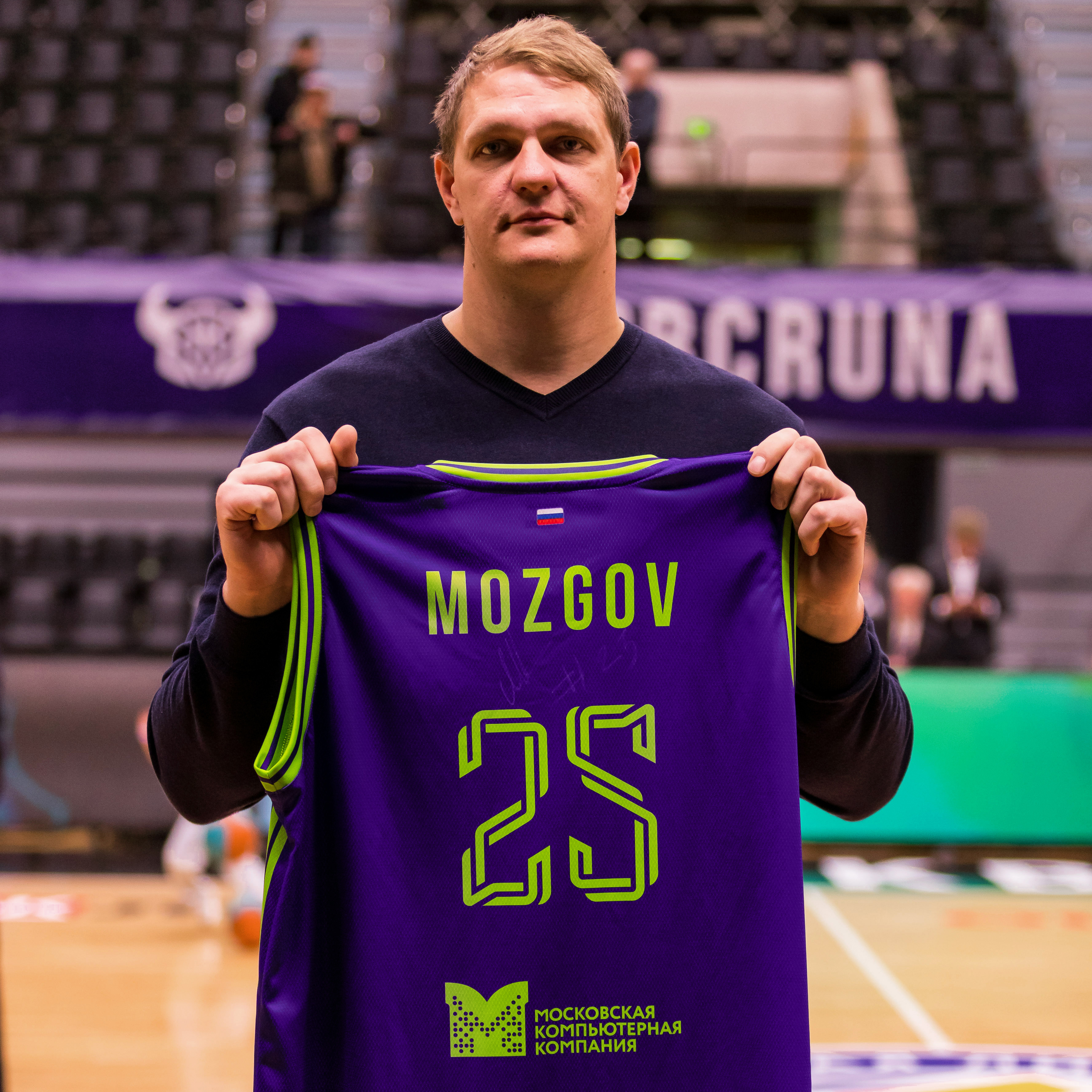
Weaving has become the basis of the game kit numbers. Moreover, northern harsh-styled elements on kits also perform technological functions — sweating away. The numbers have an additional version for duplicate numbers.

Медиа:
Sublogos
In addition to the main logo, a set of sublogos has been developed. It continues the “Scandinavian” theme: axes, a bearded Viking, a drakkar and a raven. The sublogos pack expands the possibilities of using corporate identity on various media — from printed products and match-day attributes to players equipment.


Медиа:
Заголовок:
Palette
Текст:
The club colors have changed: purple has become the main one. The choice of non-standard solutions emphasizes the focus on youth audience. The saturated green color used earlier has been transformed into a technological fluorescent color and has become an accent.
Font
The use of the visually elongated Bebas Neue continues the stereotype of basketball as tall people sport.


Patterns
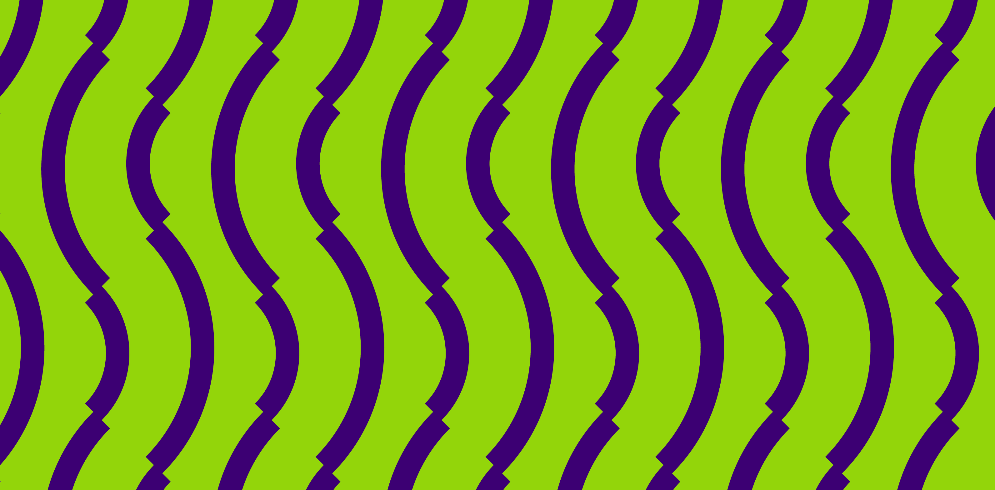
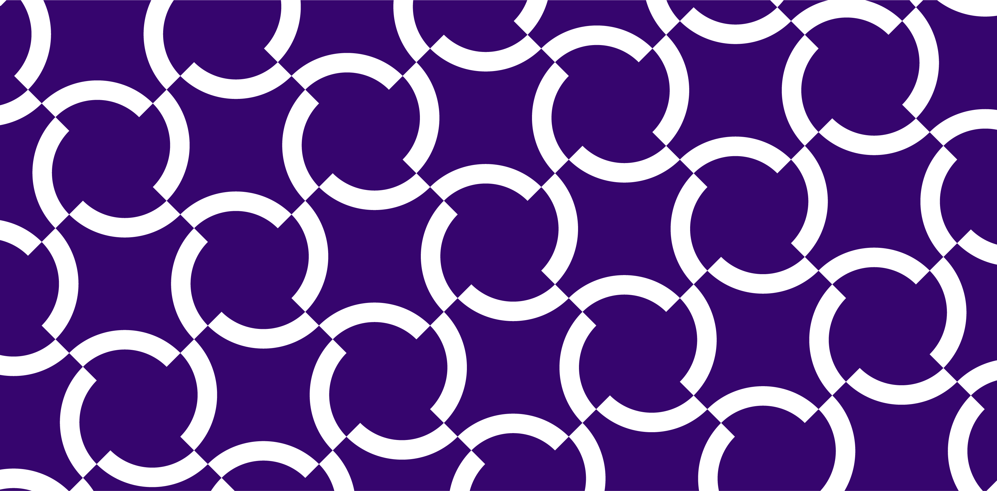
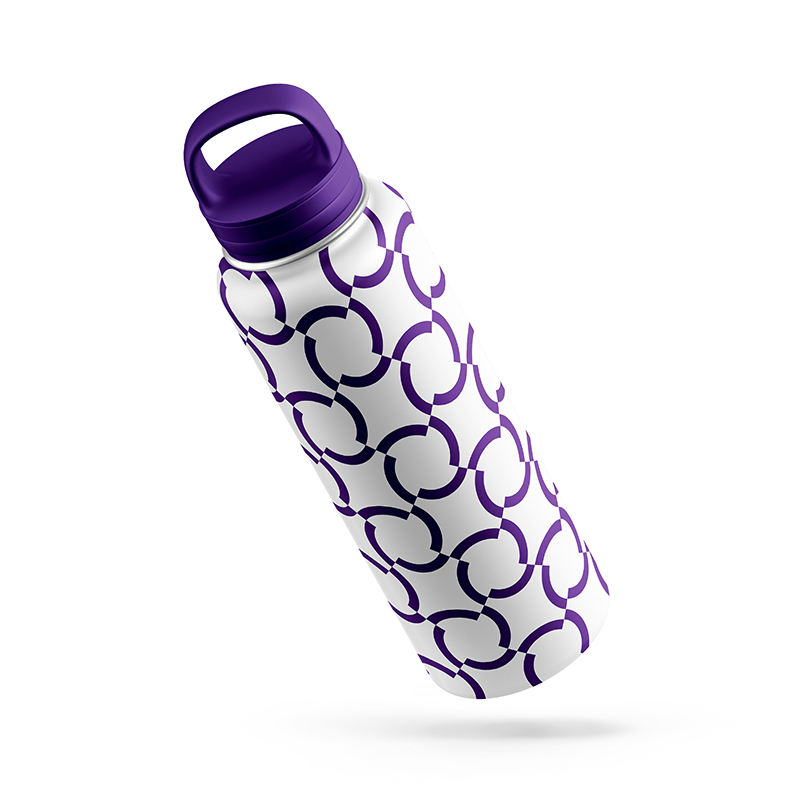
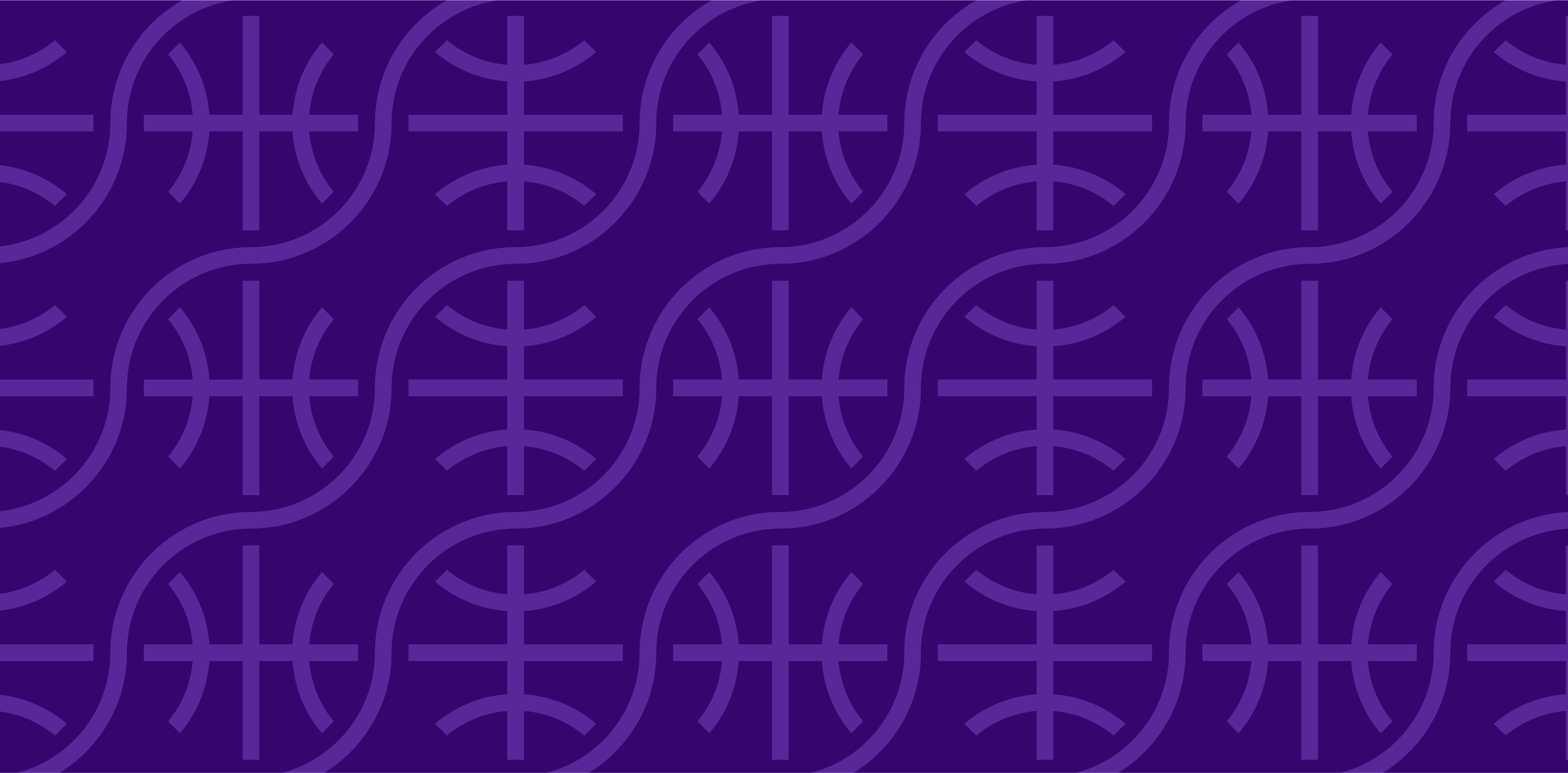
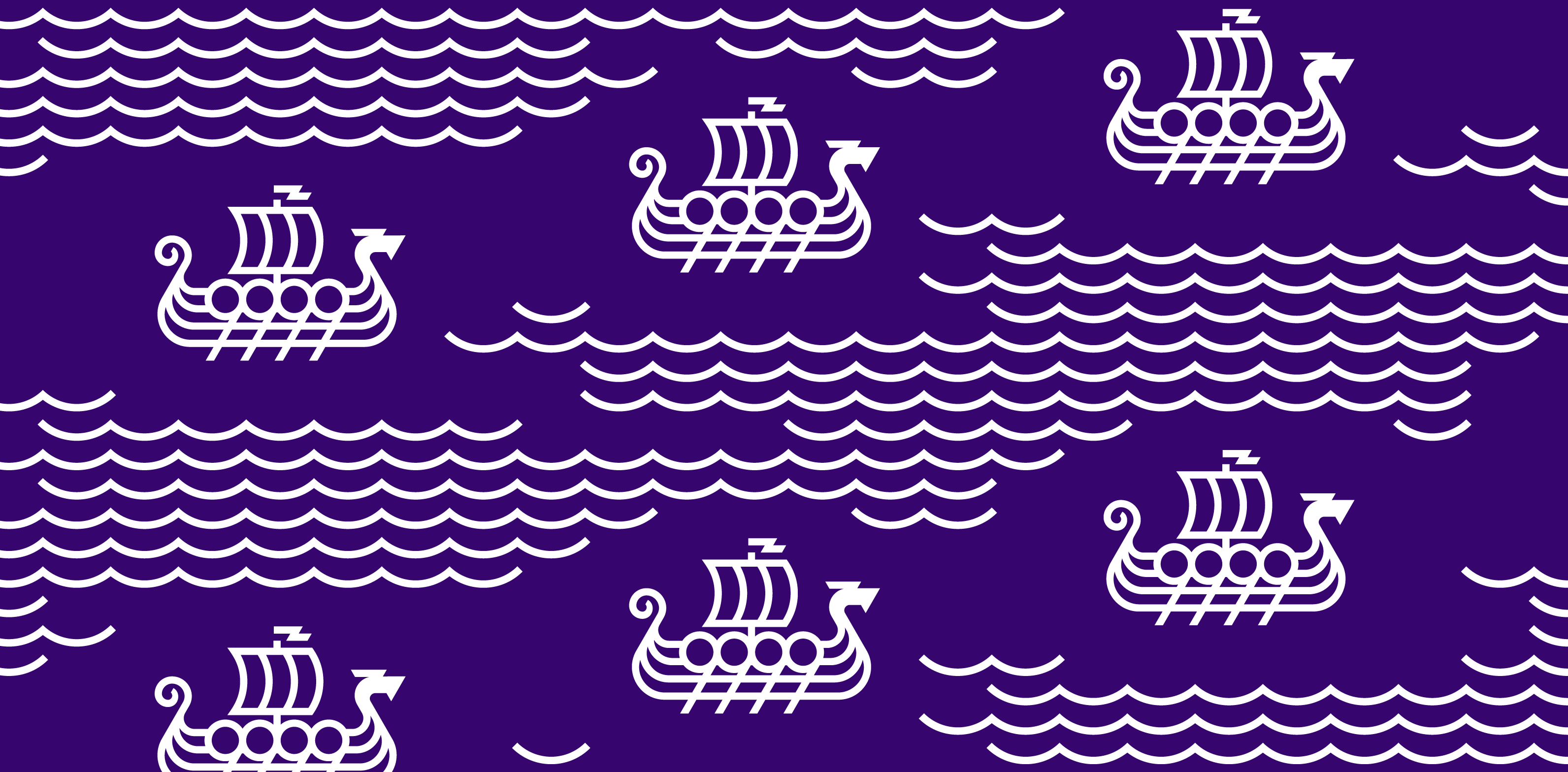
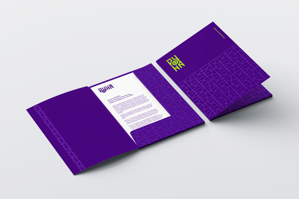
The range of patterns gives the marketing department a wide choice in the production of visual materials. They include abstract geometric patterns with optical illusion, references to the picture of basketball and the road trip Viking series (drakkar and “waves”).
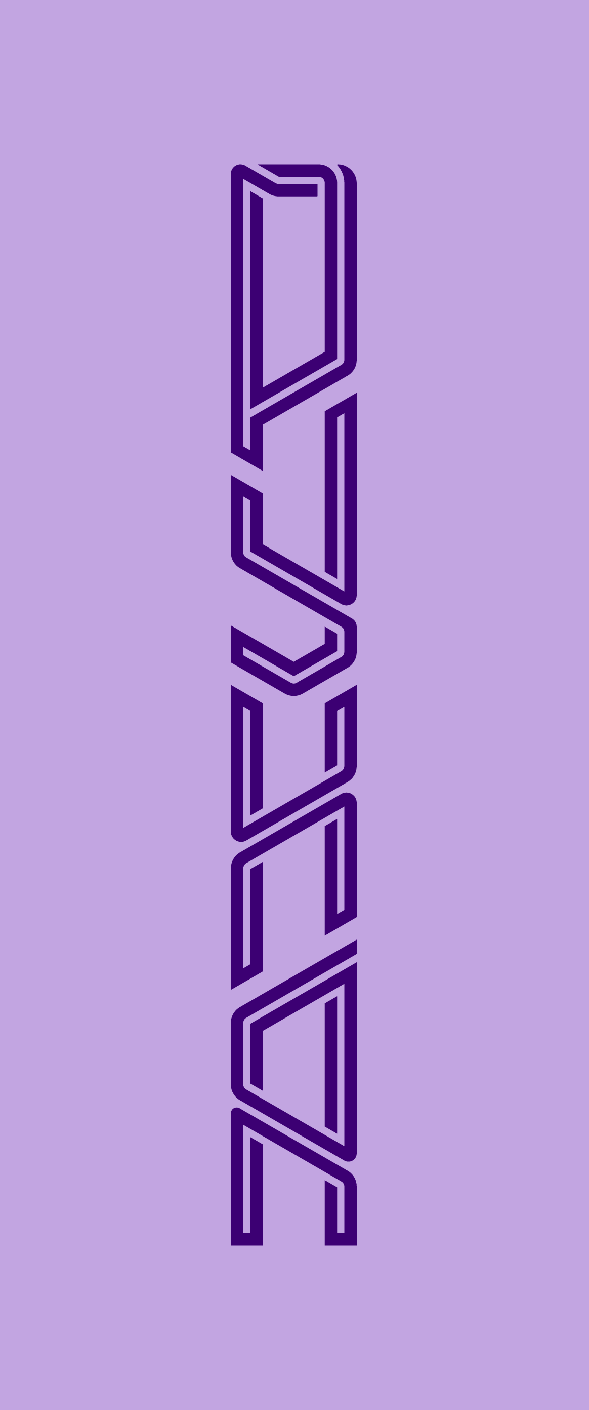
The linear pattern in the identity of the “Runa” is a metaphor for the vertical projection of the world model in the mythological system of the Scandinavians. It repeats the traditional weaving of chains for Scandinavian culture. In addition to playing a significant role in giving the game kit personality, the pattern is used to design club lanyards.

Медиа:
Медиа:

Медиа:
Медиа:
Game kit
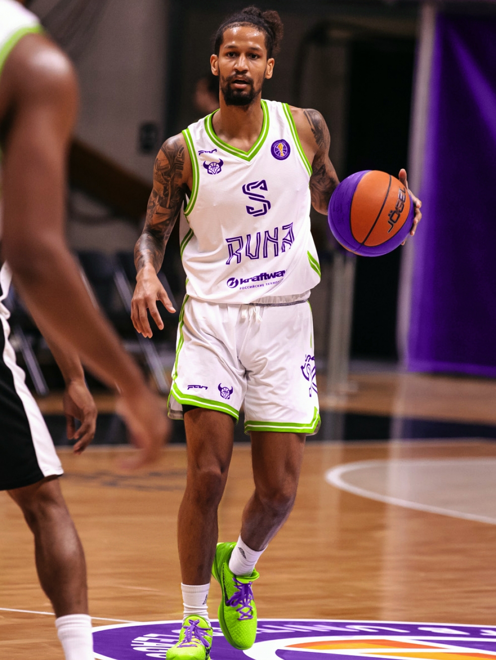
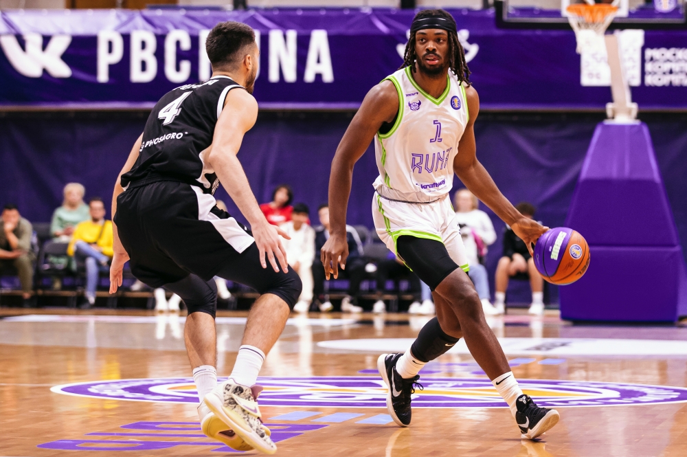
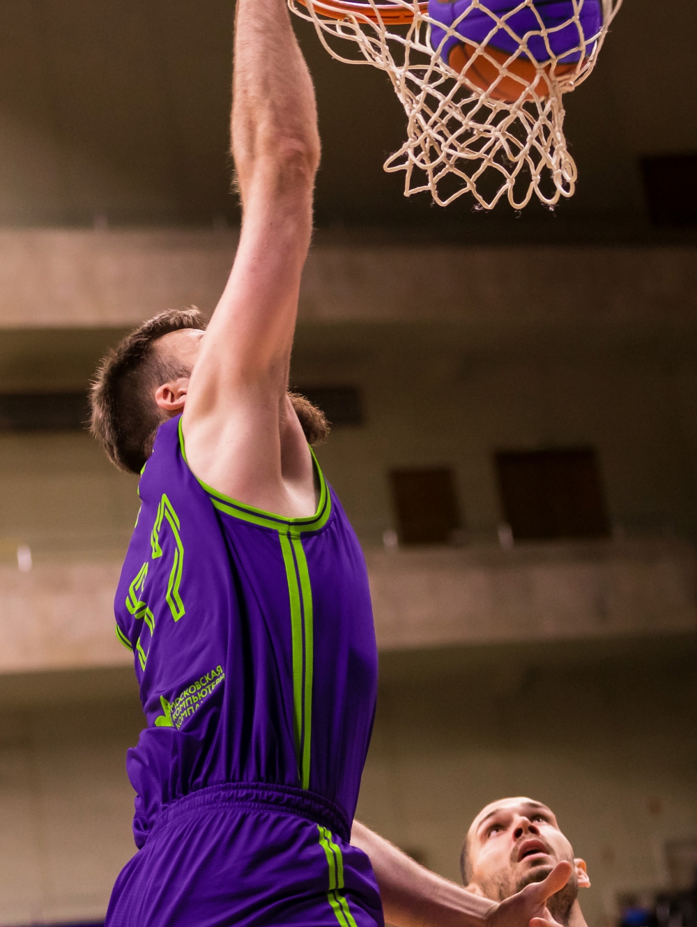
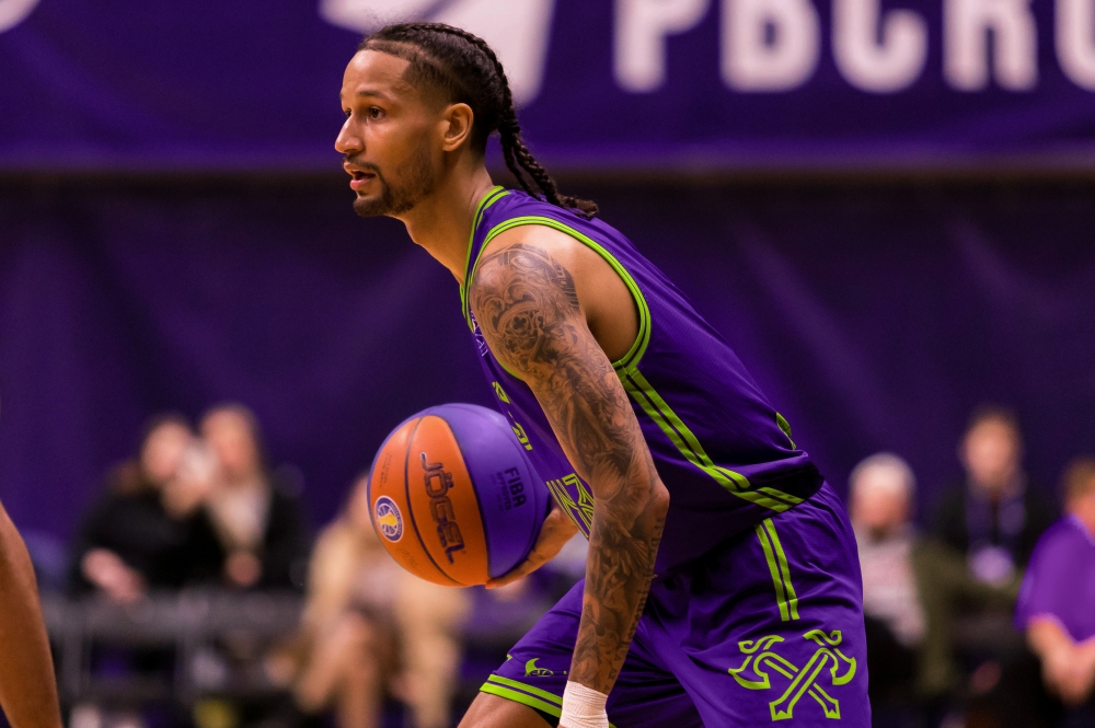
The two-core system is used not only in the construction of lettering and numbers, but also in the edges and cuffs of the main set of uniforms. An asymmetrical stripe with a sublogo visually highlights the game kit.
Медиа:

Training kit
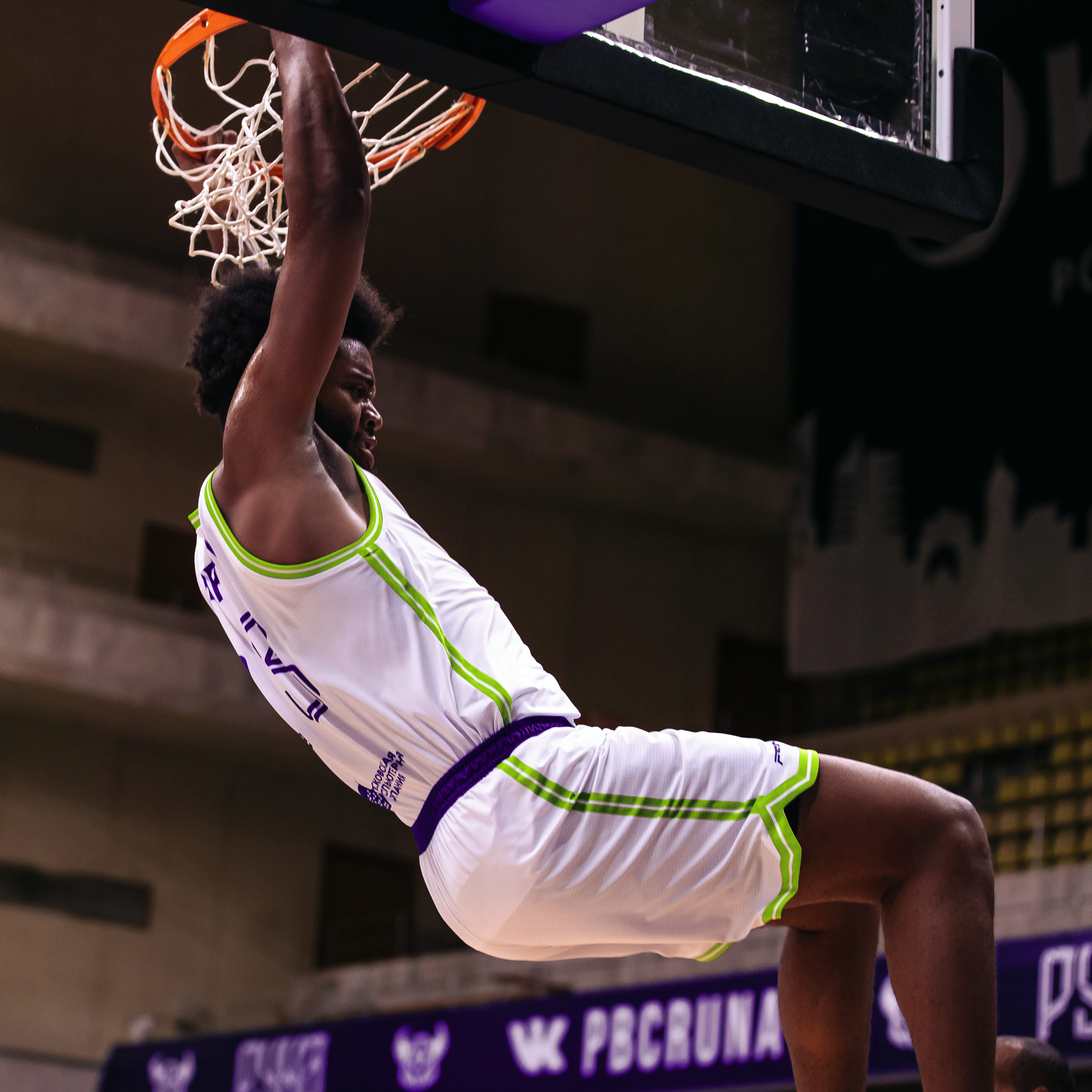
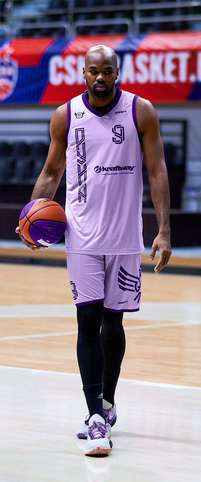
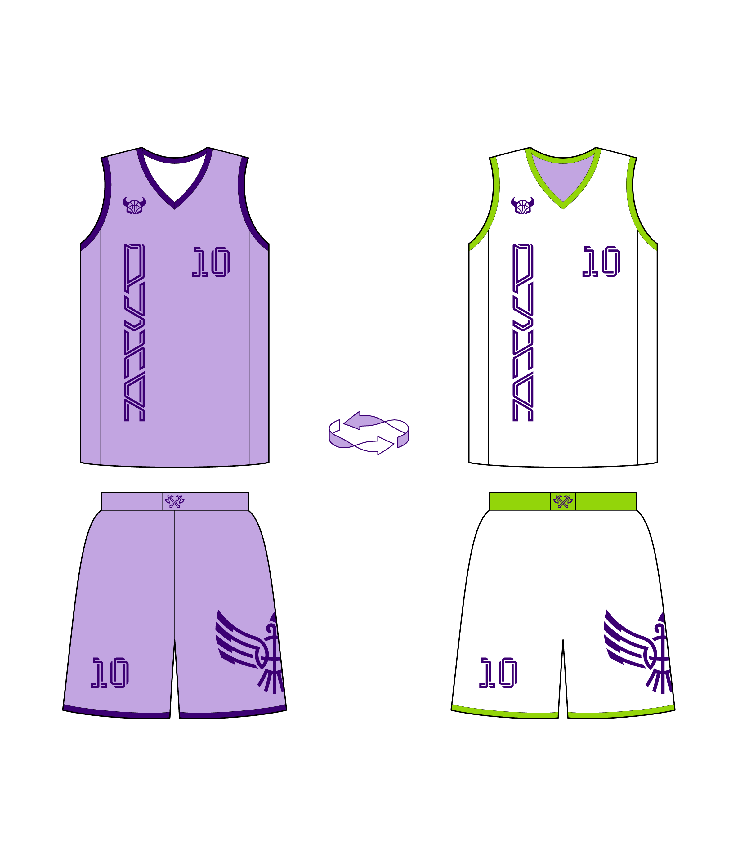
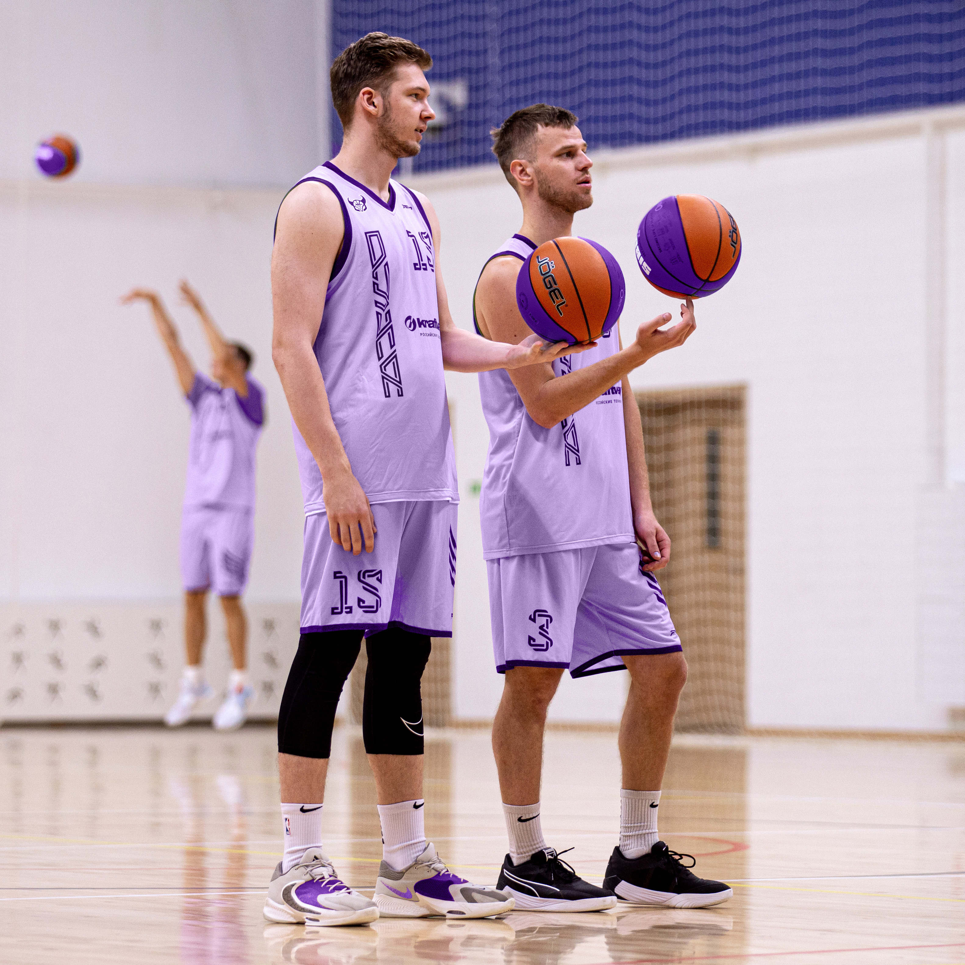
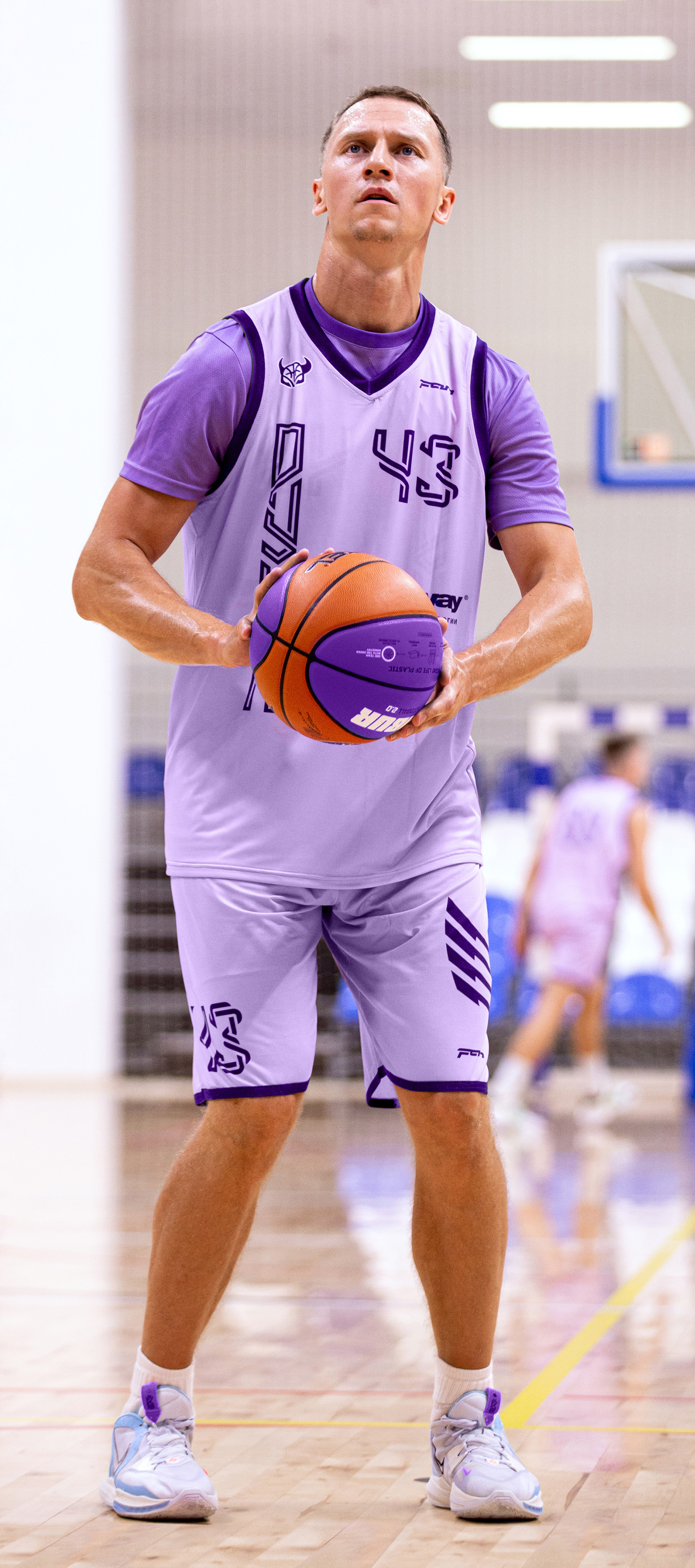
The training kit is two-sided: lilac with purple on the front side and white with green edging on the other side. In the training process, the uniform can be turned inside out, this avoids the use of training bibs.
Медиа:
Медиа:

Медиа:
Медиа:
