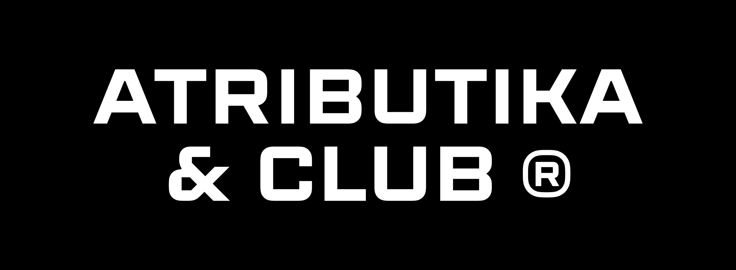
Atributika & Club identity upgrade
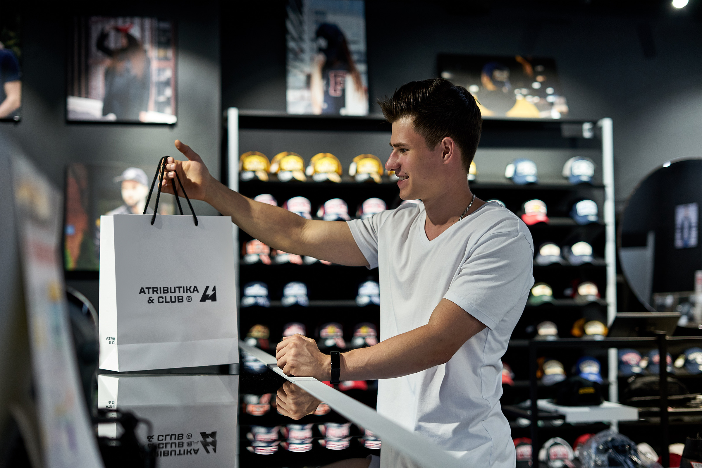
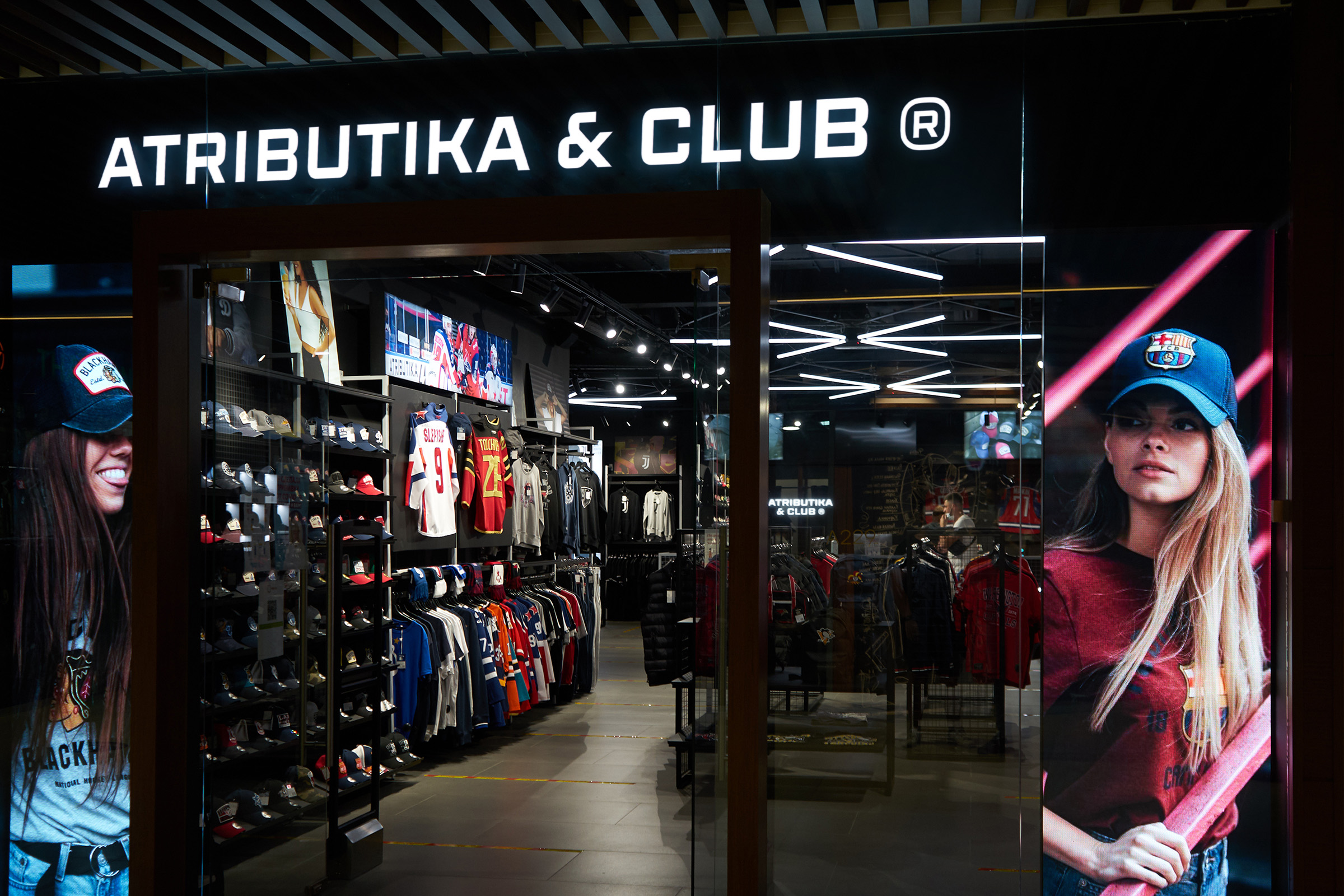
Atributika & Club became the leader in its area in those days when few people understood the meaning of «merch». Today A&C is a well-established partner of the leading football organizations both in Russia and abroad. Moreover, it cooperates with the main hockey leagues in the world — NHL and KHL. Thanks to A&C thousands of fans can stylishly highlight their loyalty to favorite teams and proudly wear their clubs’ colors.
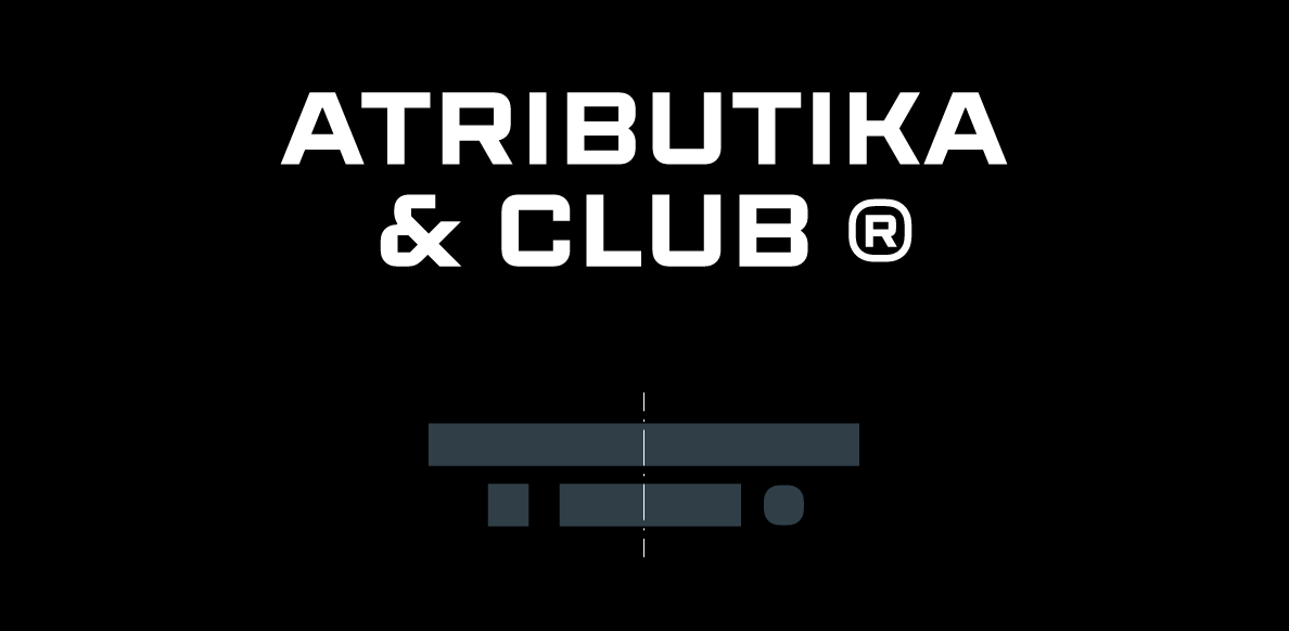
The cooperation with the legend of sportswear market is a big honor and responsibility for Quberten studio. The pack of the updated identity includes the reinterpretation of a wordmark, two signs, a logo and a brand block.
Медиа:
Медиа:


Медиа:
Restyling
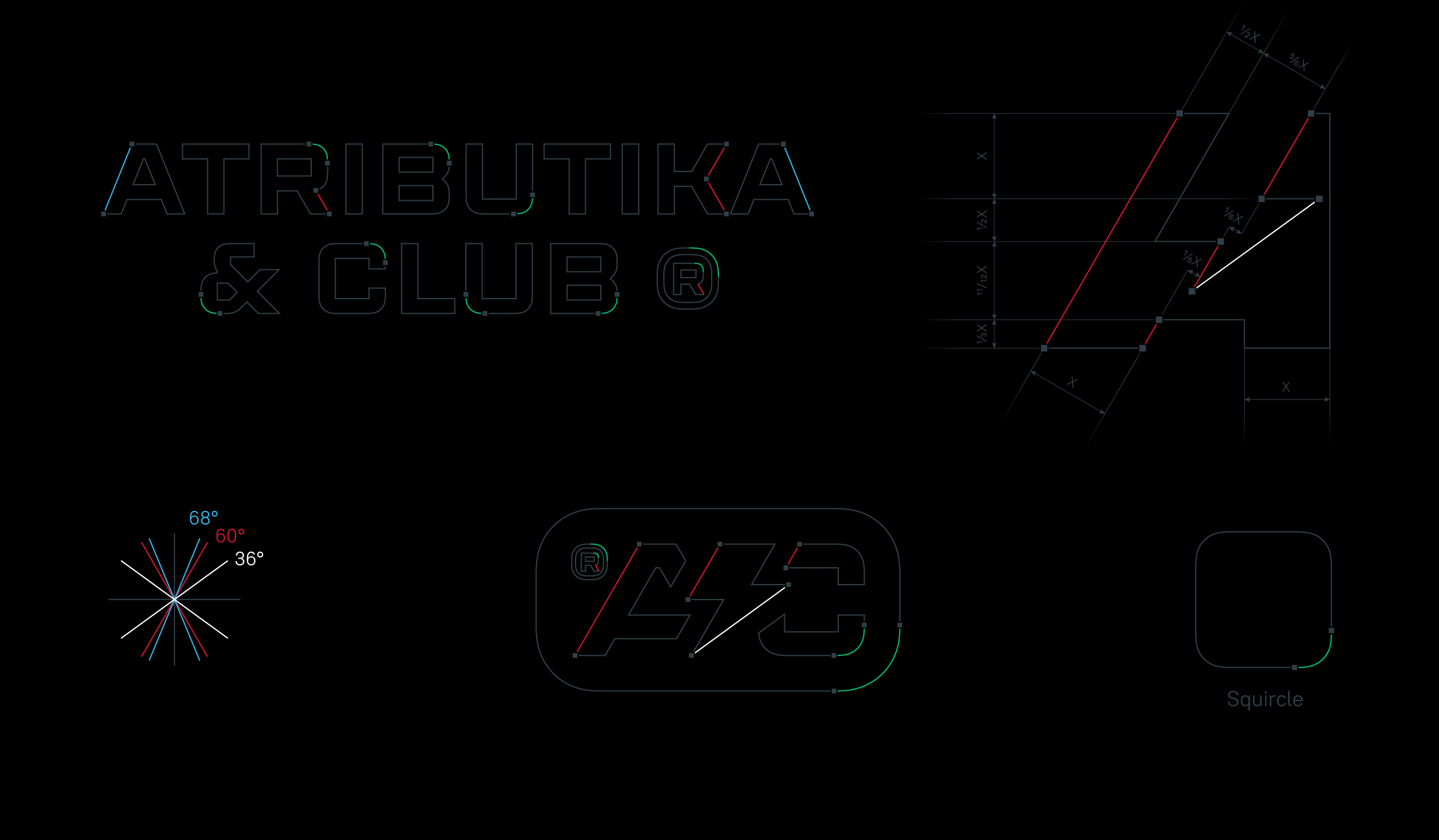
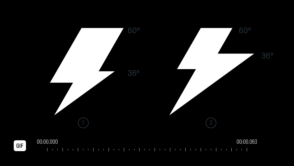
Restyling was to be delicate as the previous elements of the identity managed to become popular with sport fans. Thus, the corporate sign «A» with the lightning was redesigned only geometrically.
The word «squircle» comes from the combination of square and circle. This shape has been used in the digital area for a long time: the best example is an app icon. Form of letters in the wordmark along with integration of the sub brand logo A&C into the squircle visually made the identity more modern and technologic.
Медиа:
Registered trademark symbol
A symbol of a registered trademark can be not only functional but also decorative. In A&C restyling the ® symbol is an autonomous element and an integral part of the whole design making it more balanced. In the wordmark the bigger ® sign makes the same effect being a counterweight for the ampersand. As a result the construction receives the clearly expressed center.
The trademark symbol also balances the beveled corner of the letter «A» regarding the rectangular letter «C» on the right side in A&C sub-logo.
Медиа:

Медиа:
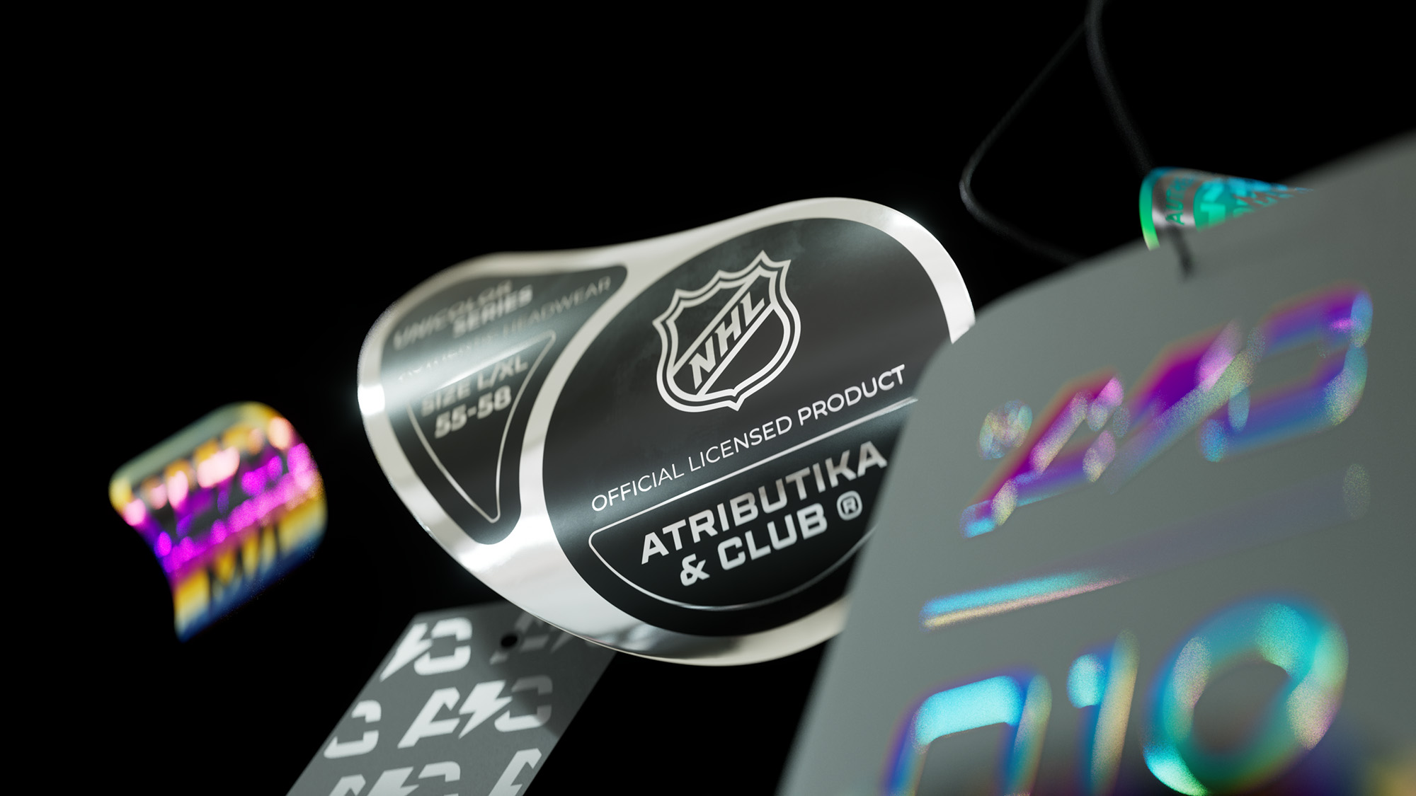
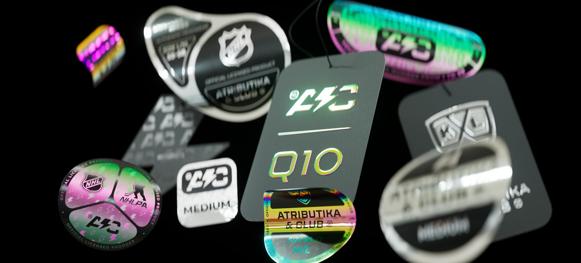
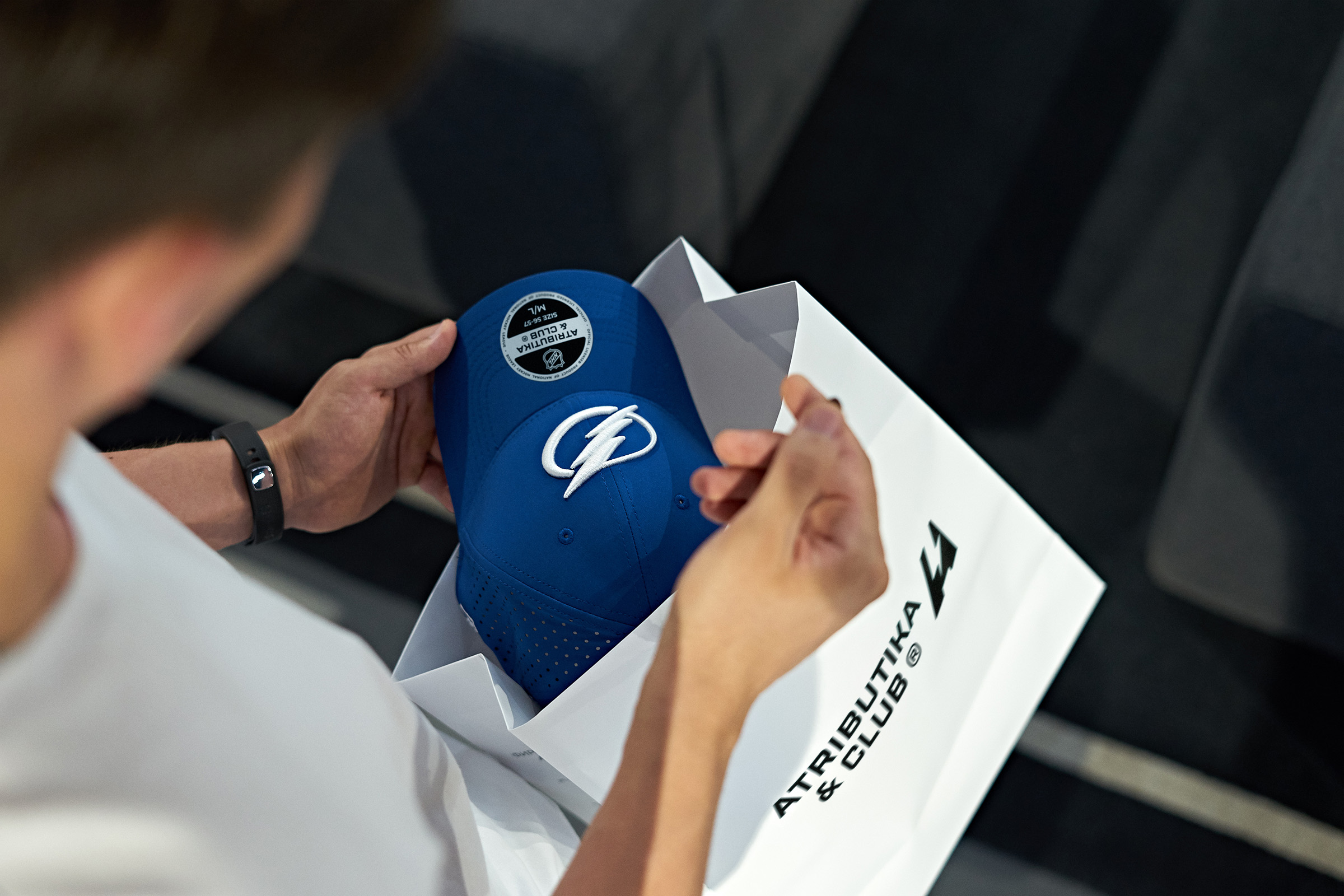
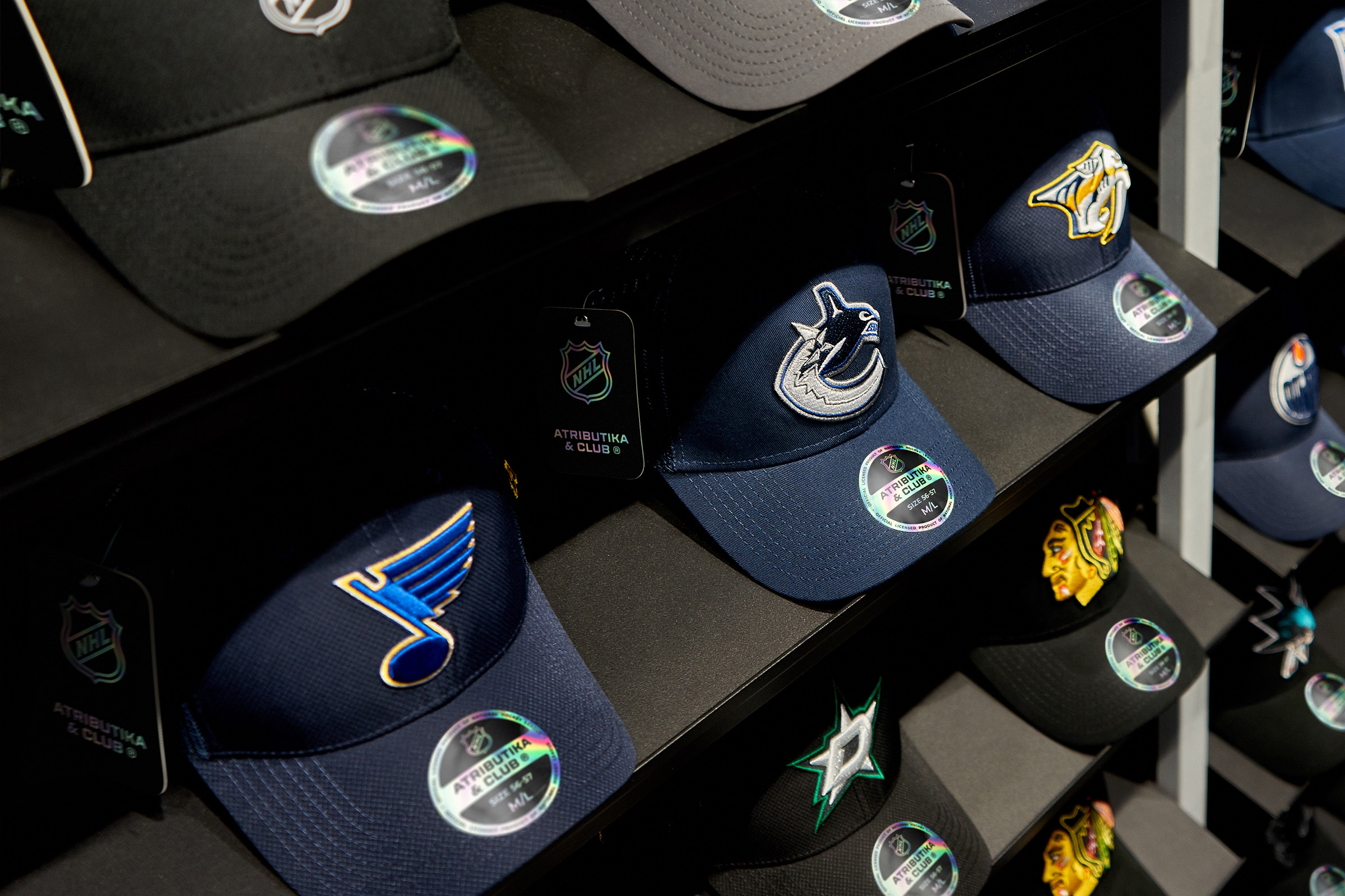
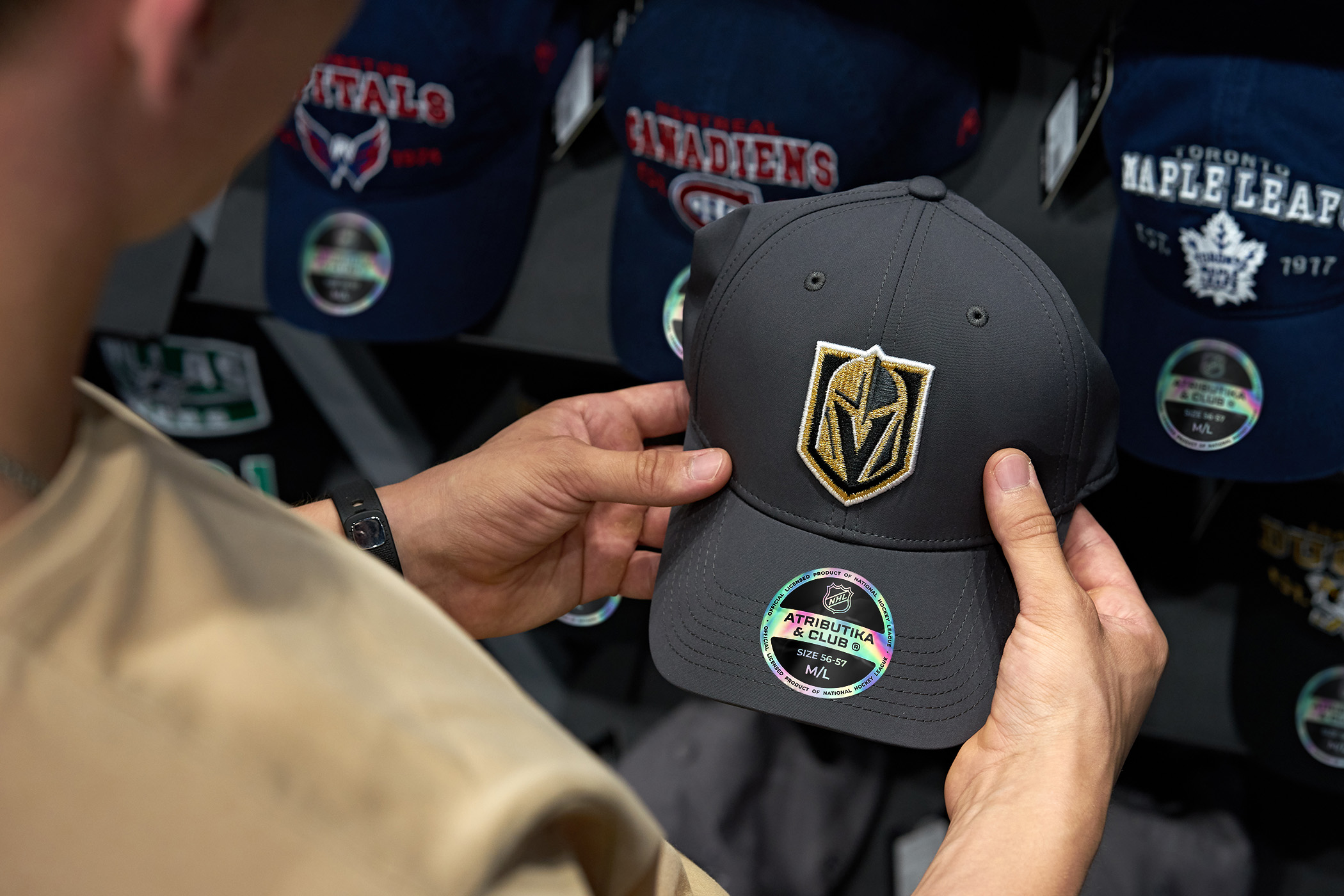
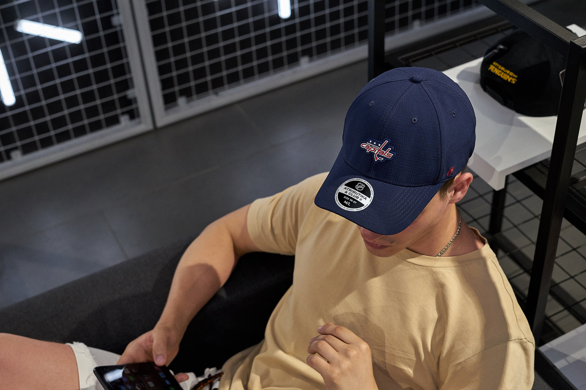
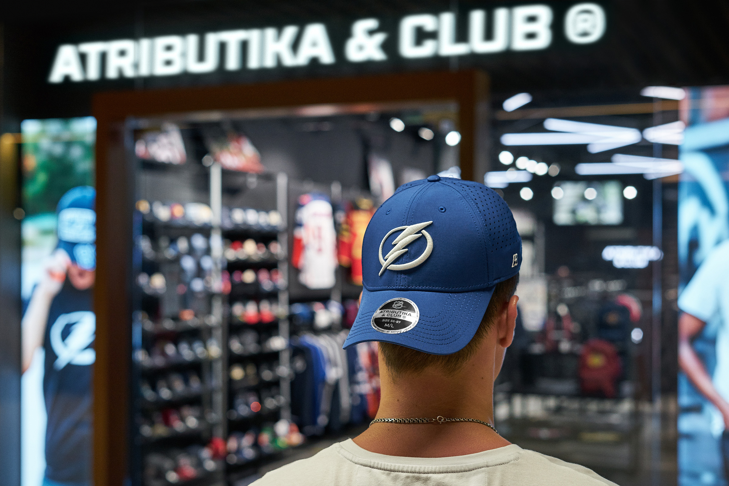
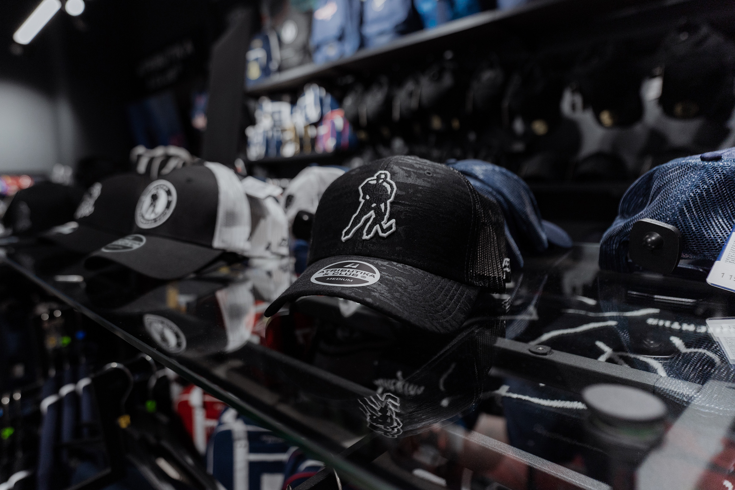
Labels
Besides the traditional labels with minimalistic design stuck to the all goods, the new lightning-shaped tag was added to the A&C’s arsenal. Such a label works as an ad medium too — it contents the corporate pattern and the company’s official website link.
As a label, a sticker can be a symbol of a new pleasant purchase. The principle of rounded corners used by superellipse in the logos can be noticed in the stickers’ shape — from size marks to special collection graphics.
In case of three-way collaboration the special sticker was designed so it could contain information about every participant of collaboration.
Медиа:
Медиа:
Медиа:
Медиа:
Медиа:
Медиа: