Redesign of Dinamo-Minsk
LOGO • SUBLOGO • FONTS WORK • UNIFORM • PATTERNS • GUIDES
The logo of the Dinamo Minsk was already 10 years old, and by the time of their anniversary it had accumulated a number of shortcomings due to both its age and insufficient level of elaboration. Minskers urgently needed to reboot and enter the 2019/20 season with an up-to-date identity.

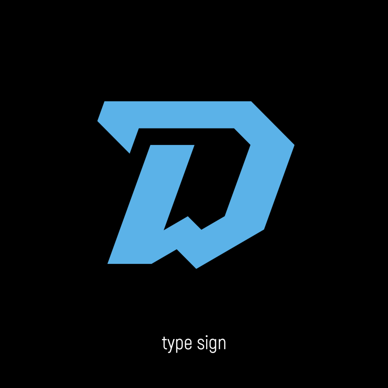
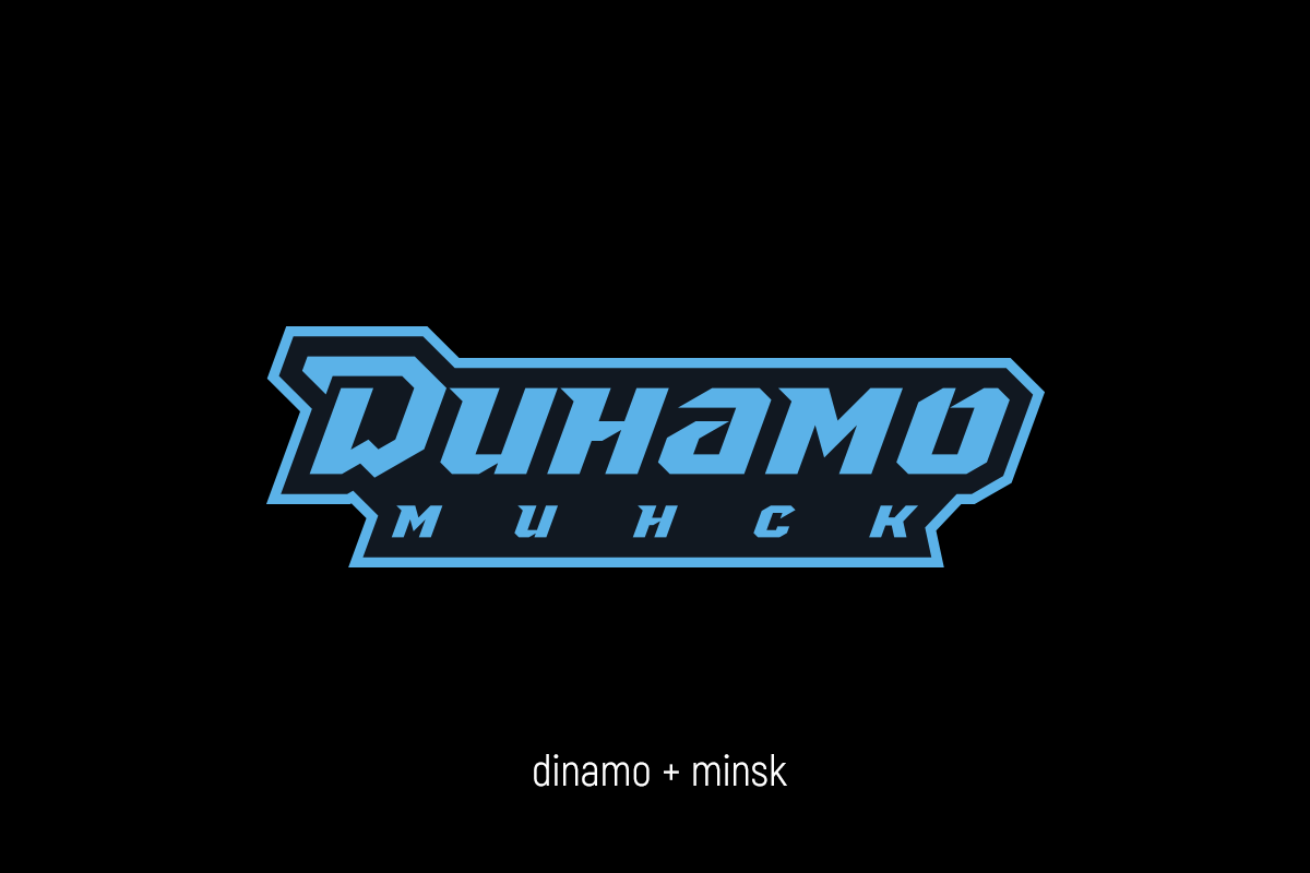
Minimalistic letter 'D' instead of the outdated bold
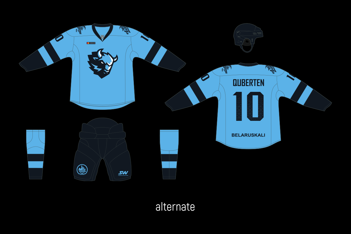
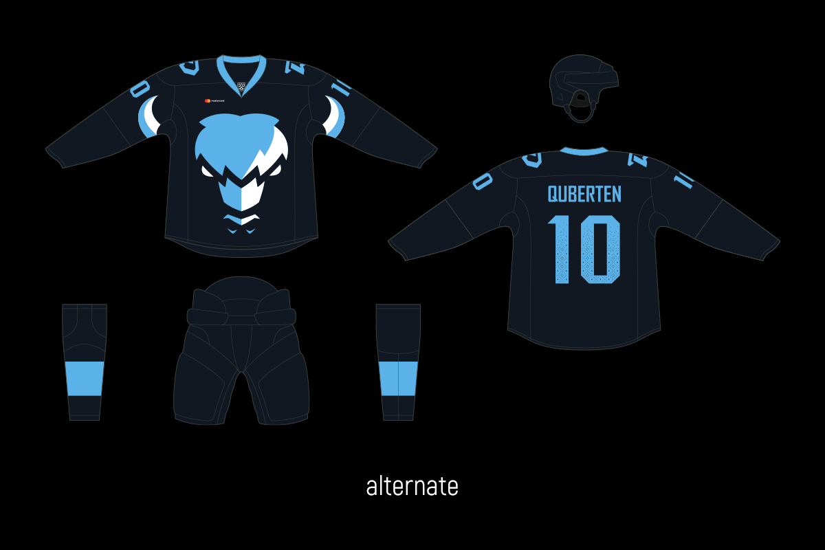
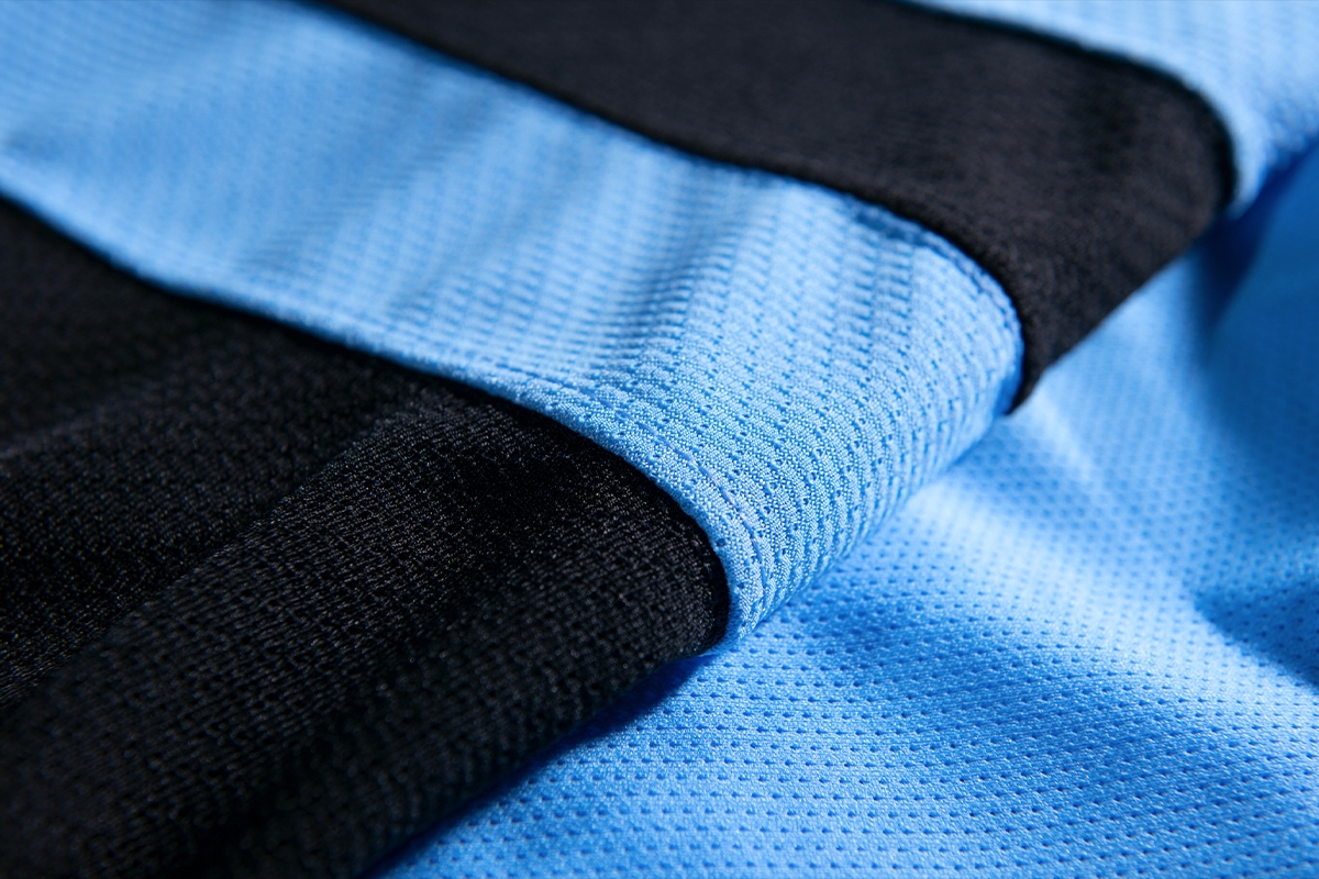
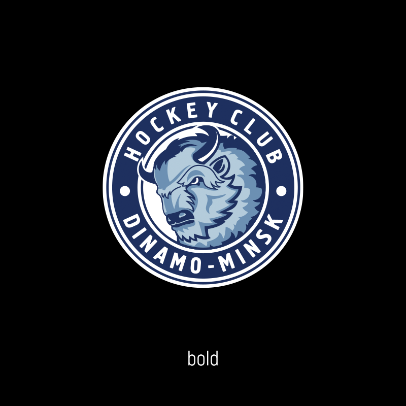
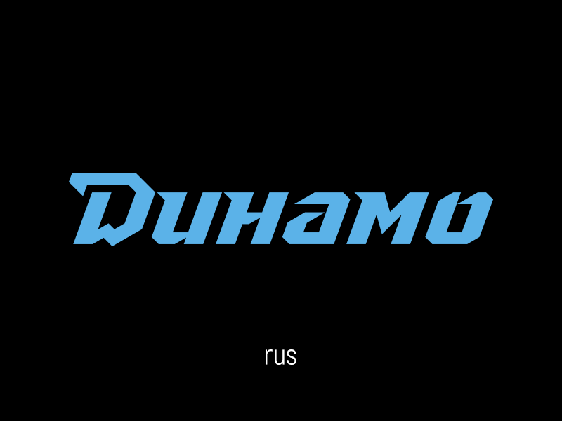
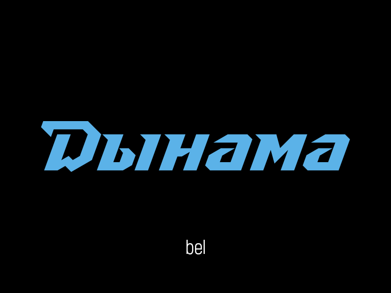
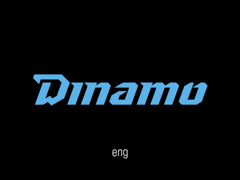
The revamp began with a change in the colouring: the previous logo used four colours, but two of them were very close to each other; this made the logo non-contrasting. Now, in addition to white, the logo includes black and a bright, recognizable fiery-blue.
Dinamo's logo was made in a bold style, which saw its popularity peak in the mid-00s. Nowadays, however, in the era of small diagonals of smartphones, it looks overloaded. Therefore, the new logo is flat. The extra colours and details, and that loud combination of lettering with the sign has gone. The most important feature still remains the brand letter 'D', but in a fresh new font.
The new lettering is based on a classic calligraphic inscription. The rigid geometry looks modern and aggressive in a sporty way.


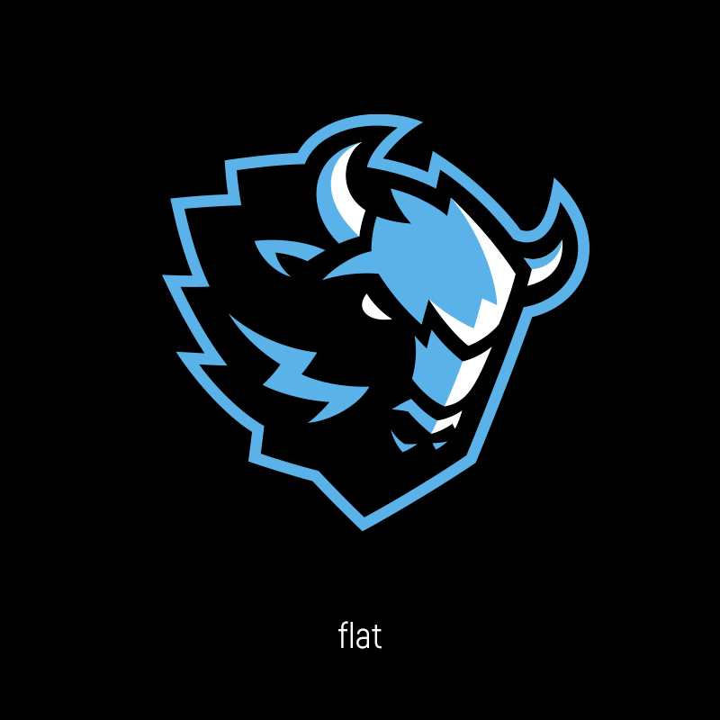
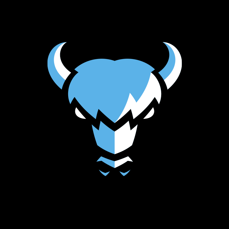
Bison as an independent element of identity
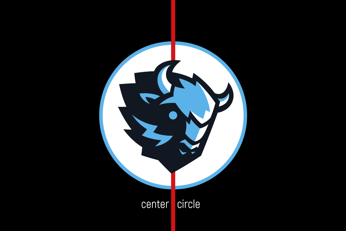
The main symbol of the Dinamo Minsk, the bison, has also been redone. It’s been moved out of the main logo and acts as an alternative logo, emphasizing the character of the club.
The bison has become more charismatic: this effect is given by the use of chopped lines, the slope of the logo and the identical 'D' geometry. For the most avid fans, there’s a hidden Easter egg: the letter 'M' is encrypted in the bison's fur, which strengthens the geographical reference.
Neither the bison nor the main letter is accompanied by the spelling Dinamo. The myth that any logo should include the name of the club in order to raise the club’s profile is a thing of the past. In fact, recognition is equally enhanced by the results and the overall work of the club system, and the lettering and the logo should be separated and applied depending on the media and the club’s aims.

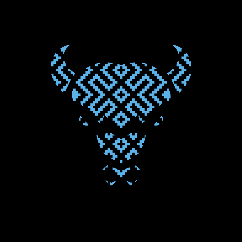

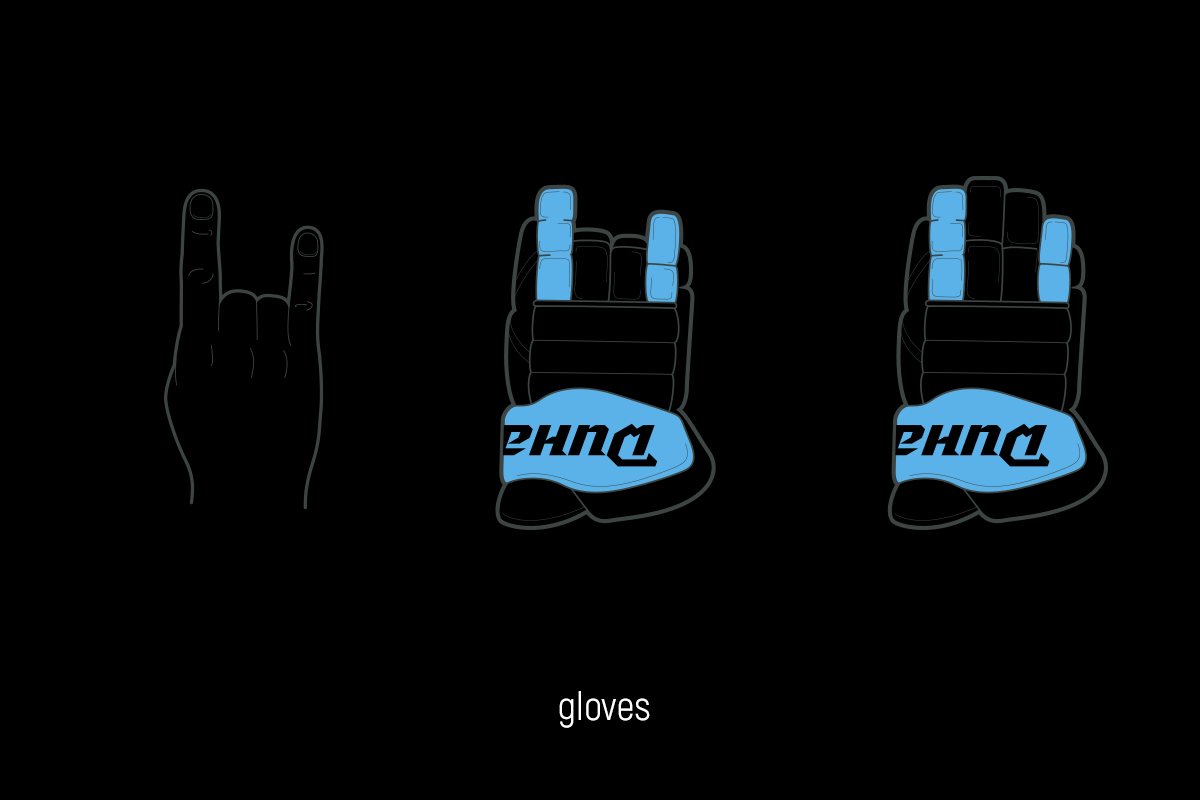
Design code of the gloves (for the first time in the KHL) and the Belarusian ornament in the perforation
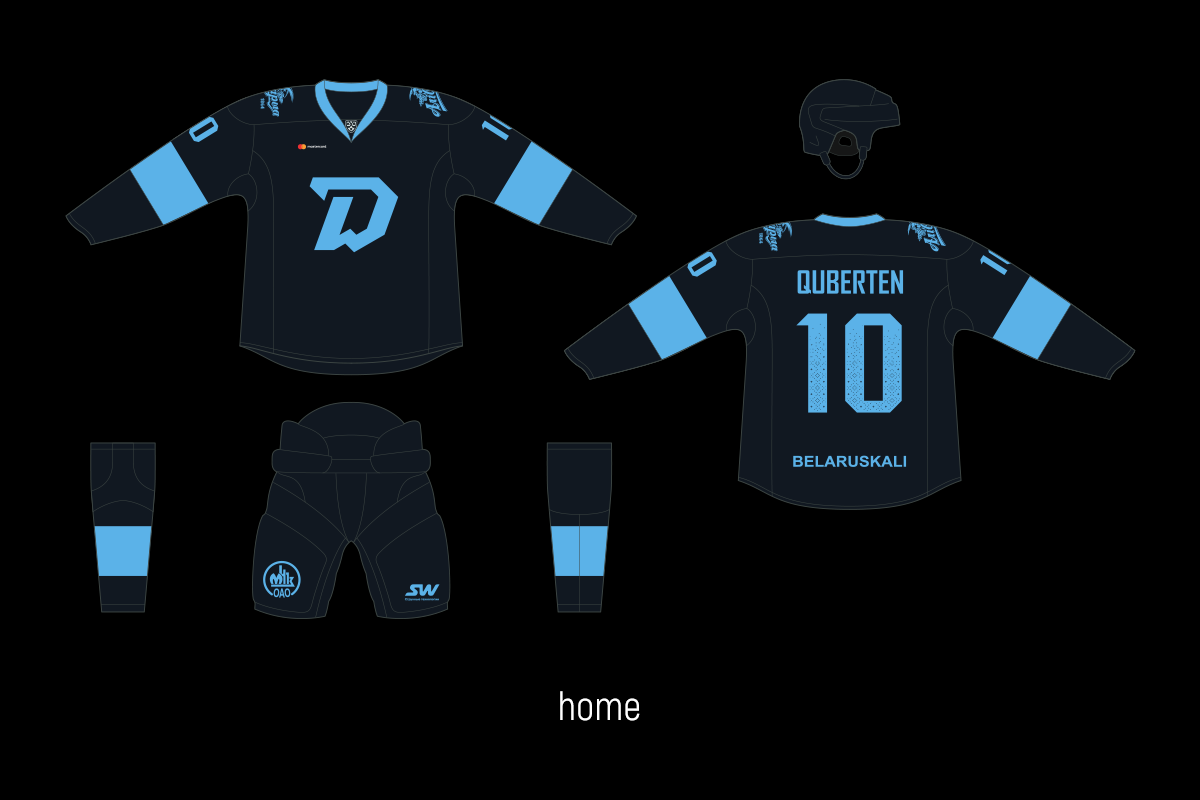
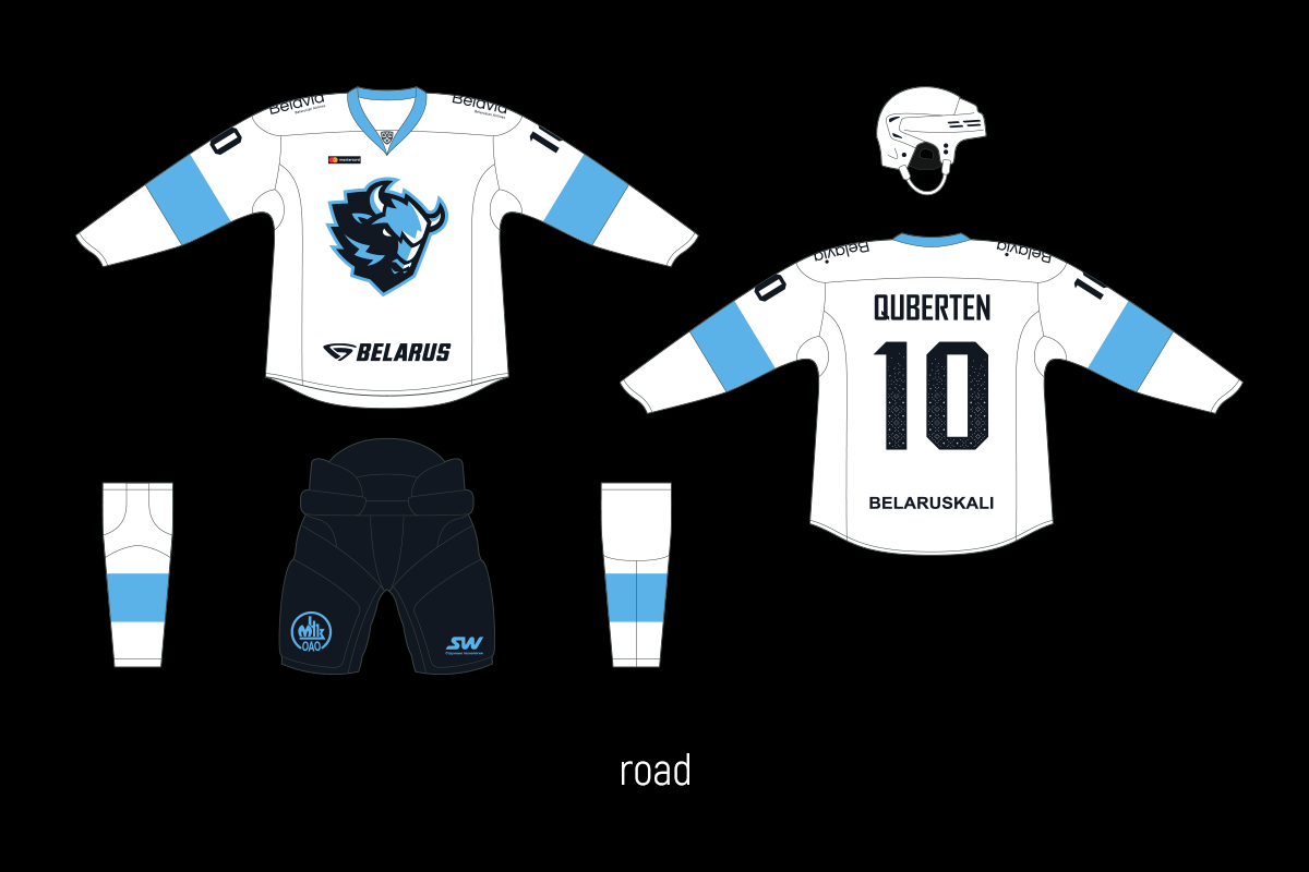
Dinamo's home kit will be one of the most recognizable of the season. The updated palette has made it contrast, but that's not all.
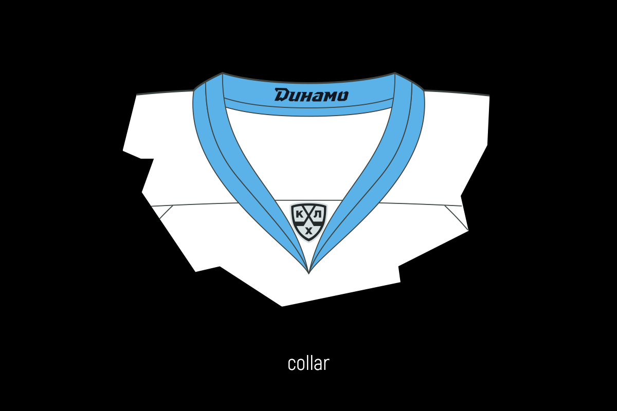
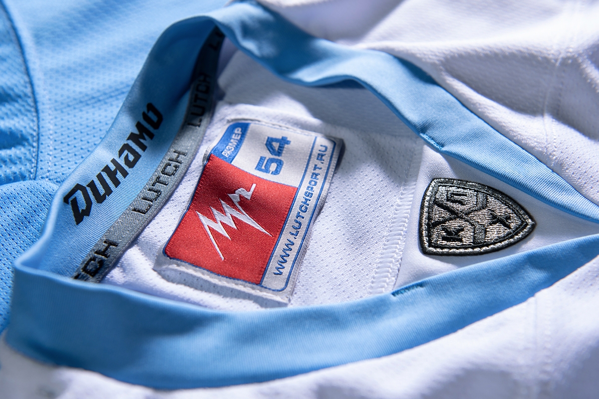
To make it even more unique, a national pattern has been added. It’s been unobtrusively integrated into all the sets with a spectacular technique: perforation of numbers with a graphic gradient. The pack of numbers, by the way, retains the continuity of the sharp style of lettering.
For the first time in the KHL, the team has a single design code for gloves. The horns (or 'goat', as rock fans used to call it) are displayed on the hockey player's gloves. The horns are a bison’s main weapon, just as a hockey player is a weapon for whipping in slap shots. The club really liked this idea and eventually adopted this idea into the revamp.
It’s quite difficult and expensive to replicate this glove design for the entire team, but Dinamo equipped all hockey players with such leggings and became the first team in the KHL to be dressed so solidly and meaningfully.