Spirit of the game. The identity of the Canadian Lacrosse League
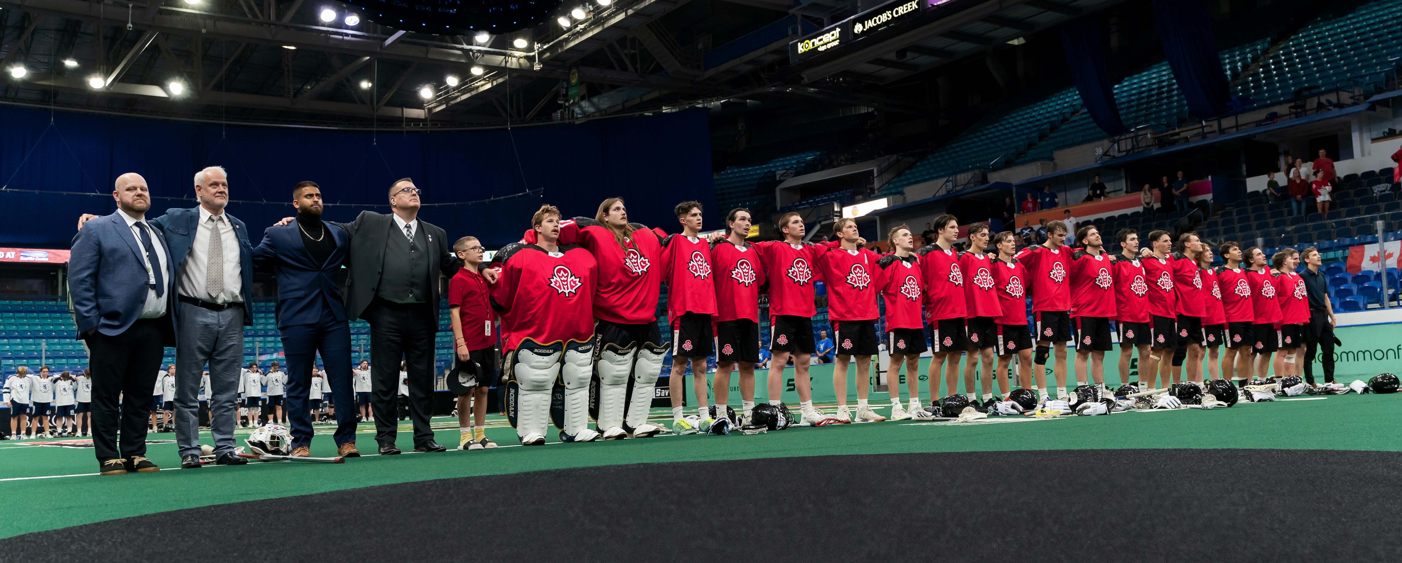
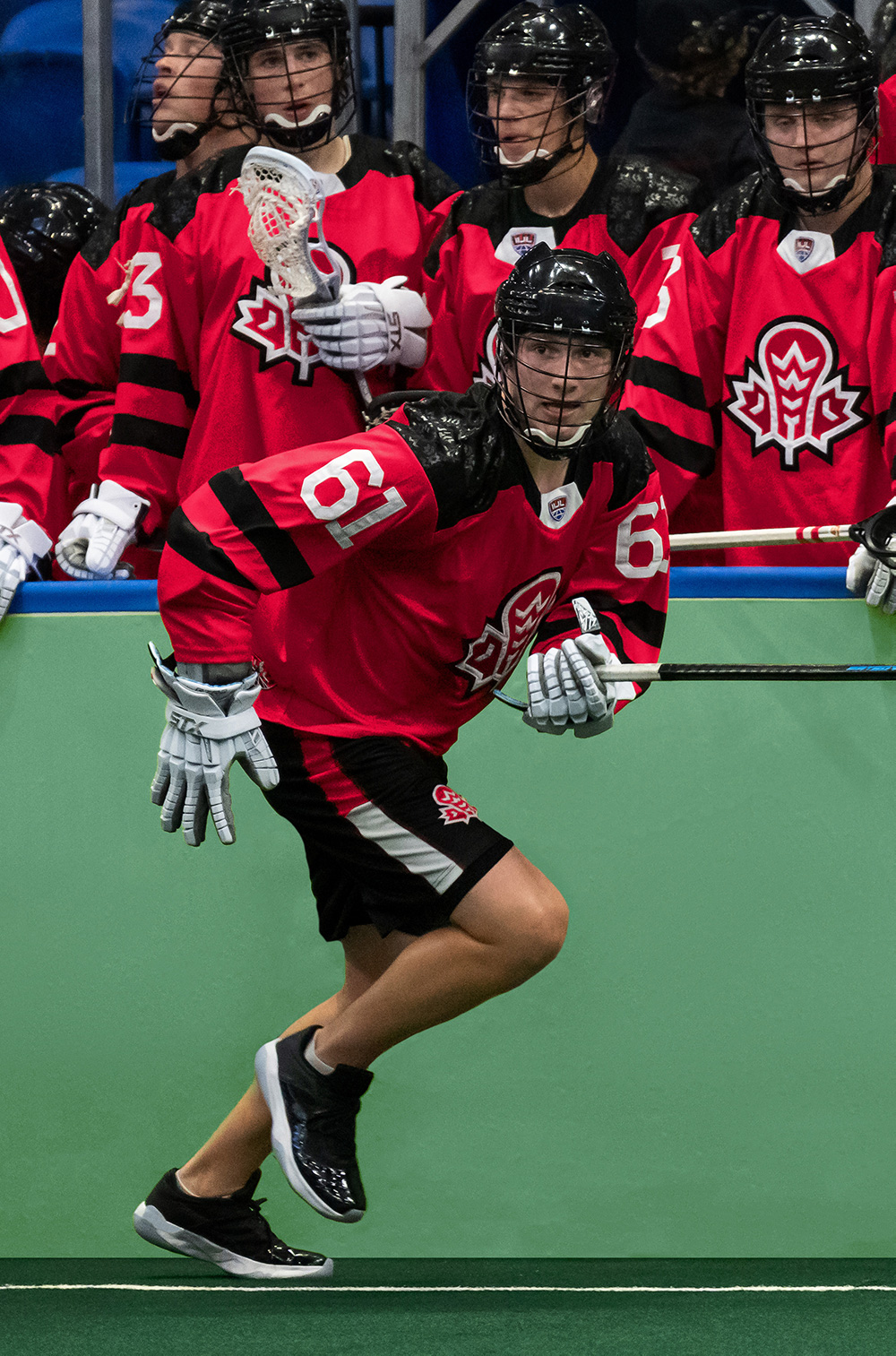
Lacrosse is a dynamic team sport with a rich history. Back in the 15th century, the game of the indigenous peoples of North America was used both for training warriors and for peaceful resolution of tribal conflicts. The name itself goes back to the French “la crosse” (putter). Canada’s leading young athletes, where lacrosse has the status of a national sport, have been wearing new jerseys designed by Quberten since 2024.
The Canadian Lacrosse League (CLL) was founded in 2016. In addition to forming the country’s main indoor lacrosse tournament among youth teams, CLL is engaged in the selection and development of players from 16 to 20 years old, providing an opportunity to play for national teams and compete with peers at the international level.
Медиа:

Заголовок:
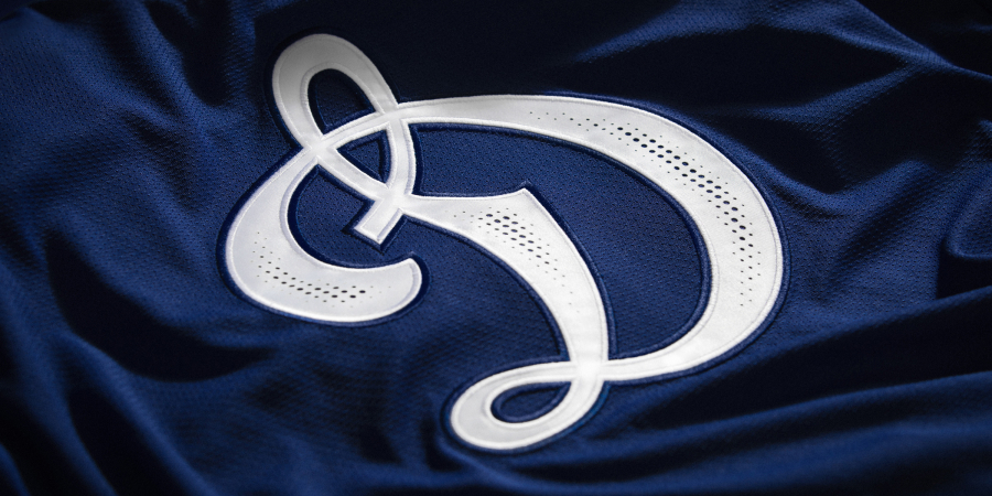
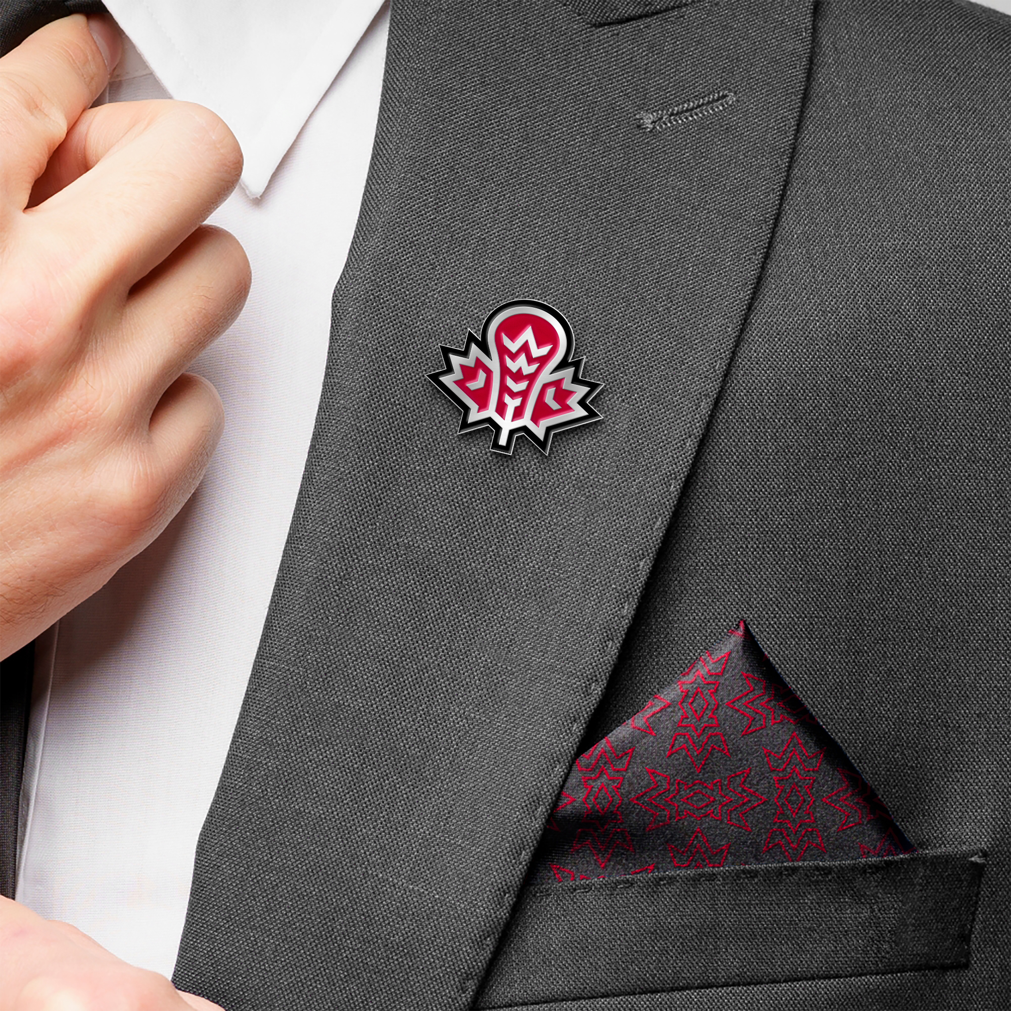
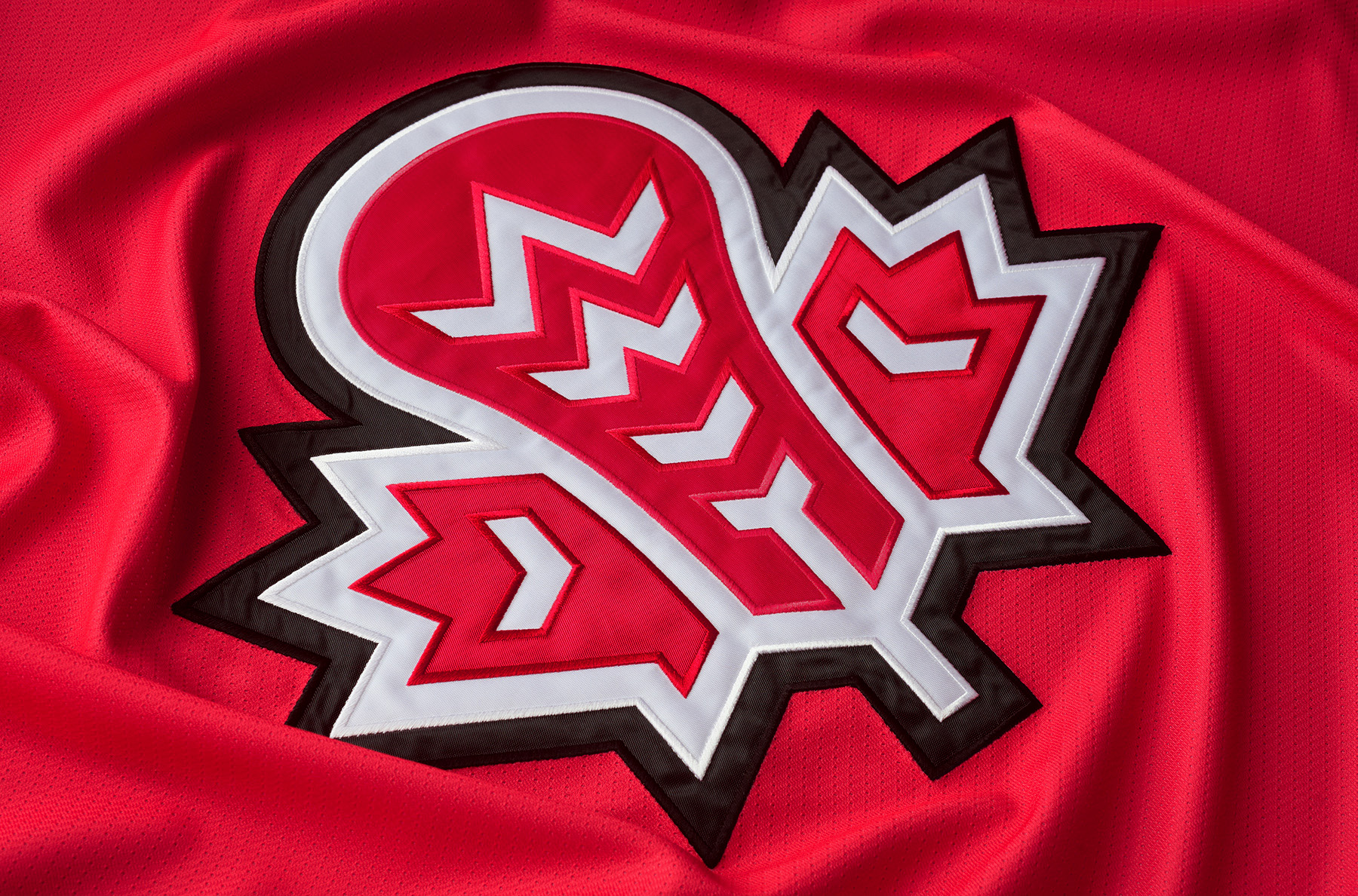
Logo
Текст:
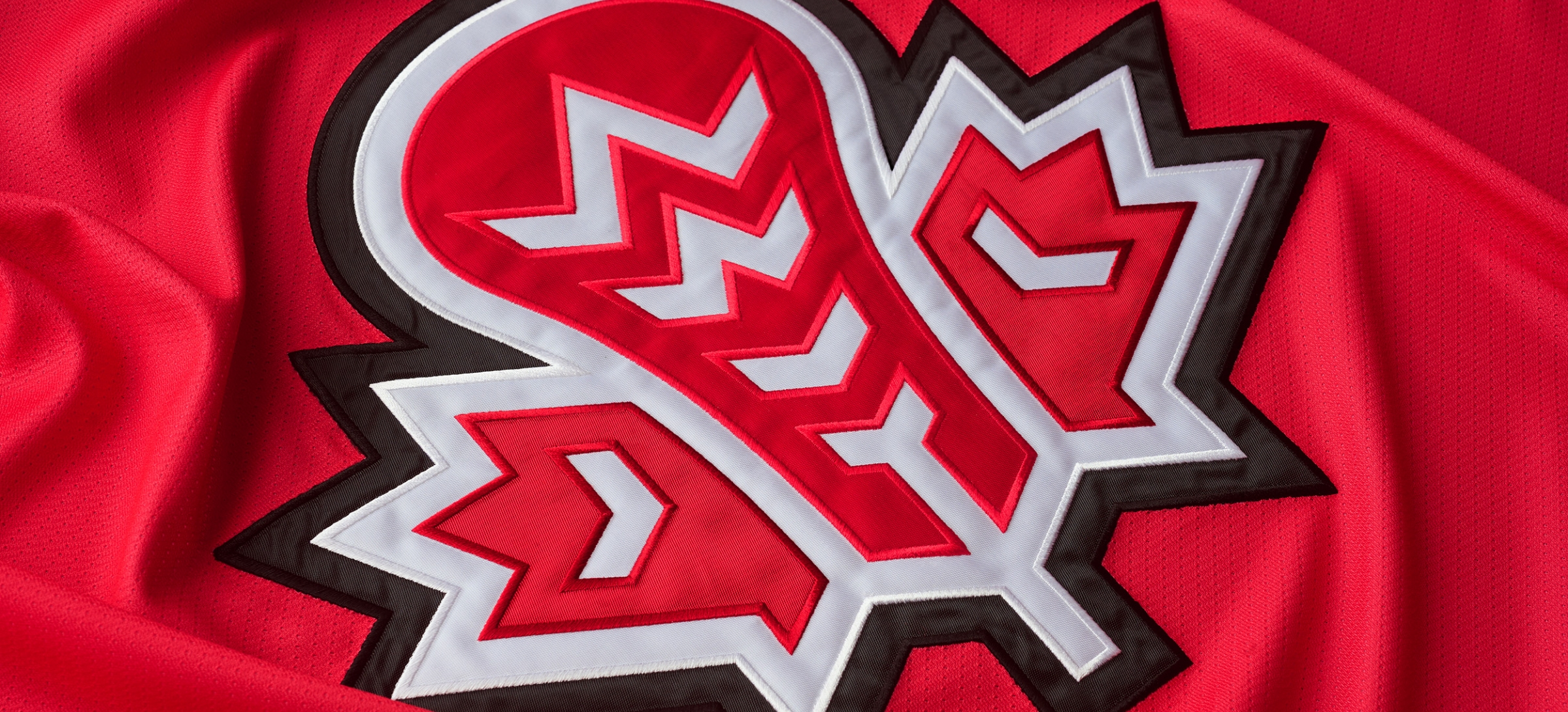
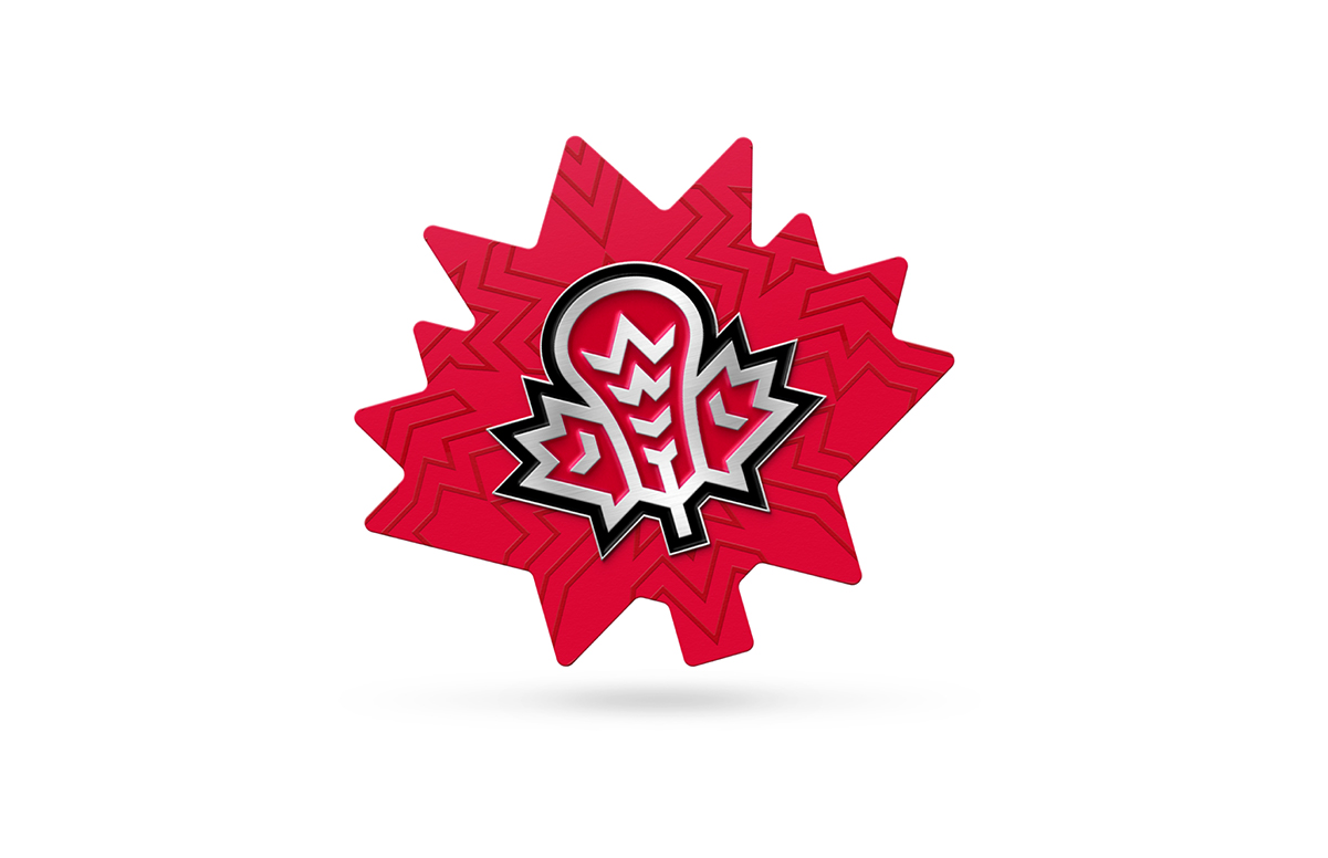
The identity of the CLL as an organization should be associated not only with the domestic championship but with the whole country. However, besides the national symbol of Canada — maple leaf, the logo includes two important signs of lacrosse identity. The handle of a stick and a feather — a recognizable artistic and visual element of the indigenous peoples of Canada and America. The symbols complement each other: the grid inside the stick frame repeats the veins of the leaf.
Медиа:
Медиа:
Заголовок:
Sublogo
Текст:
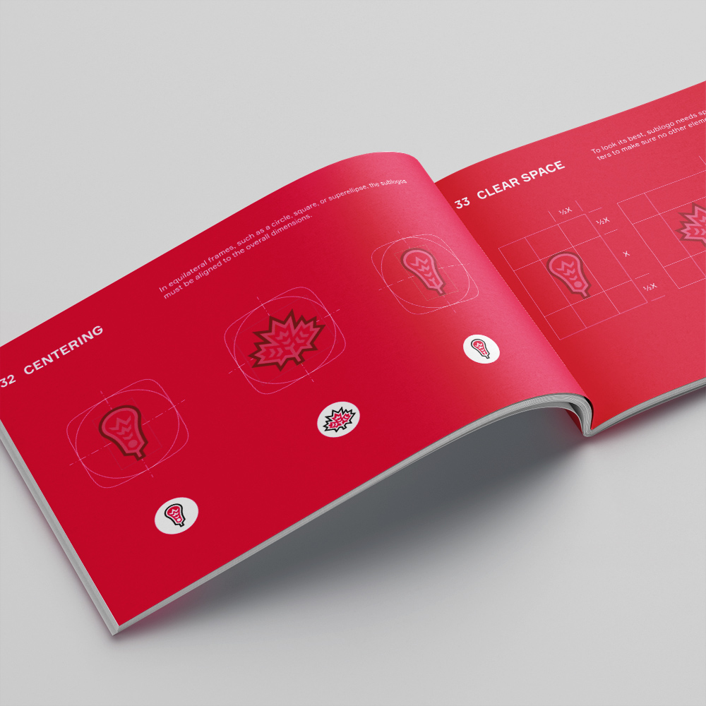
The elements of the main logo — a leaf, a stick, and a feather can also be used as independent sublogos.


Медиа:
Заголовок:
Color solutions
Текст:
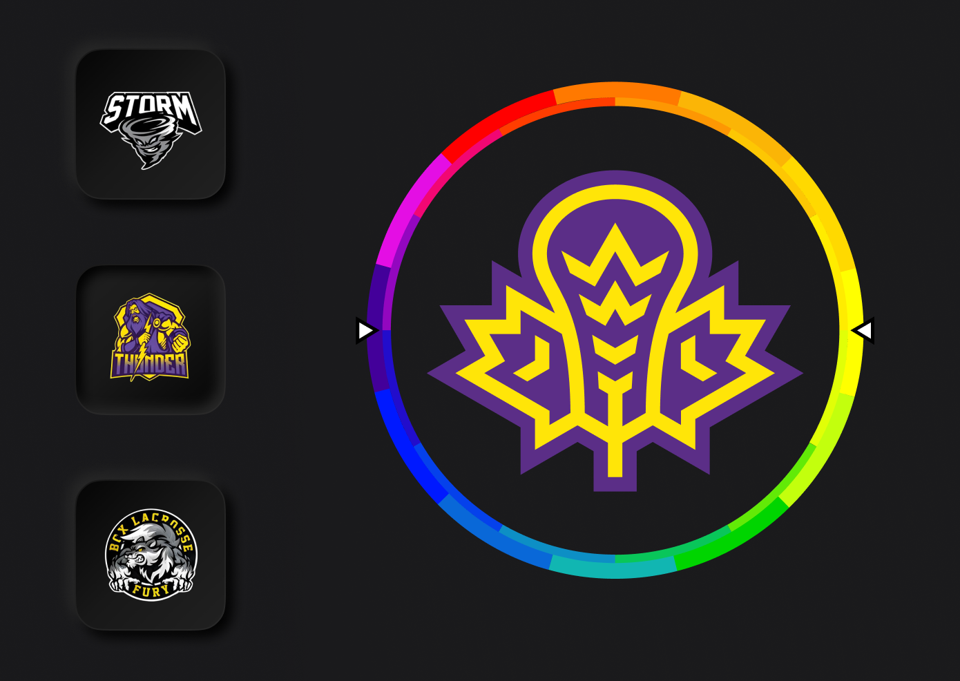
All logos are able to color mimicry. It is essential for placement on jerseys and communication between clubs of the league.
Медиа:


Медиа:

Заголовок:
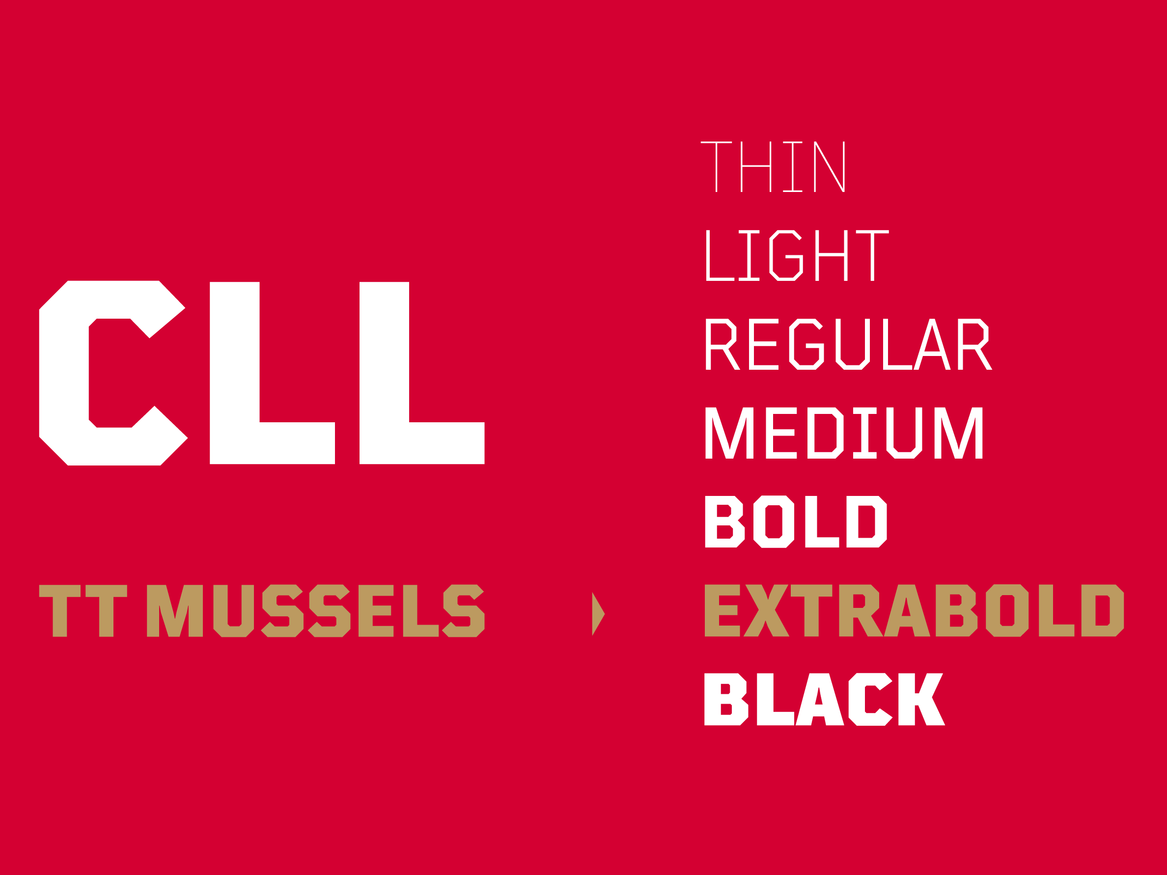
Font
Текст:
As a typography solution, the TT Mussels technological accidental font with a rich selection of typefaces is recommended.
Медиа:
Заголовок:
Palette
Текст:
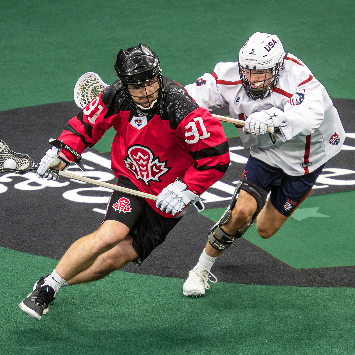
Nationality is reflected in the set of corporate colors — Canadian red, white, black, and gold. The gold color implies the possibility of displaying the successful performances of national teams that are formed on the basis of the CLL, international youth tournaments, as well as the women’s World Championship.

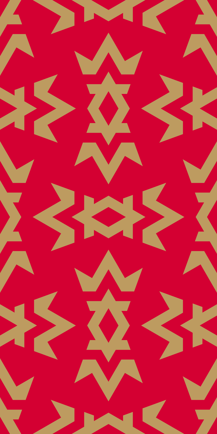
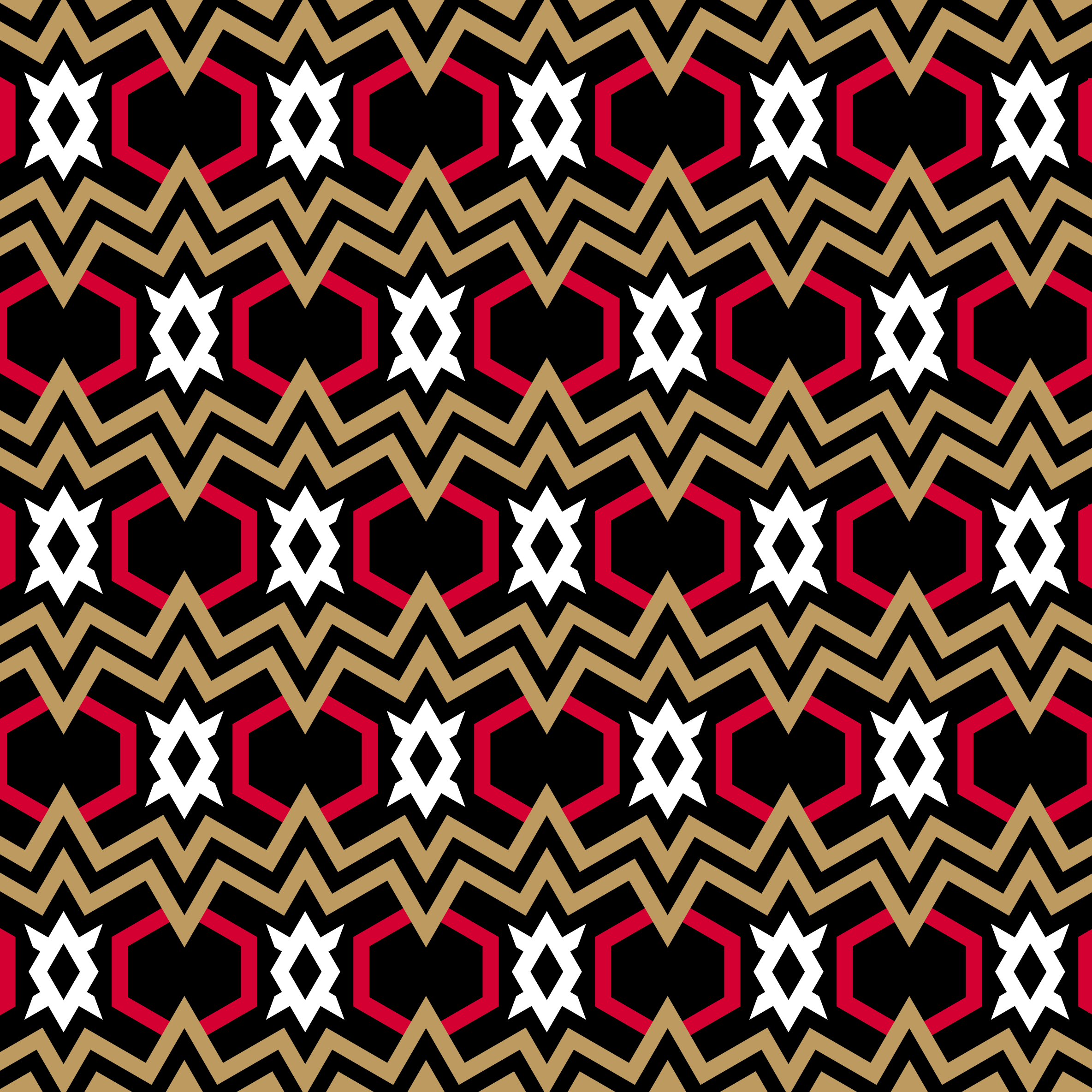
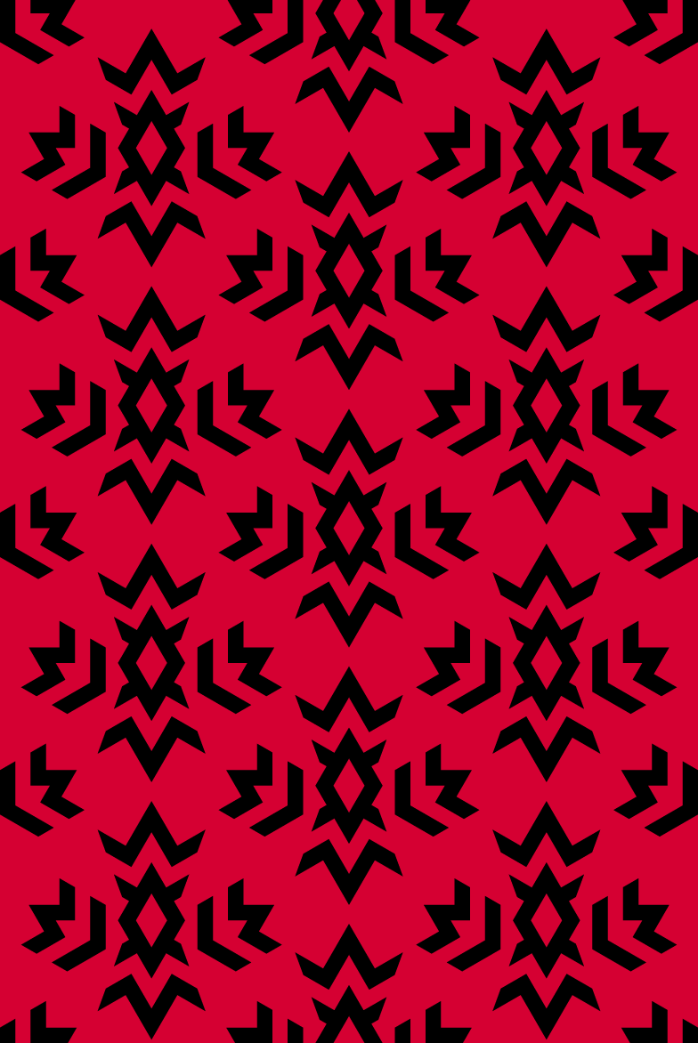
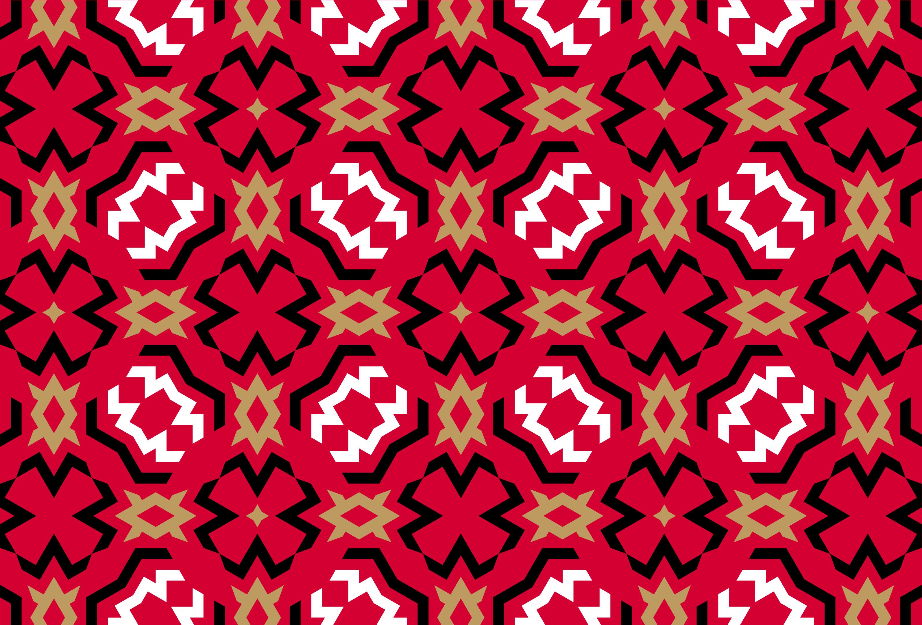
Patterns
Modern geometric patterns combine the angles and outlines of the main logo with references to the visual arts of indigenous people. It is emphasizing a strong connection with the history and traditions of the whole continent. Now, players from the country that gave lacrosse to the world will be able to carry the traditions of their sport wherever the game takes them.


Медиа:


Медиа:
Медиа:


Медиа:
Медиа:

Медиа:
Медиа:

Медиа:
Медиа: