The freshest in the league. BC Moscowsky style
LOGO • SUBLOGO • FONT WORK • KITS
BC Mosсowsky are the leaders of the United Basketball Association (UBA), where young prospects can meet on the court with ex-pro players and Olympic medalists. This is the first time Quberten has worked with an amateur team. The development of a logo and a uniform for BC Mosсowsky is a tribute to basketball culture in general, and the team is an active ambassador of this movement.

A wide pack of identity
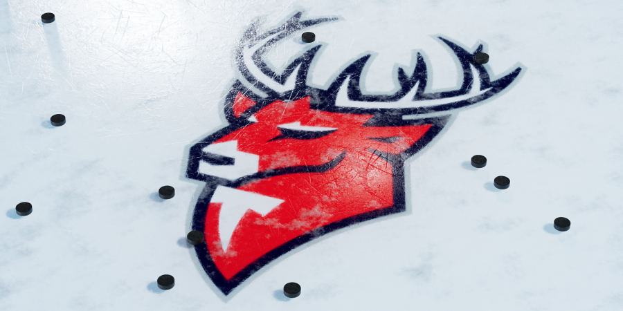
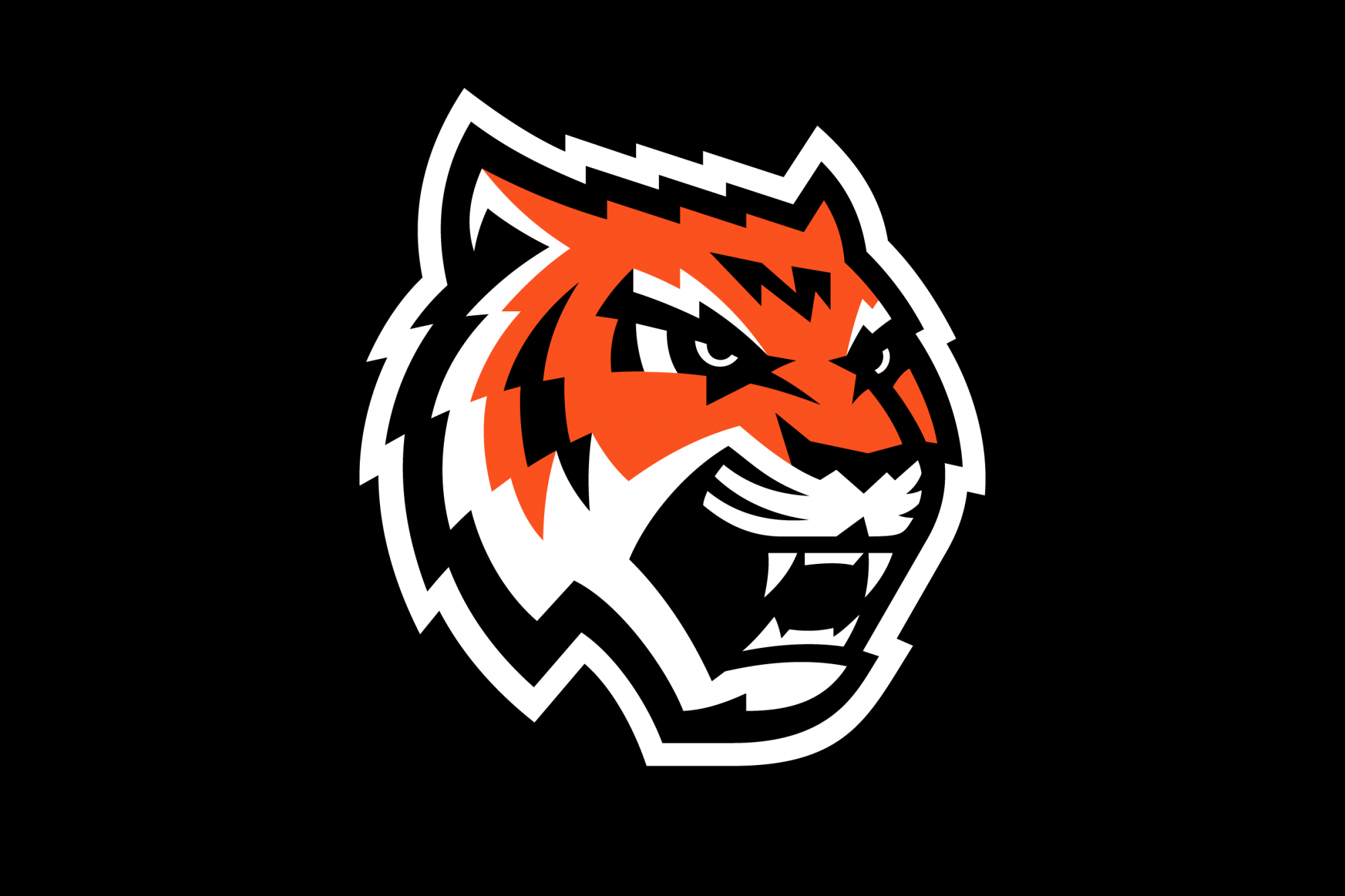
The new logo of ‘the Citizens’ adopted the aggressive mood of the previous tiger mascot, with the emblem now looking much more simple and clearer.
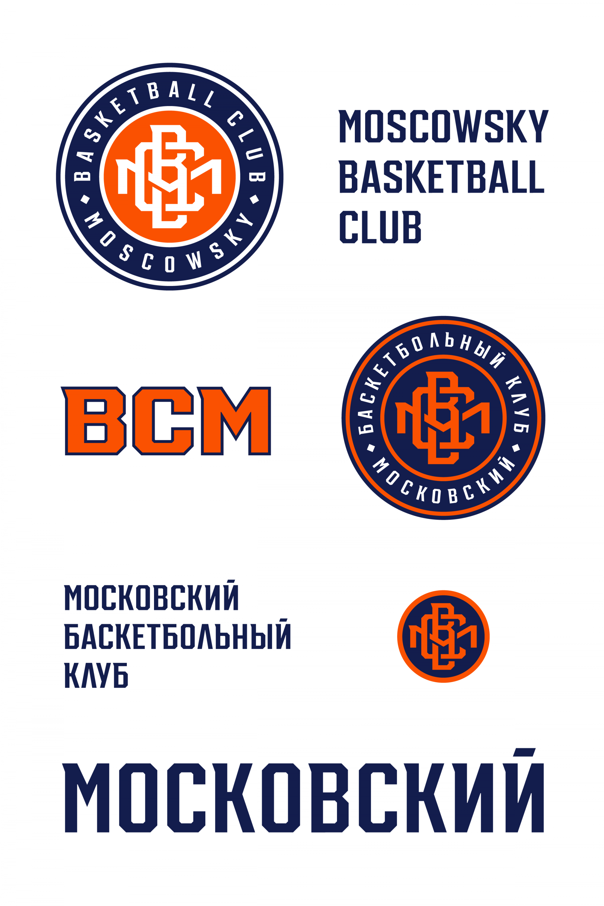
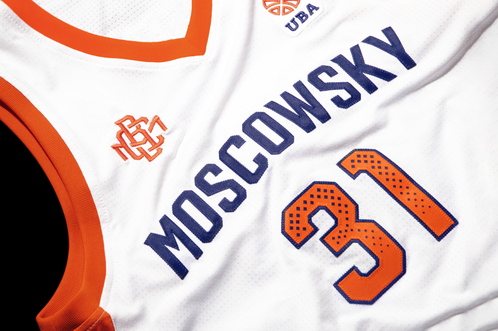
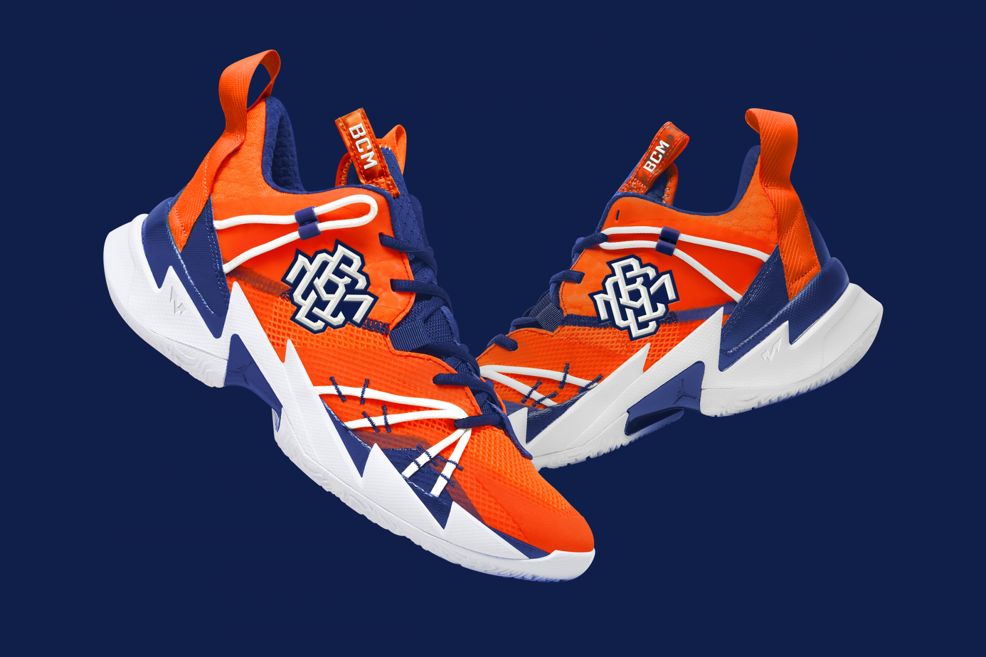
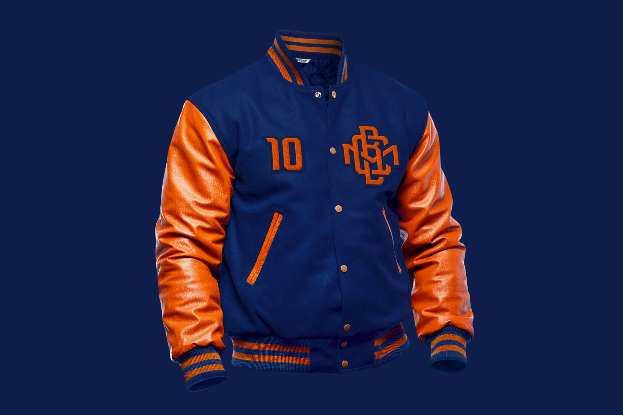
The classic monogram for North American sports adds to the feel of it. The first letters of the club’s name are woven into a single sign, which is used as a full-fledged alternative logo and a kit element.
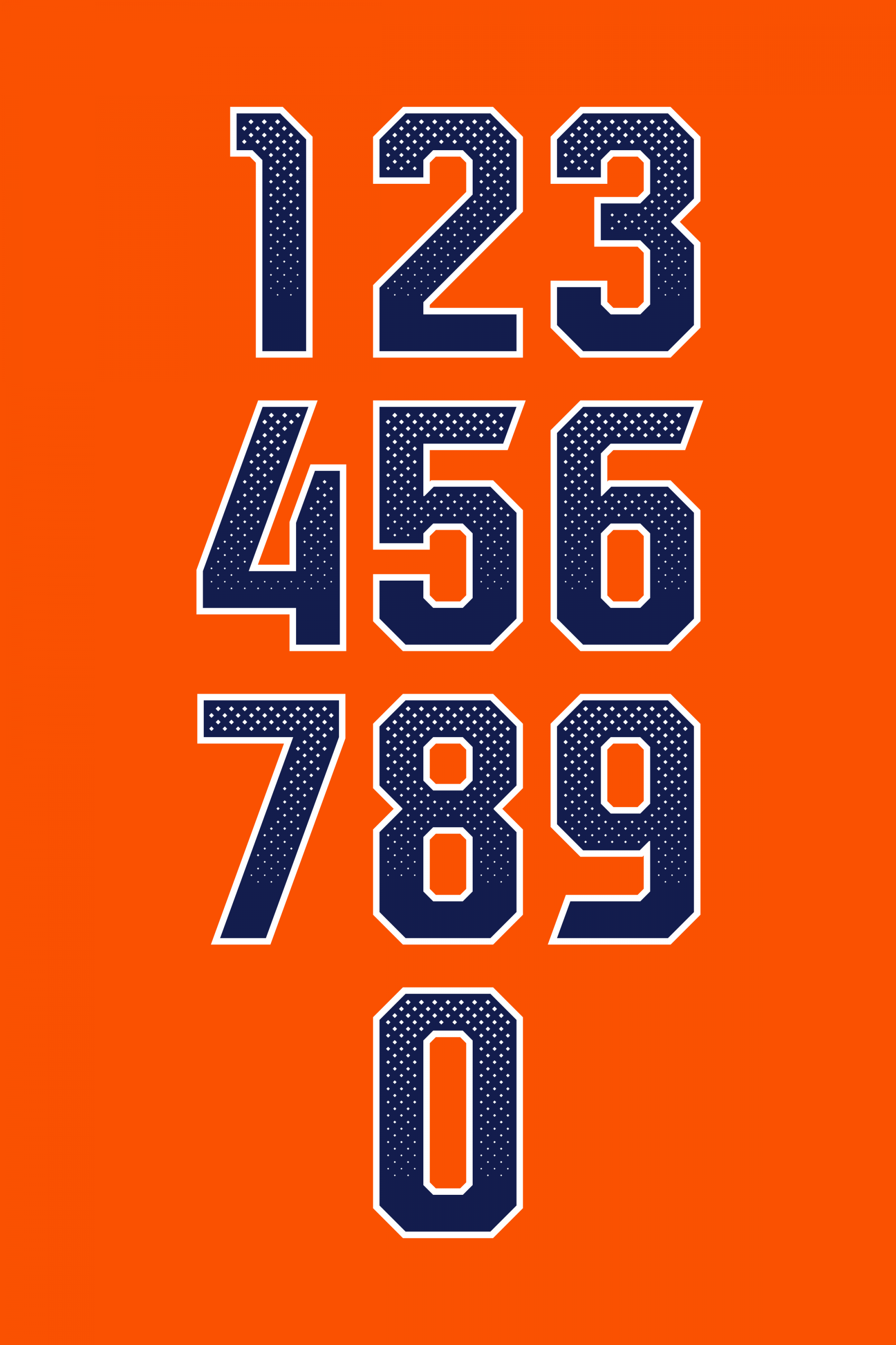
The system of angles help form the font’s style, using a monogram, the outline of numbers, the construction of lettering etc. The Latin version of the club’s name does not comply with the transliteration rules, but we’ve gone for it anyway.
Медиа:
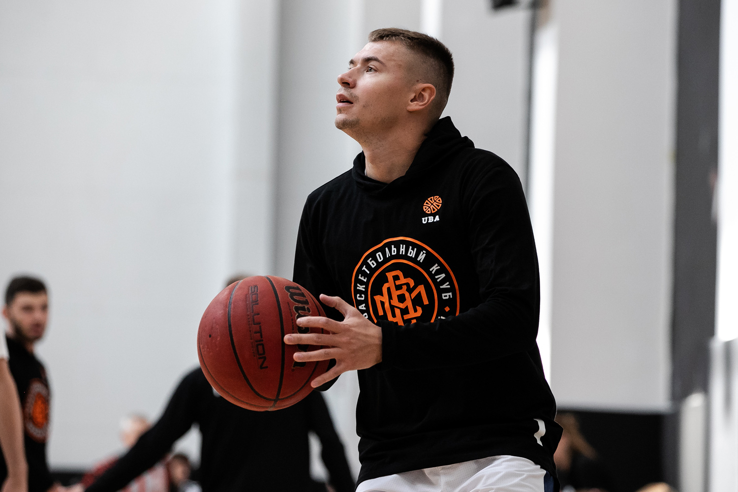
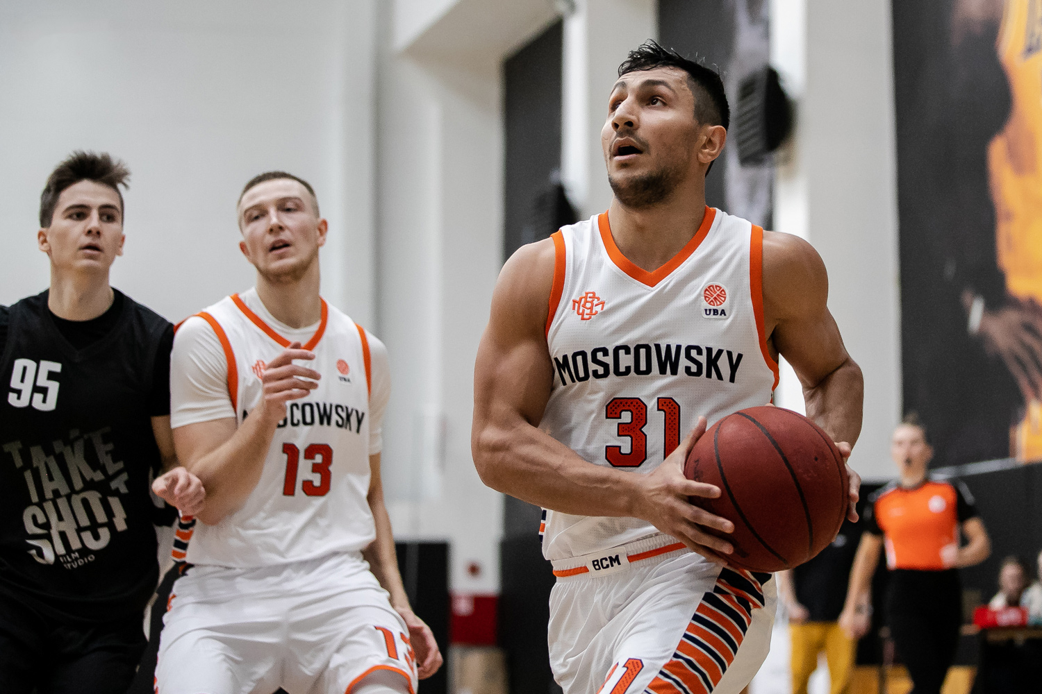
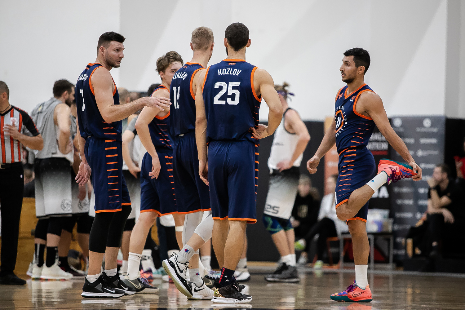
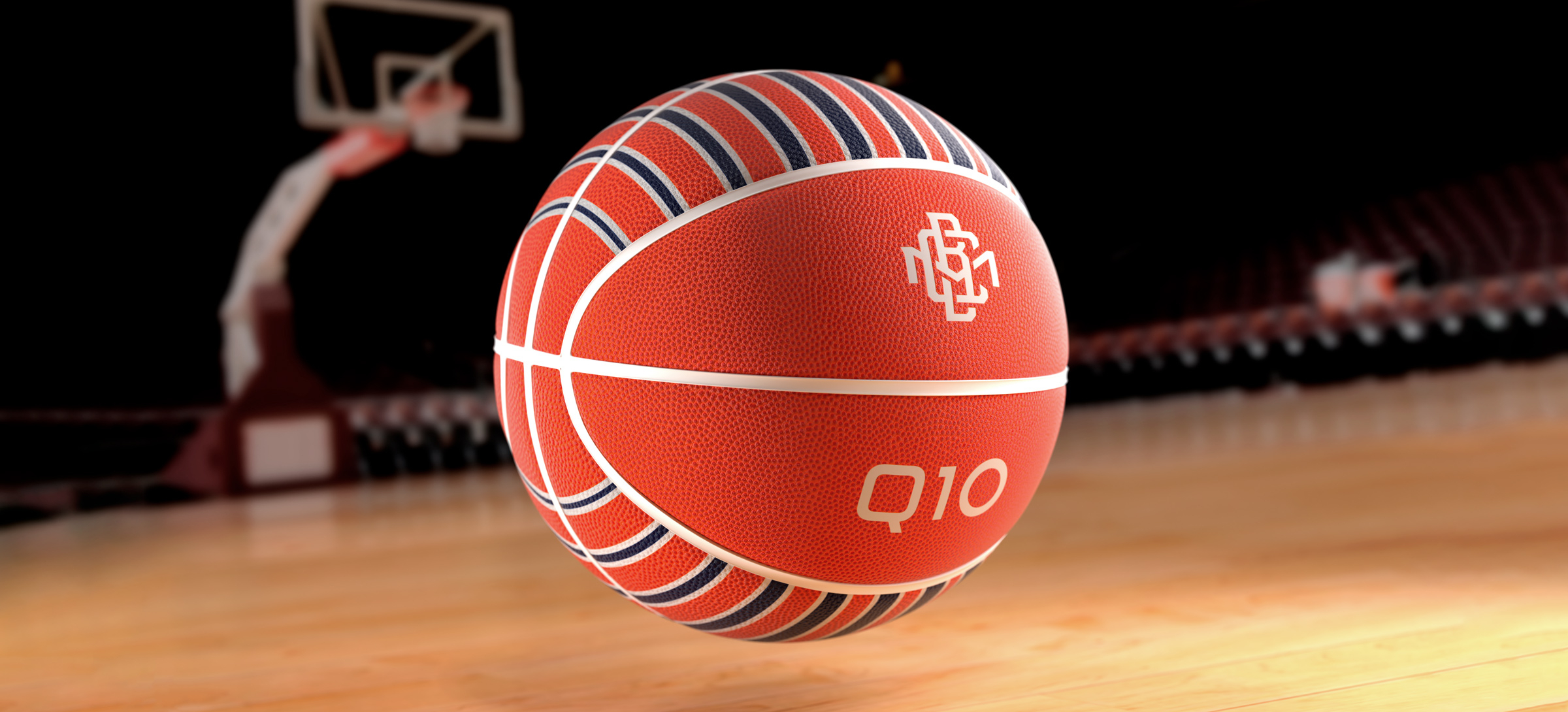
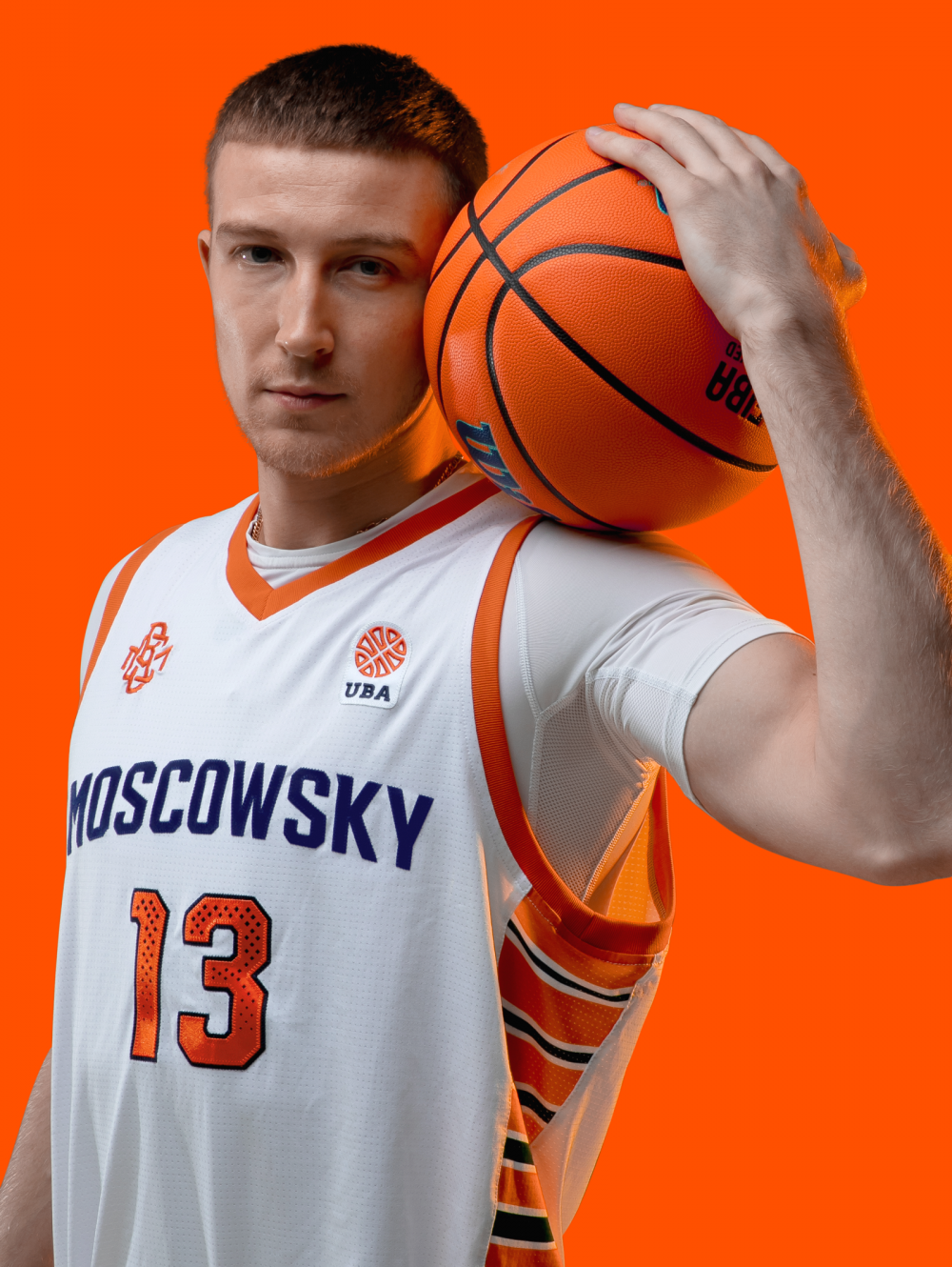
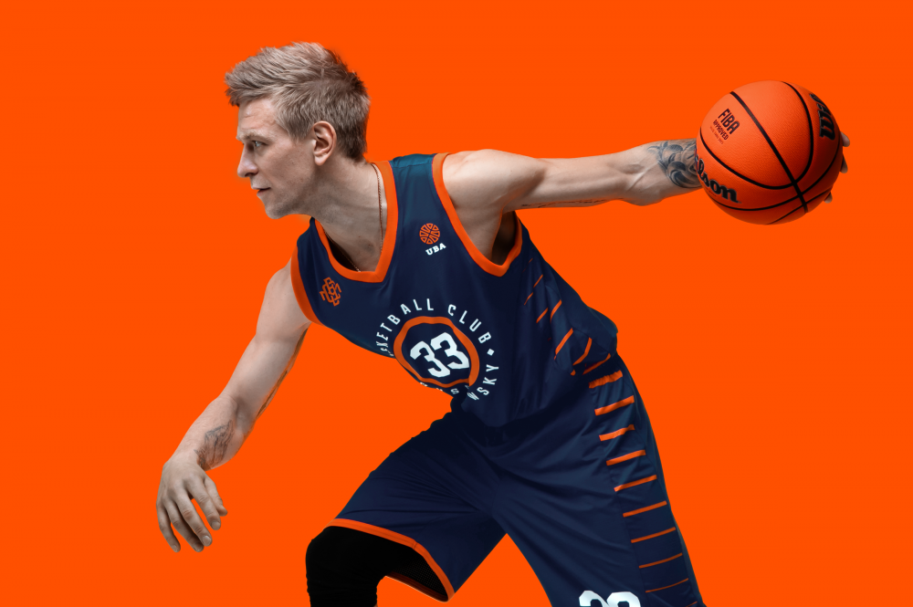
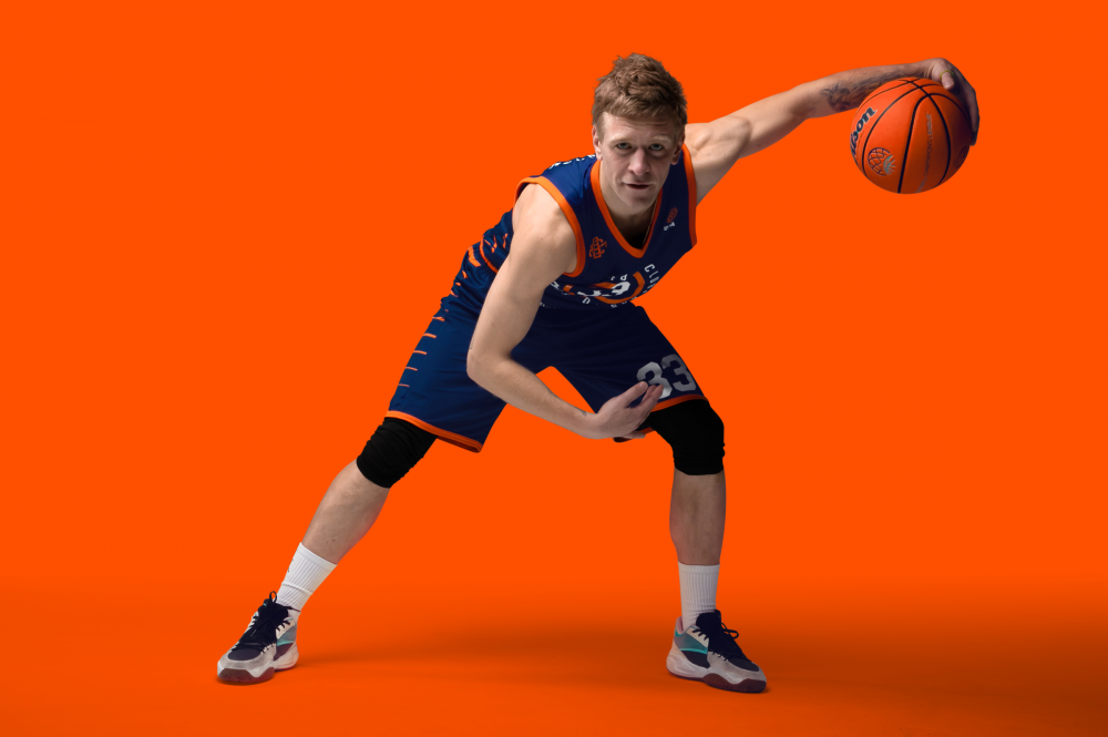
Exceptional design of the kits: from the material to the embroidery
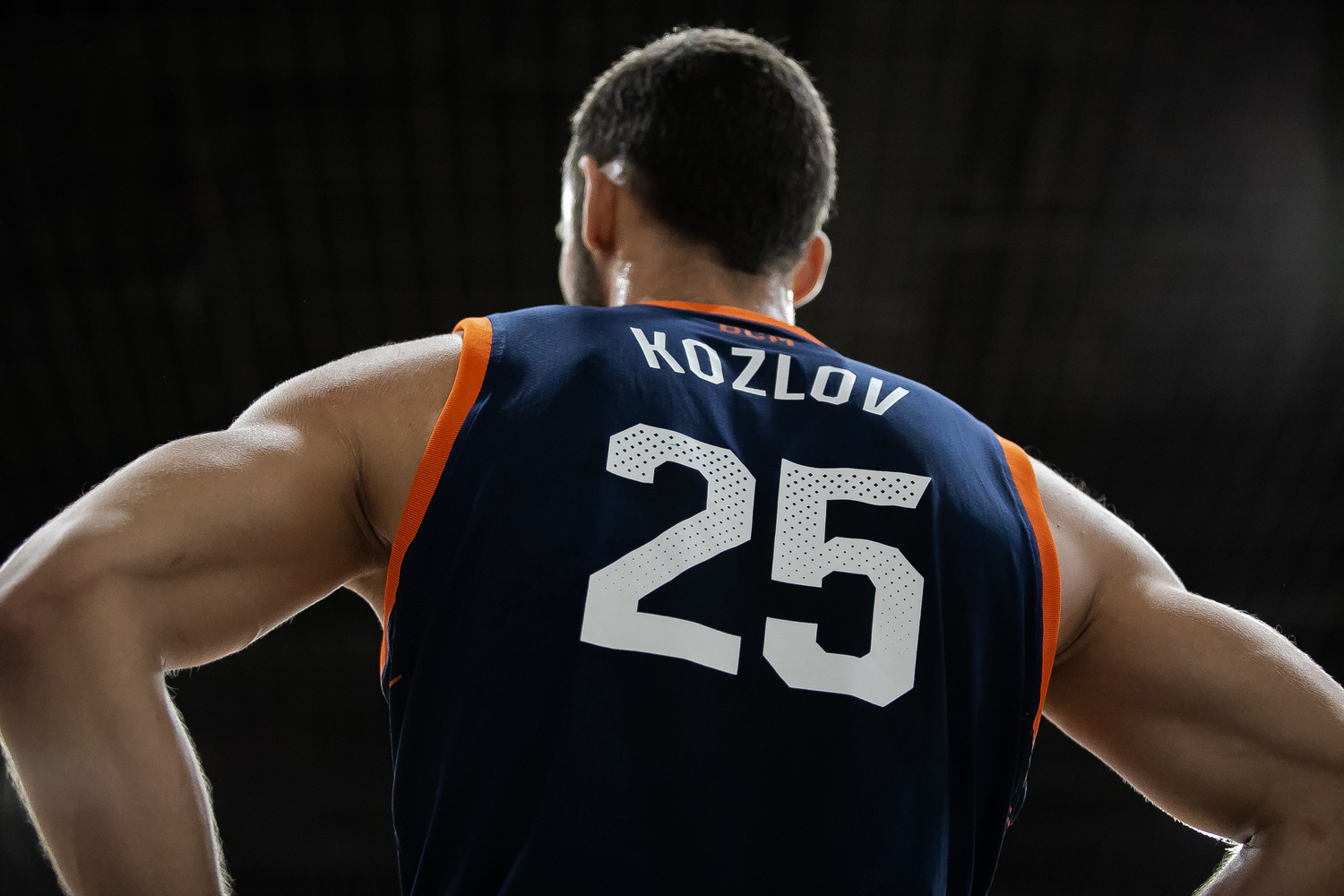
Technologically, it turned out to be an incredibly difficult task to implement BC Moscowsky’s kits at a high level. Every element was a difficult task: the selection of materials suitable in texture, weave structure and shade of factory coloring; sewn, non-sublimation elements, sparse perforation of numbers, contributing to additional moisture removal etc.
For Russian basketball, this is a high-end solution. With the specific demands by customers in regards to sport design, the studio and the manufacturer have managed to efficiently put together a design that has turned out in the best way.
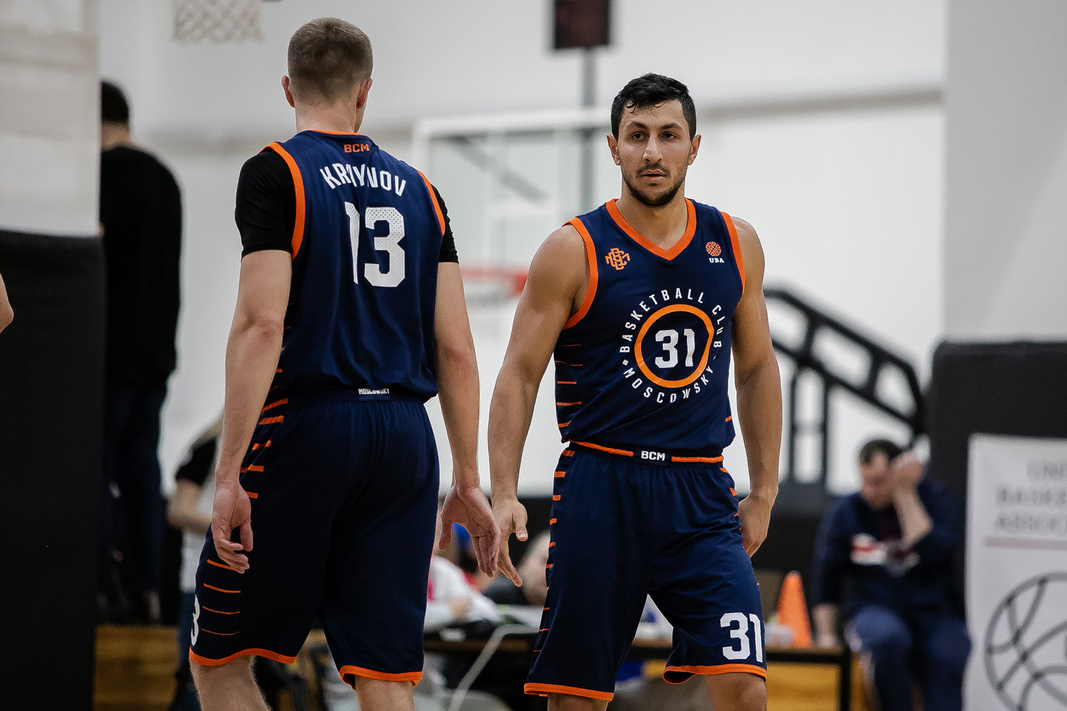
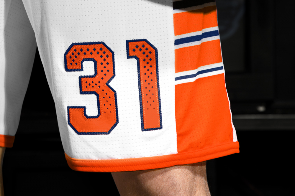
The end-to-end element used on all the kits is a stripe, which embodies the tiger theme. The stripes pattern has several versions, but each uses the same idea: flowing from one color to another.
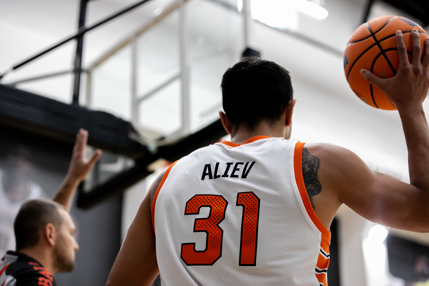
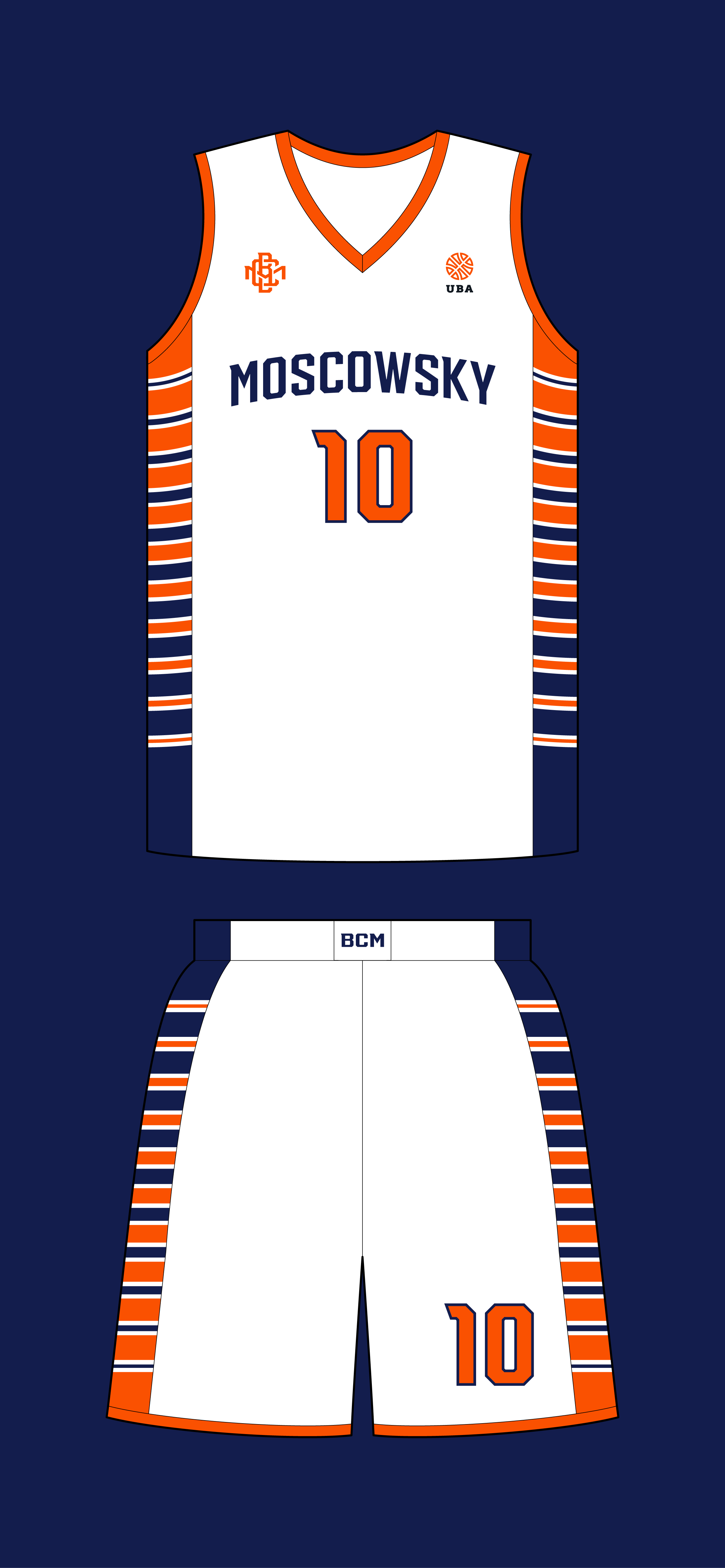
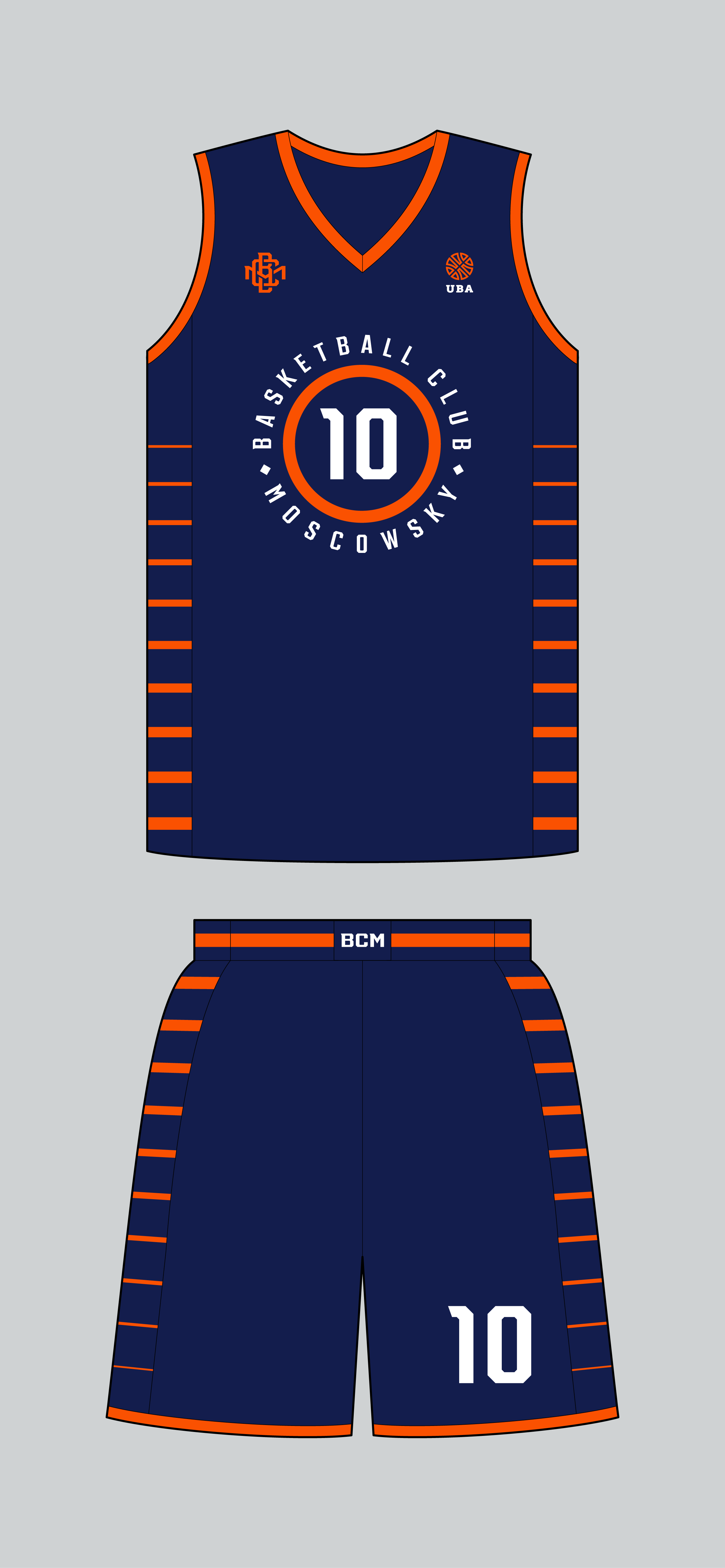
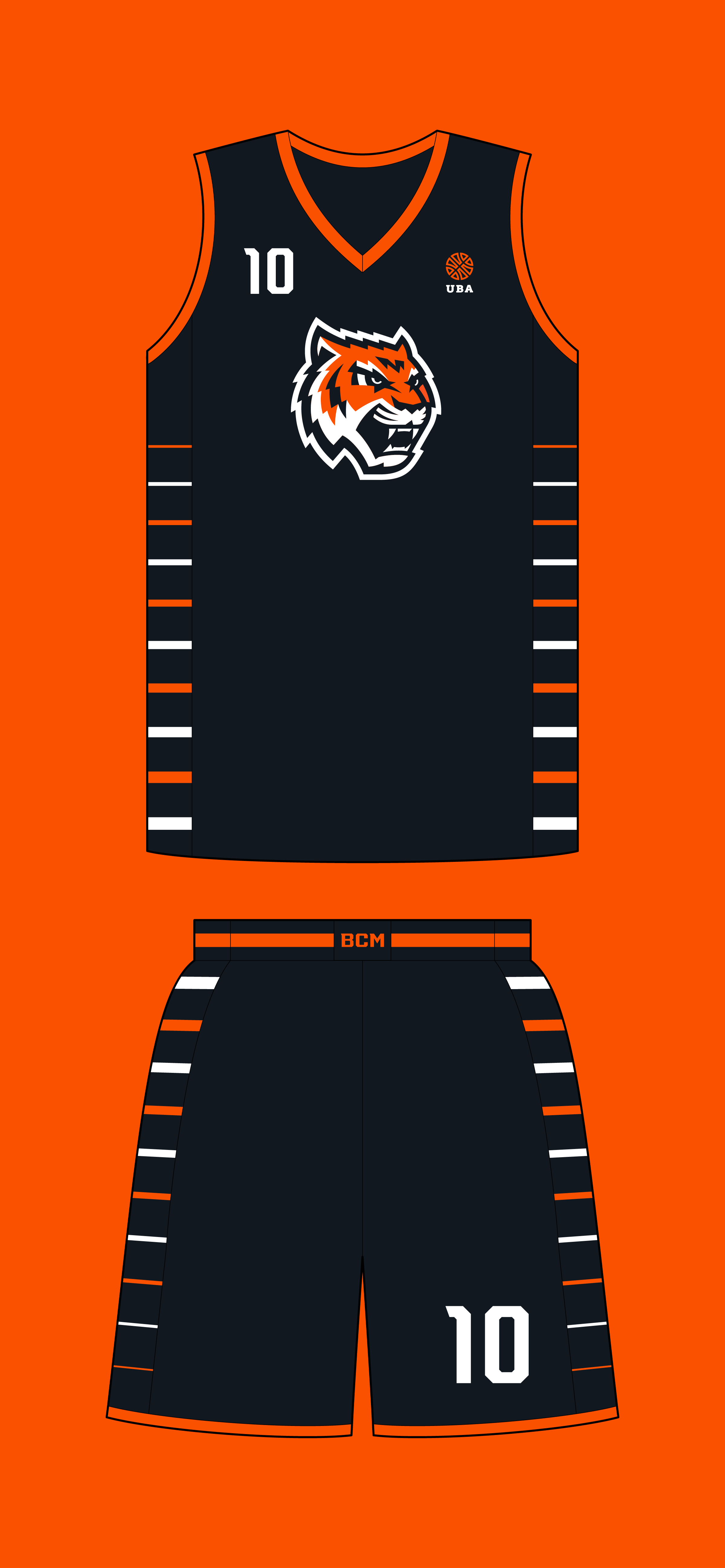
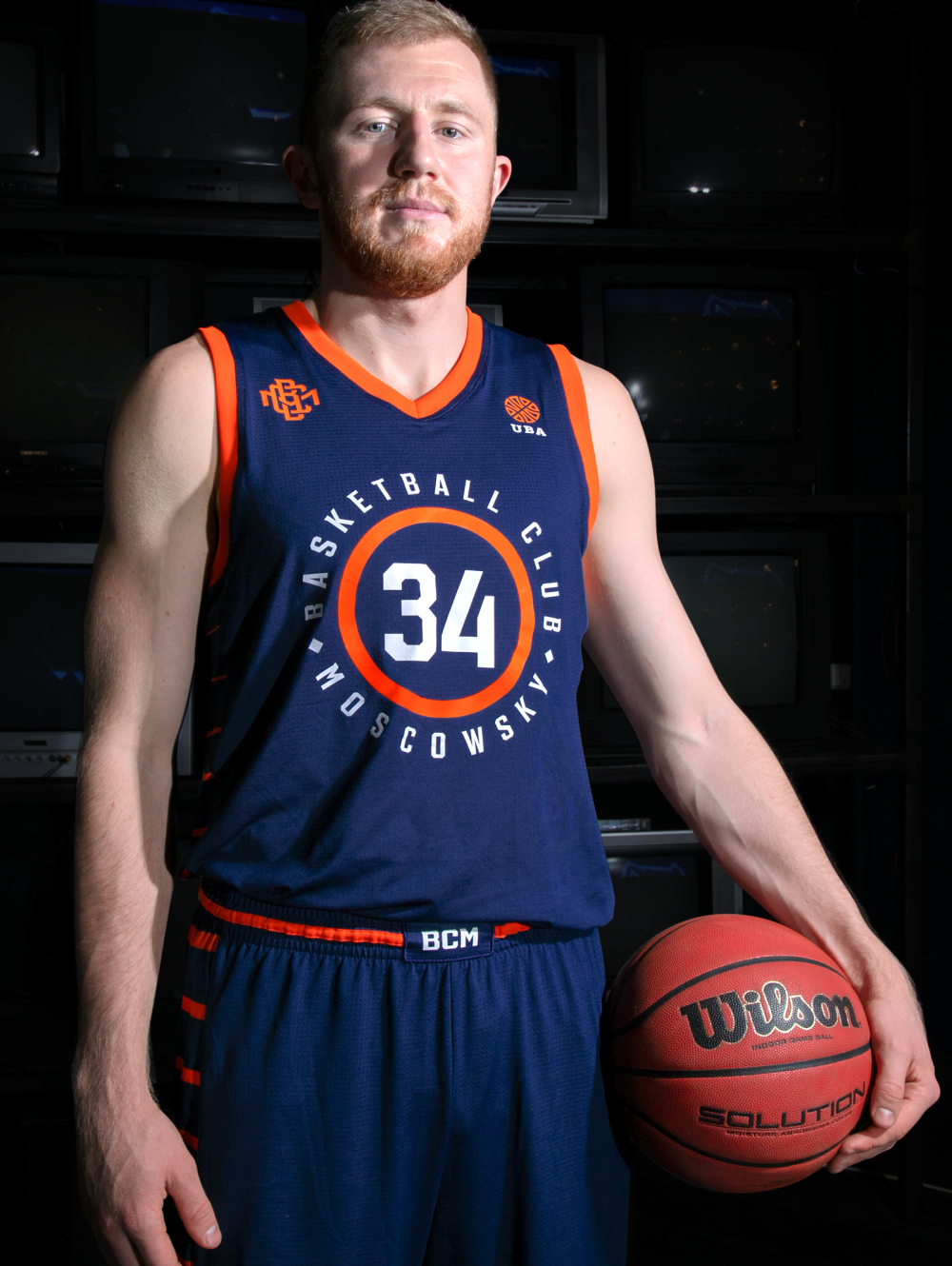
The white set is the most solid and conservative, with the lettering and the duplicate numbers traditionally located on the chest. The feature of the blue uniform: the numbers on the chest are enclosed within an important symbol in the game, a hoop, which encircles the name of the club. Usually a mascot on a jersey is not standard for a professional basketball club. However, in the case of the third alternative kit, we think it suits.
Медиа:
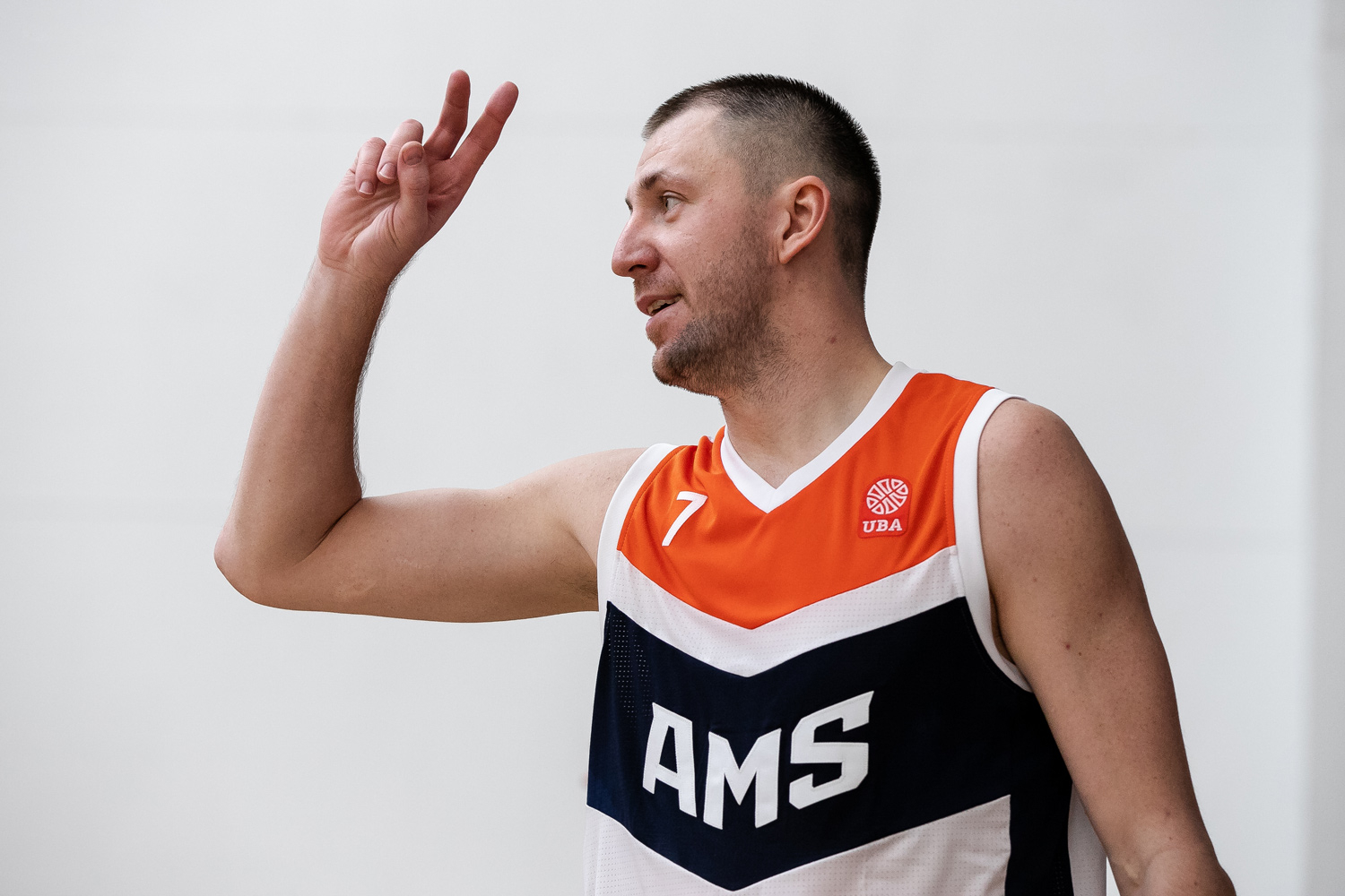
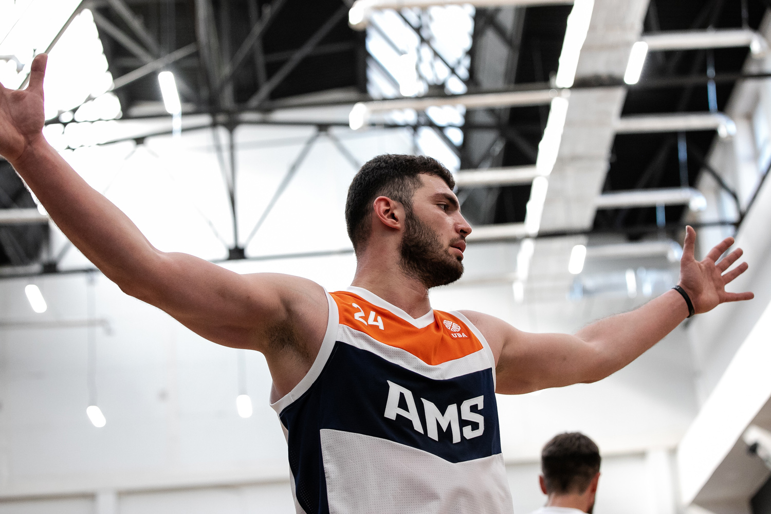
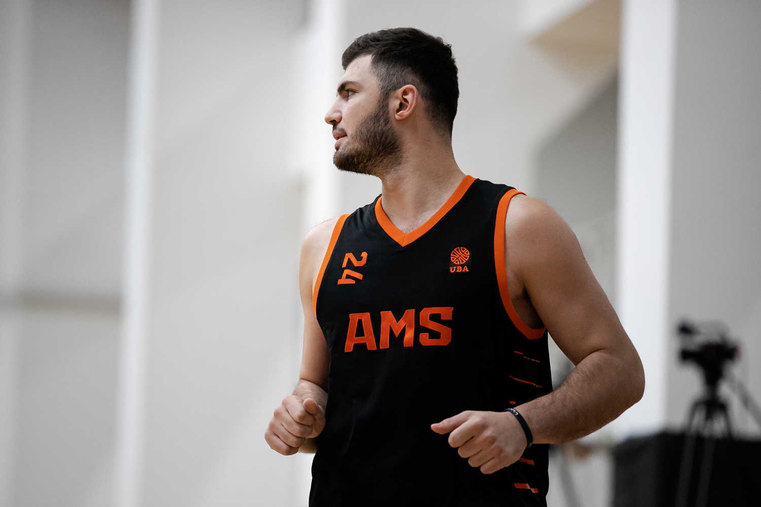
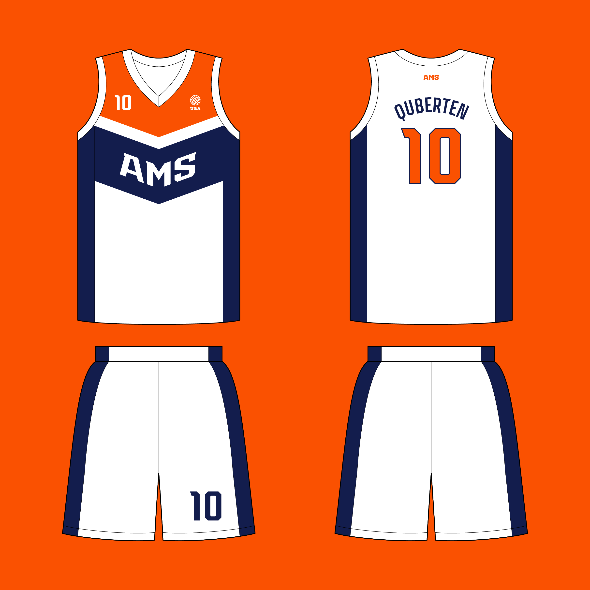
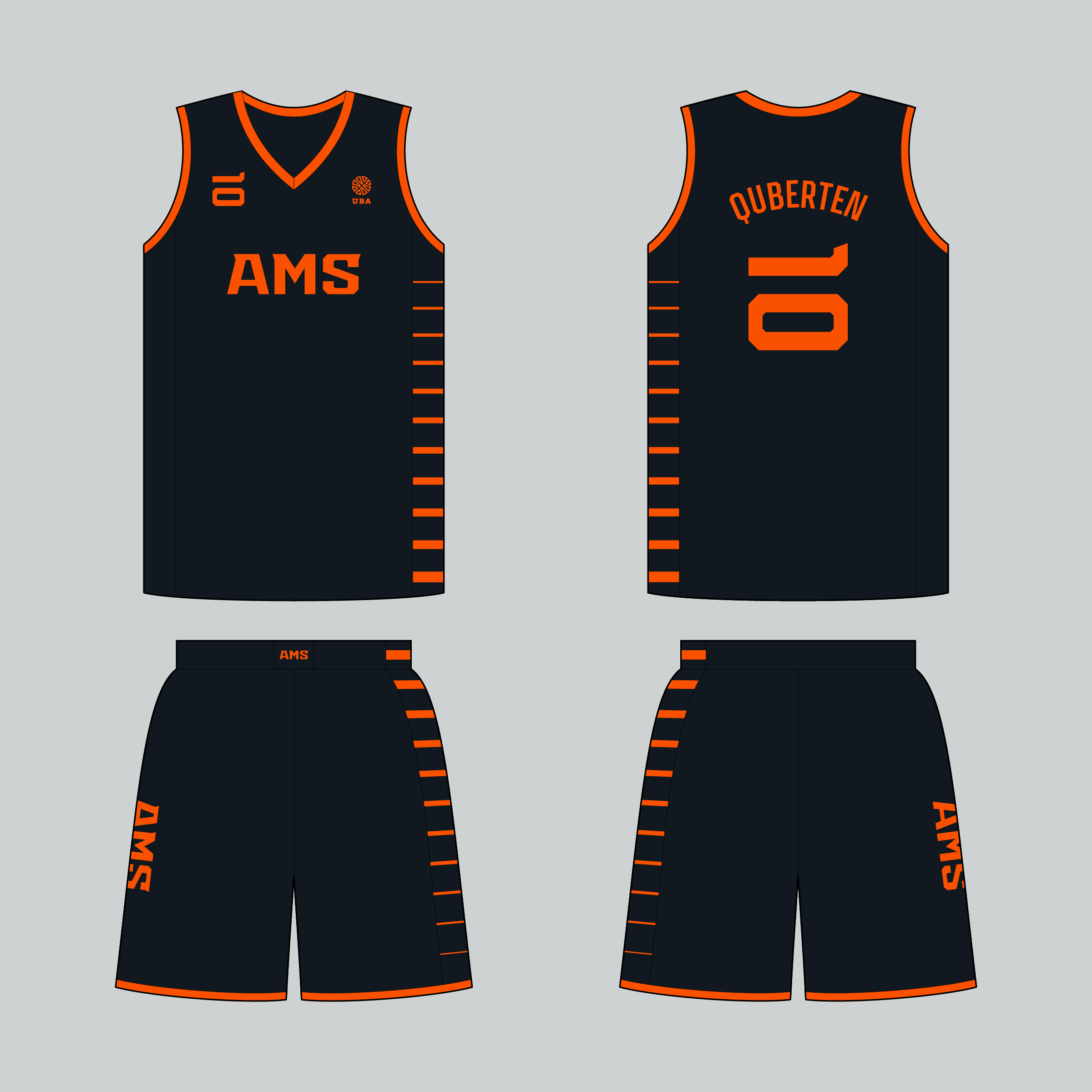
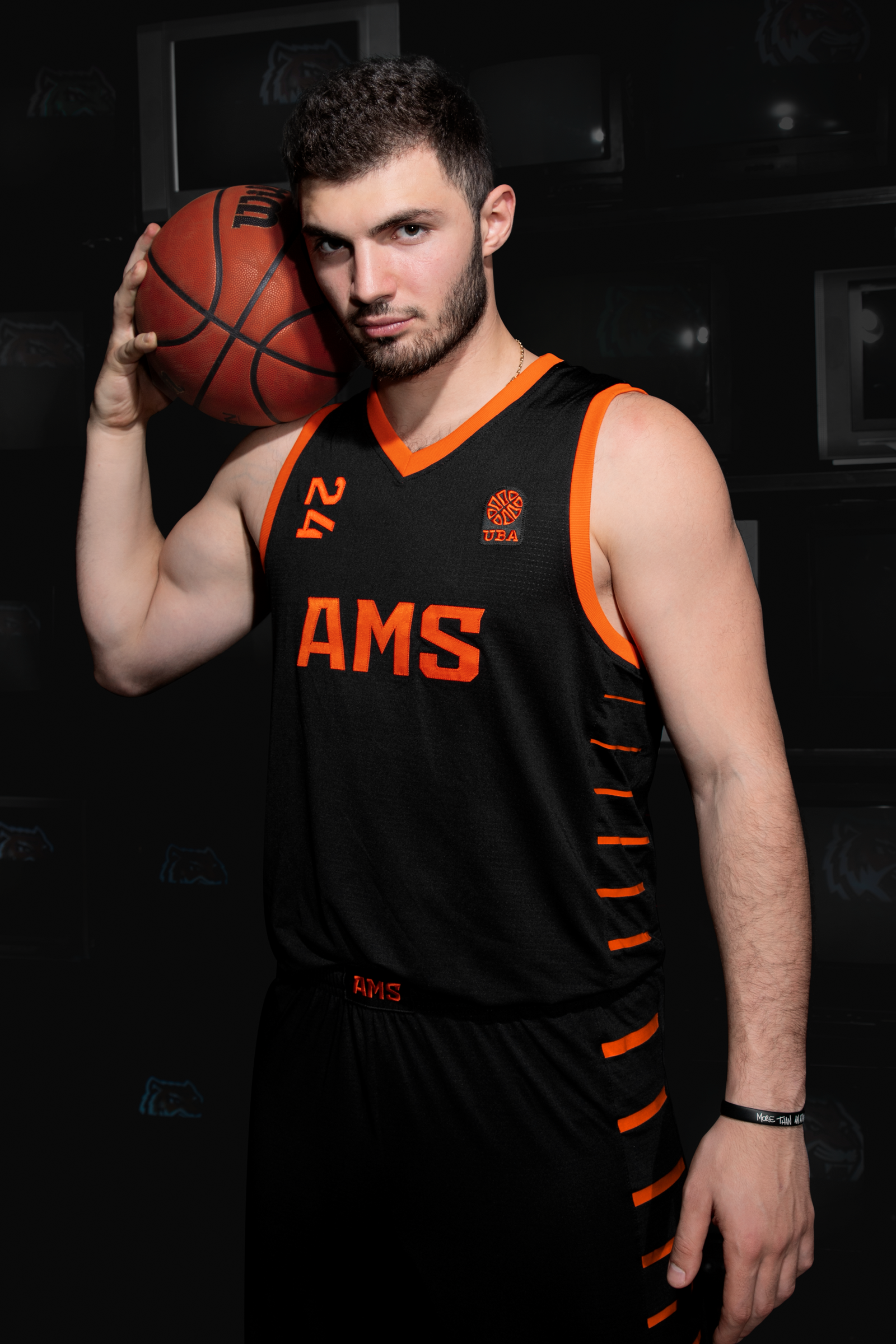
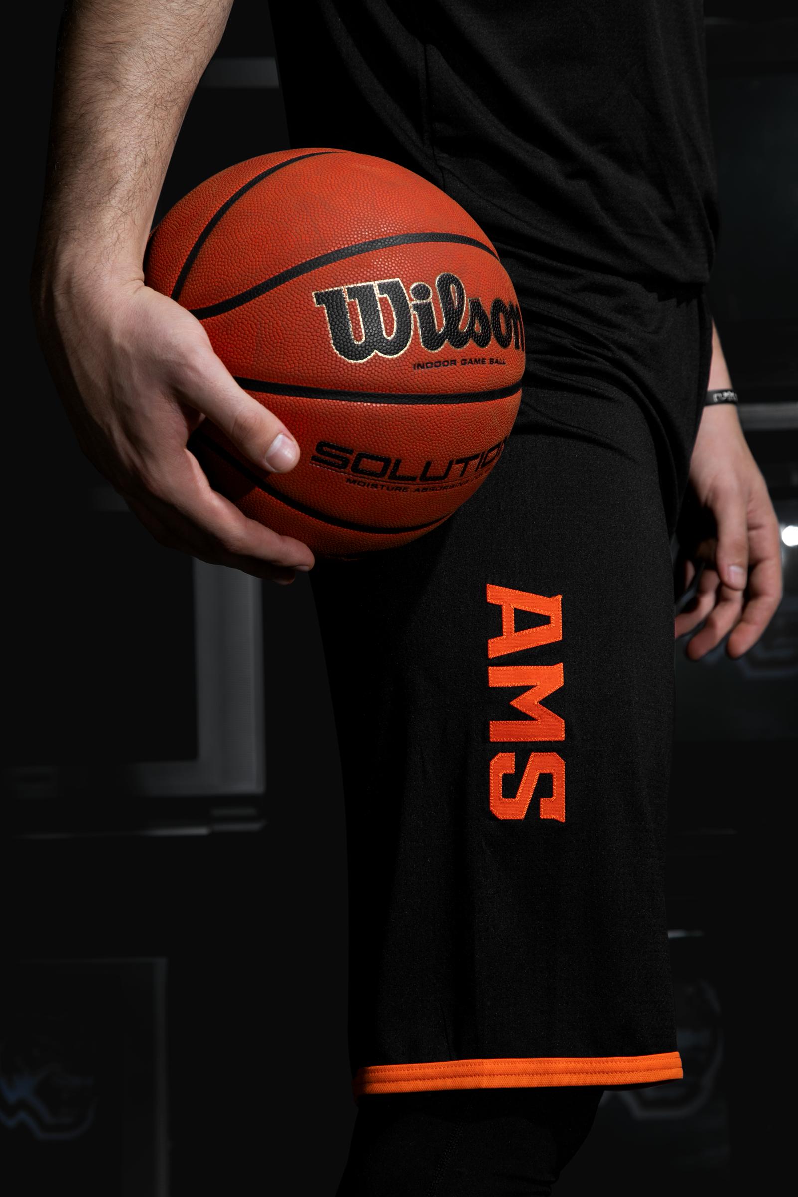
Derby colors. Uniform for AMS Academy
AMS is a full-fledged team of the BC Moscowsky system, the face of the basketball academy under the same name, as well as being one of the Citizens’ constant rivals in the UBA league.
The first set is made in the traditional colors of the system, and the wedge-shaped style of the jersey pattern logically continues the Moscow theme, being referenced with the letter ‘M’.
The most cheerful and ‘hooligan’ set of the project is the black with the bright orange accents. It only uses two colors, which creates a light neon glow effect. The asymmetric design of the kit is supported by the numbers turned sideways.
Медиа:
Медиа: