Gambit's identity remastered 2020
LOGO • SUBLOGO • FONTS • PATTERNS • GUIDES
In terms of culture, the key difference between esports and traditional sports is the absence of any centuries-old traditions that would prohibit teams to change their visual image and to be relevant in the digital environment.
And Gambit is no exception. The update followed the way of restyling with a noticeable expansion of the corporate identity. The current style required changes as it contained a number of serious problems: the chaotic construction of the logo, the absence of the author's star and shield, as well as it missed the most important element: bold lettering (Gambit). Furthermore, the club simultaneously had a large number of elements made in different styles which, unfortunately, didn’t form a whole and unified system among themselves.

Updated logo and a new potential
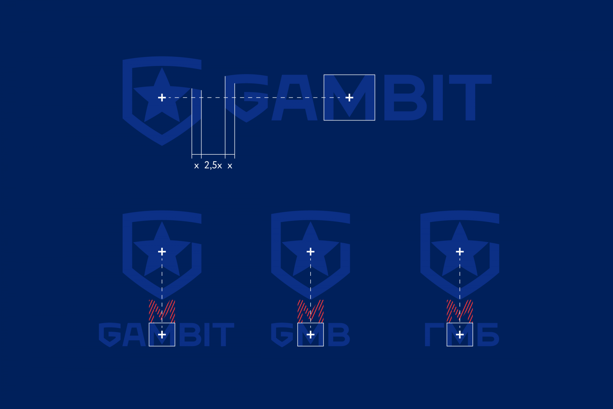
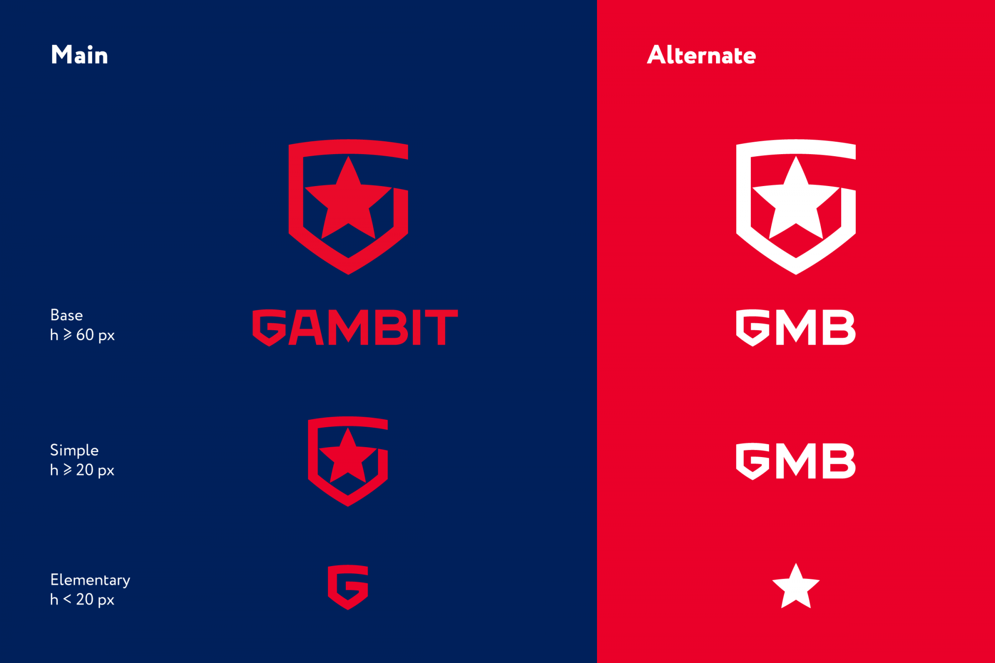
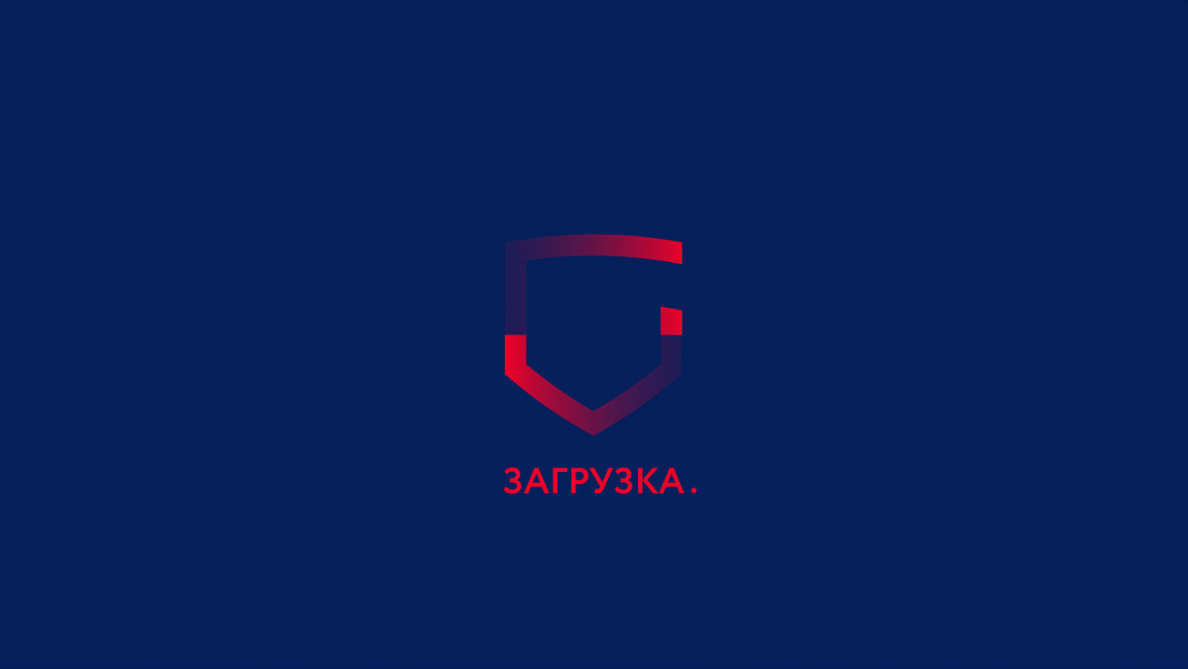
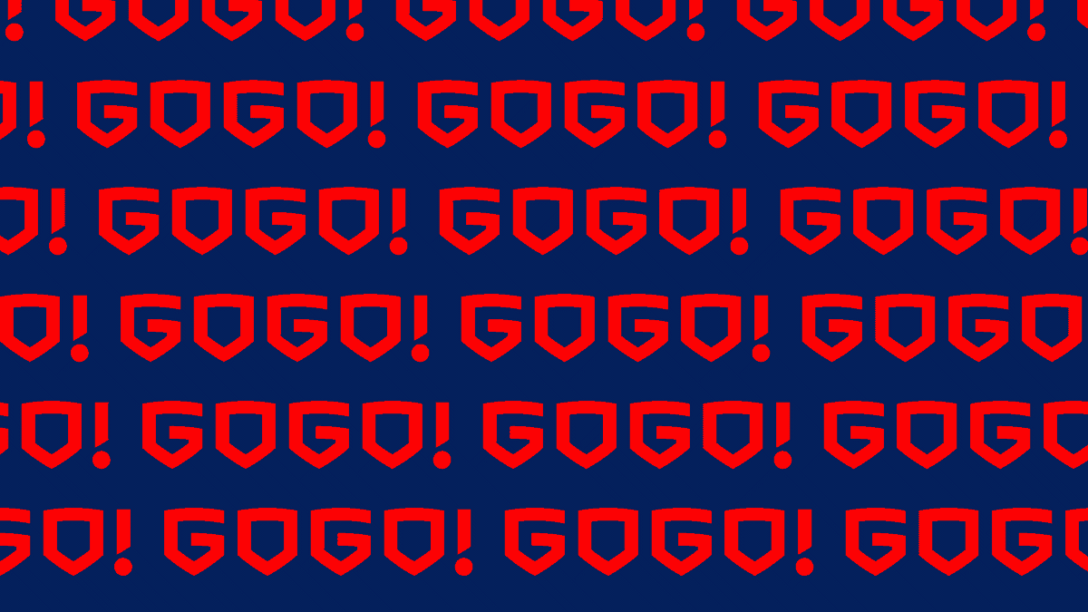
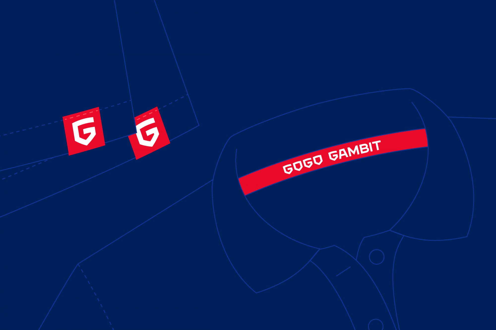
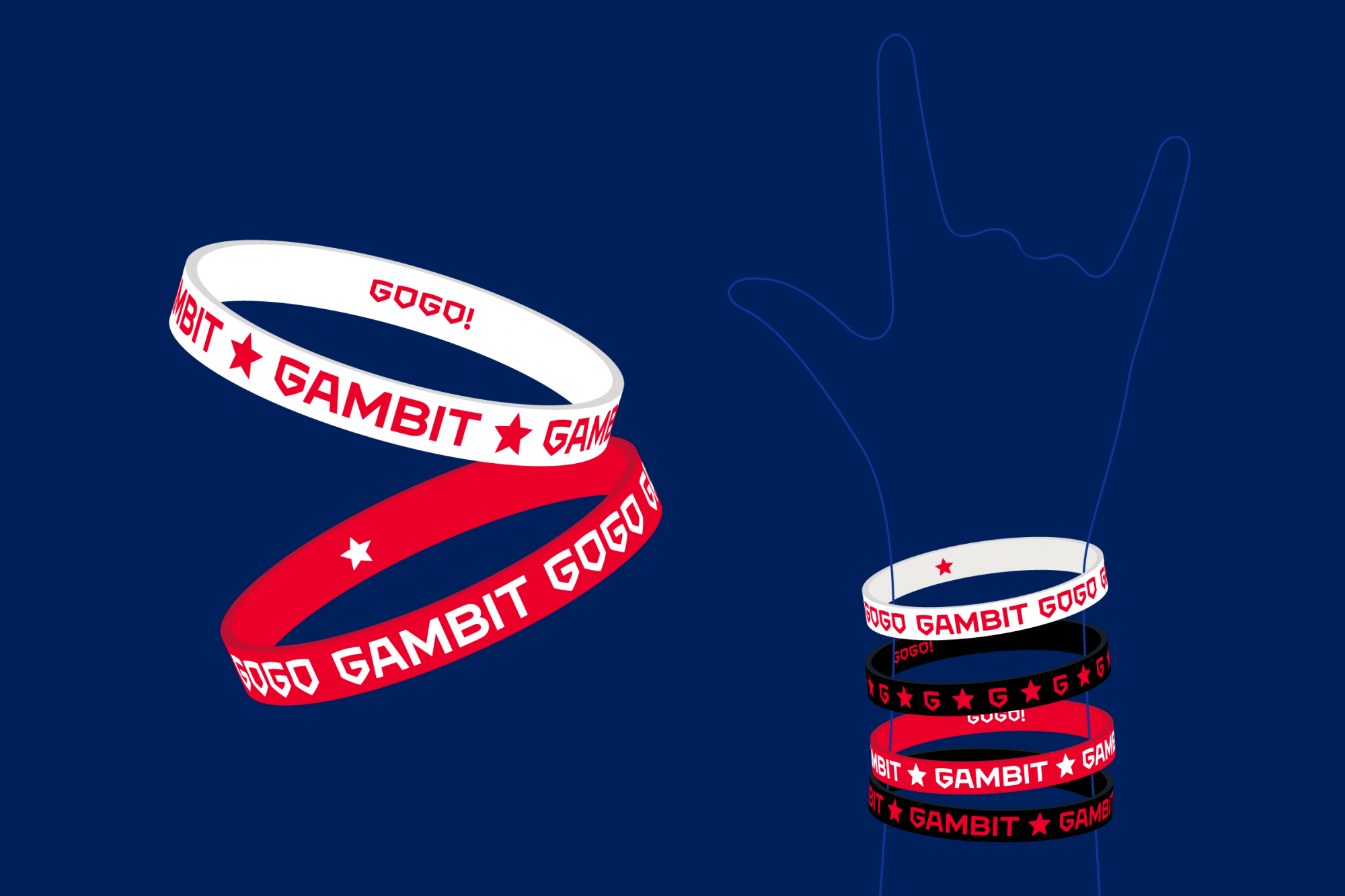
The first thing we did was correct the two basic symbols of the Gambit: the shield and the star. They kept the same look, but gave it a slightly different configuration. The emblem is now cleaner and more balanced. We also added more semantics into the logo — now the shield is also 'G', the main accent letter of the whole style. For example, such elements as Gambit's firm lettering, GMB monogram and the motivating inscription the GOGO, are based on its plasticity.
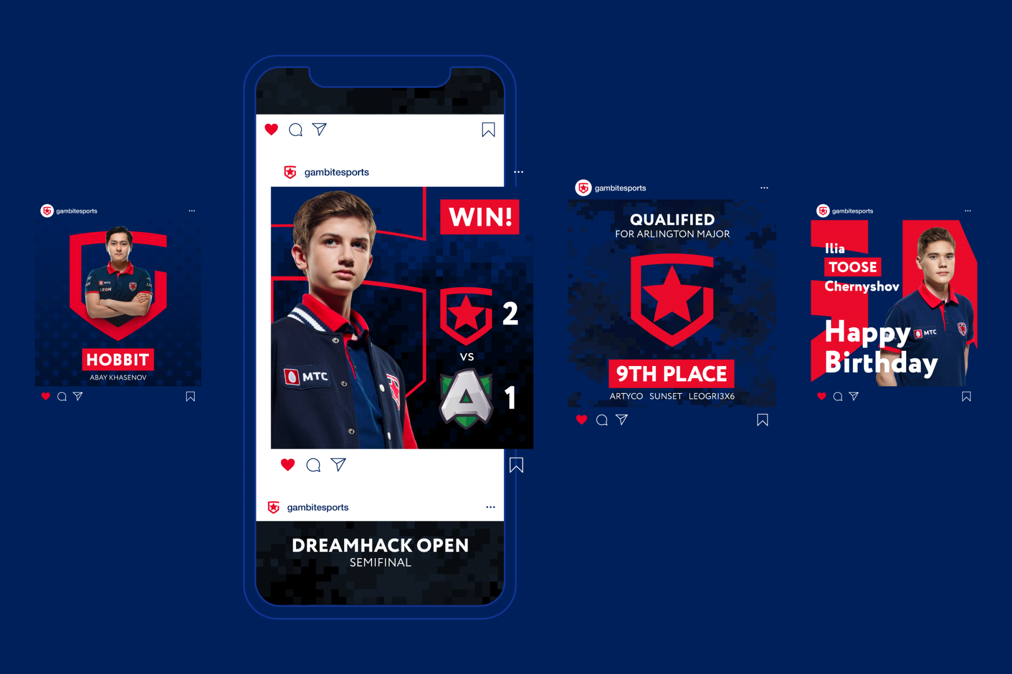
The main logo got an updated 'feature' as additional versions. This is the responsive logo principle, according to which the logo has special simplified versions for small formats (smartphones, apps etc.), which is crucial in a digital environment.


Creation of a design system
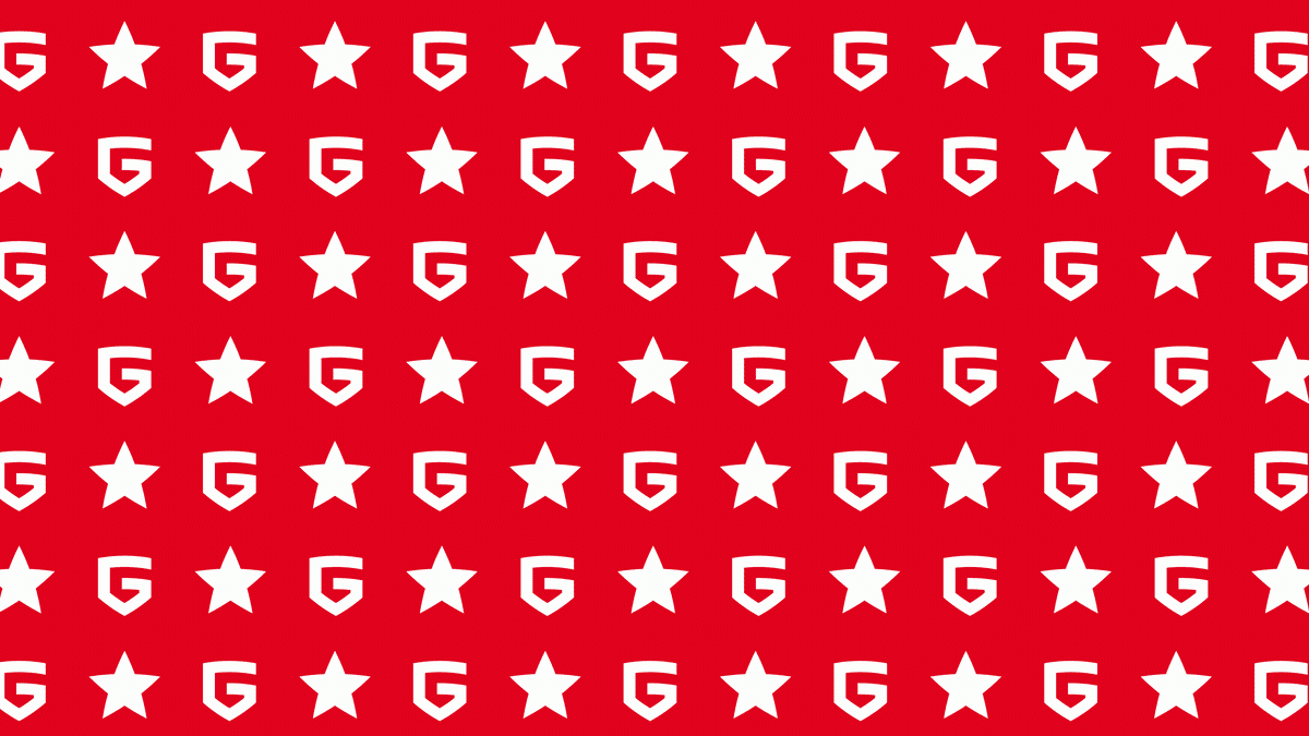
Thanks to such elementary figures as the star and the shield, the generation of sub-elements and patterns were made possible. A modern company must have a system where each visual object helps promote brand awareness. The logo is the central part of the identity, but the style itself must have its own design-code and at the same time be combined and unified.
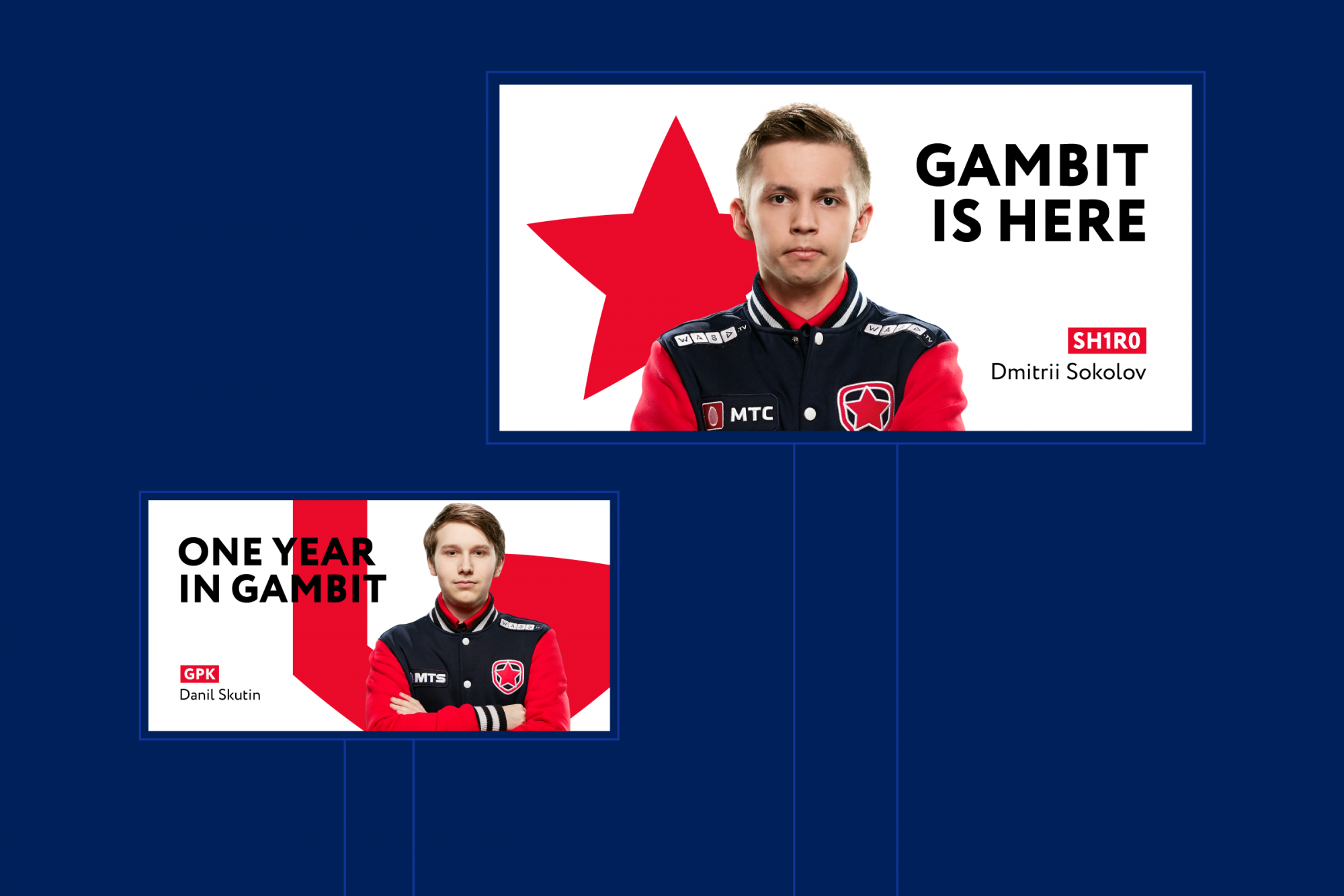
We've made the Gambit's identity flexible. The elements are familiar to those who have set up new constructions as different configurations of the shield, stars and letters G. The team has now got a large pack of active and background patterns as well. Now you can designate any space as Gambit's, no matter what's in front of you: social networks, website or offline-environment.
Colours play a fundamental role in brand awareness. We've decided to change the standard red (255-0-0) to a less trivial one — (218-41-28), which will allow the club to not get lost among all the rest of the red teams.


The whole world is Gambit
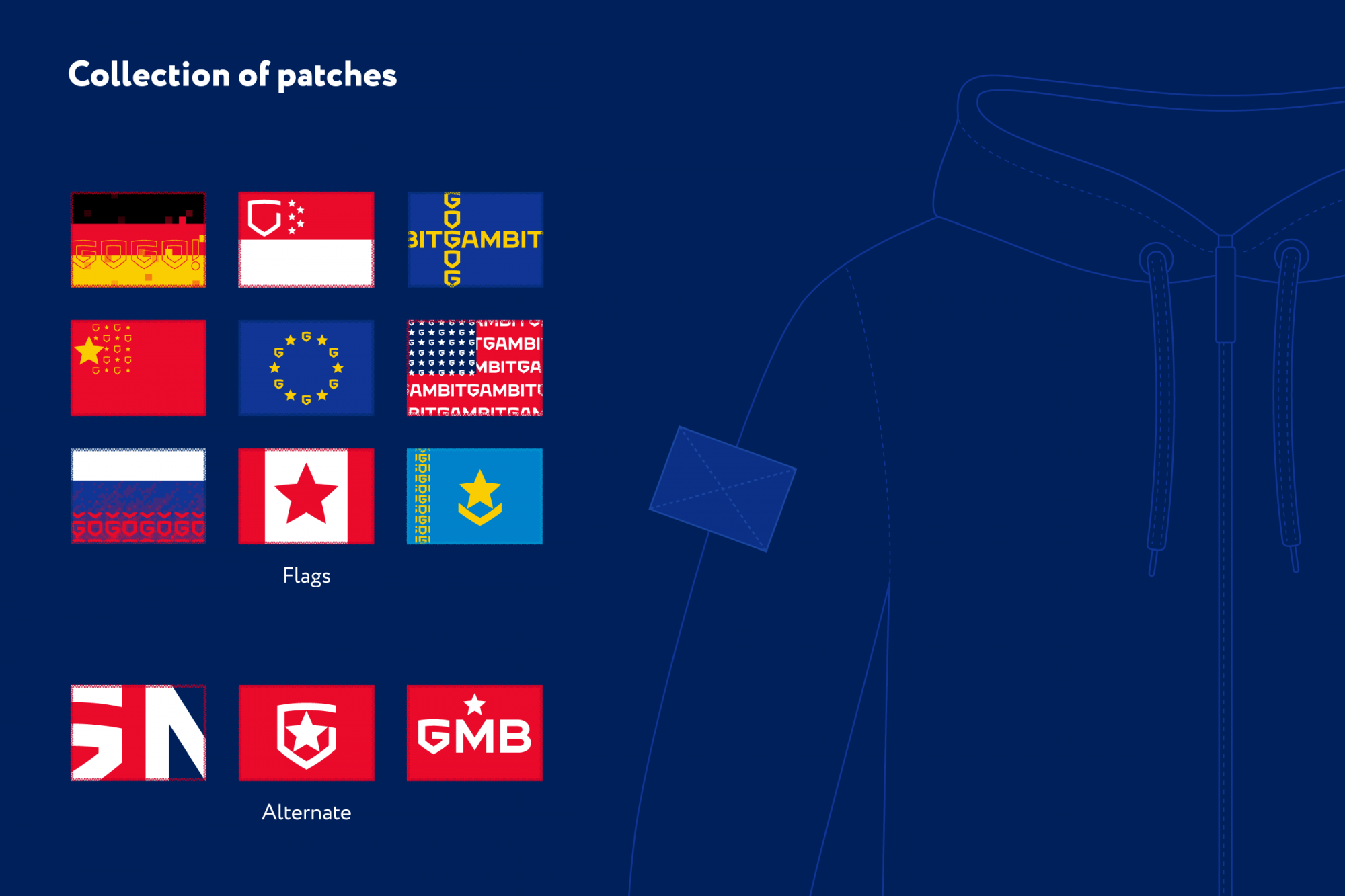
Flags have become a special trick of Gambit’s corporate identity. They make up the quintessential flexibility of the new style. Crafted entirely from style elements, the main attributes of the countries will accompany every international movement of the team, and fans can collect a set of patches.