Where the sea meets amber. The brand identity of FC Baltika
Baltika is a football club from the westernmost point of Russia. At the start of the 2025/26 season, the team from Kaliningrad has been giving the league leaders a hard time and rightfully sits among the top five clubs in the championship. Ahead of the bold team’s return to the top division, the studio carried out a major refresh of the club’s identity and developed a concept for a new logo.
Медиа:
Медиа:
Заголовок:
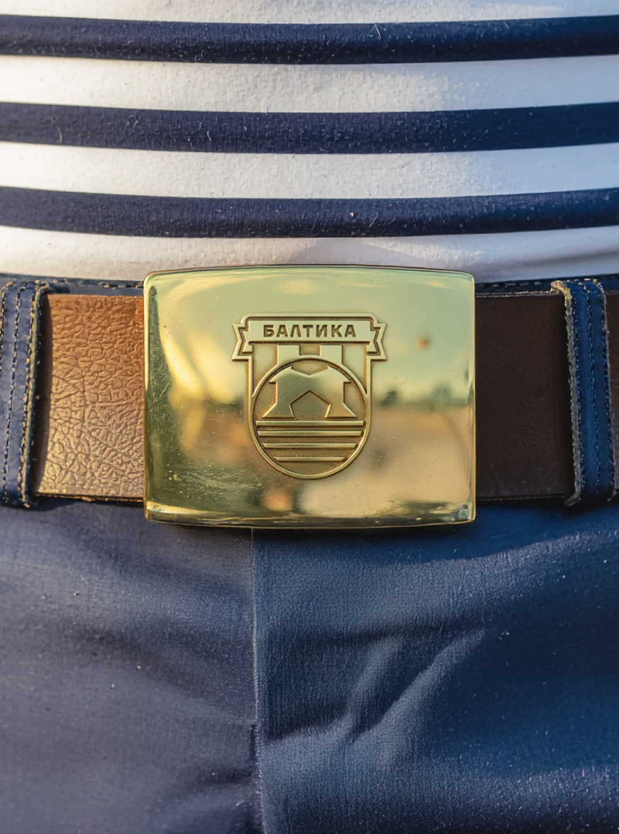
Logo concept
Текст:
Heritage and respect for history are reflected in the compositional rhyme referencing the coat of arms of the old city of Altstadt, which later became known as Königsberg and eventually Kaliningrad.
Baltika’s emblem has remained largely unchanged since 1997. As design evolves alongside the sport itself, the studio’s proposed update introduces several enhancements.
Медиа:


Медиа:
Текст:
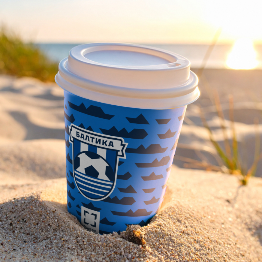
The ball has been corrected to a true circular shape and precisely aligned within the geometry of the shield. The central panel of the ball is lifted slightly upward in an optimistic gesture and placed above the waterline.
The refreshed version preserves the key elements and overall structure of the classic emblem, while harmonized line weights make the mark cleaner and more balanced.


Медиа:
Заголовок:
Club palette
Текст:
Baltika stands for the sea and its waves, represented by marine navy blue, cool bright blue, and white. Another strong association with Kaliningrad is expressed through warm amber and sandy tones. These combinations bring flexibility to the club’s signature patterns.

Signature typeface
A modern Cyrillic typeface developed locally, it reflects a contemporary view on the form and rhythm of characters. Among its defining traits are a geometric, almost engineered structure and a high degree of versatility provided by an extensive set of glyphs and symbols.

Медиа:
Заголовок:
Patterns
Текст:
The beaches along the Baltic Sea are a major attraction of the Kaliningrad region, and they inspired a caustic pattern that captures how sunlight plays across the surface of the water.
Медиа:


Медиа:

Медиа:
Текст:
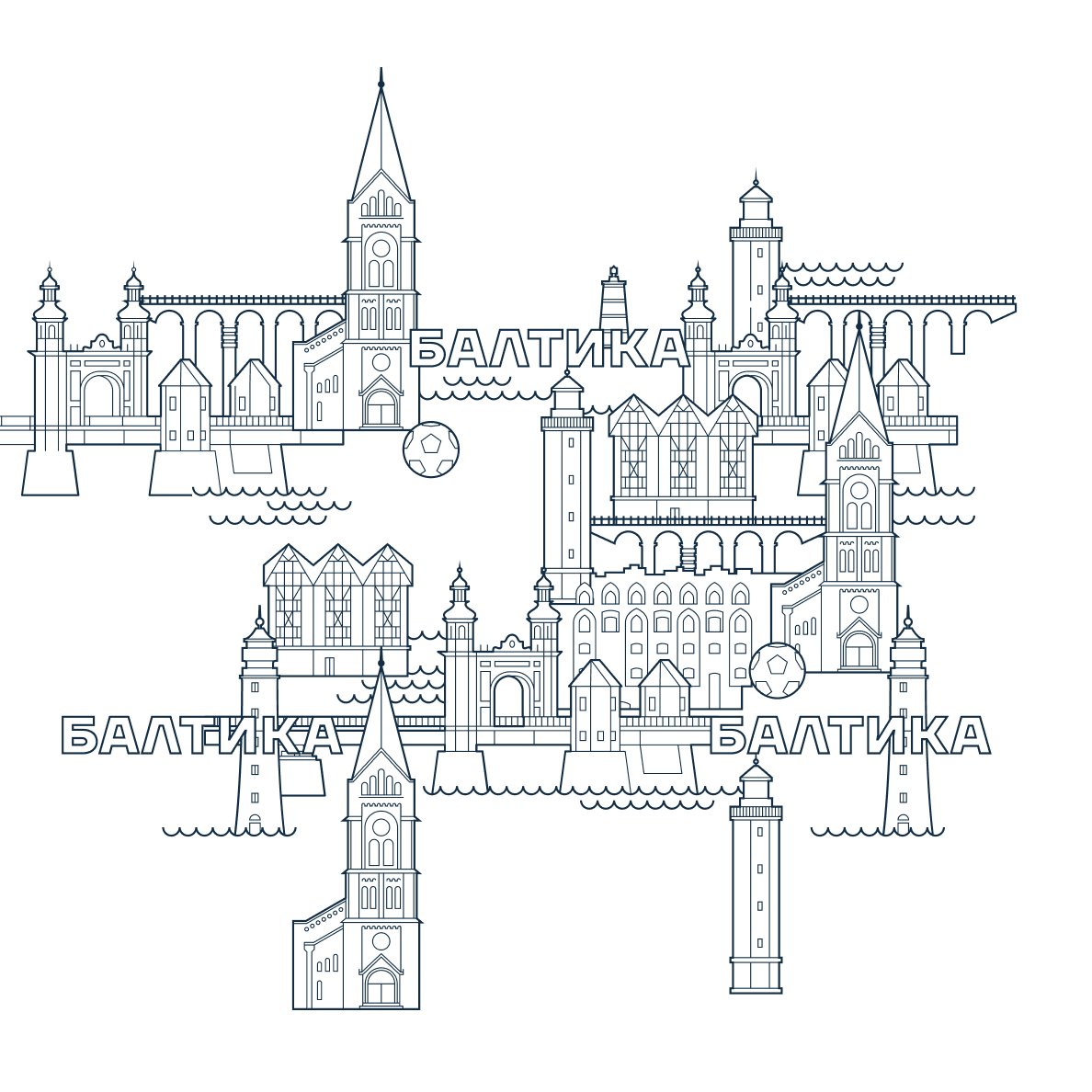
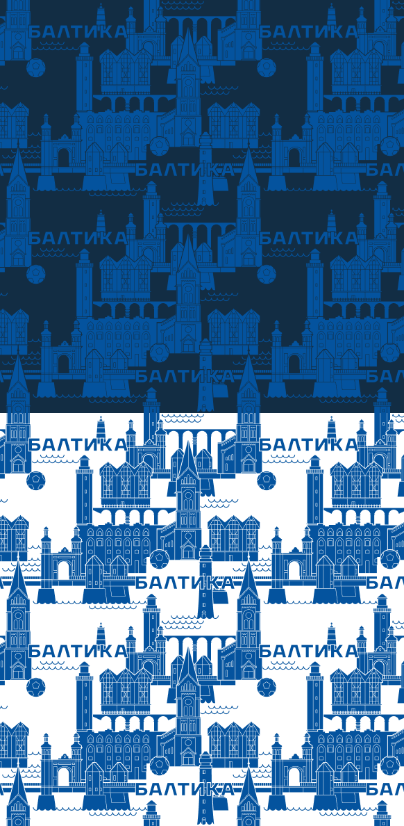
Kaliningrad today is one of the key tourist destinations in Russia, a fact highlighted in the city pattern. It draws from silhouettes of the city’s unique architectural landmarks — the Church of St. Michael the Archangel, Ragnit Castle, Queen Louise Bridge, and the region’s historic lighthouses.
Медиа:


Медиа:
Текст:
In the abstract wave pattern, ripples on the water encode a stylized «Baltika.»
The dynamic abstract motif called «Movement» can be shifted to represent players’ motion on the field, with optional outlining.


Медиа:

Медиа:
Текст:
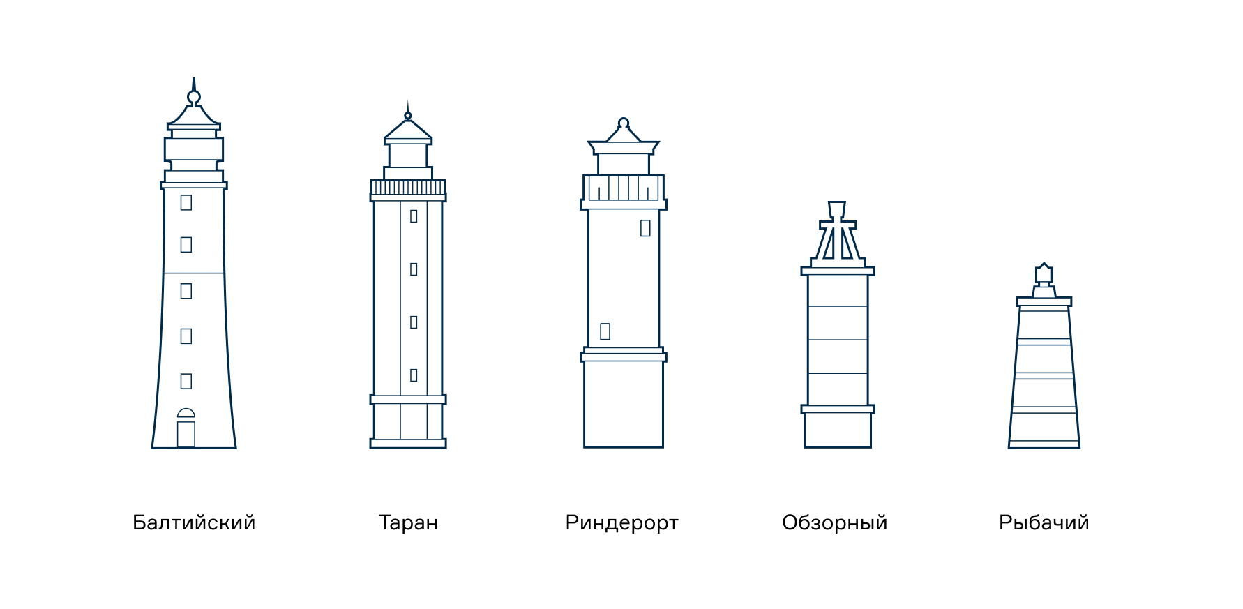
The maritime theme continues through geometric structures and lighthouses — recognizable, romantic symbols of guidance for travelers.

Медиа:


Медиа:
Текст:
The high-tech naval pattern, «Fleet,» reflects the work of Baltika’s title sponsor, Rostec, and can be used in joint activations. The design incorporates the corporation’s signature geometric style.
Медиа:

Текст:
The club’s marketing team now has two holiday patterns, combining classic festive motifs with nautical elements through an accent color.
Медиа:


Медиа:
Заголовок:
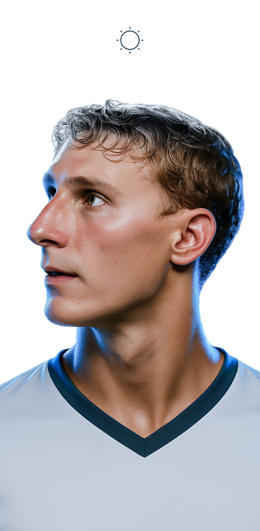
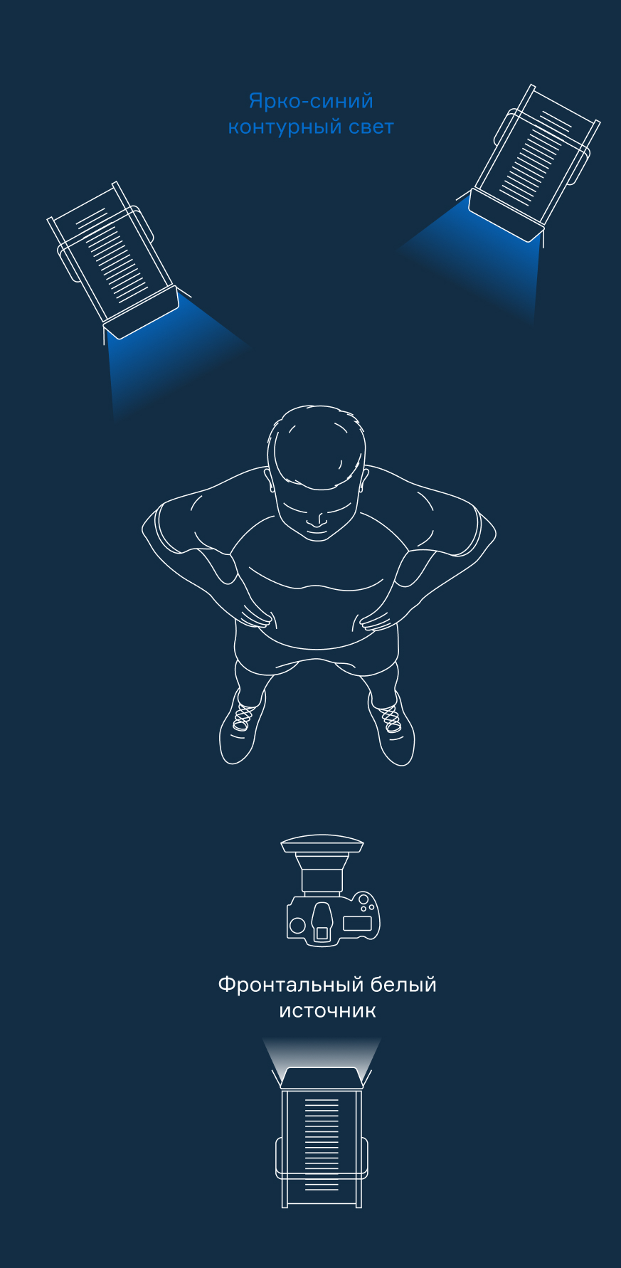
Photographic style
Текст:
The club’s new guidebook includes recommendations for visual style, including lighting setups for photographing players and staff.

Медиа:
Заголовок:
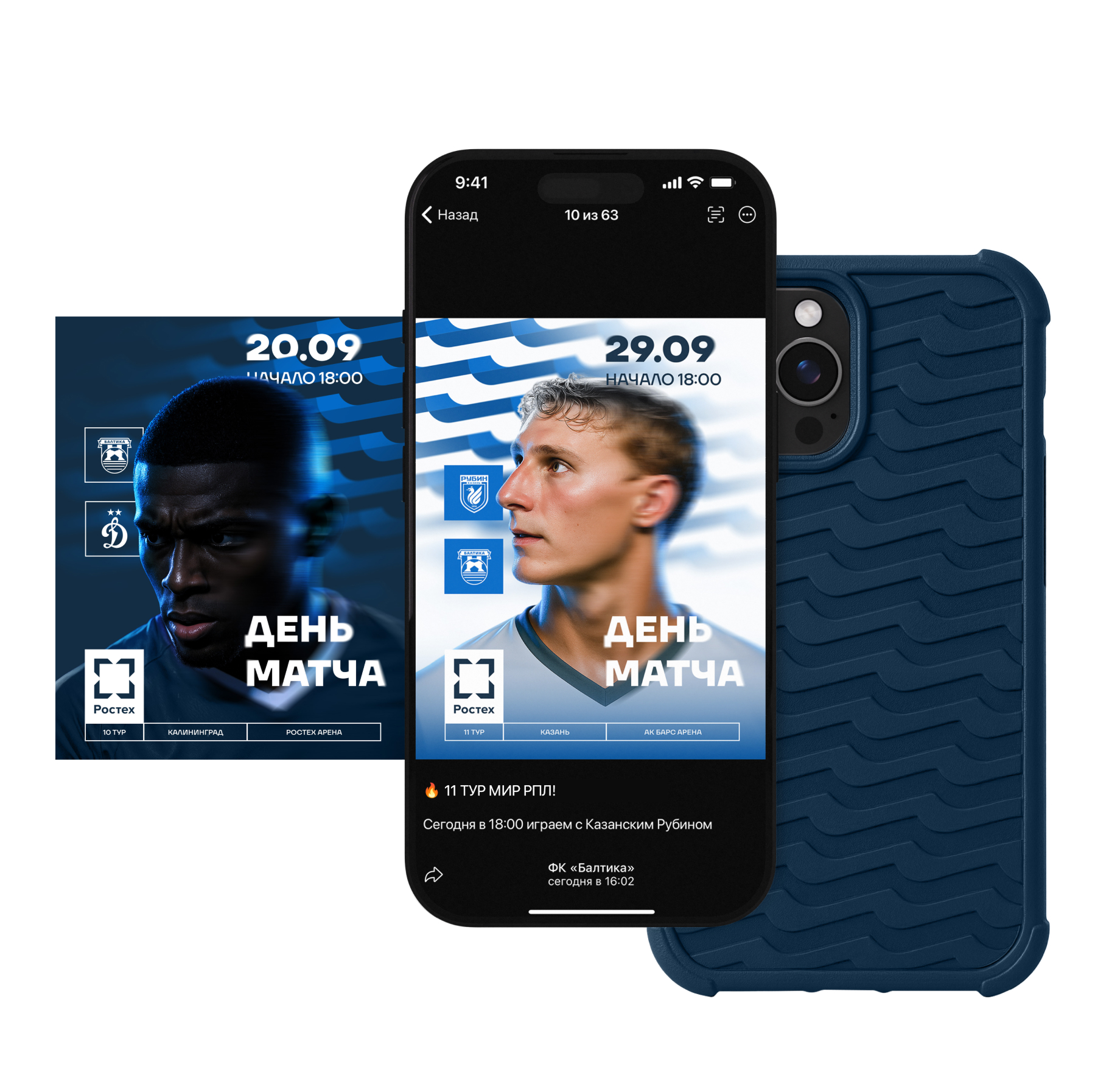
SMM templates
Текст:
Baltika’s digital content for social media is presented in two versions — for home and away matches. The signature wave pattern can also be used for club merchandise. A phone case with this pattern can easily become a stylish everyday accessory for fans.
Медиа:


Медиа:

Медиа:


Медиа:

Медиа:
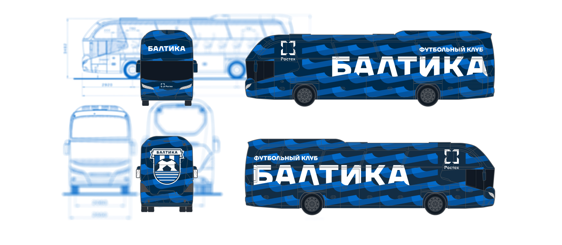
Заголовок:
Club bus
Текст:
in transit, features the distinctive wave pattern with the club’s name placed between the crests.
Медиа:
Заголовок:
Process


Медиа: