Hockey logo of the Kazakhstan Federation
LOGO • SUBLOGO • FONTS WORK • GUIDS
In 2019, the Kazakhstan national ice hockey team made it to the top division of the Ice Hockey World Championship, where Russia, Finland and the United States were already waiting. In hockey you need to enter such an elite company with confidence and dignity, so Quberten studio has prepared a rebranding of the emblem of the Kazakhstan Hockey Federation and the national team itself. Updates have been needed for a long time.
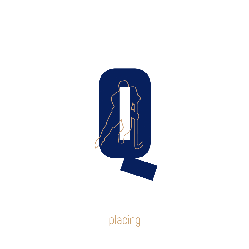
Turning 'Q' into a recognizable symbol of Kazakhstan's ice hockey
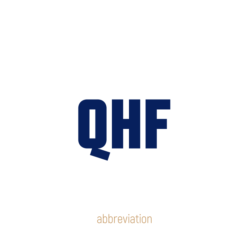
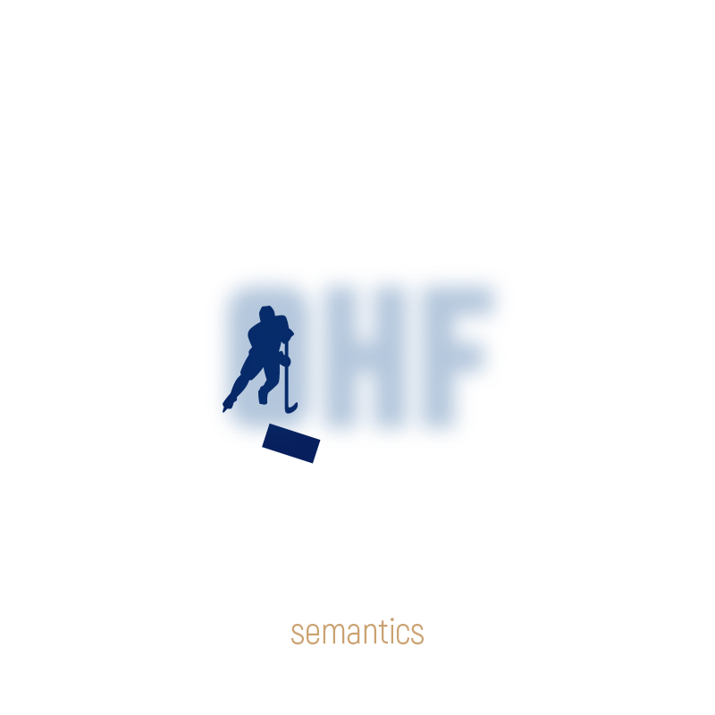
Kazakhstan is gradually switching to the Latin alphabet, so the new identity of the federation is built around the abbreviation QHF, which will be easily read both in and outside the country, and most importantly by the international audience of the World Championship.
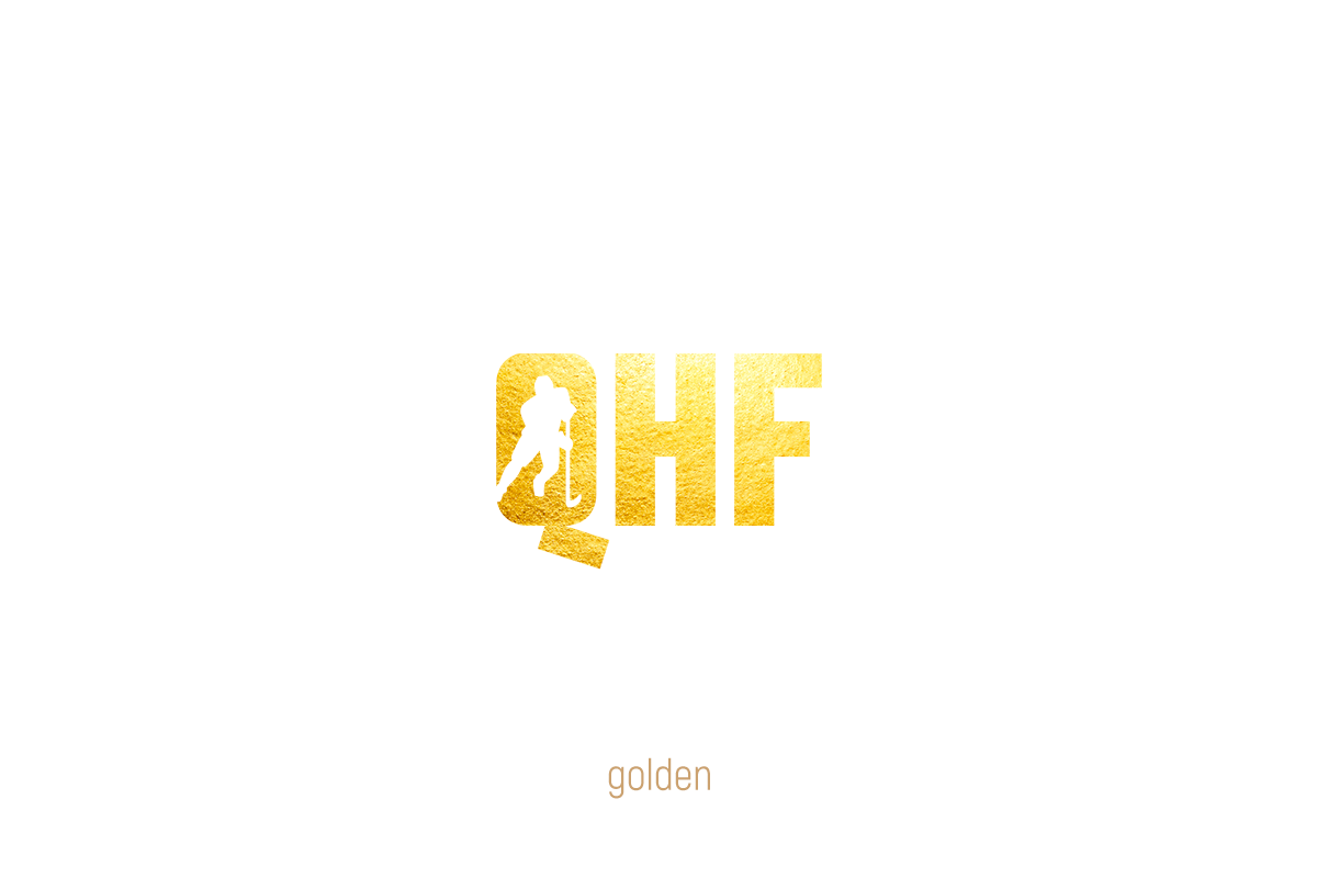
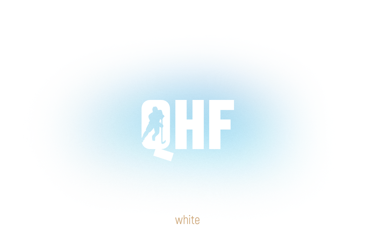
The key element is the letter 'Q'. It has nothing to do with notable hockey teams, so Kazakhstan will get a stable association in addition to the emblem. Recognition will be provided by a game with a negative spacing of the letter (the silhouette of the hockey player is located in it) and an original kit. In the tail of the 'Q', the puck is encrypted, flying towards the viewer from the player in the background, and the proportions and rounding make the letter look like a hockey box.
In most cases, the logo will be dark blue, but it can be done in different colours too depending on the context.
The emblem of the federation can adapt to the circumstances not only just in colour. On some media platforms, the use of a single 'Q' is allowed, and in microformats, a lightweight abbreviation will appear without the figure of a hockey player in the 'Q' counterform. Yet the logo will remain recognizable due to its proportions, tail and colour.