New style for FC Tambov
LOGO • SUBLOGO • FONTS • PATTERNS • GUIDES • PACKAGE • KITS
Promotion to the Russian Premier League (RPL) is not just a huge achievement for football clubs, but also a way to build up a club’s image. It’s wasteful to not build on this momentum while playing in the same league with clubs such as Zenit, Spartak, Krasnodar and others which are not only strong teams, but also have smart branding. Tambov clearly needs to refresh their image.

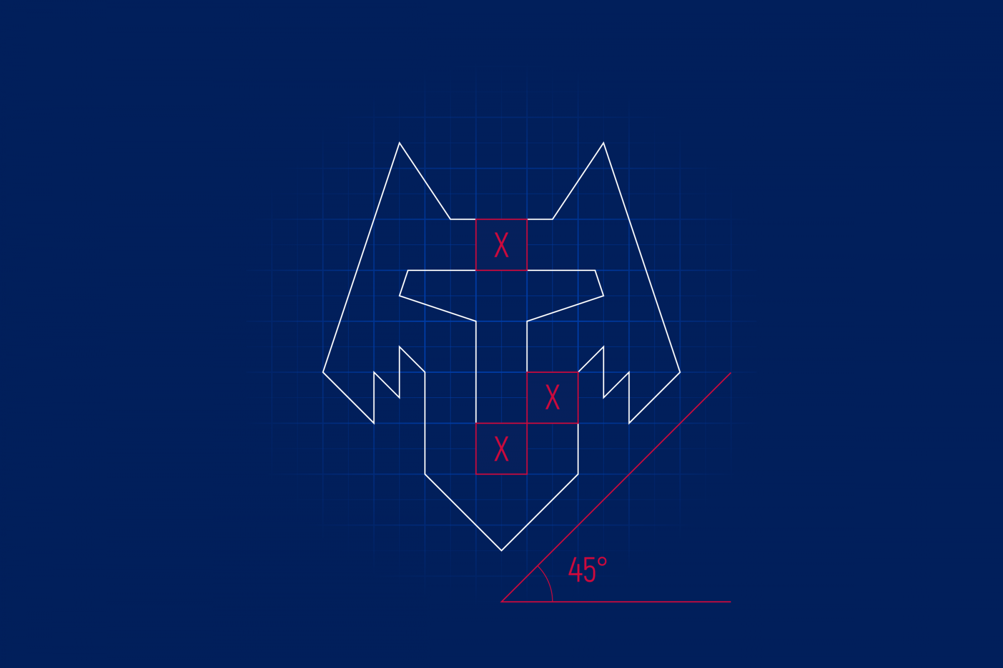
The wolf is the semantic and emotional center of the style
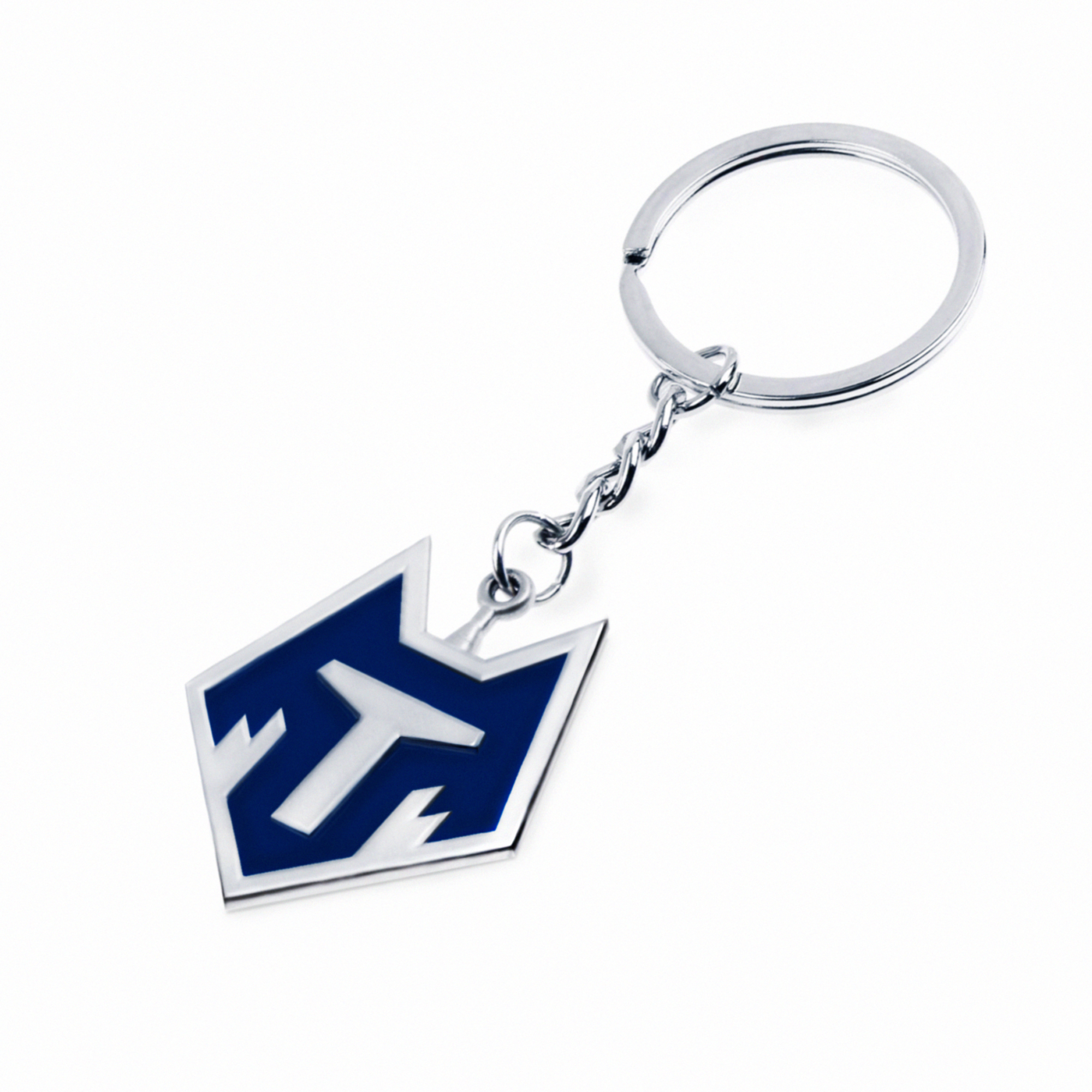
The logo is based on the wolf, the most recognizable symbol of the city, supported by folklore and doesn’t need much explaining. This is an understandable decision both from the point of view of symbolism and for the fans. The geographical reference is strengthened by the letter ’T’, formed at the intersection of the line of the wolf’s eyes and nose.
The shape of the logo, a pentagon, symbolizes one of the panels of a football. In addition to this, the traditional image of a wolf fits identically within the pentagon.
The new logo is much easier and clearer than the previous one, and this is an effective functional technique. Now Tambov’s new logo stands out on mobile apps and other small formats because it looks more simple and clean than the most of RPL clubs, many of which have logos overloaded with small elements and text blocks.

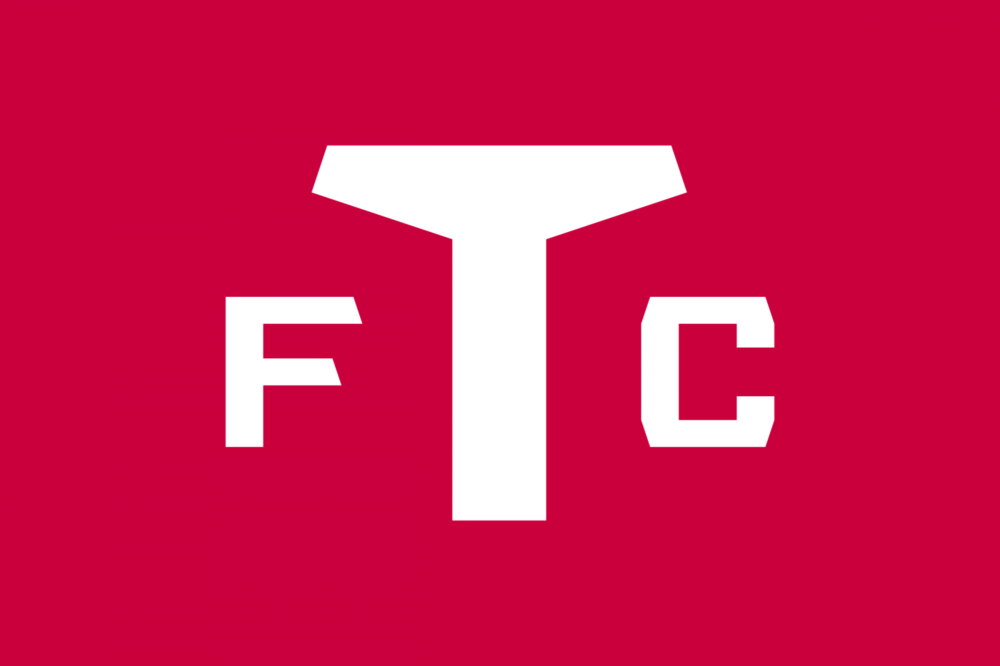
Exclusive branded lettering and color code
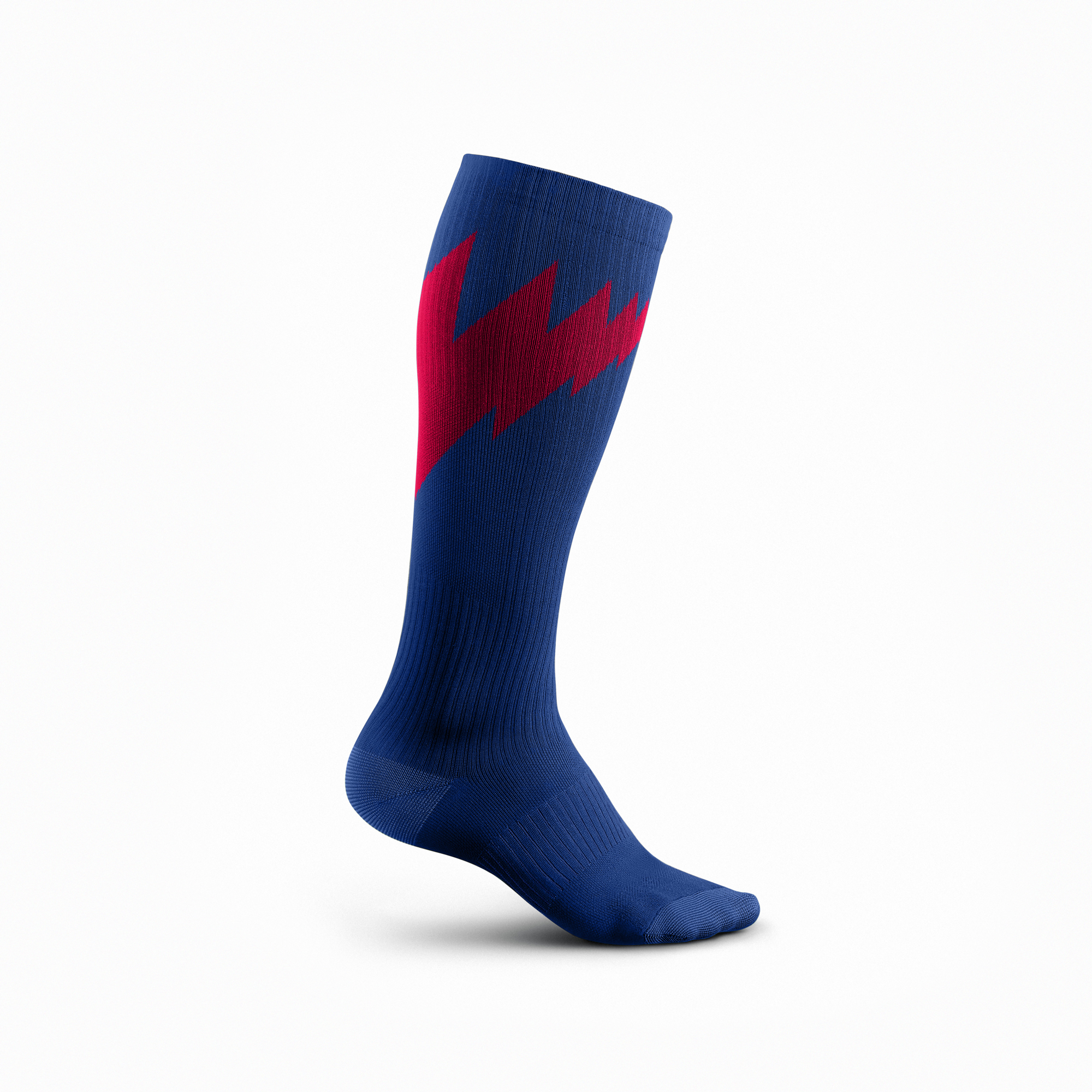
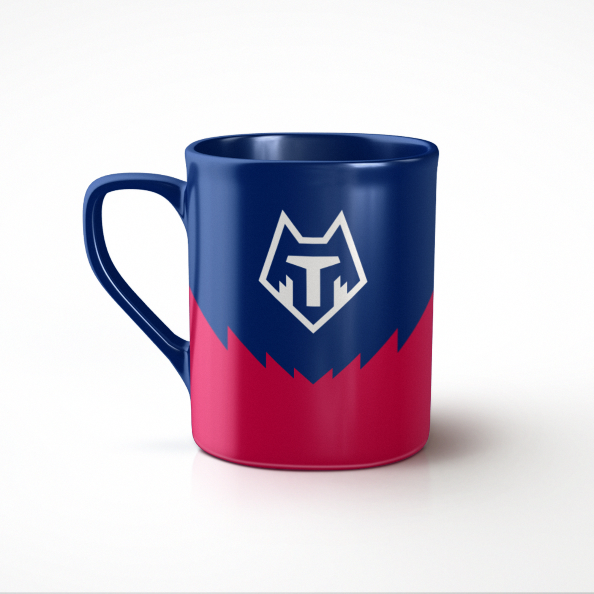
The previous logo had six colours at once, and such a wide array of colours oversaturated it too much. Now, with the advent of a full-fledged corporate identity, Tambov builds all communications around three club colours (blue, red and white), which fit in with the latest trends’ colours schemes. The unity of the style increases the recognition of the club, so the elements rhyme with each other: the lettering of Tambov is geometrically connected with the logo and the letter ’T’.

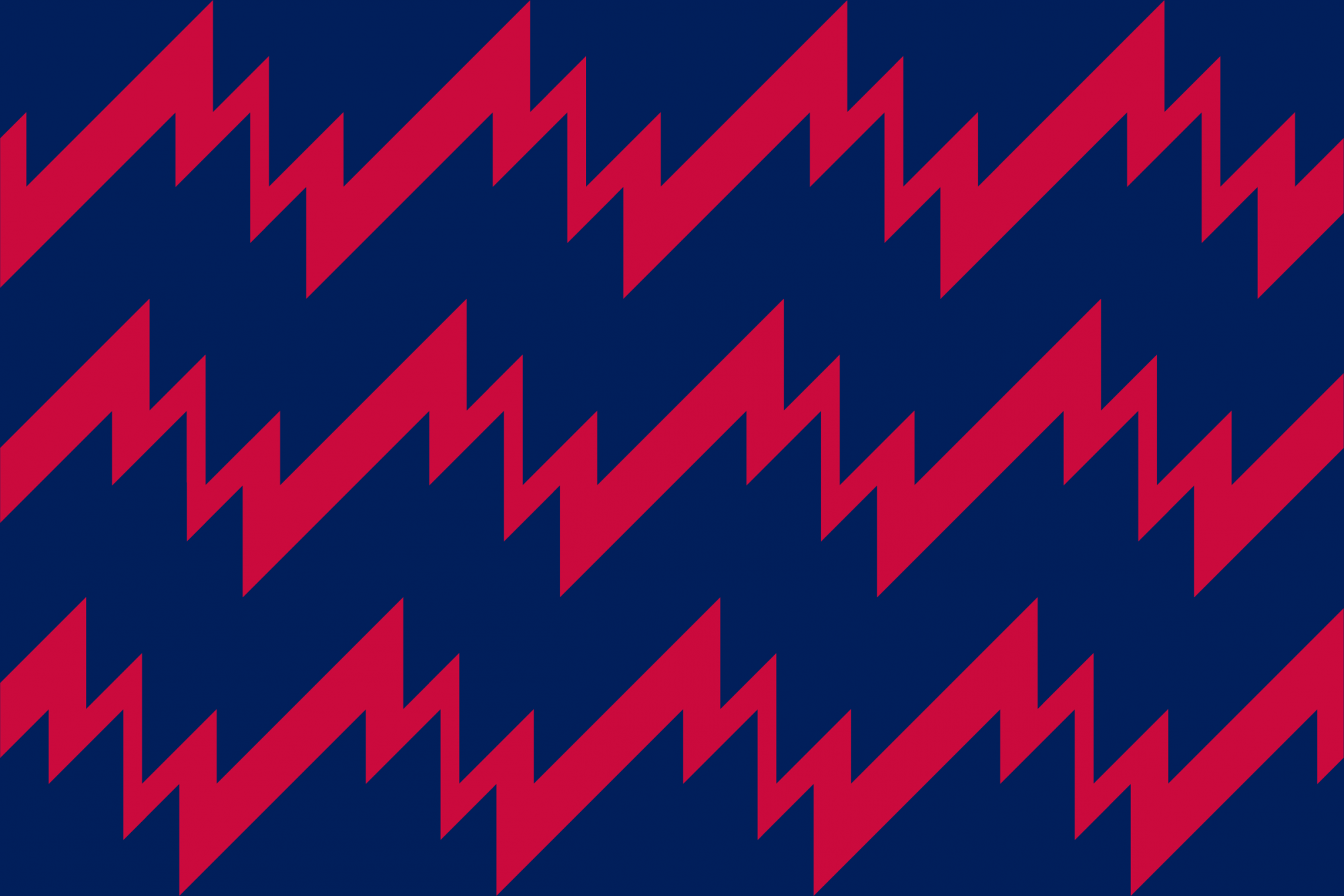
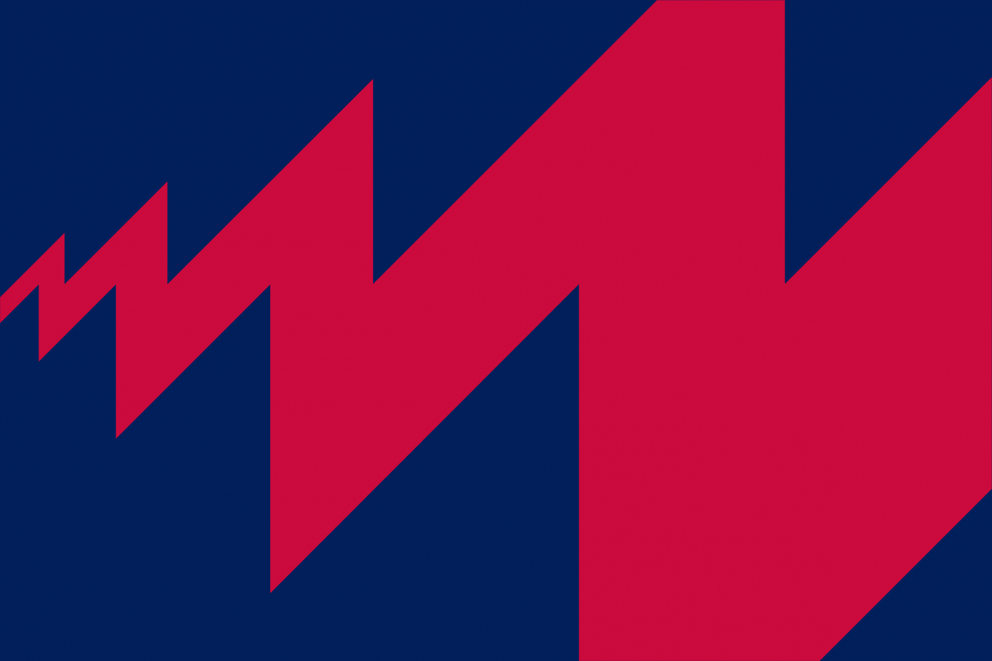
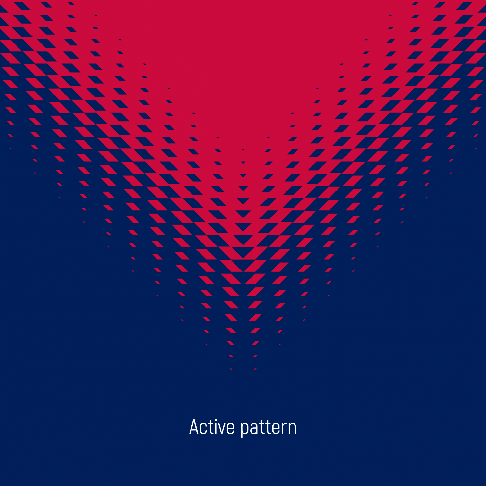
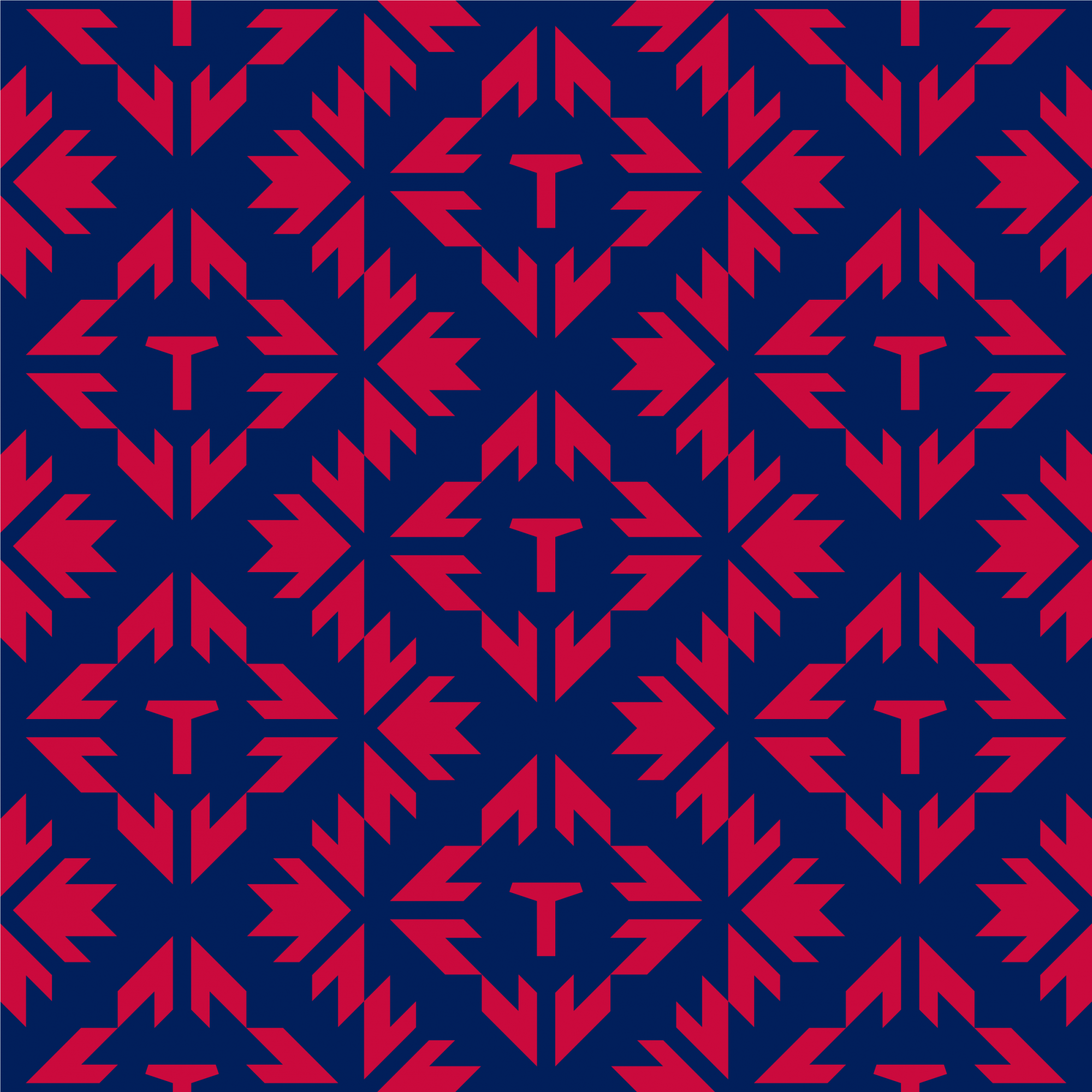
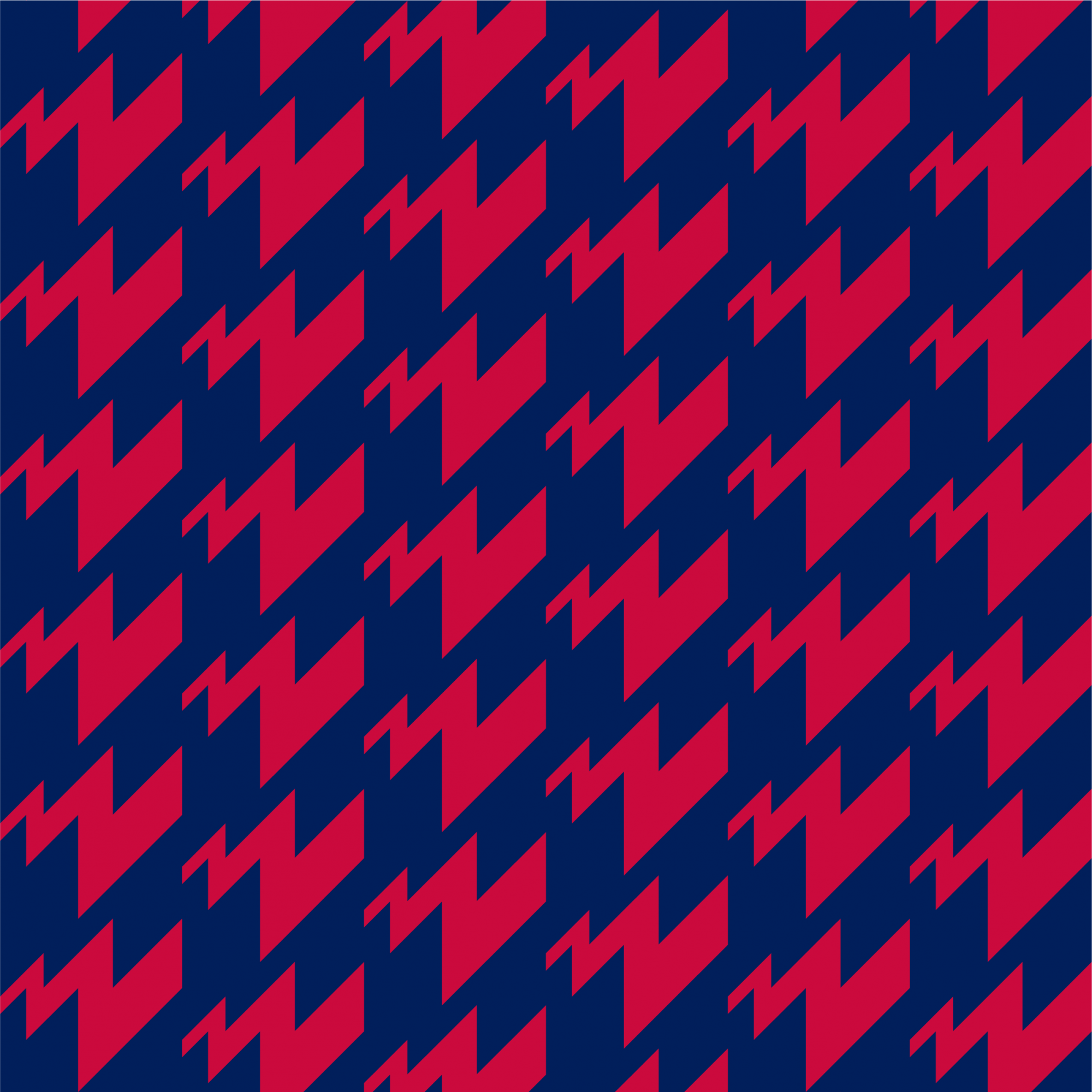
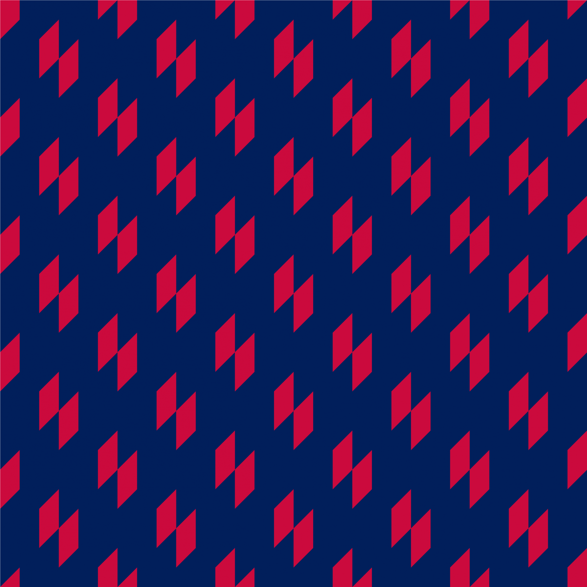
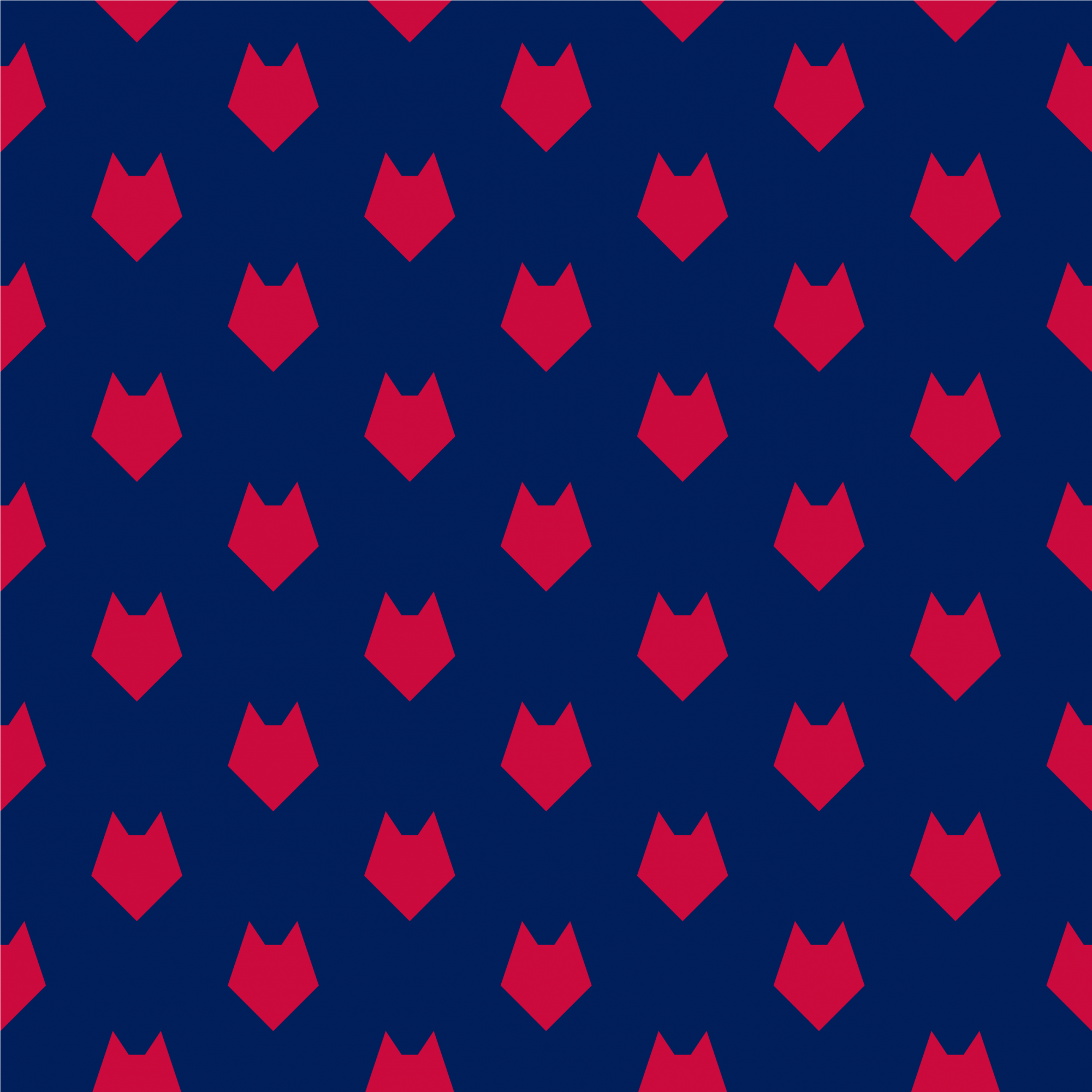
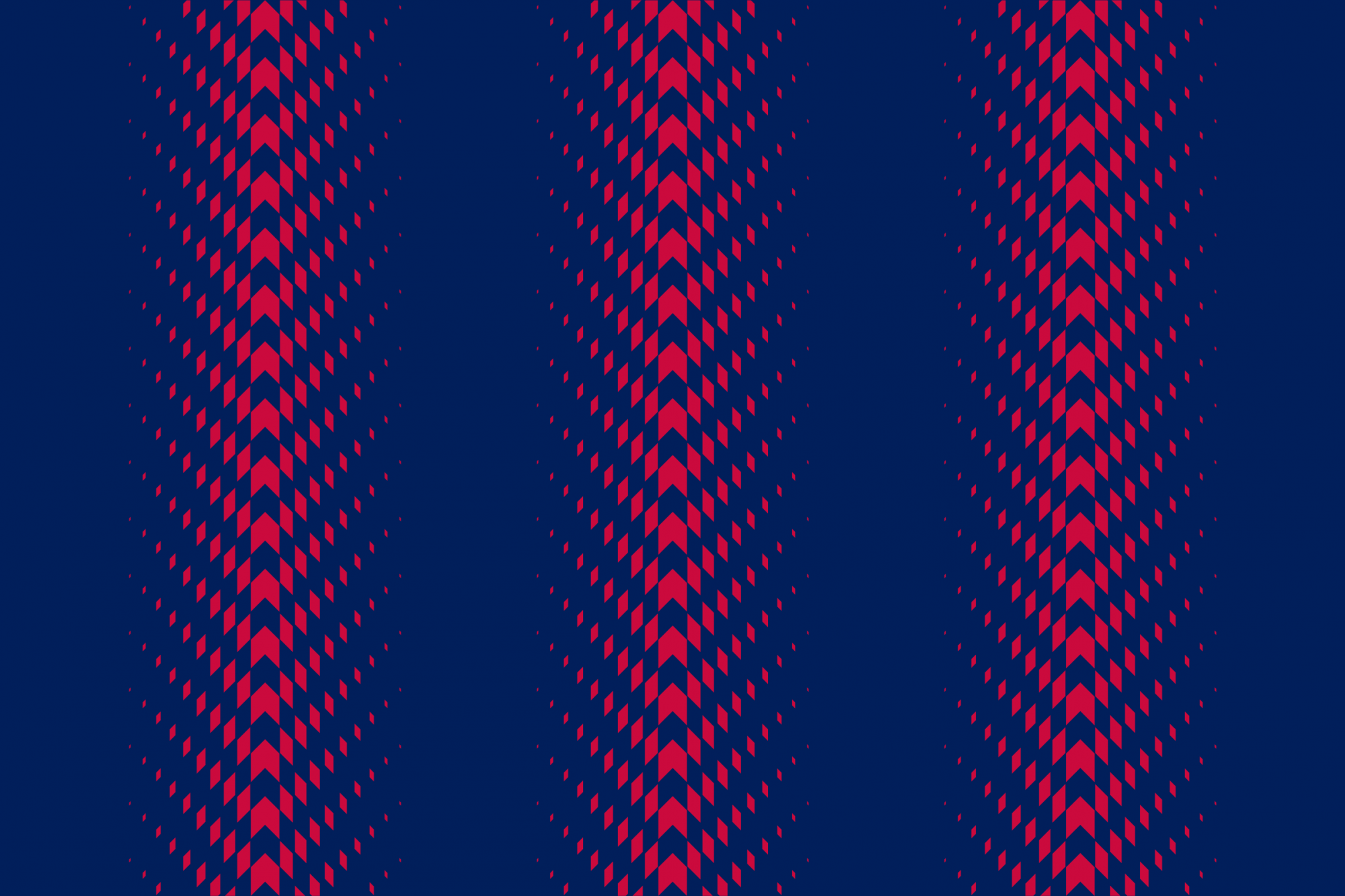
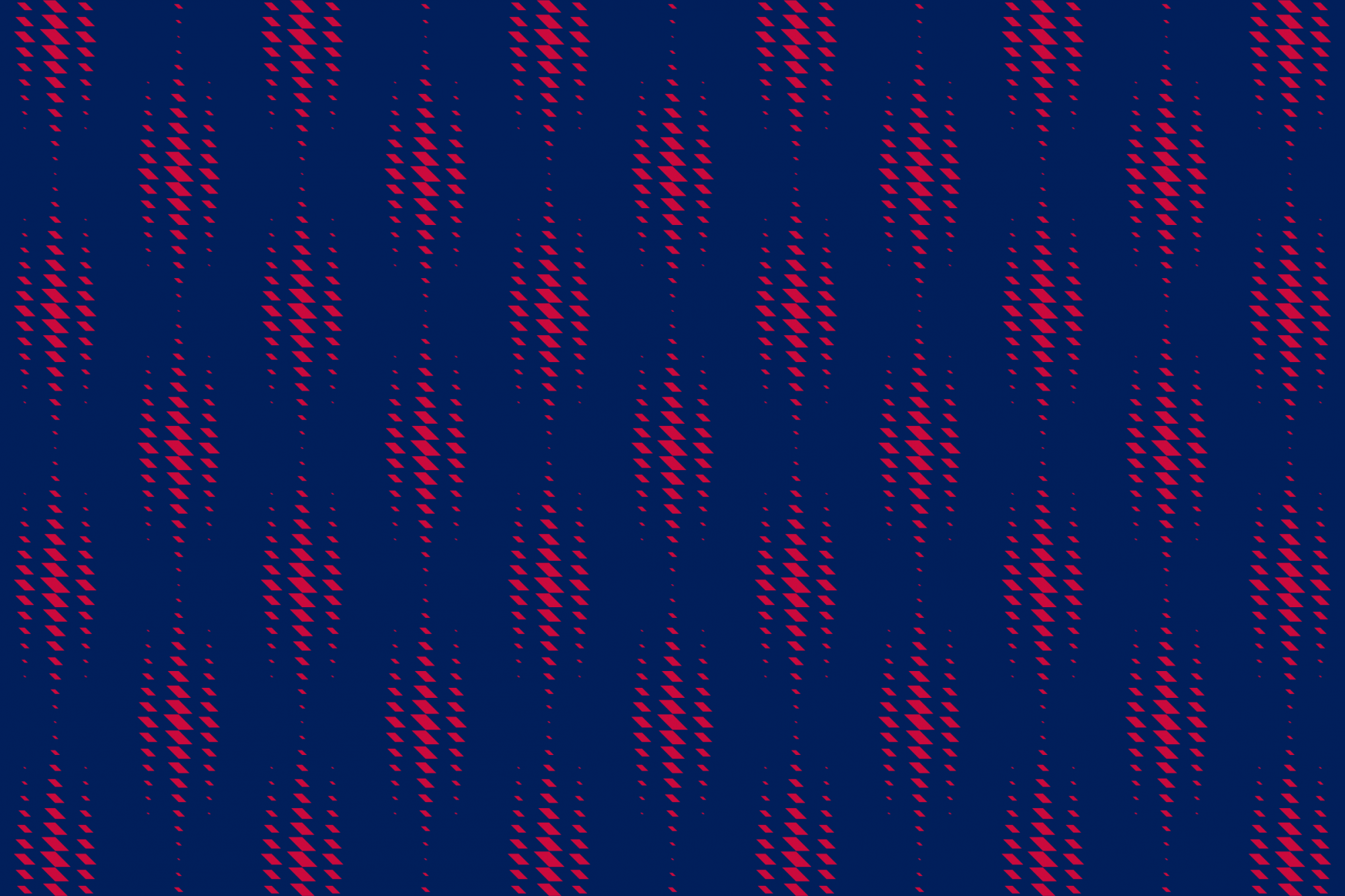
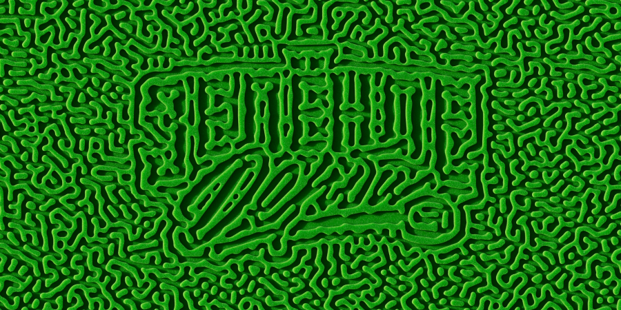
Wolf patterns as a way to strengthen the identification of the club
The club should be recognizable not only by its kit or basic attributes, but also by other media forms; from a quote template on social networks, to its packaging in the club store. Thanks to various patterns, you can think through the design to the smallest details.
In any space where you need to quickly focus your attention, Tambov can use dominant active patterns based on wolf attributes: wool, teeth and scratches. There are no such visual solutions in the RPL, so the team from Tambov can’t be confused with anyone. An impressive set of patterns also includes seamless and background variations.