Always in the Game: Primera’s Brand Identity
PRIMERA is a sportswear brand creating performance gear for athletes at every level — from ambitious amateurs to seasoned pros. Driven by innovation and a modern outlook, the brand helps athletes push their limits and chase new personal bests.
PRIMERA isn’t just about making gear — it’s about building meaningful collaborations and leaving a mark on the game. To capture this spirit, the brand teamed up with Quberten Studio to develop a bold visual identity, complete with a fresh logo, signature style, and supporting design elements.
Медиа:
Медиа:
Заголовок:
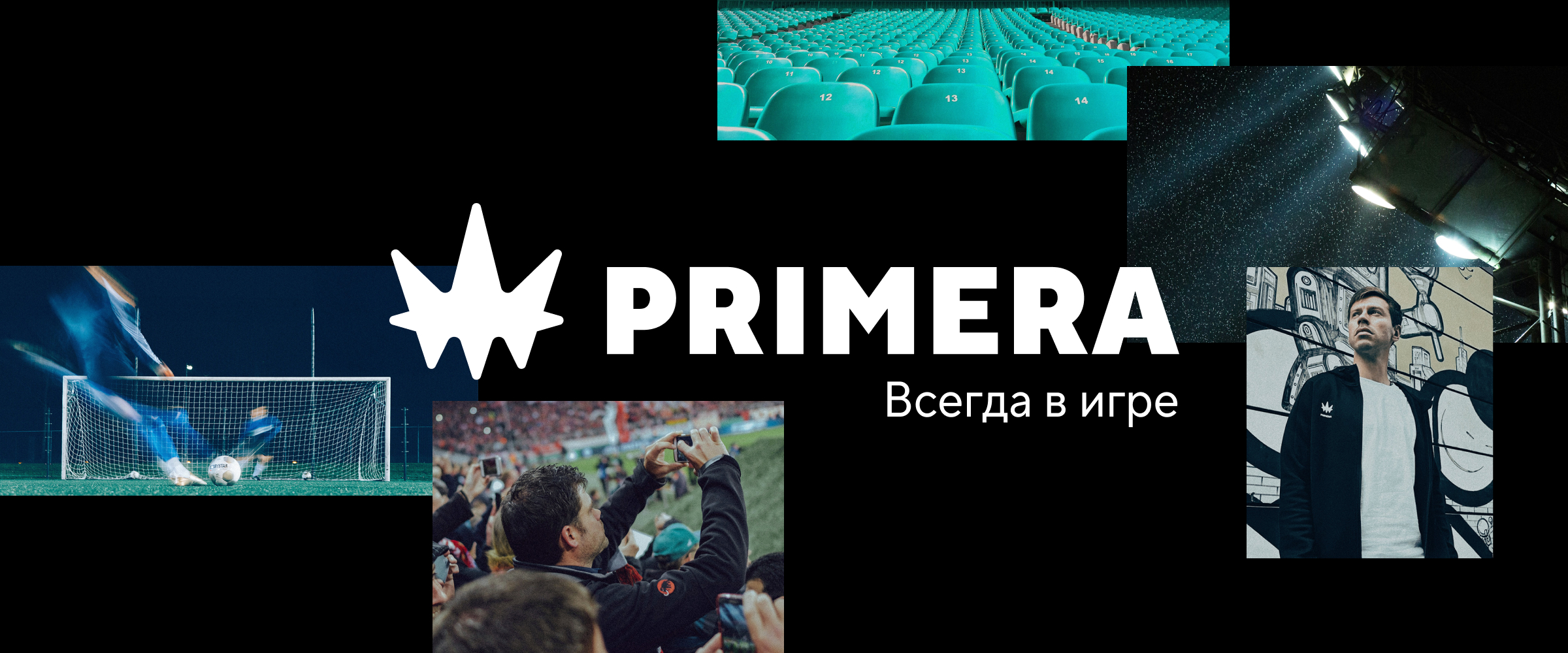
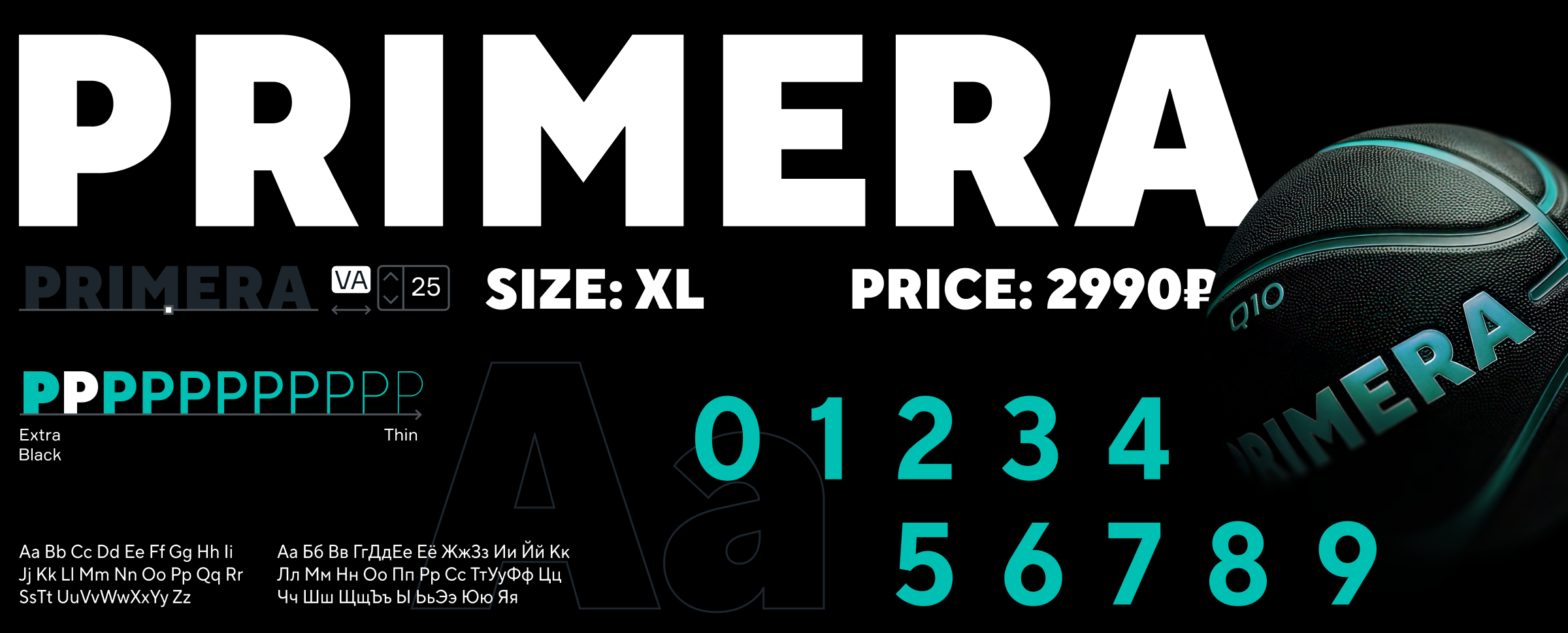
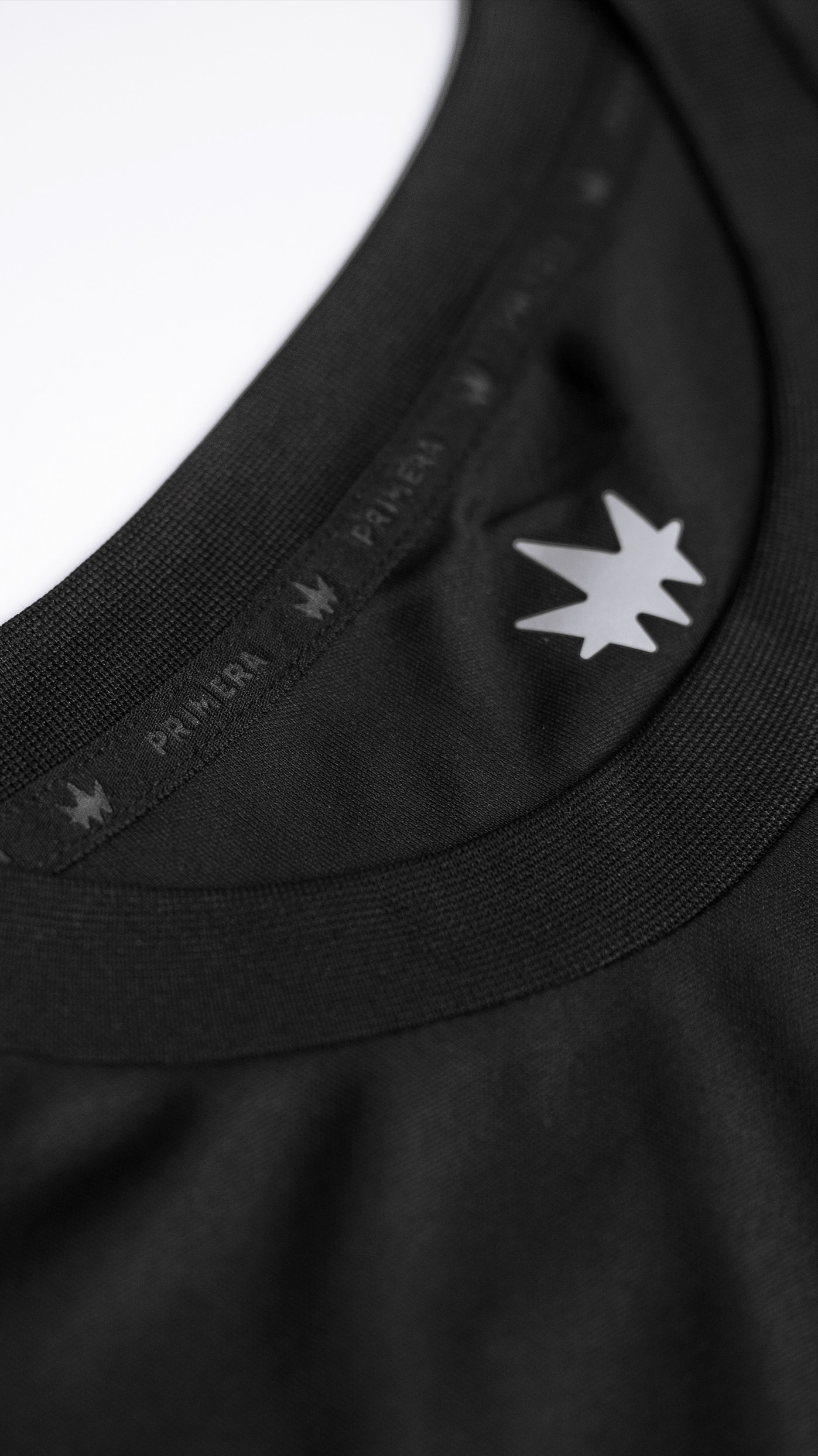
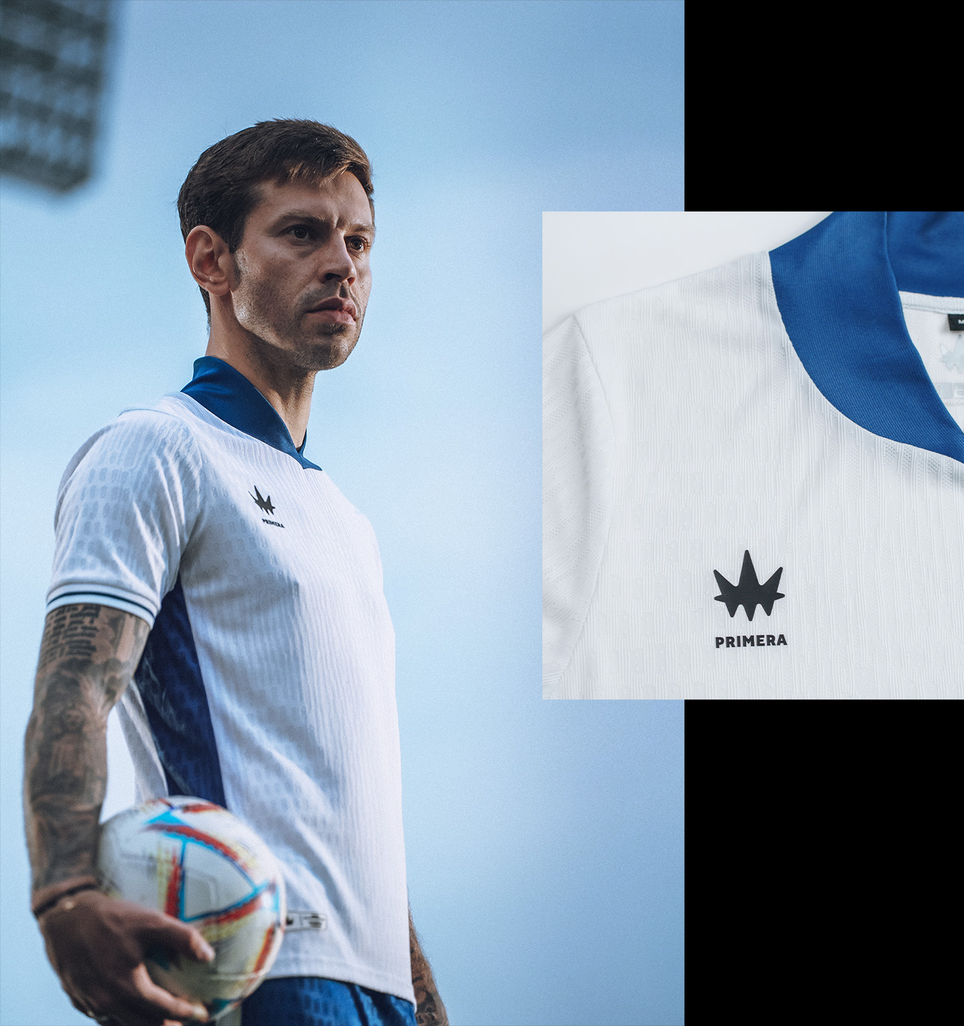
Logo
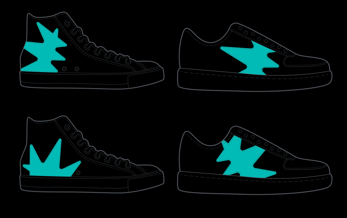
Текст:
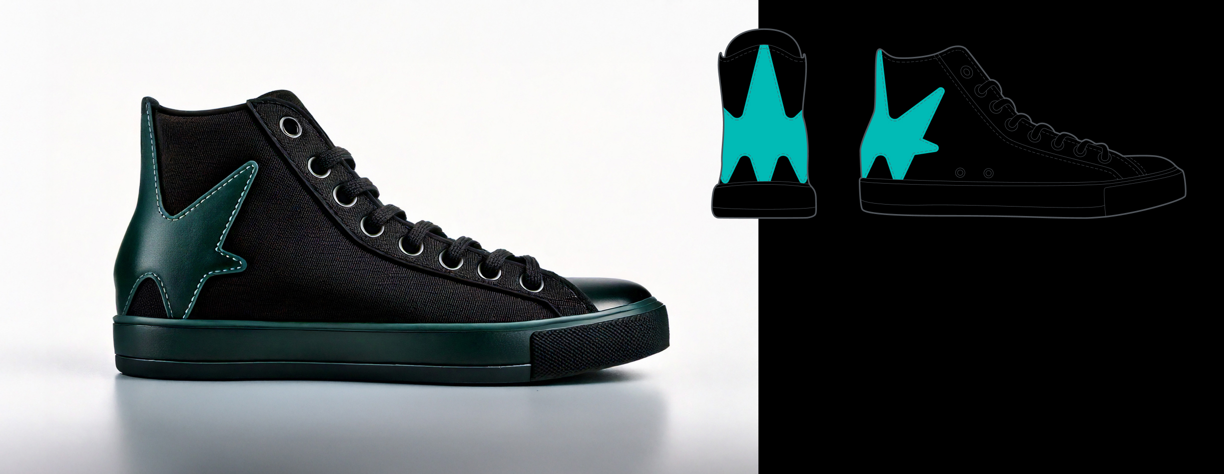
The logo brings together two powerful symbols of sporting success — a crown and a winner’s podium. Its sleek, futuristic shape represents more than just victory; it’s a symbol of ambition and forward momentum. It speaks the visual language of technology, energy, and relentless drive.
Медиа:
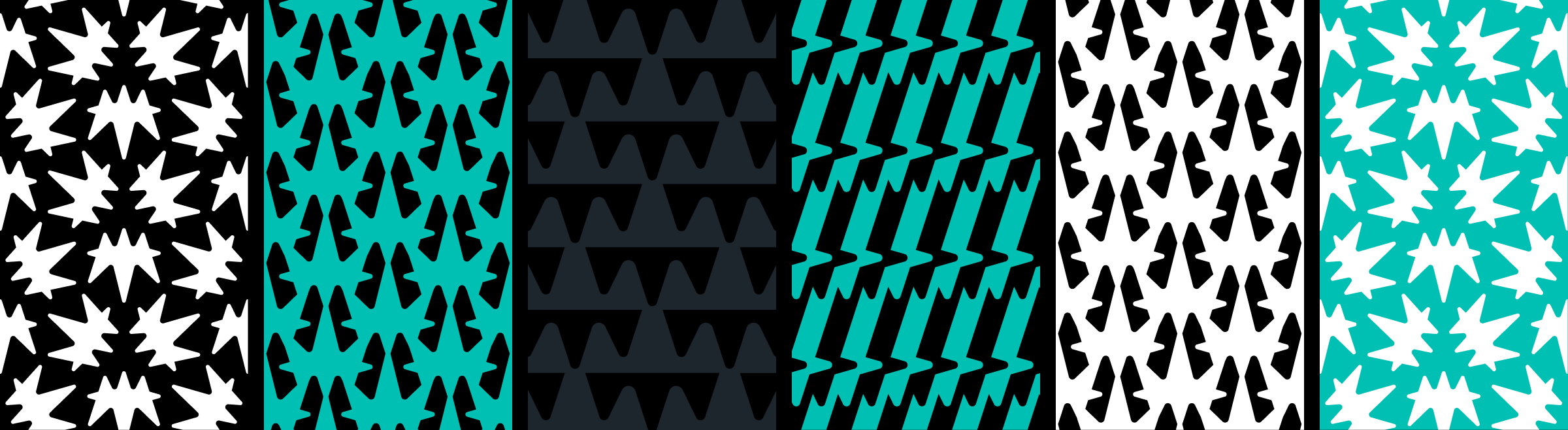
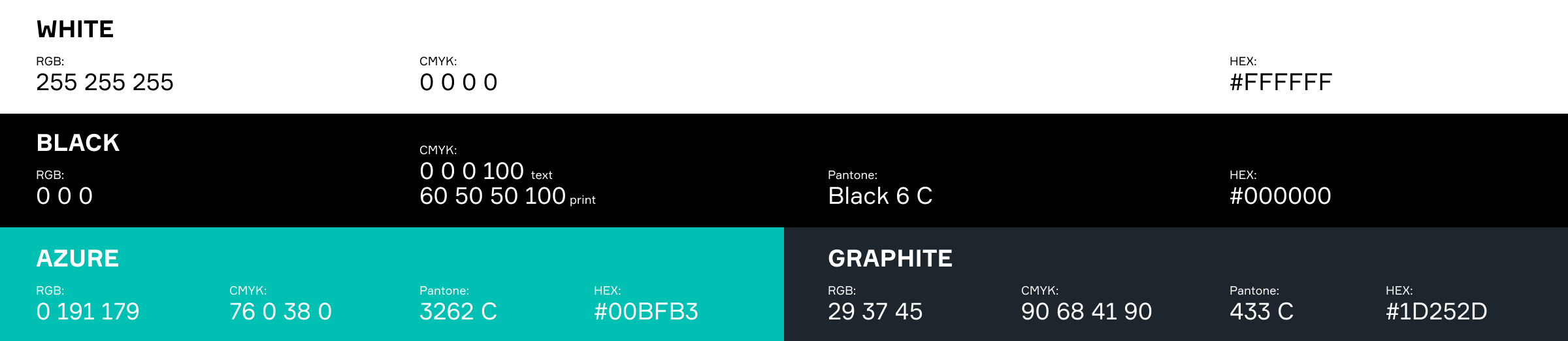
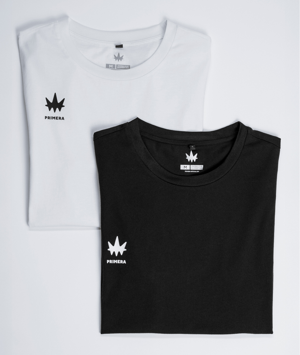
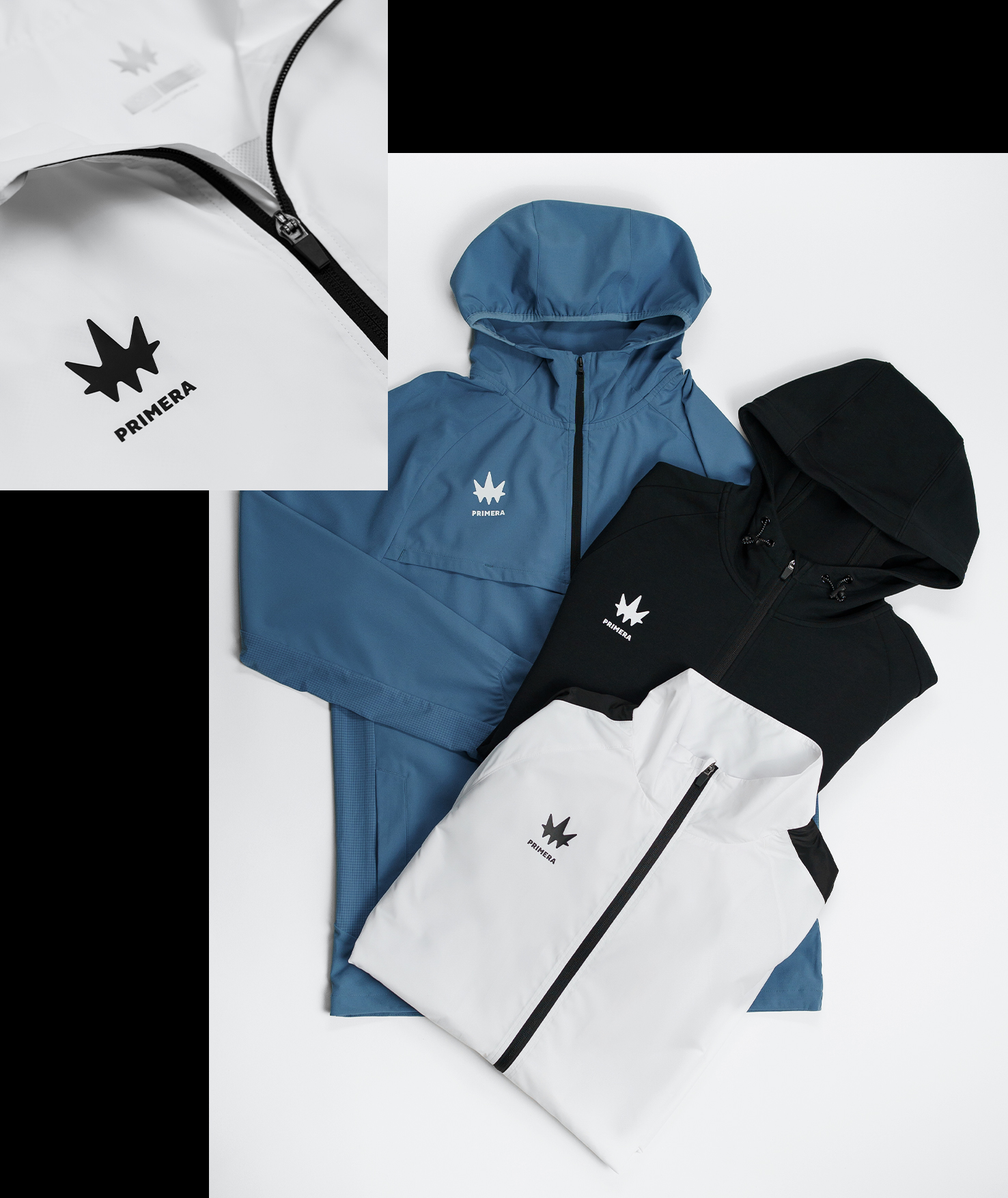
Colors
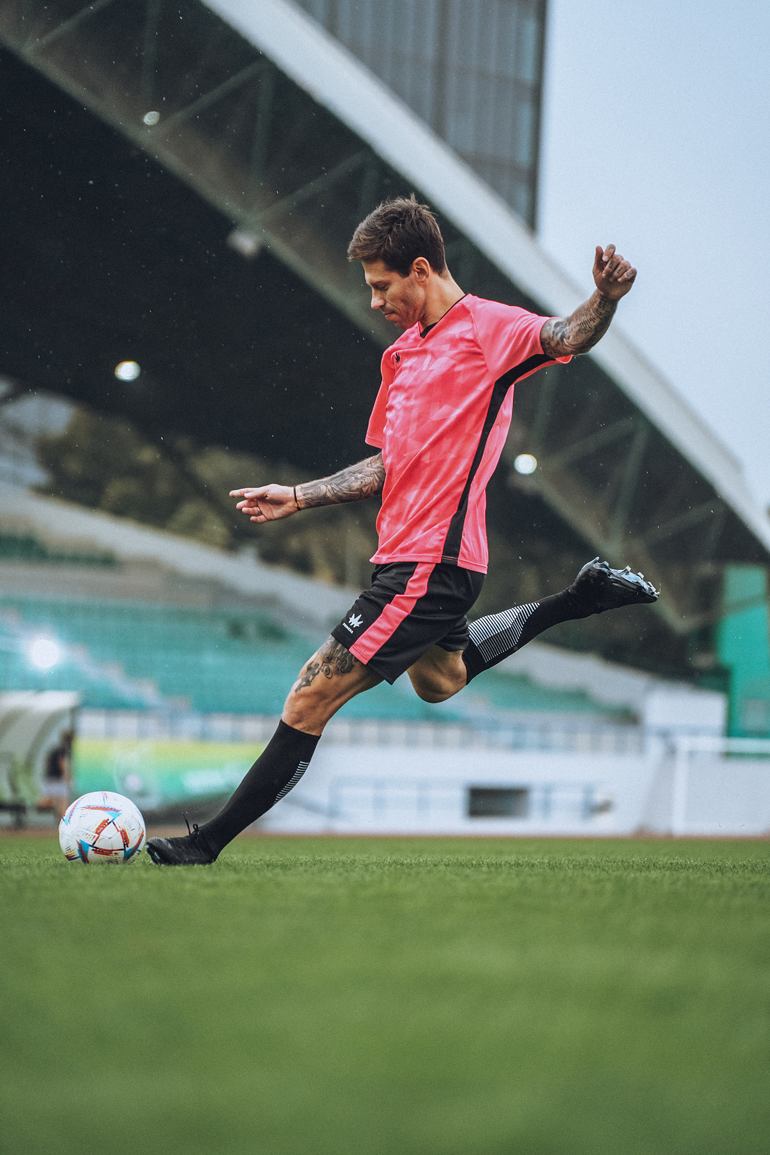
PRIMERA’s core palette features azure blue, white, black, and gray. But as a brand that outfits a variety of teams and projects, flexibility is built into the system — the color scheme can be tailored to complement each partner’s unique look.
Медиа:
Медиа:
Медиа:
Медиа:
Медиа:

Медиа:
Медиа:
Медиа:
Заголовок:
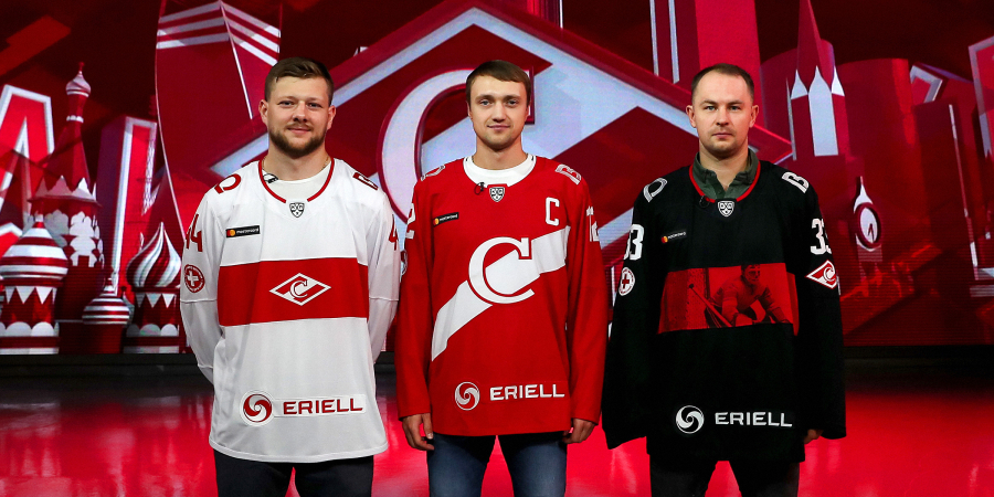
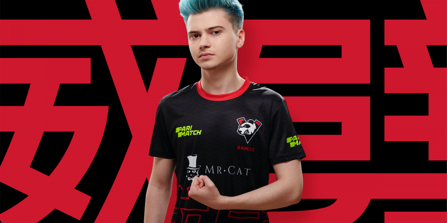
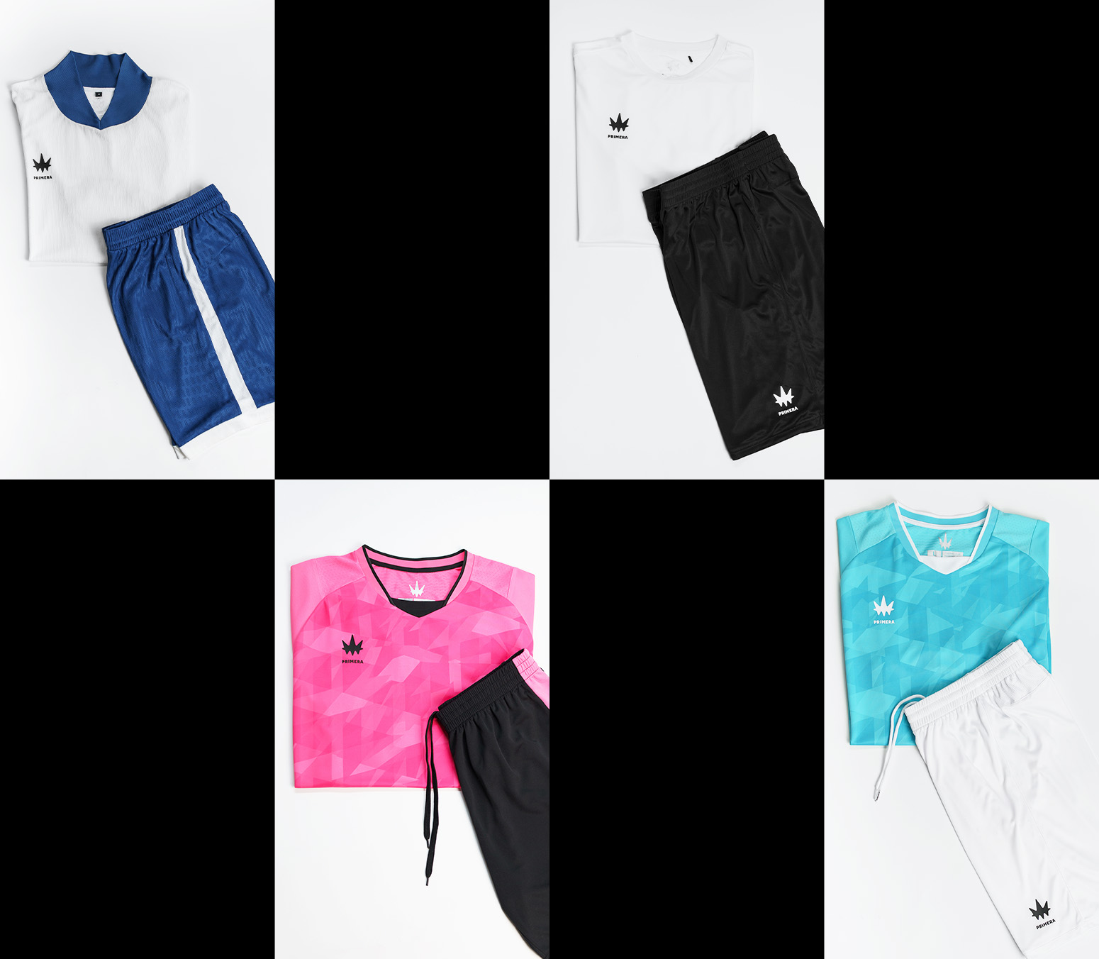
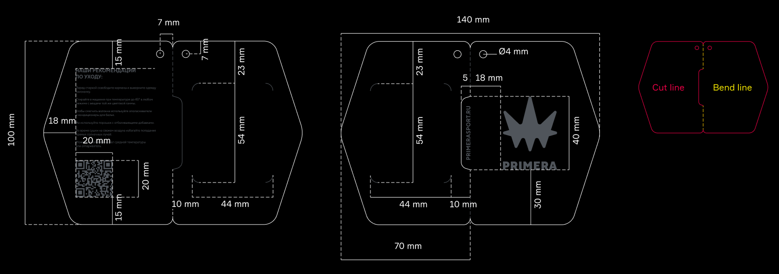
Brand applications
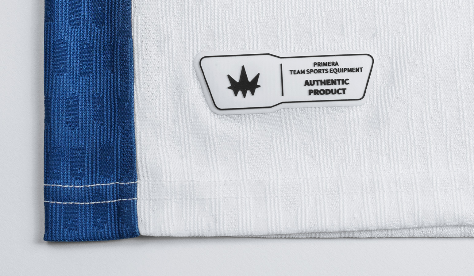
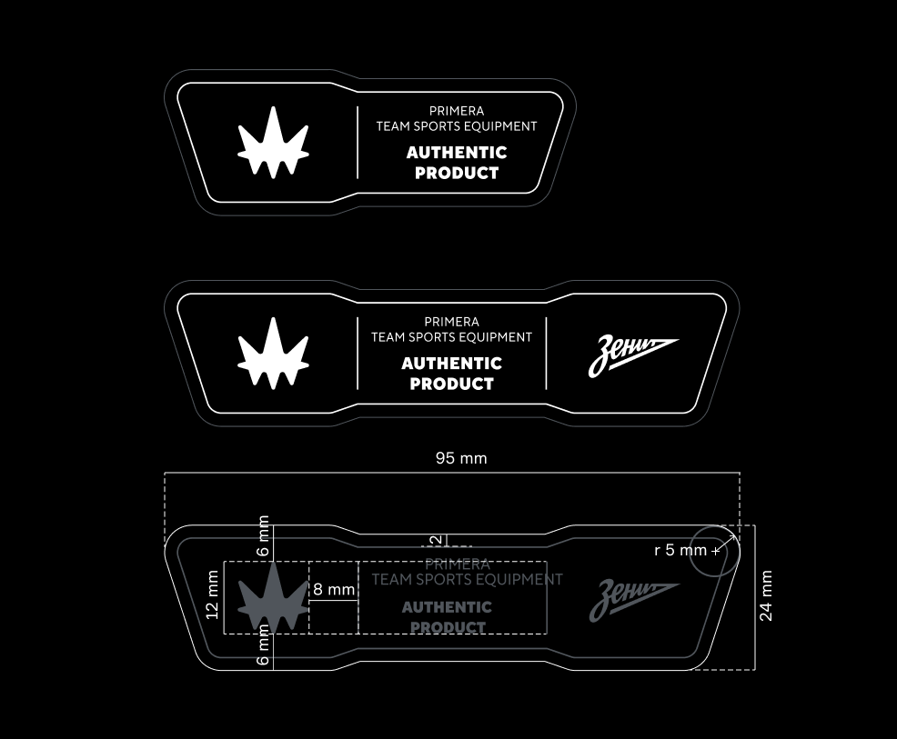
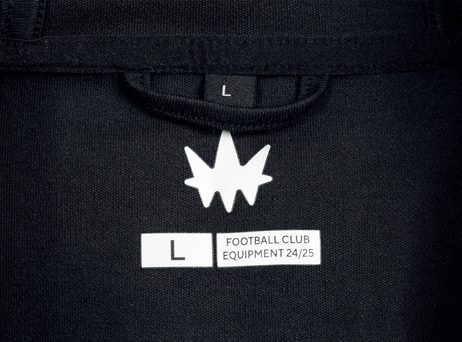
Текст:
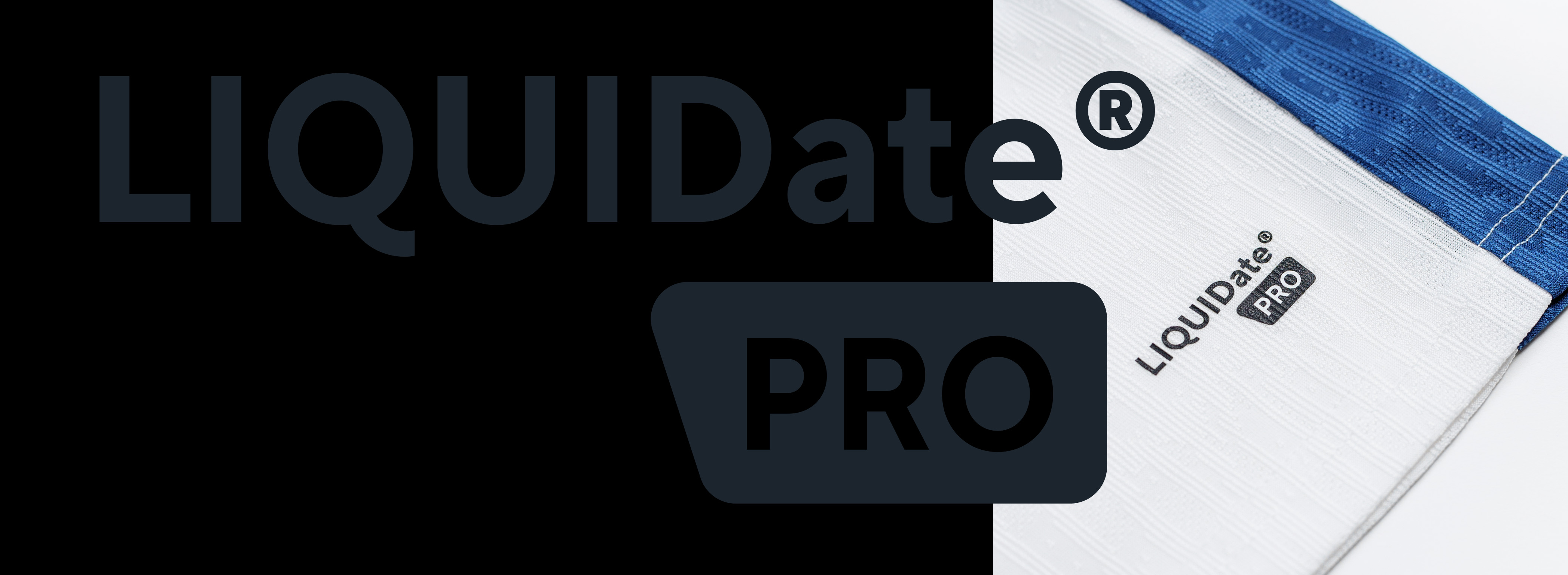
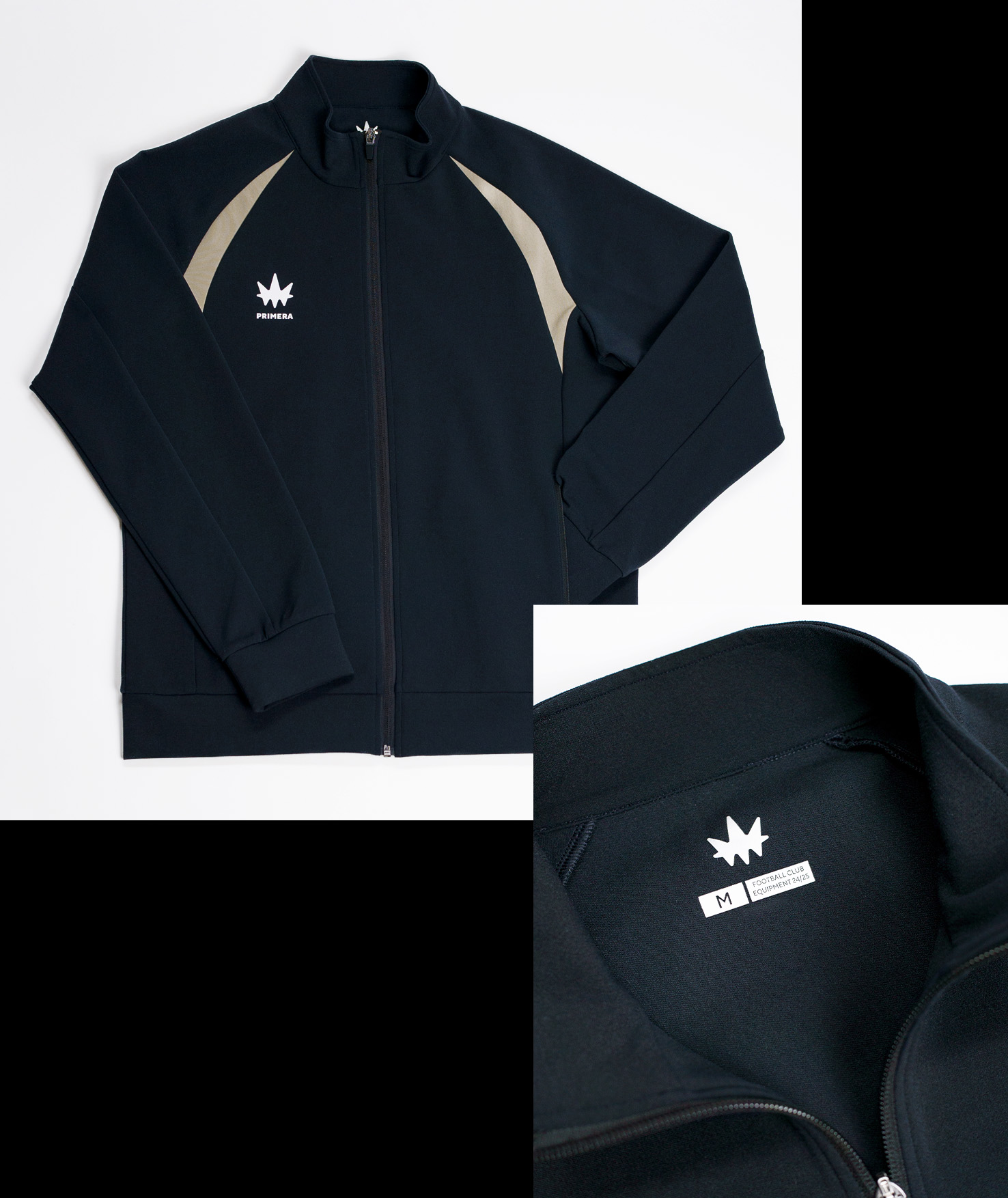
The identity comes to life through practical brand elements like double-sided tag booklets, size labels with color coding, and a customizable system of authentication patches — adding both function and flair to every product.
Медиа:

Медиа:
Медиа:
Медиа:
Медиа:
Медиа:
Медиа: