PBC Lokomotiv Kuban redesign
Lokomotiv is one of the most legendary brands of Russian sports. The main logos of the clubs in this sports society are united by a classic recognizable design: by maintaining consistency and traditions. The logo of the basketball club Lokomotiv was falling out of the general concept and at the same time it needed to be adjusted.

Not just a logo, but a design system with different combinations of logos
There were many problems with the old logo. The main ones being:
• The letter ’L’ is not obvious. Because of its trapezoidal shape, it can easily be confused with ’D’.
* The logo is unstable, it tilts to the right.
* The sign and the lettering are combined, which is why the emblem turns out to be overloaded and noisy. The logo should be remembered and recognized without the text.
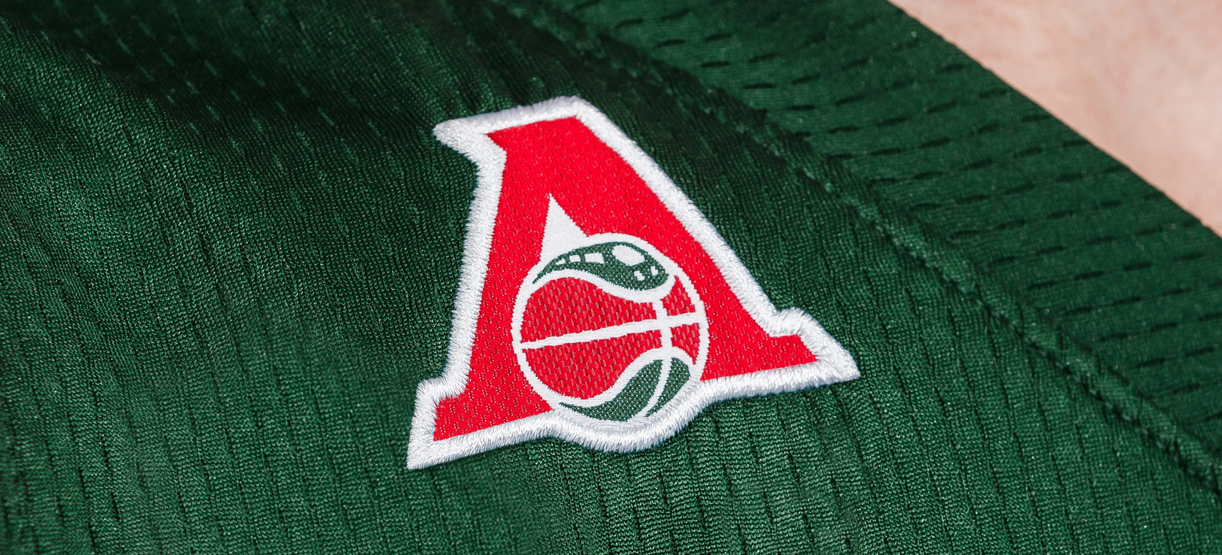
We have corrected these shortcomings in the new logo, which at the same time adopted the current style of sports design, keeping the traditions of the sports society and at the same time it stands out among teammates. The logo of Lokomotiv-Kuban is quite strict and moderately brutal: good qualities for a sports club.

A modern identity isn’t just limited to one logo, it requires the creation of integral design systems, where different elements are united by a single corporate identity, which can be combined with each other depending on the situation. Loko has received a wide set: the main logo, sublogo types and letterings are freely connected. And when the elements of the kit are tightly connected, a monolithic corporate style is felt and every detail makes the club recognizable. Lokomotiv is the only basketball team in Russia with such a wide identity package.


Numbers and letters in the ’L’ geometry, a new colour scheme of the shape
In Russian sports, little attention is paid to typography. Numbers and surnames are often displayed in standard fonts, although the corporate font of numbers and surnames can become an additional identifier of the club. After all, in many situations during the game, typography is much more noticeable than the logo.
The new package of numbers and the corporate lettering are geometrically in sync with the letter ’L’ from the logo. Here the connection is clear and strengthens the style of the club.
The new model of the uniform is one of the best in the Under Armour line. The club has changed the colour scheme: now it will play in the VTB United League in a red kit, and in the European Cup: in green (previously it was the opposite).
On the kit for European cups there is the abbreviated name Loko, corresponding to the traditions of basketball. At the same time, an interesting nuance: regulations don’t allow you to write the name above the number.


Corporate gesture is a new feature for Russia
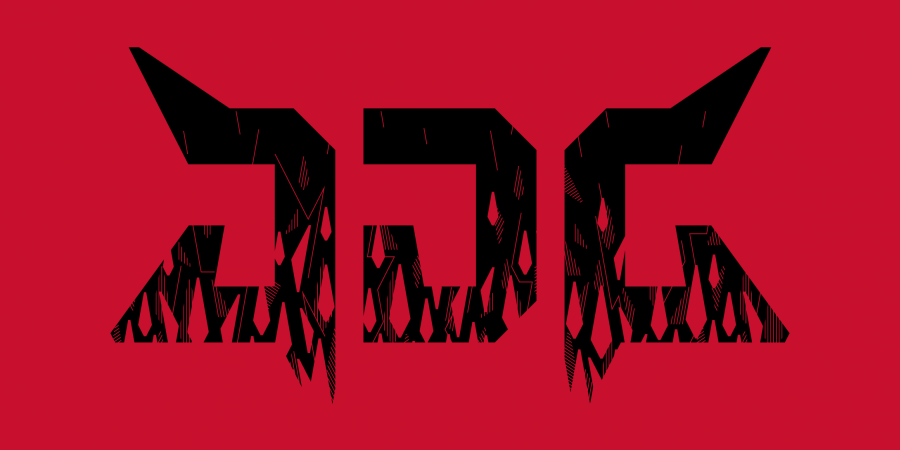
We also came up with a club gesture for Lokomotiv, which forms the monogram LK: Loko Kuban. A rare team can boast a signature gesture, but basketball has a cultural advantage: it’s closely connected with hip-hop culture, where special gestures on various occasions are highly appreciated.
The appearance of such a gesture can brighten up the arena. With competent directing, it will help to diversify the broadcast, saturate it with emotions. Three-point shot: fans in the stands show viewers the author. They win the cup — the player has the right to effectively demonstrate the champion’s ring.


