Redesign of FC BATE
LOGO • SUBLOGO • FONTS • PATTERNS • GUIDES • SEASON TICKET • UNIFORM
BATE is Belarus’ most prolific football club, being one of the most regular participants in European competitions among the former Soviet Union’s states. High-profile victories over Bayern Munich and Arsenal have attracted attention far beyond the city of Borisov. However, big results require big efforts. And it’s not just on the pitch that you need to meet the requirements of the Champions League and the Europa League.
The old BATE logo needed to be overhauled and upgraded to be a bit more 2020, where it’s not just necessary to be adaptable via digital media, but vital. Yet they didn’t want to lose their traditions and history, so we carefully assessed all the club logos.
In the center of the emblem is a flag, symbolizing the desire to win. The club’s yellow and blue colours have appeared in the form of stripes, however they’re not historically linked to the club. At the same time, the logo clearly lacks any hints to its industrial origins of the club. The new identity now incorporates a factory style.

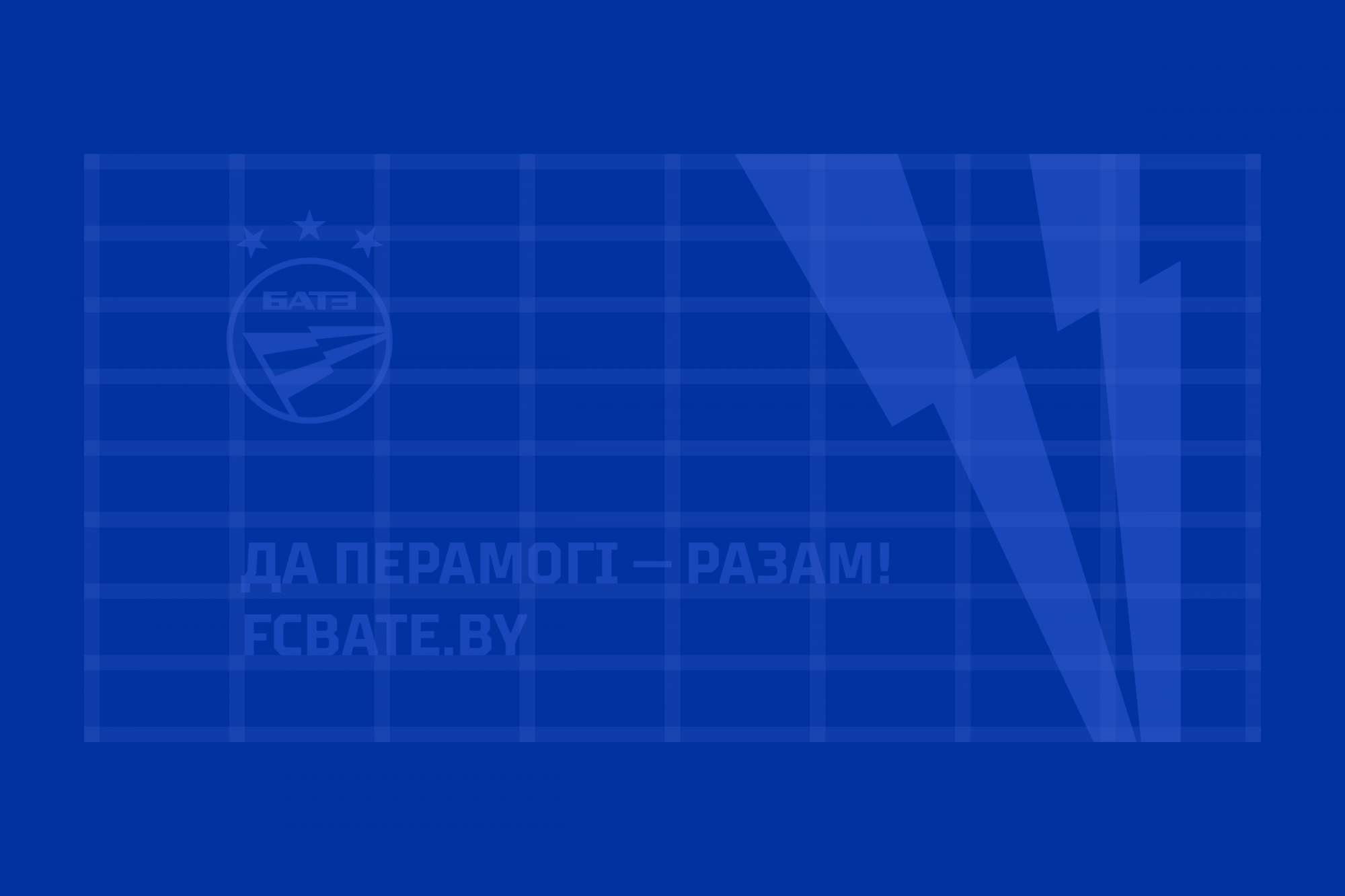
The logo has gained clarity and connection with history
The new logo has been cleaned up and has much more meaning to it. It now stands out very clearly against the logos of other Belarusian teams and is not lost among Europe’s top clubs.
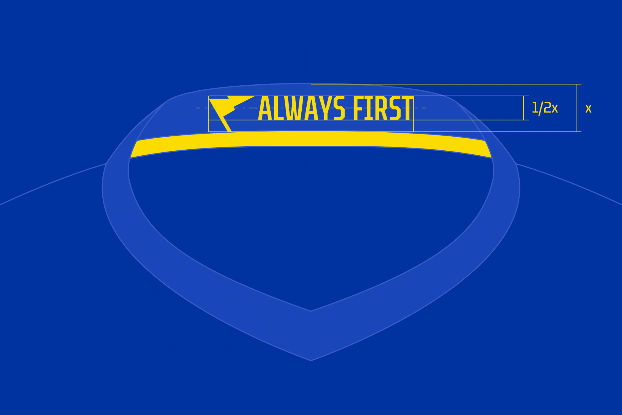
First of all, we cheered up the weary, sadly downwards-pointing flag: the flag is now split by a stripe, this being a reference to both the flag of Borisov and the factory. The blue stripes along the edges resemble lightning bolts. Such a flag in a simplified form can also be a self-sufficient logo for different forms of media, primarily merchandise.
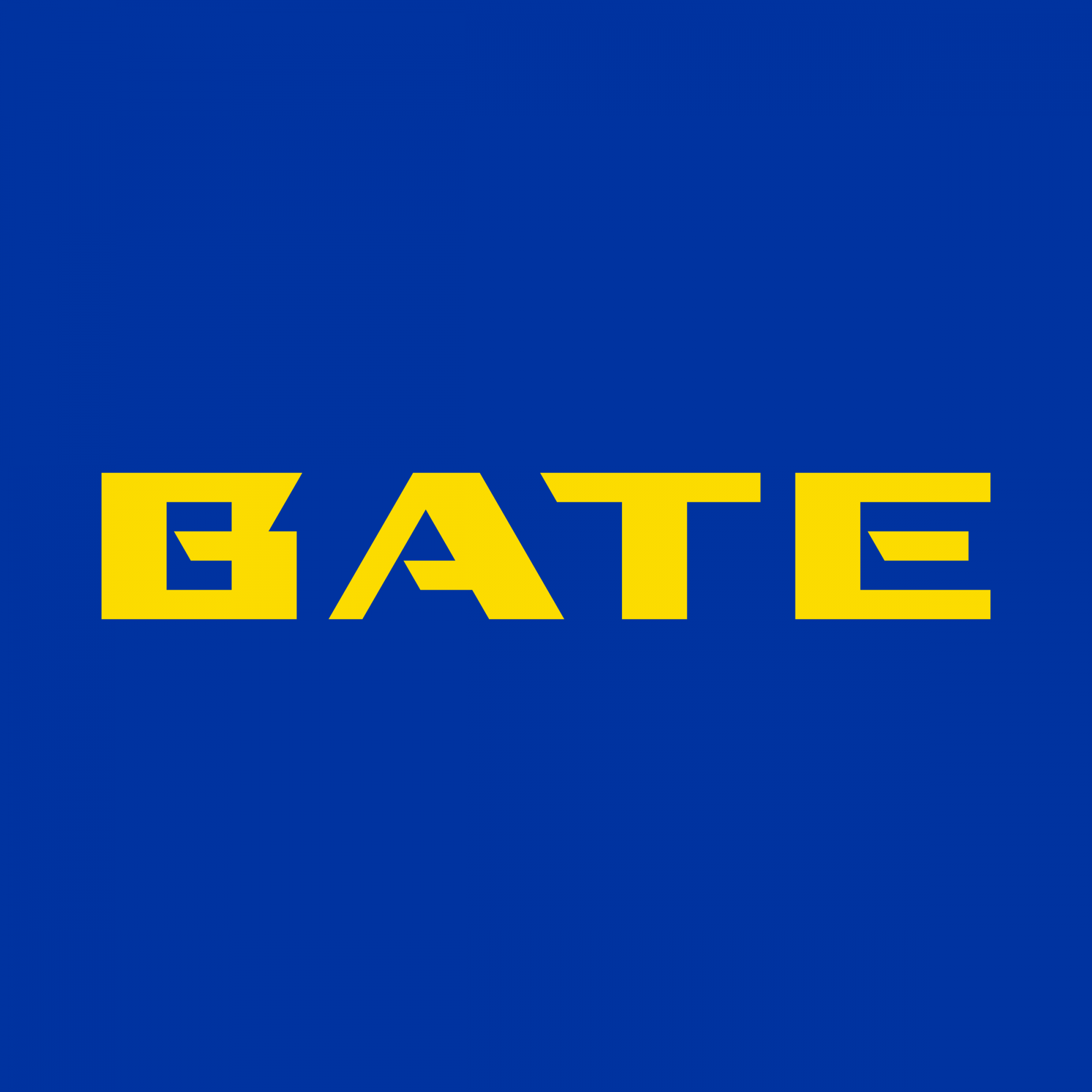
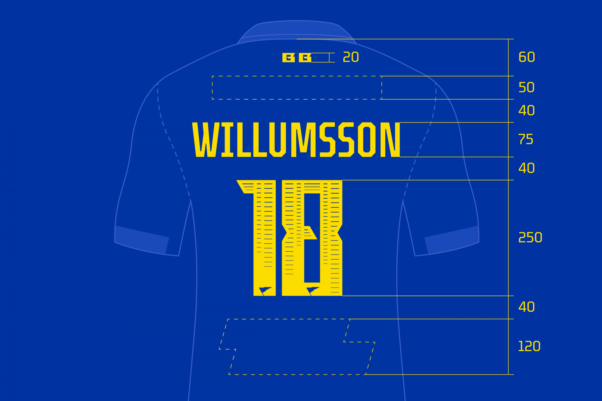
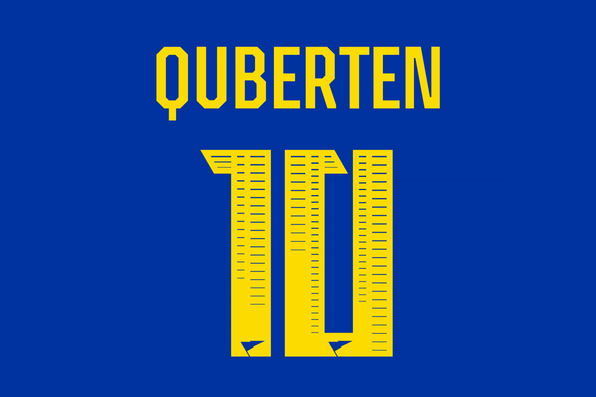
Factory motifs also appear in the new lettering. The former Bookman Old Style font looked both morally and physically outdated — moreover, it didn’t match the plasticity of the flag. We added fresh new lettering that keeps with the aesthetics of the heavy automotive industry: the massive squat letters look peremptory.
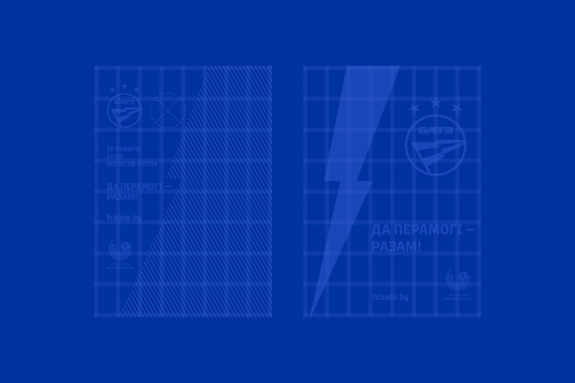
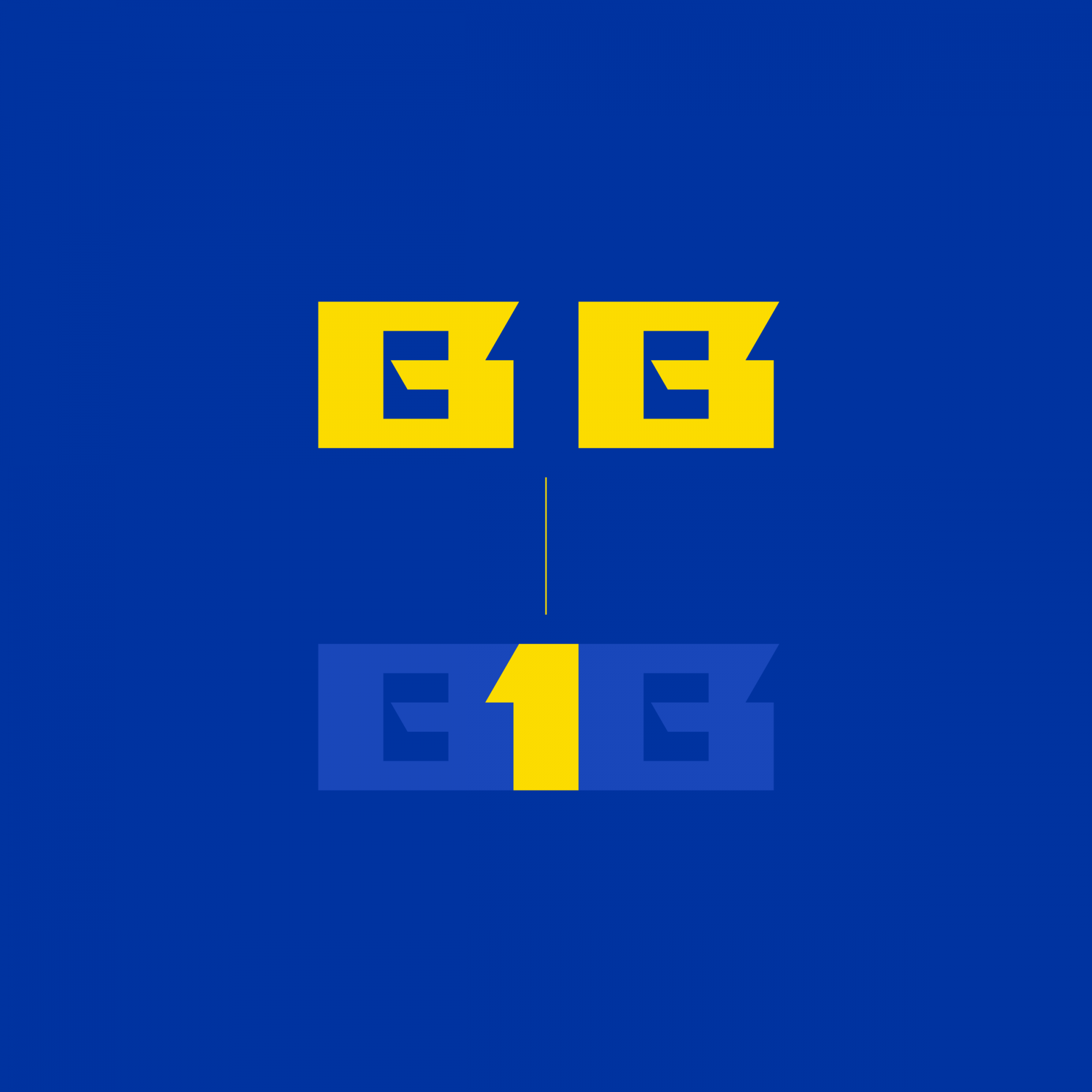
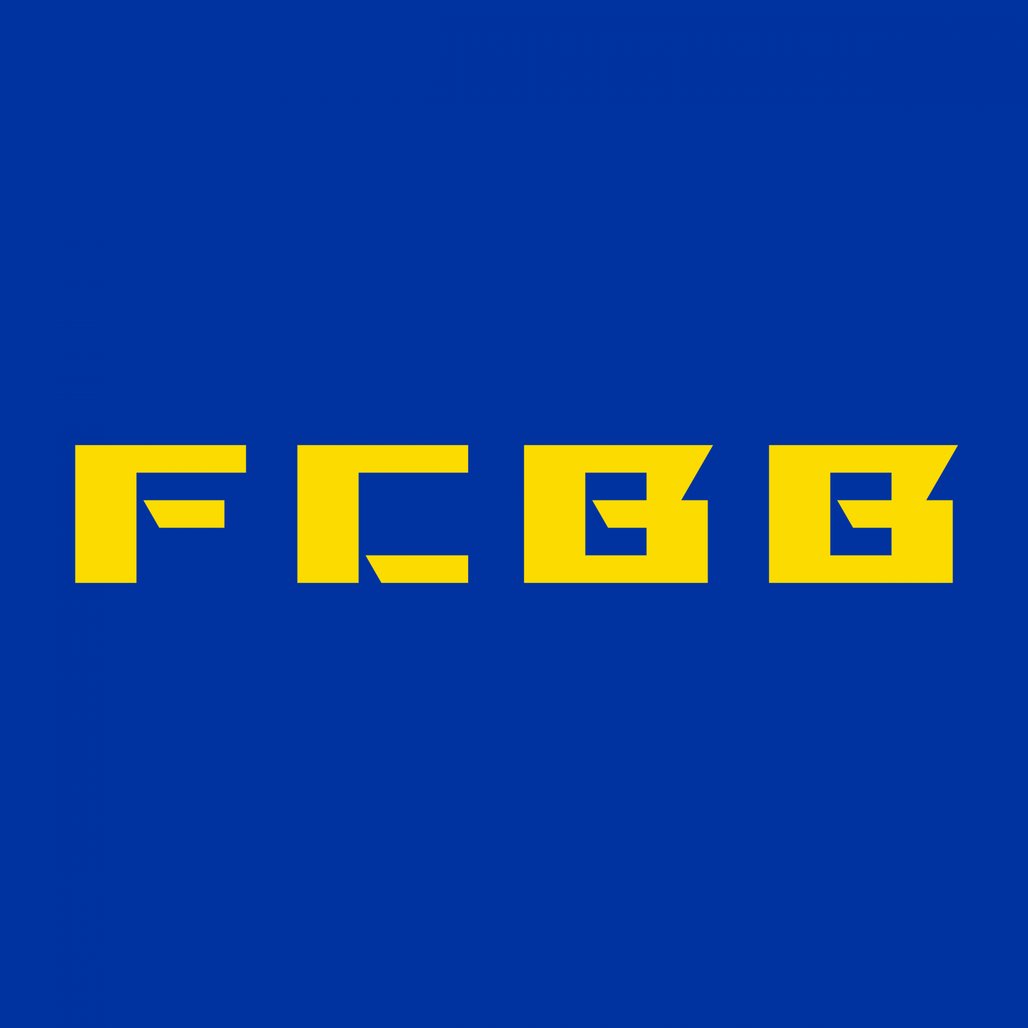
In addition to the main lettering, the Latin monograms BB and FCBB have been developed — specifically for European competitions.


Industrial style in details
As a result of the redesign, BATE received an entire rebrand, including a logo, sublogos, monograms, patterns and unique spelling. And this is not just a chaotic set of instruments, but connected and harmonious elements to create one whole look.
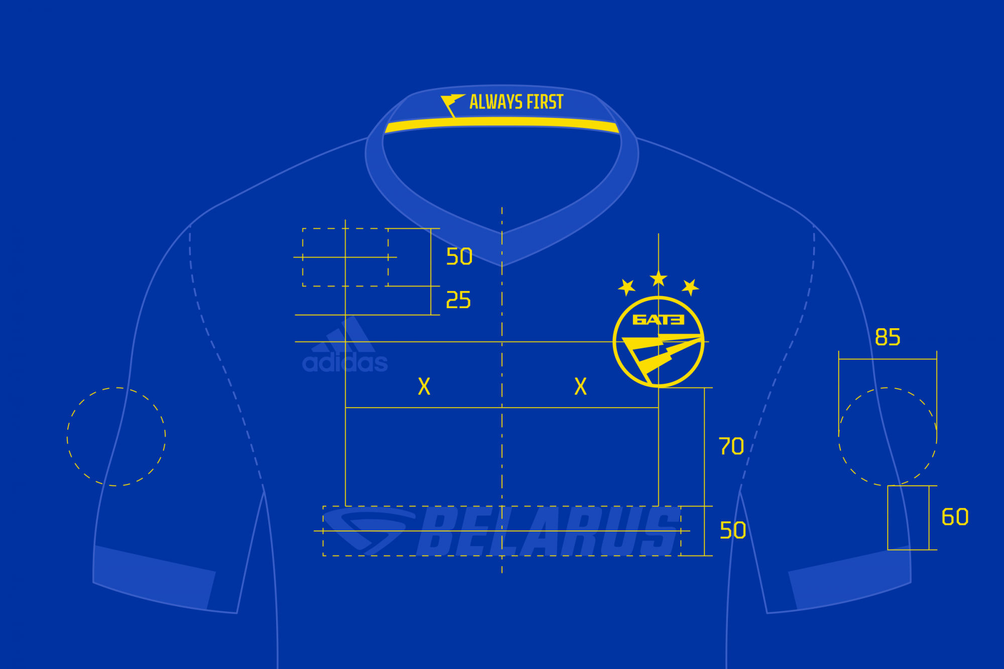
The geometric principles of the basic lettering are also transferred to the numbers on the kits which have a perforated pattern resembling factory work mechanisms. Such a technique is rare in football, a conservative sport on the whole, and can favorably set a team apart from the rest.


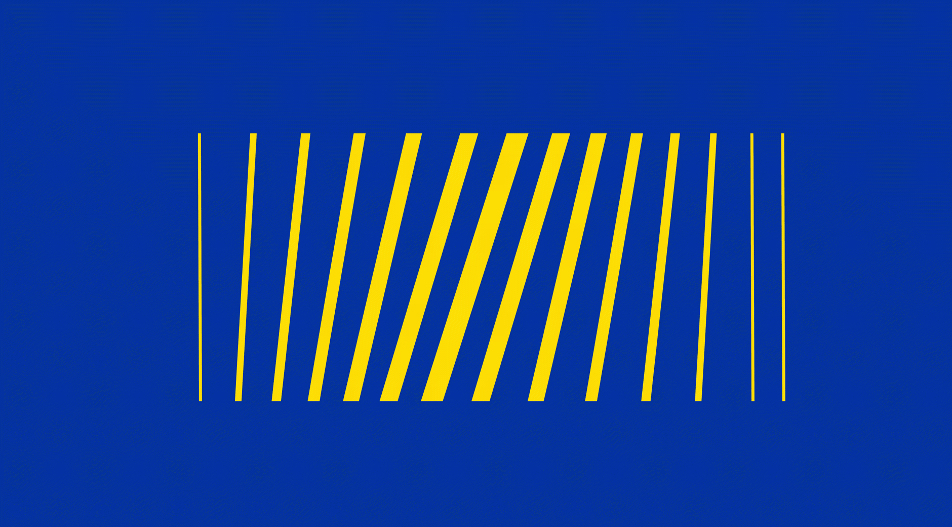

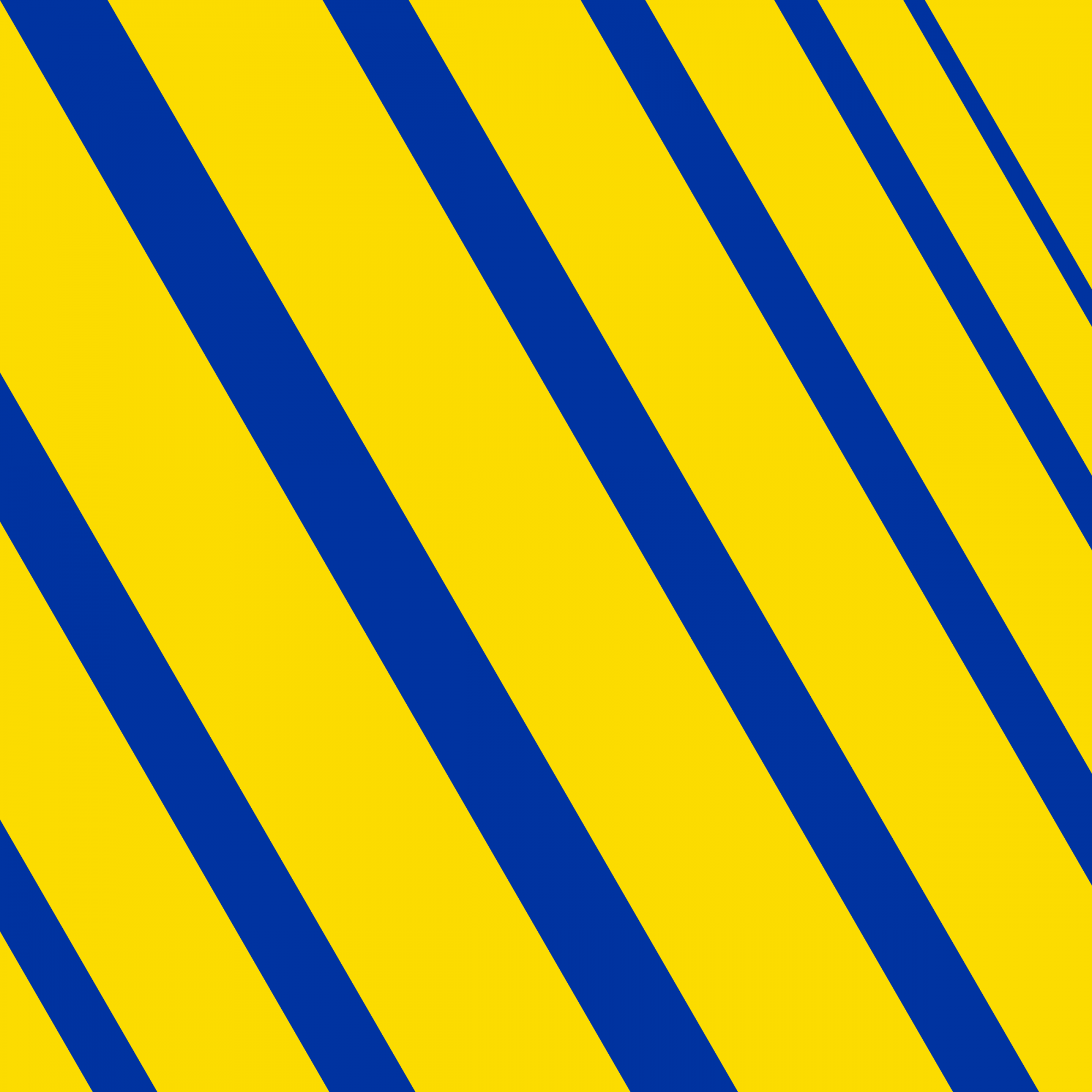
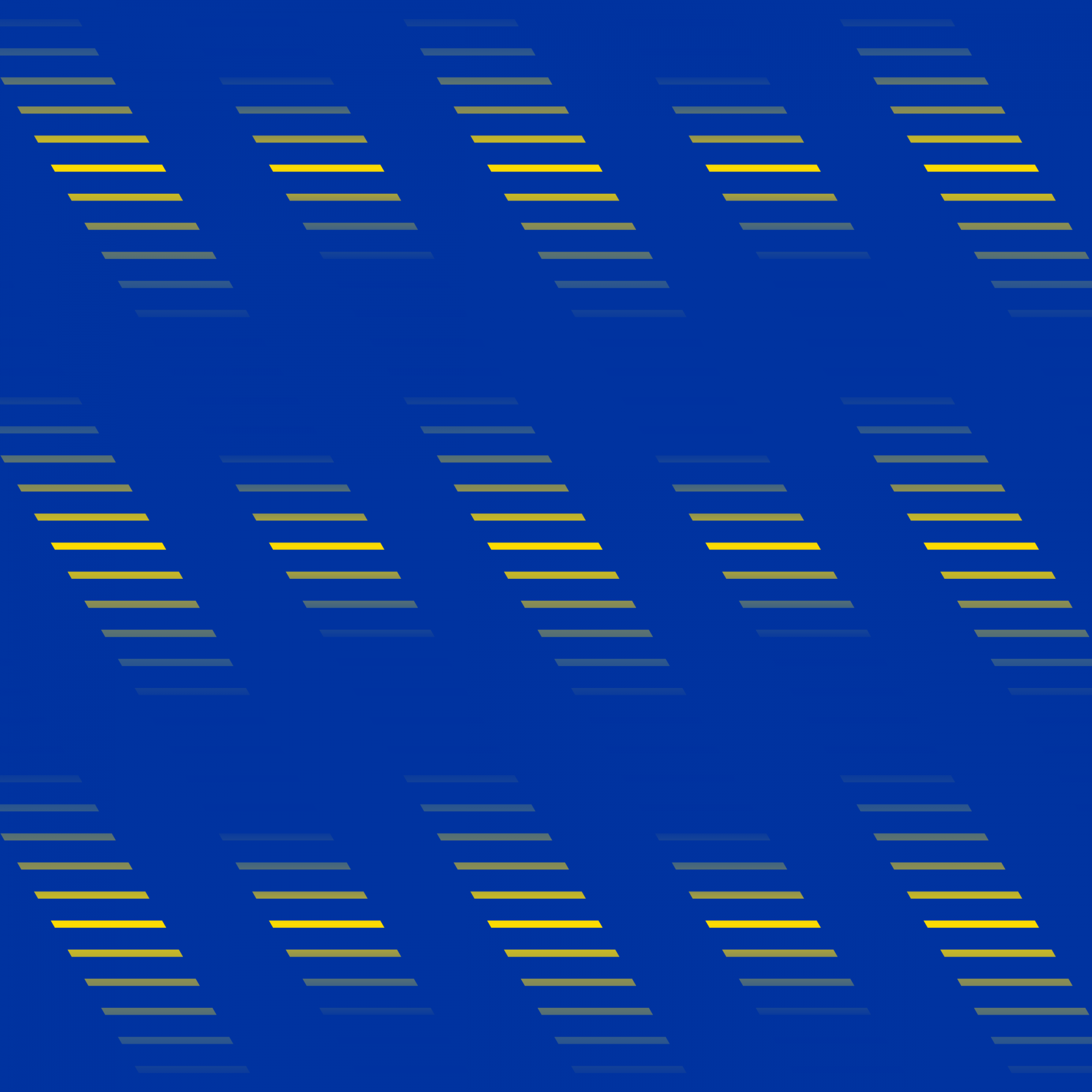
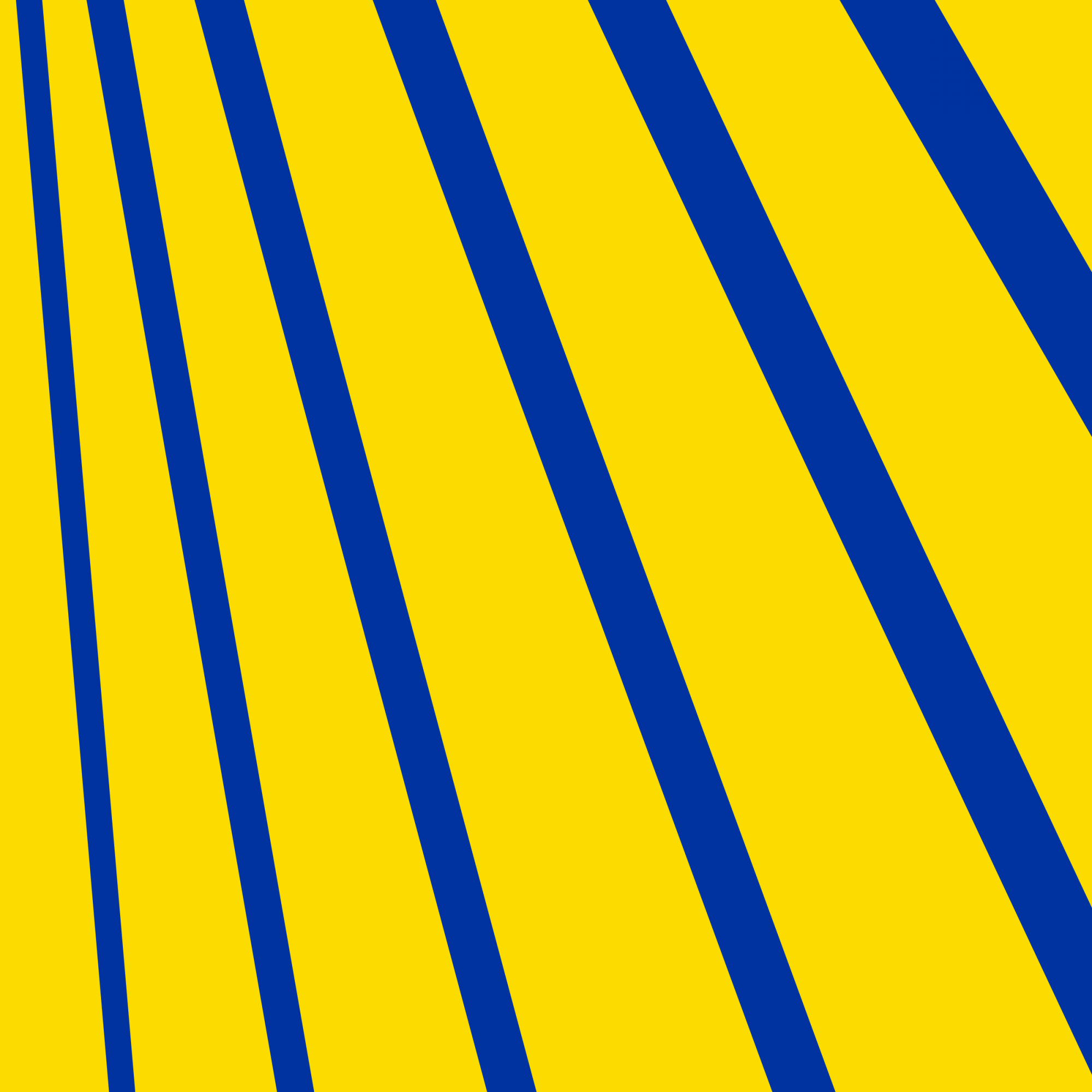


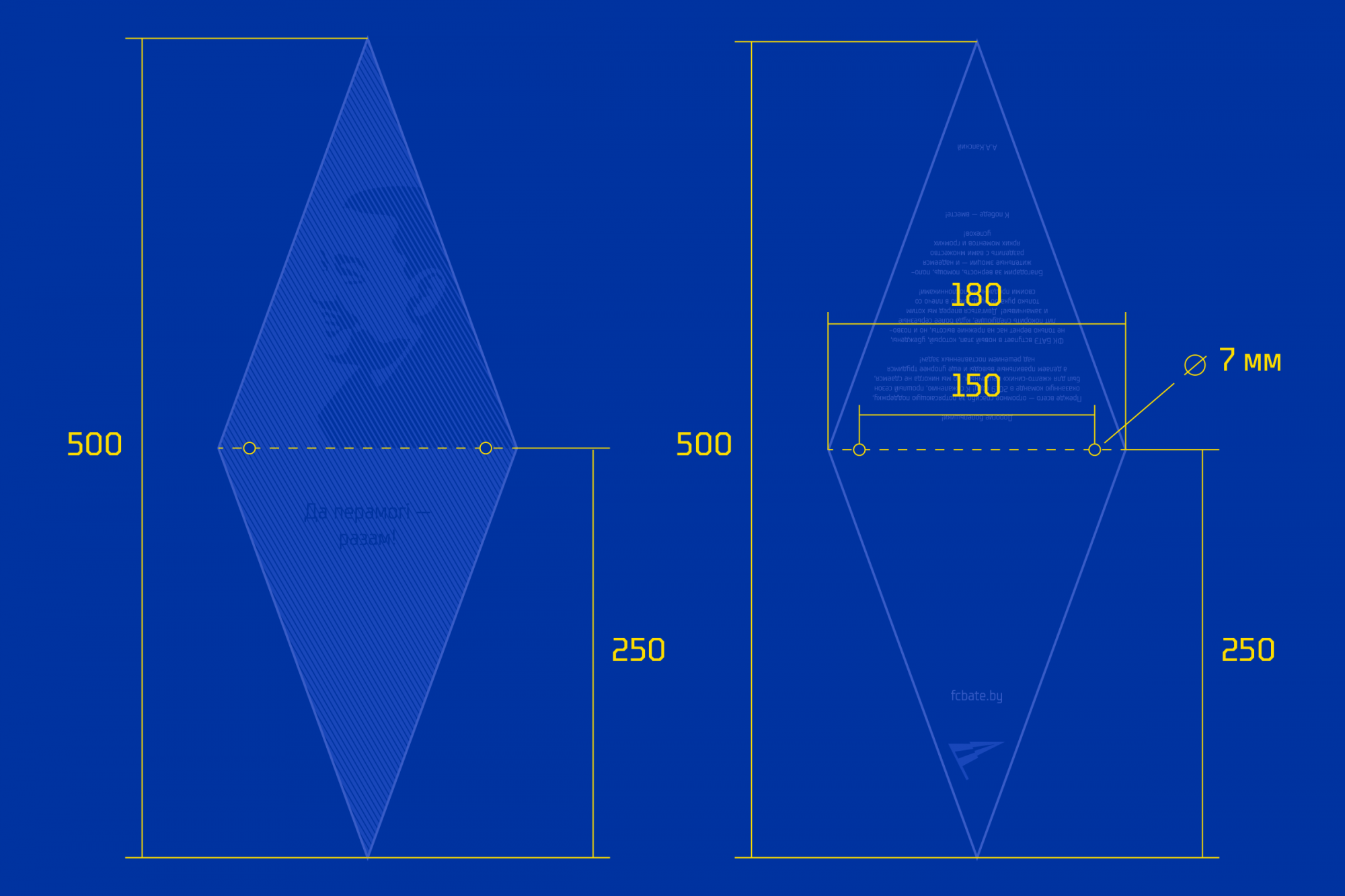
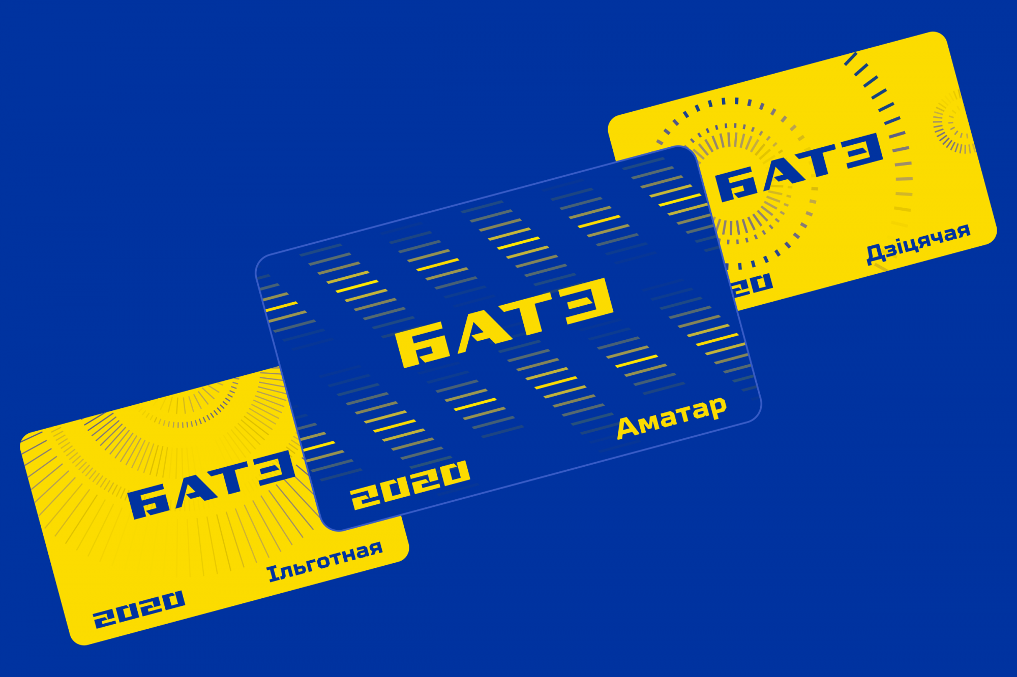
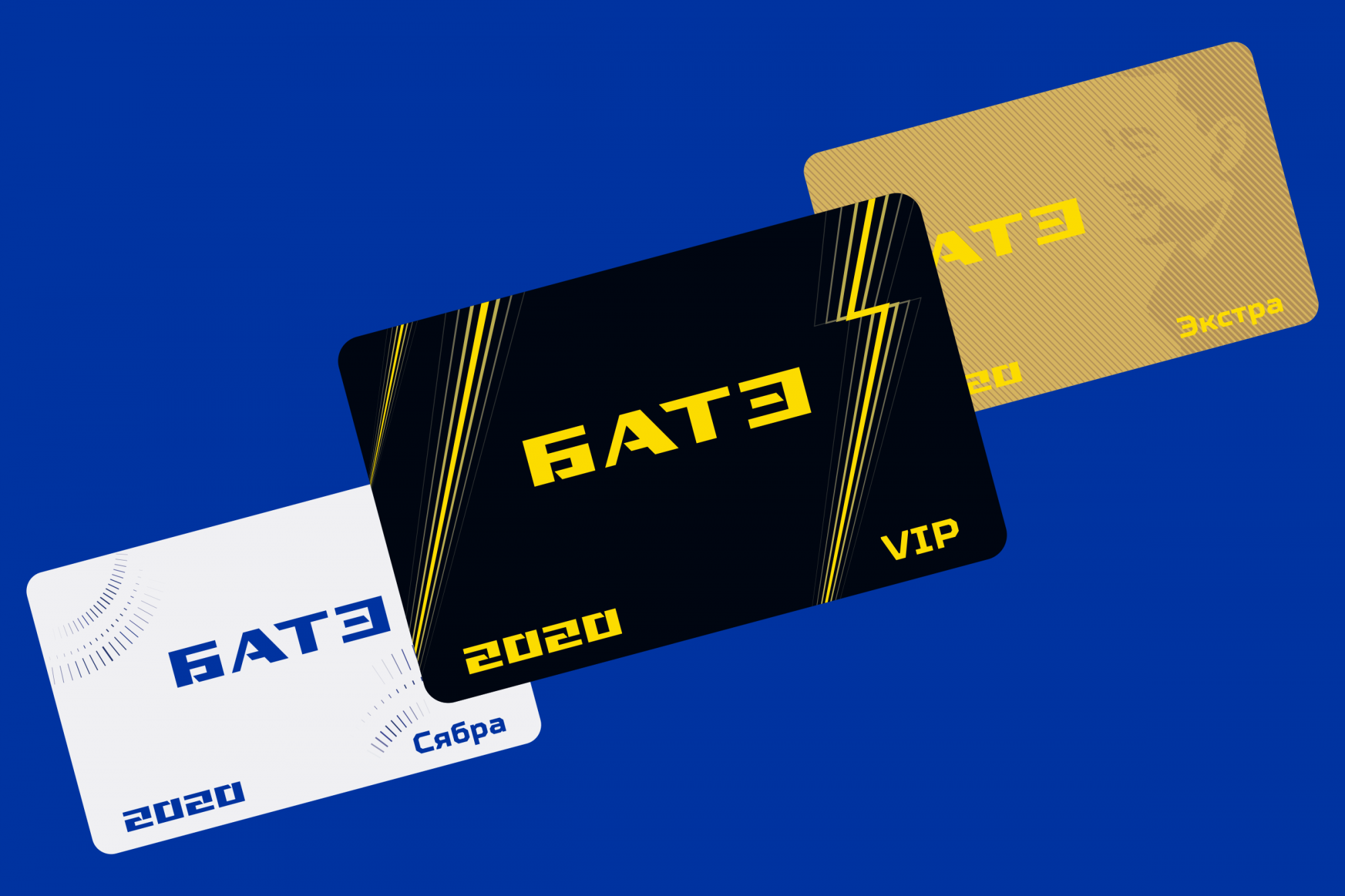
An entire line of industrial patterns has an identical task.
The main club font was the newest variable TT Squares Neue of the TypeType studio. This is an exclusive type of font: it’s recognised as simple and clean, despite the octagon at the base. The headset is great for sports design and plastically supports the factory theme.
In general, in the post-Soviet football world, it’s almost impossible to find a club with a logo similar to the multi-component corporate identity that BATE have now adopted from us.