Fiery style of FC Fakel Voronezh
Voronezh Fakel is gearing up for their second consecutive season in the Premier League, the top tier of Russian football. Our design studio has refreshed the identity of this fiery team while carefully considering the main objective of a restyling process: to approach it with finesse and precision. After all, honoring the club’s traditional symbol holds a paramount position in its new chapter.
Logo
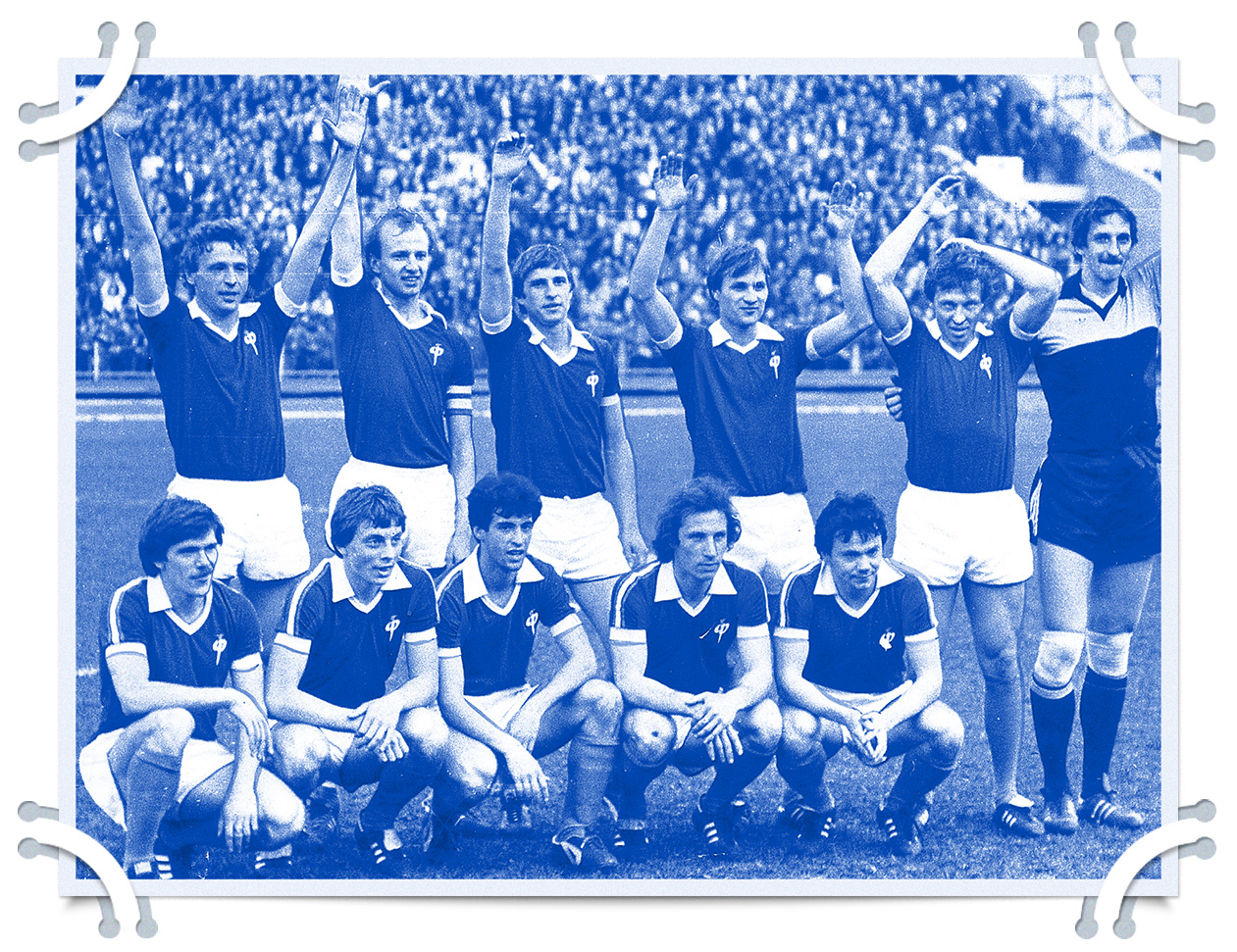
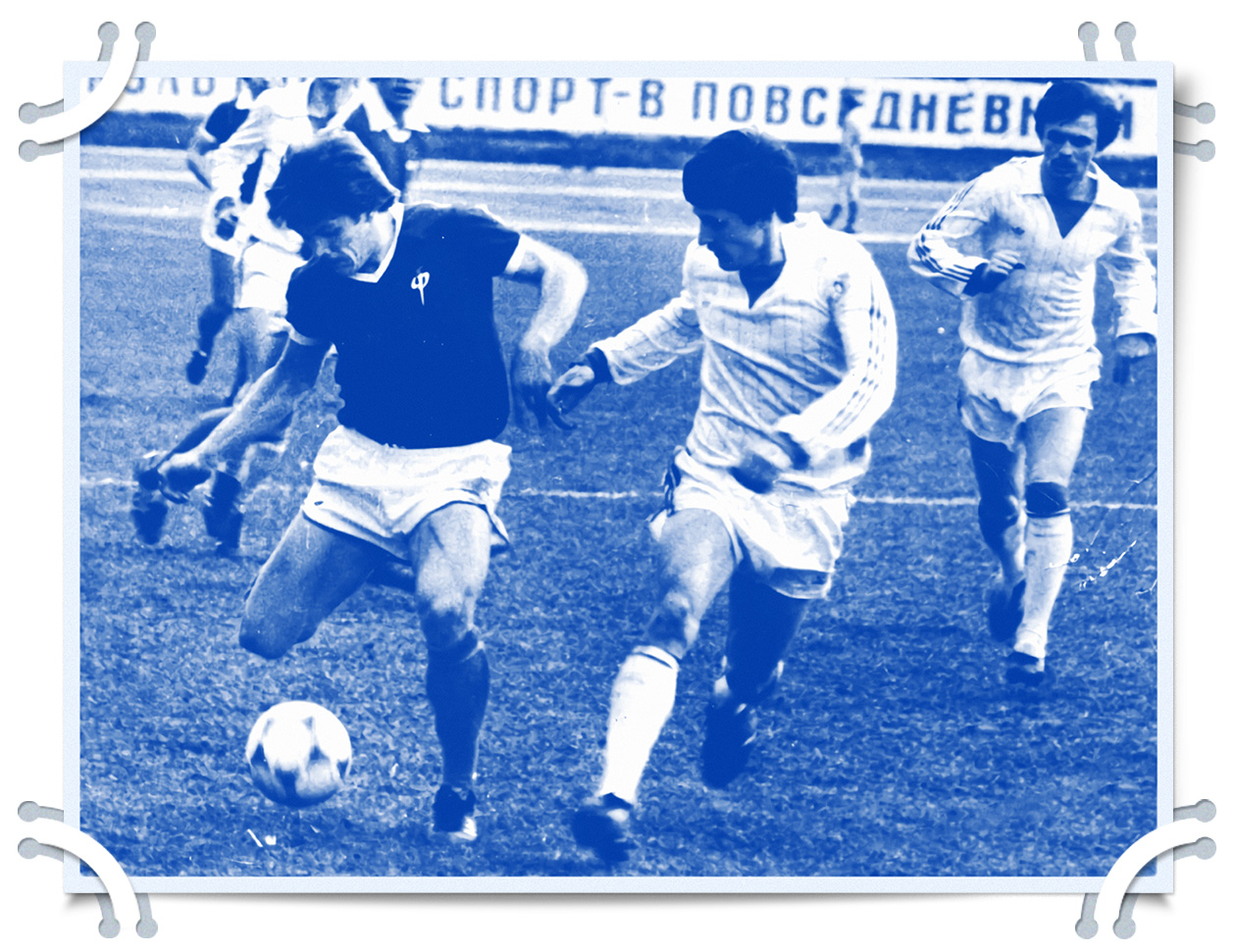
Fakel boasts a rich history showcasing an exceptional ability to climb up the ranks. As the city’s prominent enterprise operated under strict secrecy, the football team couldn’t be directly associated with the plant’s activities. In 1977, the name Fakel was conceived. It drew inspiration from the flame emitted by a nozzle — the same nozzle used in the development of space rocket engines by Voronezh KBHA.
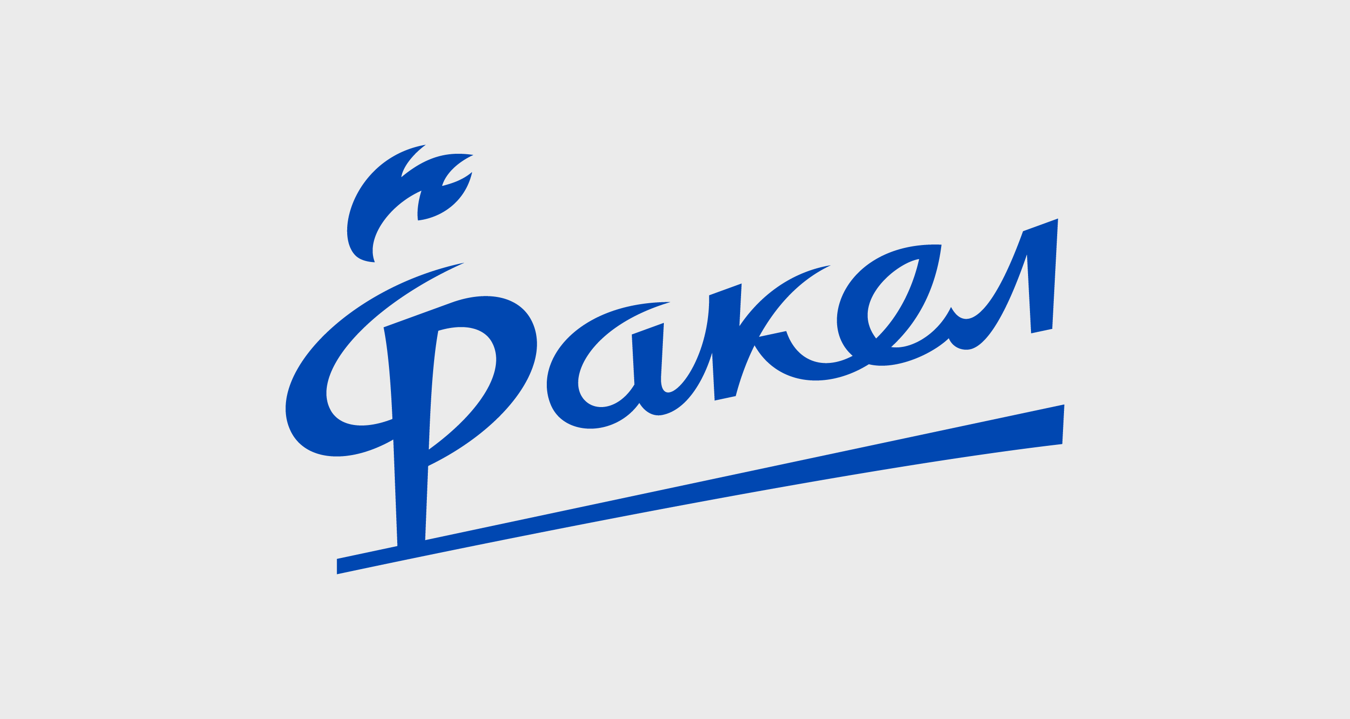
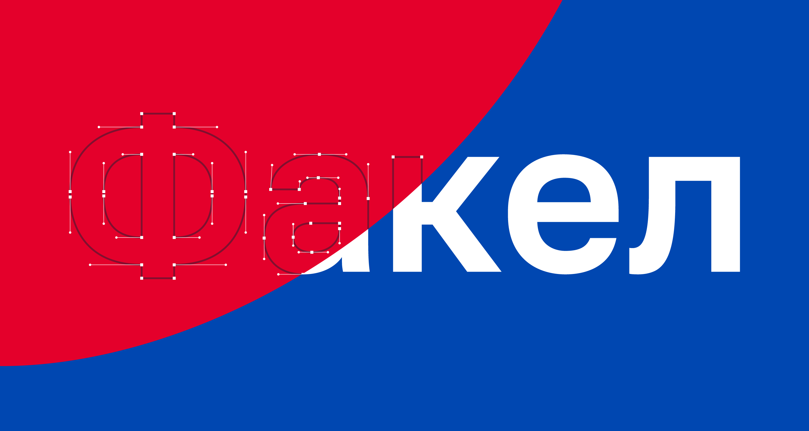
The current club logo has achieved classic status but it does possess a few flaws. These include issues with centering, haphazard geometry in the swoosh-shaped half-ovals forming the letter “F” and the use of the outdated Electron font, created in the early 90s. These shortcomings not only hinder the logo perception but also pose challenges for licensees and contractors working with it.
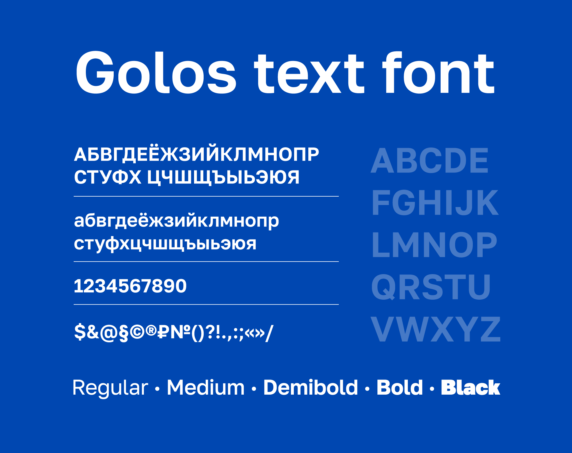
The modern and versatile Golos grotesque font has been adopted as the club’s official typeface.
Simplification becomes particularly evident when the logo is decreased to the size of a smartphone app icon ensuring that the image remains clear. However, when it comes to smaller sizes a sublogotype based on the Cyrillic letter “Ф” (F) is recommended to use.
Медиа:
Медиа:
Медиа:
Заголовок:
Lettering
Текст:
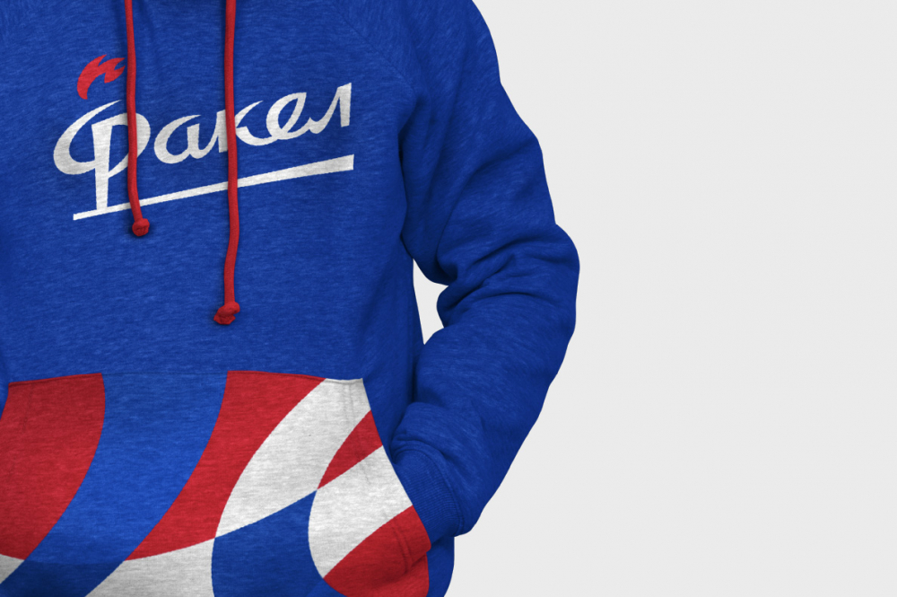
The identity package includes a corporate wordmark of Fakel that mirrors the design of the letter “F” in the logo. The vintage aesthetic emphasizes succession and pays homage to the 1996 logo which marked Voronezh’s entry into the Top League.

Медиа:
Текст:
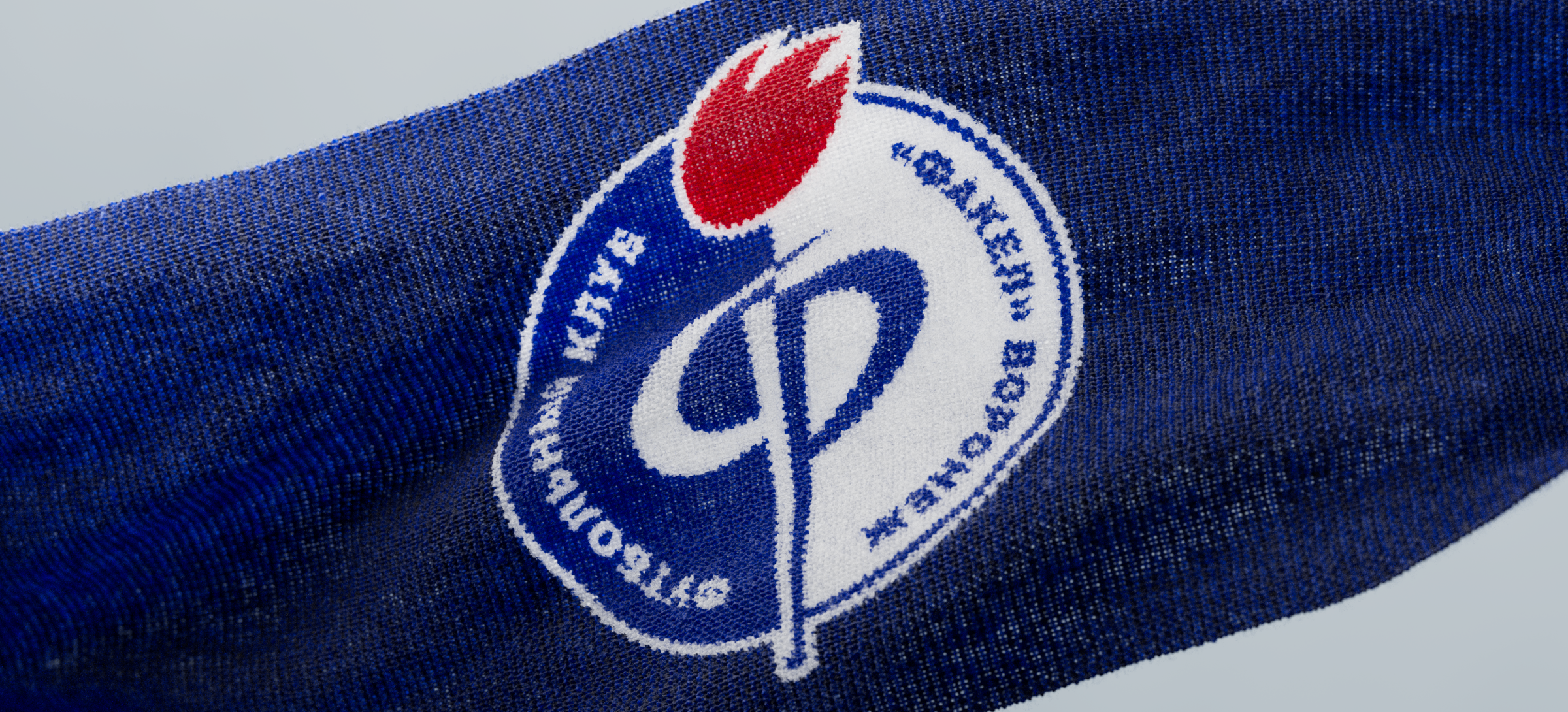
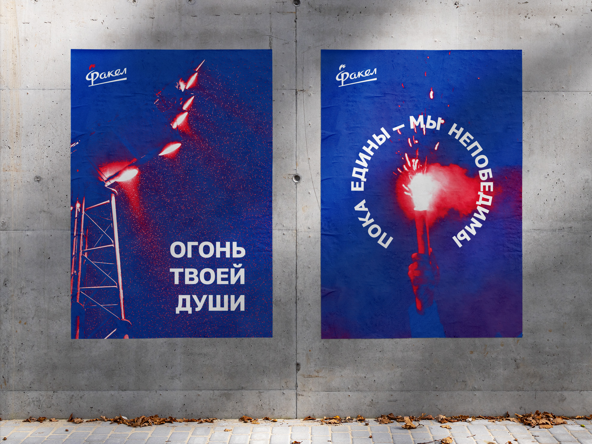
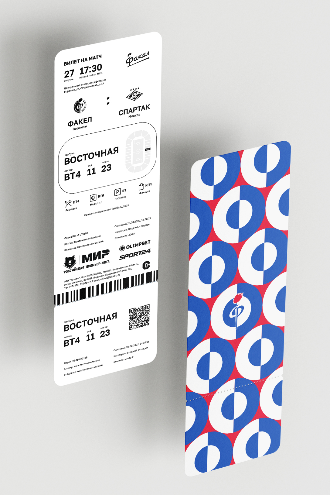
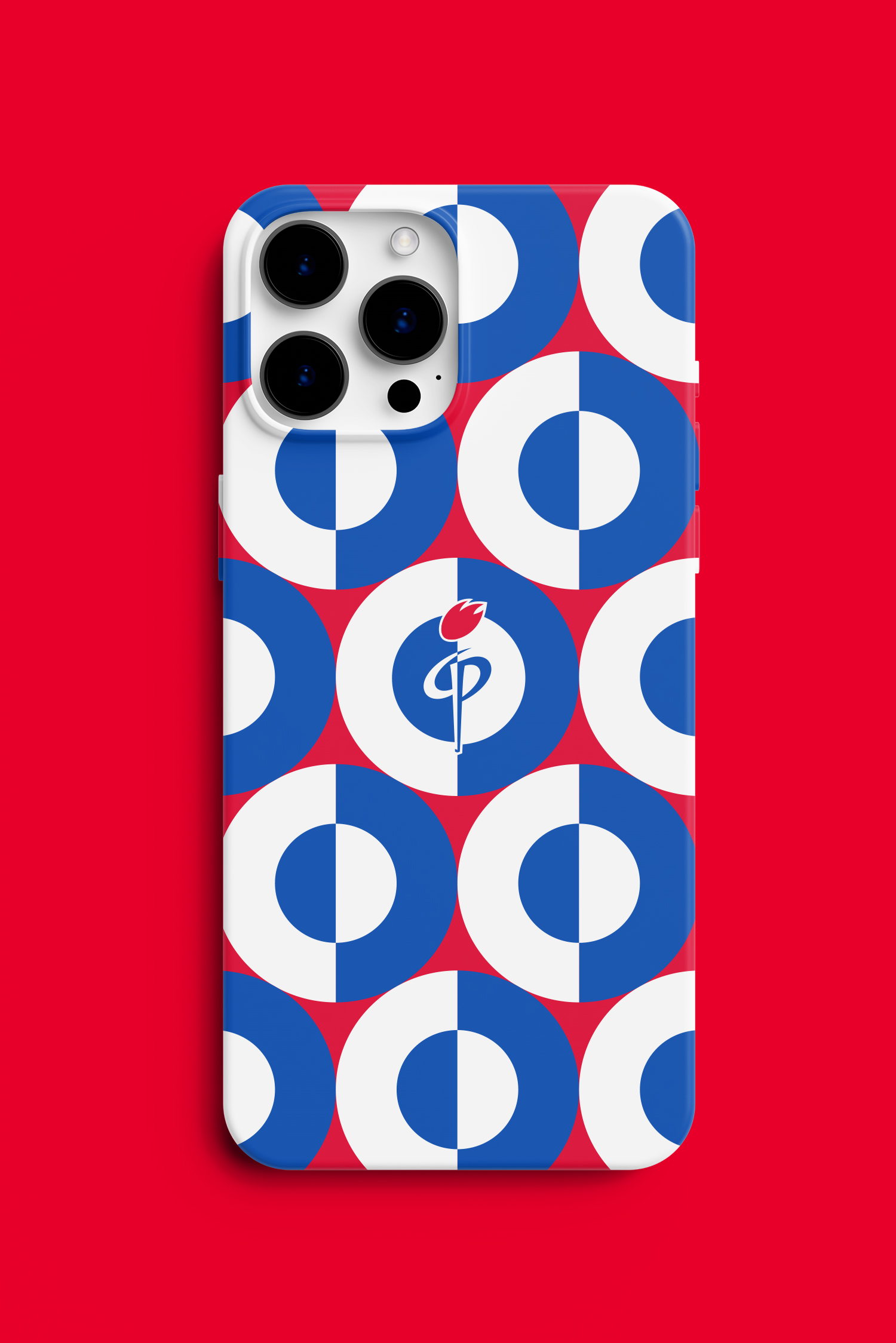
The color palette incorporates the traditional Fakel colors: vibrant blue, white and fiery red.
Медиа:
Медиа:
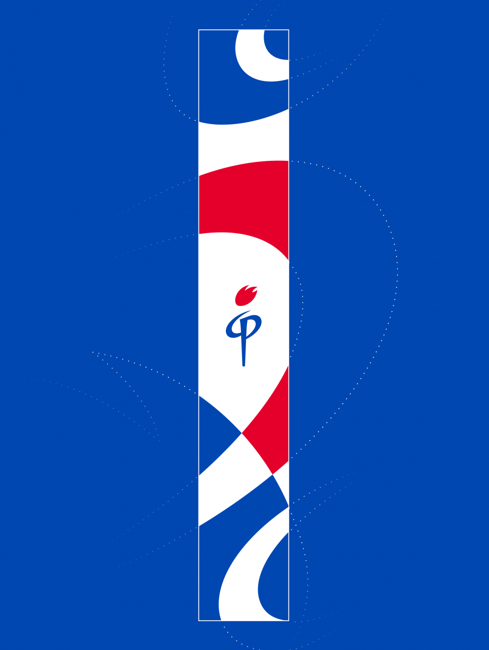

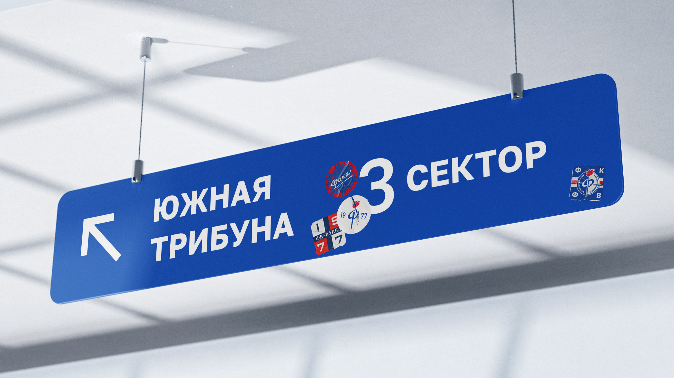
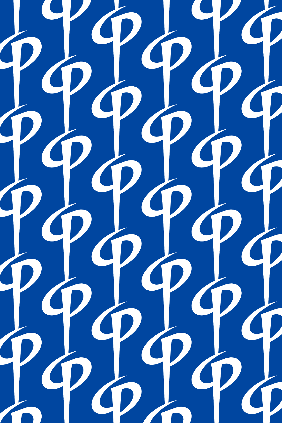
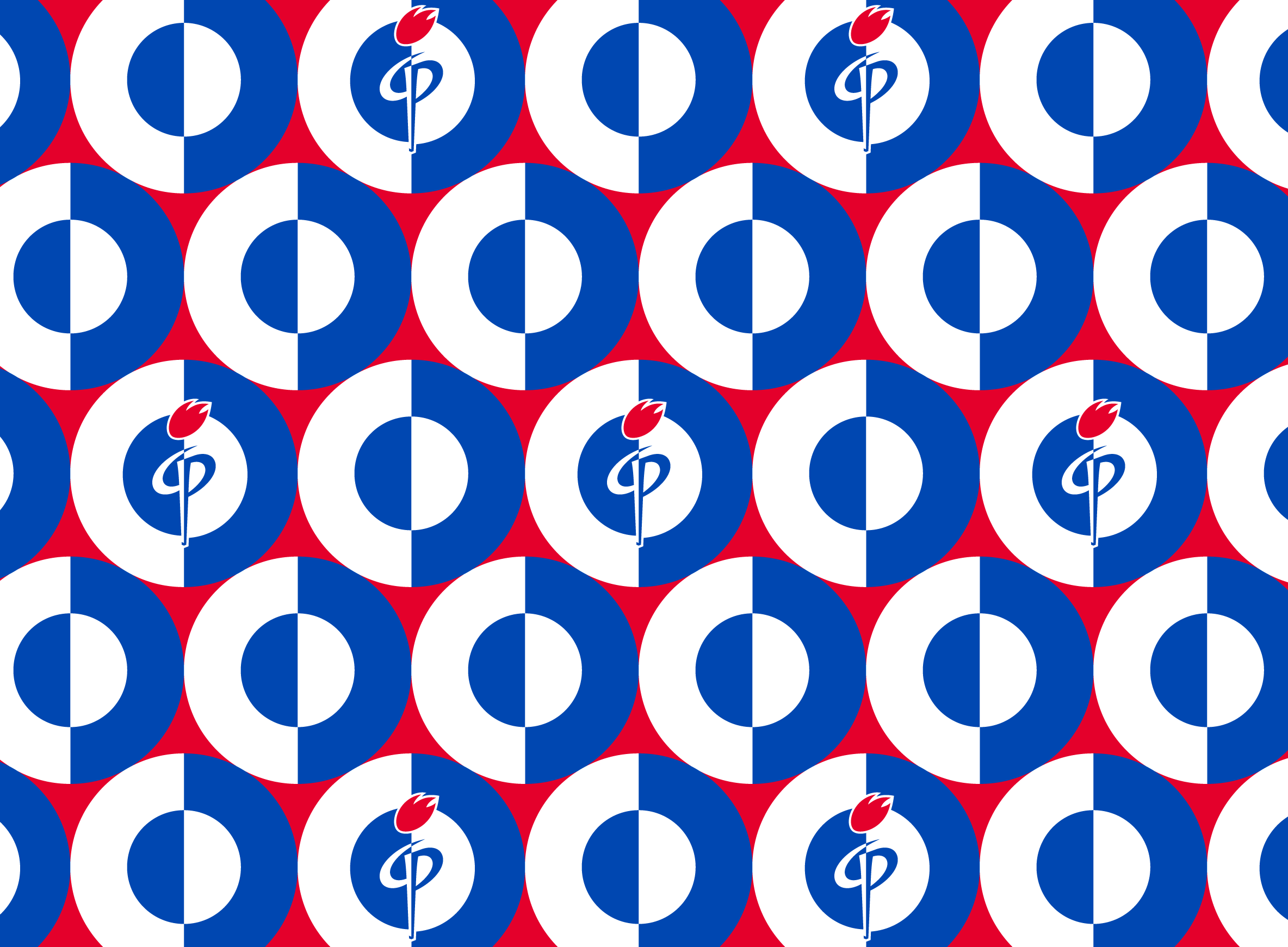
Patterns
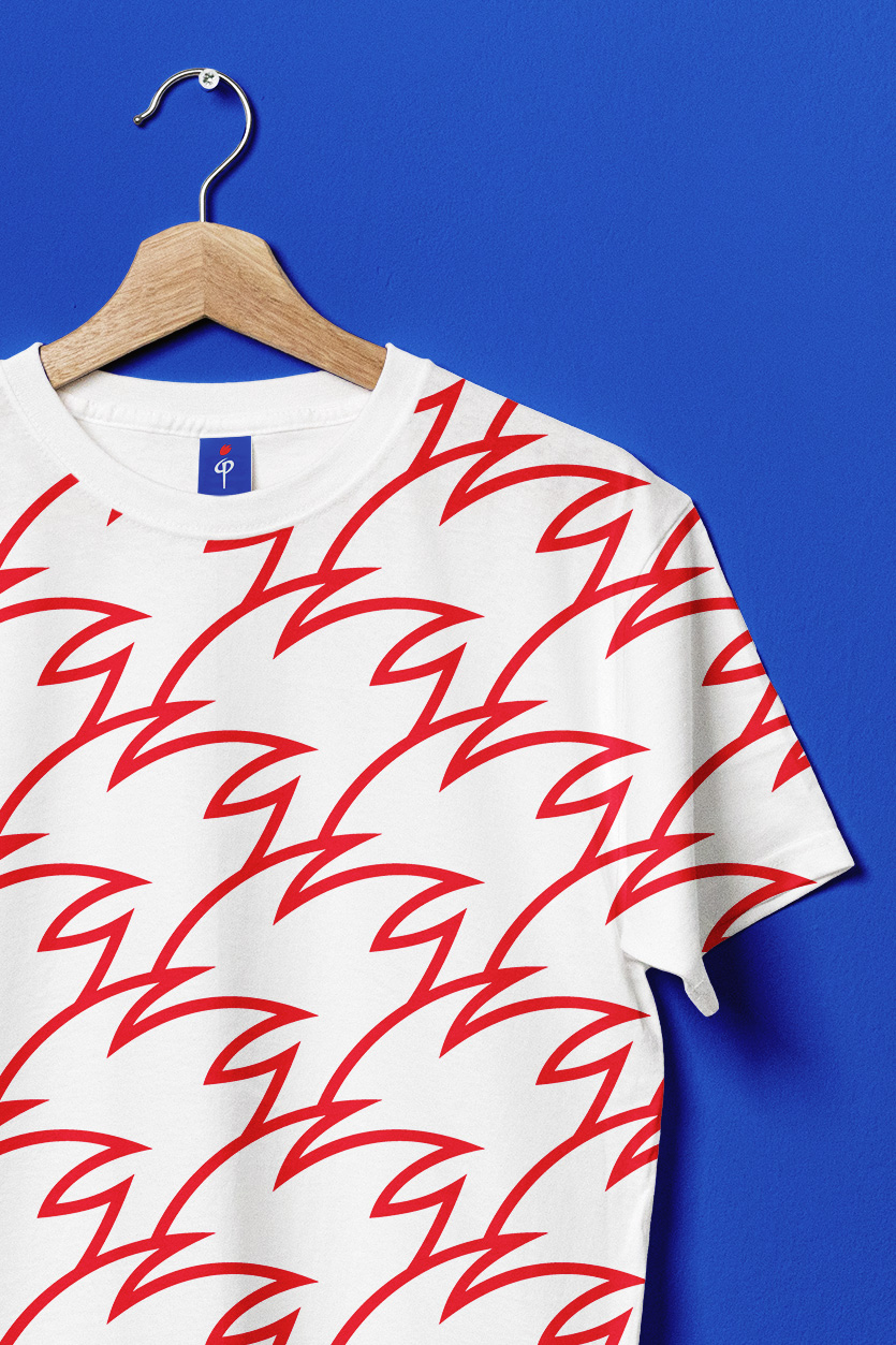
The torch symbolizes enlightenment and serves as a prominent motif. A diverse range of patterns derived from logo decomposition explores the fiery theme at its core. Some elements allude to the rocket theme and the branded swooshes in the logo. This pattern collection enhances Fakel’s marketing opportunities for extending to the production of casual club apparel and kids fan merchandise.

Медиа:
Медиа:
Медиа:


Медиа:


Медиа:


Process