Premier Hockey Federation rebranding
LOGO • SUB LOGO • FONT WORKS • PATTERNS • GUIDES • MERCHANDISE • SMM TEMPLATES • KITS
In early September 2021, the National Women’s Hockey League for the USA and Canada, formerly known as the NWHL, was given a new name.
The league’s name change from NWHL to PHF is a key turning point in the history of new sports. For the first time, the leading women’s league in a team sport decided not to have to specify ’women’ in the name. This message is to help encourage the league as a competition for players based on talent, technicality, and their dedication to hockey, not just based on gender.
Thanks to a full-fledged design system developed by Quberten studio, a bold and progressive PHF statement, even by the standards of the USA, has an appropriate visual embodiment.


Медиа:
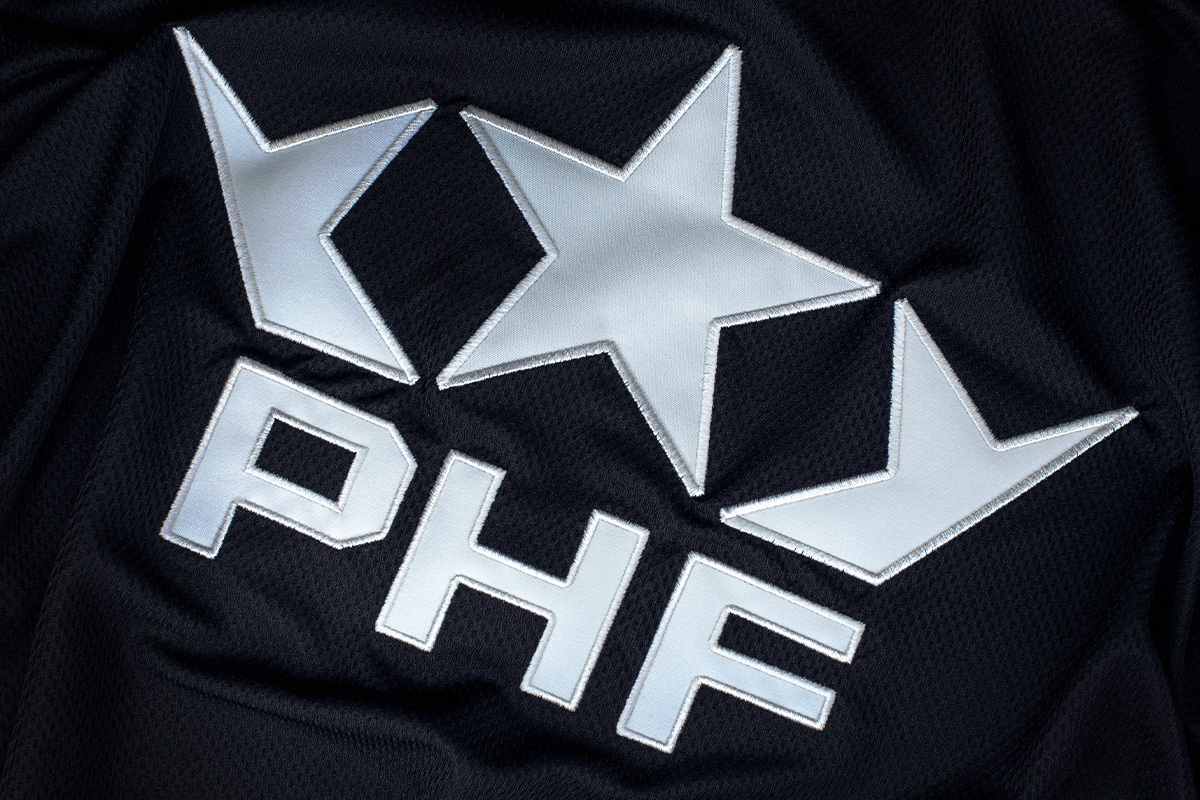
Harmony of a sign and font
The union of stars with another powerful symbol, the crown, embodies the willingness to develop and grow. In the 20th century, the connotation of the words ’star’ and ’crown’ in mass culture conveyed popularity, ambition and success.
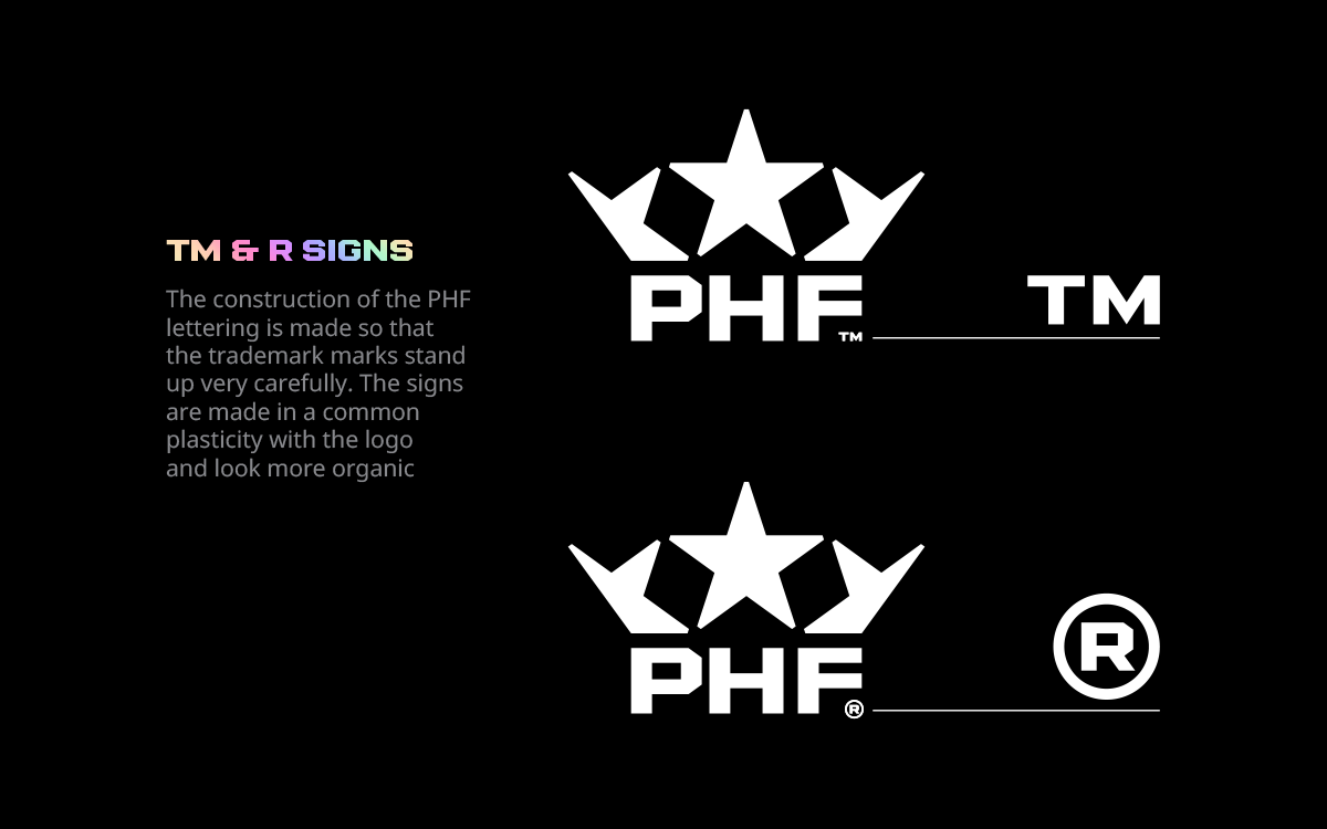
The geometric clarity and simplicity of the logo gives ample opportunities for web design, which can be used in situational marketing, or act as a frame for a photo or video. The trademark symbol does not violate the geometry of the sign, but rather naturally complements it.
While creating a font for the headlines, we took into account that the league is bilingual, and saturated the font with a few finishing touches: ligatures and diacritics of the French alphabet. All souvenirs and sub-logos are duplicated into one of the two official languages of Canada.

Медиа:
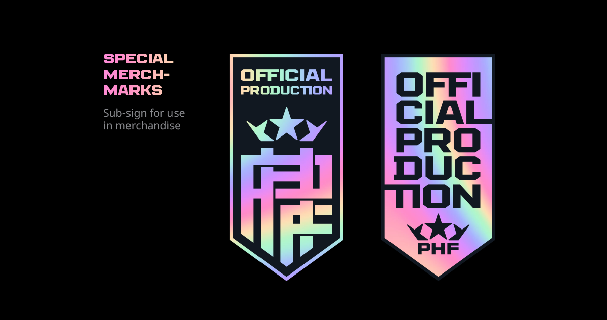
Subelements for the innovative league
The subelements of the PHF design system take into account the variety of carriers: depending on the task, they are either in emphasis or, conversely, neutral.
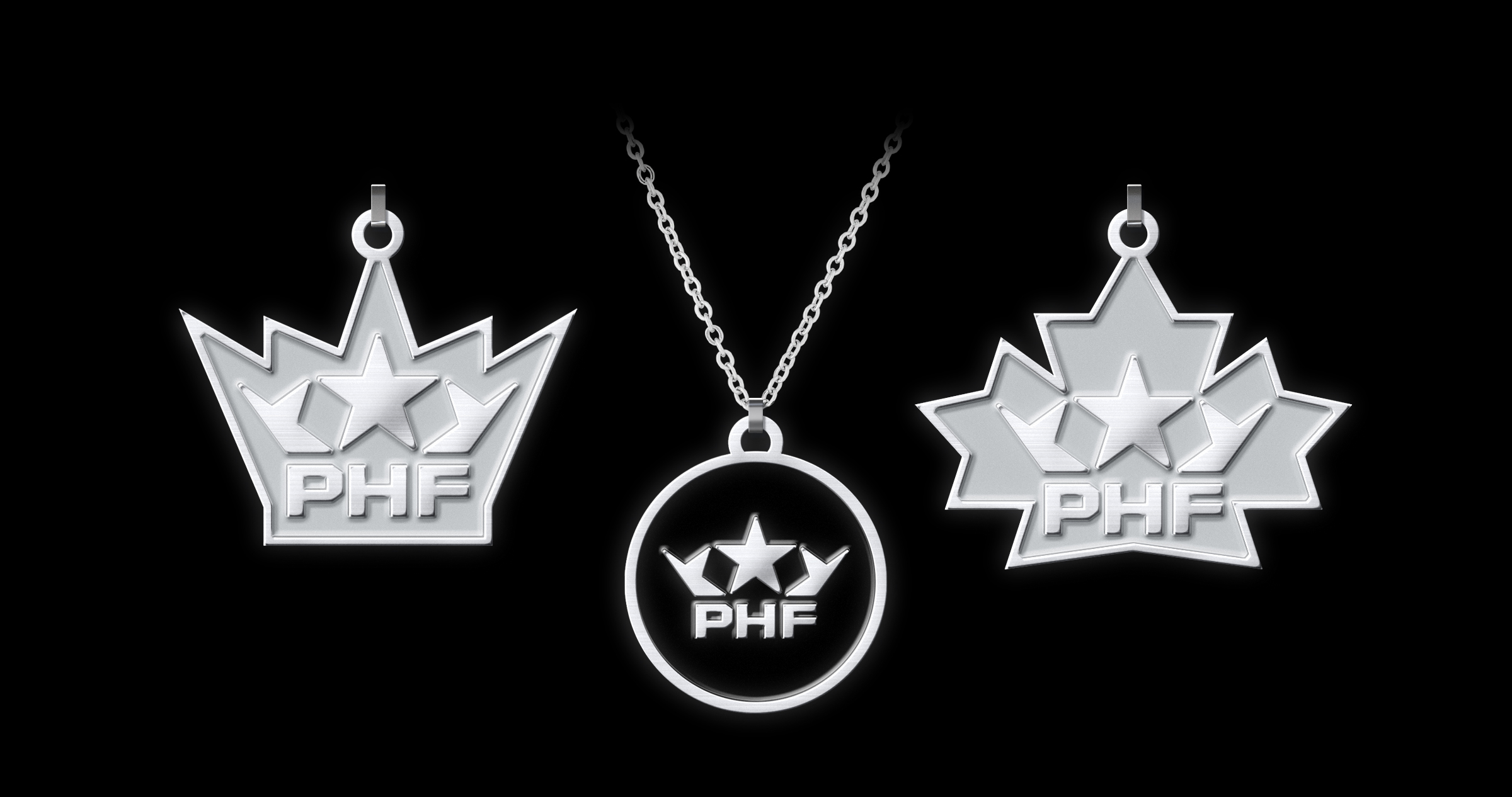
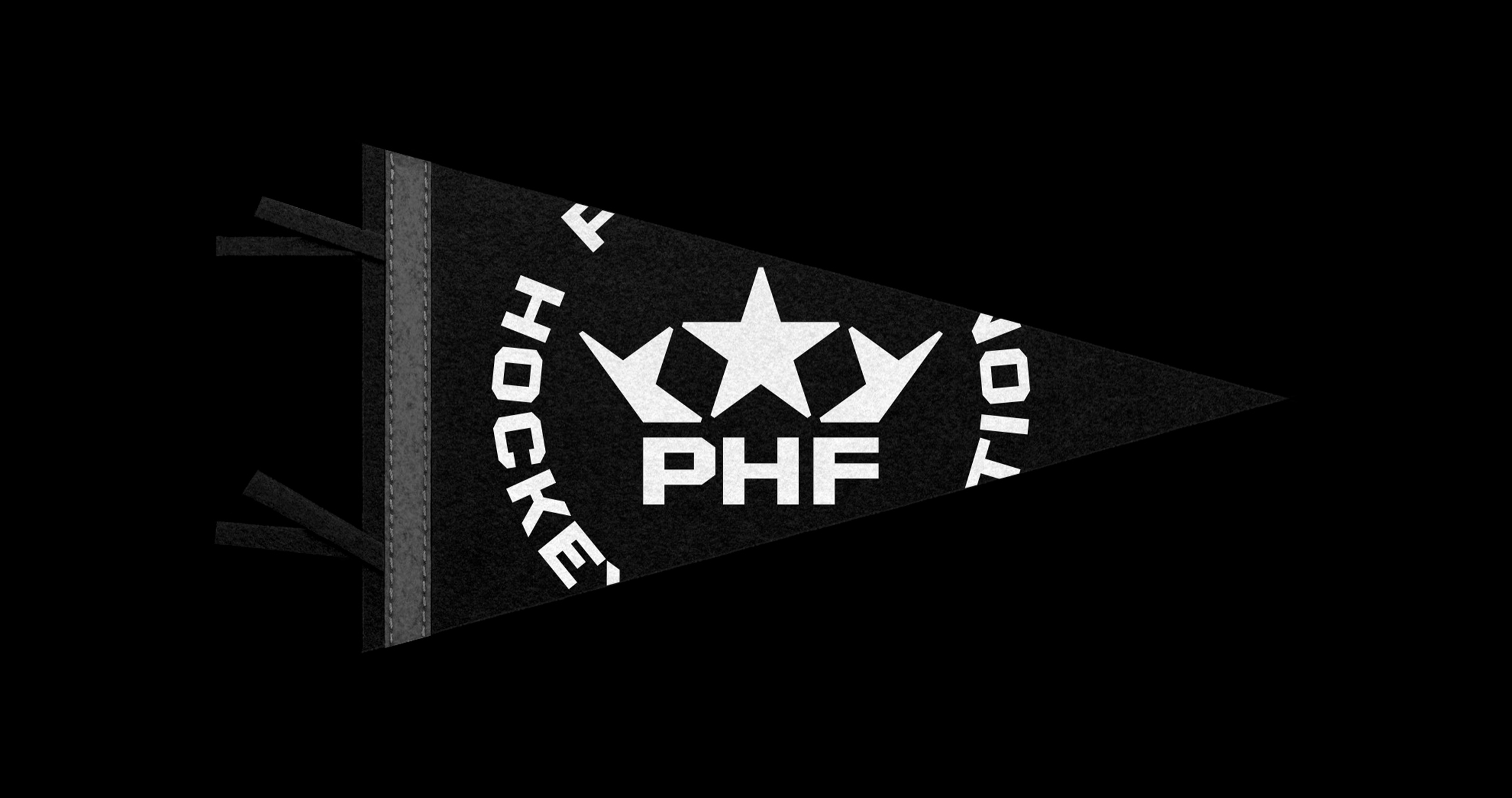
For souvenir products, the studio has created a special monogram logo, it is made in the classic North American style of intertwined letters.


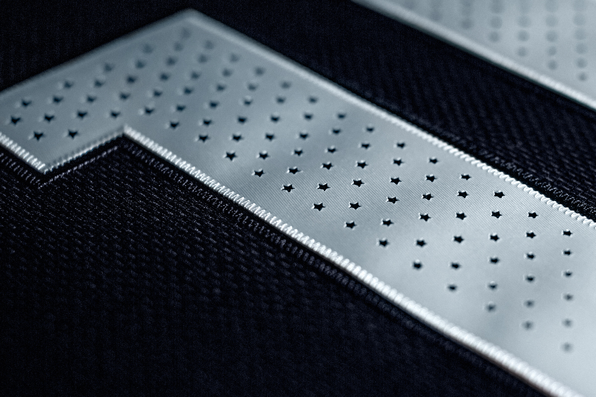
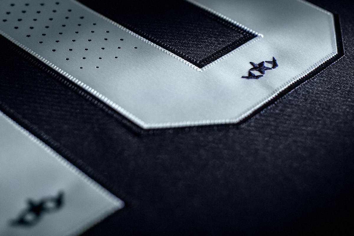
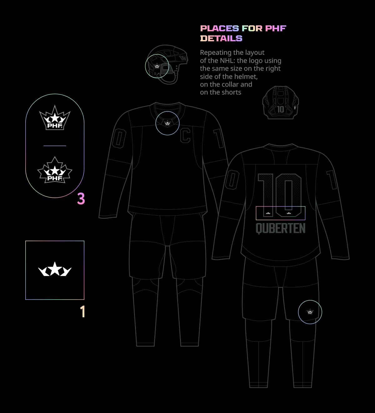
Frame-transformer and the functionality of the details
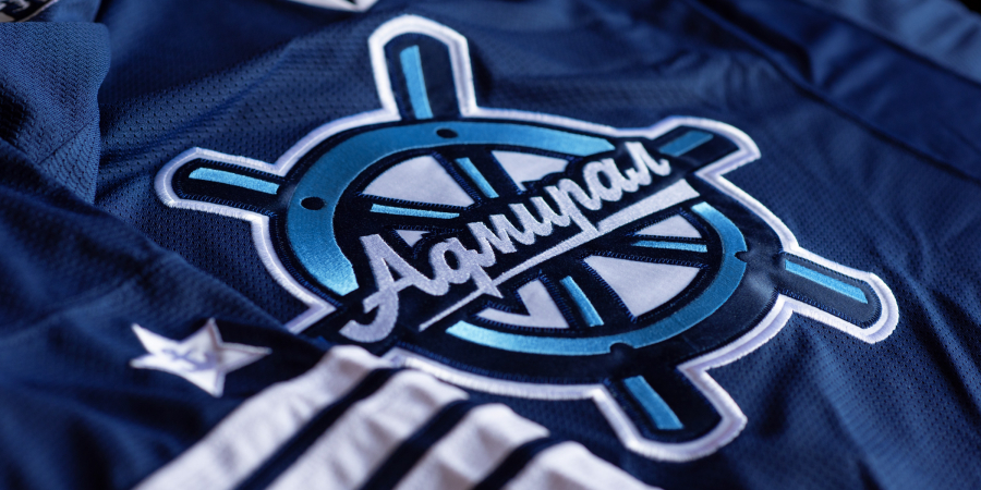
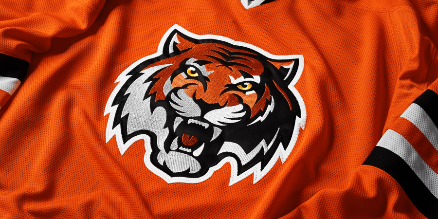
The design of the numbers mimics the plasticity of the font. The decorative details on the jersey and other elements of the uniform emphasize the geographical affiliation of the teams. In addition to the obvious ones, like flags on the shoulders for exhibition games, it is also a special symbol with a sub-logo on the collar.
An innovative solution in the construction of the frame itself performs a functional role. It’s presented in two variants: in the form of a maple leaf for the Canadian teams, and a crown for the American ones. Both are elegantly integrated into the general geometry of the identity and look natural and easily distinguishable on the uniform.

Медиа:
The habit of being a leader. Attention to visual details
The PHF is a league that is used to being the first: from the payments of the players, up to changing the name and carrying out a large-scale rebranding for the seventh season of its existence. With this, the league opens a new era of its leadership: it’s likely that as of today the PHF identity pack is one of the most well-known among the professional leagues in North America.
A significant part of any sport in the digital world is what happens outside the venue, what falls under the scope of the cameras: the arrival of teams at the arena, interviews and PR events. The PHF corporate identity provides for a variety of branding of the entire visual aspect and media carriers: from the silhouette of the crown on the goal net and along the edge of the carpet, to banners, microphones and the form of accreditations directed by the crown prong downwards.


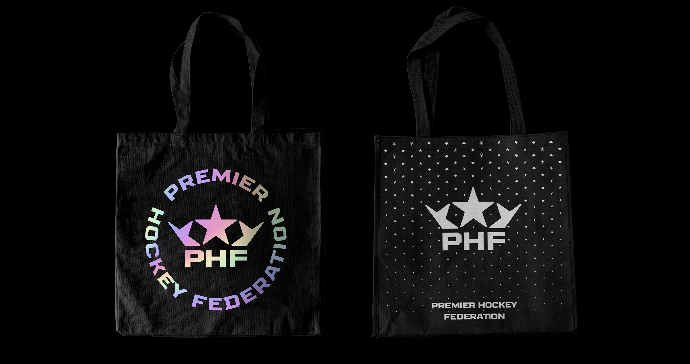
PHF values its employees: the players. The new identity features allow it to preserve branded merchandise: replaceable patches for club jackets, specially devised stickers and other elements of attributes; it’s a way of paying tribute to the cultural traditions of neighboring countries, uniting players with much more, with the sole idea of playing hockey.
Медиа:
Медиа:
Медиа:


Медиа: