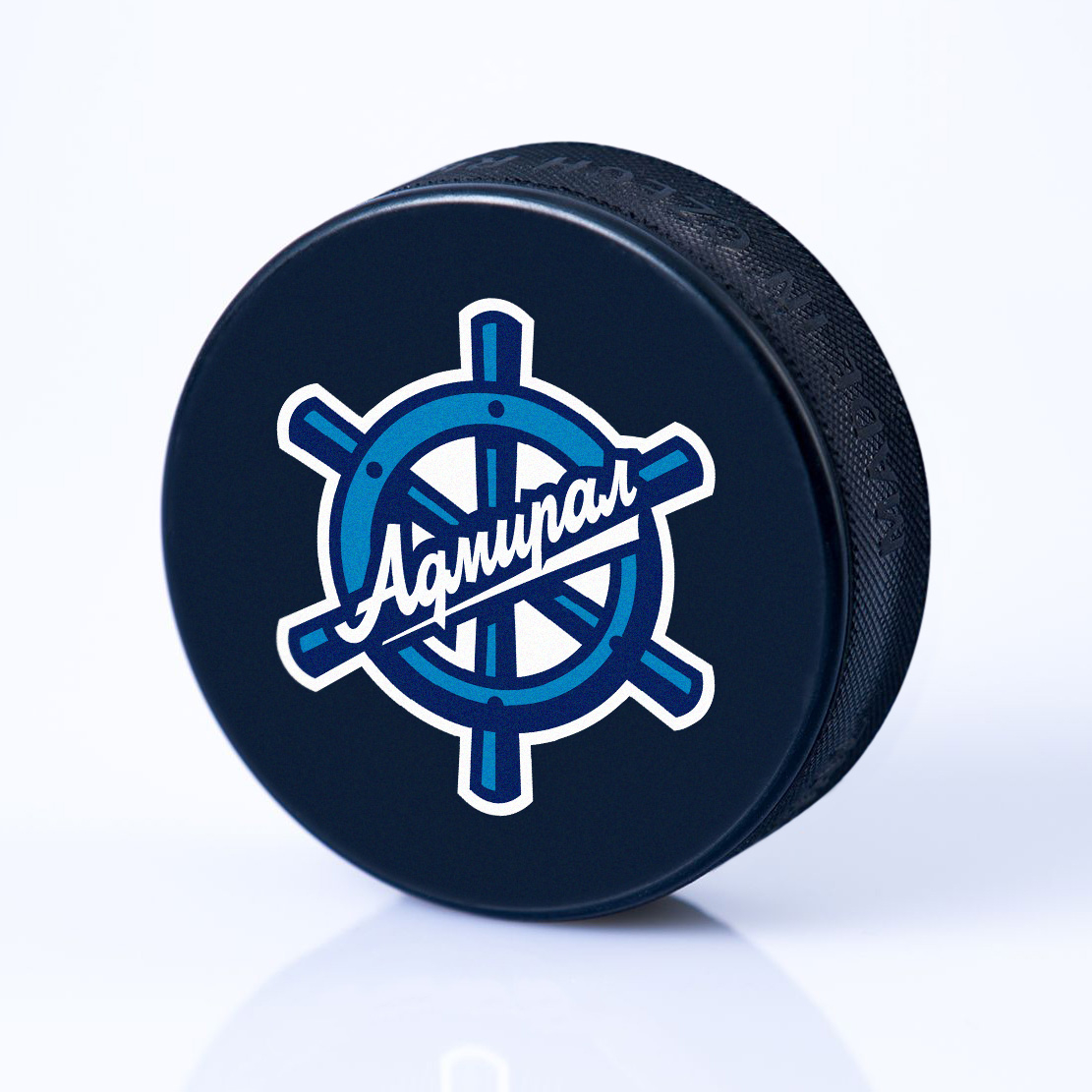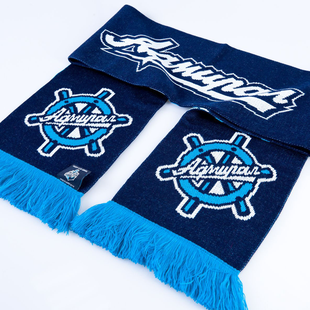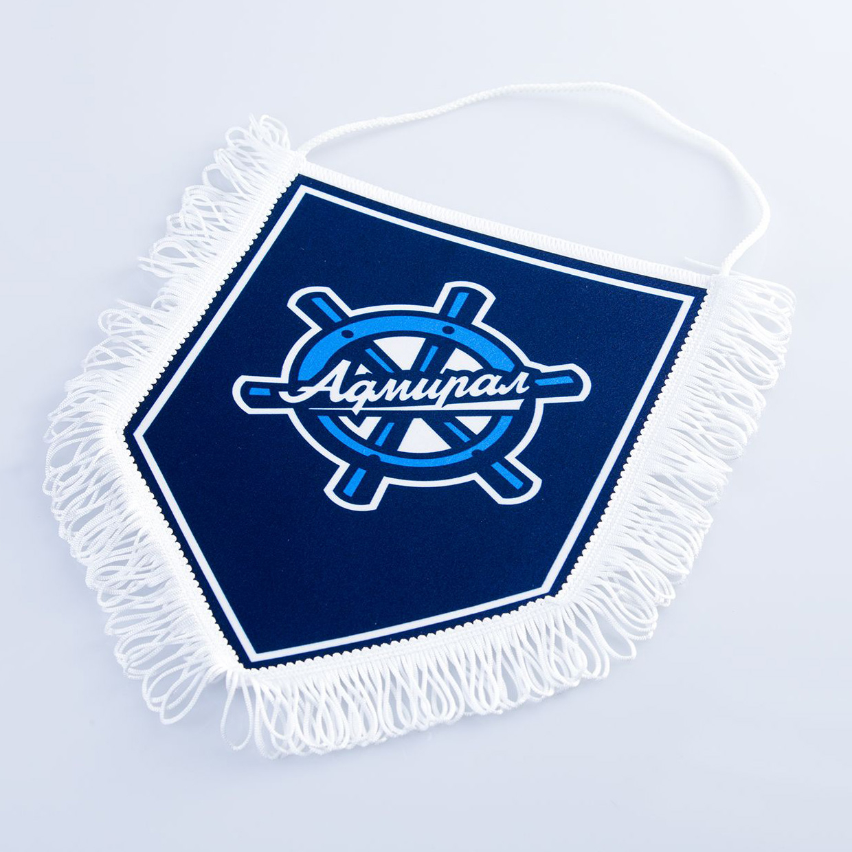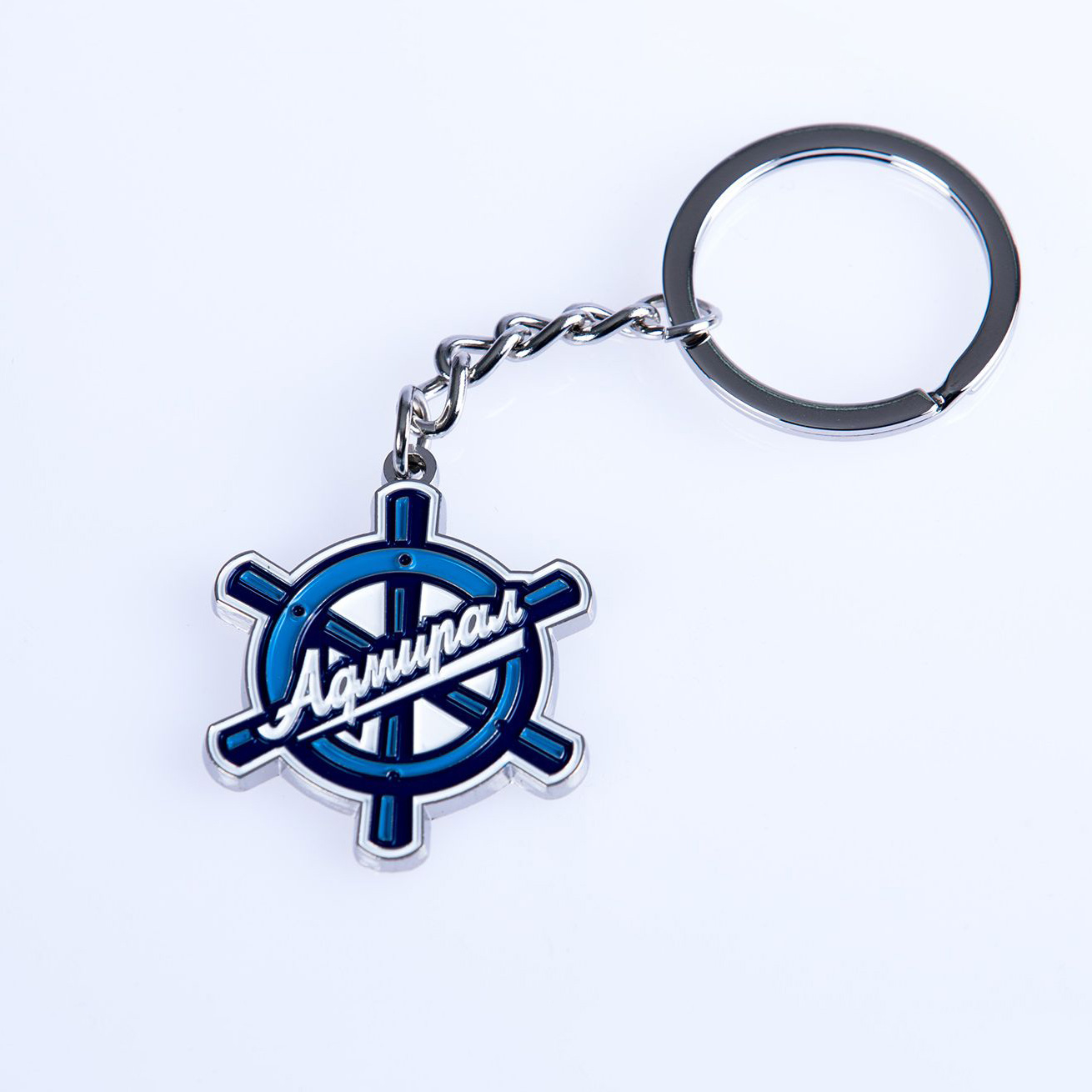
New logo of HC Admiral
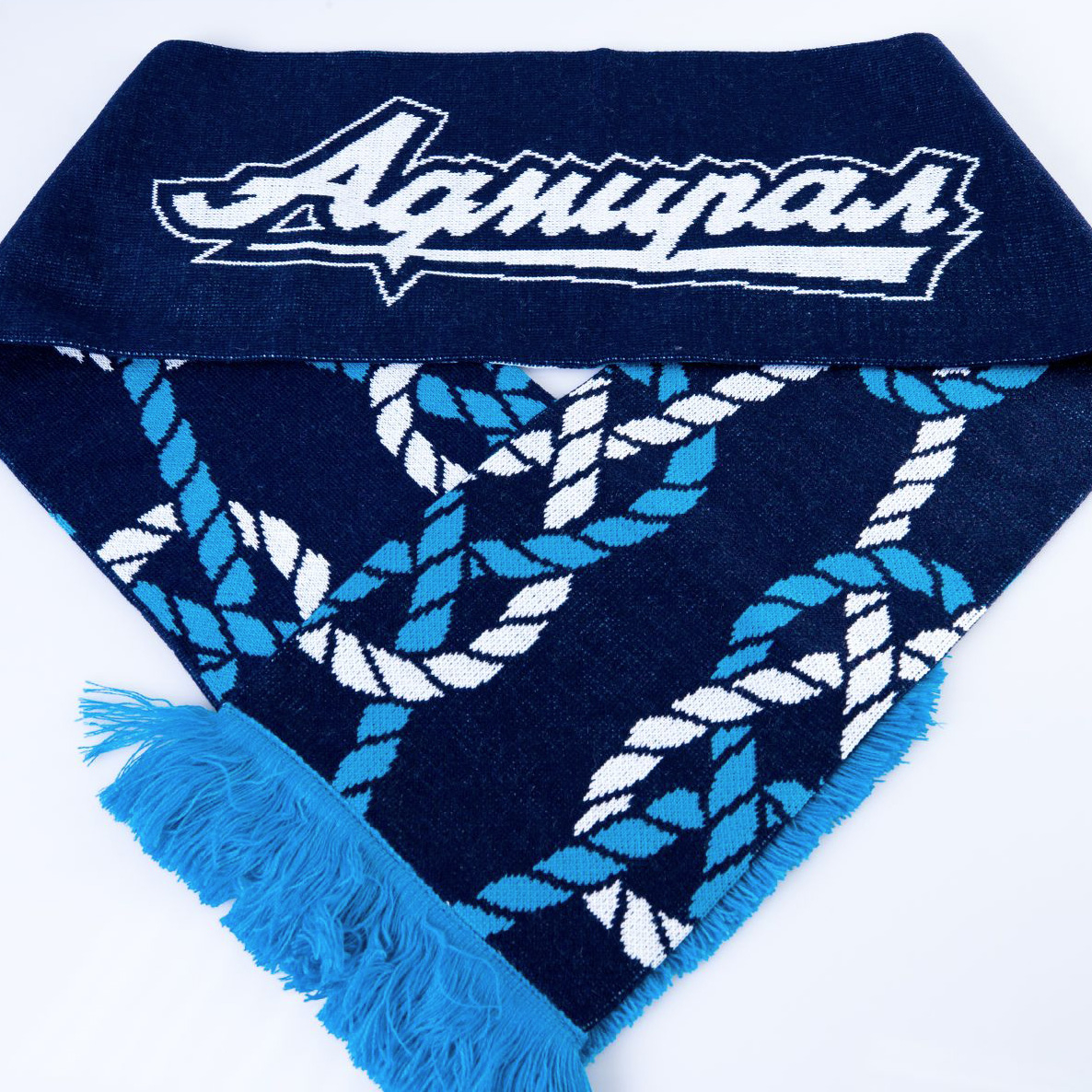
LOGO • SUBLOGOS • LETTERING • PATTERN
Admiral is one of the longest-standing clients of the Quberten studio. In 2013, the team started in the KHL with our logo, but since then the corporate style has changed and has become somewhat outdated.
All advanced sports clubs and leagues simplify their identities, moving away from the pretentious bold style. This isn’t just the fashion, but a functional solution related to the consumption of content: a noisy, overloaded logo won’t be easily identifiable on an app, within the stands at a game or on other platforms on a smartphone. Therefore, the Admiral moved towards a more minimalist approach.

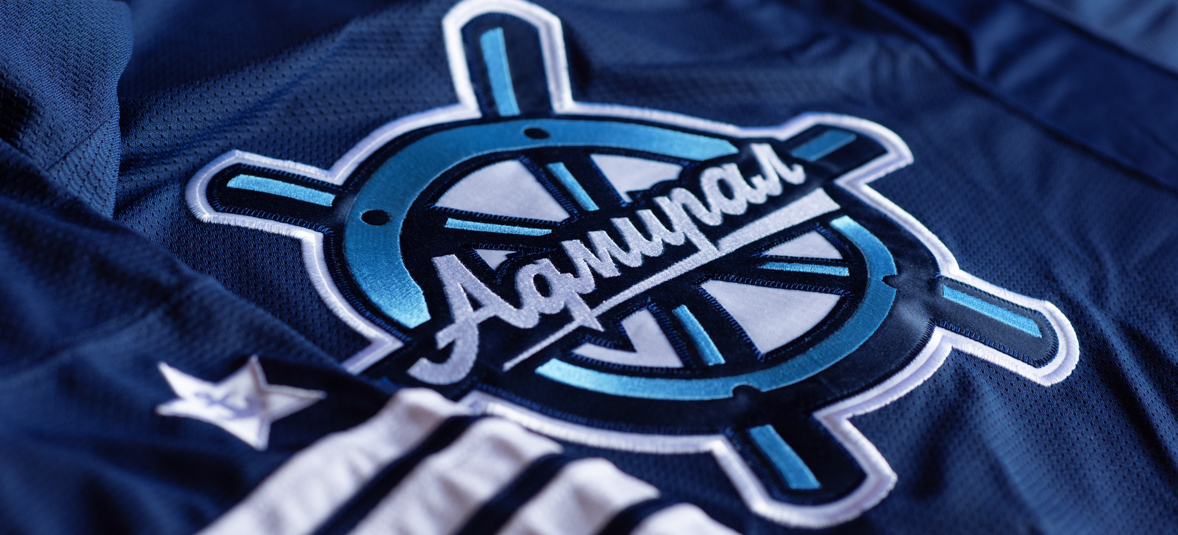
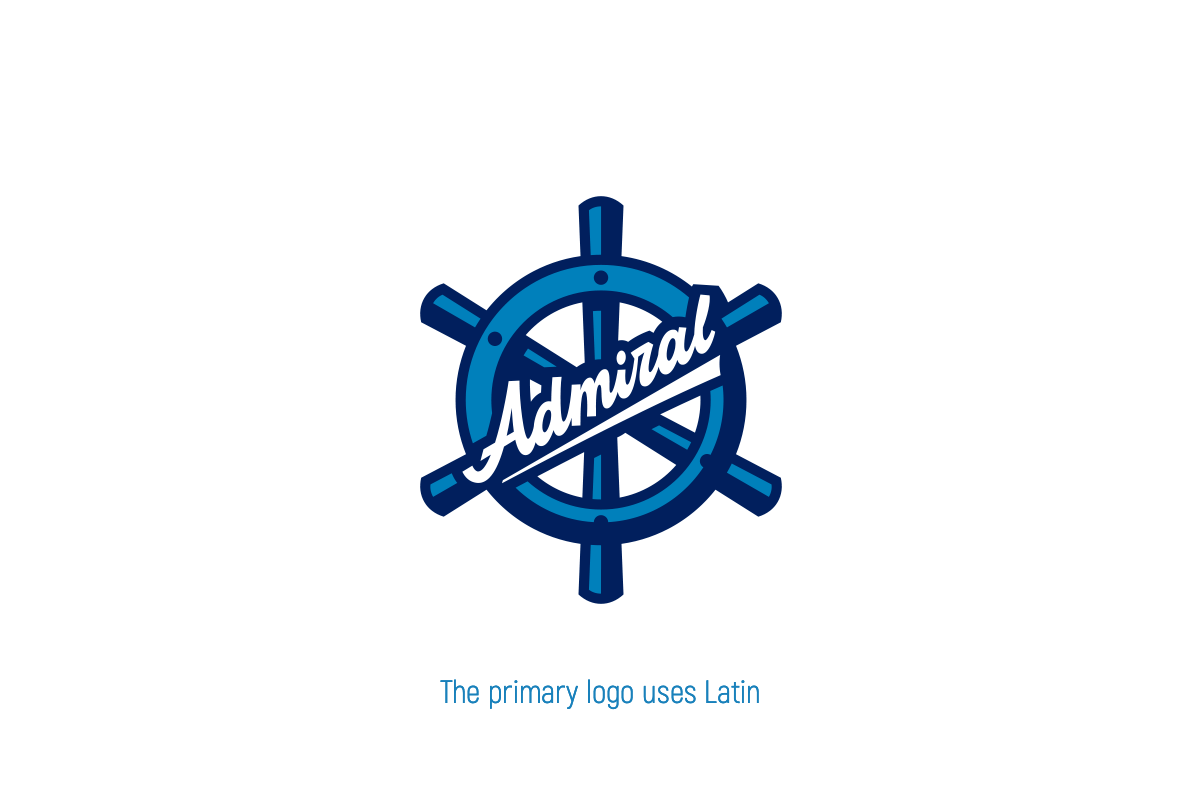
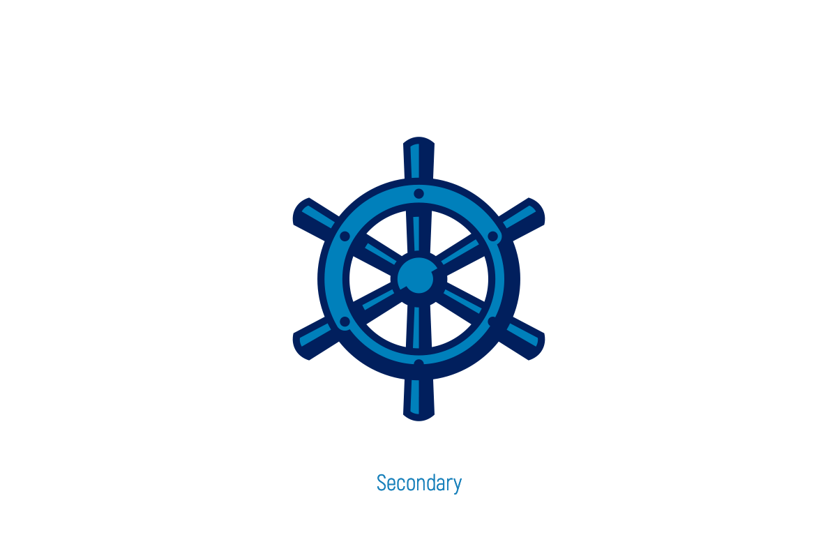
The logo with steering wheel has become flat
The previous logo was replete with small details: shaped steering wheel balusters, glare, secondary inscriptions (Vladivostok) and designations (PK) deprived the image of clarity and didn’t allow it to integrate into a more modern and digital reality. The weak geometry was also pretty eye-catching: the direction of the inscription Admiral conflicted with the diagonals of the steering wheel.
We have however cleaned up these errors. The steering wheel has become cleaner and clearer, and its 30-degree diagonal is finally geometrically in sync with the new lettering. A simplified version has been developed for working on a small scale: without the original inscription.
In addition, if the anchor returns to its identity in the future, it will be able to interact with the steering wheel.

Alternative logo — made of encrypted sea symbols
The potential of the Admiral’s corporate identity has significantly increased thanks to a fresh element: an alternative logo ’Compass Rose’ has appeared. According to the geometry, colour scheme and the other finer details, it emphasizes the main emblem, but at the same time, it’s completely independent and includes encrypted Easter eggs.
Try to find them yourself, but if you can’t seem them, there are transcripts on the side.


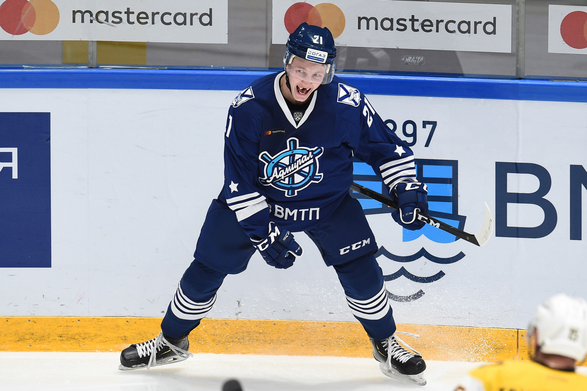
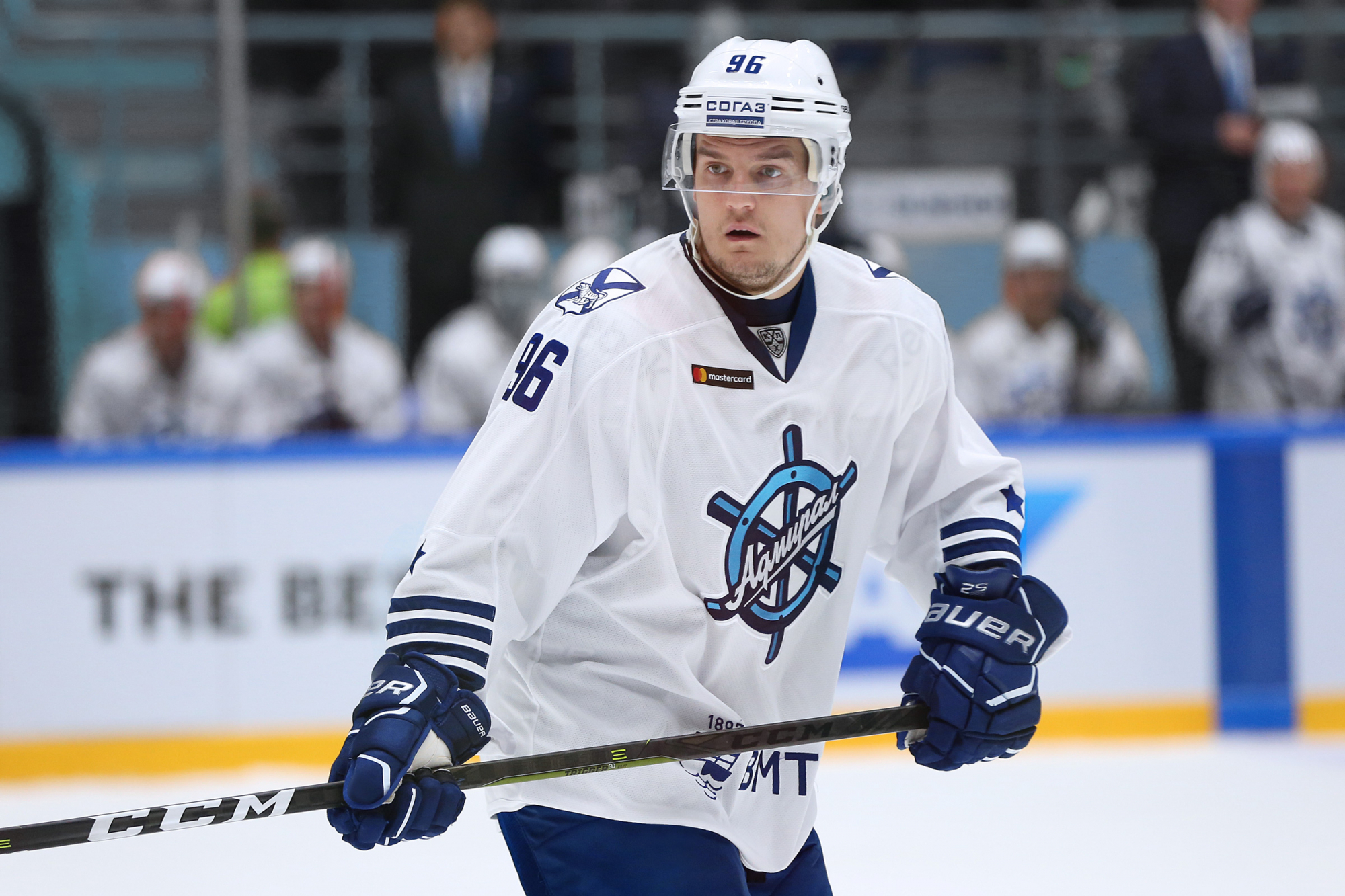
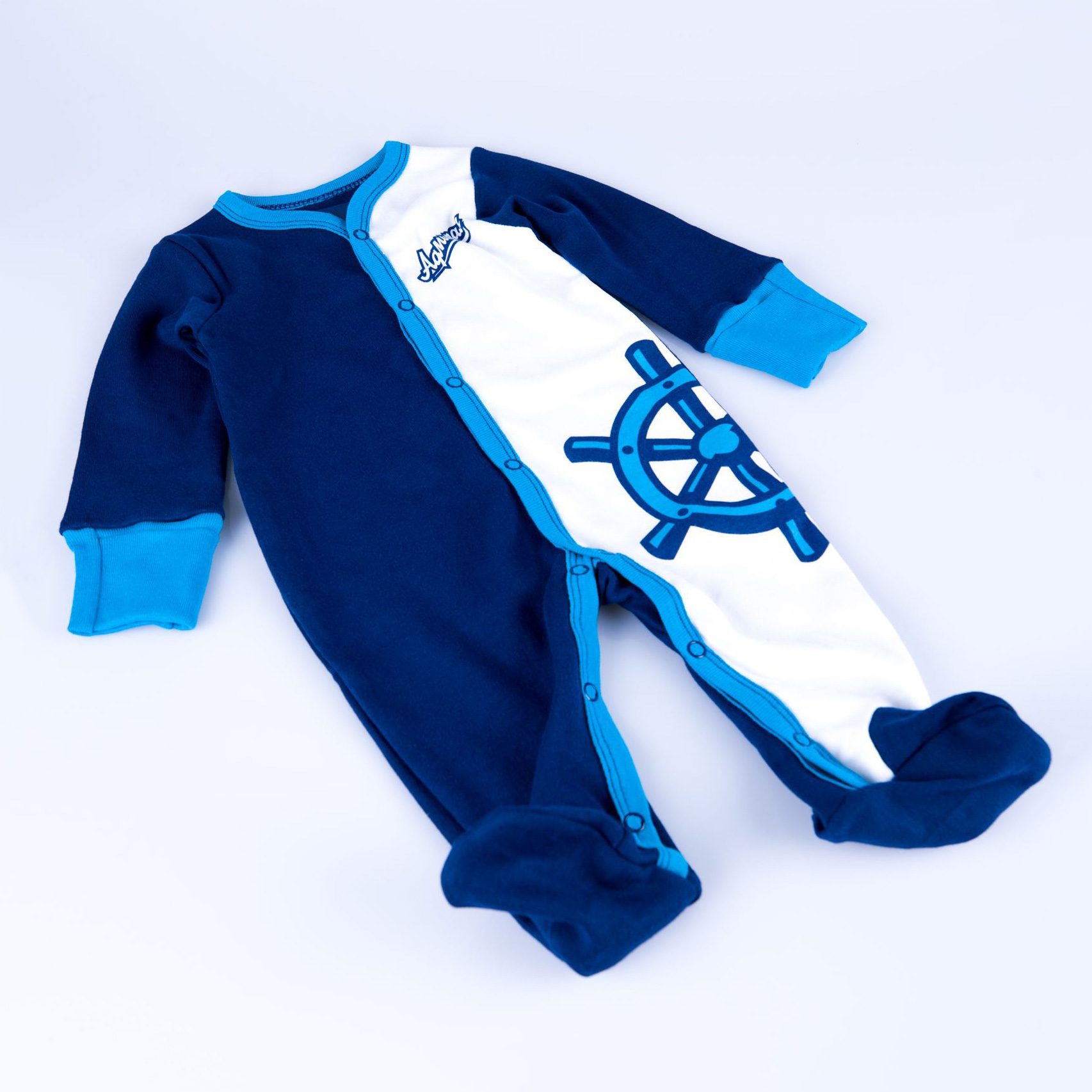
The uniform is like an admiral’s jacket, and the captain’s letters are like a badge of distinction
The blue-and-white uniform retains the corporate graphics associated with the admiral’s uniform. On the shoulder boards, the lower stripe is thicker than the others, and in the new iteration of the kit, the lower stripe is increased to the edge of the sleeve. This change has made the graphics overall more noticeable.
We also worked out a star that practically repeats the armband of the admiral of the fleet, but only the anchor isn’t the same as that of the Russian Navy, but is familiar to the hockey club.
This anchor also makes the captain’s letters special. It’s quite rare that a KHL club boasts exclusive letters-patches. This will be another feature of the club.
The font of the numbers remained almost unchanged. Only some nuances have been corrected.