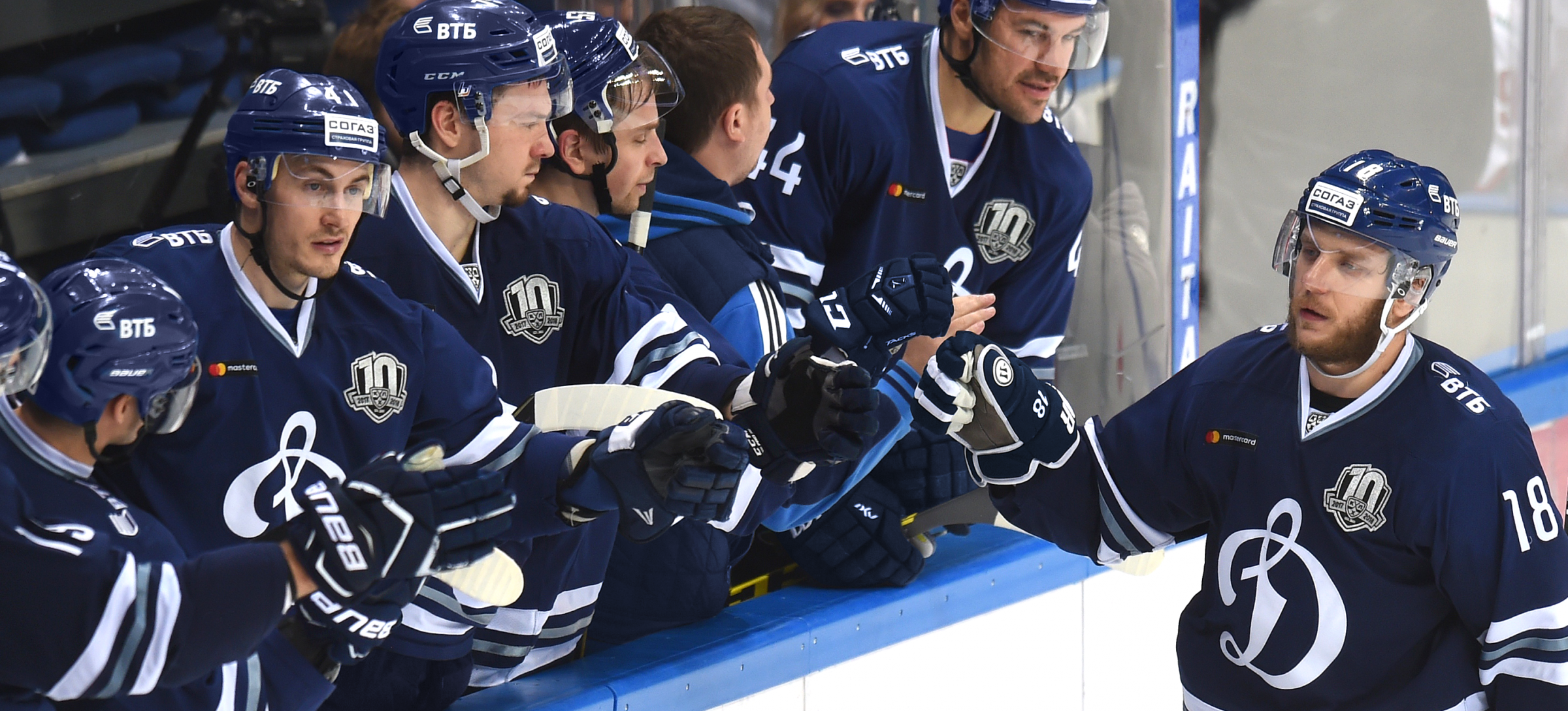
Logo and uniform of Dynamo Moscow
LOGO • UNIFORM • FONTS
Dynamo has a rich cultural heritage: the letter ’D’ is a classic that looks good in all scenarios. Tectonic changes are not required for such a club, but a neat restyling is still needed: some shortcomings have accumulated over the years. Following the logo, the Quberten studio also updated the game kit for Dynamo’s players.

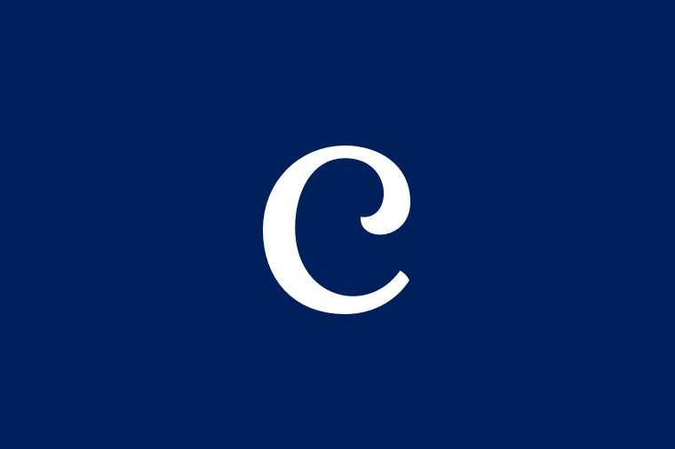
The remarkable letter ’D’ has become cleaner and more harmonious
The previous logo had two key problems. Firstly, the letter was outstretched with an extra contour, which created a moire effect and hid the uniqueness of the calligraphy.
Secondly, the shape of the letter and its culture of curves were not professional enough. We have restored its geometric accuracy.

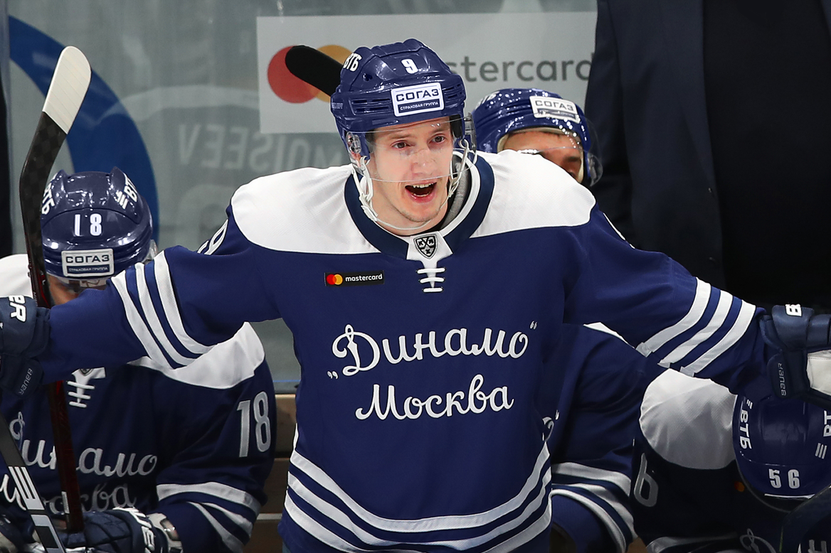
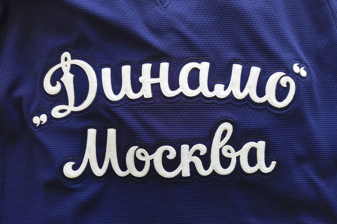
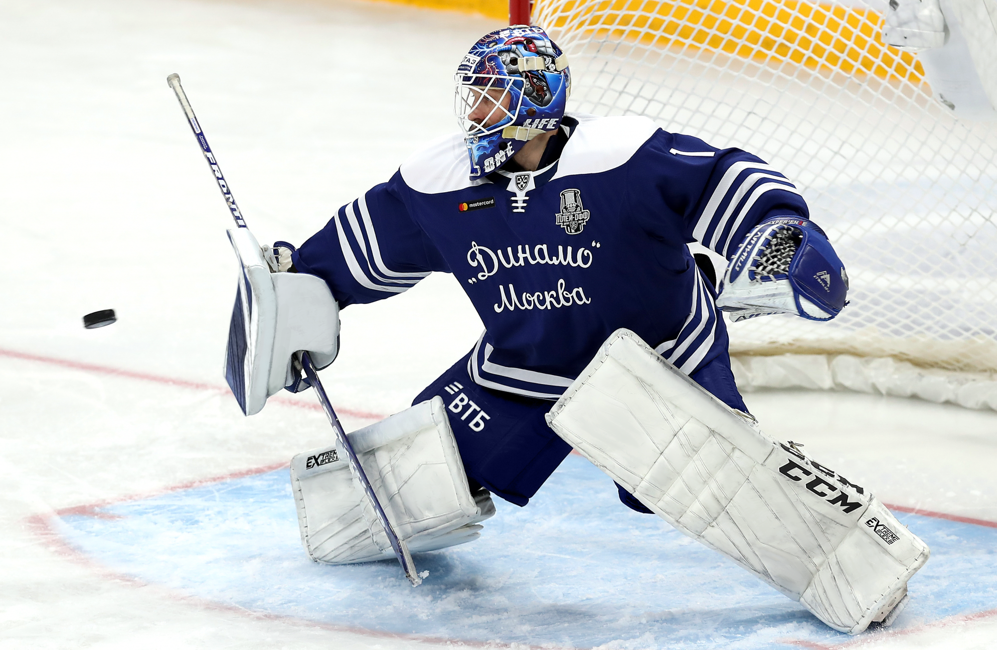
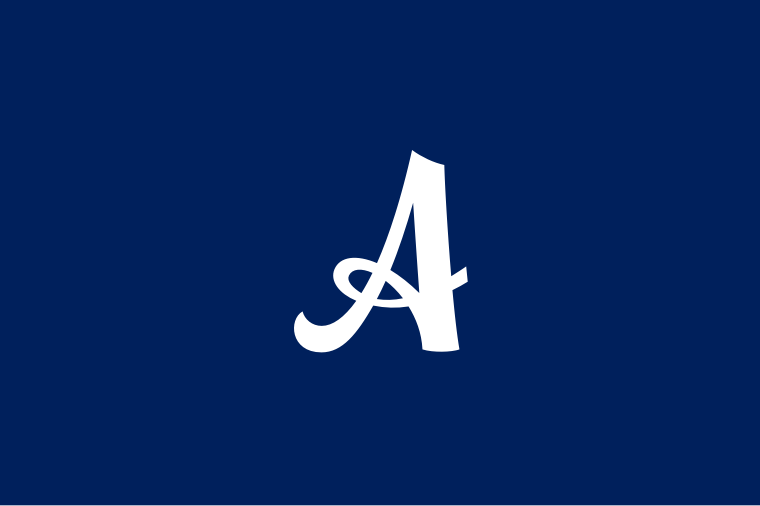
Calligraphy changes the kit, through lettering and special captain’s letters
The colour division of the two main sets: the first one is white, with the other being blue. It still looks the same, but the design has changed a lot.
The key elements are subordinate to the letter ’D’, making the kit monolithic. Previously, there was no unity of style. For example, the team held the previous championship with a strict inscription ’Moscow’ at the belt level, which did not connect with the calligraphy in the logo. Now the geometric collegiate fonts have been removed. In their place, we have prepared a new font that has adopted the plasticity of the emblem.
The new font for the numbers is also made in this way. Previously, faceted numbers conflicted with the smooth strokes of the logo. The new version retains a brutal mood, while the curves in each digit permeate it with a dynamic aesthetic.
Another feature of the kit was the captain’s letters, which was inspired by the traditional ’D’. In the KHL, not enough attention is paid to the captain’s features so far, yet the more noticeable will be an unconventional decision that turns a seemingly technical element into an important part of club identification.


To enhance the style of the season, we have also developed a retro kit for Dynamo; it’s based on the kit of the 1971-1974 seasons. In the center of the kit there is a calligraphic inscription Dynamo Moscow, which at one time even acted as the main logo. A similar lettering club has already been used in the first season of the KHL and in thematic events, but both options were incomplete (the first lacked integrity: the letter ’D’ did not unite anything with others in the phrase; in the second, the below-standard digitization of the Soviet script was too striking).
The new font is completely based on the original from the 70s and closely echoes the logo: all the letters in the phrase and the letters D have common style-forming elements.