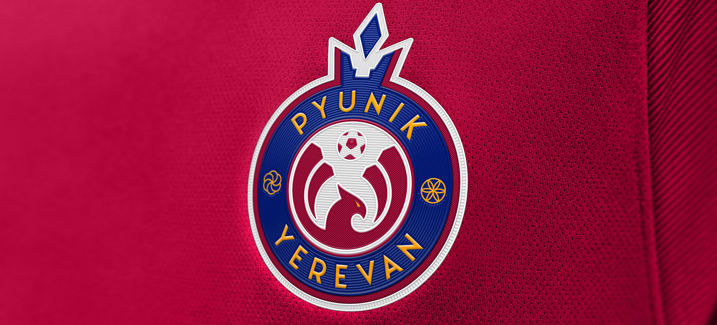
Logo for FC Pyunik
LOGO • SUBLOGOS • TYPEFACE DESIGN
Pyunik is one of the strongest football brands in the CIS and the record holders with the most number of Armenian championship titles. But no great team can dwell on the past; to look confident right now, you need a fresh identity. Quberten studio has not only created a new logo, but a full-fledged commercial logo that changes the perception of Pyunik.

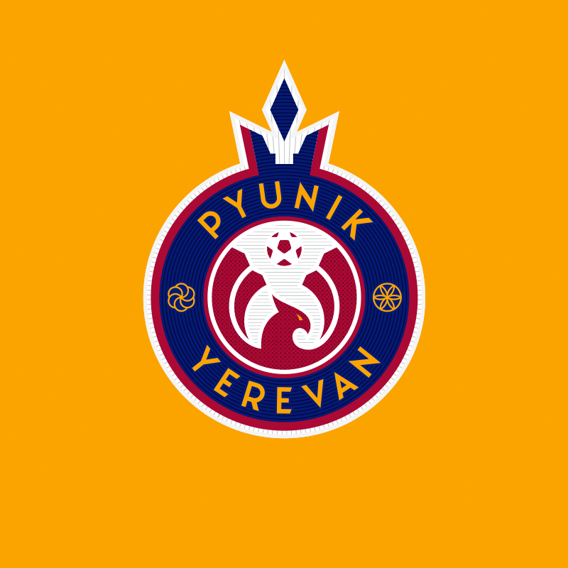
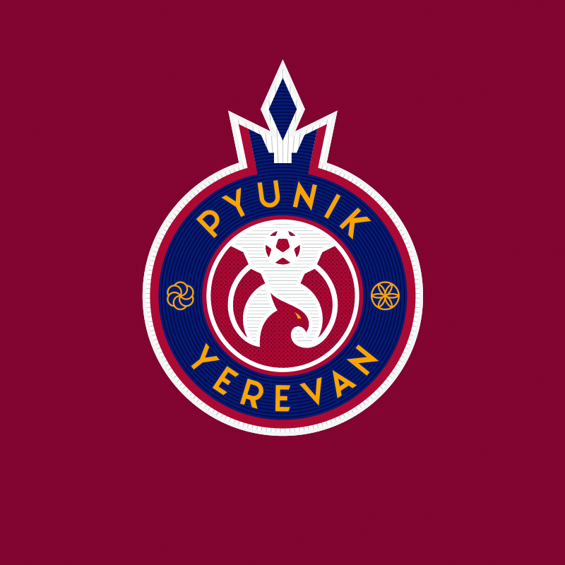
Pomegranate with a crown — the national logo for the champion
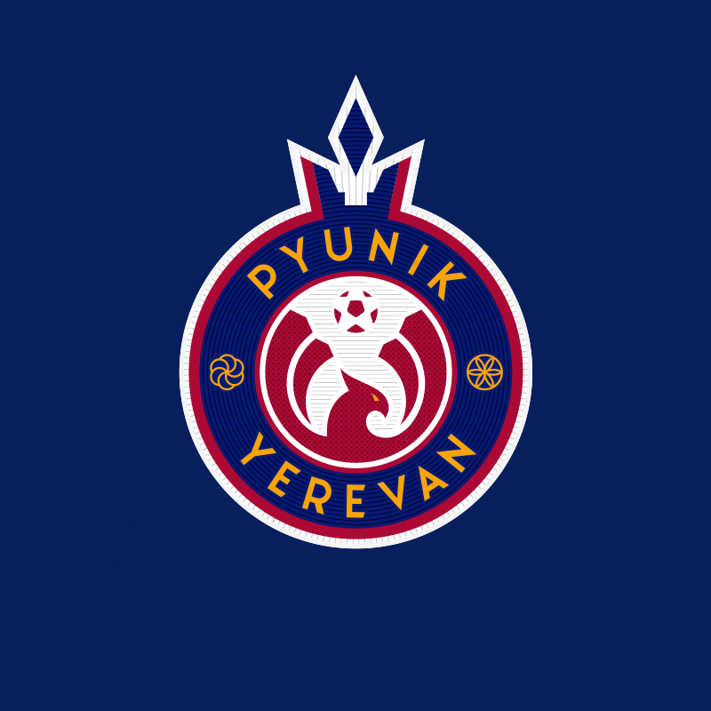
The new logo of Pyunik: the jewel in Armenia’s footballing crown emphasizes the deep connection of the club with the important symbols of Yerevan and the country as a whole. For example, the updated palette was filled with the colours of the Armenian flag, but with a shift to more complex shades; this improves the basic recognition of the club.
The crown covering the sign is a reference to the capital city’s coat of arms, while the accentuating letter Y is encrypted in its negative space, combining the Latin spelling of Pyunik and Yerevan.
In combination with the circle, the crown forms the main silhouette element of the emblem: a stylized pomegranate, a staple in Armenian cuisine. Thanks to this technique, the logo will be read faster on any media carrier, because non-standard silhouettes stand out and strengthen associations (for example, you will always recognize the logo of Real Madrid without even noticing the inscriptions in the logo).
In the center of the emblem is a geometric figure of a phoenix, drawn in the style of traditional Armenian ornaments (‘Pyunik’ being Russian for ‘phoenix’). There’s a football over the head of the mythical bird. On the left: an arevakhach, the Armenian sign of eternity. On the right is a rosette in national ornaments.


The result is a flexible logo, the elements of which can work separately or which can be rebuilt to create alternative signs, depending on the task.
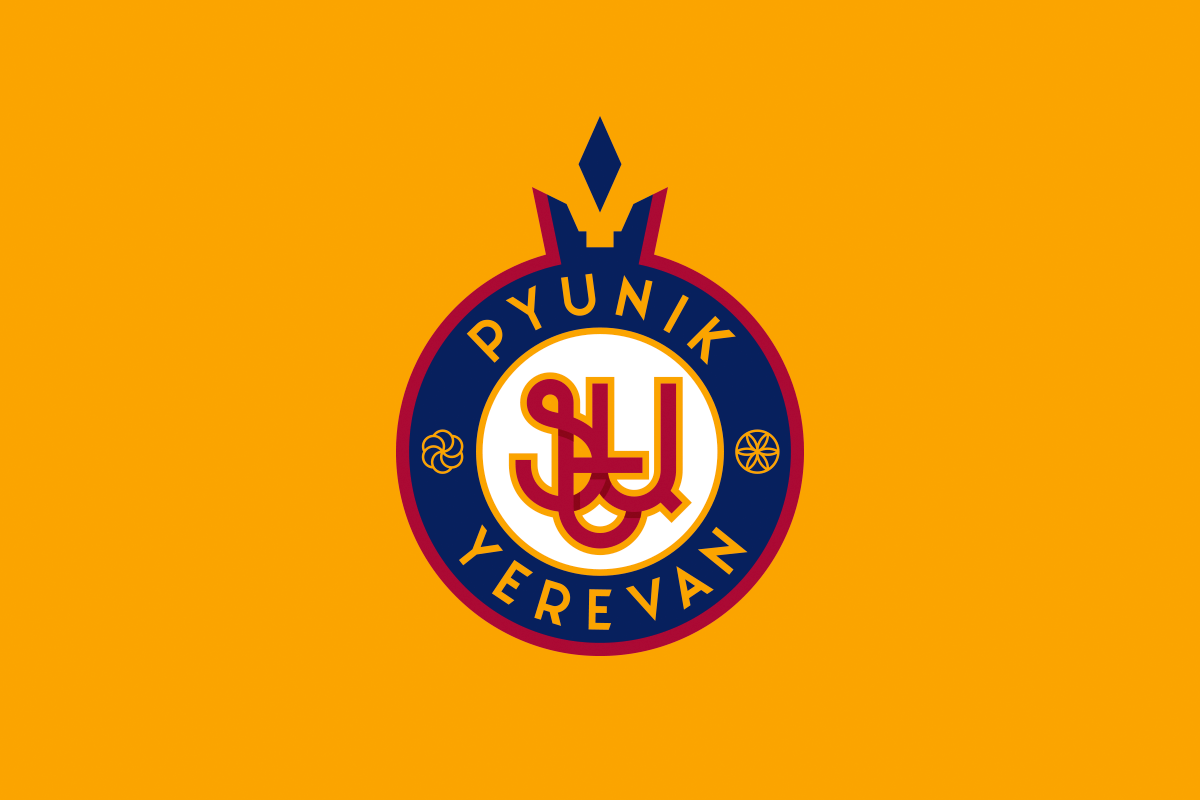
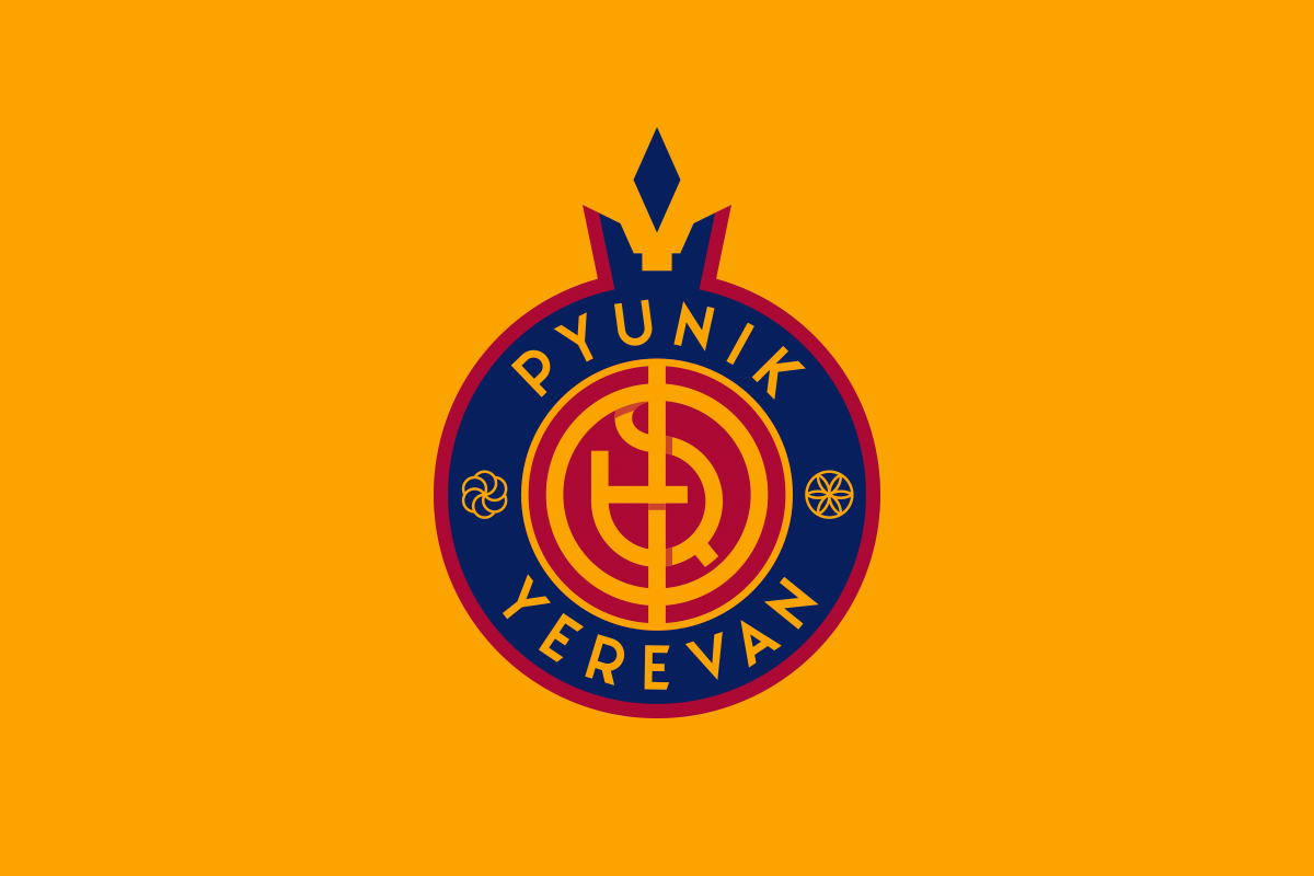
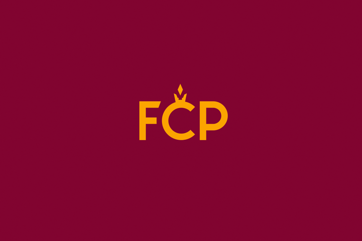
A special version of the logo has been developed for merchandising, in the center of which the abbreviation FCP is printed in a calligraphic font. There’s also a special tourist logo with simplified national motifs.


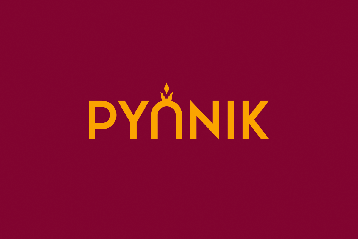
A stylized crown can act as an independent recognizable element. With it, a text version of the logo is formed and even an abbreviated text version that is convenient for use on the kits.
The kit is a continuation of the emblem: a phoenix on the chest and a crown on the numbers
Pyunik’s game sets are no longer disconnected from the identity system, but are now fully integrated concepts. A wide pattern with a phoenix is embossed on the chest; it makes the T-shirt embossed, jazzes it up and attracts further attention.
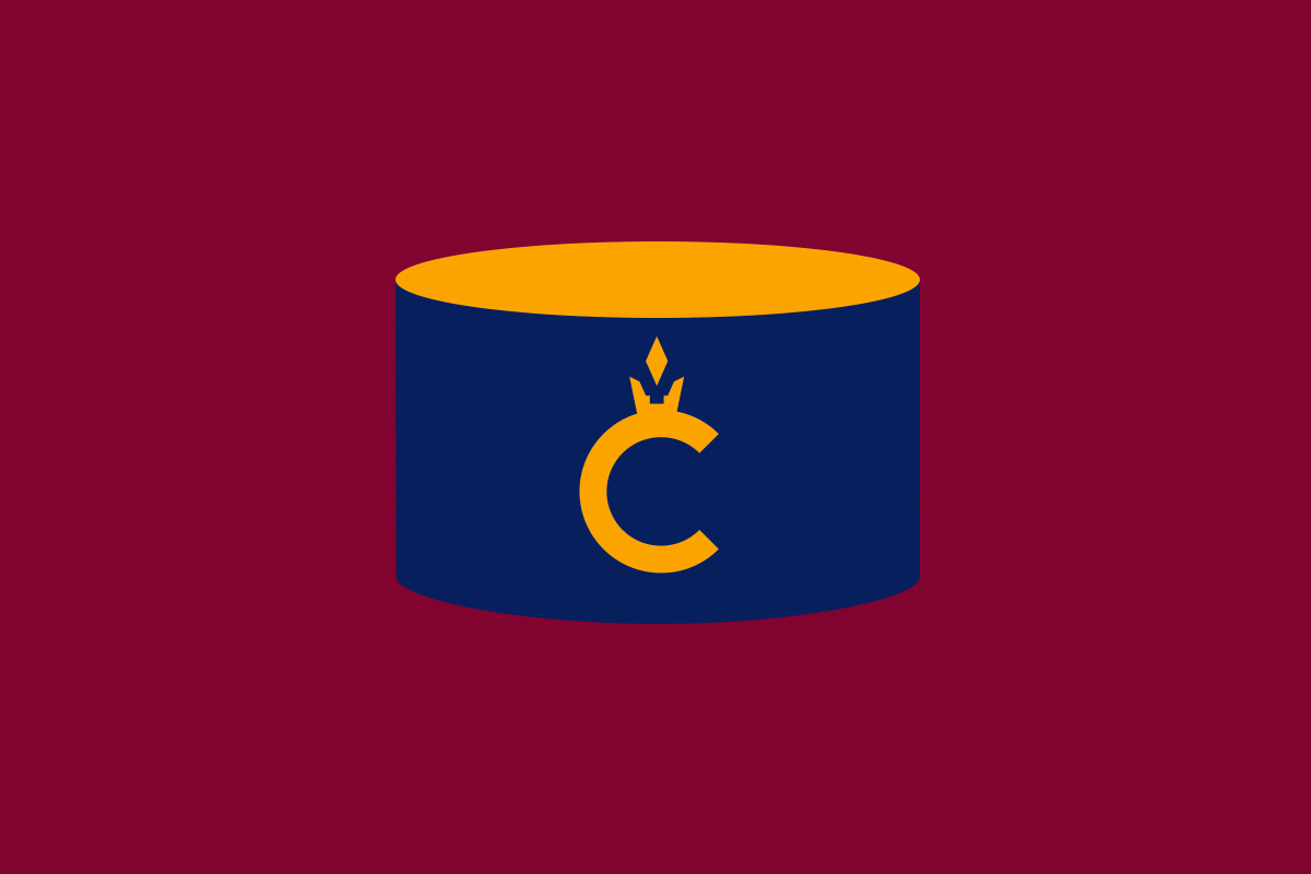
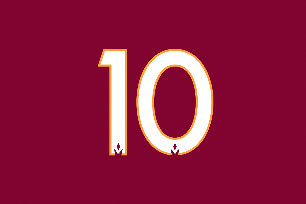
Another important element of the logo, the crown, is integrated into the kits through a simplified text version on the back, a custom captain’s armbands (inlaid with the letter C) and adapted numbers. A special font has been developed for players’ kit numbers, and the base of each digit is supplemented with the crown.
There is also a pleasant detail for everyone around Pyunik: on the inside of the collar there are 14 stars, in honor of the club’s 14 championships.