Redesign of HC Severstal
LOGO • TYPEFACE DESIGN • UNIFORM
In recent years, Severstal has been doing everything to make Cherepovets hockey a strong brand, to be recognized far beyond the Vologda region. The club has strengthened its diverse marketing (players met with factory workers at 7 am, the club was the first in Russia to launch a project with AR), so a minor rebranding is a logical step in development.

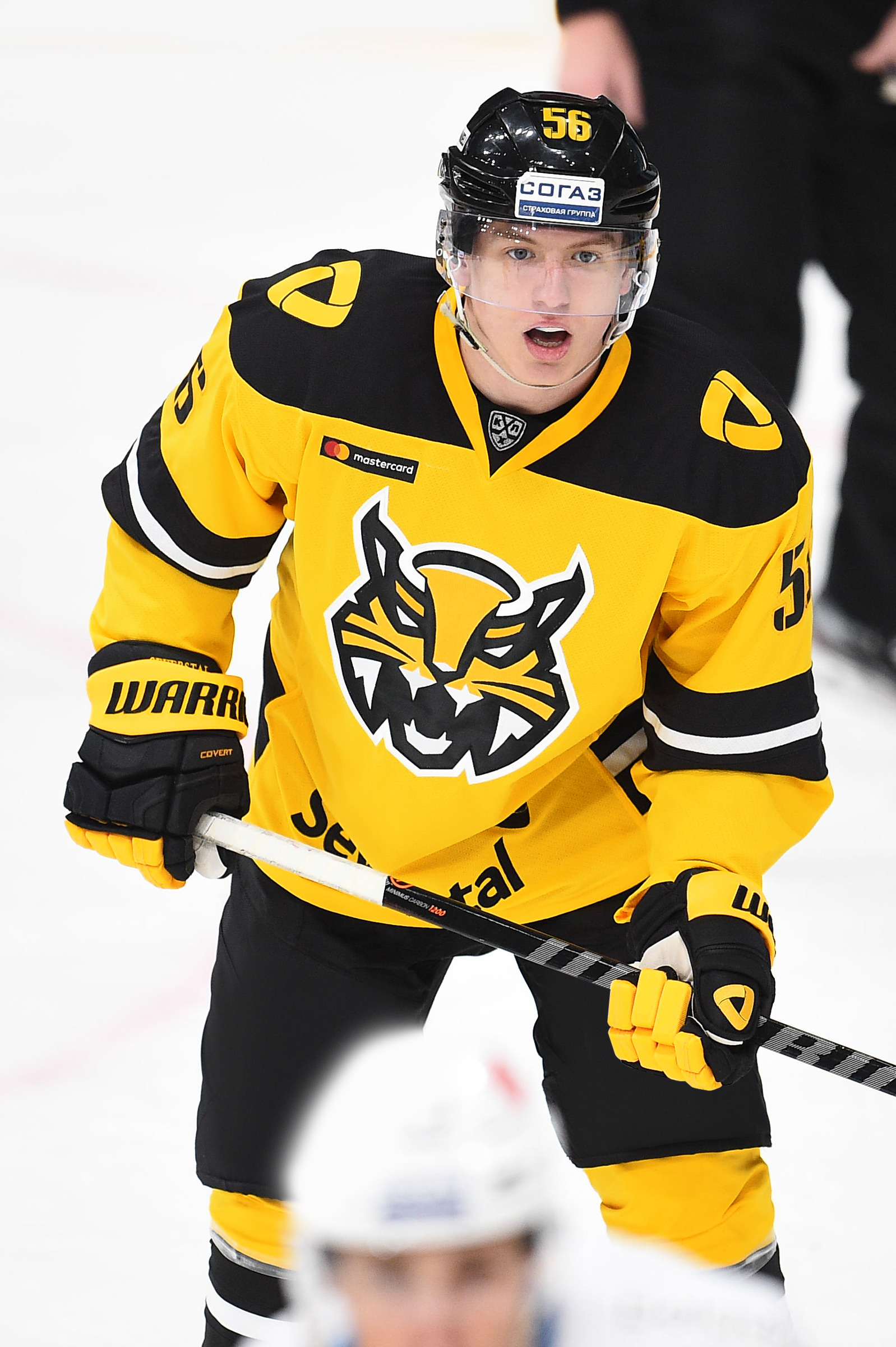
Updated lynx logo with metallurgical Easter eggs
The main logo emphasizing the relationship with the Severstal company — the monochrome Unity sign in black and yellow remained almost unchanged. Only non-obvious graphical errors have been fixed (extra dots have been cleaned out).
The alternative logo has changed much more. It still shows the lynx, which are common in the Vologda region, but the outdated bold style has been replaced by the current flat minimalism, which works equally well on large media carriers and on a small scale (mobile applications, tournament tables, etc.). The rigidity and moderate sports aggression of the sublogo correspond to both the brutality of hockey and an equally harsh sphere of metallurgy.
The continuity of the metallurgical plant and the club is strengthened by encrypted images. The lynx’s forehead and nose are a casting bucket from which metal is poured, the mustache is a spray of liquid metal, and the upper lip and teeth are the sparks.

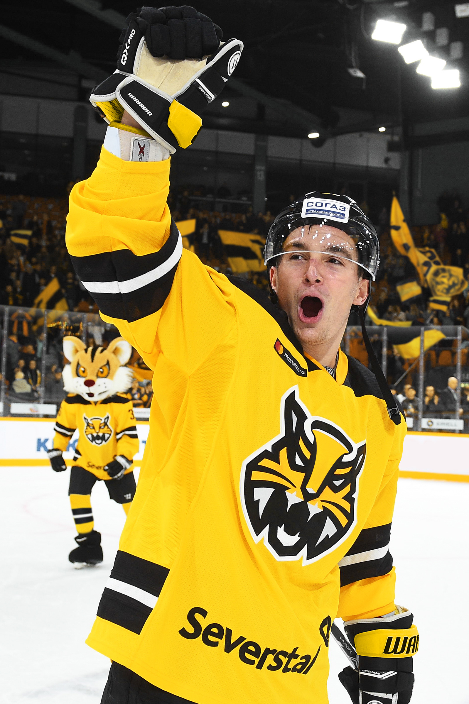
The kit has acquired a yellow colour and the factory font for the numbers
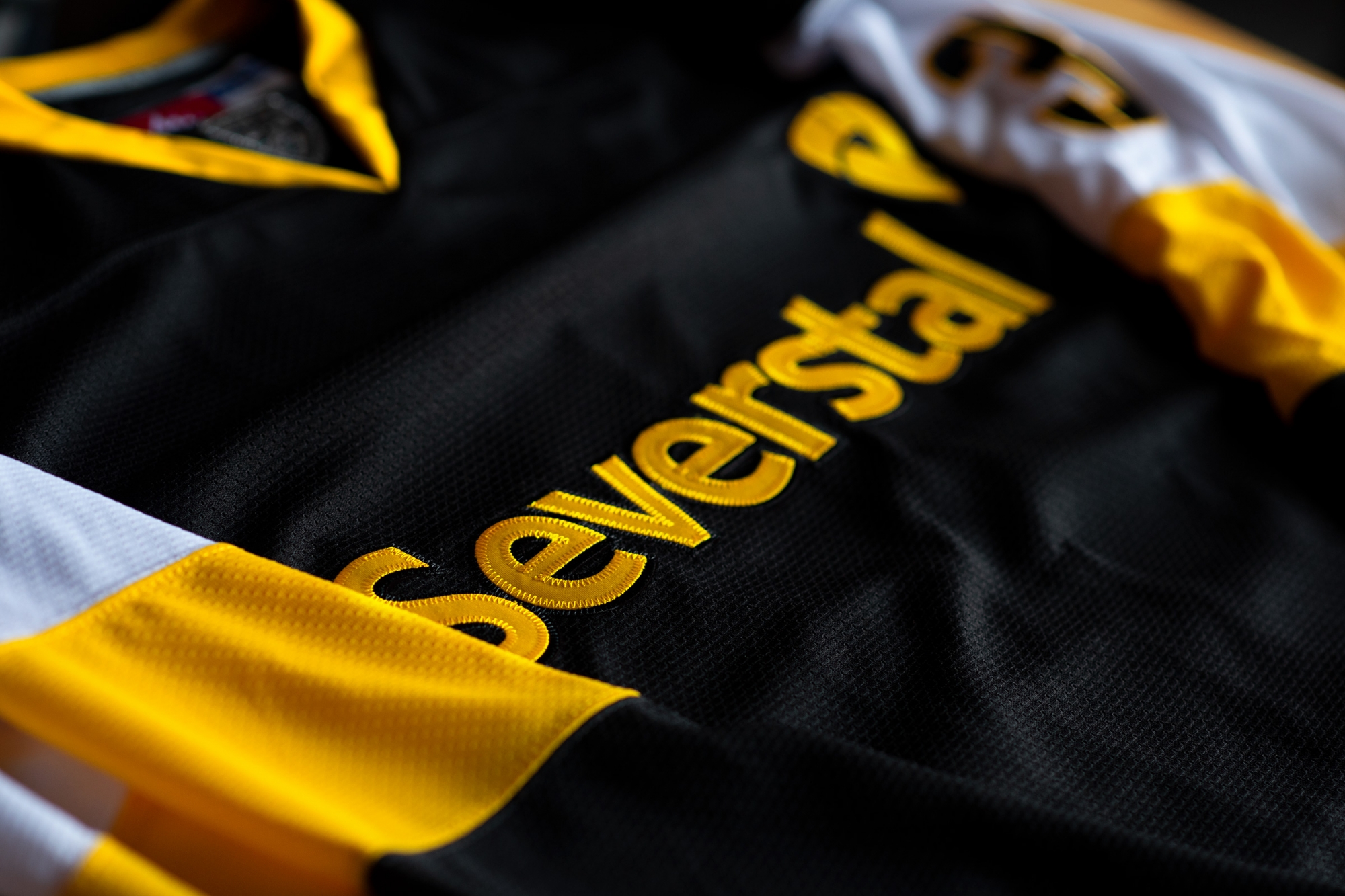
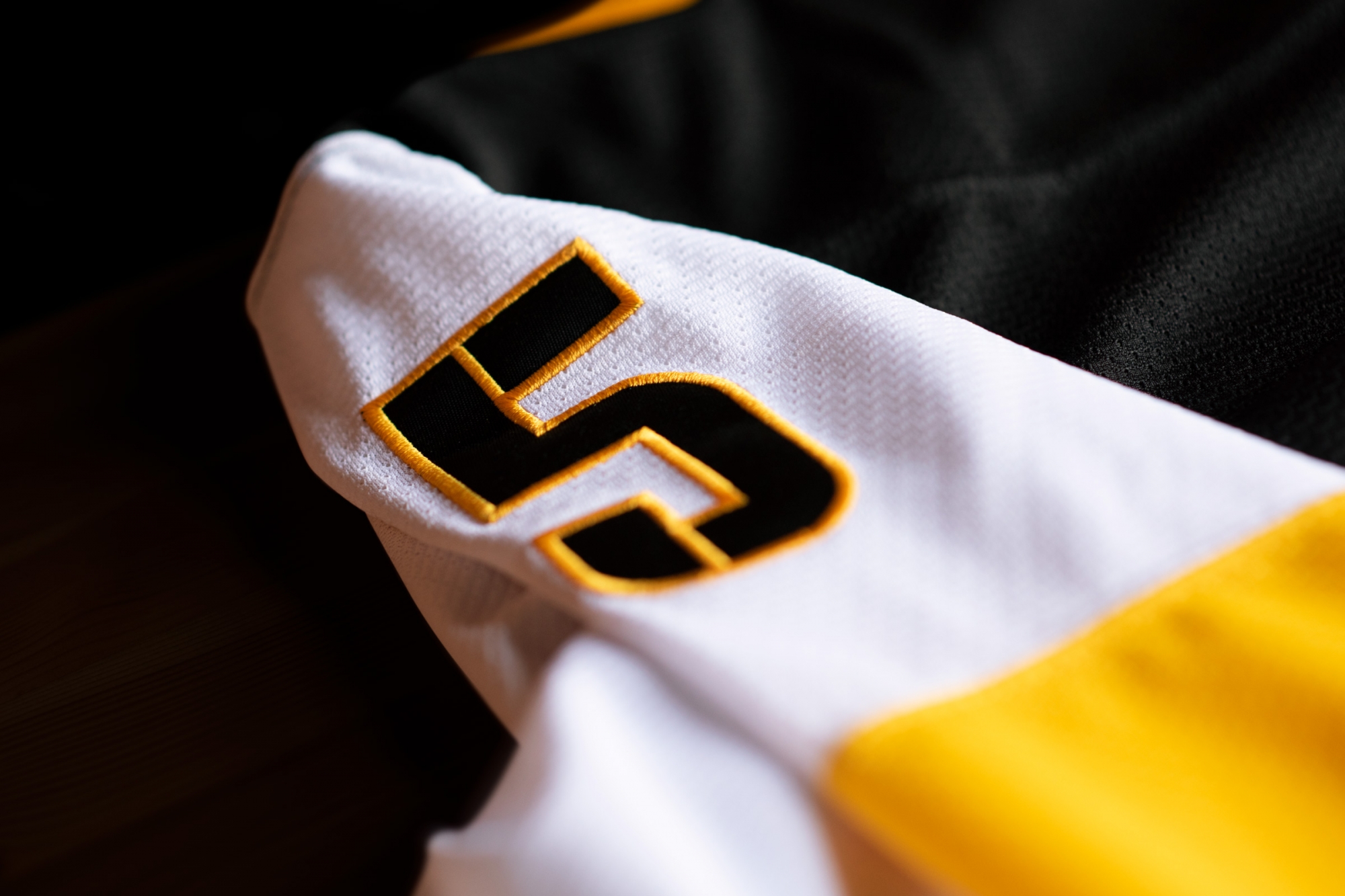
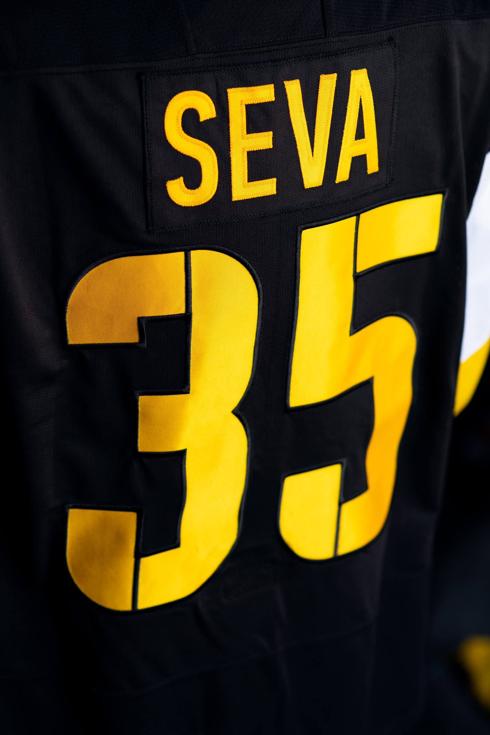
Severstal’s kit has been completely rethought. Important changes have affected the typography.
We have developed a new font for the numbers and captain’s letters, inspired by the industrial stencil markings found in factories and during transportation.
This aesthetic will give the team an industrial look and will become another link between the club and the metallurgists. Moreover, the Unity sign in the monochrome version of the logo has streaks unique to this stencil.


We also revised the balance of club colours in the game kit and significantly increased the percentage of yellow. It makes Severstal very noticeable and distinguishes it from other KHL teams (yellow is almost unheard of regarding other teams’ kits). In the third set, the central place on the chest is occupied by the logo with the lynx.
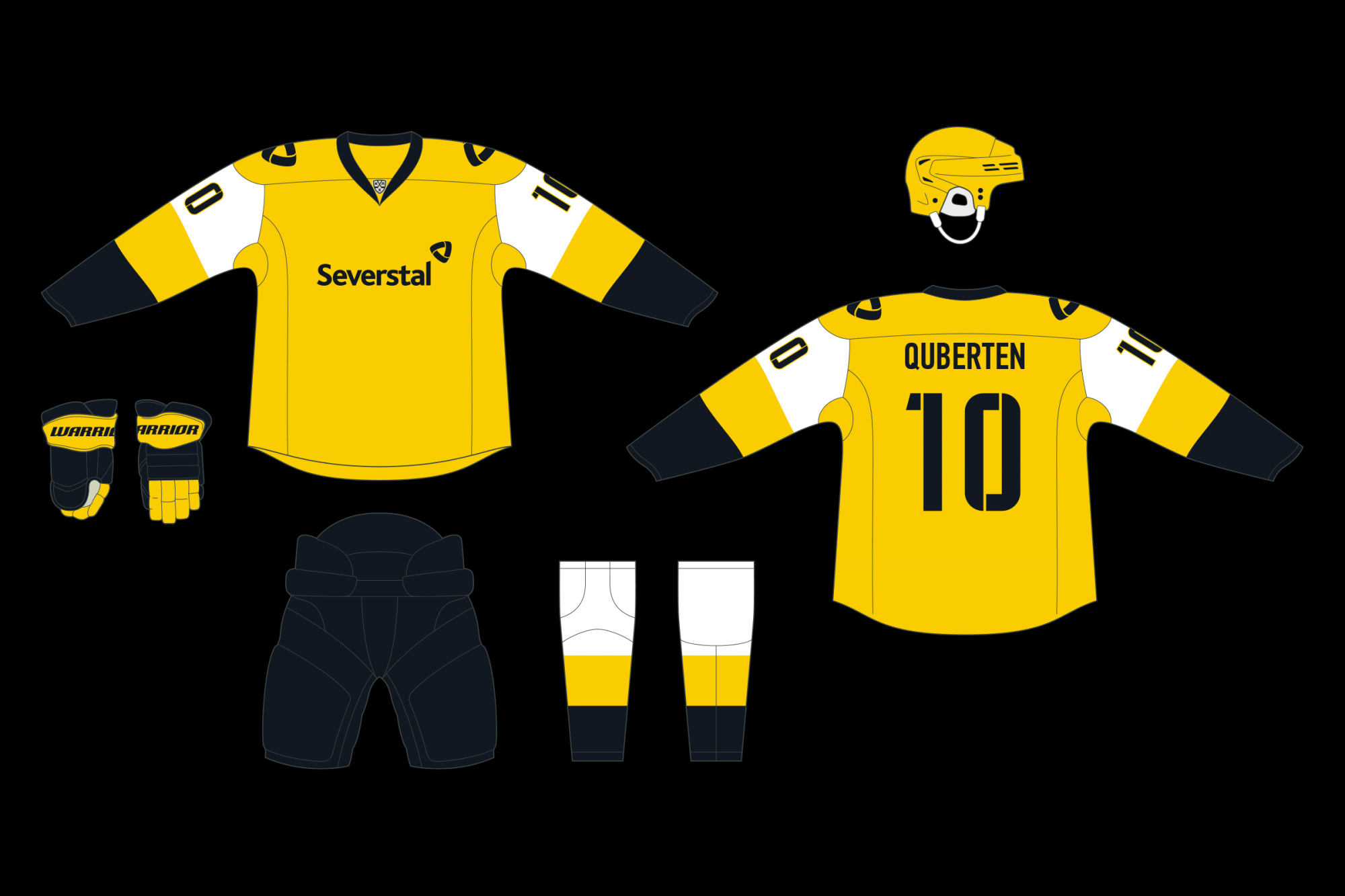
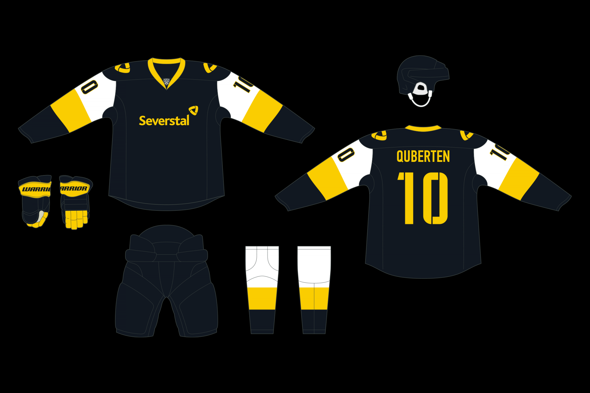
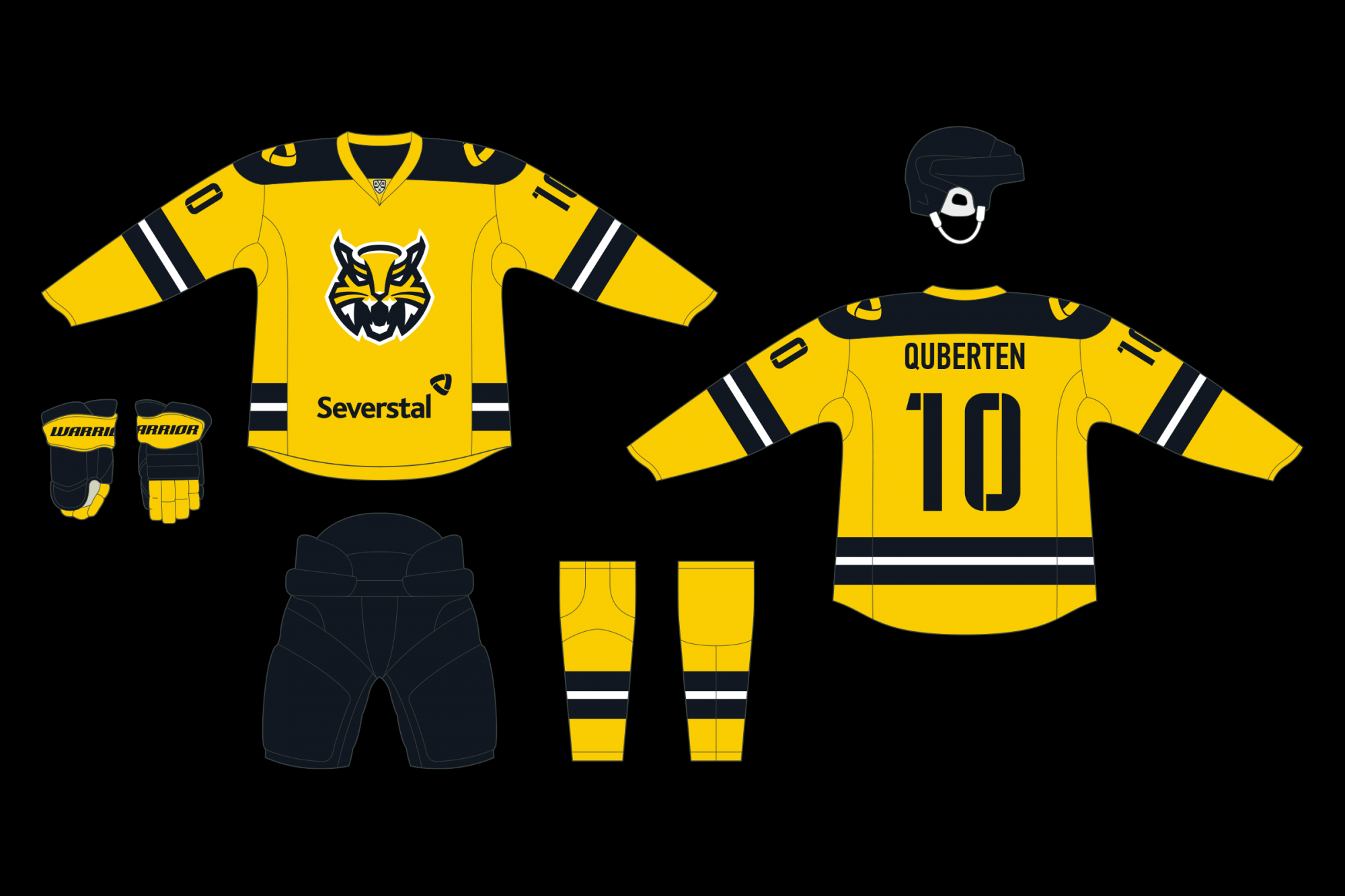

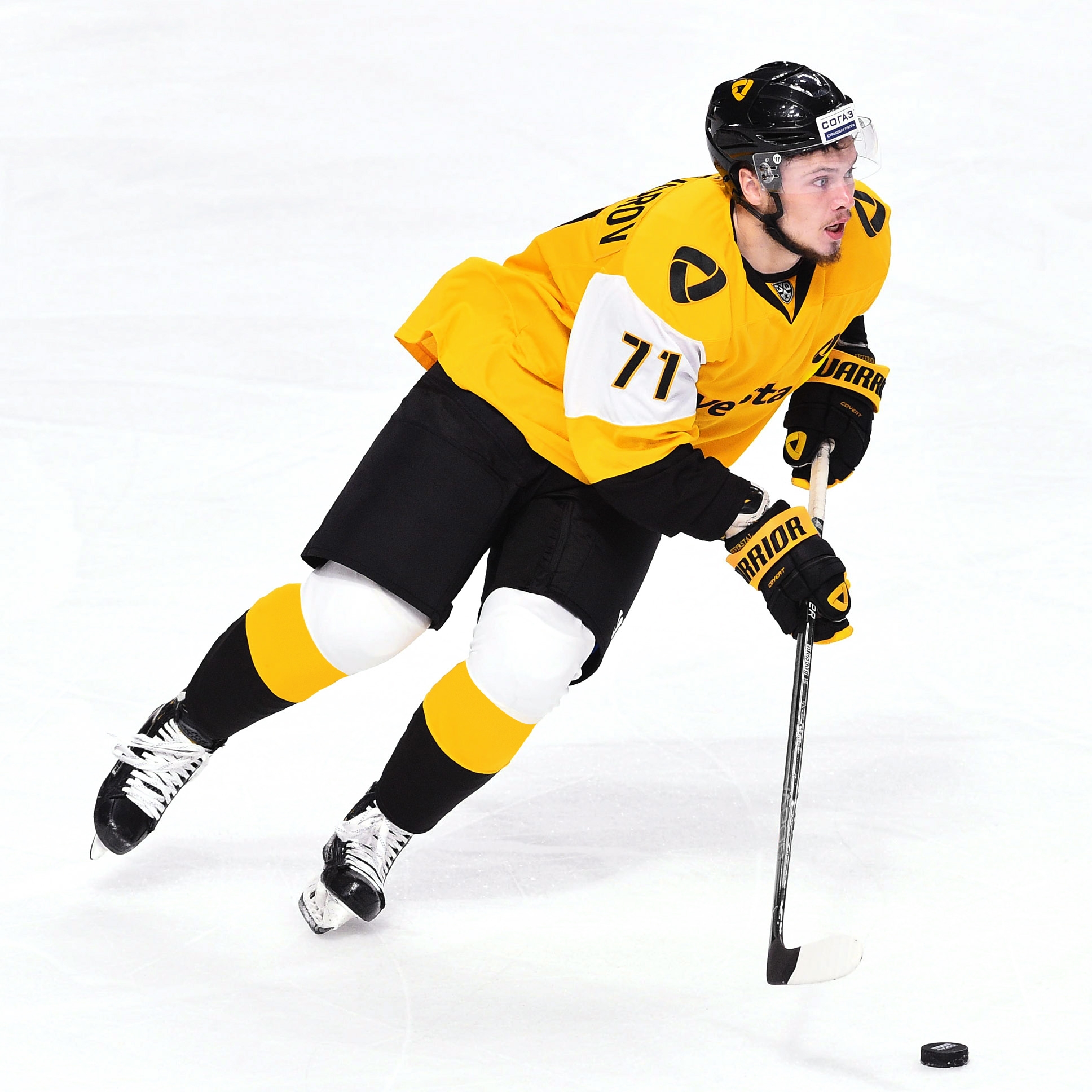
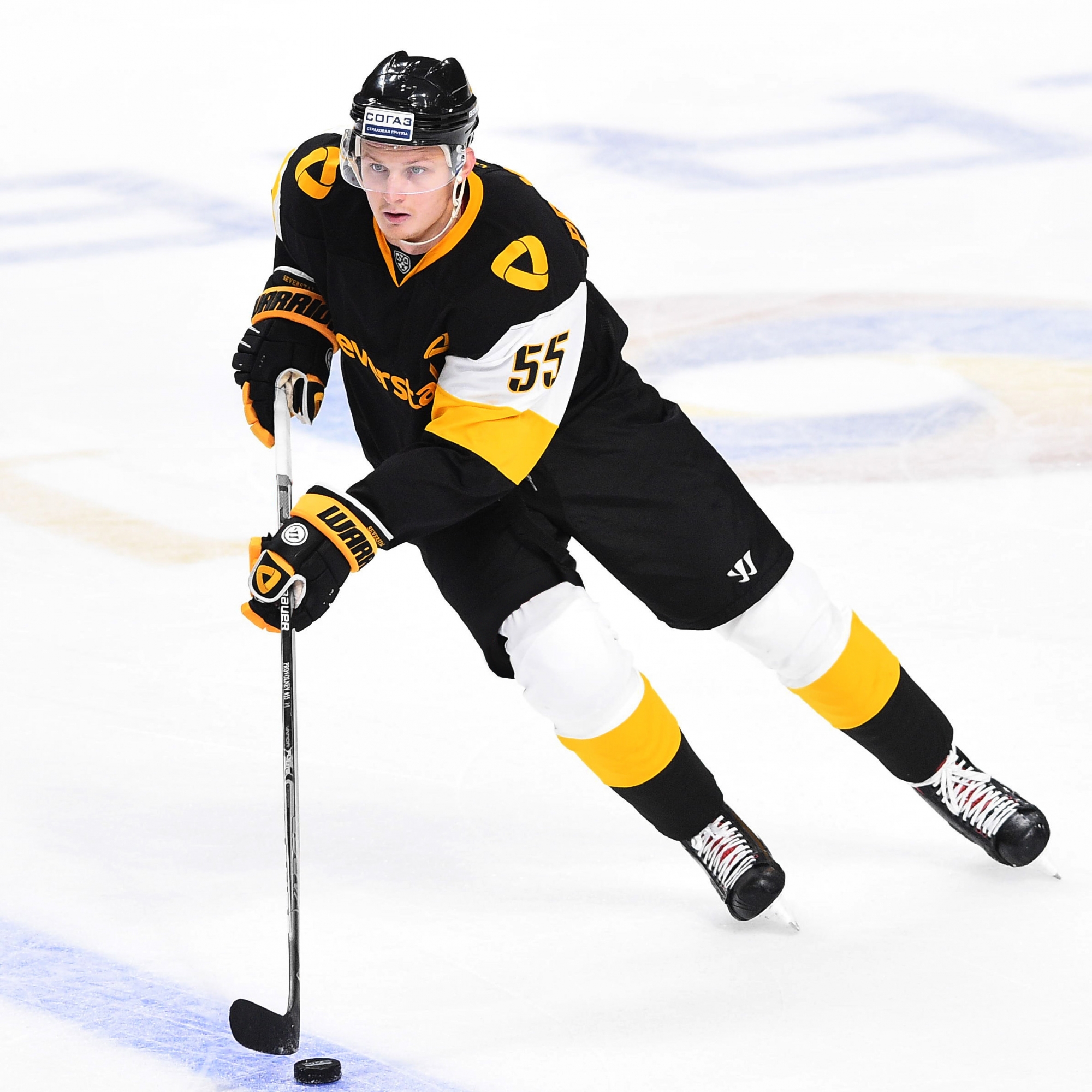
Of course there is no sublimation, only embroidery, and only factory-painted canvases. Thanks to this fabrication, the kits will have a much deeper colour. Everything looks stylish and advantageous together.