New black-white style for HC Traktor
LOGO • SUBLOGO • FONTS • PATTERNS • GUIDES • UNIFORM
HC Traktor is one of the real old school lots of Russian ice hockey. Their logo became a breakthrough in the early 90s and has been so for around a quarter of a century. And the typeface soaking with that 70s look has been around even longer.
A first glance at the logo may give the deceptive impression that the team also has additional colours as well as the standard black and white. The yellow in the club can give a false impression that it's also one of their colours.

Black-white palette
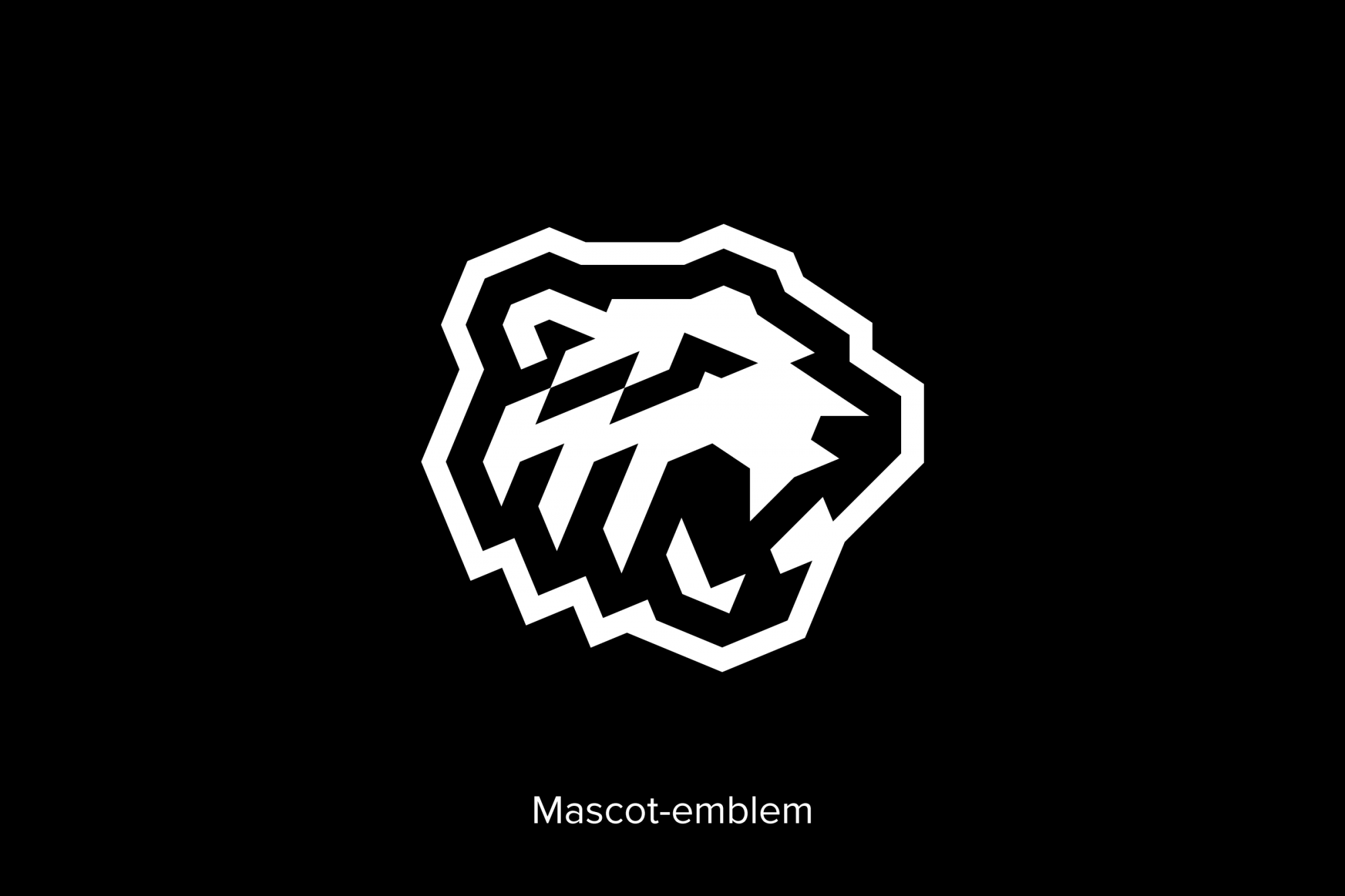
We decided that the radicalisation of the palette would benefit Traktor; black and white is what Chelyabinsk (a very industrial city in Russia) needs austerity and a stylish monochrome fit for one of the oldest brands in Russian hockey. The status obliges. Yes, the ‘bear’ shouldn’t be forgotten as the club's mascot, but Traktor's style should be more strict, ‘classic’ and restrained, full of history and references to old variations of the kits and logo, including close ties with industry and ChTZ (Chelyabinsk Tractor Plant).
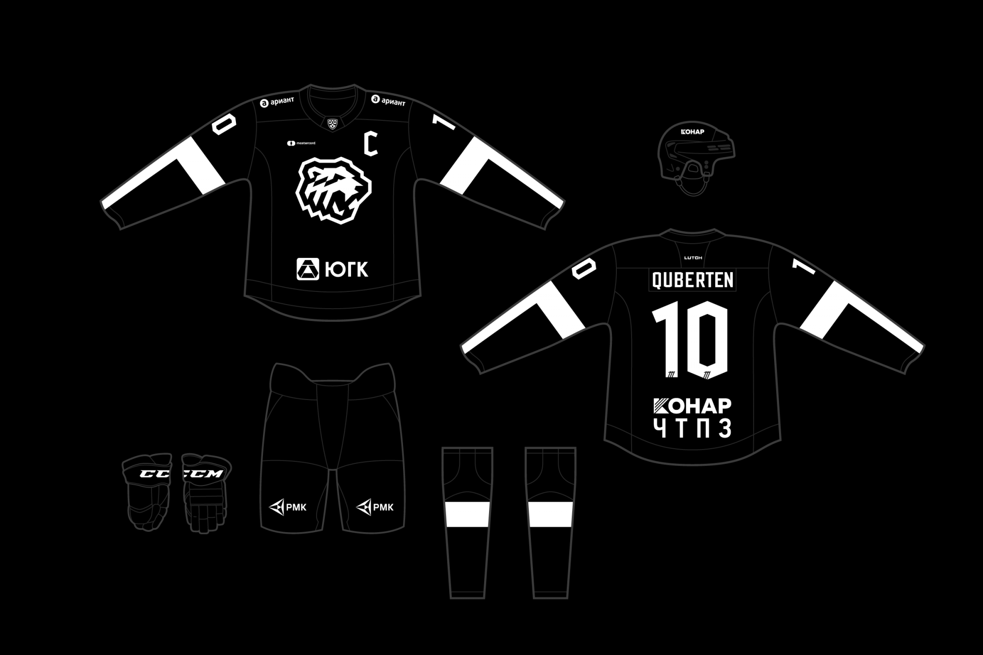
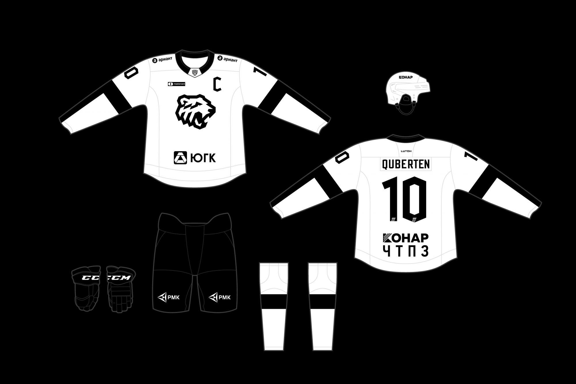
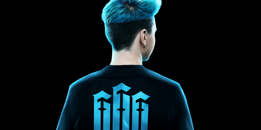
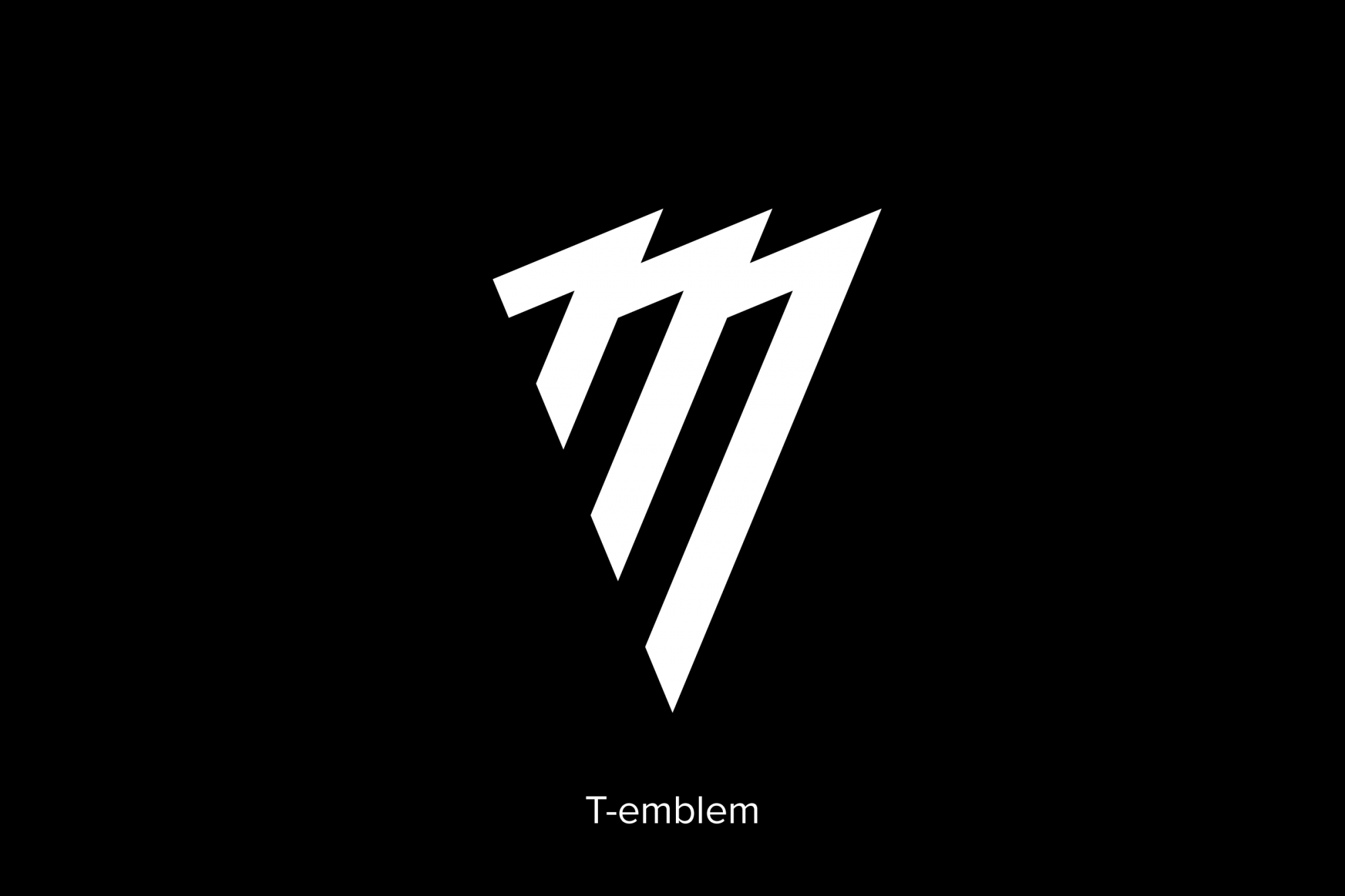
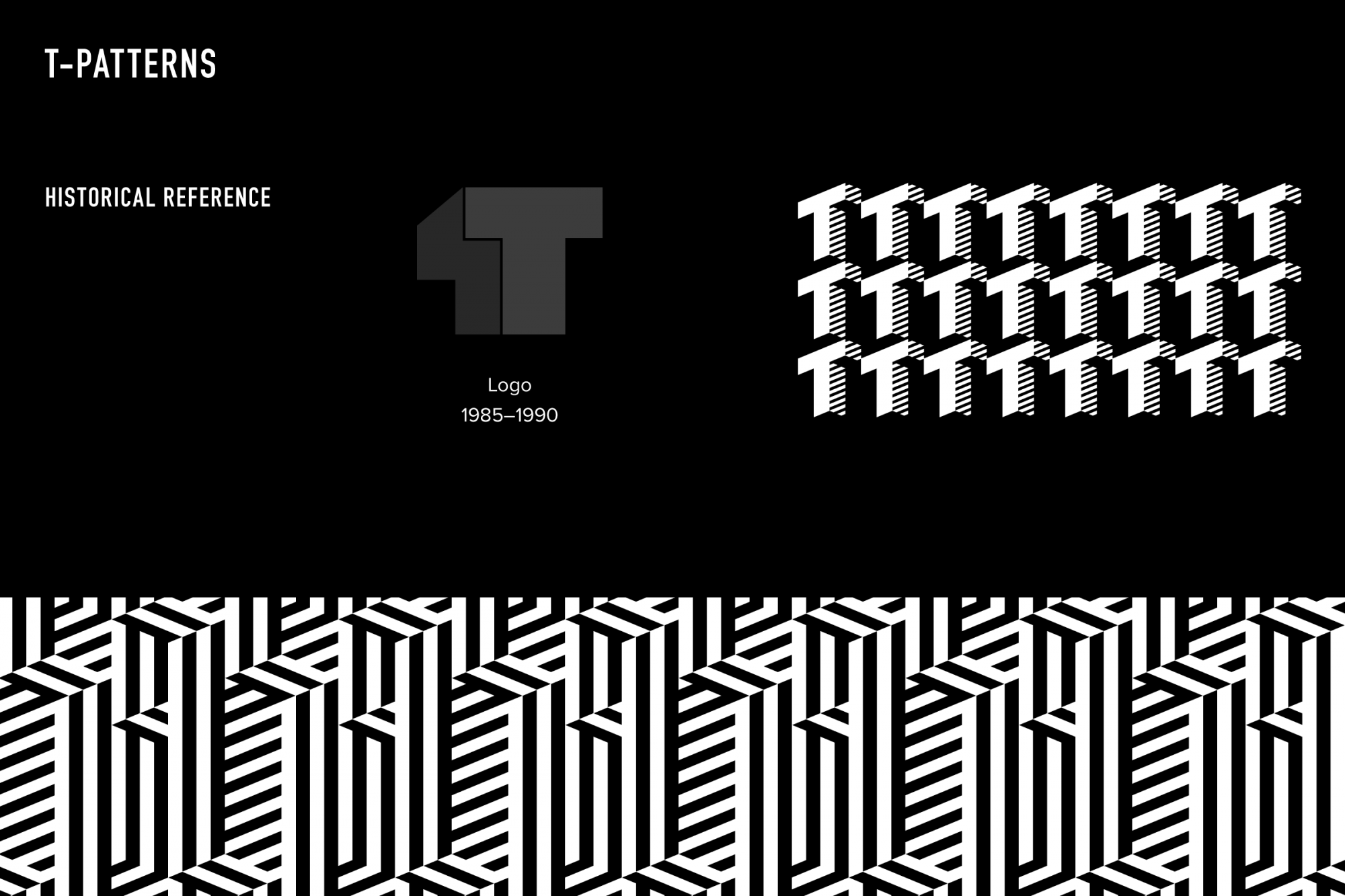
The logo combines the letter T, industrial stripes and a triangular layout, referring to the historical sub-logo of HC Traktor, the ChTZ logo to the 40th anniversary of the plant, as well as the
lettering of the 90s. The logo has a derivative version in a more familiar for Traktor round frame, plus there is a version in the cog. The letter T is also supported by the main lettering, kept untouched, while the rest of the letters follow the general angle and character. The writing and logo create a tightly-knit pair which don't conflict with each other. In the centre of the idea of the Traktor style is the letter T. This is also present in the mascot version (bear) of the logo. The angles of the bear are obeyed to octagonal logic and have multiple rhymes and conjugations.


The alternative colour was borrowed from the famous make of tractors called Stalinets by ChTZ during the 1930s and 40s — it had a complex shade of grey with a bluish tint. To find a new accent, you
can accurately and precisely add red colour, as how it was on the inscriptions of the original Stalinets tractors.


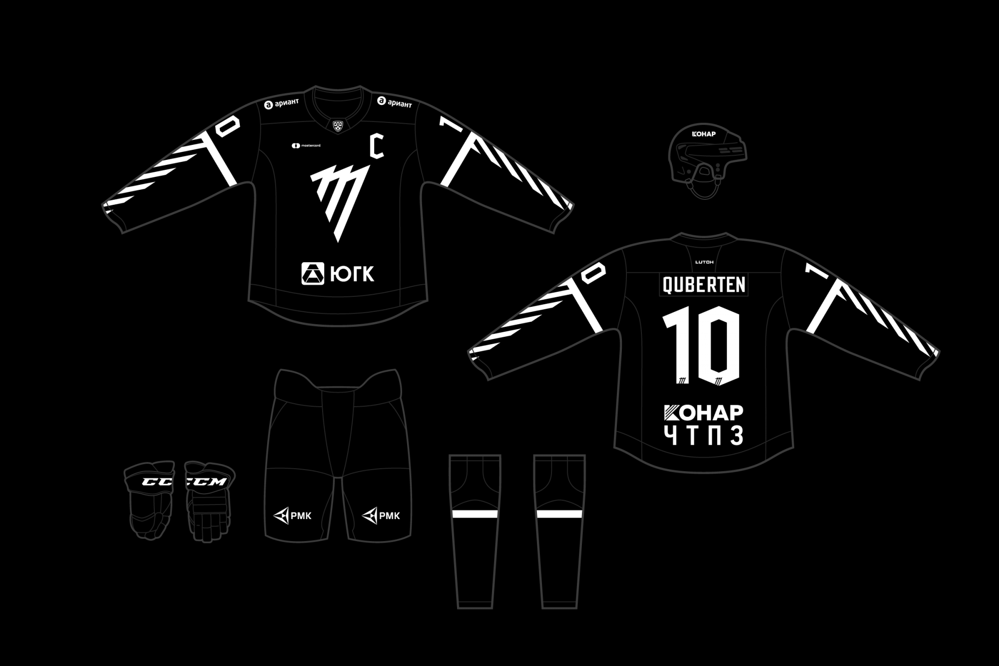
A special set of numbers was developed for Traktor. We also took an octagon for creating this pack. The kit’s numbers will be decorated each with a T.


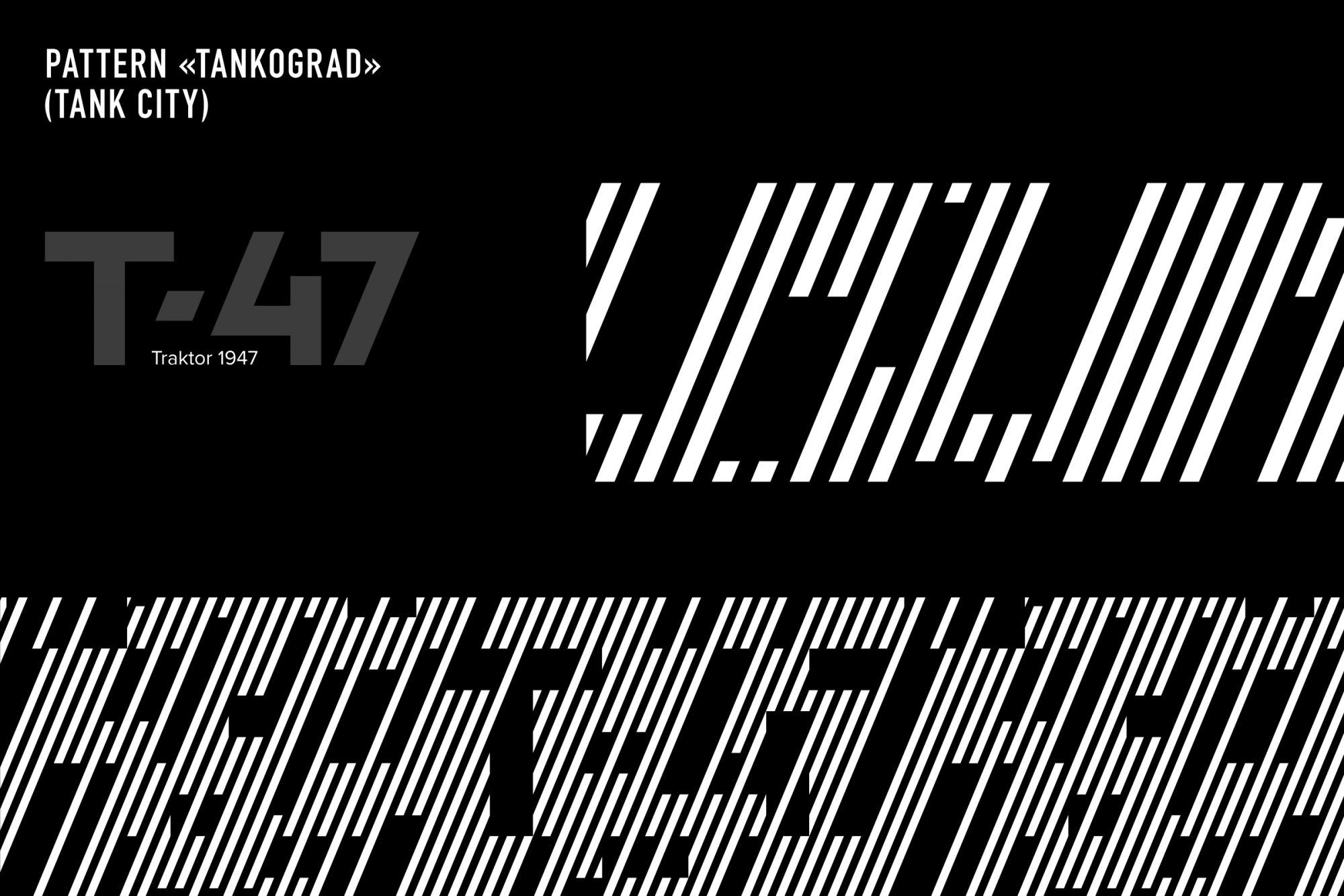
Geometric pack of patterns for identification of brand
After the rebranding, the club got a whole system of patterns for all spheres of club life — SMM, merchandise, corporate design and even customisation of hockey attributes. Modular angles and strong colours can generate many pattern variations. For example, it could be blinding camouflage — a technology that has been used since the First World War. Active contrast lines distort the outlines of the goalkeeper's silhouette and this complicates the visual perception of the goalkeeper, makes it difficult to assess the distance, speed, direction of movement. It's just more difficult for the opponent to aim!


The combined method at work
A large-scale work was carried out: it was necessary not only to come up with and implement many elements but also to put them into the system so that none of them stood out from the general row. The club now has a full-fledged style — all elements, from the logo, kits and front of the arena to clothing of staff, letterheads and patterns for decoration in social networks — are summed up under a common denominator. They don't exist separately from each other, but all work together to form a huge and living idea.