Logo and identity for CTRL PLAY
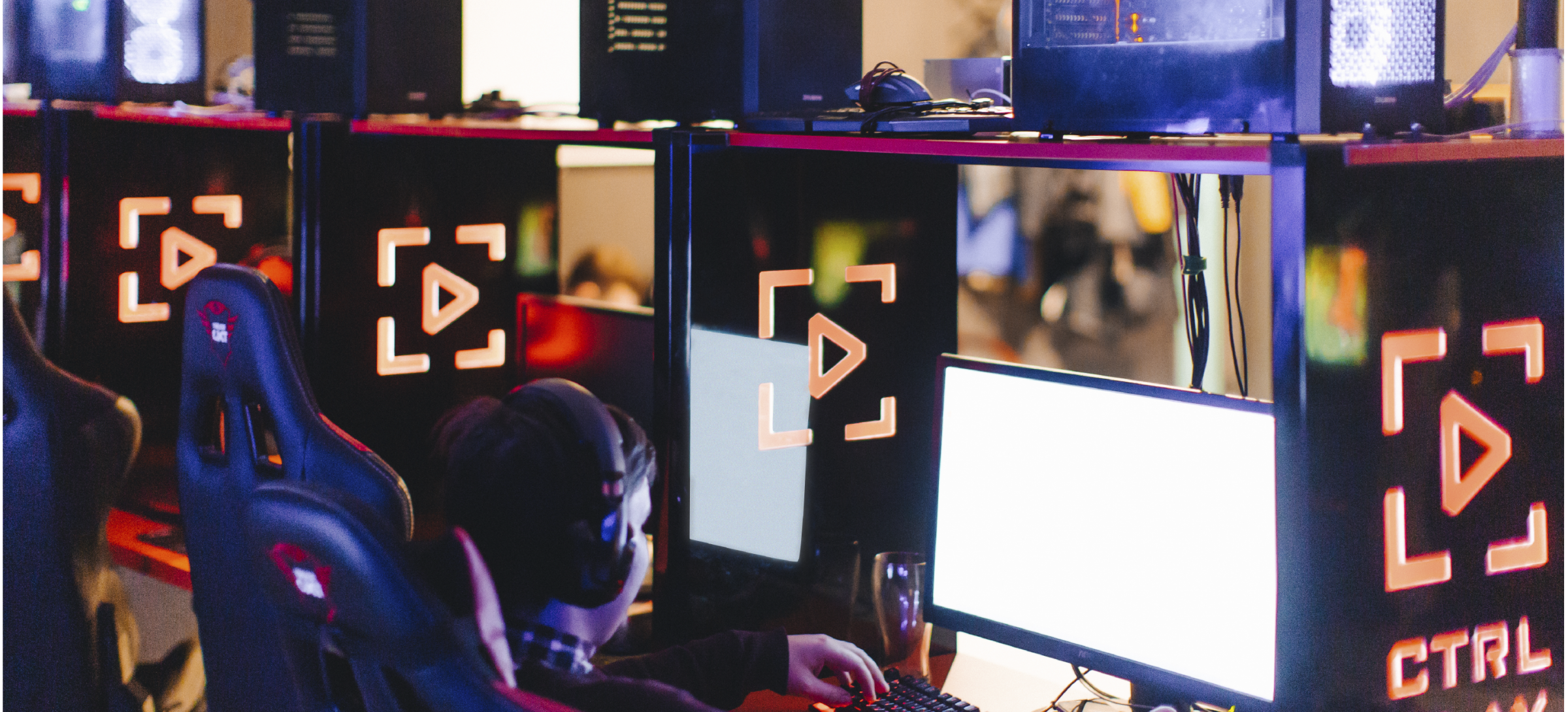
CTRL PLAY is a network of gaming zones in various regions of Russia, an organizer of esports tournaments and a gaming community. A company of such a broad profile needs a strong corporate identity that will unite all areas of activity and form a chain of common associations.

Logo in the style of a military stencil
The requirements of the time, especially in esports, are extremely clear: no oversaturated logos, only minimalism and to make it clear cut on all social media platforms.
Since most gaming disciplines are related to the topic of combat operations, the identity is built in a military style. The logo, lettering and font of the numbers look like stencils that are used for identification in military design.
The CTRL PLAY sign is made up of the letter ’C’, denoting the word ’Control’, and the ’Play’ icon. At the same time, the logo has a second semantic level: the stencil ’C’ can denote a sight, and the ’Play’ button: an arrow, acting as the forward movement.
The logo easily works by itself (for example, on social networks), and is also able to interact with lettering and form branded blocks.


Merchandise of the tournaments converge with the trends of everyday fashion
Camouflage is in demand in the casual clothing lines, so the new corporate style of CTRL PLAY opens up great opportunities for promoting the merchandise.
The Play triangle from the logo allows you to collect sharp combinations of patterns that should not only become digital backgrounds, but also be transferred to baseball caps, T-shirts and esports things (mice, keyboards, chairs, etc.).


