Youth and audacity. The emblem of HC Torpedo
In modern sports, there are more and more visual changes within teams, however, they’re not always carried out systematically. The case with the Torpedo hockey club began back in 2021, when the Quberten studio devised 'City Edition' kits, as well as details of the updated style in the year of the 800th anniversary of Nizhny Novgorod. The improved logo became the next stage in the joint project.
Медиа:
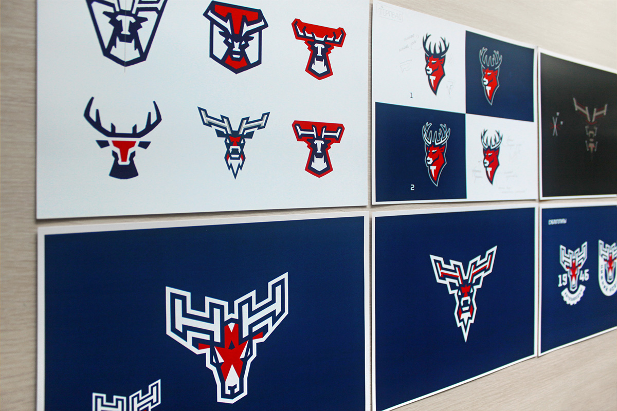
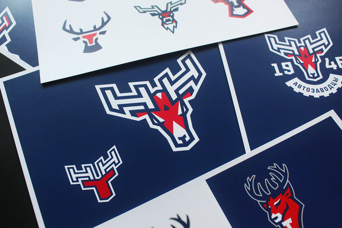
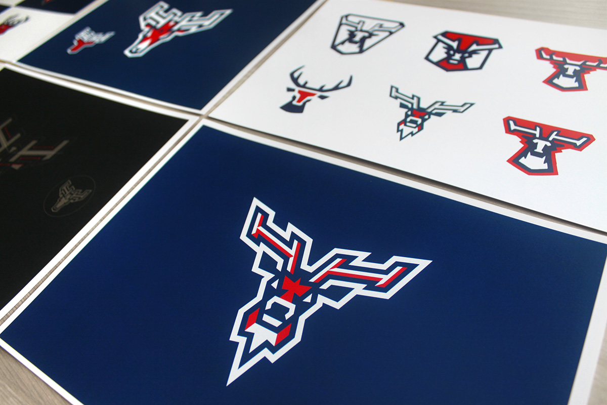
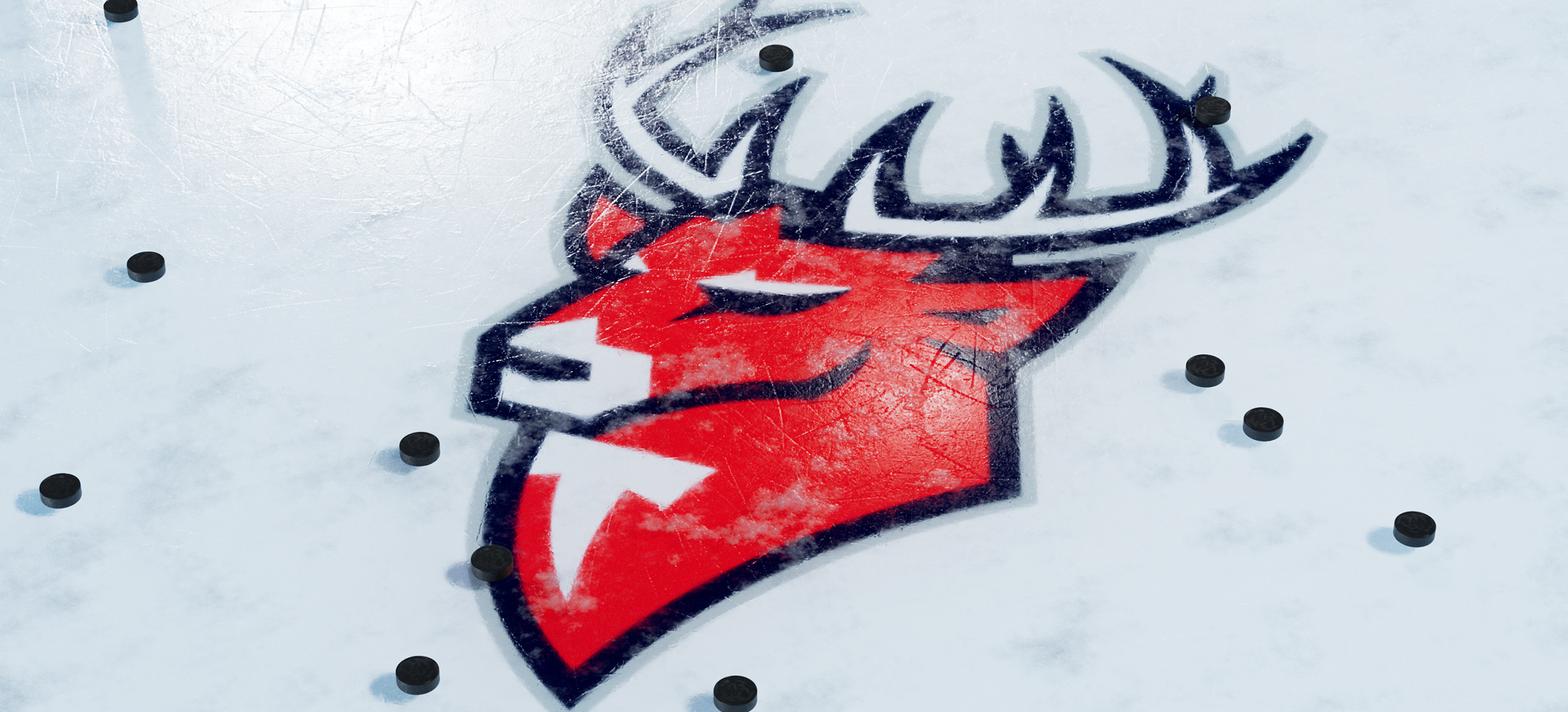
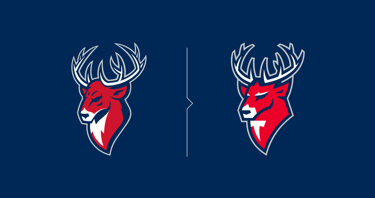
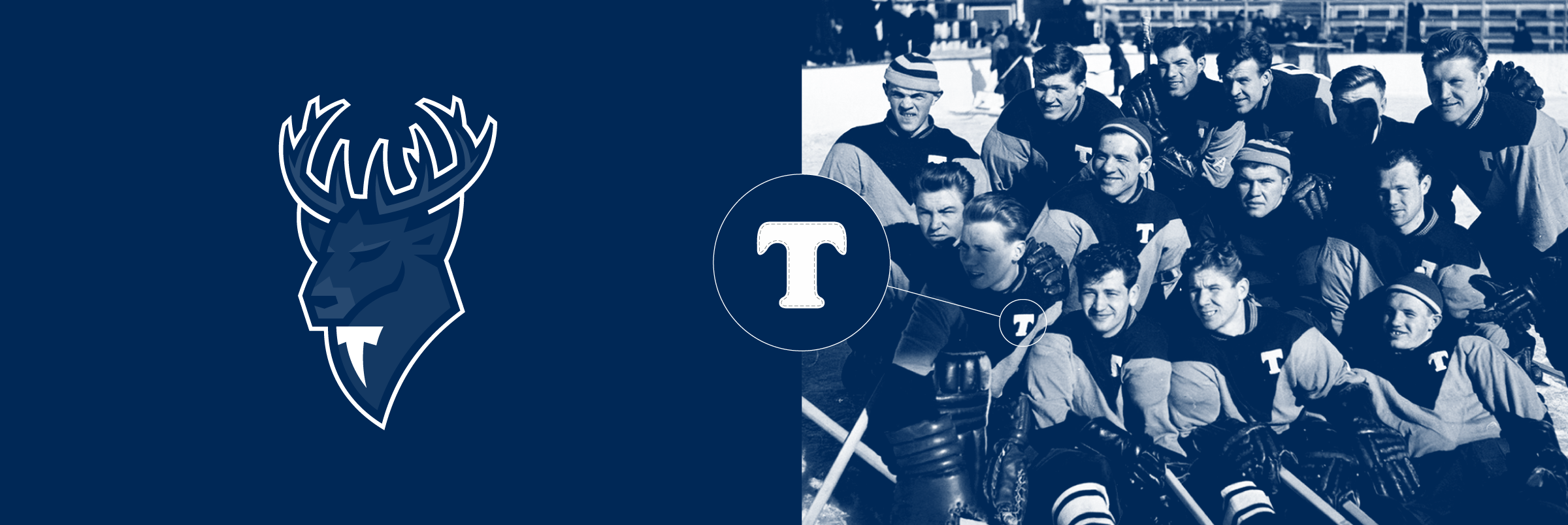
The studio has since carried out a delicate restyling of the current logo of HC Torpedo, with the symbol of the club looking much more fresh. The mascot of the club has been visually 'rejuvenated', which adds a bit of audacity and boldness to the image. In addition, this is a great opportunity to attract a young audience using an updated and bright sign.
The letter 'T' has also undergone changes, but unlike the deer, it brings fans back to the past: it resembles the classic Torpedo sign from the Soviet times.
Медиа:

Медиа:
Медиа:
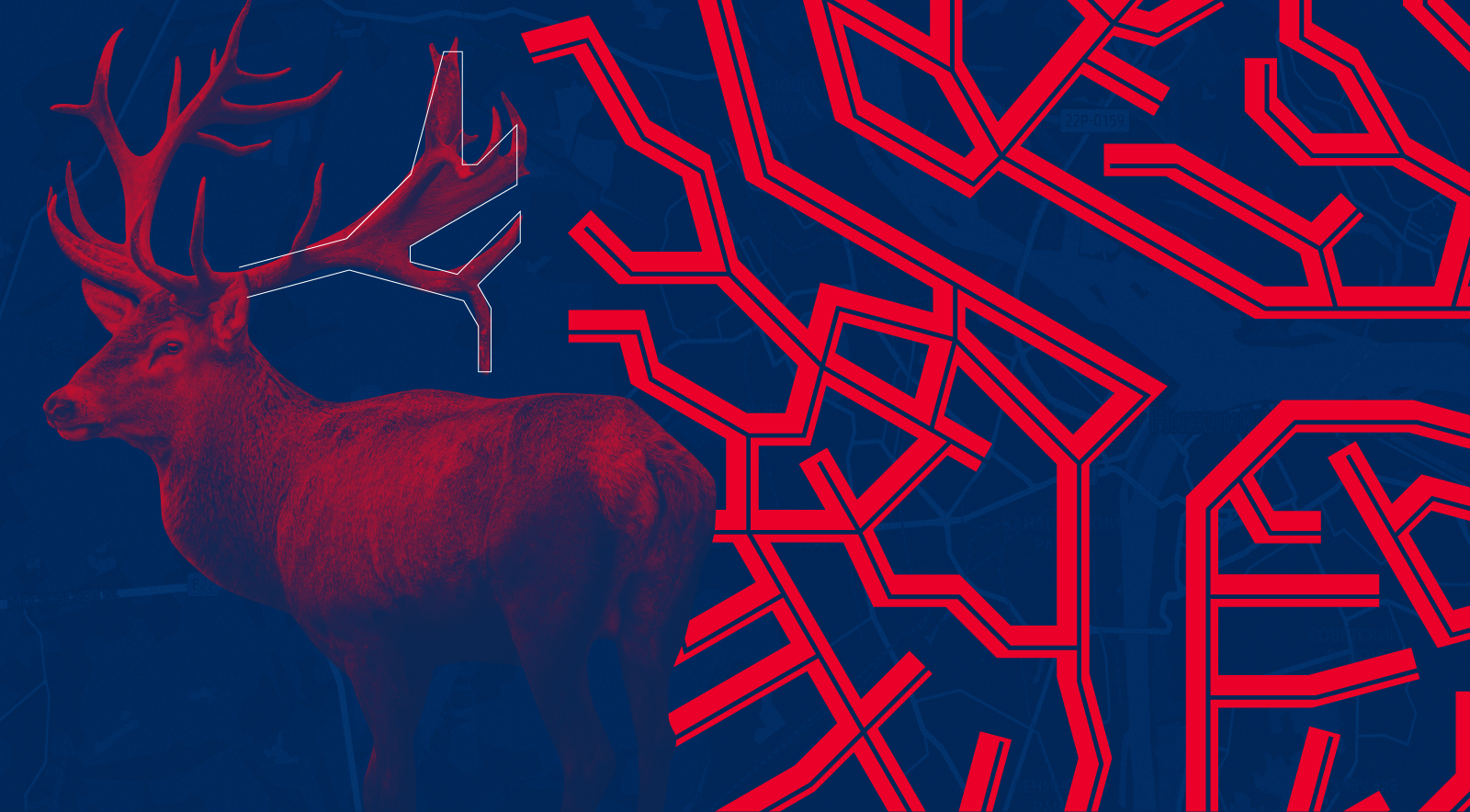
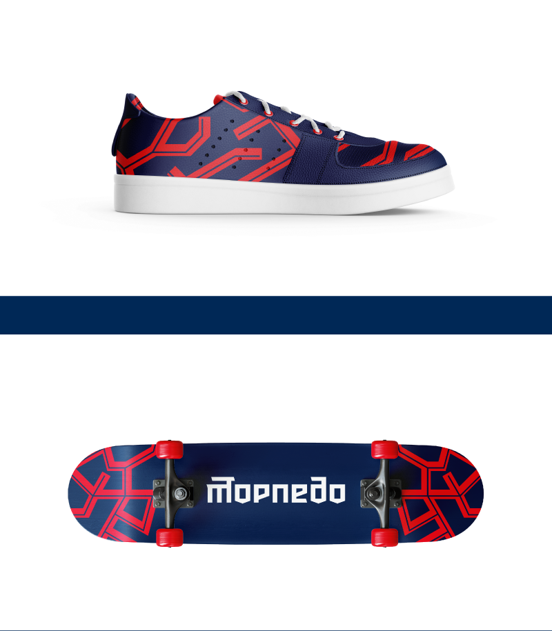
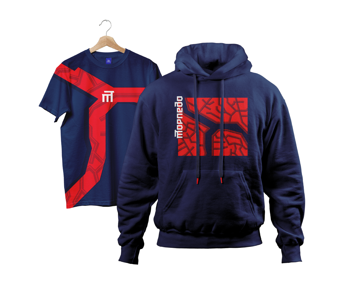
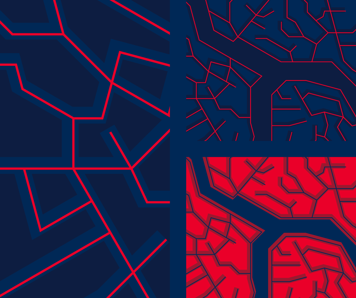
Active pattern 'branched streets'
The pattern demonstrates the strong connection between Nizhny Novgorod and the club: a map of the city is read at a first glance. There’s a lot in common between schematic street designations and deer antlers, and their visual unity is achieved due to a rigid geometric style.
Медиа:
Медиа:

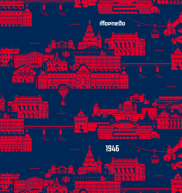
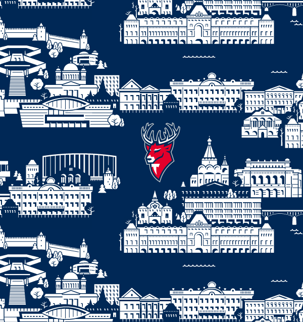
Urban patterns
A variation of last season's patterns was dedicated to the 800th anniversary of the city, this year to Nizhny Novgorod itself, its details and architecture.
Several versions of the 'urban' pattern continue the idea of a local team. The key figures are the sights of Nizhny Novgorod, among them: the Kremlin, a group of cathedrals, the city zoo and the planetarium. The background blue color symbolizes the Arrow as the main natural feature of the city.


Медиа:

Process
Медиа: