City edition sets of HC Torpedo for the Nizhny Novgorod's 800th anniversary
UNIFORM • FONTS • GUIDES • PATTERNS • SUBELEMENTS
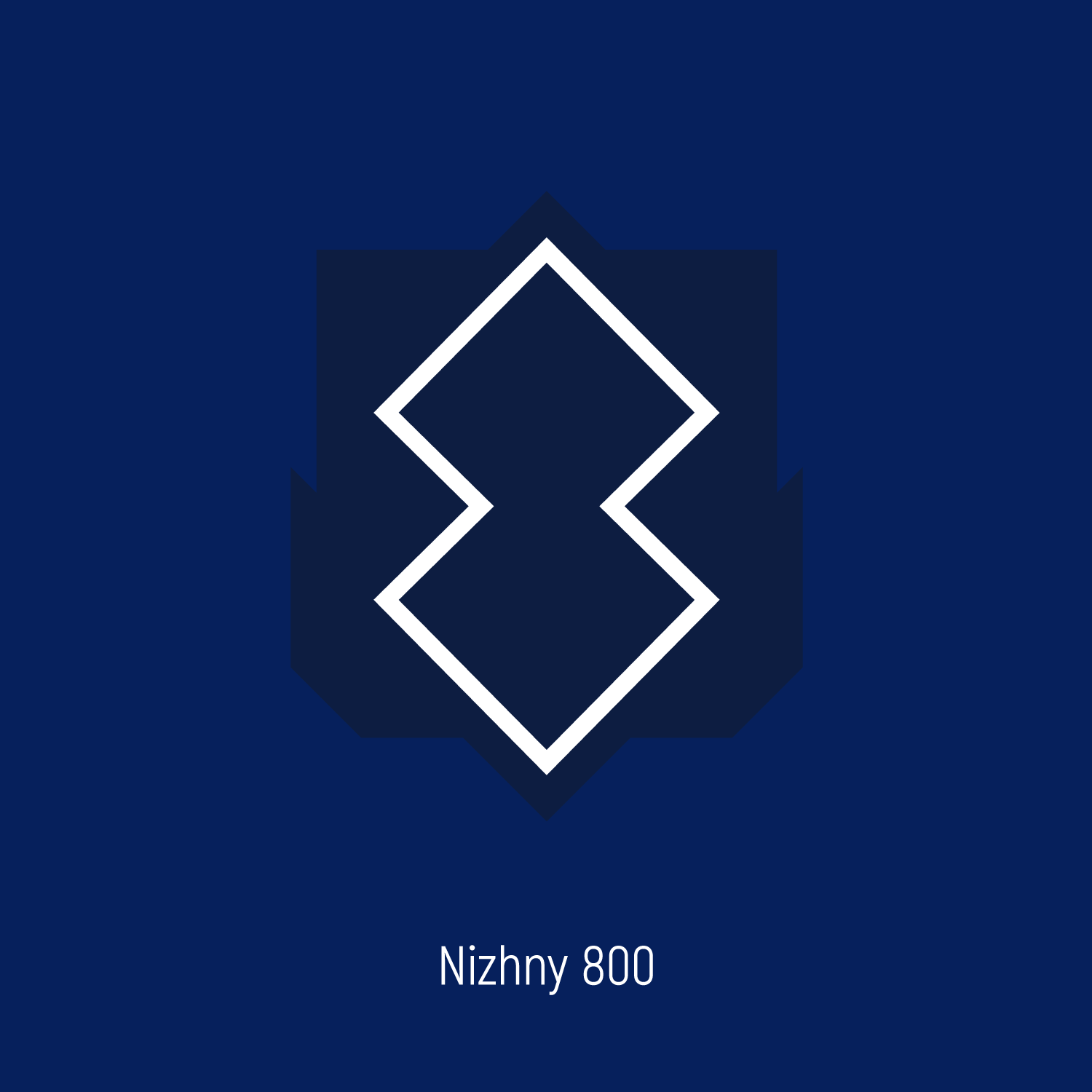
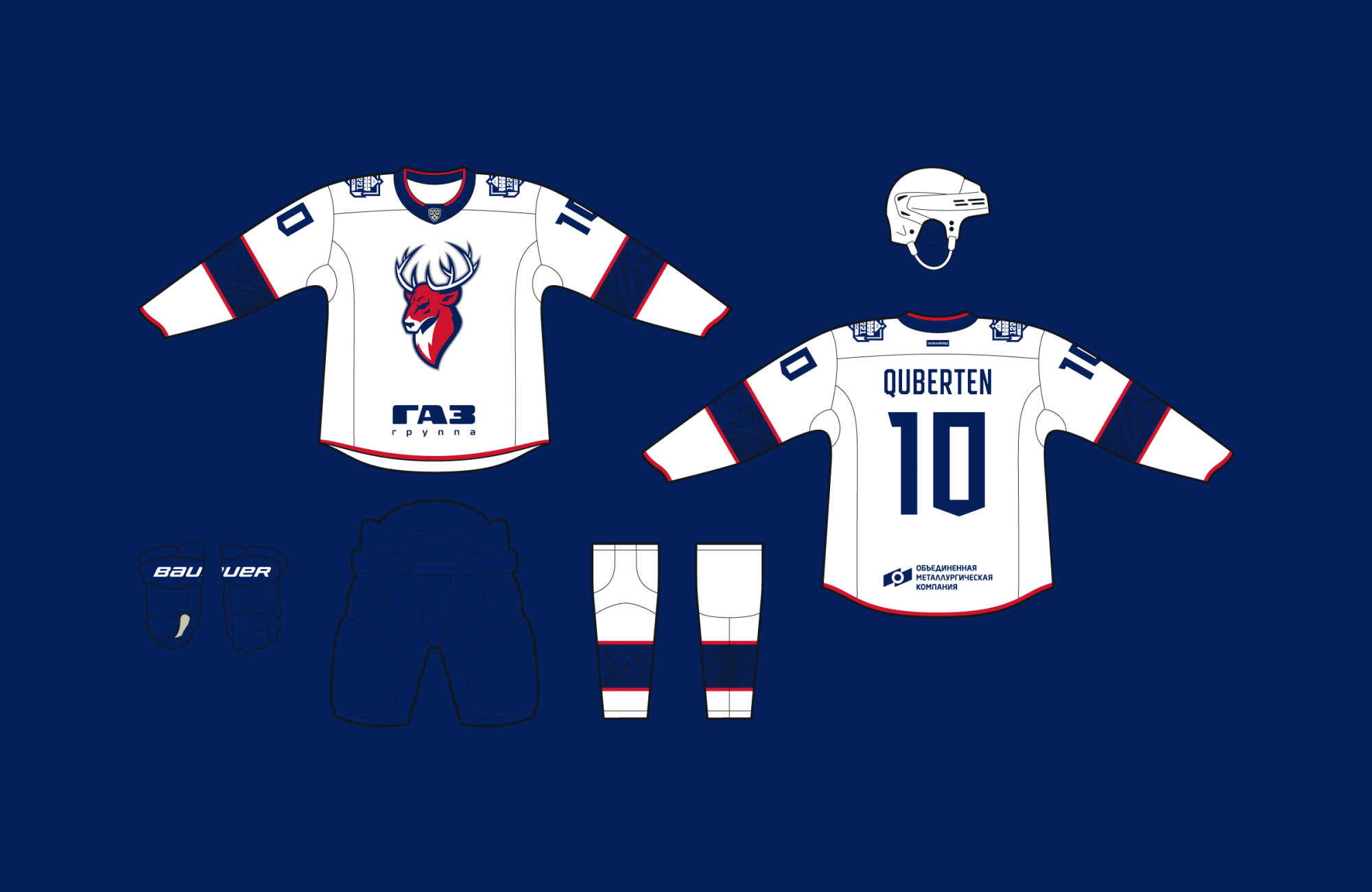
The celebrations of Nizhny Novgorod’s 800th anniversary have influenced the city’s main hockey team. The club’s uniform will be supplemented with various elements of the anniversary identity ’Nizhny 800′ for the upcoming season.


A classic set with holiday notes
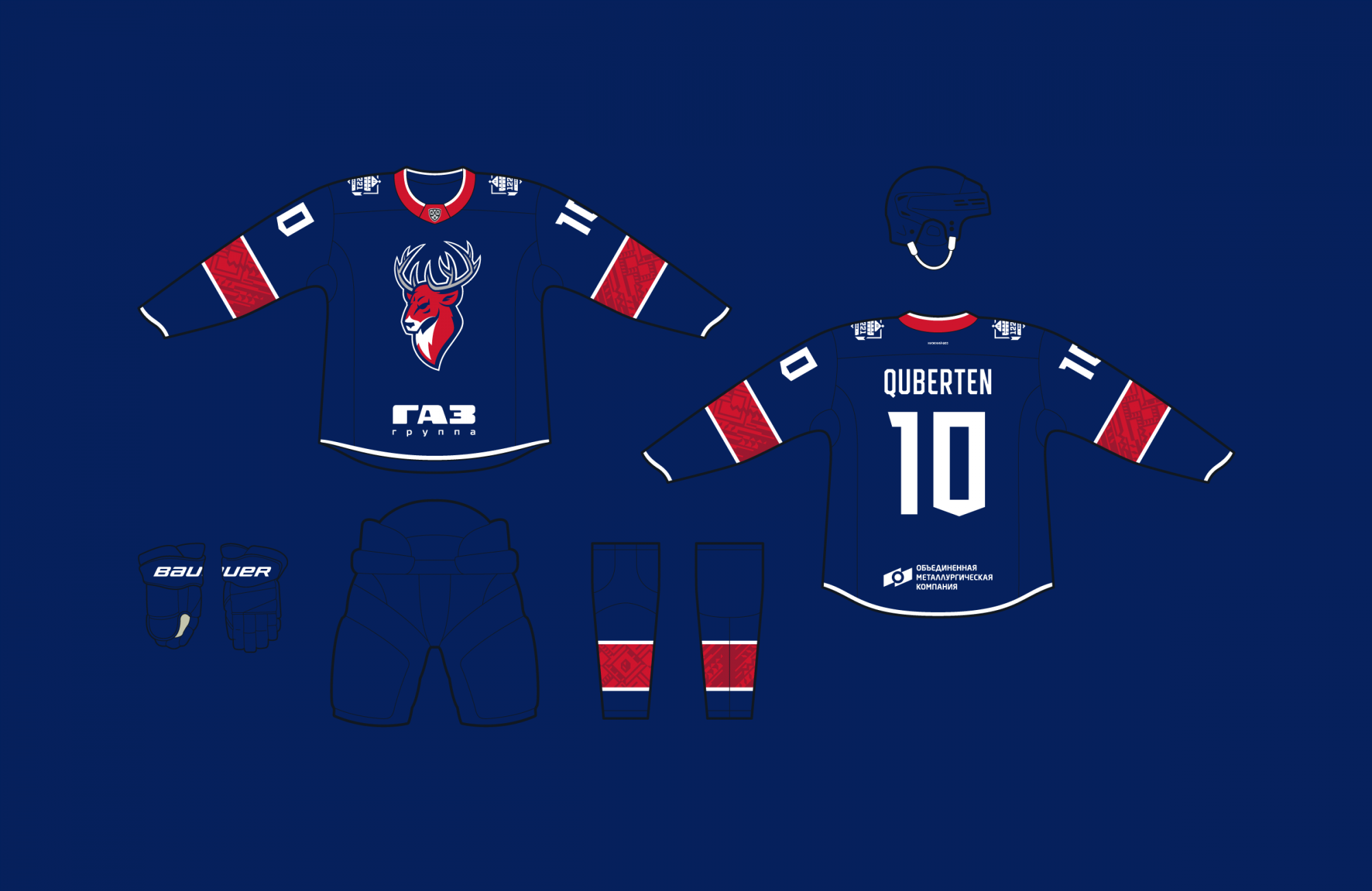
The uniform is based on the traditional design of the home and away jersey, with some details being a reference to the city’s 800th anniversary.
Graphics from the ’City Edition’ identity are now visible on the socks and sleeves. The inscription ’Nizhny 800′ can be seen on the jersey both the inside and outside. The first one is made by thermal transfer application on the inside of the collar, and the second is in the form of a patch on the back, just above the names of the players.
Lettering, numbers and the captain’s letters have taken up a new style with the anniversary’s concept in mind. Two types of numbers have been prepared: the main ones are elongated with a wedge-shaped perforation, and the additional ones will be used on the sleeves, serving as wider duplicates.


Медиа:
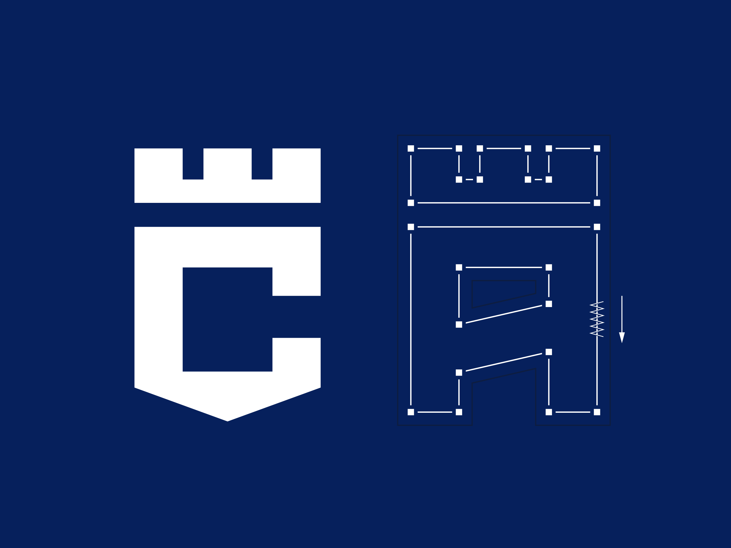


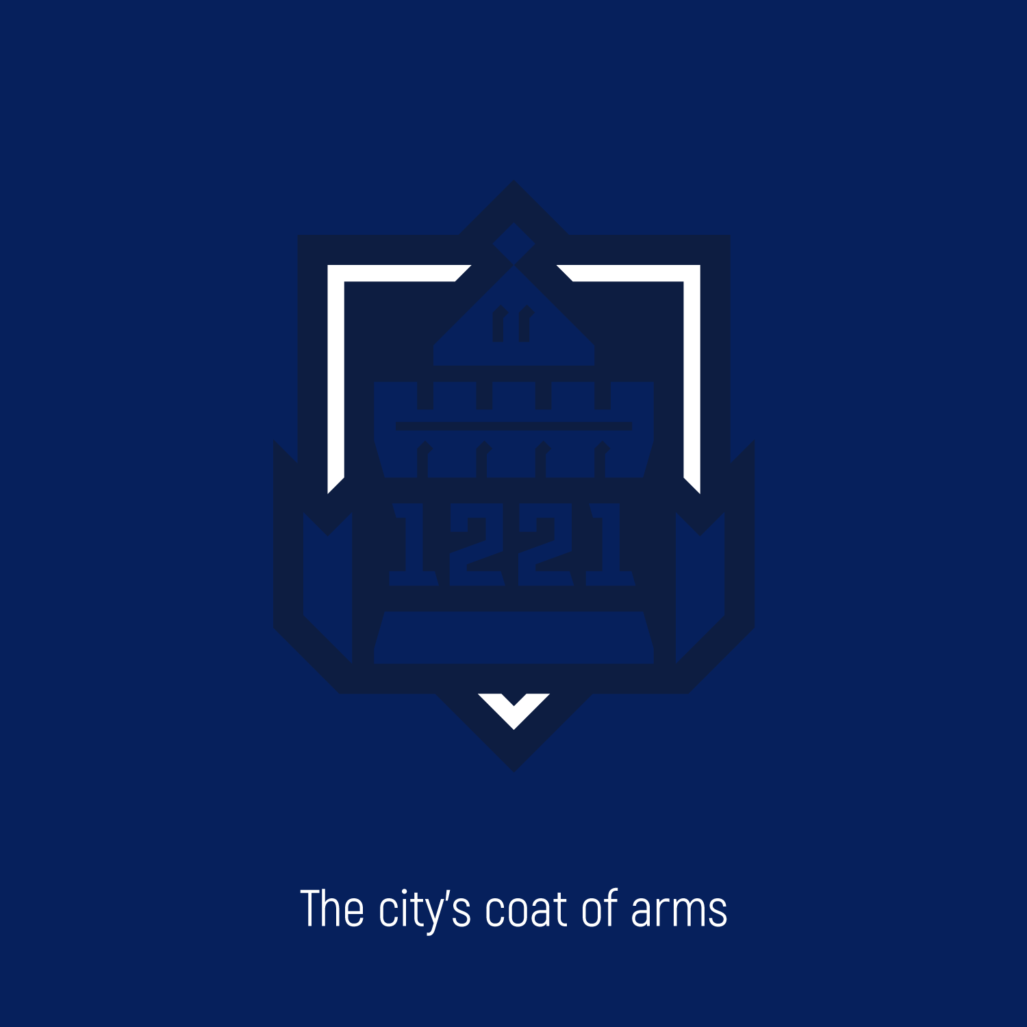
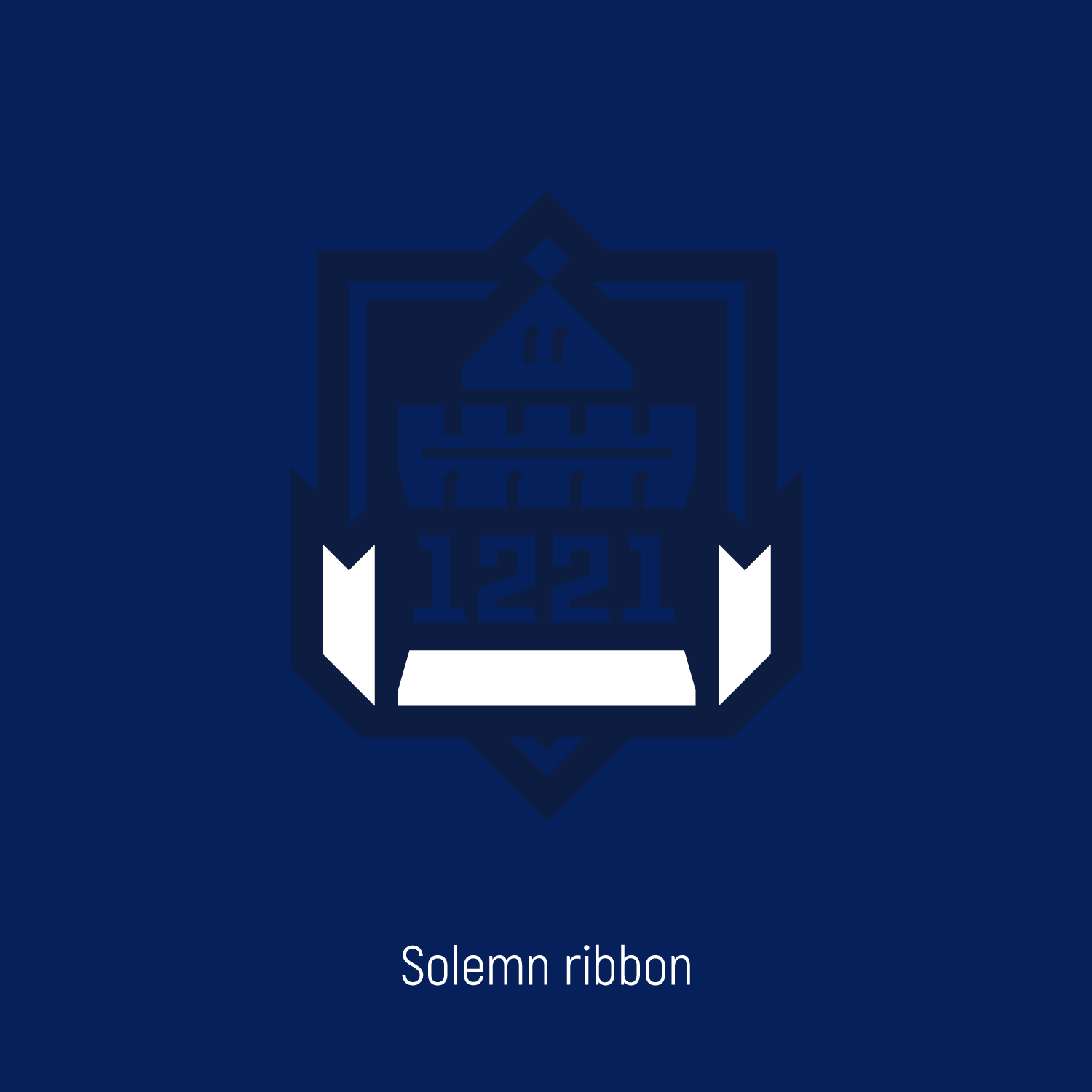
Logo patch as a reference to the anniversary of the city
The overall point of the logo is to represent the city of Nizhny Novgorod. The ribbon adds solemnity to the logo. It wraps around the Dmitrievsky Tower of the Kremlin, the city’s most prominent monument, thereby forming the outline of the city’s coat of arms. The year of its foundation is located in the center, and, thanks to the rigid graphics, the logo rhymes with the general style of the event.