→KHV. Alternative logo and kit of HC Amur
LOGO • LETTERING • TYPOGRAPHY • KIT • GUIDES
Amur is a KHL club from Khabarovsk, which is well known for its attentive attitude to the design and visual component of their image.
In 2013-14, the team conducted a powerful identity rebrand. This included a brand new logo using unique colors for the KHL, with which Amur declared itself as a trendsetter. This was developed for Khabarovsk residents by the future co-founder of Quberten. The tiger’s muzzle then produced an impressive effect in the hockey environment, and a popular American website Sportslogos.net labelled our piece of work as ‘the best sports logo of the year’.
Design system and a new visual language
The alternative emblem, lettering and sub-elements were born out of the need for renewal. Global trends dictate new rules to brands. Amur strives to speak the same language with the fan it’s fighting for: it’s young and modern, following the latest trends and living in the digital world.
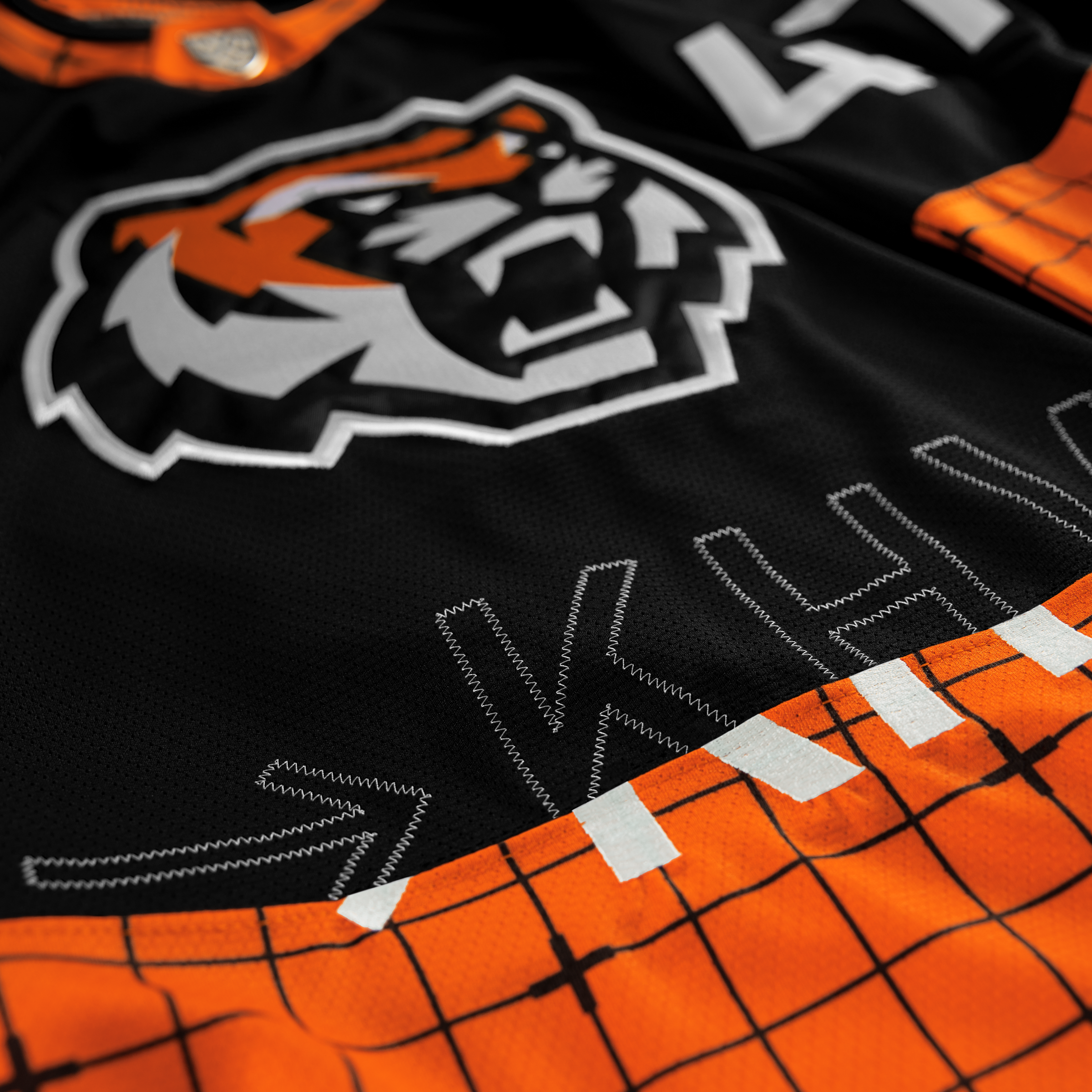
The image of the new tiger takes into account the trend towards simplifying identity in favor of small scales. The sign made with ’large strokes’ preserved the recognizable anatomy of the tiger’s muzzle, including such a feature of the Far Eastern individual as its thick fur.


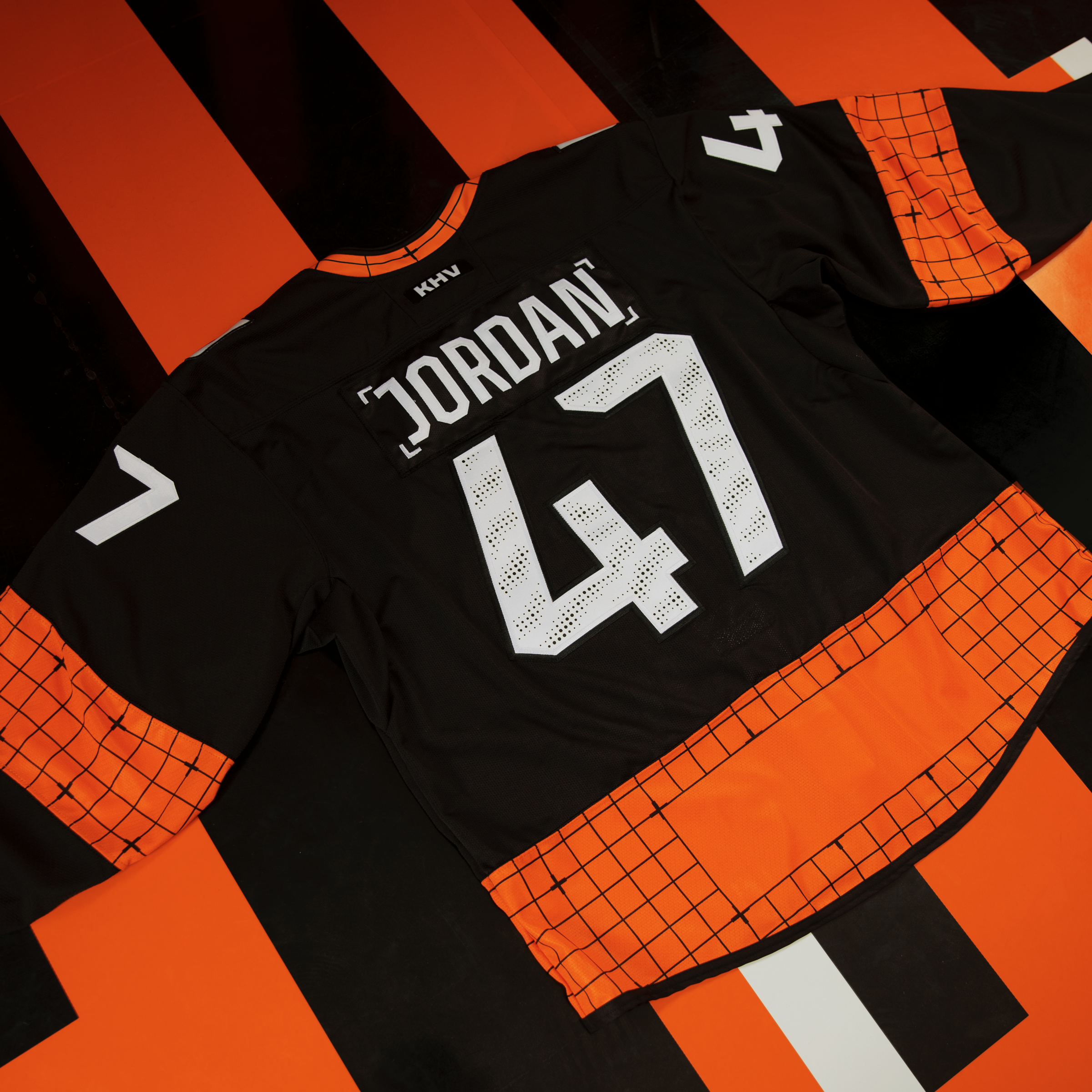
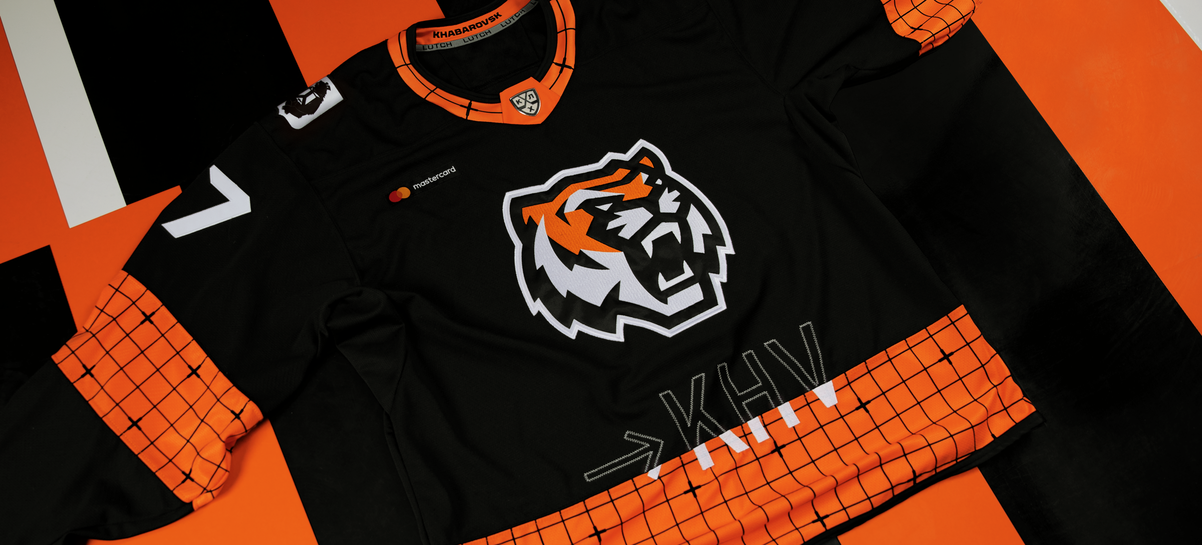
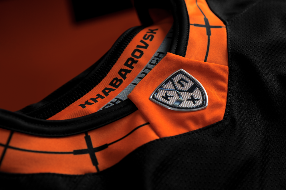
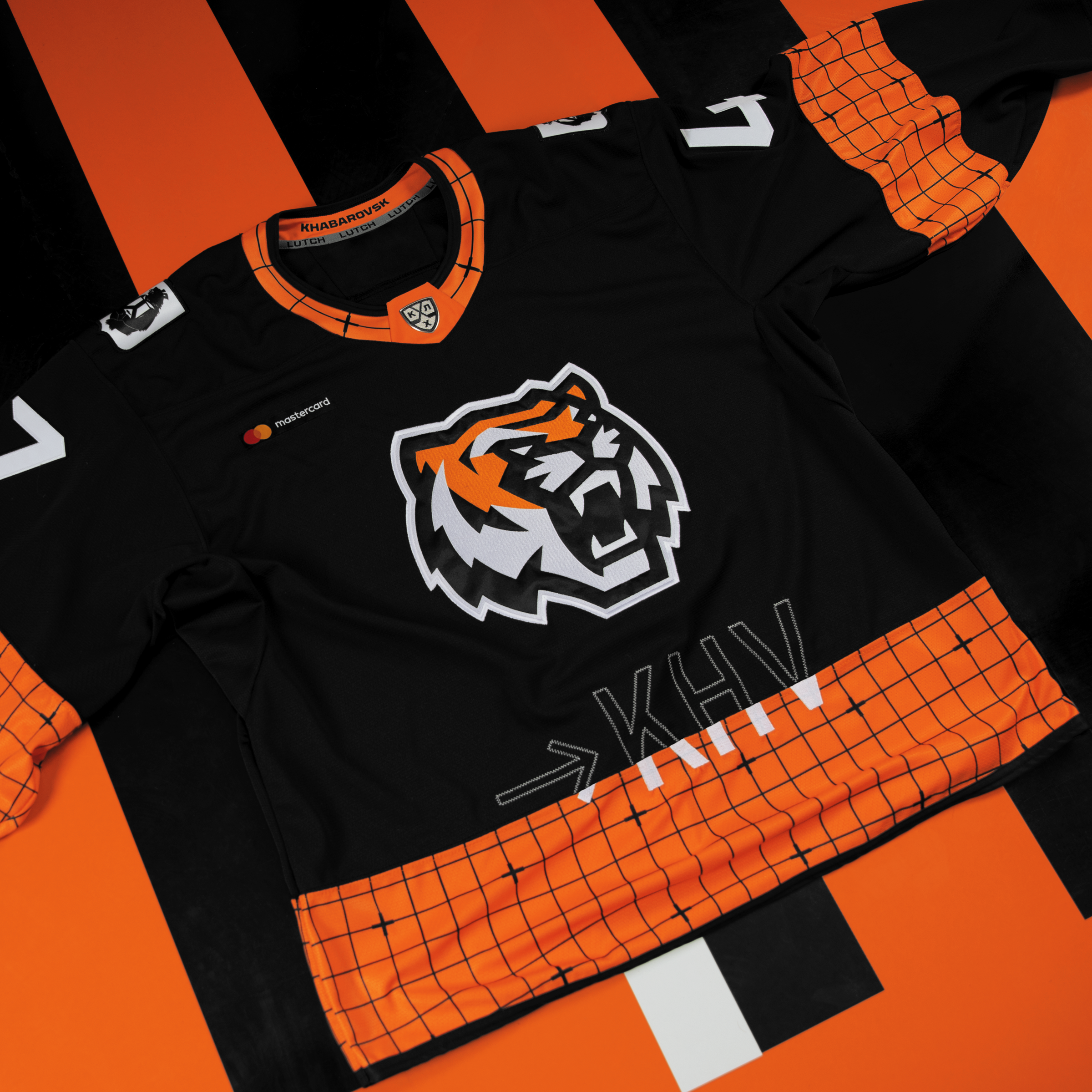
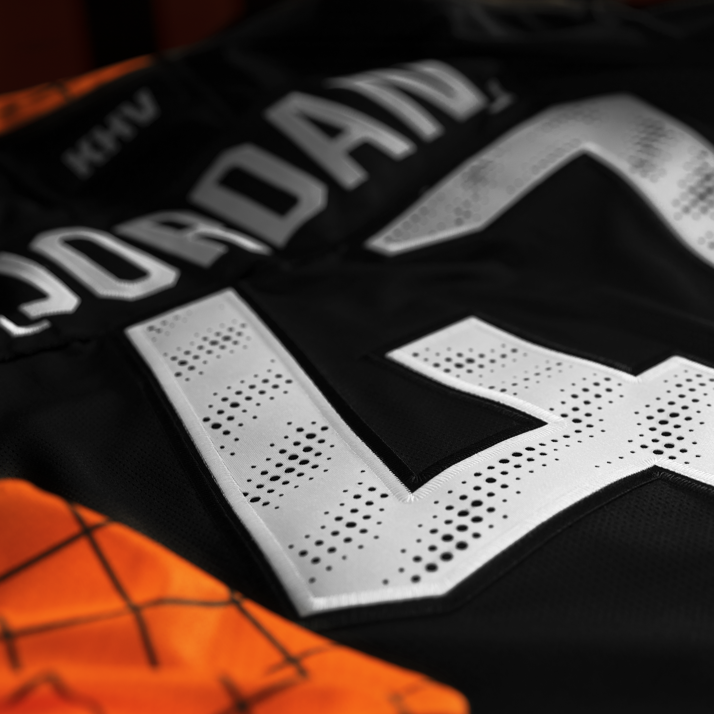
Industrial vibe in an alternative kit
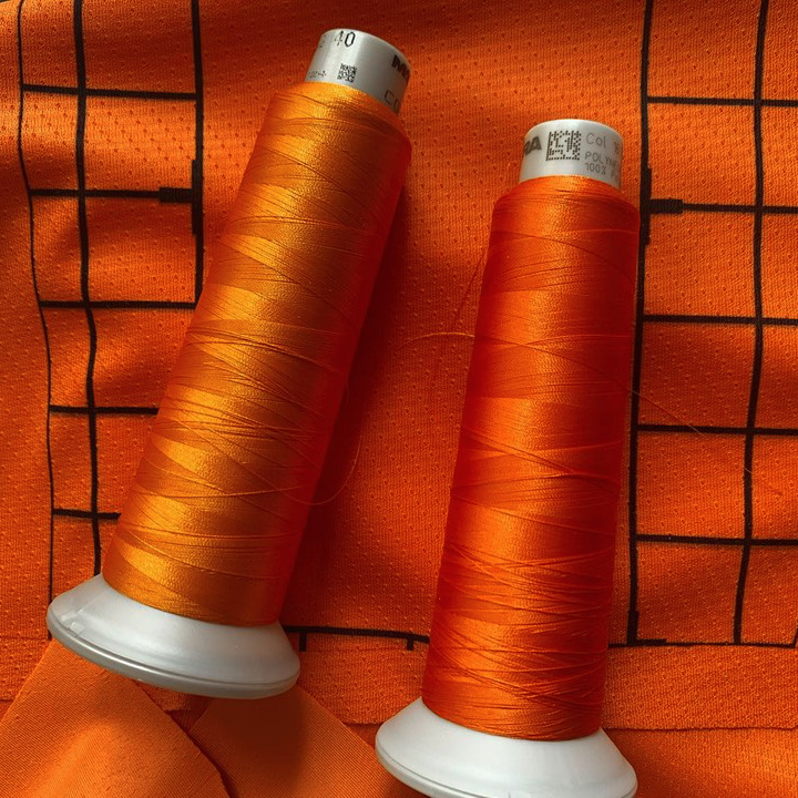
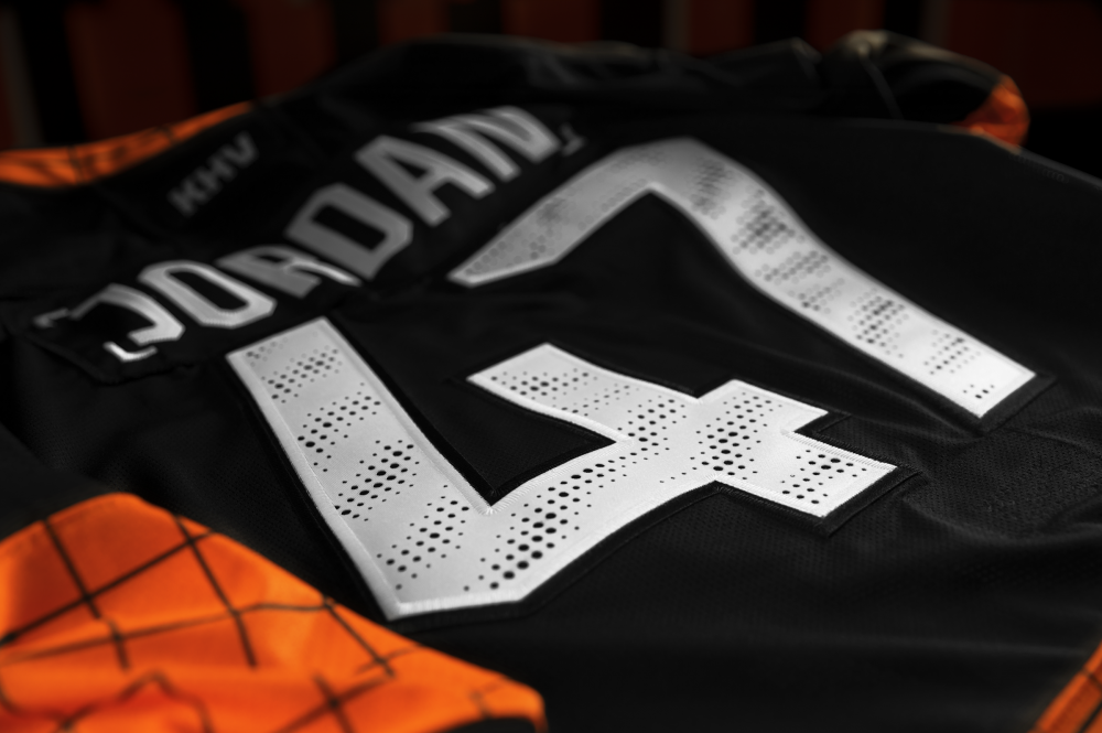
The studio’s signature style in hockey projects was working with numbers and their perforation. A mix of functional and decorative design is an additional tool in revealing the image. The pattern of the holes repeats the tiger’s color.

Медиа:
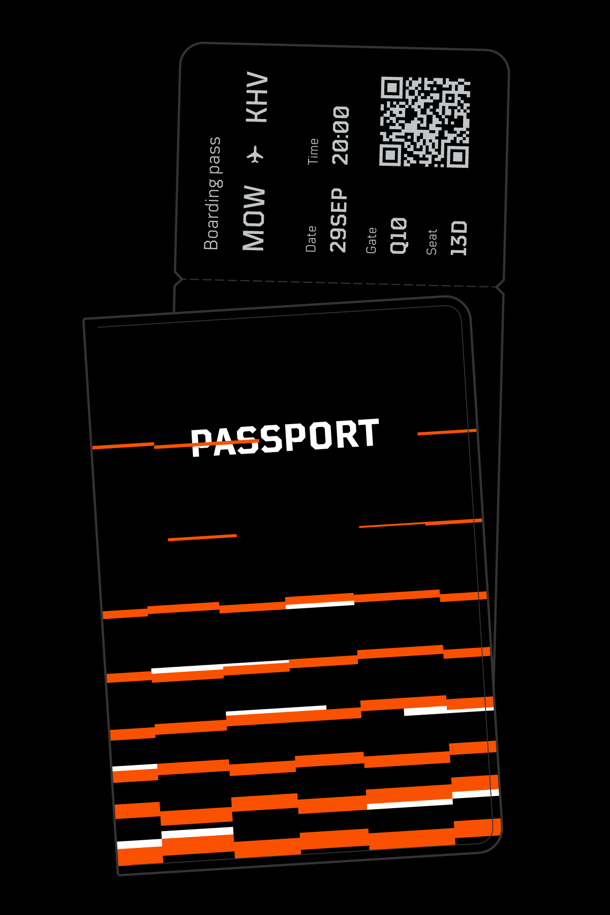
The Khabarovsk team spends much more time in the sky than on the ice: 80% of the club’s away fixtures require a five-hour flight. Within the KHL community this has become a meme, and for athletes it’s just a big hindrance having to clock all these miles just to play a game.

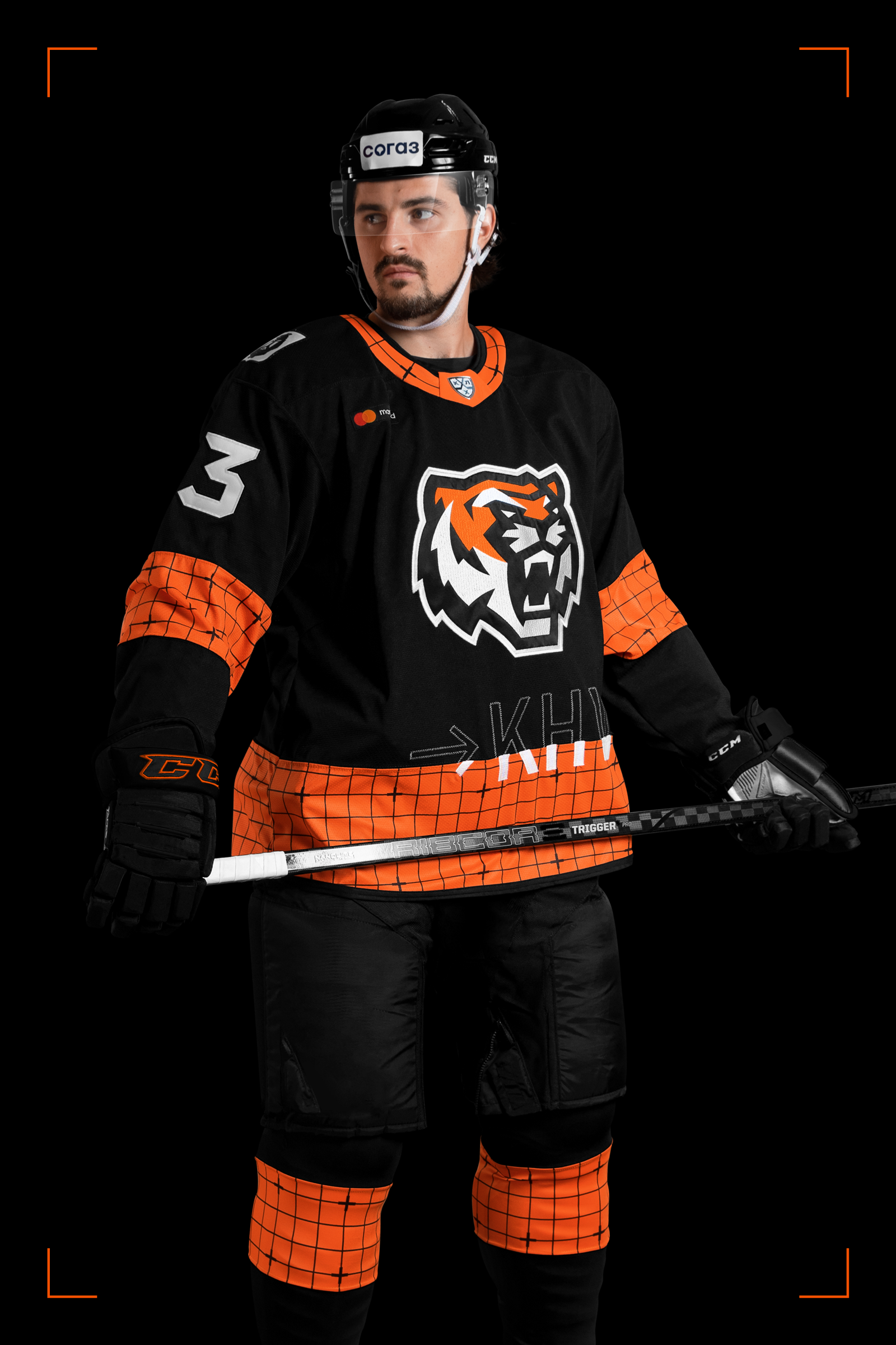

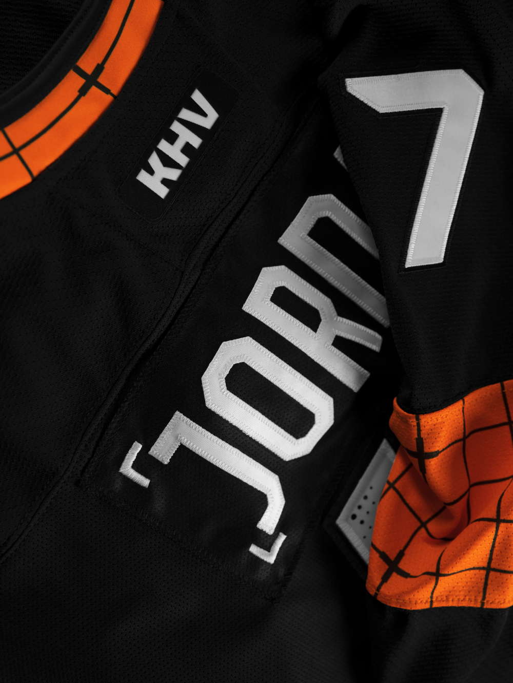
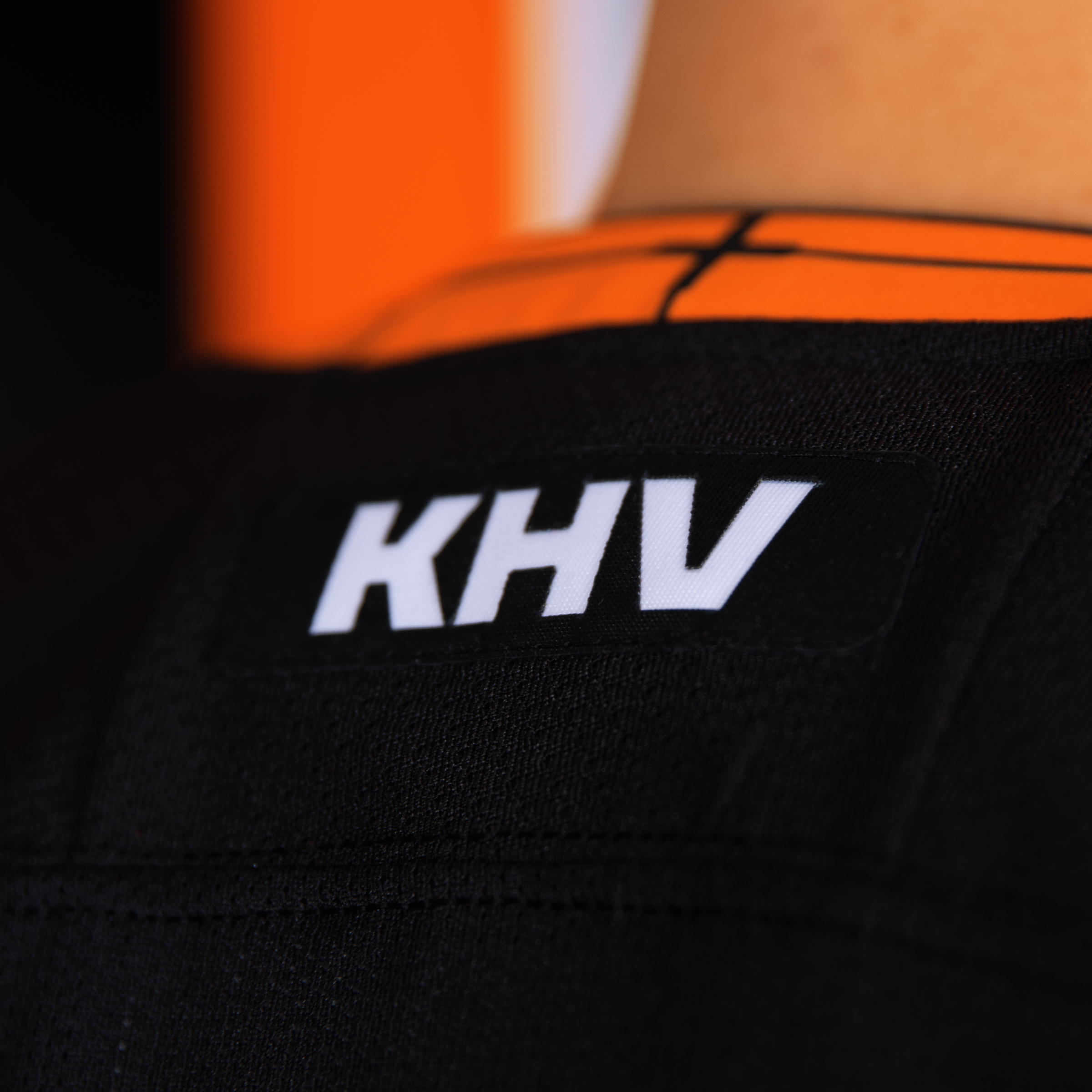
The kinship of the team within the theme of aviation is subtly emphasized by the location of the unique identifier KHV at the bottom of the sweater, the inscription uses a glitch effect. On the back side under the number there is a ’window’ for the advertising patch.
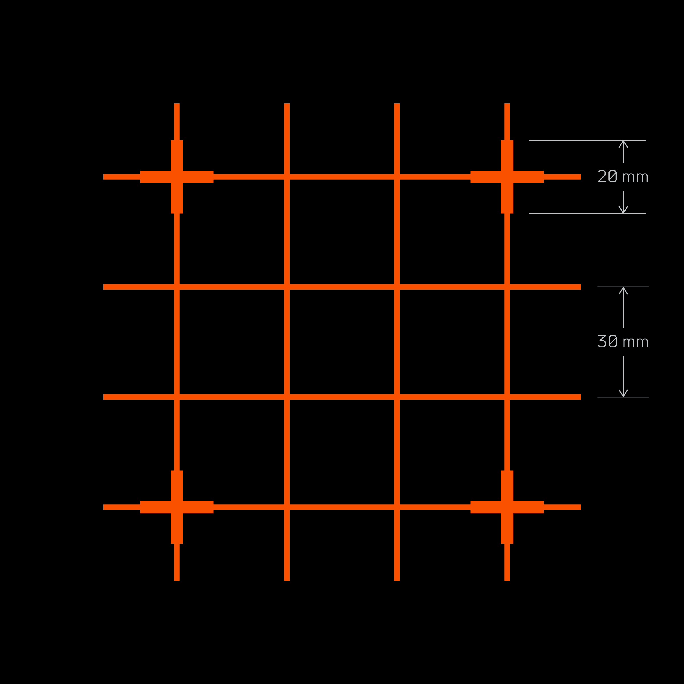
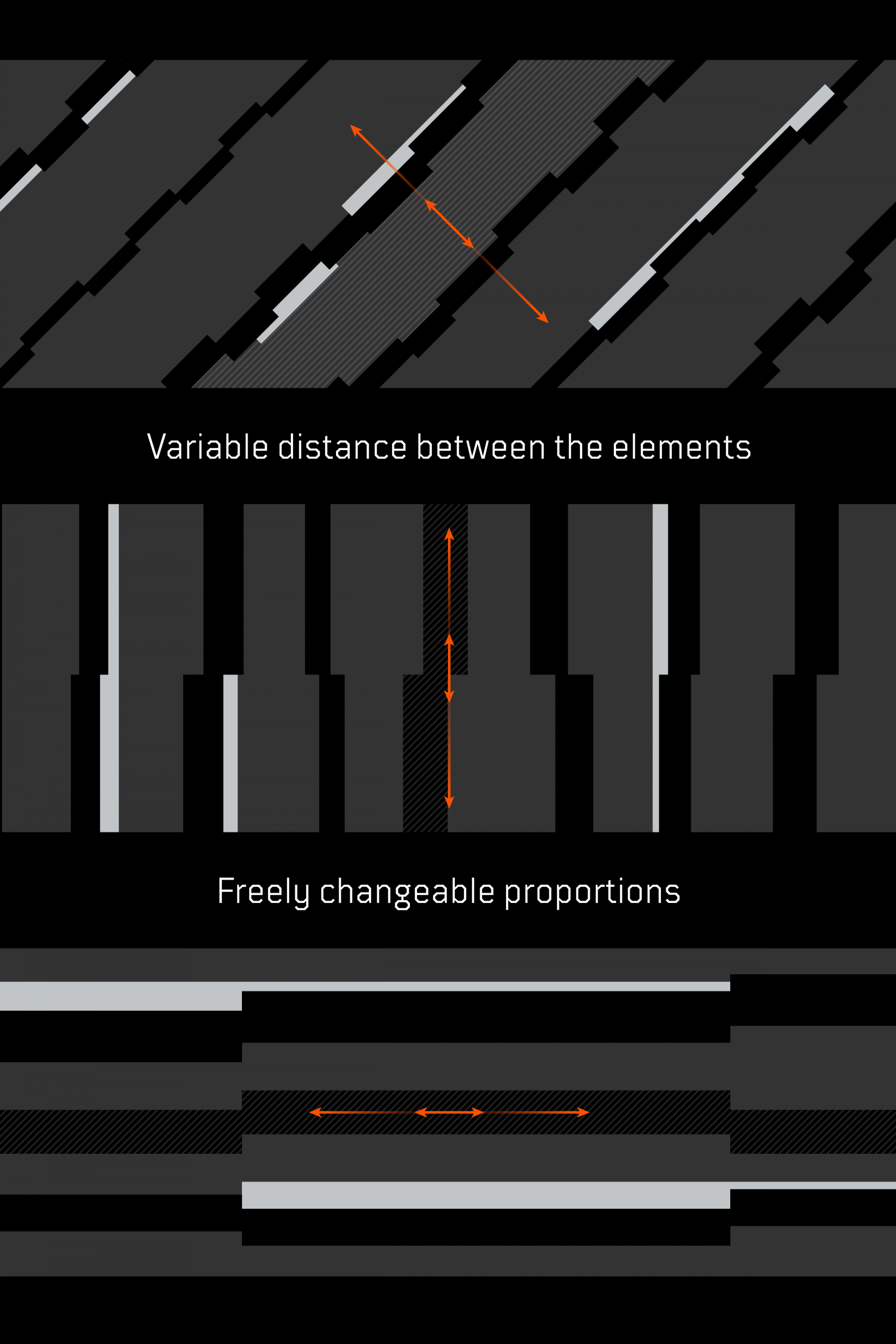
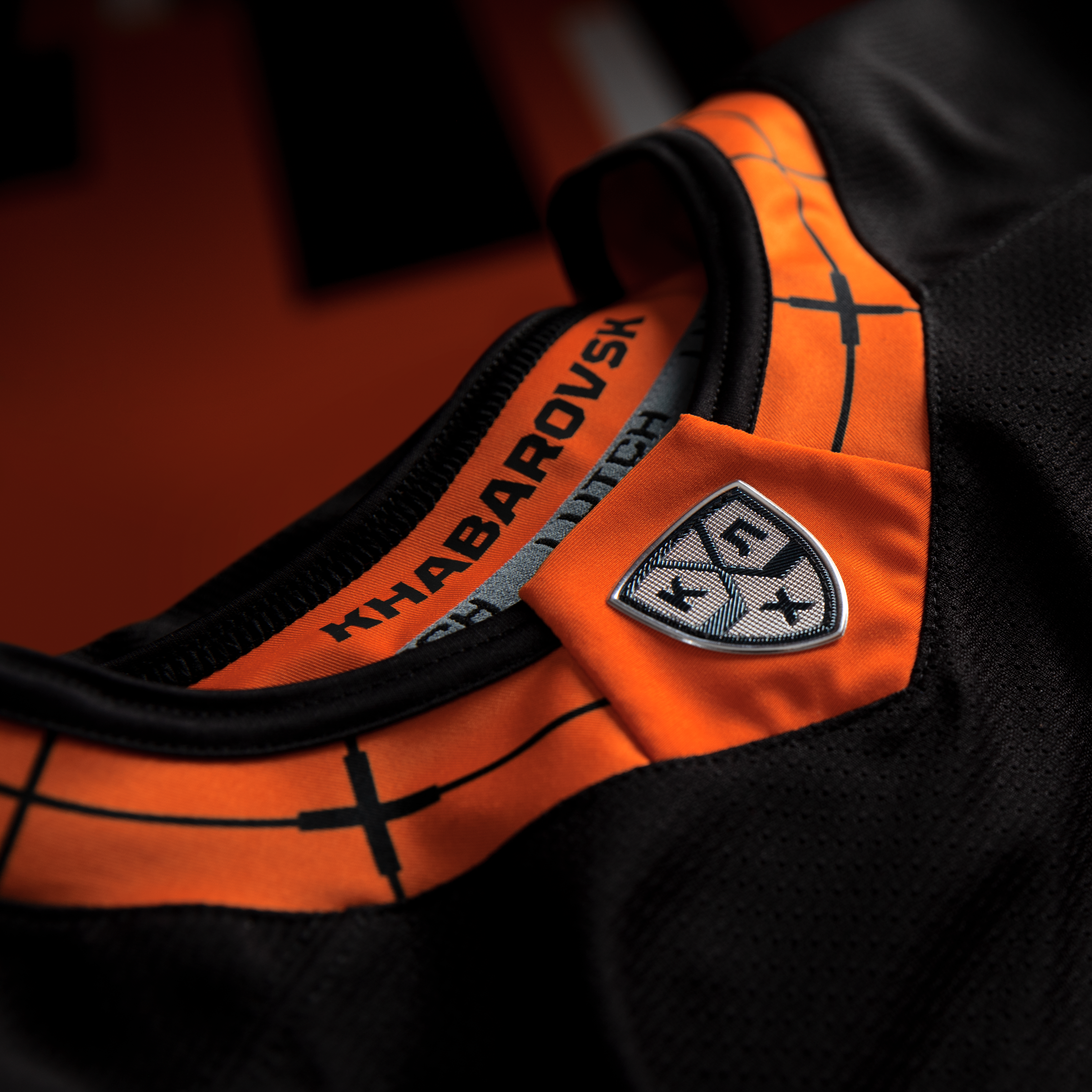
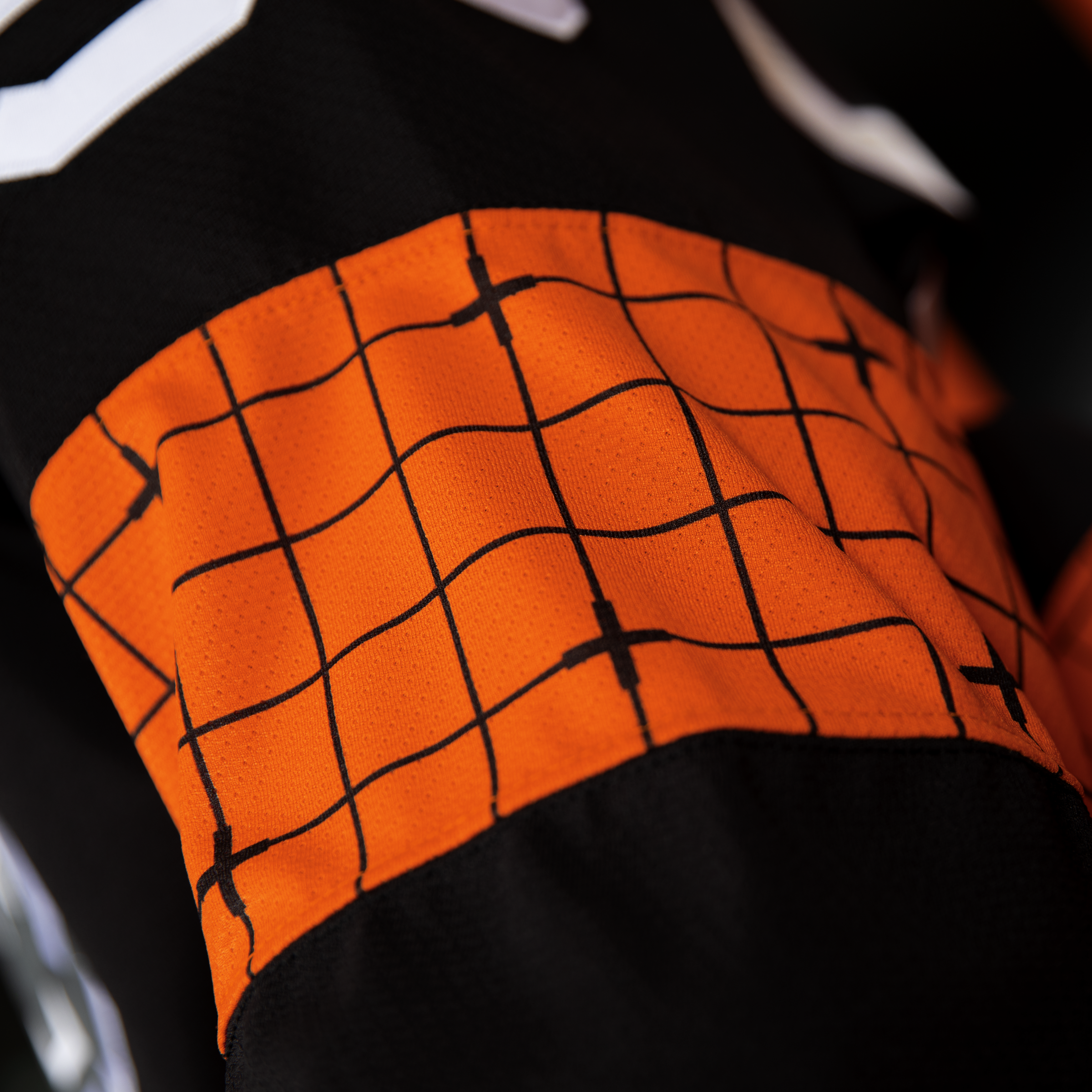
The upper part of the KHV element is made with machine stitching ’zigzag’; this is also an interpretation of the ’industrial’ trend in modern textiles. Industriality is added by the use of a scale-coordinate grid. It goes through many elements of the form: sleeves, jersey bottoms, gaiters, and even a collar.


Patterns refer to the location
In some iterations, the tiger’s digital stripes are instantly associated with the waves of the Amur River.
Abstract lines can expand and have a rich arsenal of outlines. Before the start of the season, the club applied a dynamic pattern in the design of the interior space of the home Platinum Arena. However, a number of patterned schemes allow you to use them as navigation icons, in the design of locker rooms, and so on, giving this system 100% output.


Медиа:
Медиа:
Медиа:
Медиа: