Mikhail Sergachev's personal brand
LOGO • FONTS • UNIFORM • MERCHANDISE • GUIDES
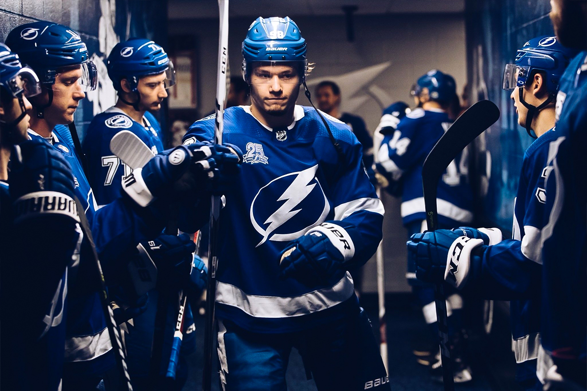
A personal brand is noting new for athletes, but it has recently become a trend in ice hockey. Mikhail Sergachev, the young star of Tampa Bay Lightning and the 2020 Stanley Cup winner, is one of them. The defender now has an identity's pack which can be used both online and on physical objects like kits for training camps, merchandise line etc.
The logo itself is multifaceted. In addition to the hockey silhouette and the letter S, the number 98 is sewn onto it and, with a slight 180-degree turn, a lock which symbolises reliable protection. The sign, lettering and number can be used both independently and can be formed into composite blocks. In fact, this is a constructor, from the elements of which you can manage logos to fit the occasion, and the player's number has several representations and may vary depending on the event.
The brand's video uses a classic superhero theme. This isn’t just a reference to the athletes that possess almost superhuman qualities, but also to the role Sergachev plays as a defender, who protects the team from the enemy's attacks, but sometimes he can use his fists and stand up for partners.
We have developed a set of merchandise and our own unique sweater for Sergachev, which resembles his team Tampa by stripes, but differs slightly by using a metallic fabric that hints at Mikhail's endurance and strength.
The project was realised by order to sports marketing agency HockeyPeople who represents Mikhail Sergachev's interest.
Медиа:
