New look of HC Dynamo Moscow: sub-elements and kits
LETTERING • SUBLOGO • FONTS • PATTERNS • GUIDES • UNIFORM
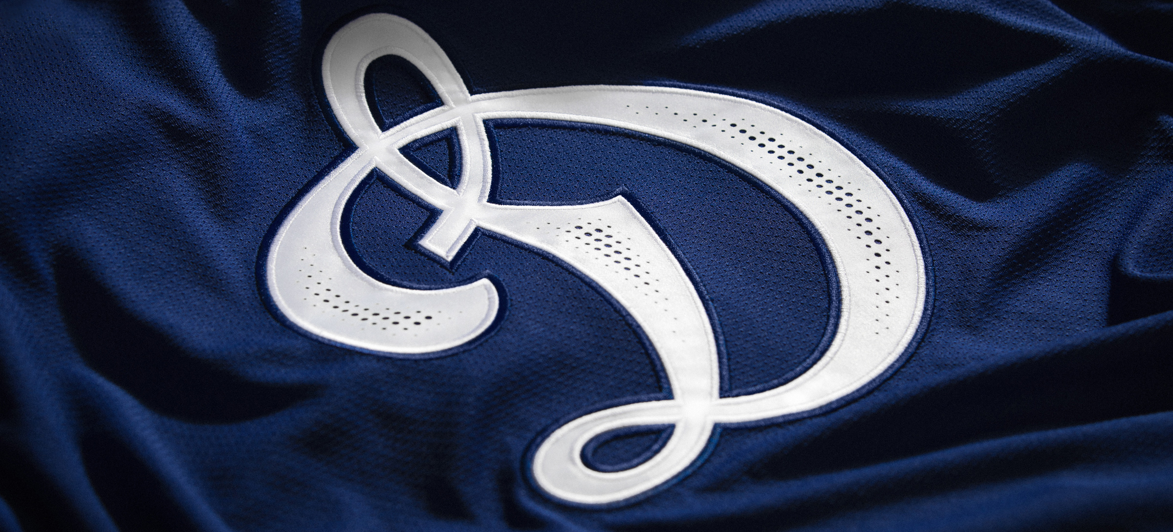
Dynamo is one of the first sports societies in the USSR, dating back to the 1920s. The classic D letter is a sports brand recognised around the world and is still, despite its age, one of the most
elegant elements of sports design. Quberten studio restyled the Dynamo hockey club logo for the first time and made game kits in 2017, and cooperation expanded in 2020: in addition to game kits, we created new letterings, sub-logotypes, a line of merchandise and achieved the visual integrity of the corporate identity in every aspect.

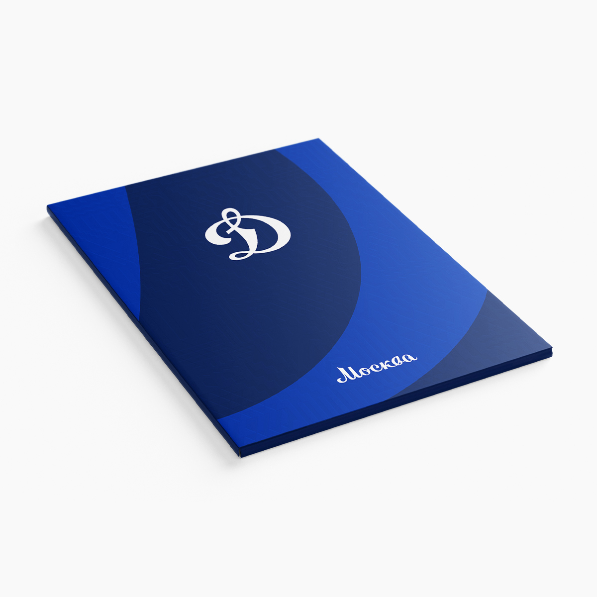
New clean and functional sub-logotype
Nowadays, any club is obliged to think about the convenience of reproducing a logo or sub-logo in any environment — and here perception is strongly influenced not only by the traditions of the team but also by effective digitalisation: fans are constantly viewing their club’s brand and logos in digital formats, whether as a small application icon or an avatar on social media. While updating a club identity, it’s important to comply with a balance between functionality and corporate identity. Graphics shouldn’t just be simple, but should automatically connect with the key visuals of the club. We’ve refreshed the Dynamo sub-logo, the wolf mascot, removed all the unnecessary details and linked it with the main letter D through geometric rhymes. The new sub-logo and monogram DM were proposed to us as concepts.


Lettering: a strong connection with the logo
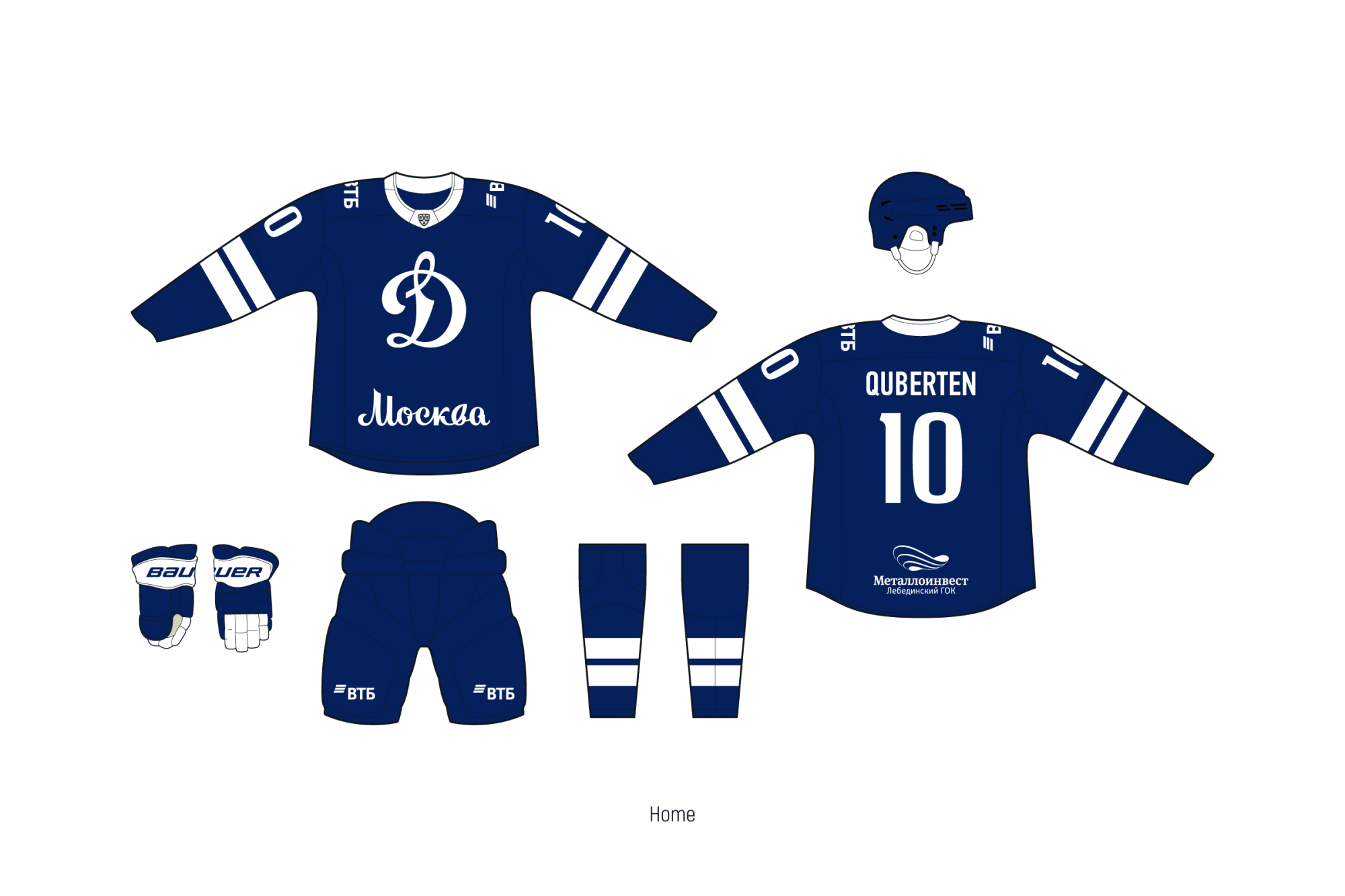
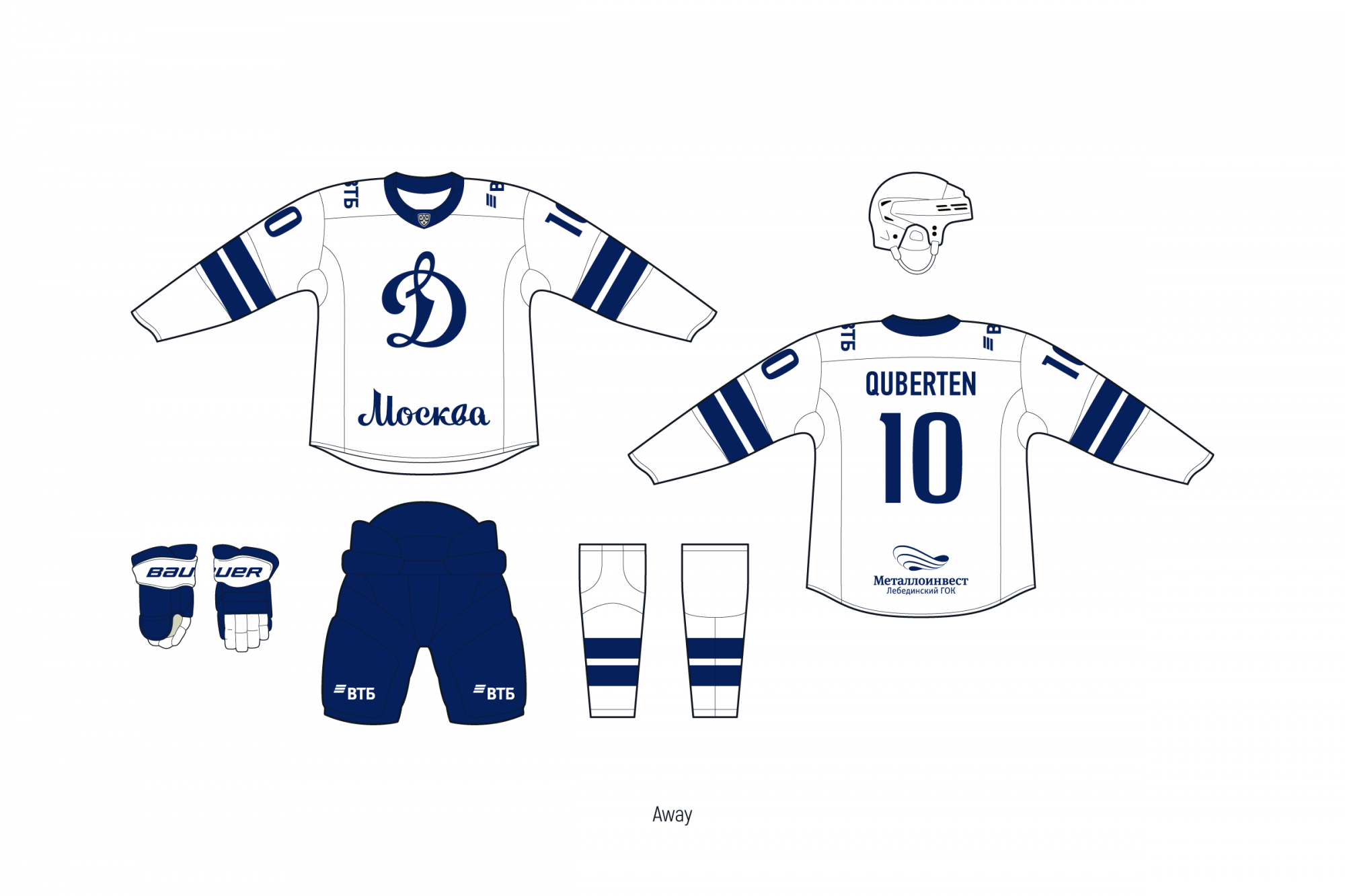
The new calligraphic lettering is completely identical to the letter D from the club's logo and is presented both in merchandise and on the team's kits: the inscription Moscow is drawn in the same style.
The additional style is much stricter but simultaneously doesn’t loose its strong connection with the main letter D. We wanted the entire identity to be done in the same style, and since the main letter of Dynamo is contrasting, we transferred this visual system to the rest of the elements.


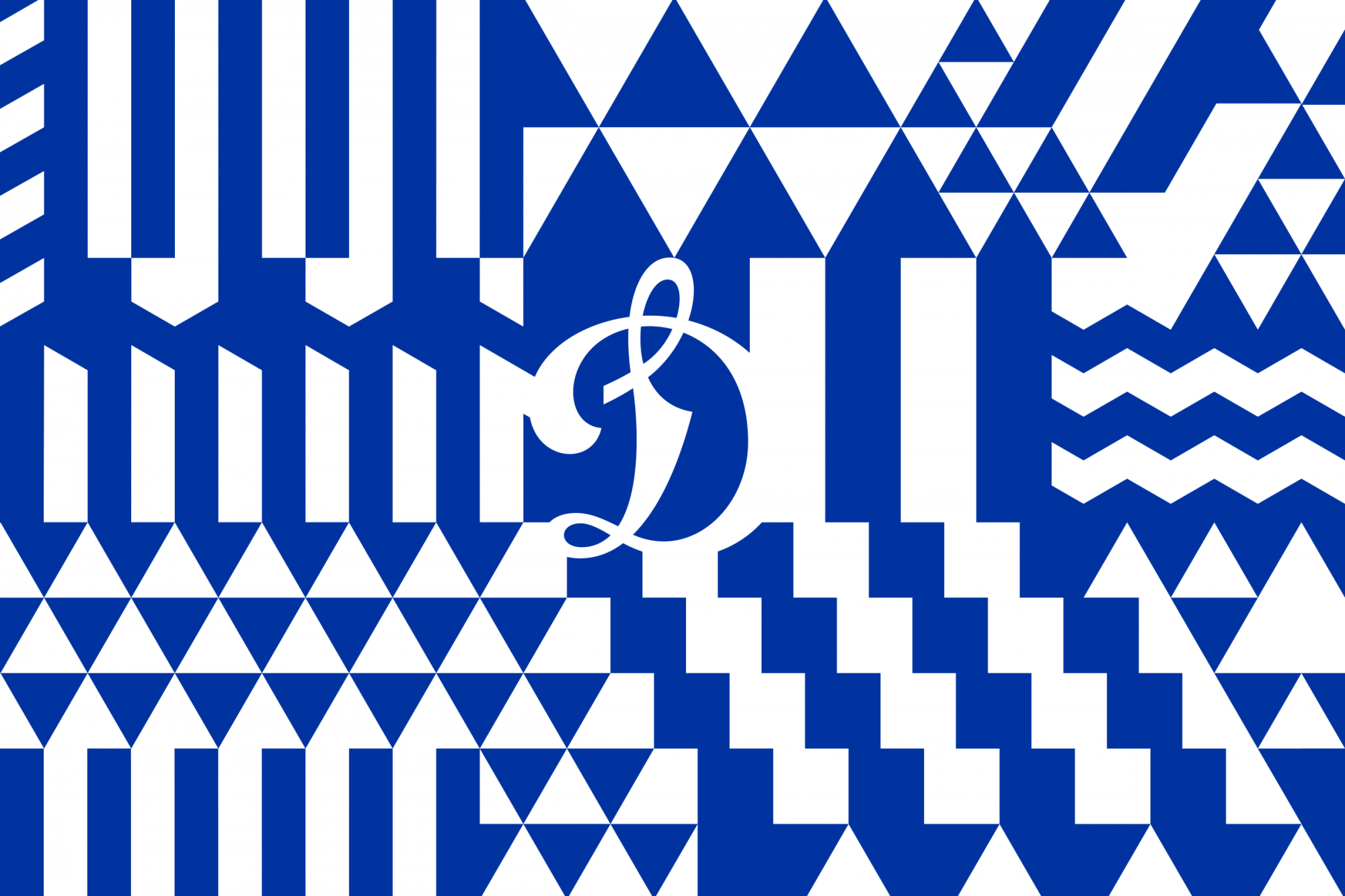
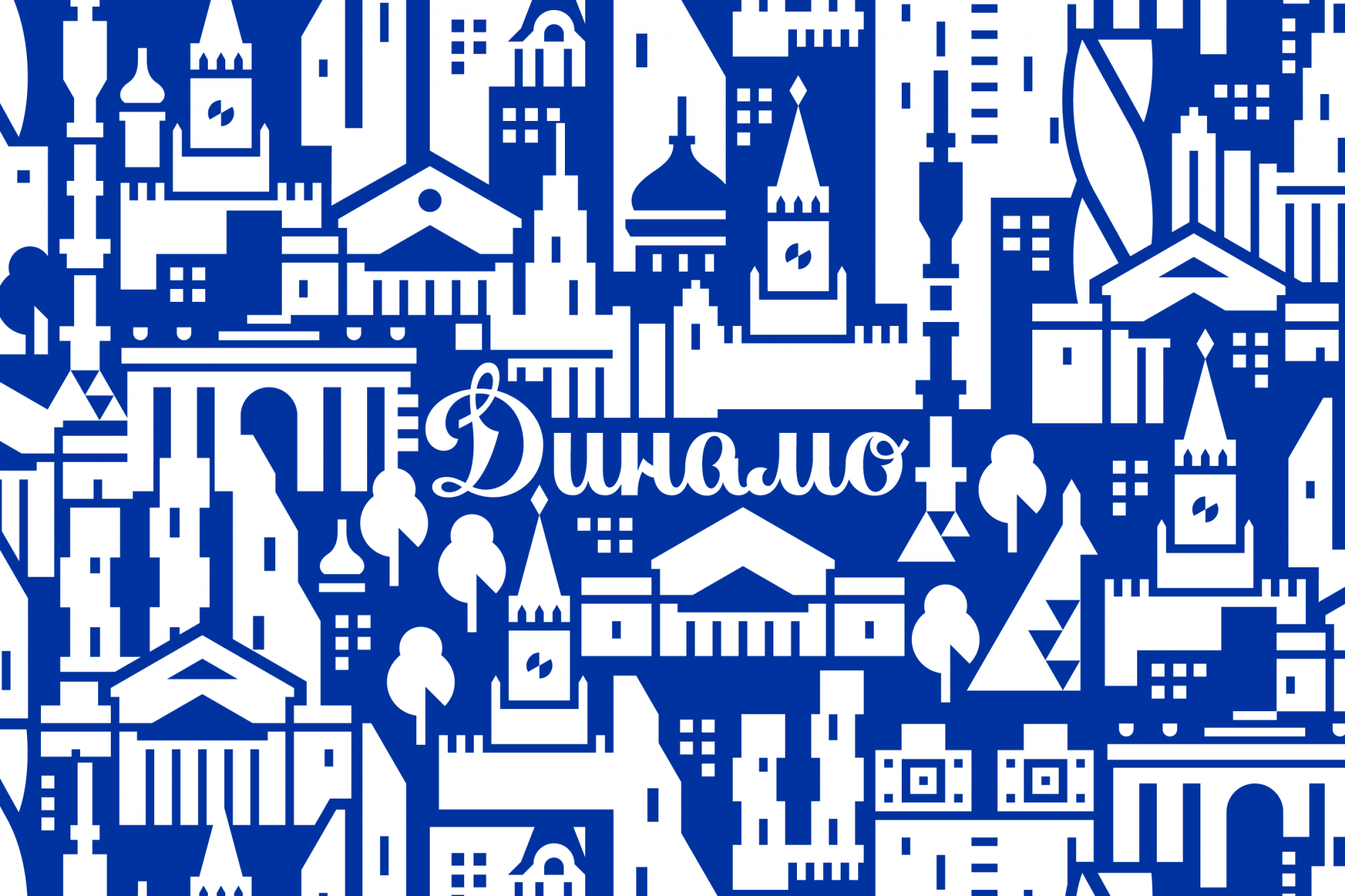
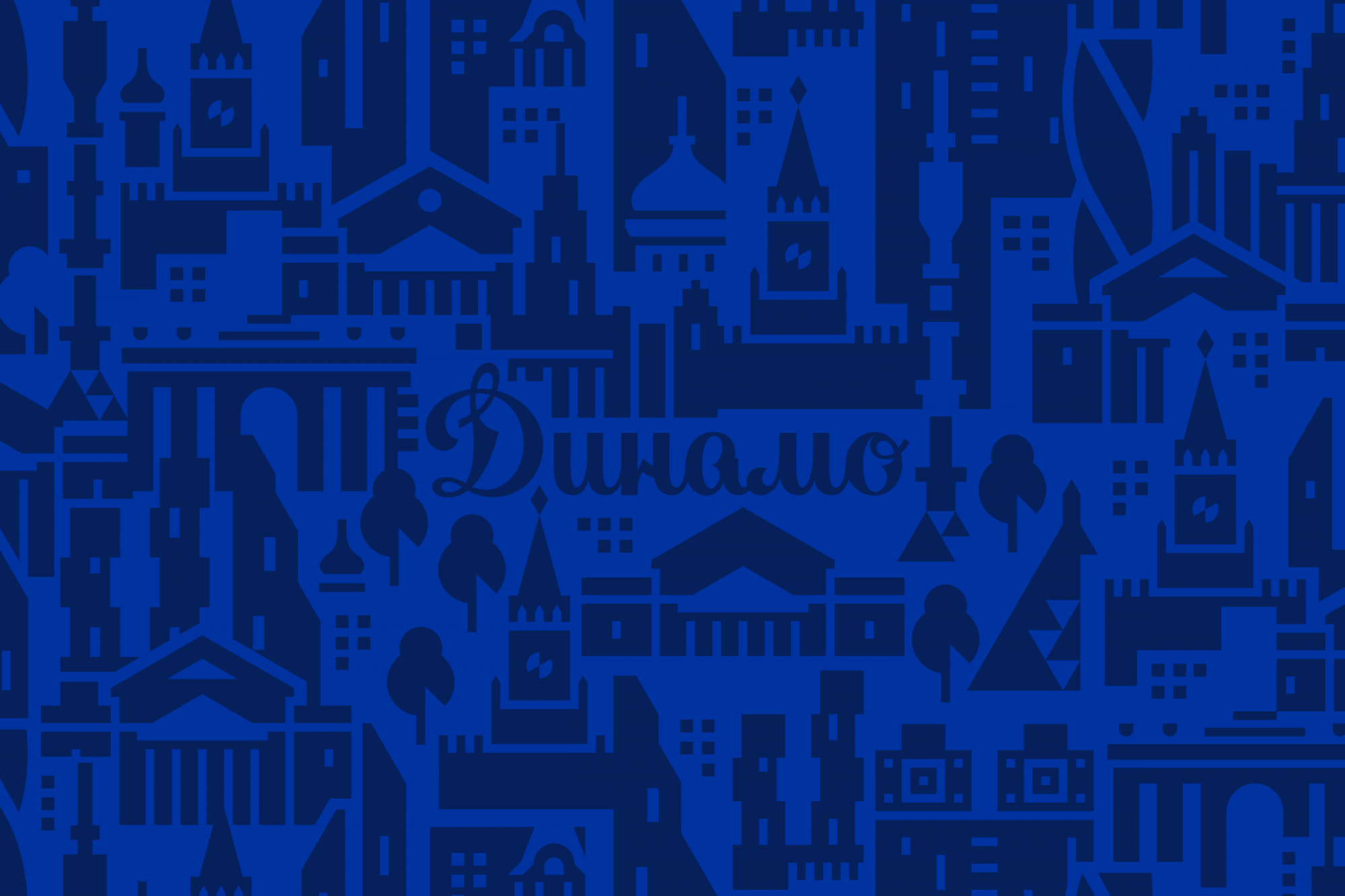
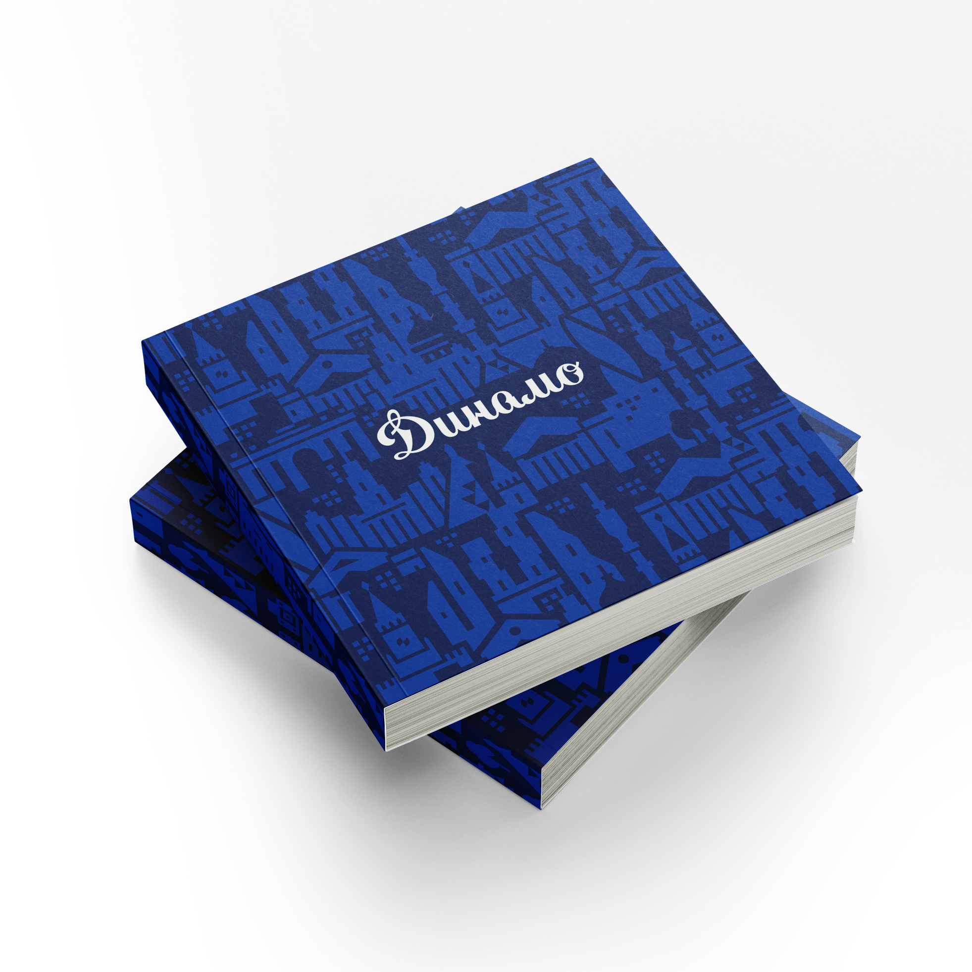
Patterns as part of the Moscow theme
Dynamo's communication strategy for the 2020/21 season is linked to the club's Moscow roots and the capital's cultural code. The relationship between Dynamo and Moscow is revealed through patterns.
Here the large city images with hockey symbols merge together. This is how Moscow architecture matches the soft plasticity of the lettering and informs: Dynamo is Moscow. Each element has references to traditional lettering and does not exist apart from the corporate identity.


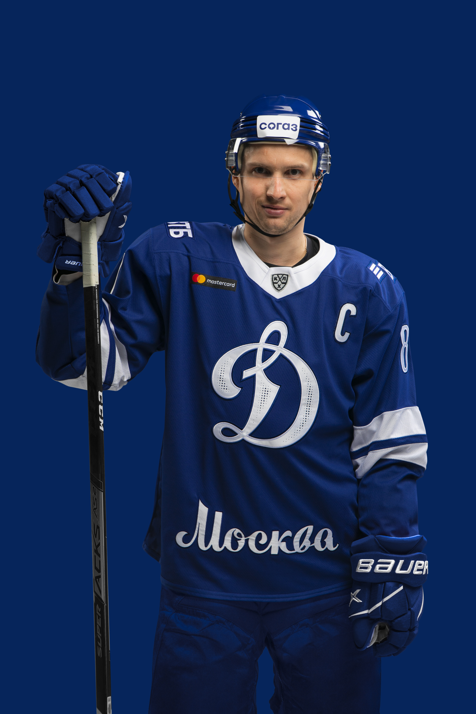
Kits: logo perforation and legend's autographs
The new uniform has incorporated the classic elements of the past: traditional styles and two-lane graphics. Of course, that’s not all. Here at Quberten we take an approach of combining different elements with a high attention to detail.
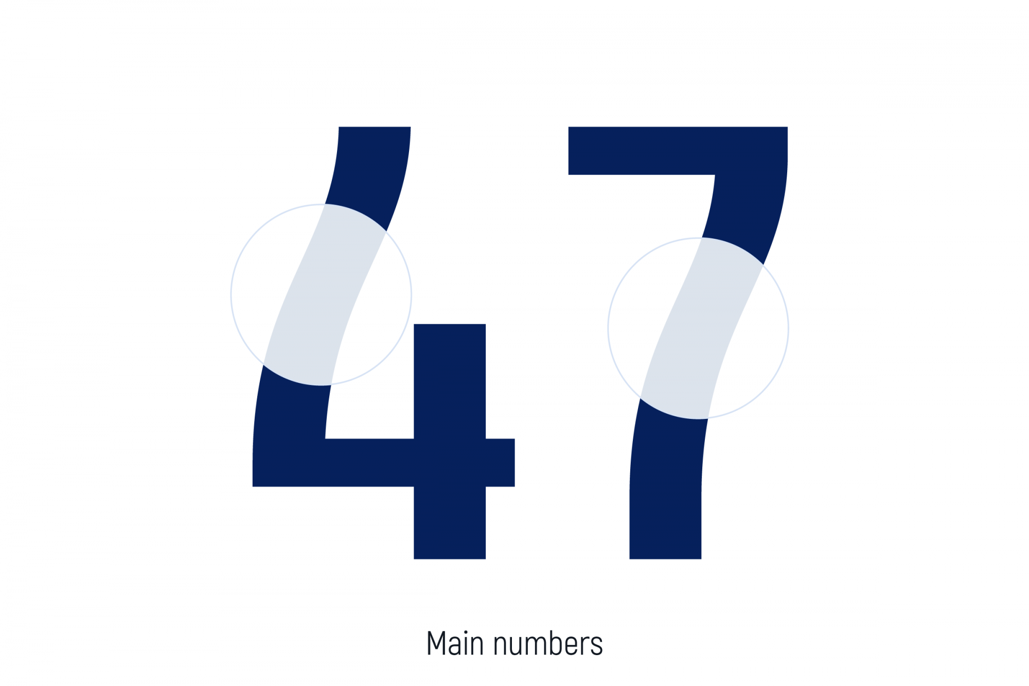
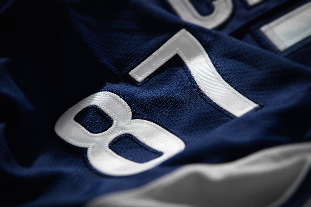
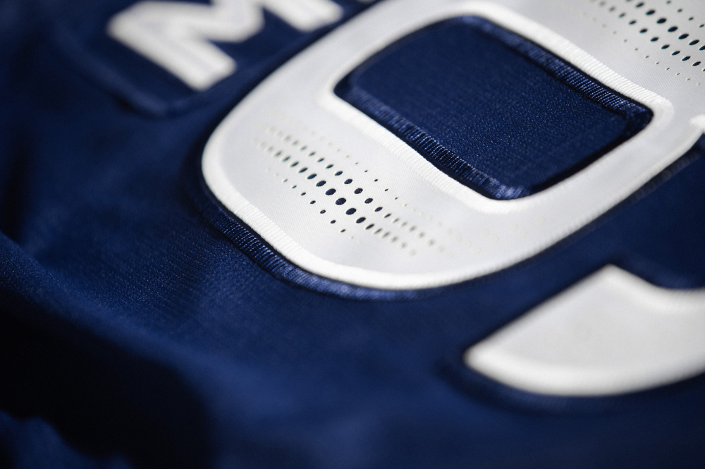
Many people get used to ‘perforate’ numbers, but no one has made it with the main logo yet. Firstly, the holes in the kits are a functional technique that helps maintain moisture removal. This function can be combined with decor. As a result, the uniform becomes more ‘breathable’, technological and at the same time stylish.
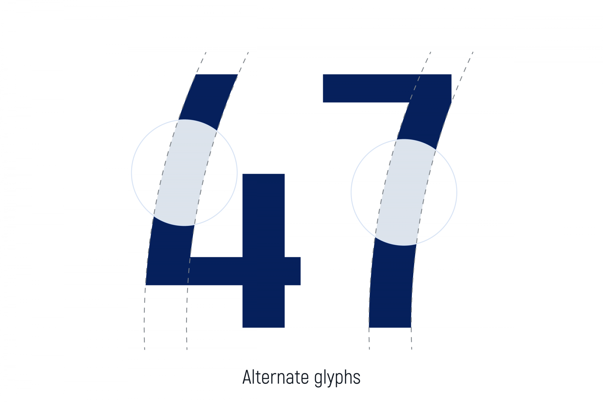
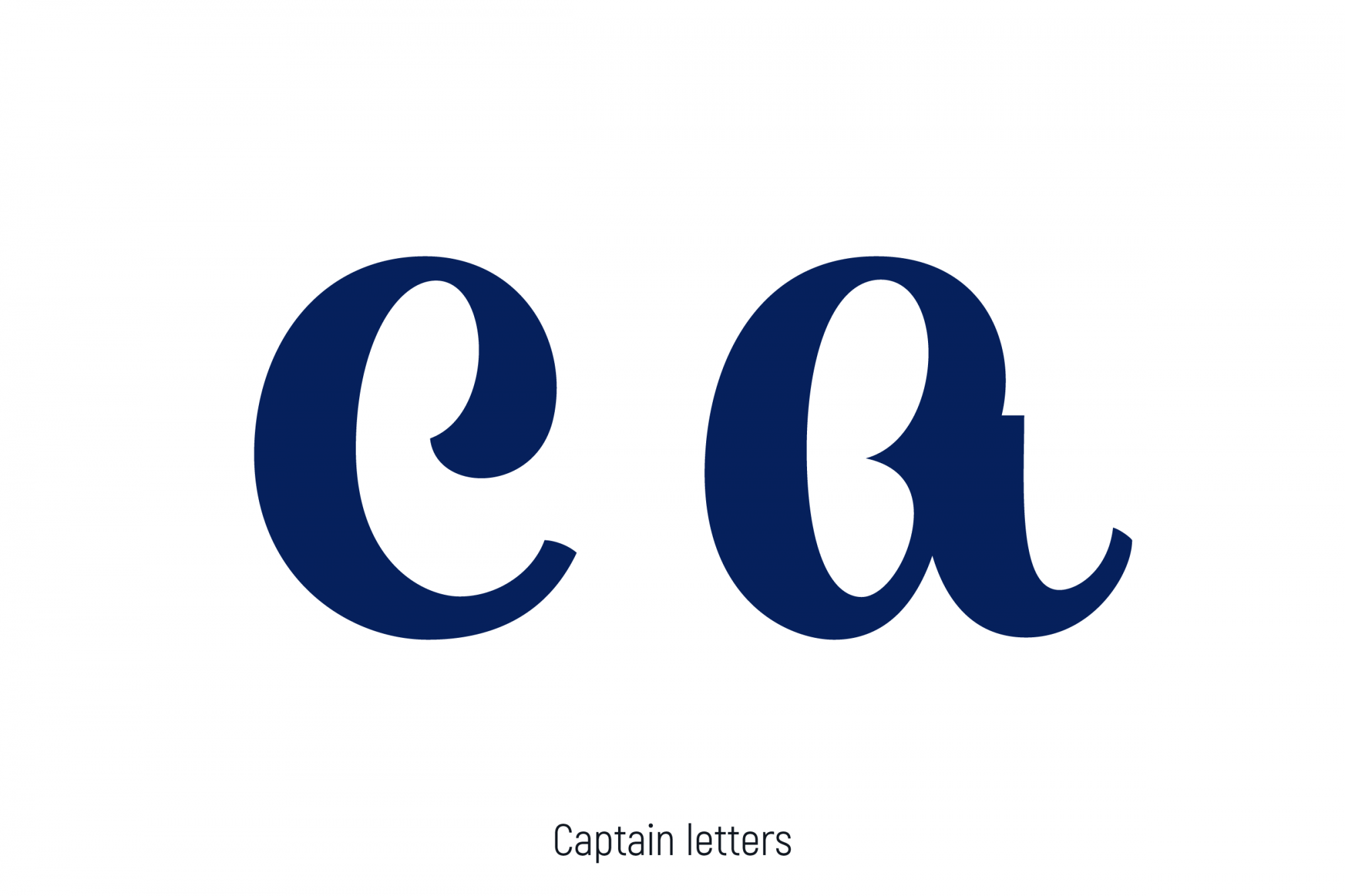
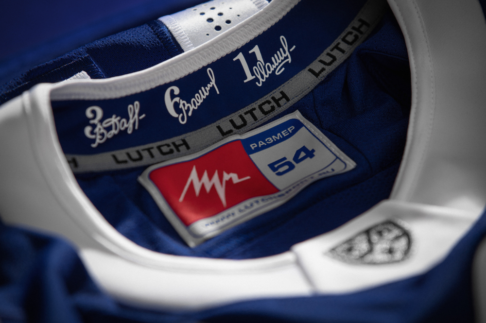
And one more additional feature: the personal signatures and the retired numbers of the three legends of Moscow Dynamo, located on the gates. The signatures of Alexander Maltsev, Valery Vasiliev, and Vitaly Davydov were drawn in the same style using new calligraphic lettering. Finally, the captain's letters and a set of numbers, identical to the main logo, create a unified image.
Dynamo's new kits have been designed to combine fashion and sport: the sweater has acquired the mood of the current techwear and street style.