From Waves to Weaves. Identity of HC Admiral
HC Admiral from Vladivostok is firmly connected with the sea and ... with Quberten. In 2013, the “Sailors” entered the league with a logo that was created by the studio. Despite the fact that the club is still young by hockey standards, over the years it has managed loudly to declare itself. They have competed in four Gagarin Cups and have become the main source of jetlag for their competitors.
The Admiral is currently playing in a uniform proposed by the studio in 2015. Over the past few years, the club has come a long way, and the identity required updating.
Медиа:
Медиа:
Медиа:
Заголовок:
Logo
Текст:
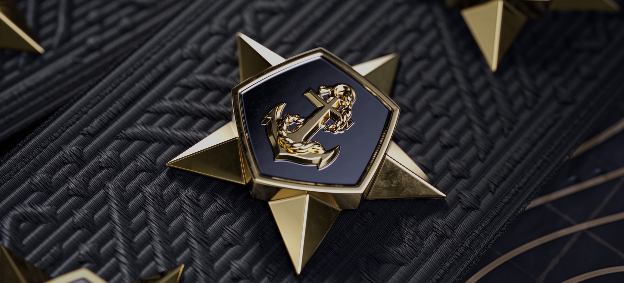
Originally, the logo featured the admiral’s star as an alternate, but it eventually became the primary one. Later, a rope was incorporated into the emblem design, mirroring the placement of the element on the officer’s cockade in the Russian Navy.
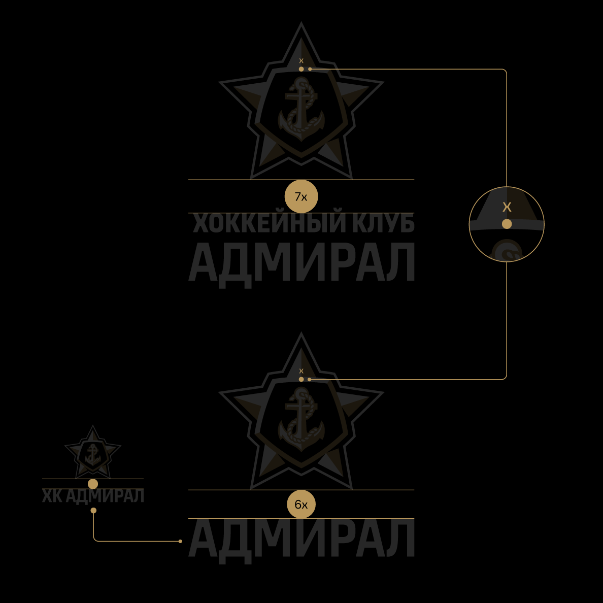
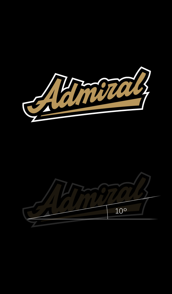
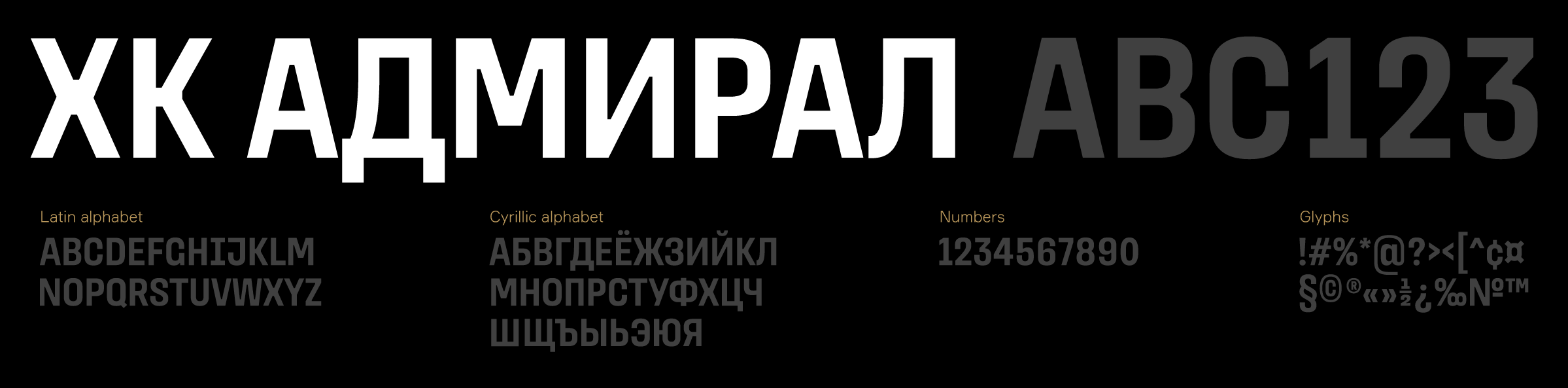
In the previous version, the lettering, represented by the steering wheel, was initially integrated at a 30° angle based on the sign’s geometry. Now, we’ve adjusted the angle of the lettering for the club name to a more moderate 10° inclination.
Медиа:
Медиа:

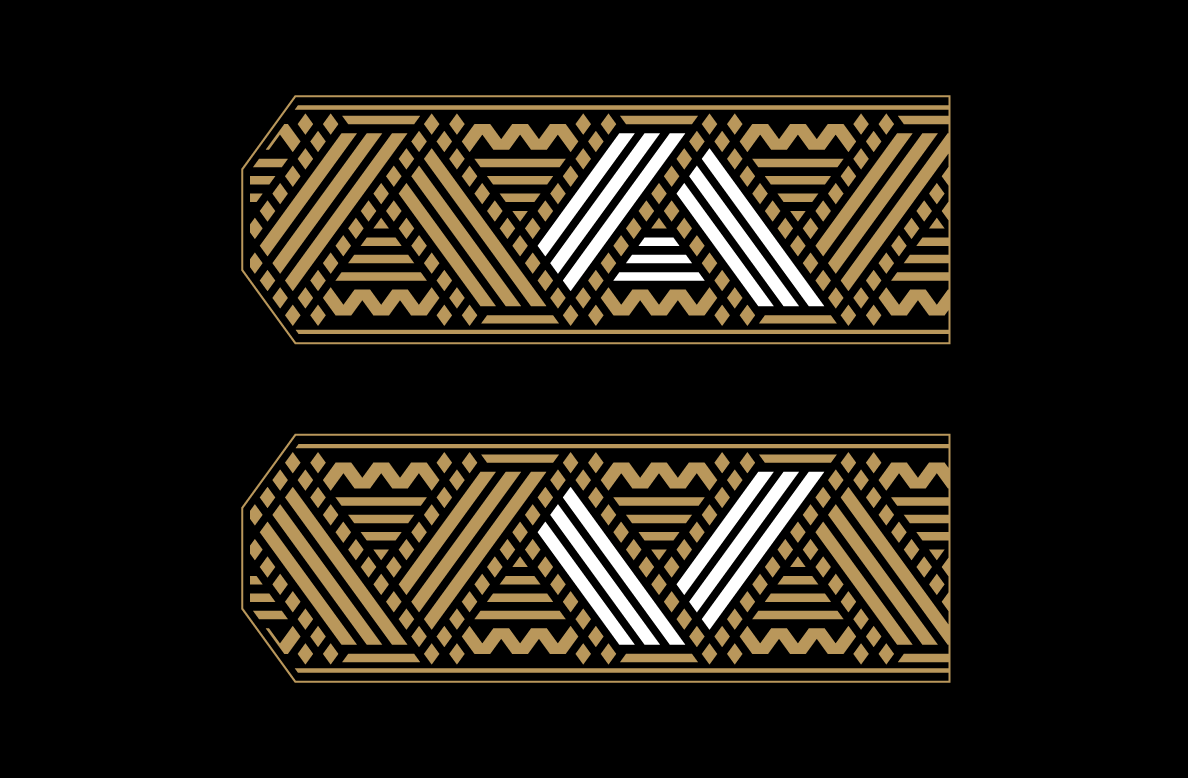
Sublogo
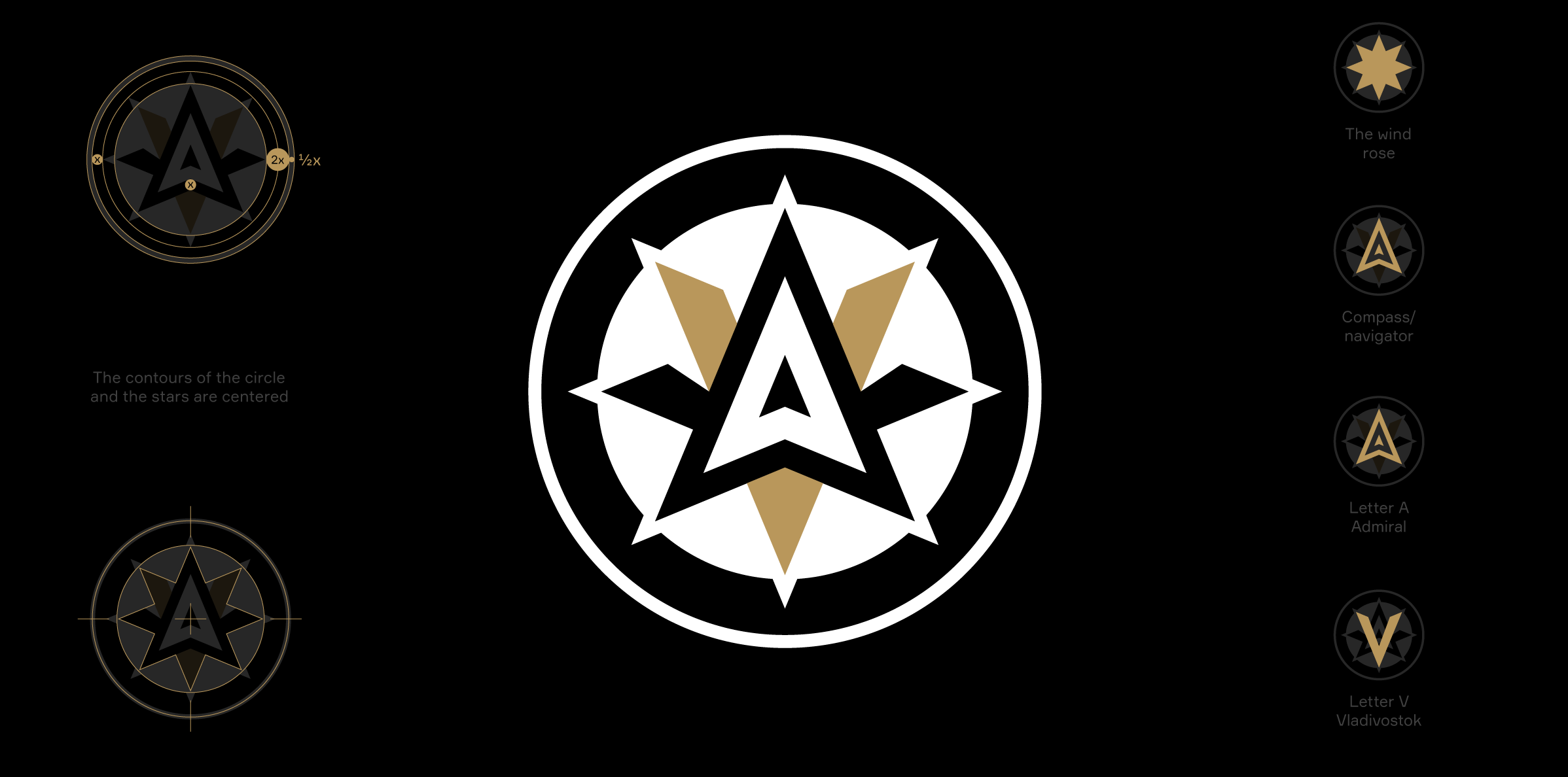
The revised alternate sublogo draws inspiration from the wind rose on a meteorological chart. Alongside the compass and navigator, the letters A and V representing Admiral and Vladivostok, respectively, are enclosed within the sublogo.
Медиа:
Медиа:
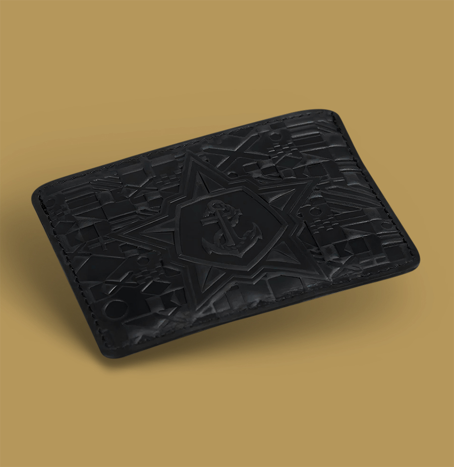
Заголовок:
Emblem
Текст:
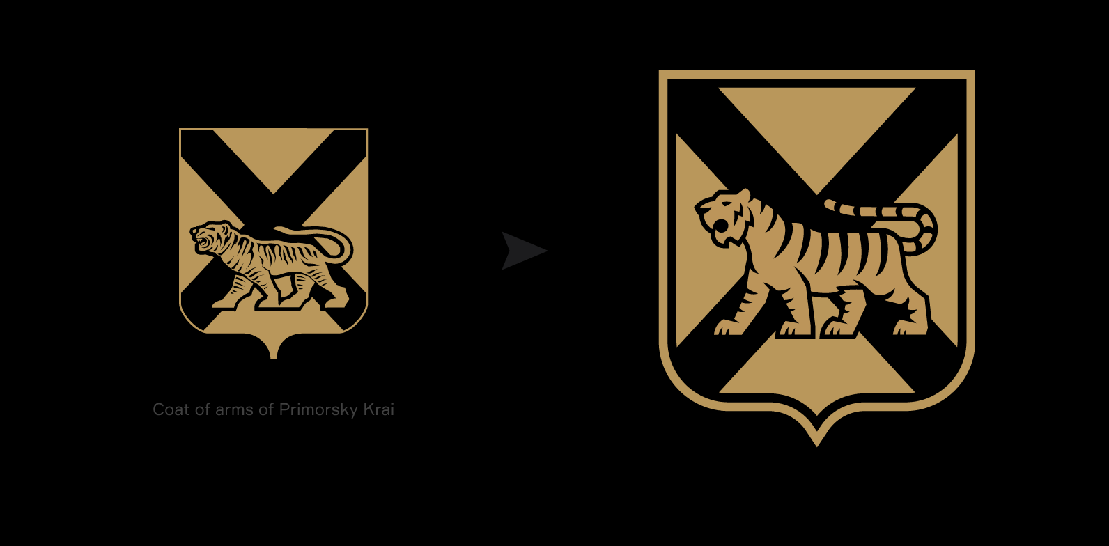
The coat of arms of Primorsky Krai has been reinterpreted to match the sports aesthetics. Thus, the adjusted coat of arms will not look foreign on hockey kits and in club communications.
Медиа:
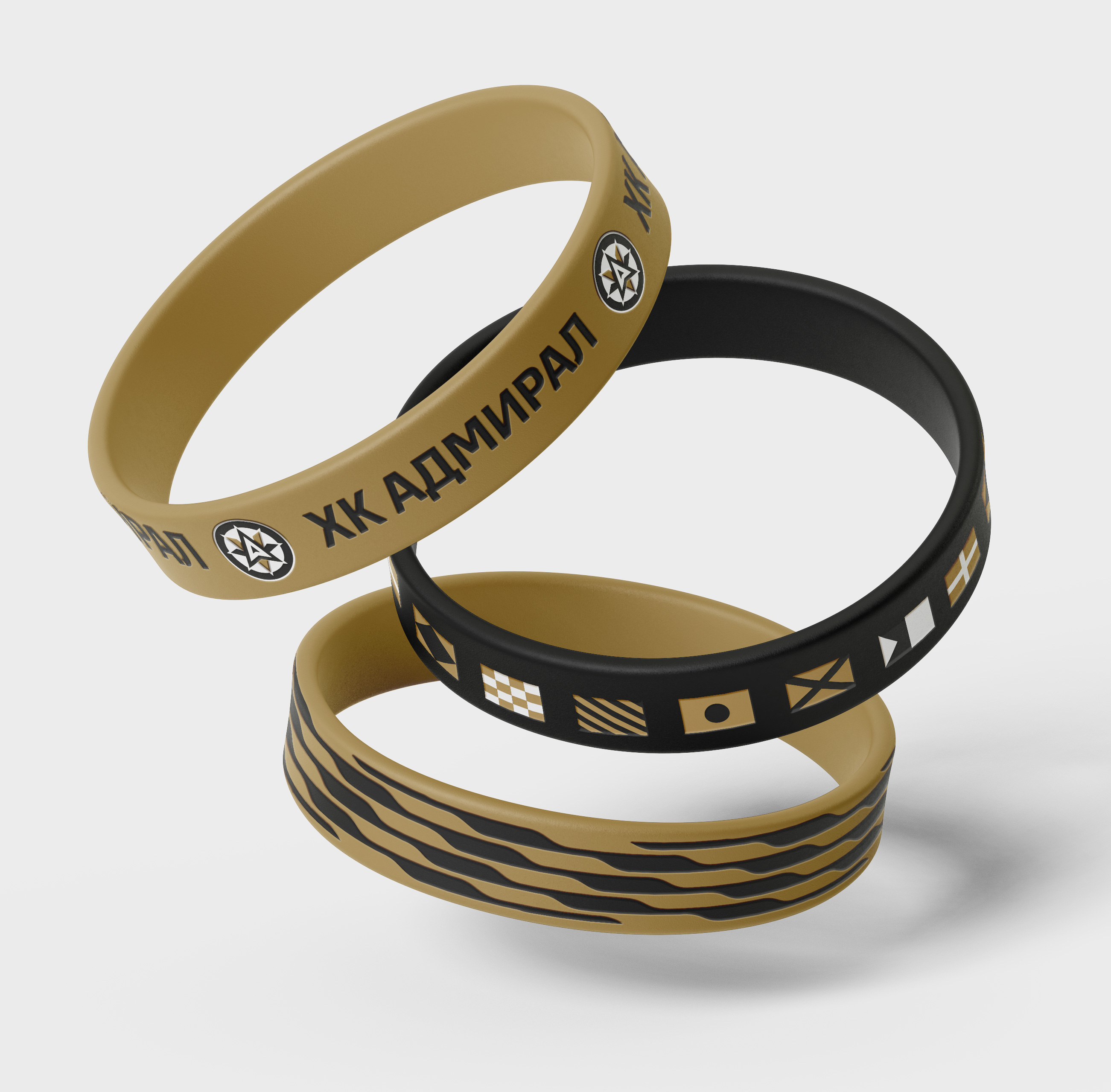
Заголовок:
Colors
Текст:
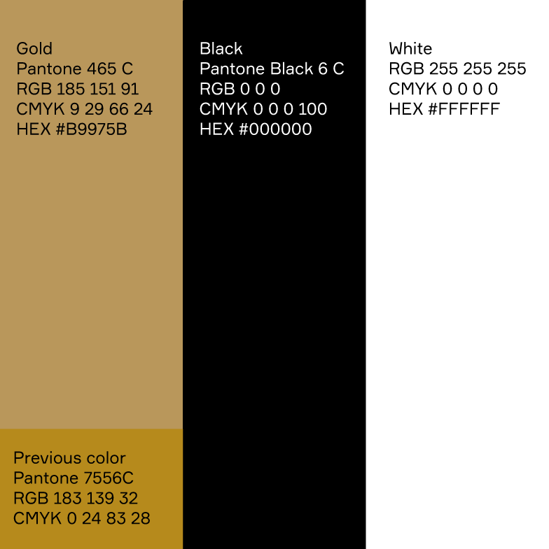
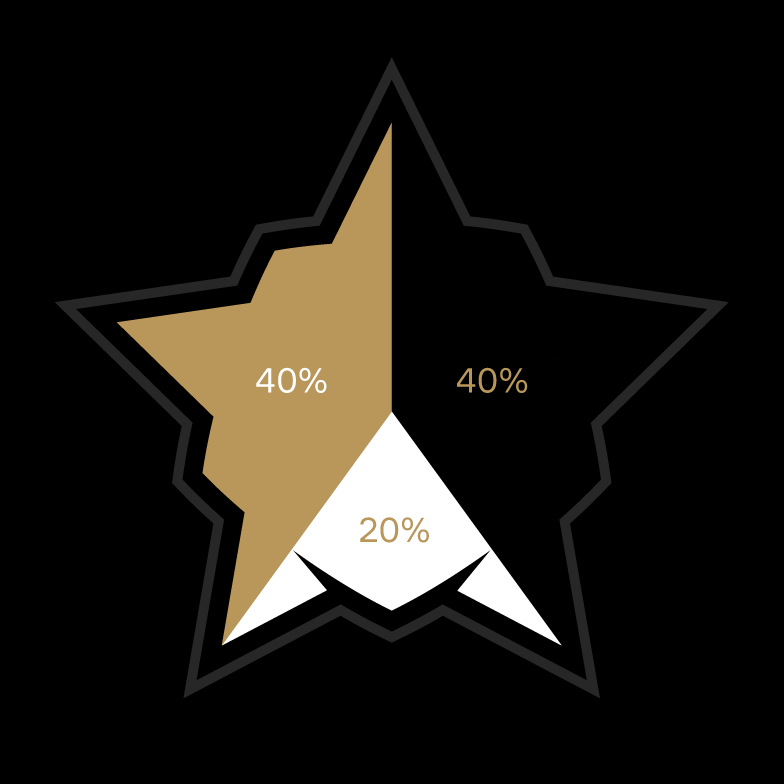
The signature gold color has been adjusted in favor of a noble shade. The color palette now consists of gold, black, and white, with a distribution ratio of 40-40-20.
Медиа:

Медиа:
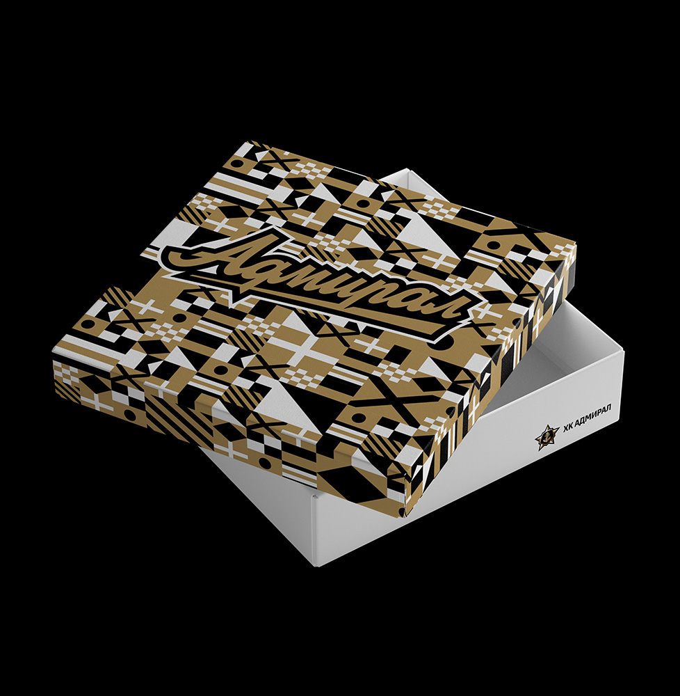
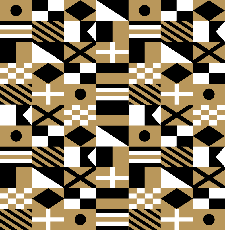
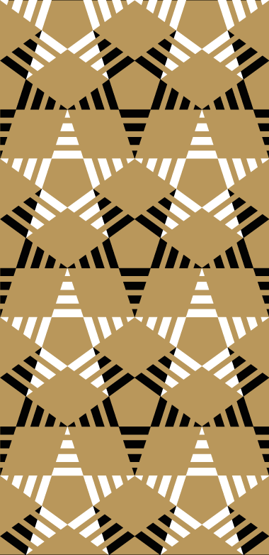
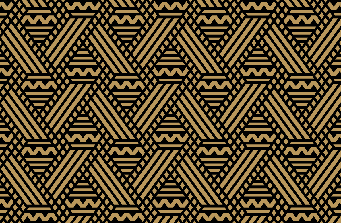
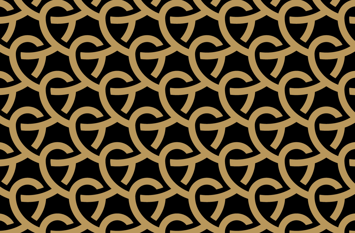
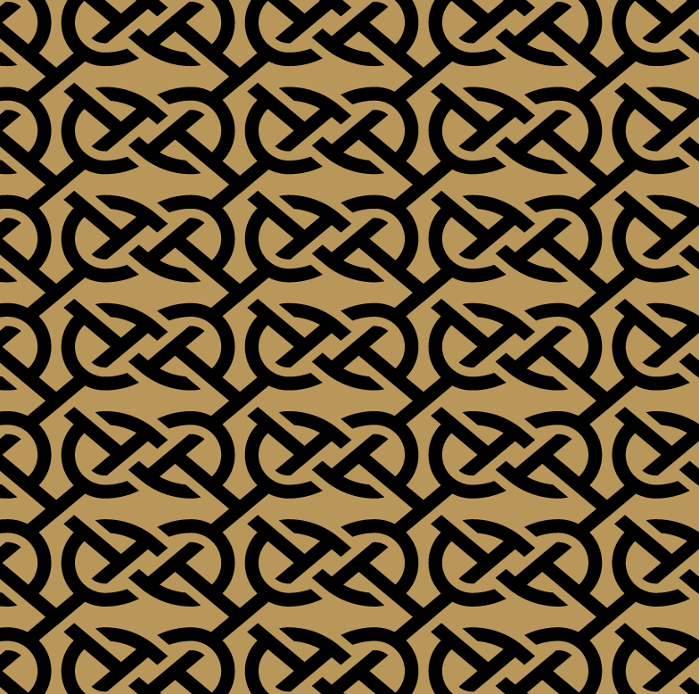
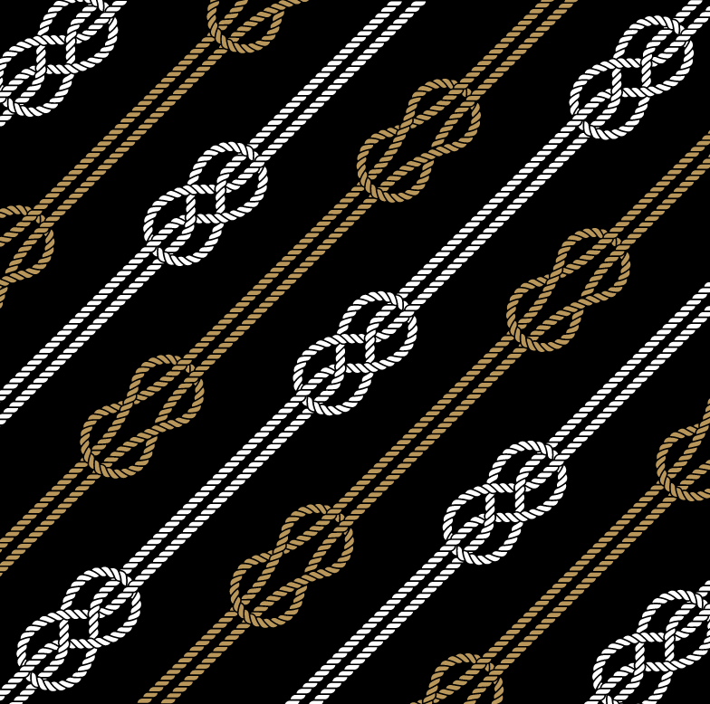
Заголовок:
Patterns
Текст:
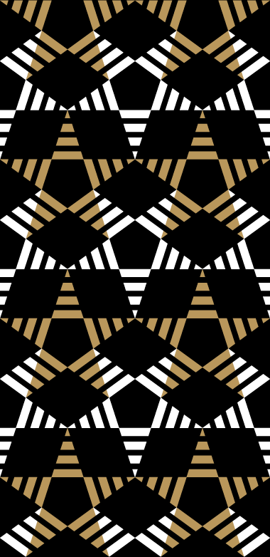
Maritime connection with Vladivostok locals offers a wide field for creating patterns. In addition to the line of rigging loops and knots inside the pack, there is an abstract star ornament and two other versions based on flags from the naval code of signals.
Медиа:
Медиа:

Медиа:
Медиа: