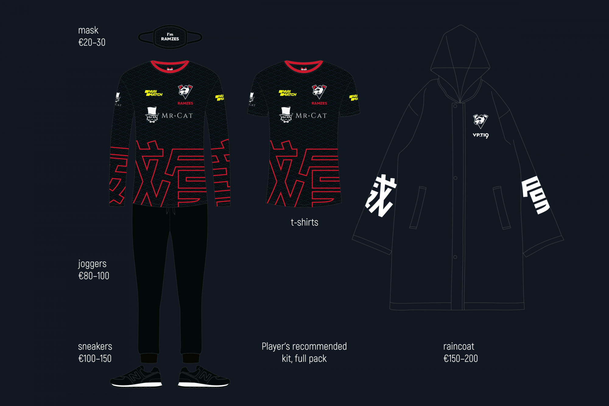
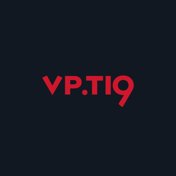
VP kit for TI9
SUBLOGO • TYPEFACE DESIGN • UNIFORM
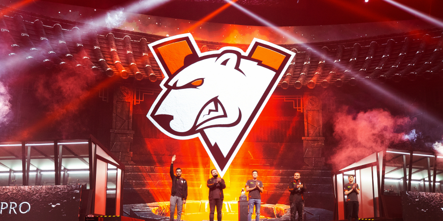
In 2019, The International was held in China for the first time, so we were not only looking for local features of Shanghai, but of the entire country that an international audience will easily recognise. Many people associate China with hieroglyphs, red street lamps, urban patterns and pandas. To develop a special style for the tournament, we had to take into account modern megalopolis trends, and pack them all into one image and give it a little background story.
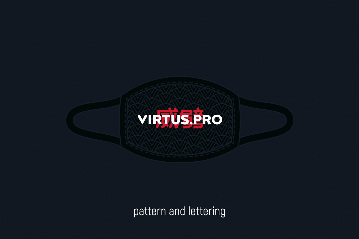
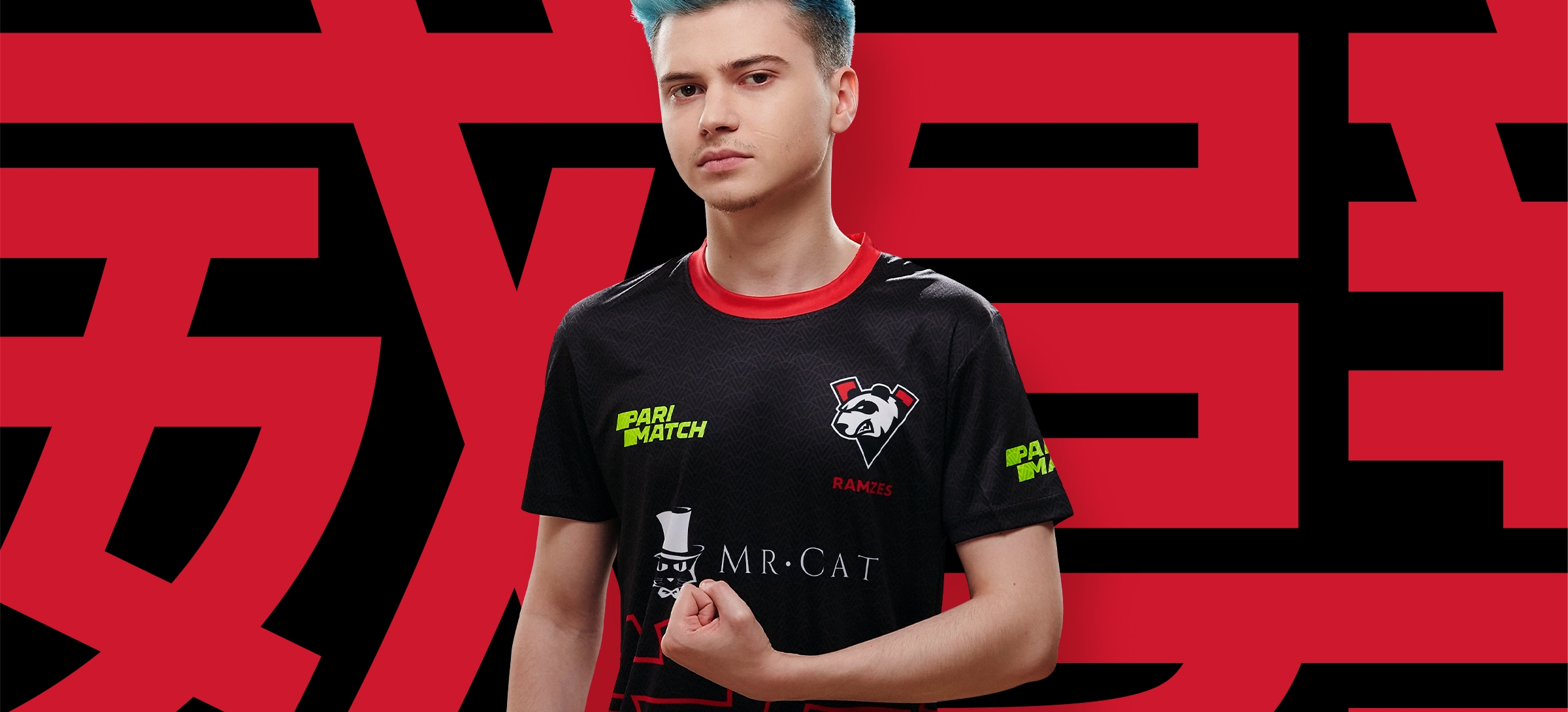
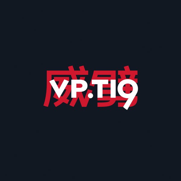
Chinese version of the logo: a game with hieroglyphs, a panda instead of a bear, red instead of orange
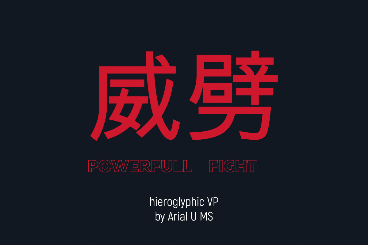
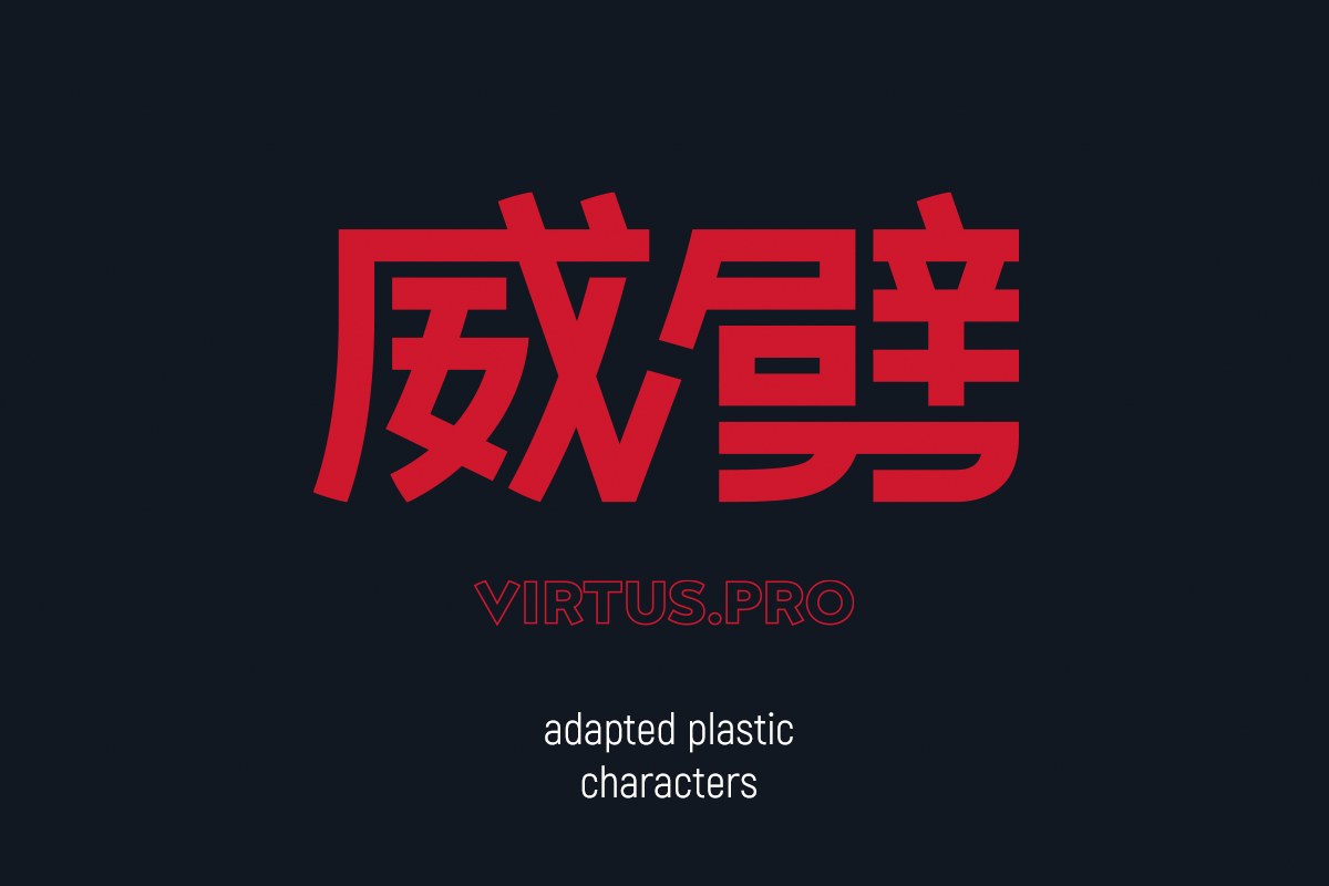
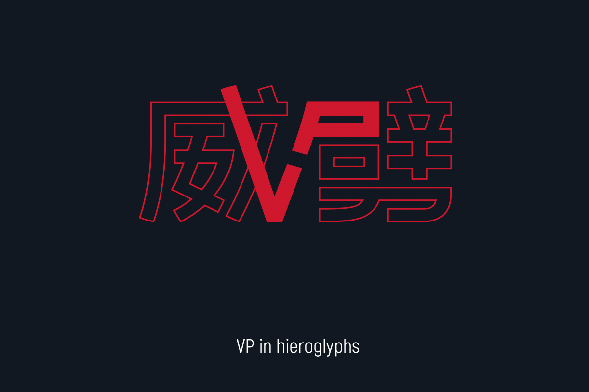
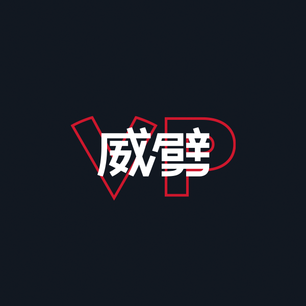
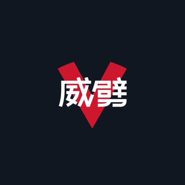
First of all, we created the hieroglyphic abbreviation VP (the left hieroglyph means ‘mighty’ or ‘strong’, the right: ‘fight’) and adapted its plasticity to the branded spelling Virtus.pro. At the junction, the hieroglyphs form VP; this is an Easter egg for those who pay attention to finer details.
Chinese lettering interacts well with the Latin alphabet and allows it to play with combinations of the first and second plans (a simplified logo is also suitable for Virtus.pro, and the situational sign for TI9).
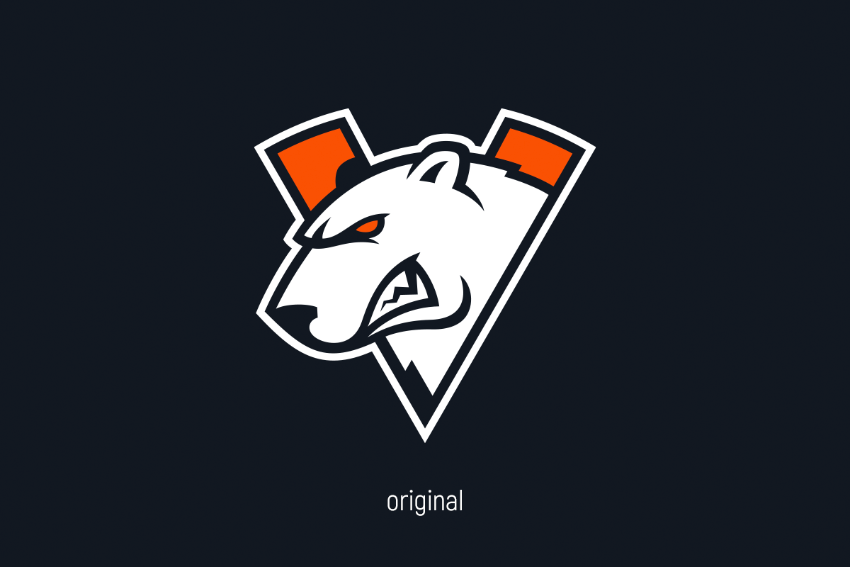
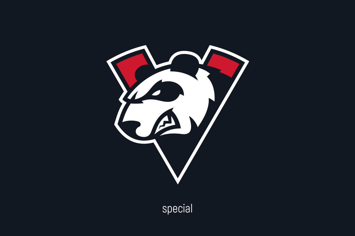
The main logo has also changed for TI9: instead of the usual bear, now a Chinese panda. In place of the usual orange, the same shade of red from traditional lanterns. The logo that’s changed the palette fits easily with the hieroglyphs and can form a more corporate looking shape on the kit.

The uniform isn’t just a T-shirt, it’s a whole image that takes into account the peculiarities of China
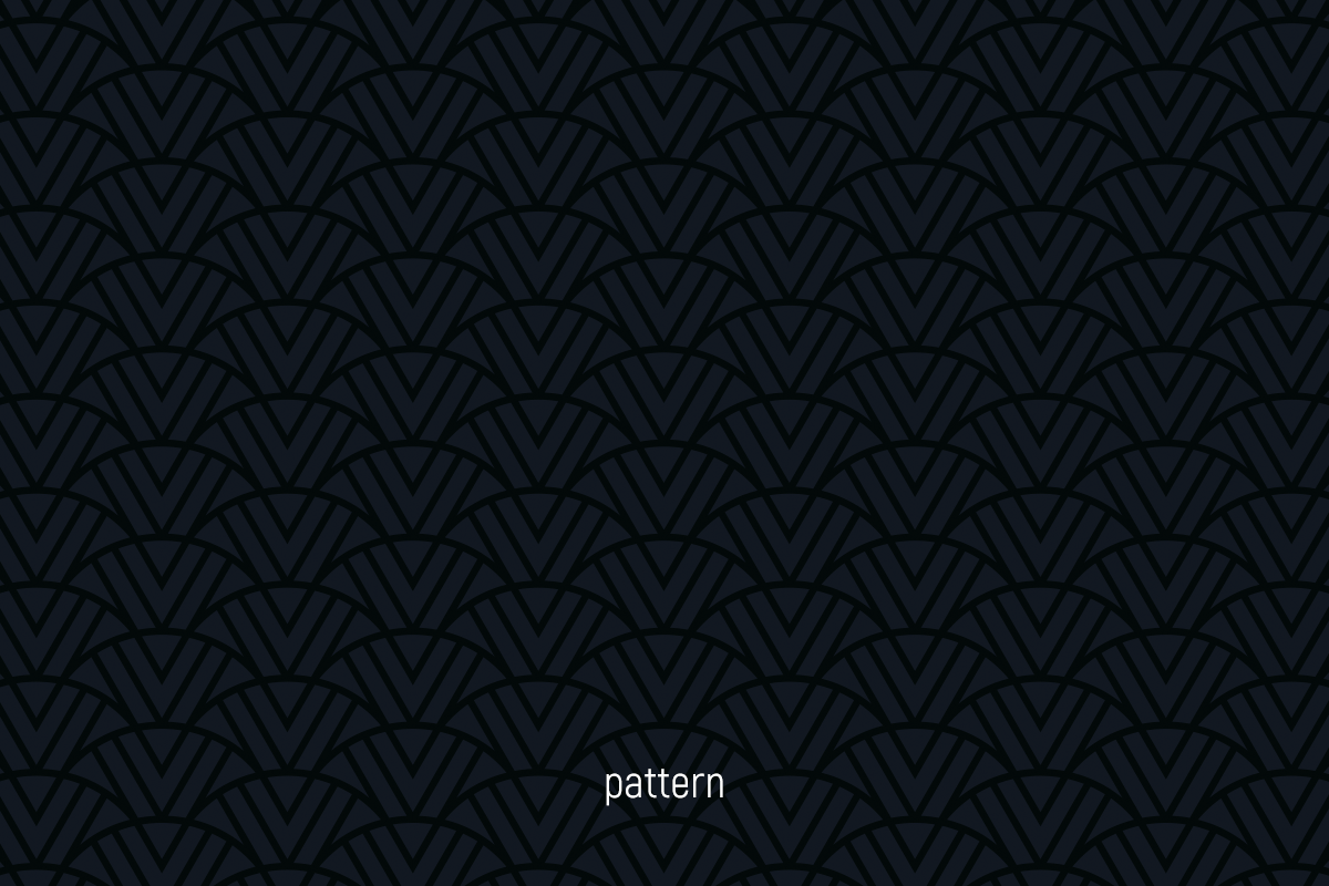
The kit has absorbed all the elements of Virtus.pro under the Chinese landscape: red colour, updated logo, a large block with a hieroglyphic abbreviation. To enhance the colour, we added a pattern inspired by Chinese ornaments based on the V sign, and individual branded blocks of esports players on the back, which combine two types of writing.
The Virtus.pro kit on TI9 isn’t just a T-shirt with long or short sleeves. Yes, most of the time only the top is in the frame, but a full-fledged look is particularly important for a major tournament: joggers and sneakers simply complement the style, but a dust mask (also one of the symbols of the East) and a transparent jacket are ready-made merchandise.