Spartak — 100th anniversary. Style and brandbook
LOGO • SUBLOGO • FONT WORKS • GUIDES • MERCHANDISE
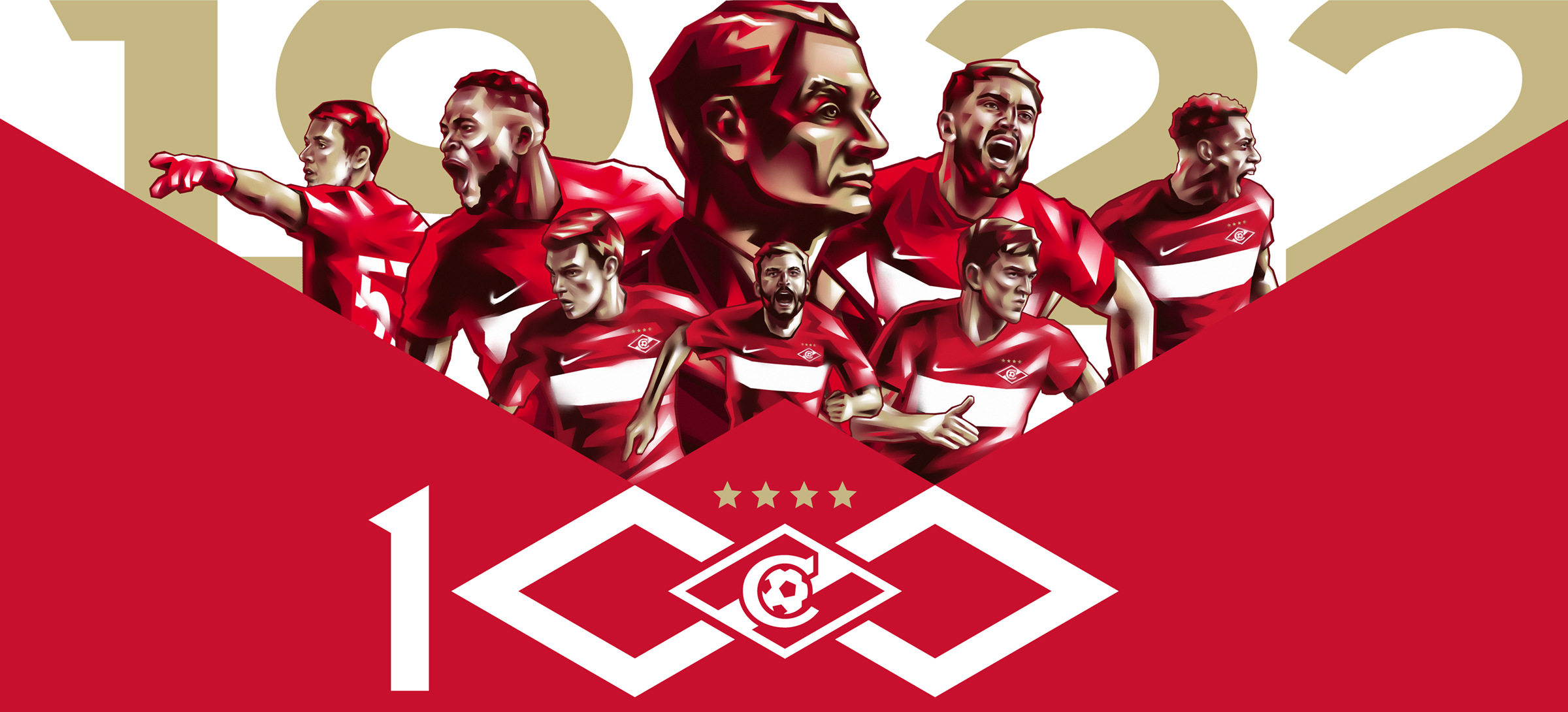
On April 18, 1922, the MSS (Moscow Sports Society), which was the predecessor of Spartak, held its first match. Today, 100 years later, Spartak Moscow is the most titled and popular club in Russia.
A century-old history, great football players and a lot of fans around the world — what distinguishes Spartak from others and makes it truly a «people’s team». Quberten Studio was tasked with preserving the identity of the club and creating a stylish modern image around it in the centenary year.
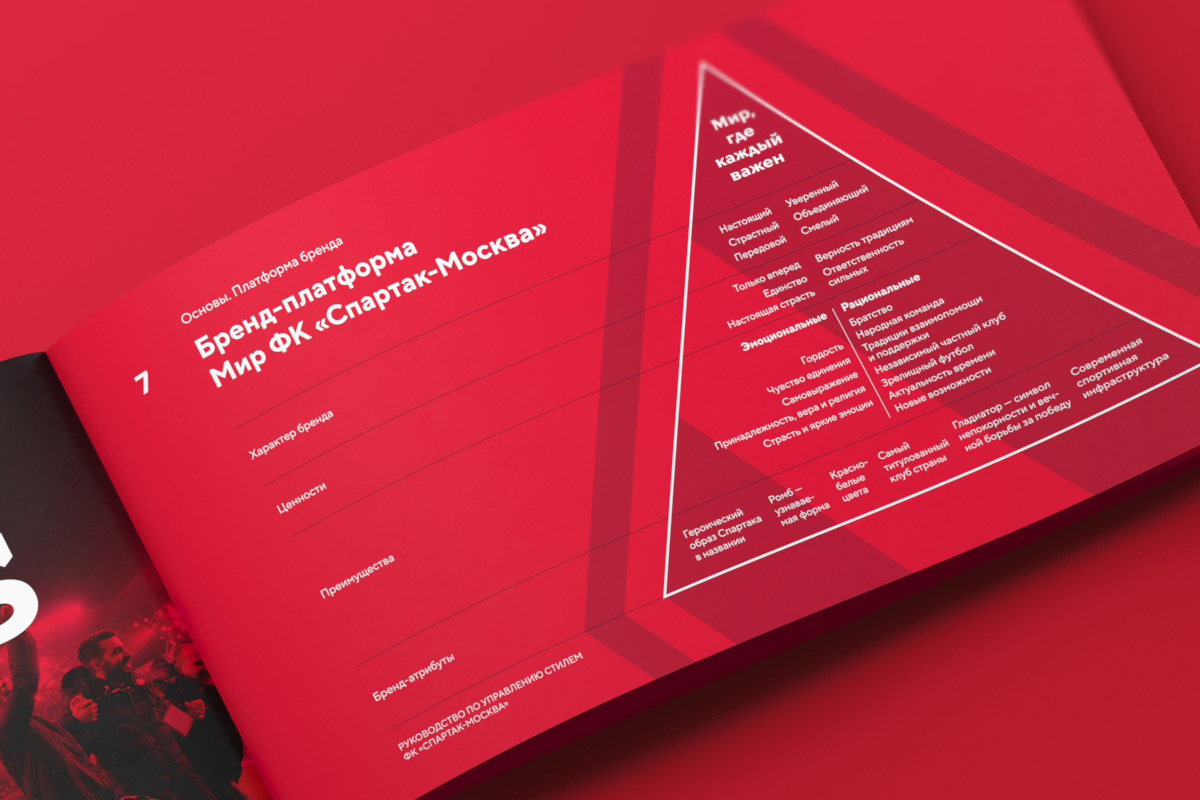
Brand platform
The global project implies serious work, so the creation of a new image of Spartak began long before the logo. Colleagues from the agency Graphite by Leo Burnett Group developed the brand platform, and the studio Quberten designed it in the form of an understandable visual language.
Before developing a corporate identity, it was necessary to understand what message the club wanted to convey to its fans? After all, Spartak is the people who support it always and everywhere. For some, Spartak is even much more than just a club — it’s their life.
The pyramid «Everyone is important here» will become a pillar of the new communication strategy. It, like many other rules, will be included in the first full-scale brandbook of FC Spartak Moscow.
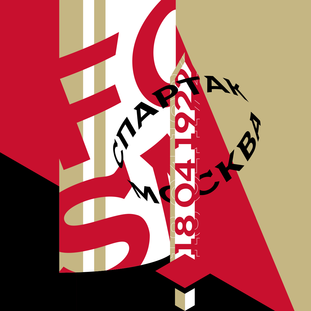
Sign of the centenary
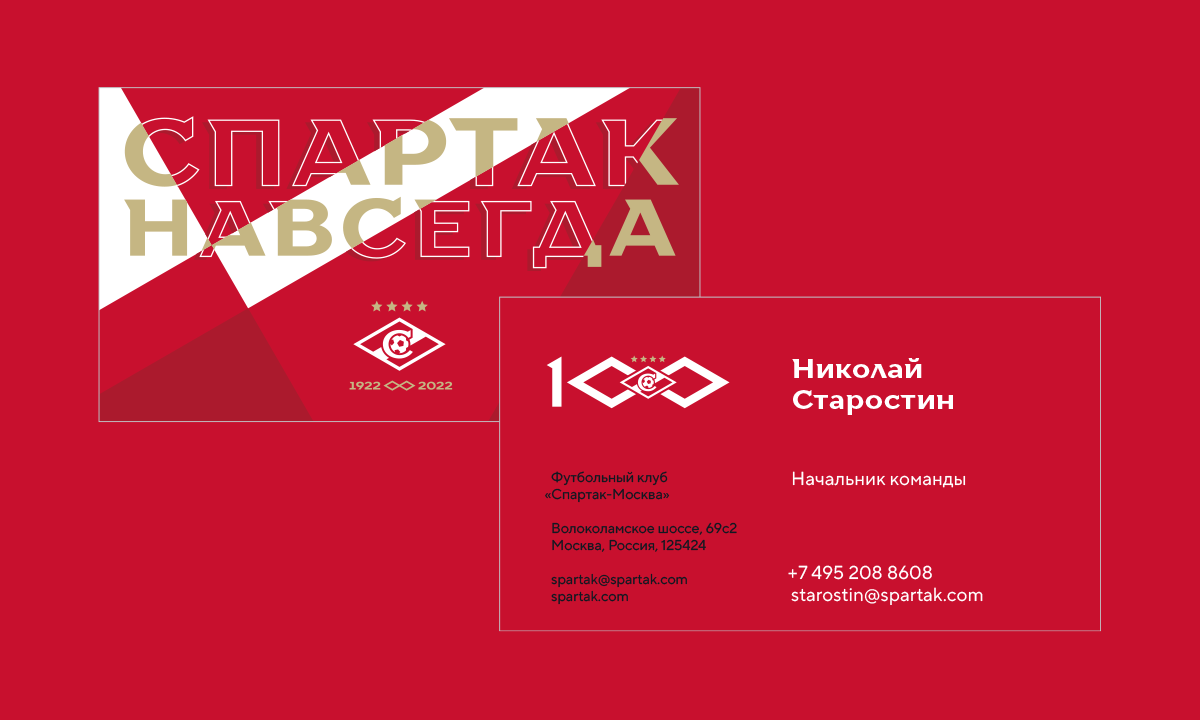
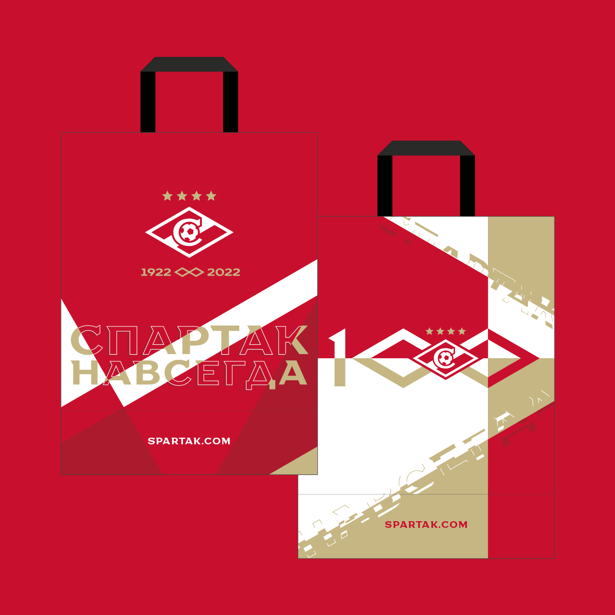
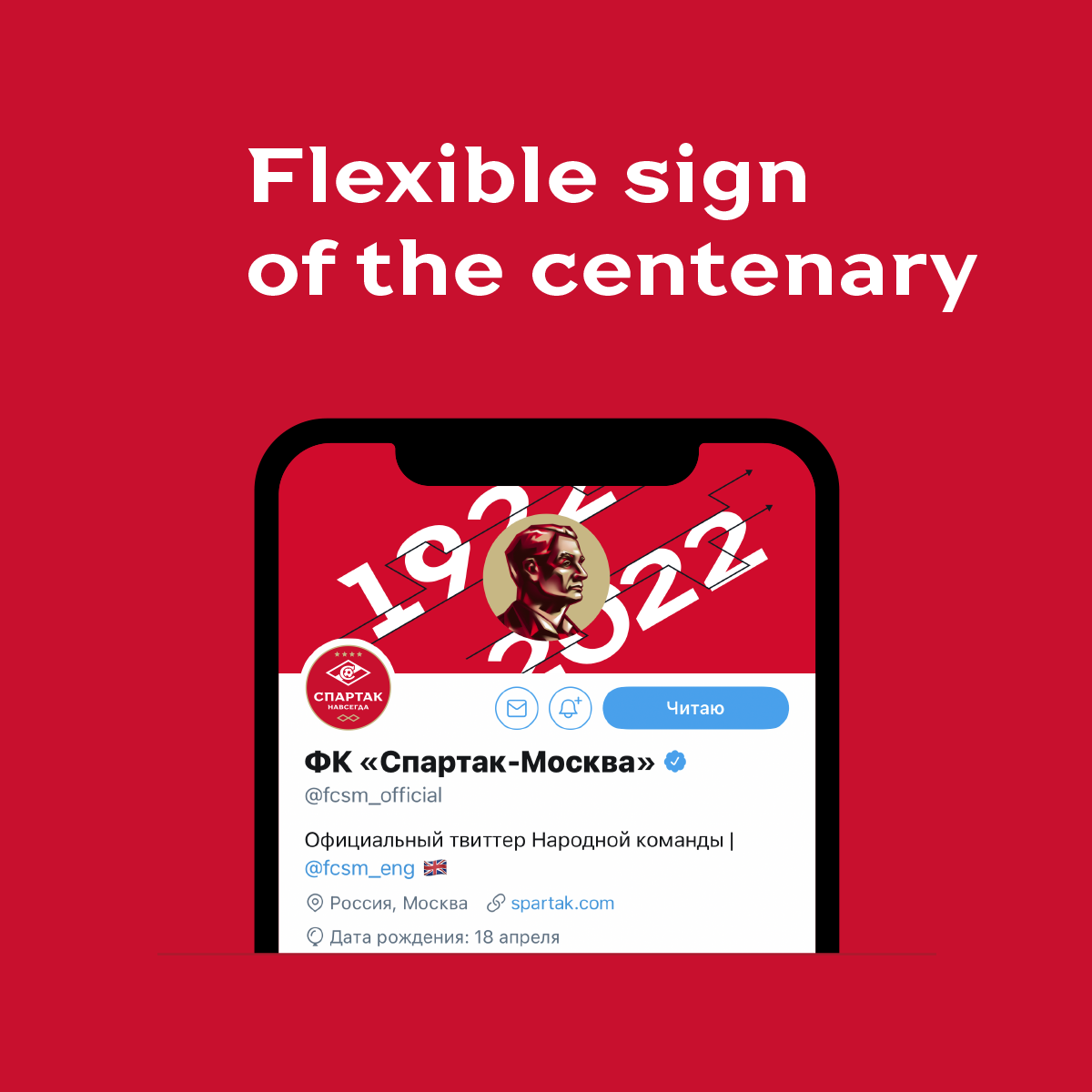
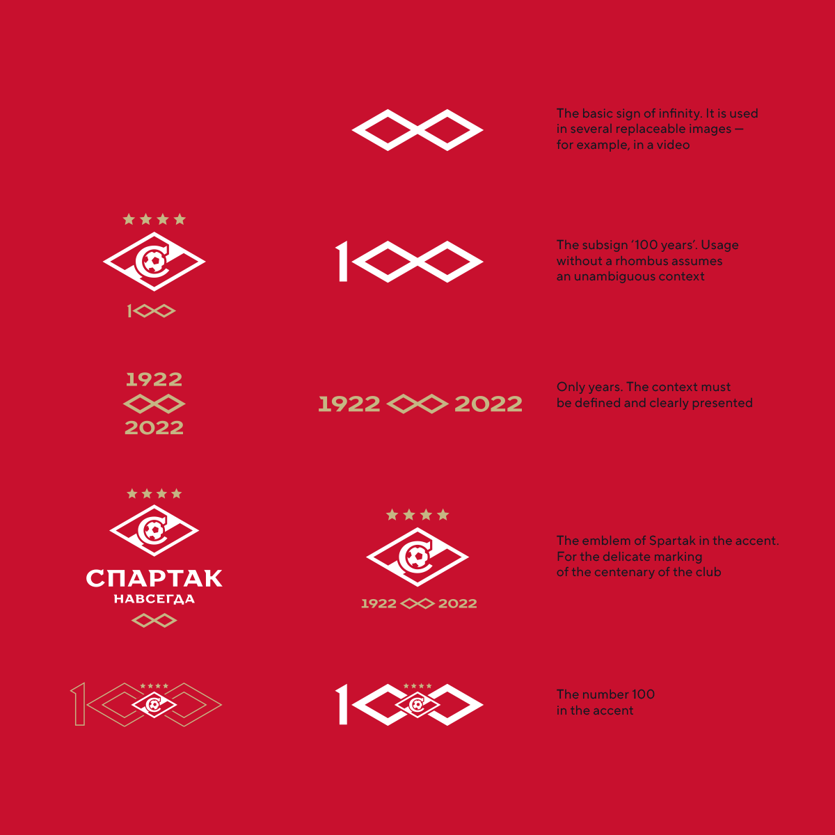
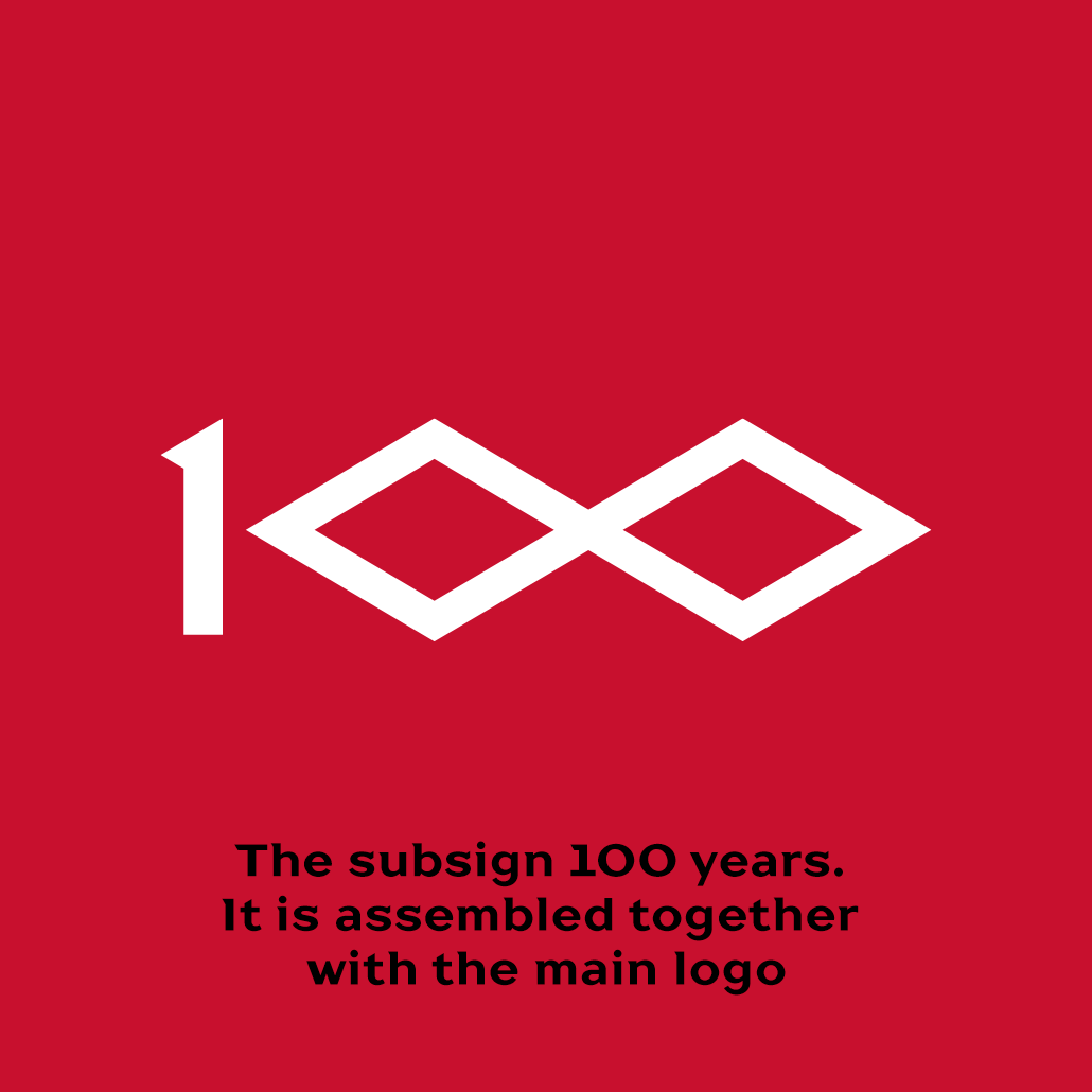
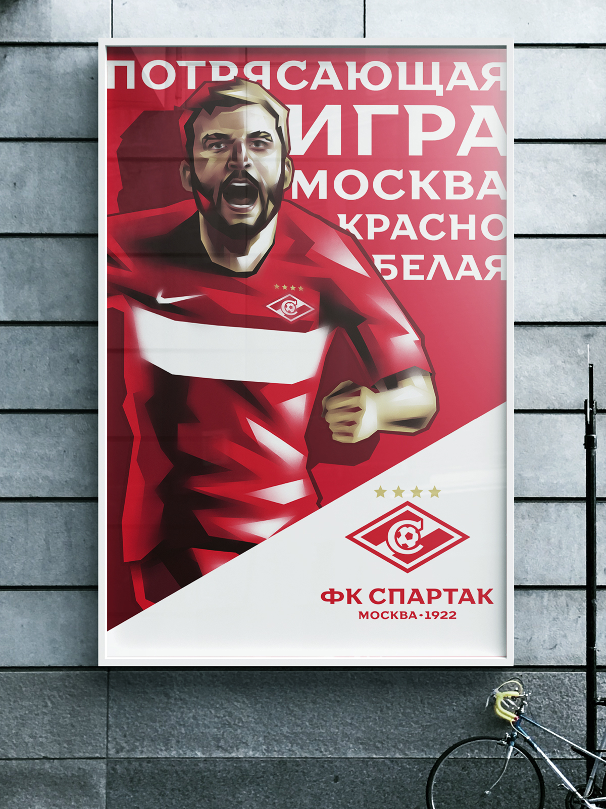
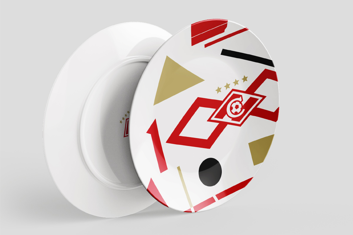
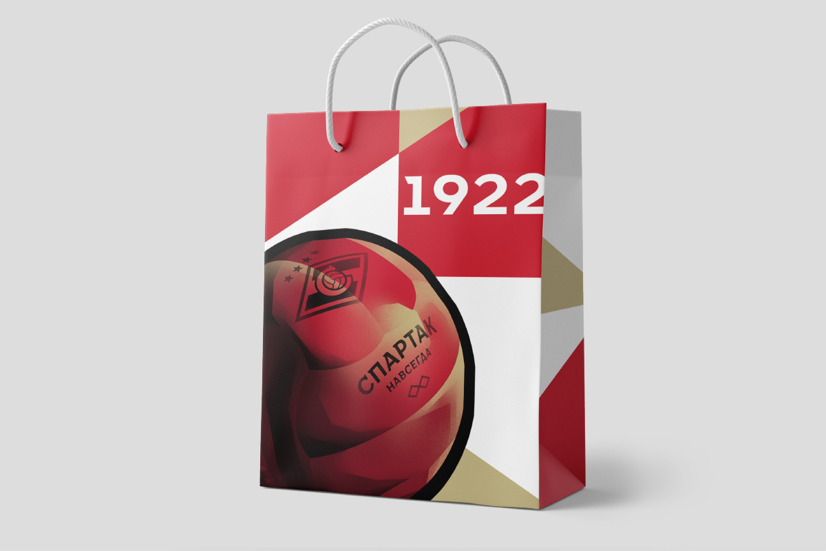
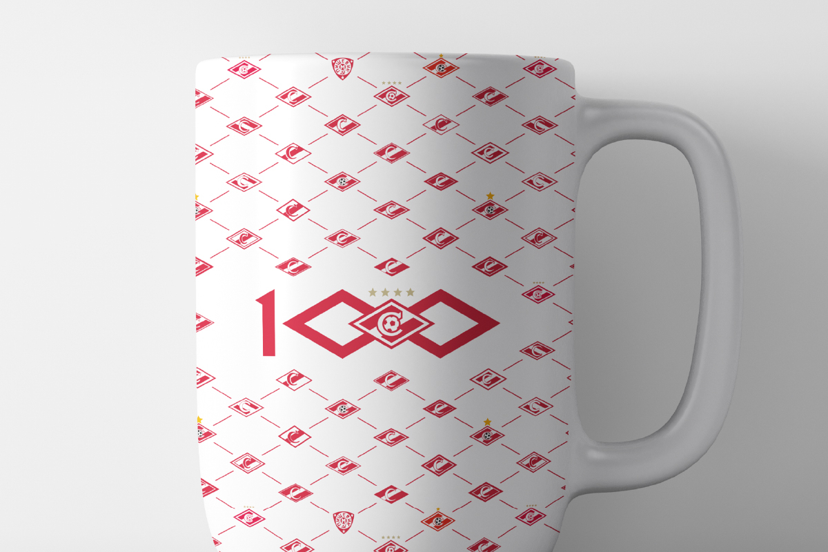
Modern anniversary logos in football are no longer static; they become variably event-driven, can adapt to different needs of the club. This is exactly the approach used in this project, so the identity pack of the centenary is very flexible: a component sign for all cases, an infinity sign that transforms into the number 100, and many other subelements.
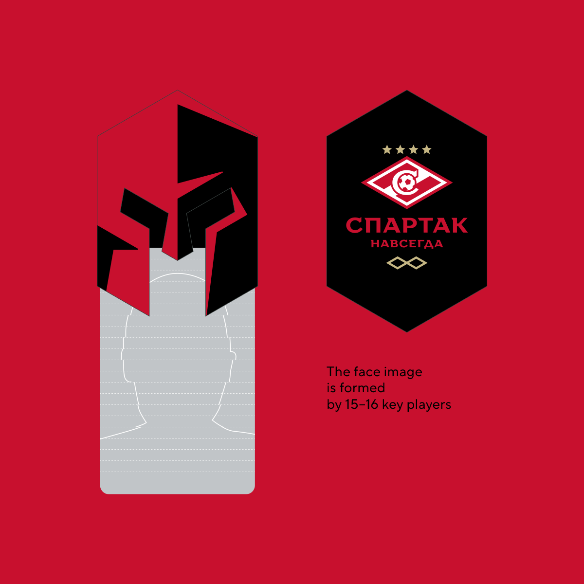
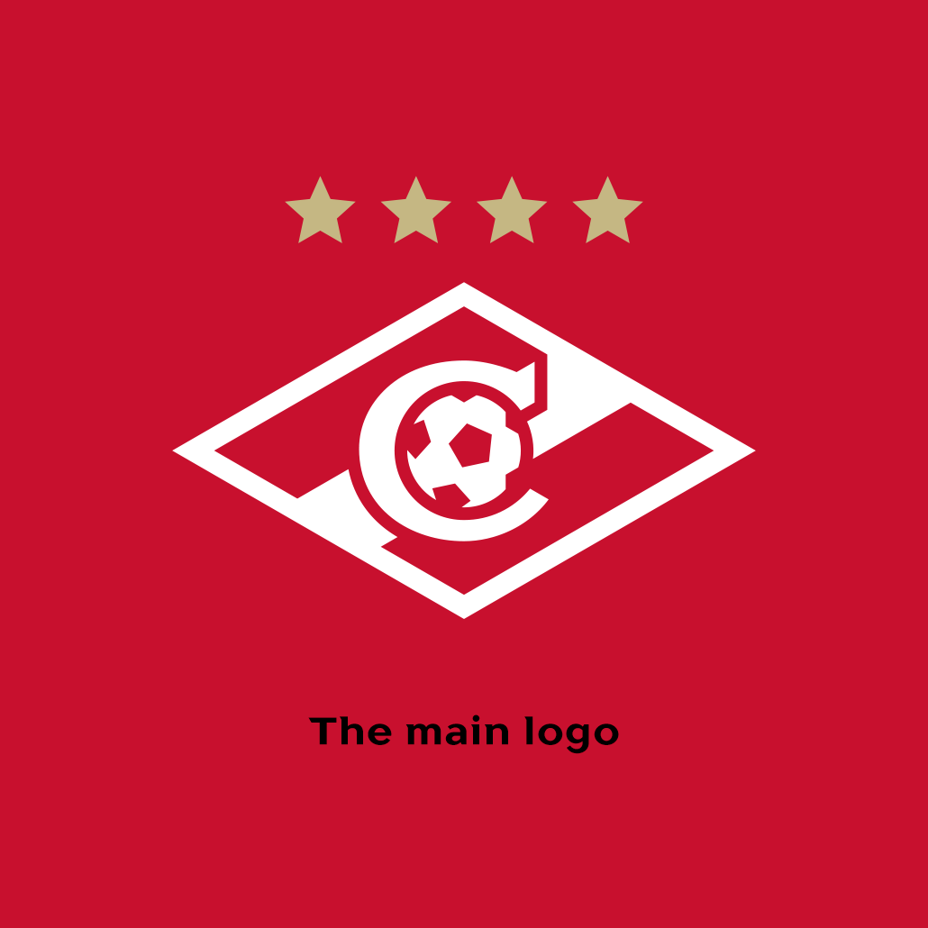
The emblem with a leather ball is one of the subversions in a wide set of signs. The Tiento ball from the 1930 World Cup in Uruguay was taken as a basis. Exactly this ball reigned on the fields in the 30s of the last century, when Nikolai Starostin approved the first logo of Spartak.
The famous Tiento ball pattern is ubiquitous in world football, and in particular in clubs that want to emphasize a deep history. Authentic balls are used in Premier League and in Primera, now the retro ball will appear in the RPL.
An essential and at the same time not the most familiar detail for modern fans is the direction of the diagonals. This decision refers to the «historical» rhombus of the late 30s and early 40s.

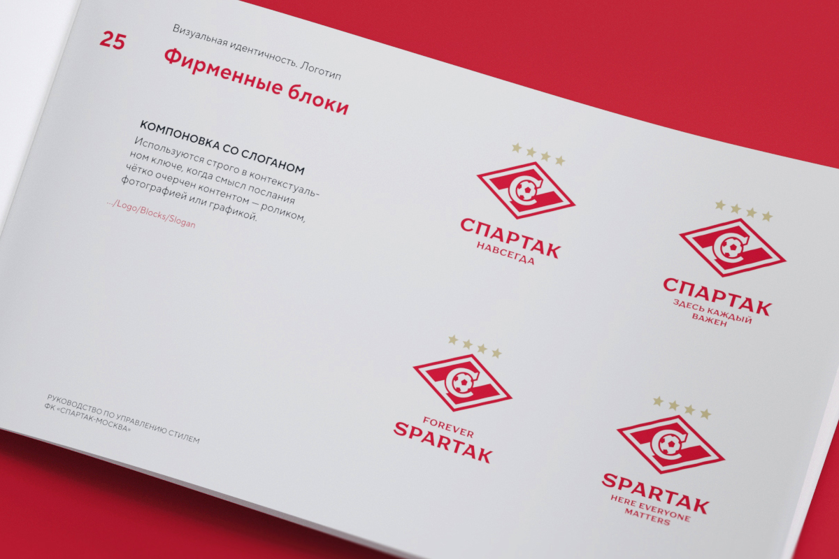
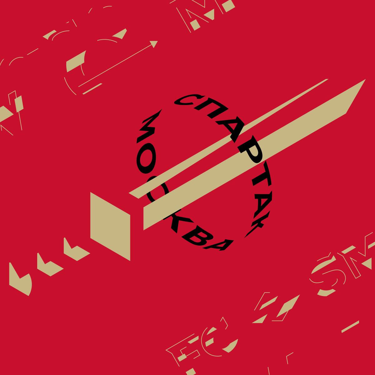
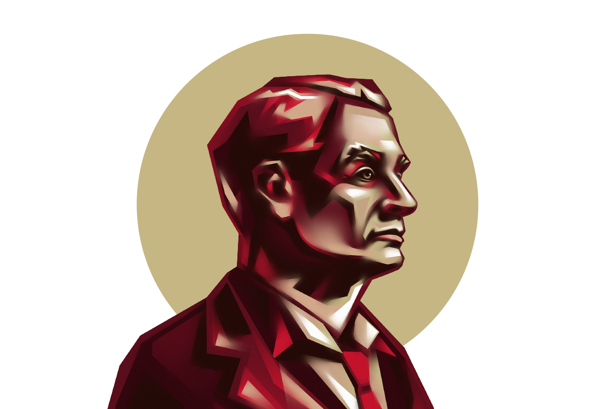
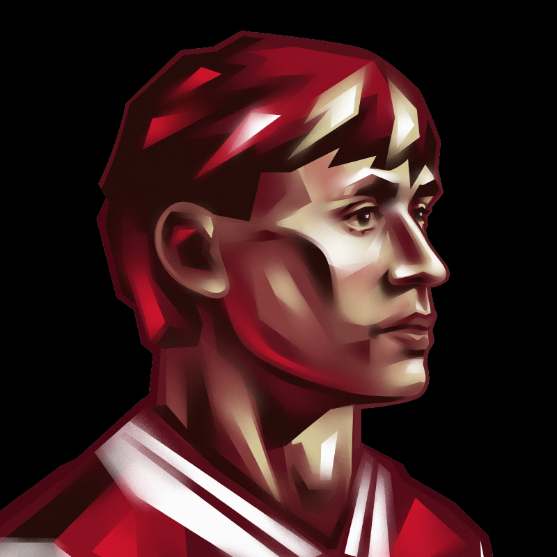
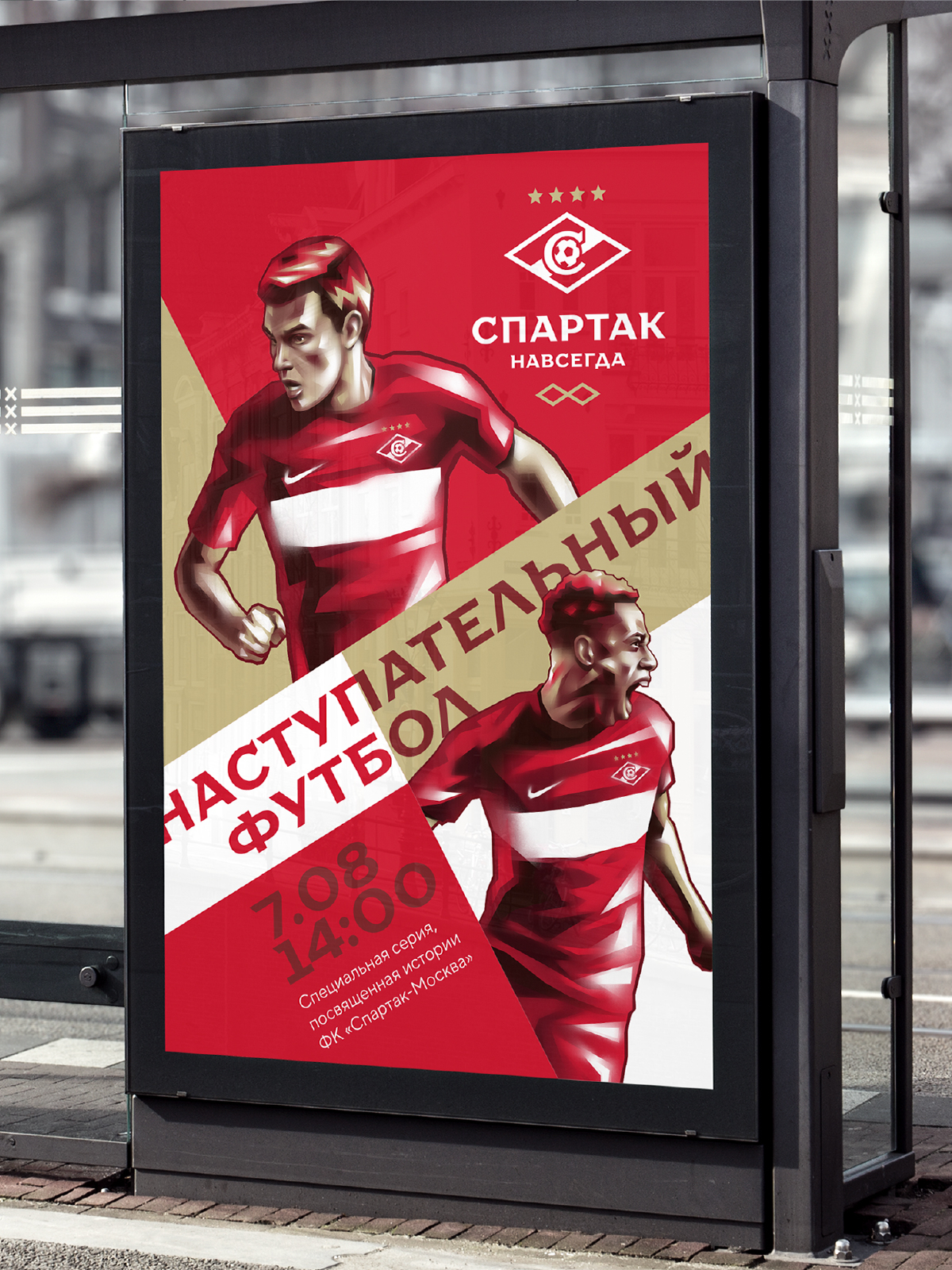
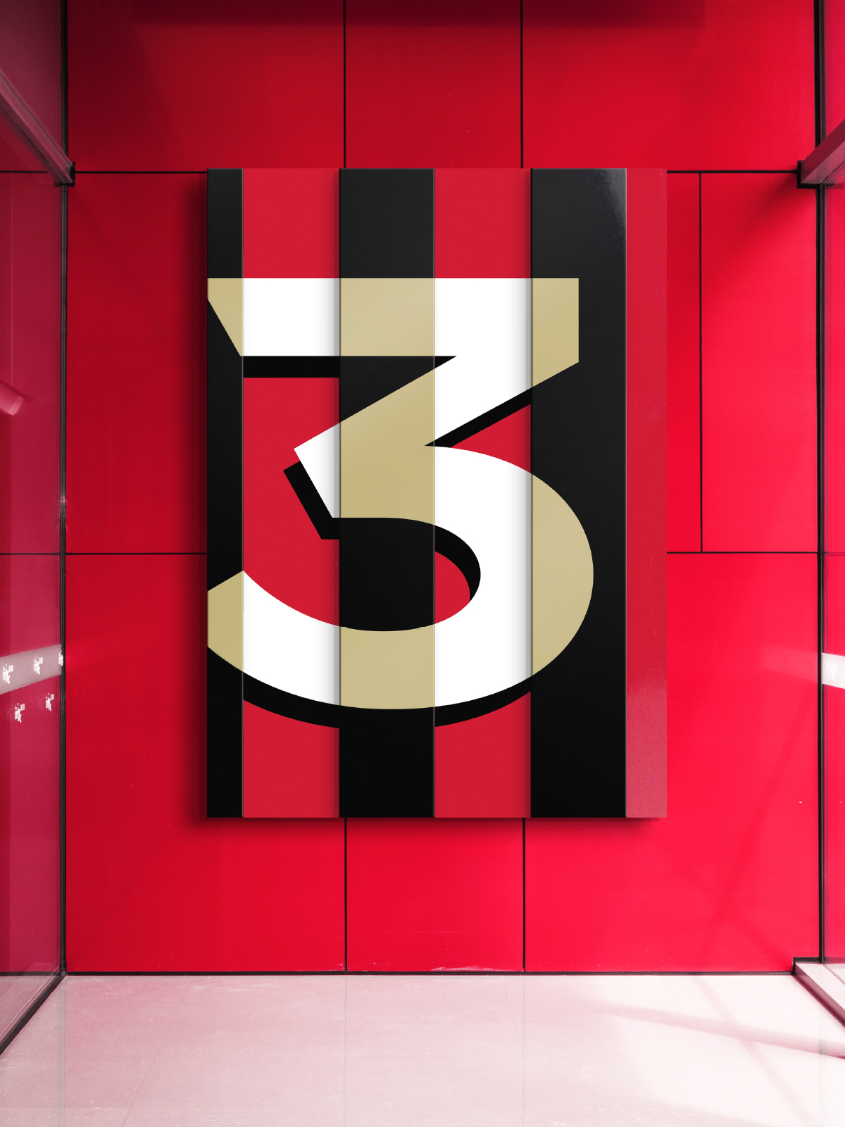
Subelements and frames
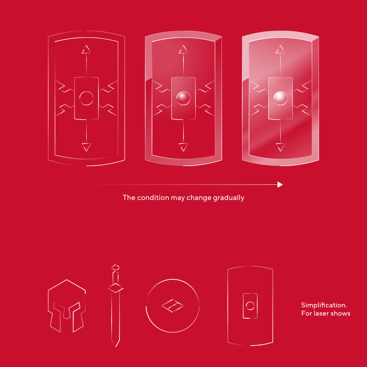
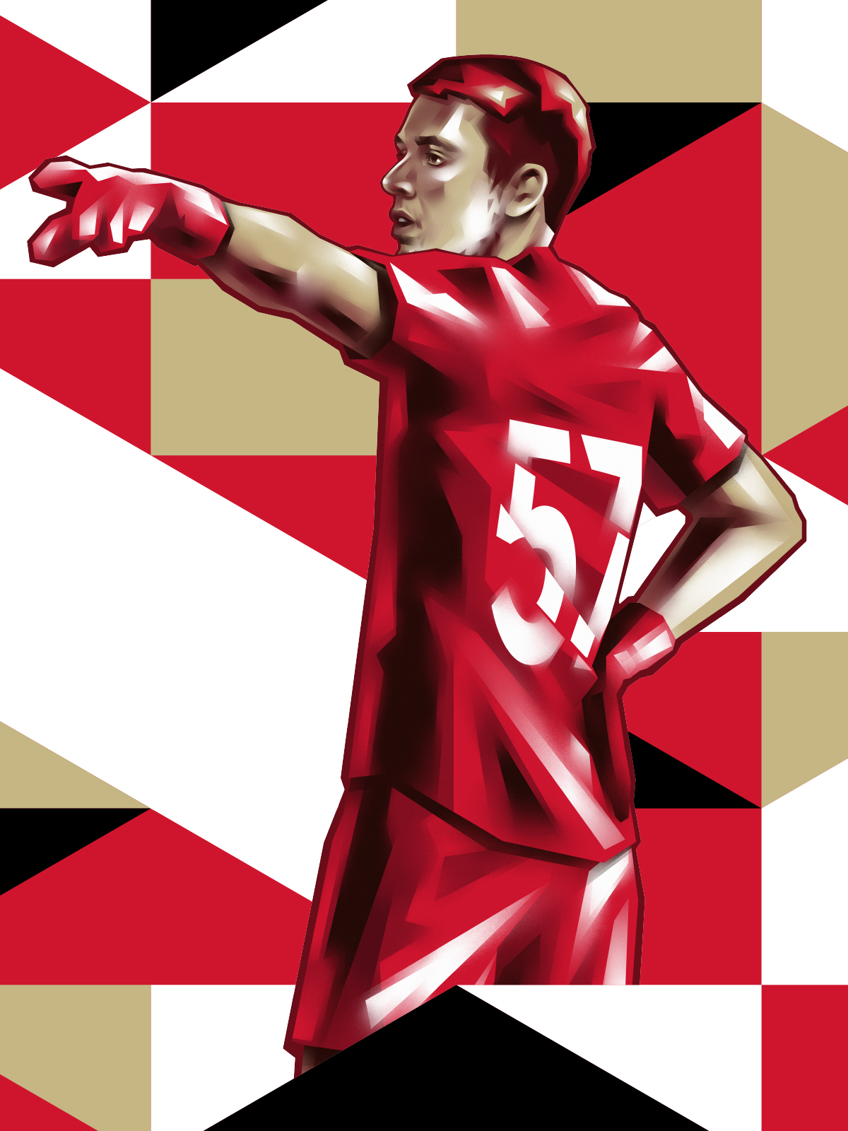
The new corporate identity of Spartak is based on a mixture of different elements, for example, a font and a set of frames (in the form of swords, helmets, shields). By combining the components with each other, you can create different compositions, which will allow the club to expand its branding capabilities.
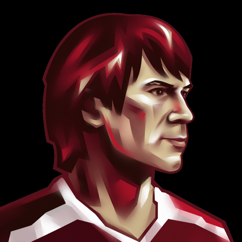
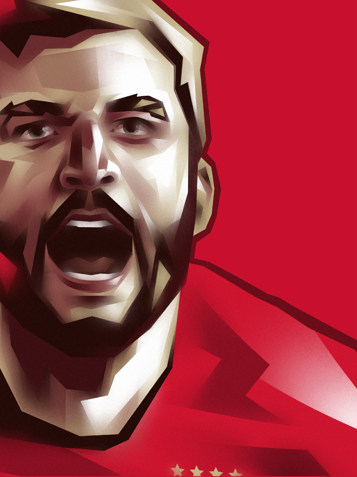
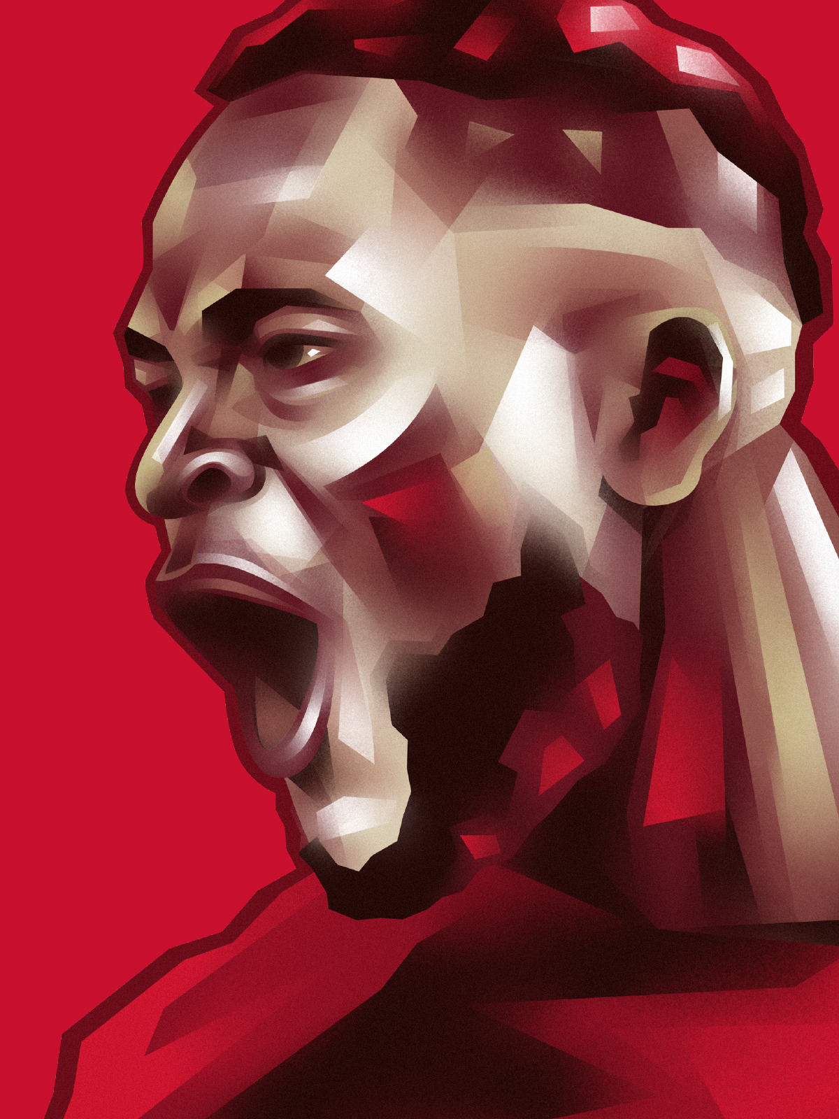
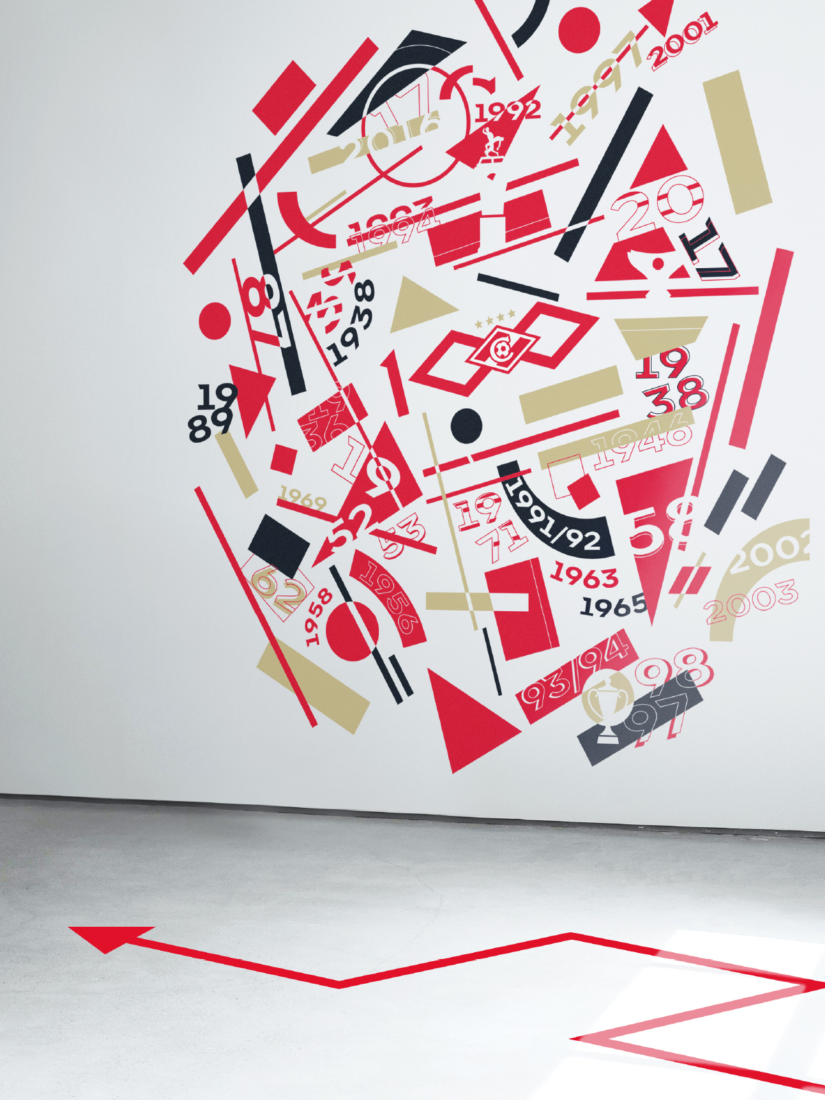
The identity is based on two directions: the Avant-Garde era (the 20s) and the aesthetics of Ancient Rome. Their intersection is characteristic of the avant-garde spirit of photographs with sharp light falling from above, and unusual angles and poses.
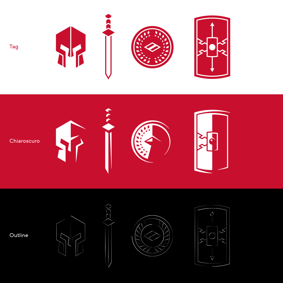


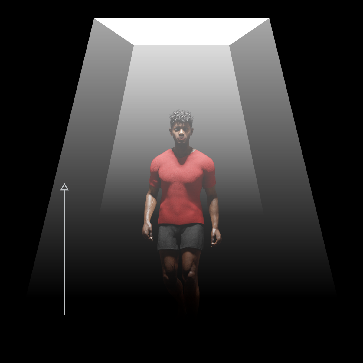
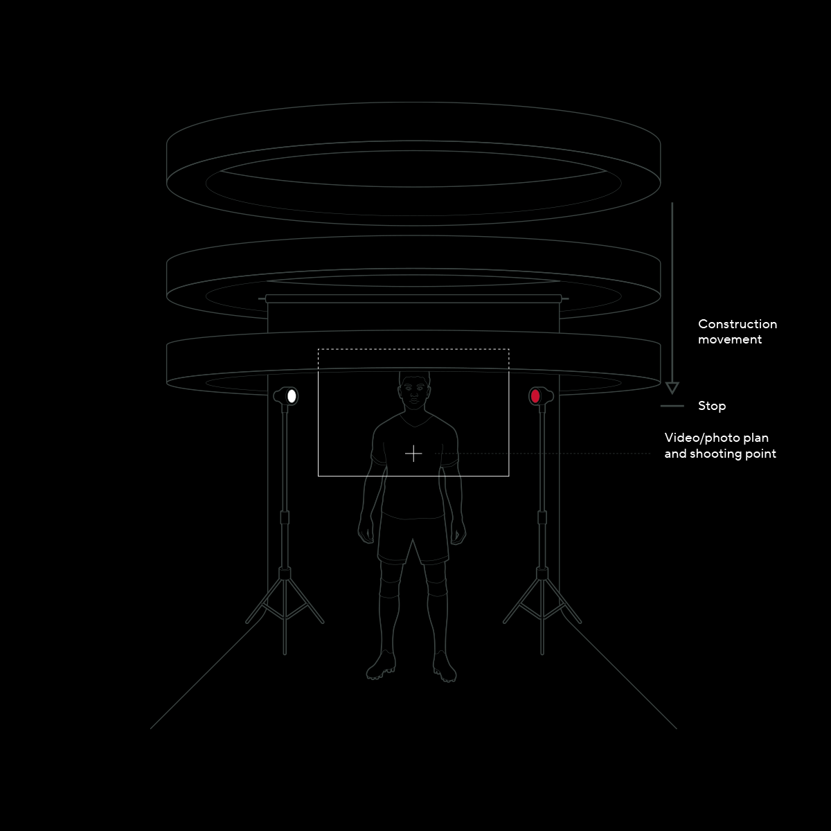
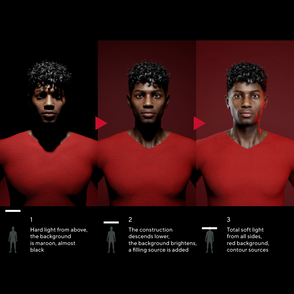
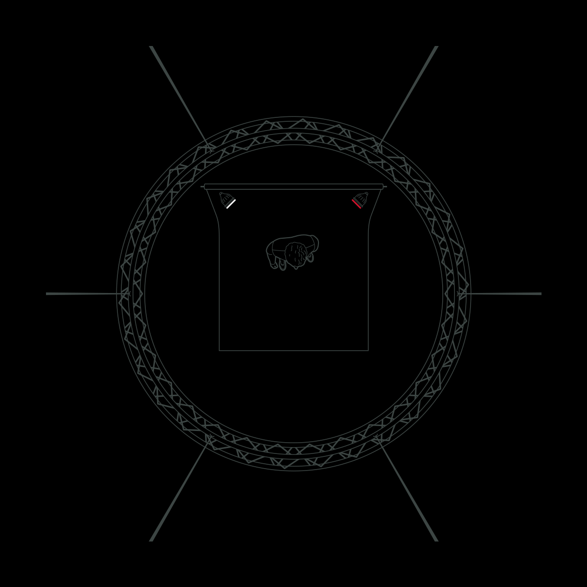
Abstract compositions of the 20s, which refer to the image of ancient Roman statues, as well as hard light from the photo style were used in the construction of key visuals — they form an aggressive and recognizable style.


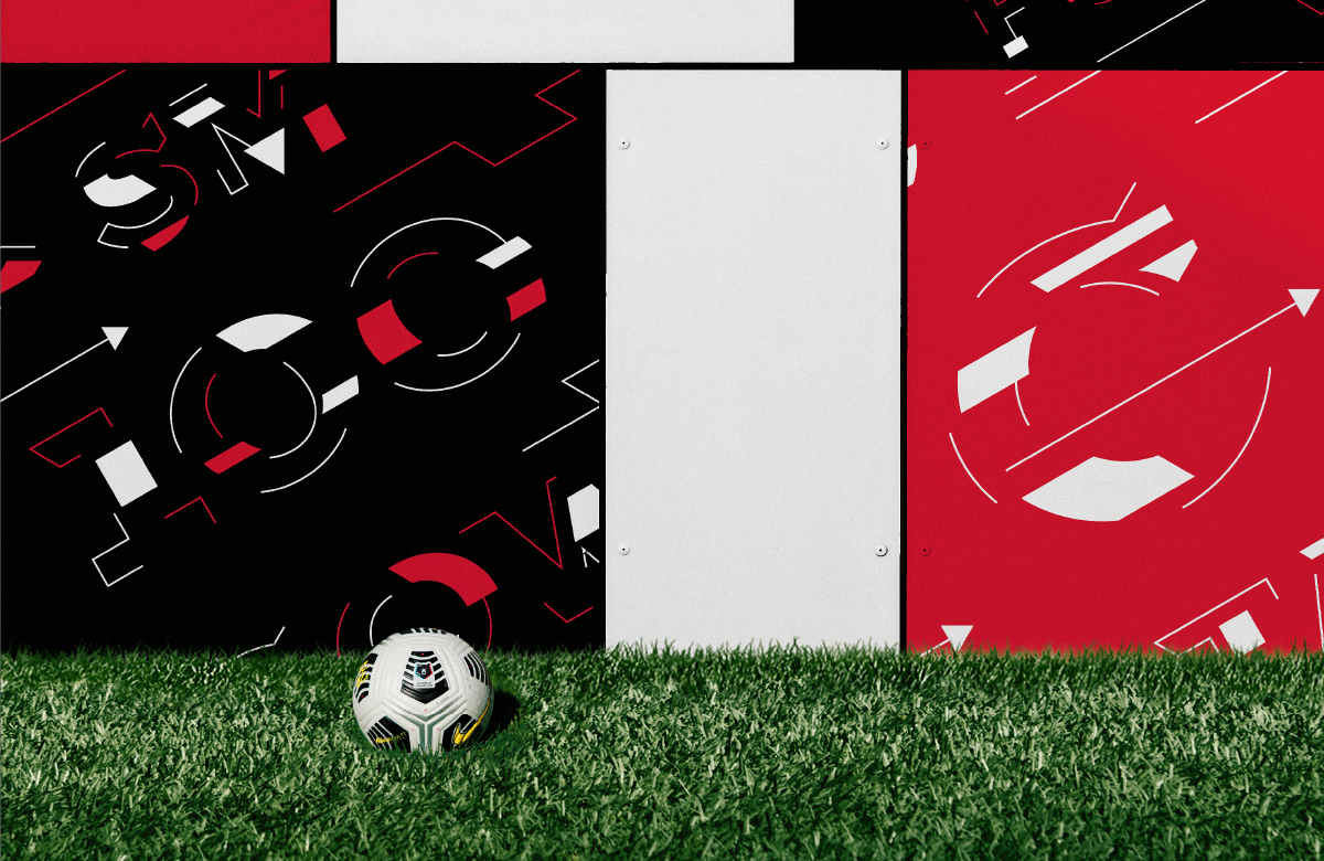
Patterns and graphics
All elements — fonts, patterns, key visuals — are perfectly combined with each other, creating an even greater variety of compositions for any media, ranging from printed and digital and ending with attributes.
One of these compositions was a pattern consisting of references to 8 famous and important confrontations of Spartak. The pattern is a test for a «true fan», it encodes the kits of the club and the result of each key match over the past three decades.
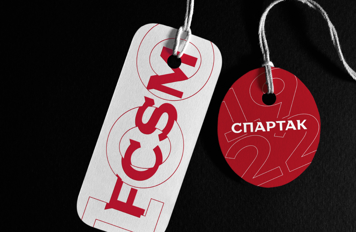


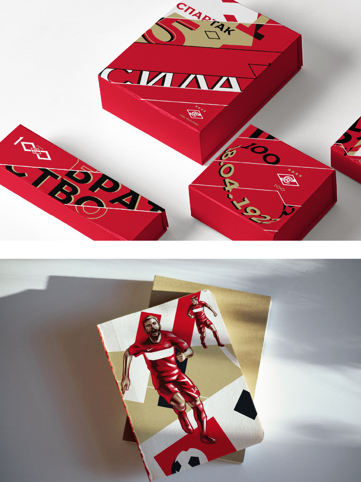


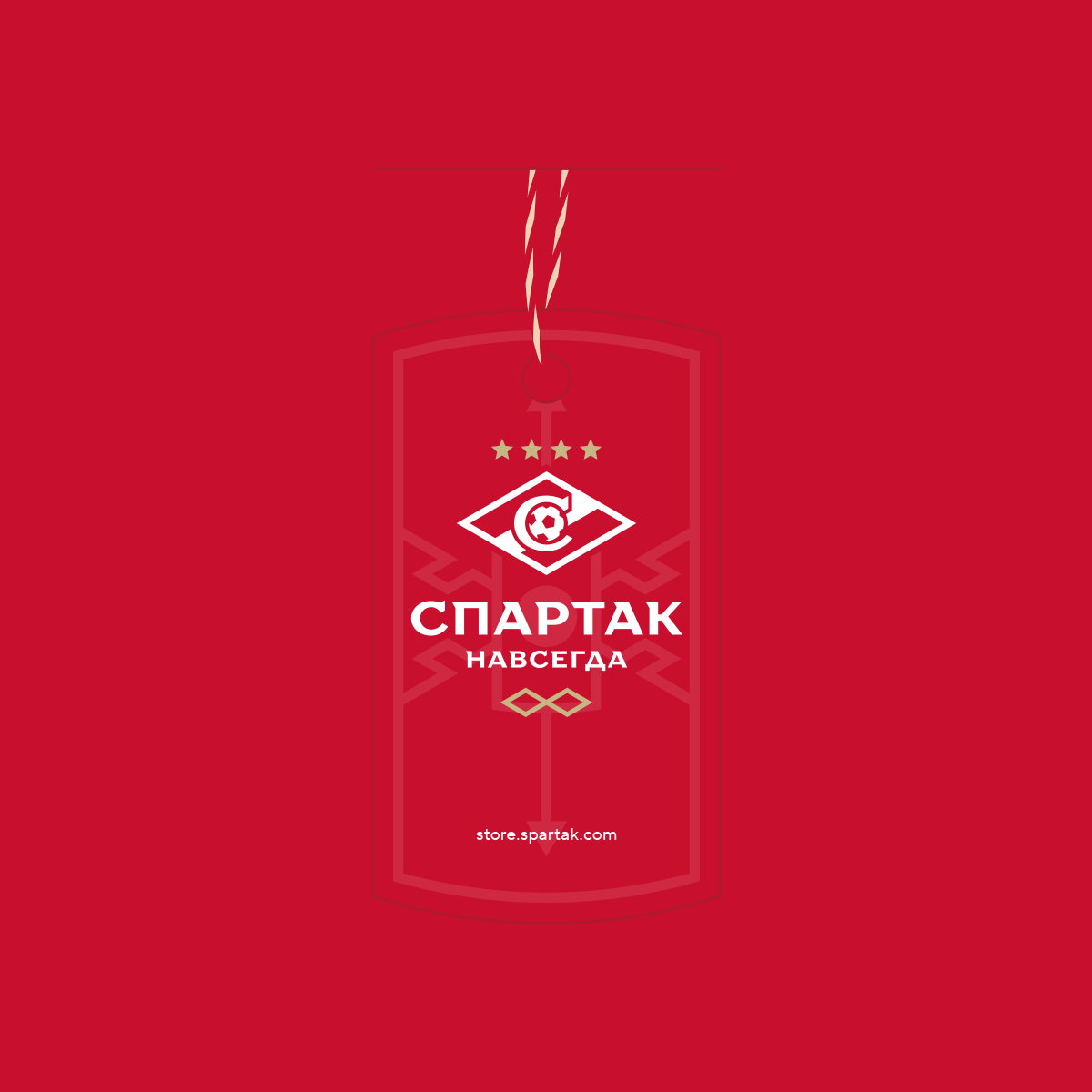
Physical carriers
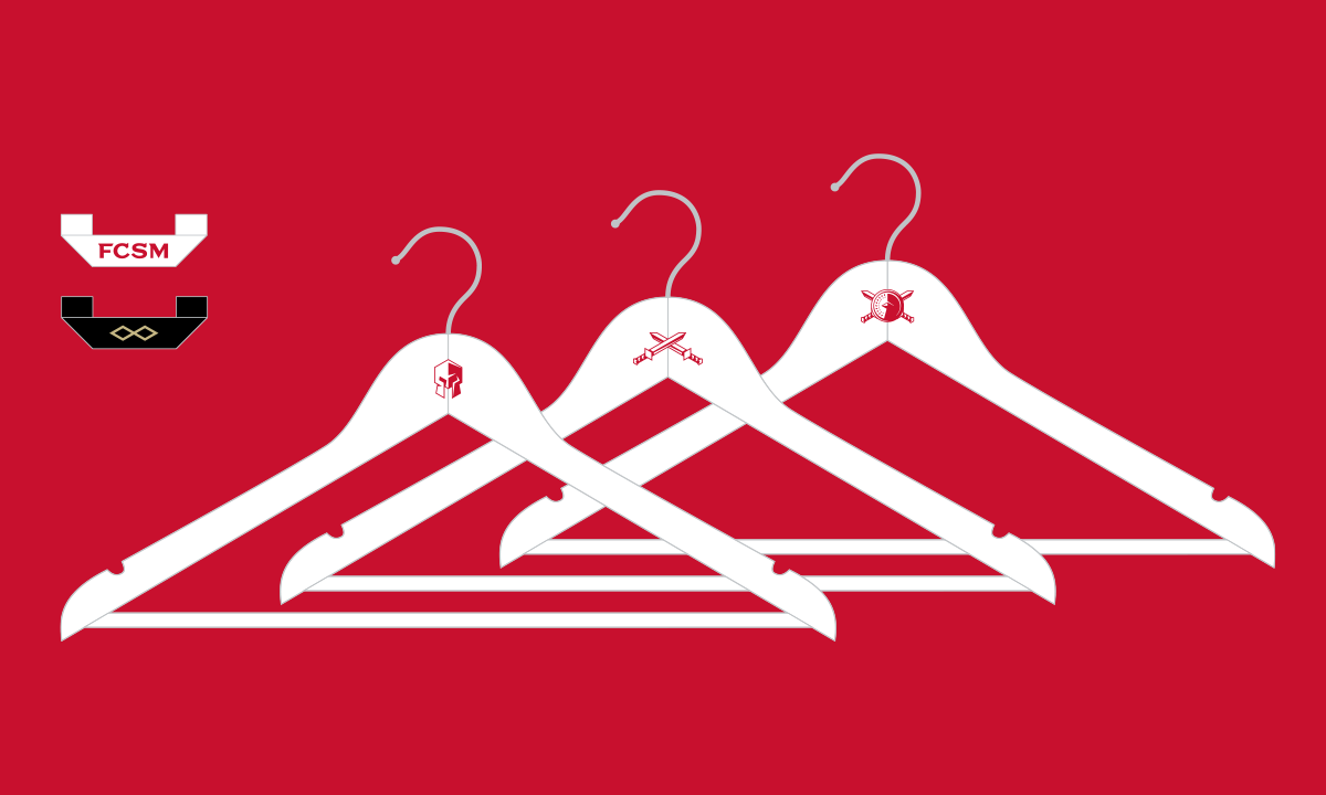
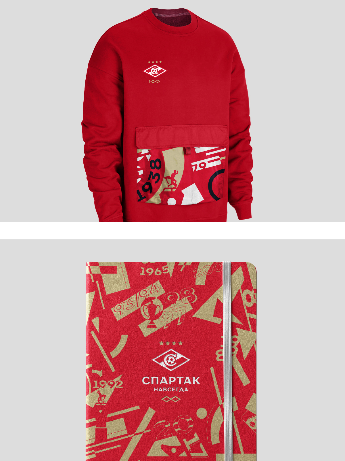
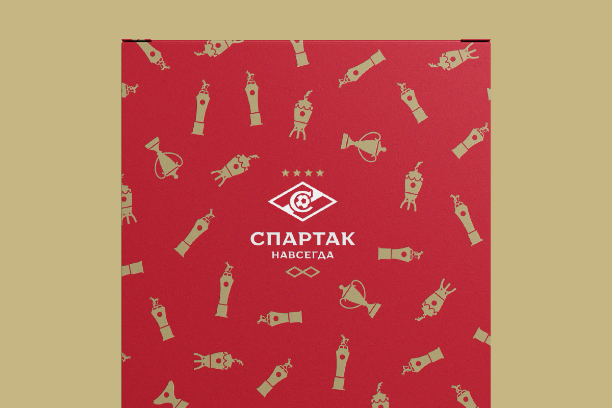
The memorable graphics of Spartak will also appear on physical media. Branding penetrates into the smallest details of the style, so the sub-elements of the corporate identity will appear on tags, and even on hangers in the club store.
Such a deep dive is necessary to create a full-fledged image around the capsule merch series. Active dynamic prints emphasize the time period of the foundation of the club and will form the basis of a special anniversary collection