The symbol of Tatarstan. Rebranding of HC Ak Bars
LOGO • SUBLOGO • FONT WORK • PATTERNS • GUIDES • MERCHANDISE • SMM TEMPLATES • KITS
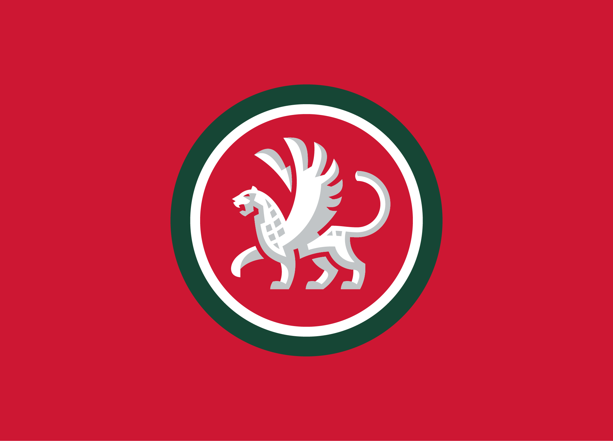
Ak Bars is both one of the main symbols of the Republic of Tatarstan and the leading Russian hockey club, whose activities are also judged on the development of the sport in the country as a whole. In a large-scale project, the identity of the ’snow leopards’ was reinterpreted and updated.
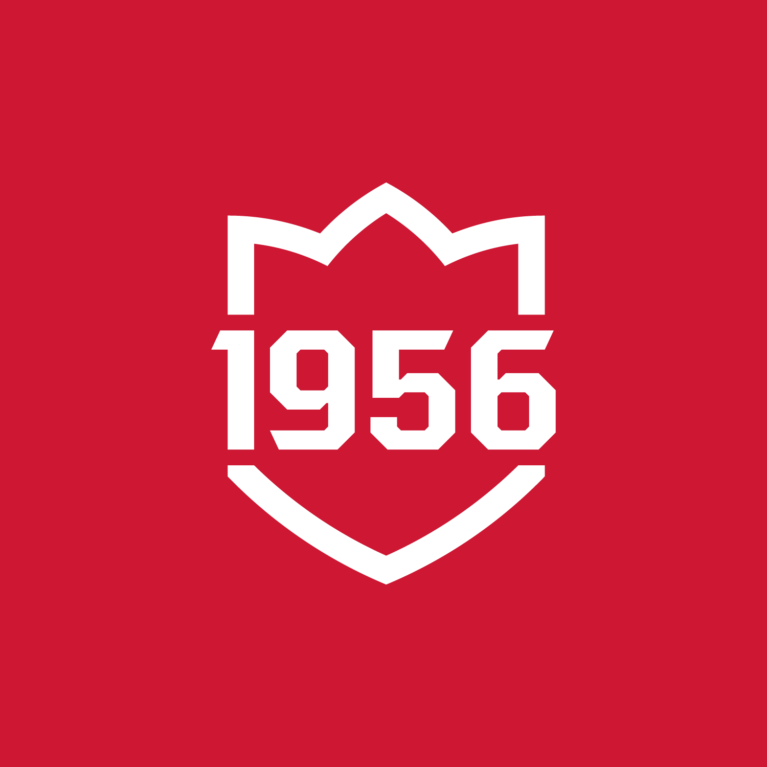
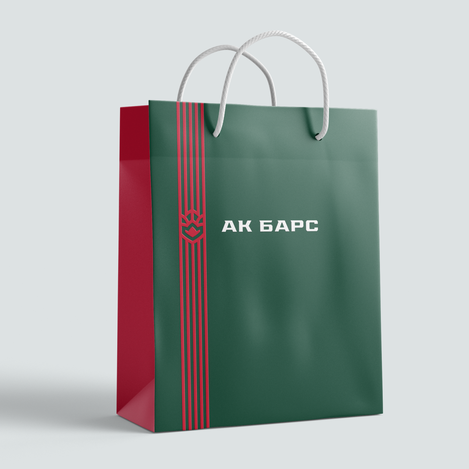
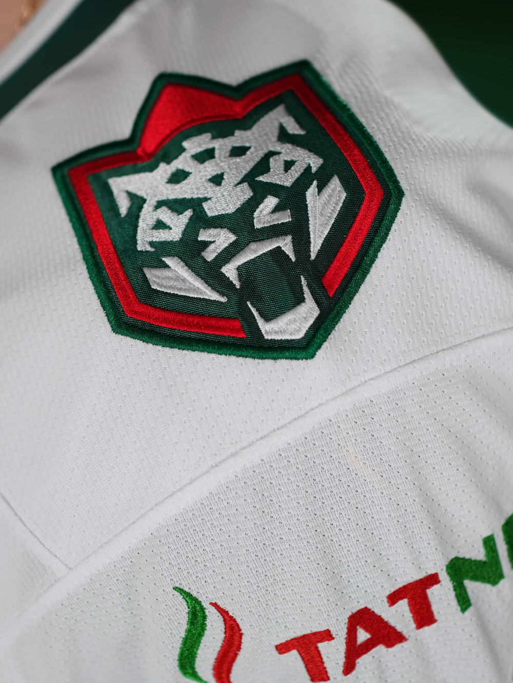
New logo and sublogo
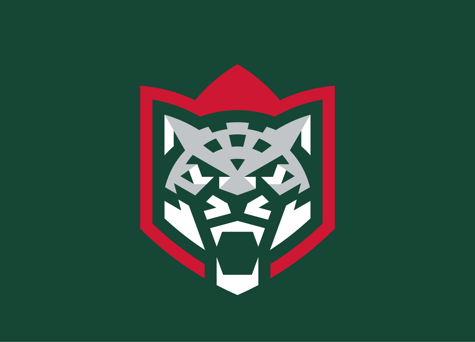
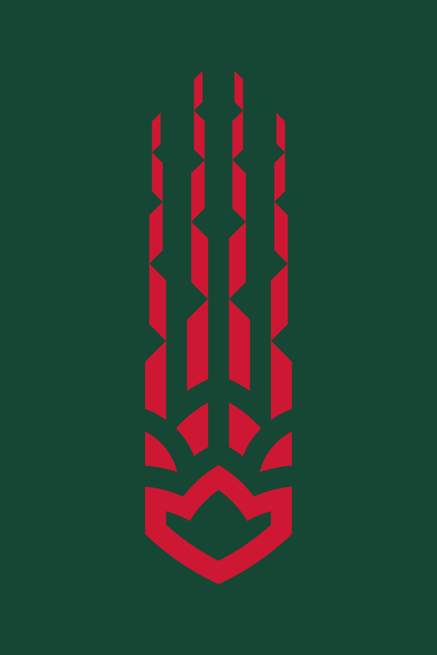
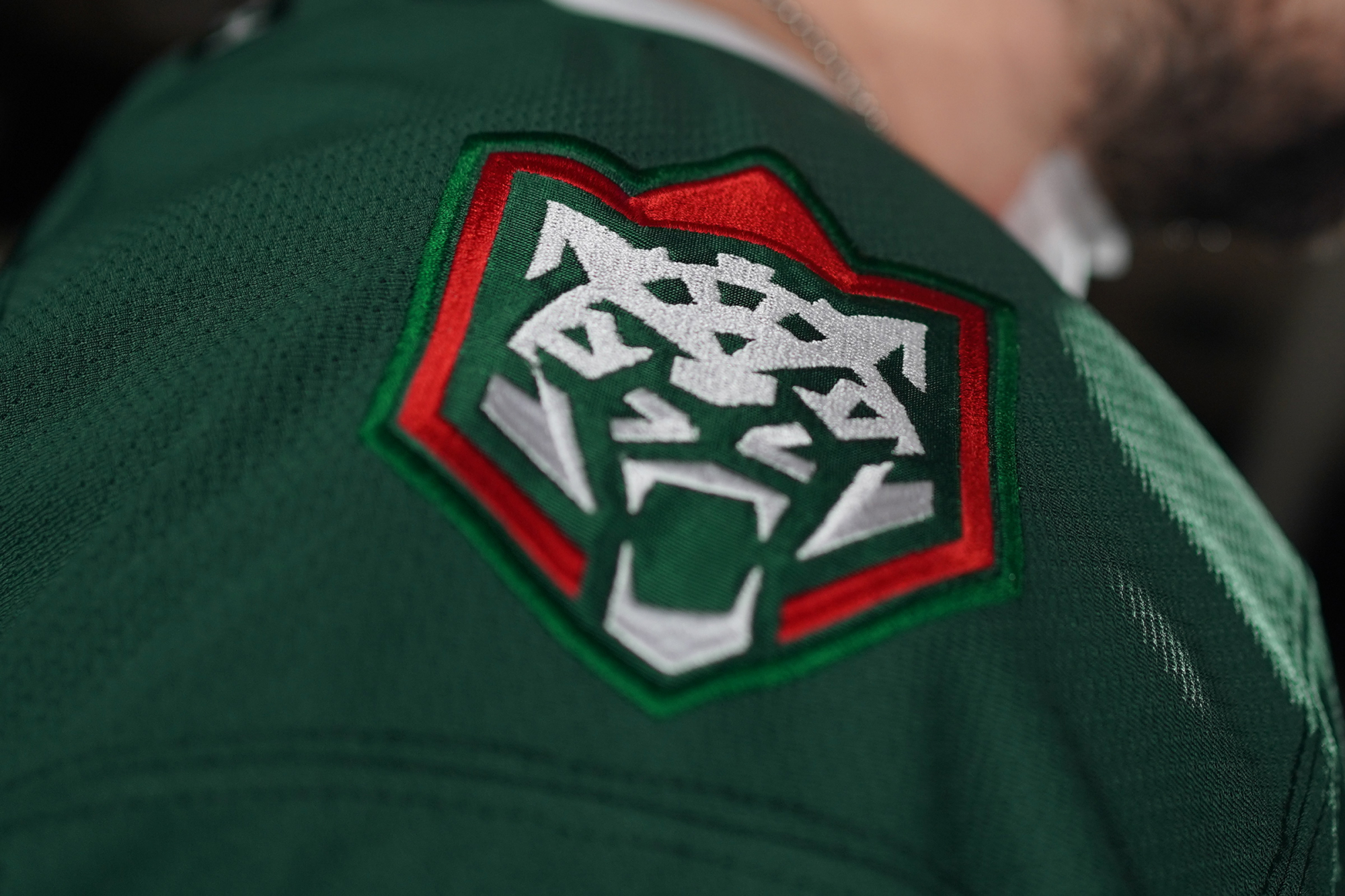
The snow leopard and the tulip are traditional symbols for the republic and the team, they formed the basis of the new logo. The common principles of the construction of the leopard and the tulip form a system of corporate identity. The gray color in the emblem palette is the snow leopard’s usual color. Through the cheekbones and forehead of the predator, it adds volume to the image. In addition, the logo looks great in monochrome and adapts to any color scheme.
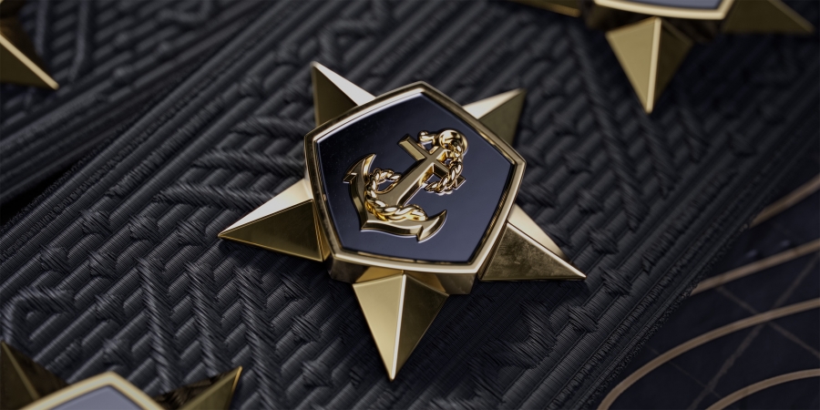
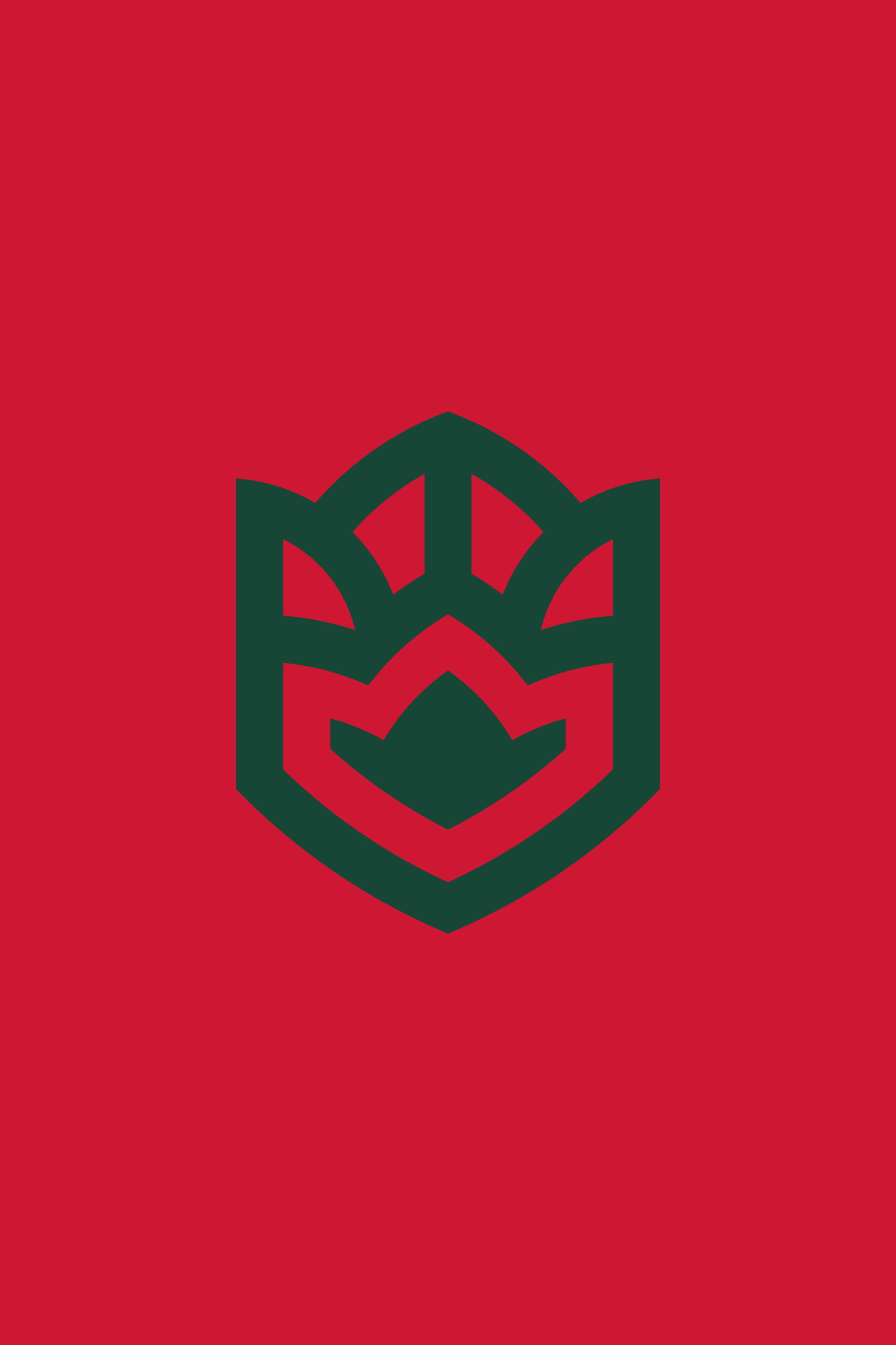
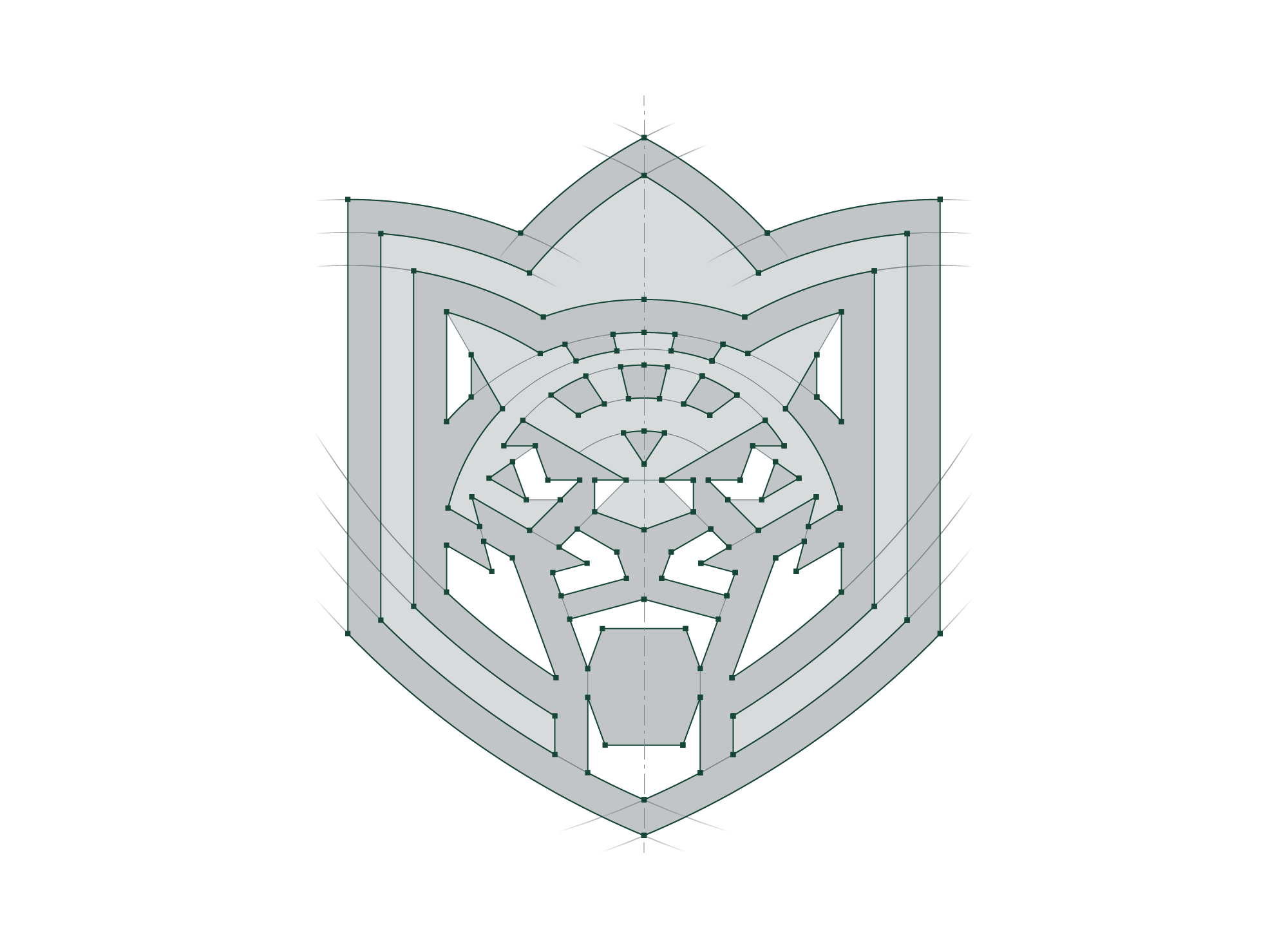
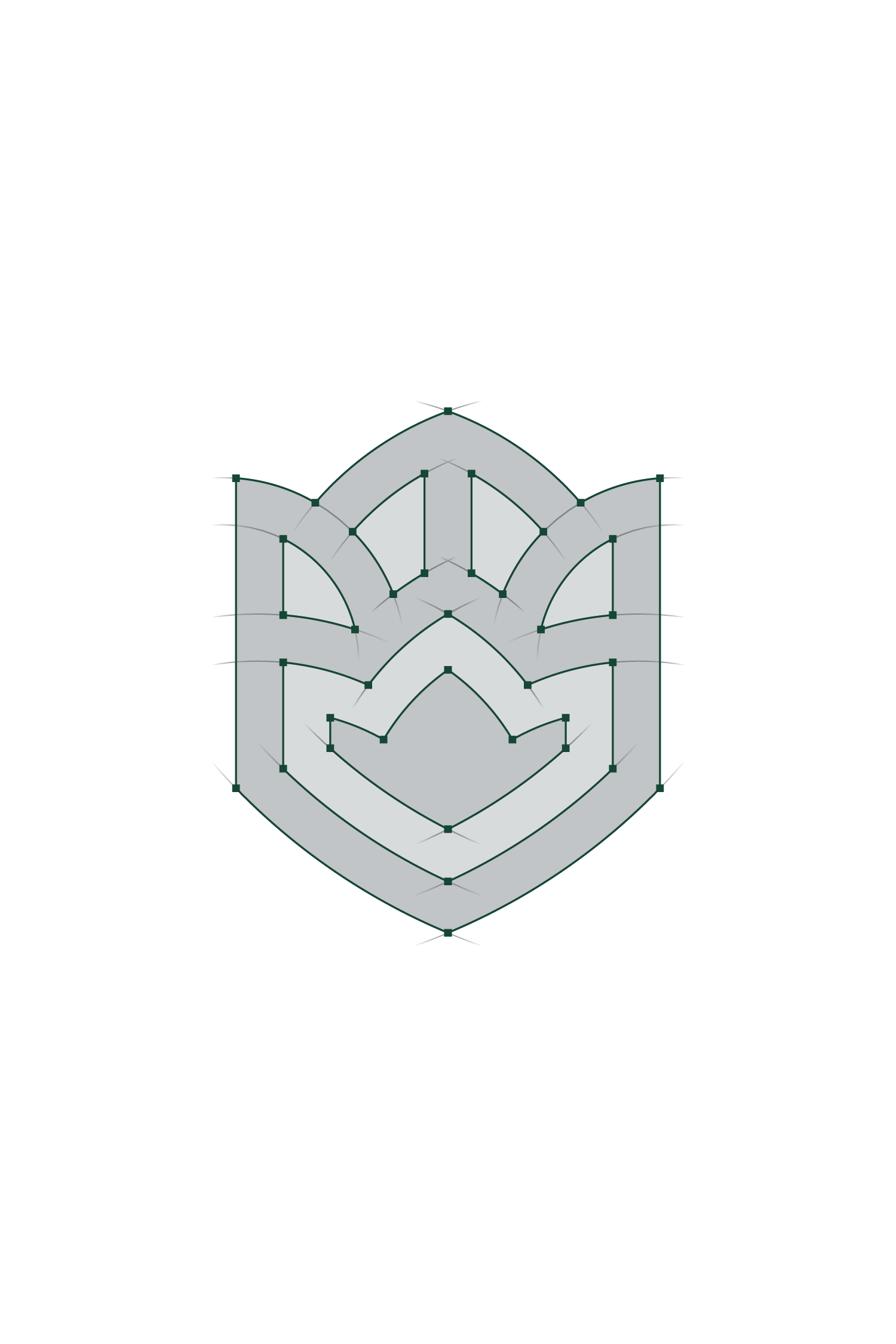
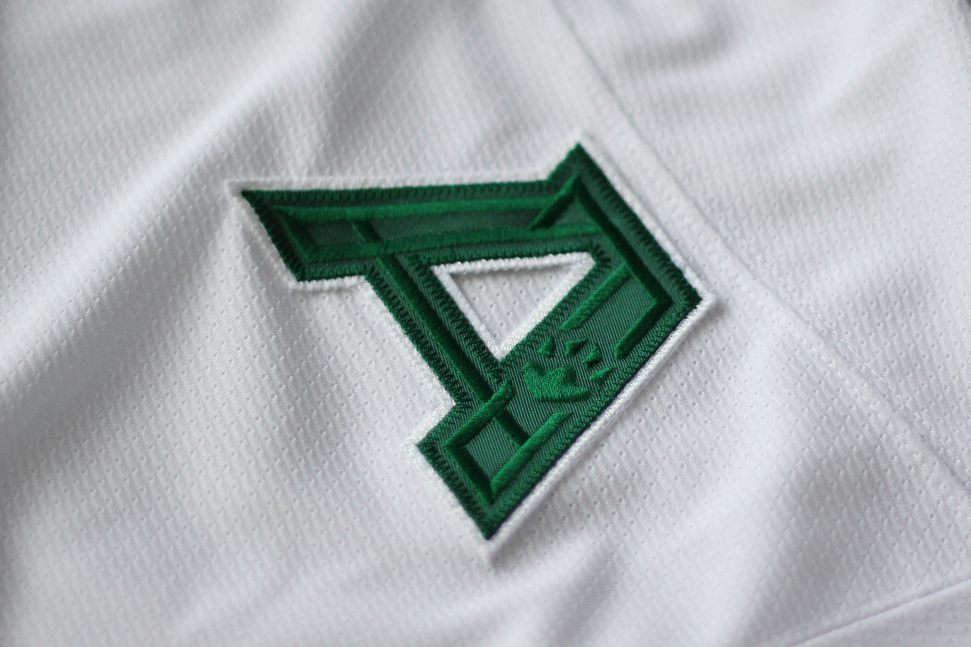
Along with the main sign, the studio has developed a sublogotype for the club with a large number of subversions. The leopard’s paw can be used on a small scale as the silhouette of the spot is identical to the shape of a tulip.
Медиа:
Медиа:


Медиа:
Медиа:
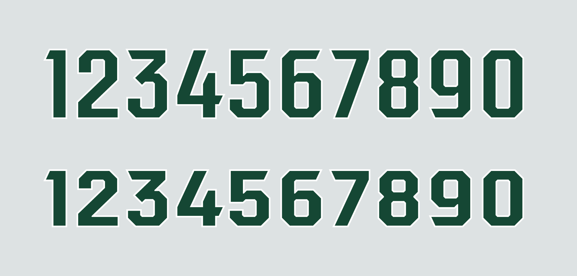
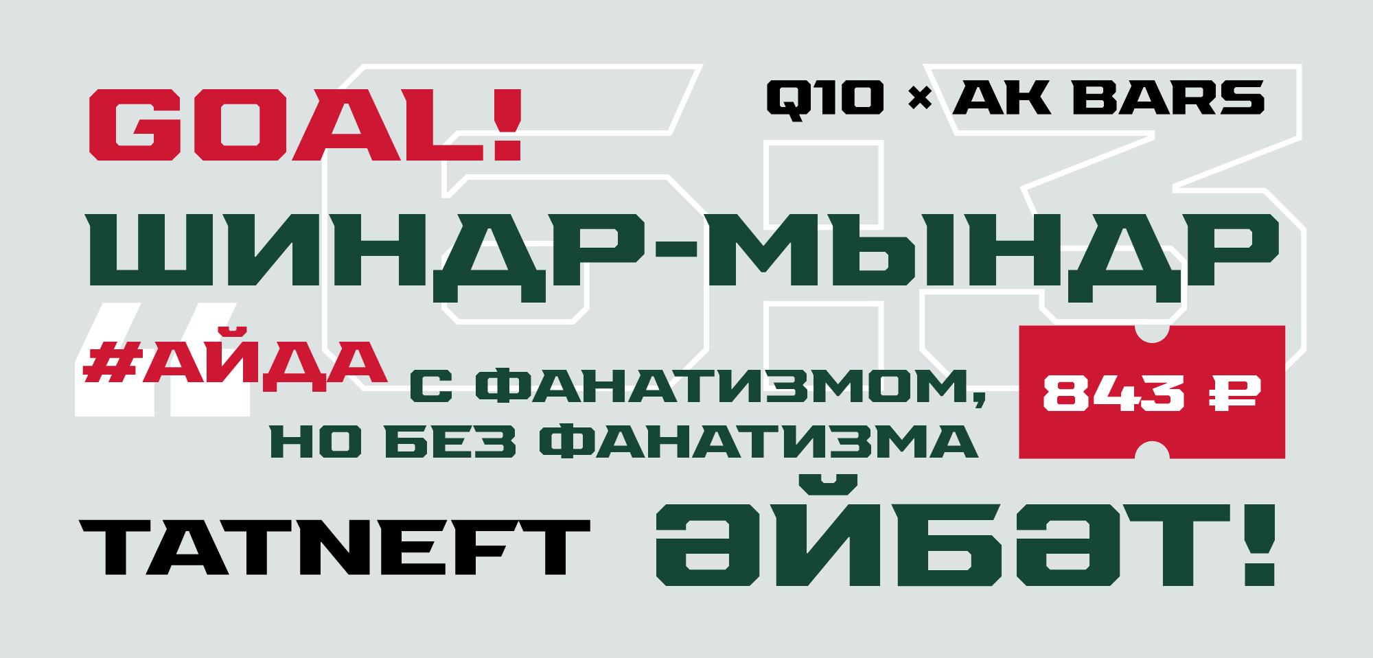
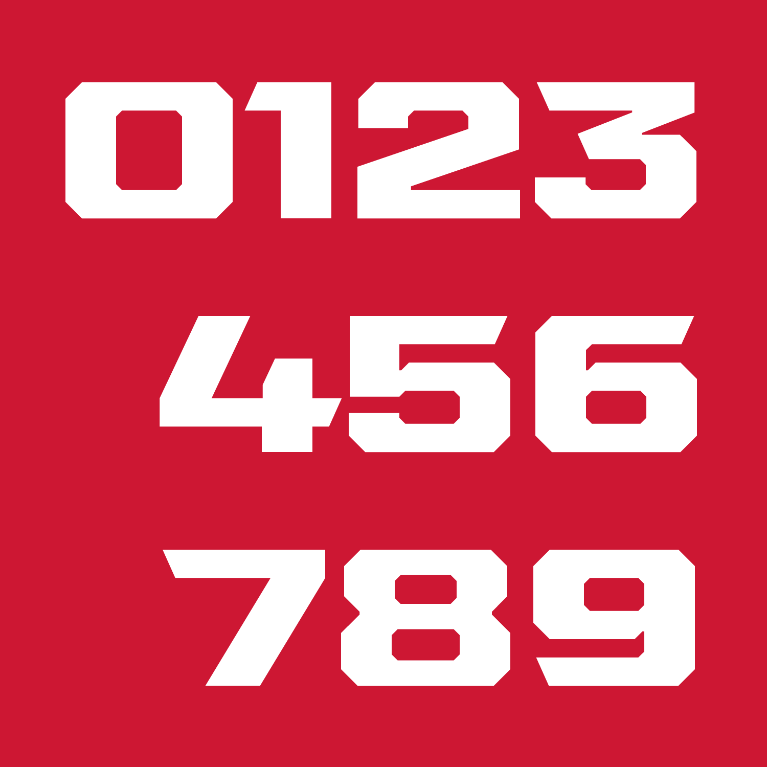
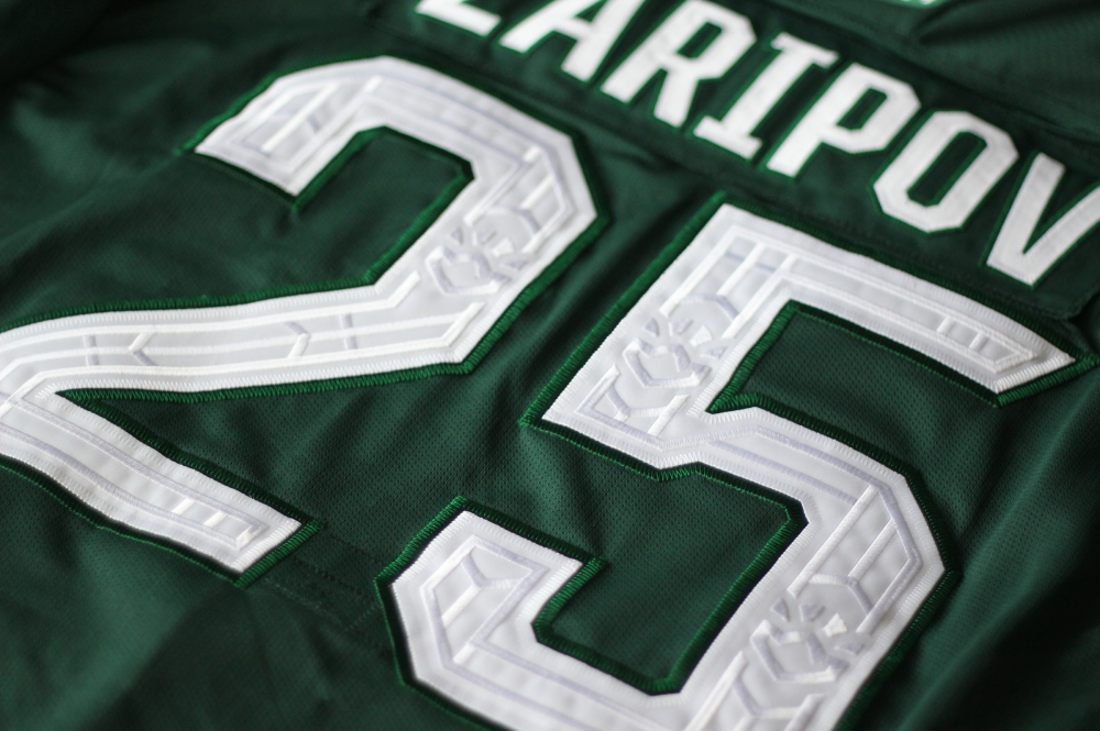
Font
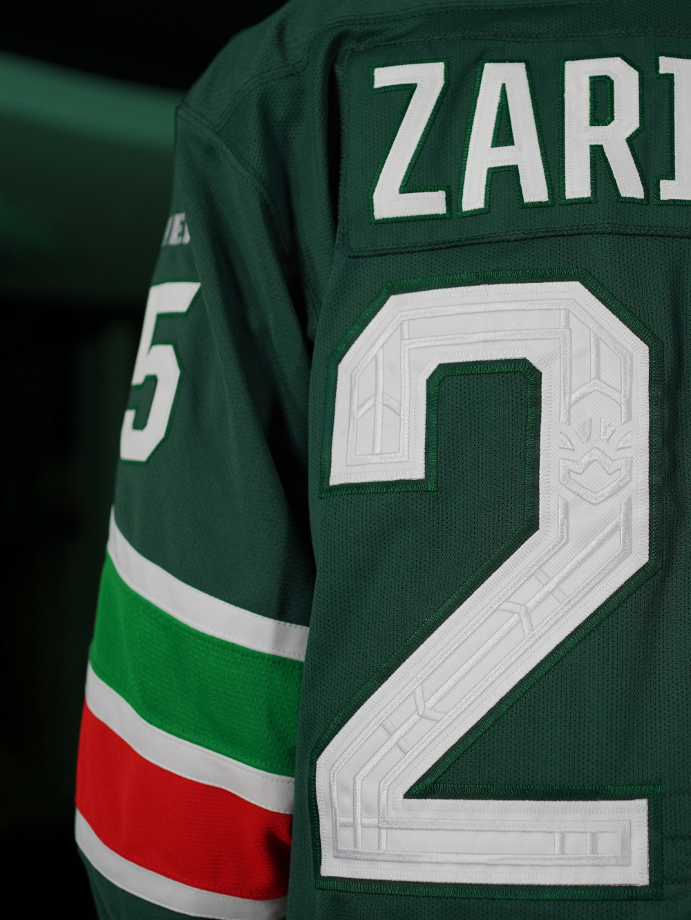
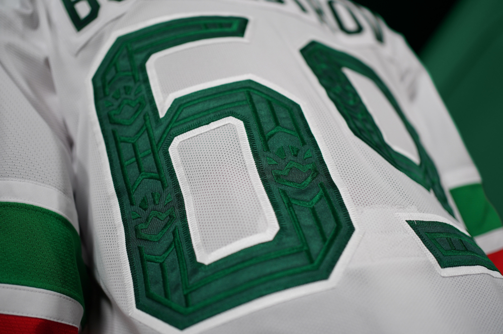
The branded club font is gradually becoming the standard font within the industry. The design of the numbers on the back and sleeves is identical in style to the lettering and corresponds to the general monolithic style.
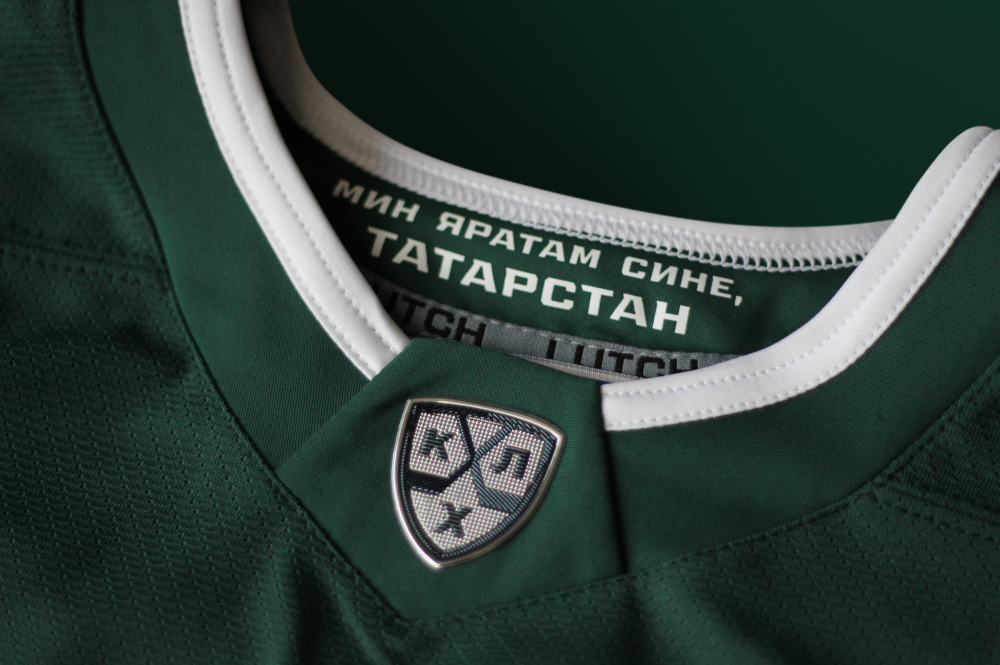
Tatarstan is a bilingual republic, so the studio has provided signs of the Tatar alphabet in the font. This functional detail gives the club the opportunity to interact with the audience fully.
Медиа:
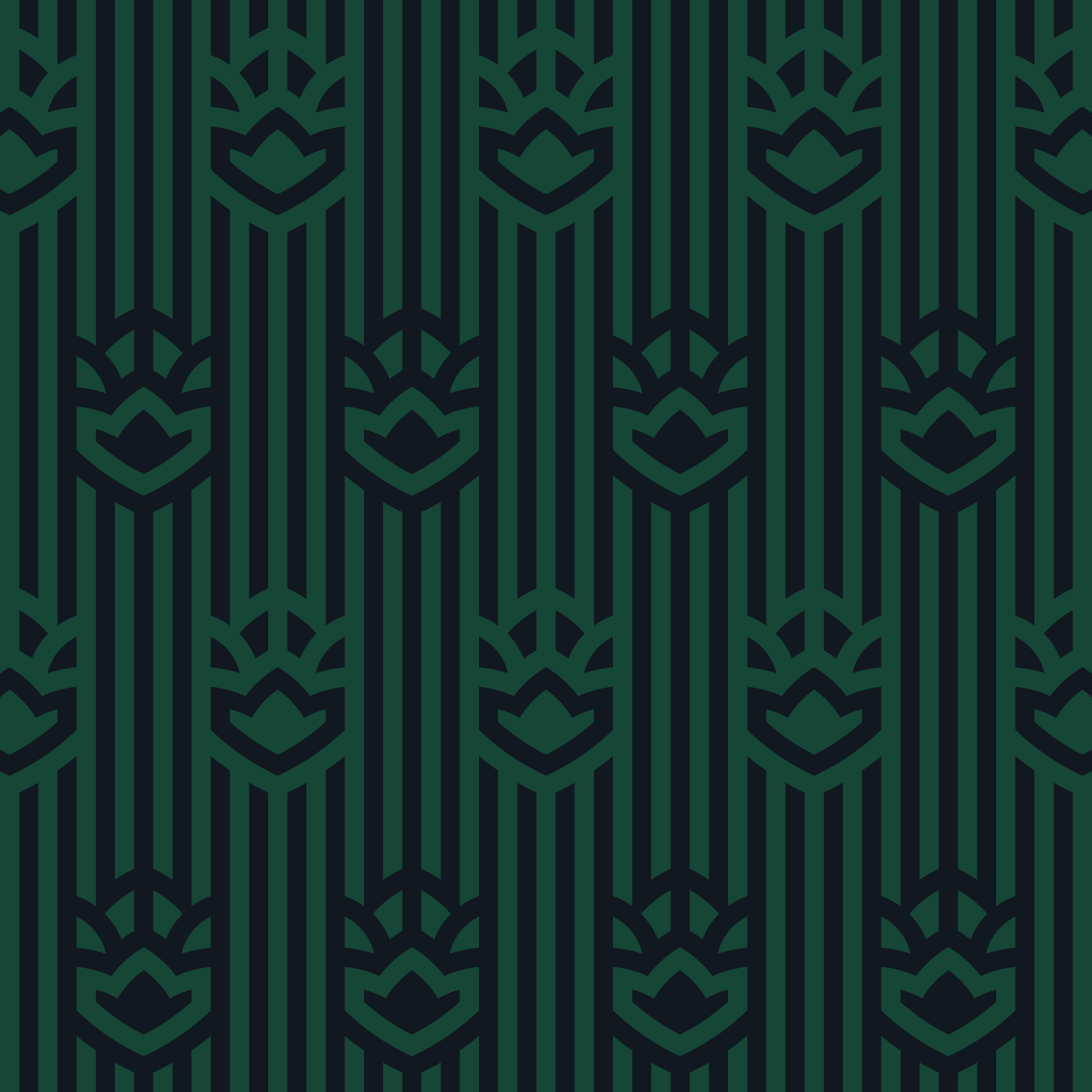
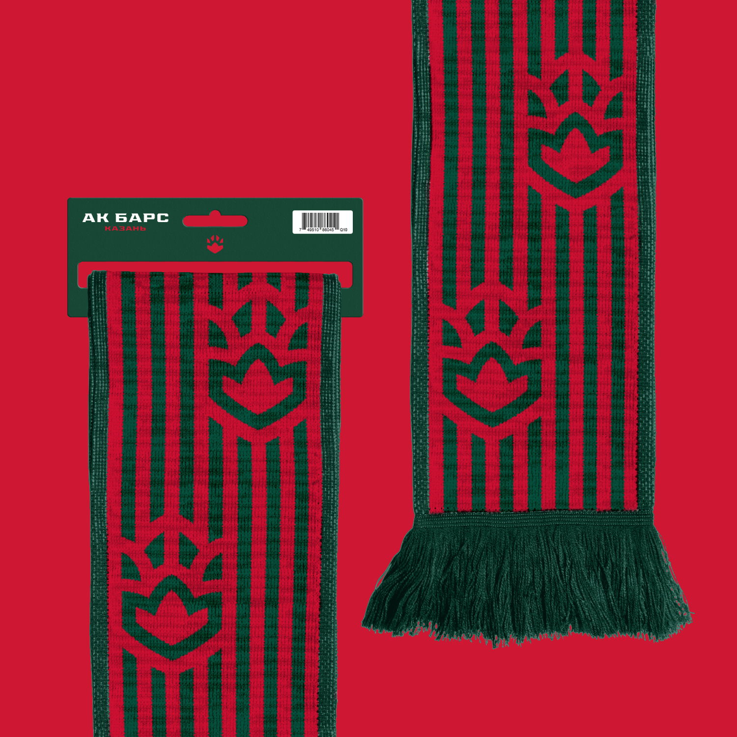
Patterns
The visual basis of the patterns is aesthetics and elements of architectural forms characteristic of Kazan.
A wide range of patterns is divided into background and active. First are used for the design of spaces and in printing products. Active patterns help to place visual accents, for example, in merchandise, social networks, or in video production. The elements of the patterns are quite flexible and can be transformed, stretching in height if necessary.
In addition, the studio has developed a universal modular transformer pattern, which will become one of the effective tools of club communication. Each rectangular container section of the generative pattern can be replaced in any order. Thus, the module is able to be ’assembled’ into the desired form, depending on the purpose: into a positive animalistic composition (for a children’s collections) into a bold aggressive one in combination with a font message, for more adult and casual collections.
The club bus is a notable carrier and image unit. Holding several dozen home matches per season, AK Bars comes to each of them on its own transport, according to the league regulations, and it’s always televised. In addition to the reference to the flag of Tatarstan in the vertical display, the so-called dazzle effect is used in the design. In the natural environment of use, it is designed to hide the silhouette, whereas in the urban environment it is designed to attract attention. An ice filling machine can be designed in the same way.
Медиа:

Uniform
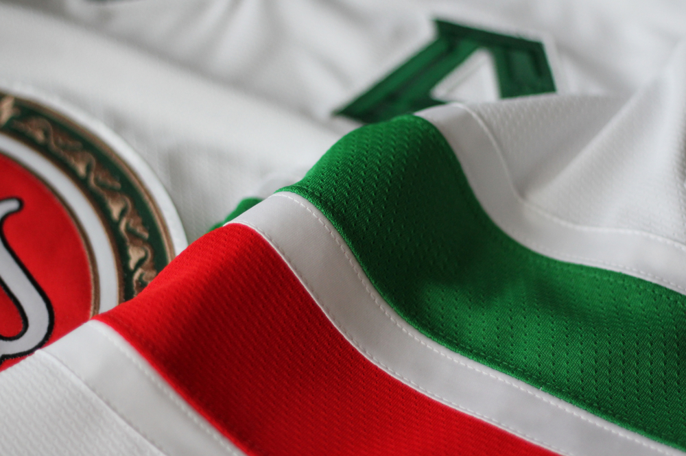
The main set of uniforms is made in Dark Green, but one of the stripes on the sleeves is bright light green (Kelly Green). And this is a triple homage at once: first, to the flag of the republic. Secondly, this was the same color used on the team’s jersey historically. Thirdly, it is the color of one of the flames on the logo of the general sponsor: Tatneft. The lettering of the numbers on the sleeves is traditionally wider, this makes them more readable.
An interesting detail that will be noticeable when zooming in TV broadcasts: the letters of the captains are embroidered with an AB pattern, as are the numbers on the back. No one has ever done this in hockey before.
The studio sees a great prospect for customization of the League’s plate. As a solution, matte polyurethane patches of club colors are offered. A simple element can create a significant difference in perception.

Медиа: