
Futuristic classics: restyling of CSKA Handball
CSKA handball teams strive for leadership positions both in tournaments and in the media. In order to interact with fans more effectively and attract attention in the digital environment, the clubs decided to redesign their identity.
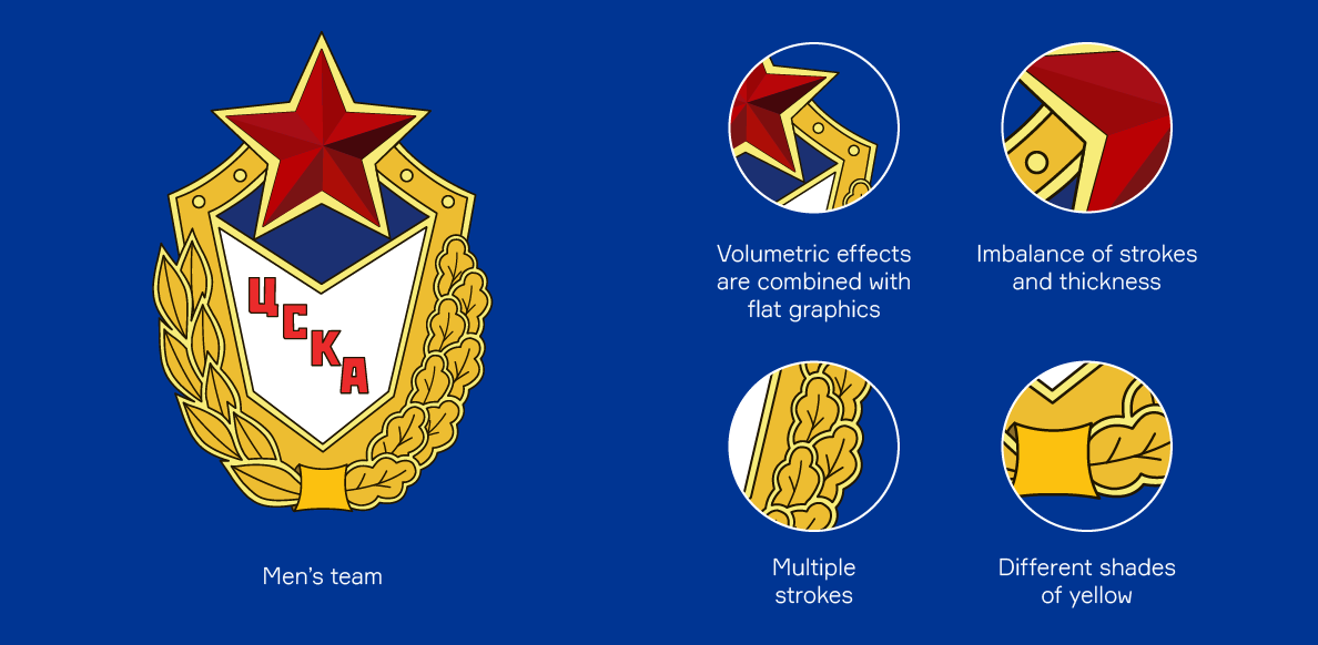
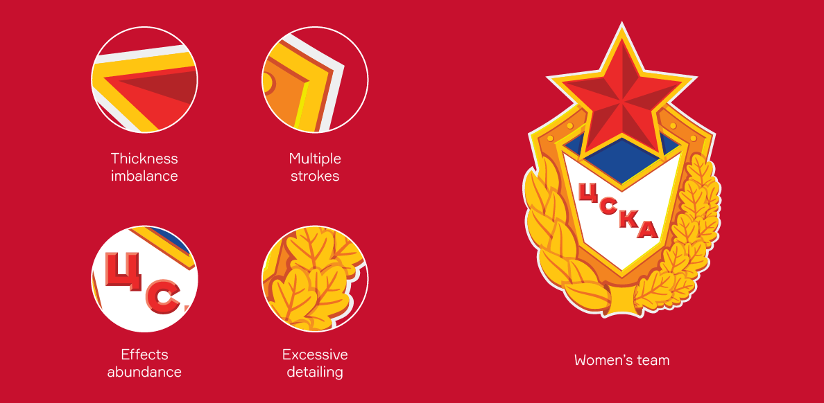
Both the men’s and women’s teams previously used different versions of the logo of the CSKA Sports Society. During the renovation it was important to keep in touch with the traditions, while expressing the identity of the handball teams.
Медиа:
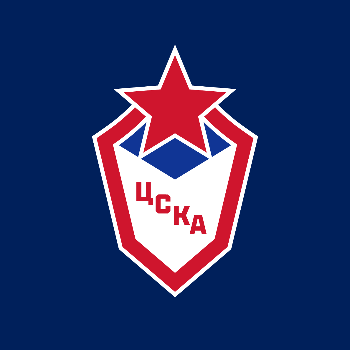
Logo
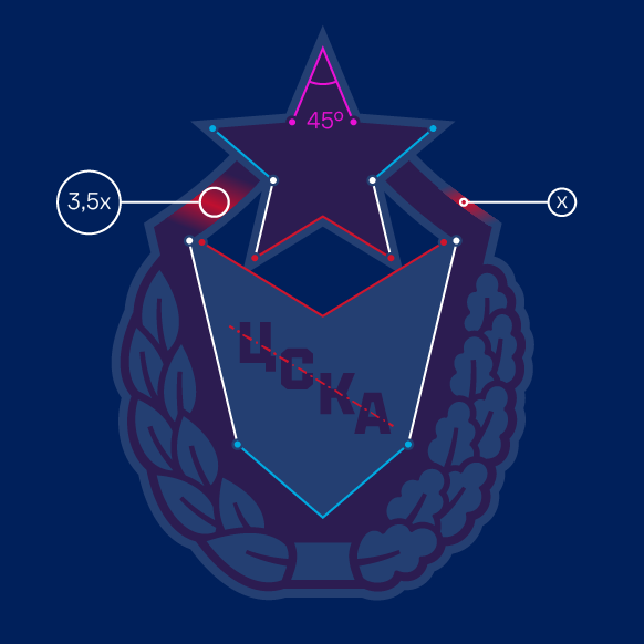
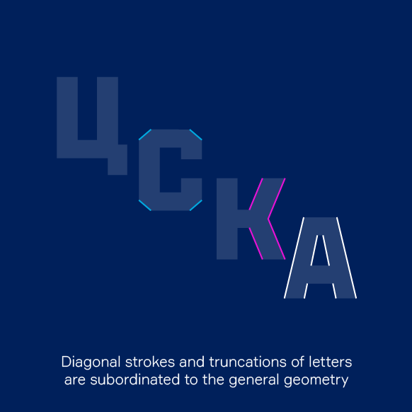
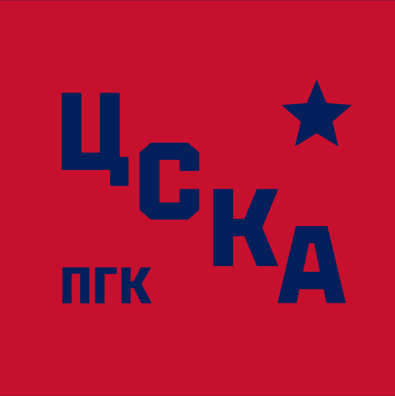
The designed logo is based on classic army attributes: a shield, a star and a diagonal acronym. The new logo is free from the visual inaccuracies of the previous version: an imbalance of thicknesses, multiple strokes, excessive contrasts and other shortcomings.
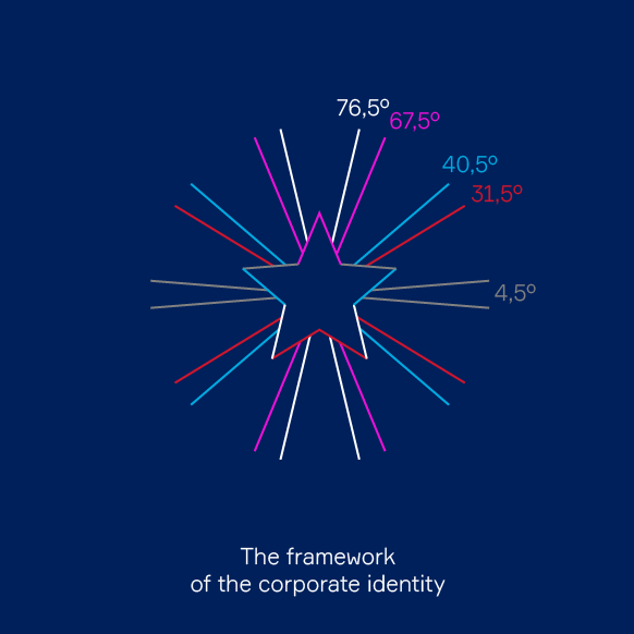
The main sign looks simple and harmonious. The same angles are used in the outlines of the star and letters, which creates visual rhymes.
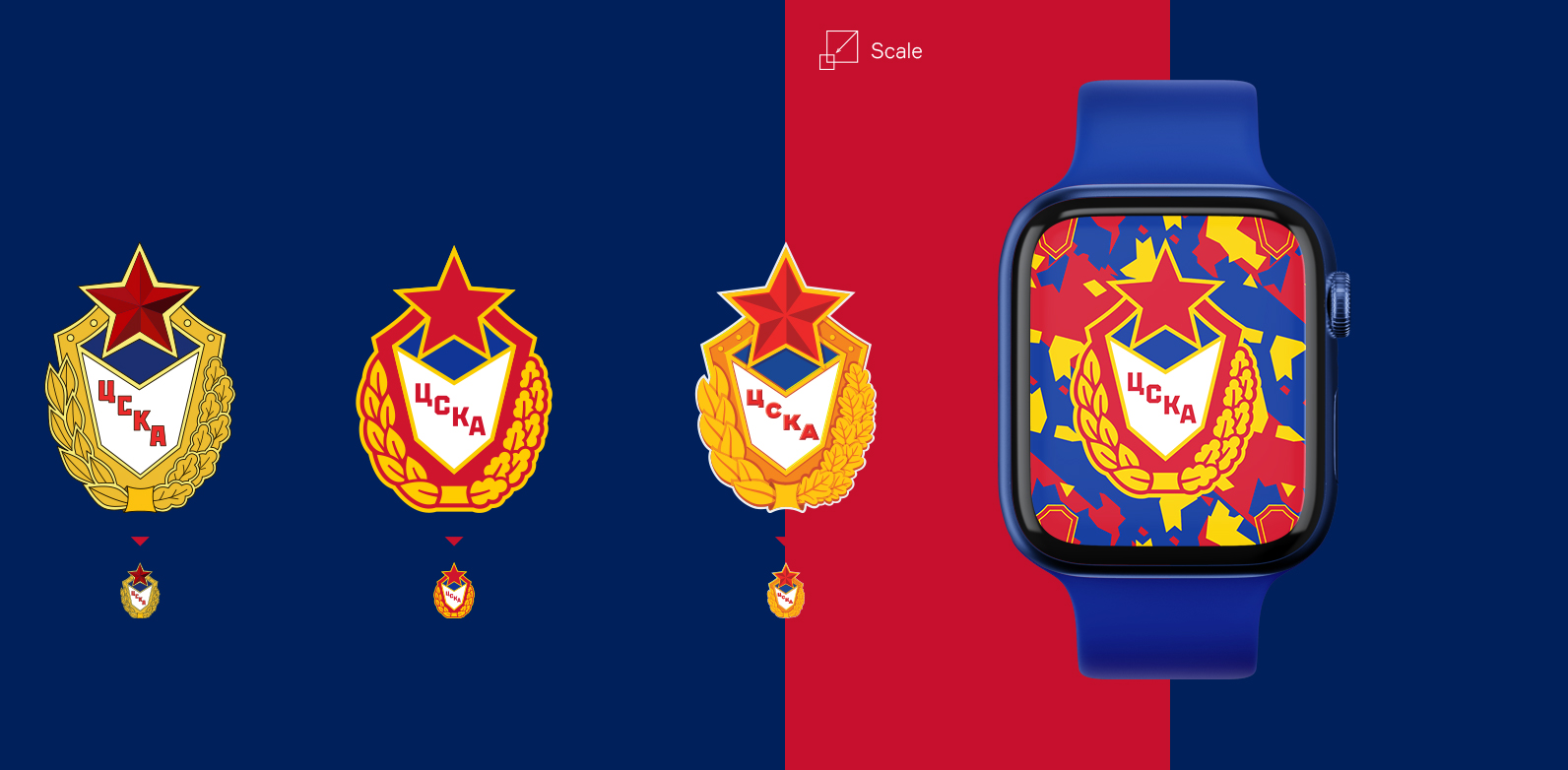
The logo has been transformed into an icon that looks bright and modern, adapts well to the digital environment and works clearly in microformat. This significantly expands the range of its use.
Медиа:
Медиа:
Медиа:
Медиа:
Заголовок:
Logo variations
Текст:
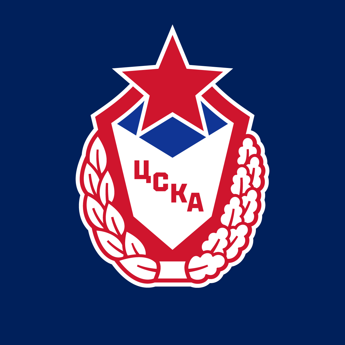
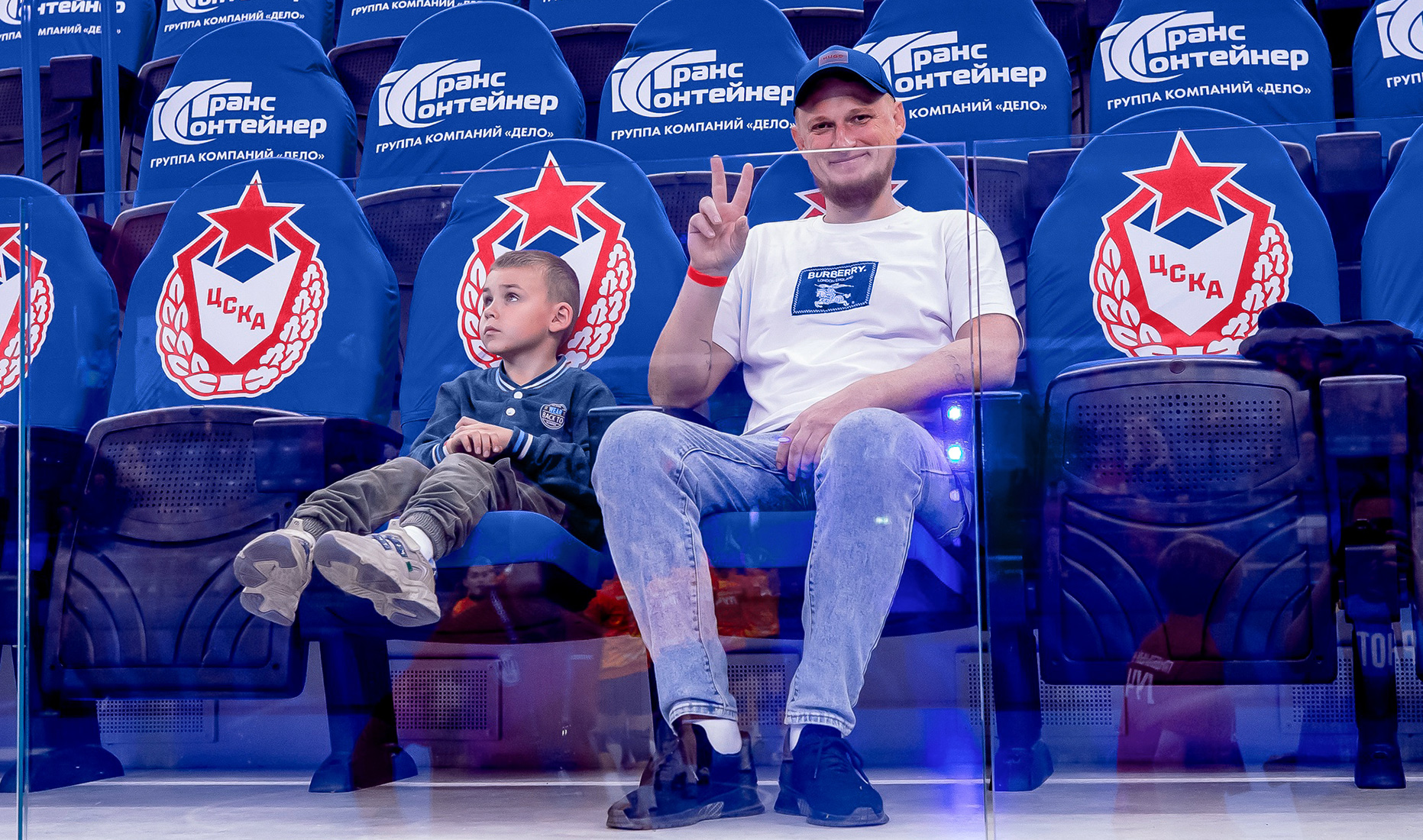
The identity package includes several logo options. The main version has no wreath, which makes the logo more utilitarian. In the expanded version, the shield is framed by laurel and oak branches, giving the emblem status and grandeur. These elements refer to the emblem of the CSKA sports society, but designed in modern aesthetic.
In addition, extra identifiers have been developed for the women’s and men’s teams. They depict the silhouettes of the players inscribed in the geometry of the star. The images of handball players are made in pictogram format, which makes them suitable for use in microformats. These signs can be integrated into the main logo or used as independent elements.
Медиа:

Colors
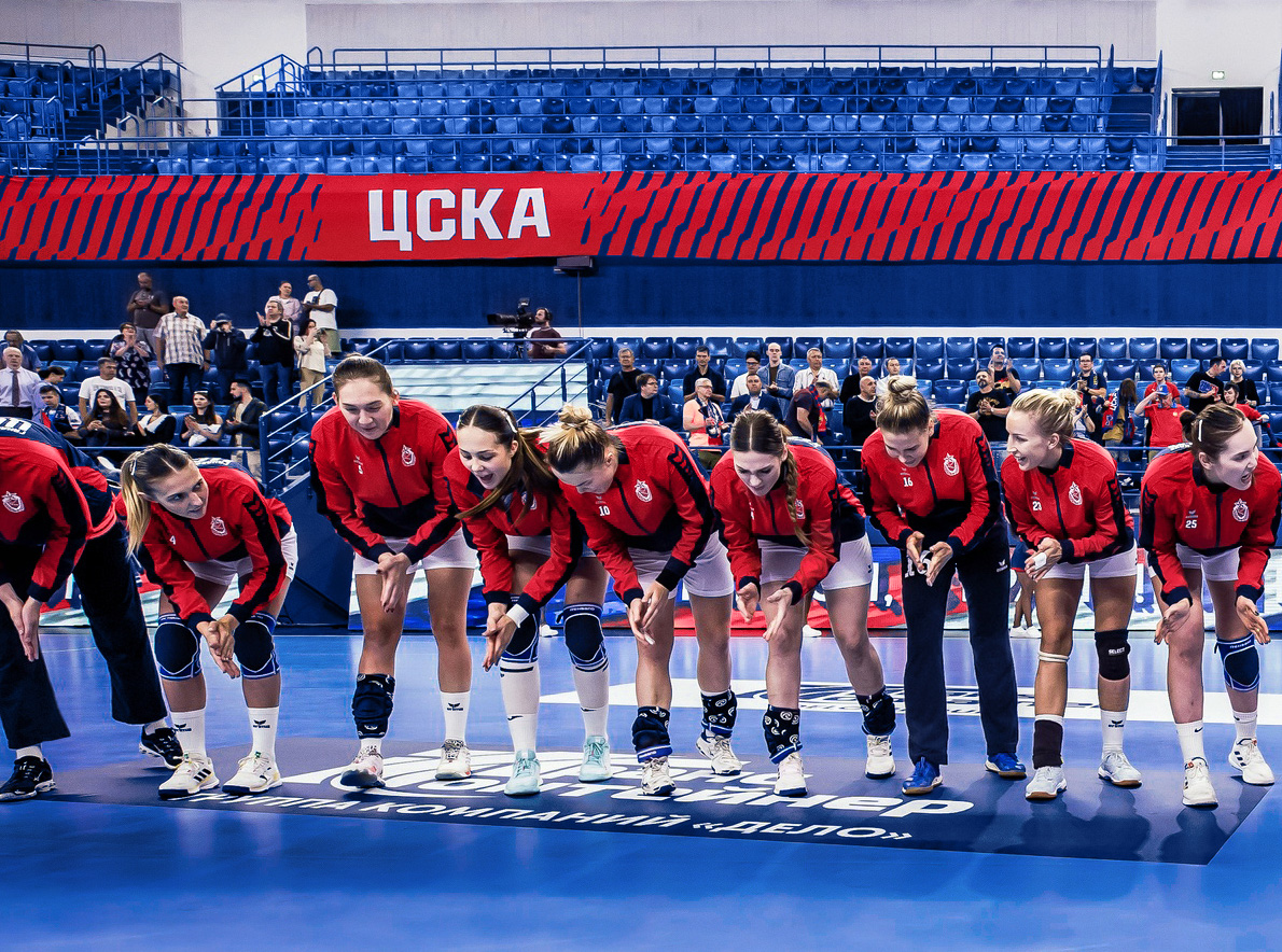
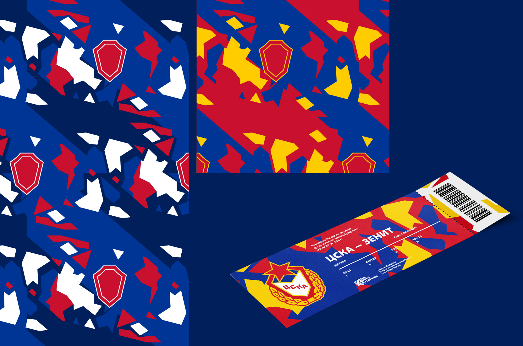
The palette follows the traditions of CSKA clubs. The main colors are deep and bright blue, red, and white. Burgundy and yellow are used as extra colors for some elements.

Patterns
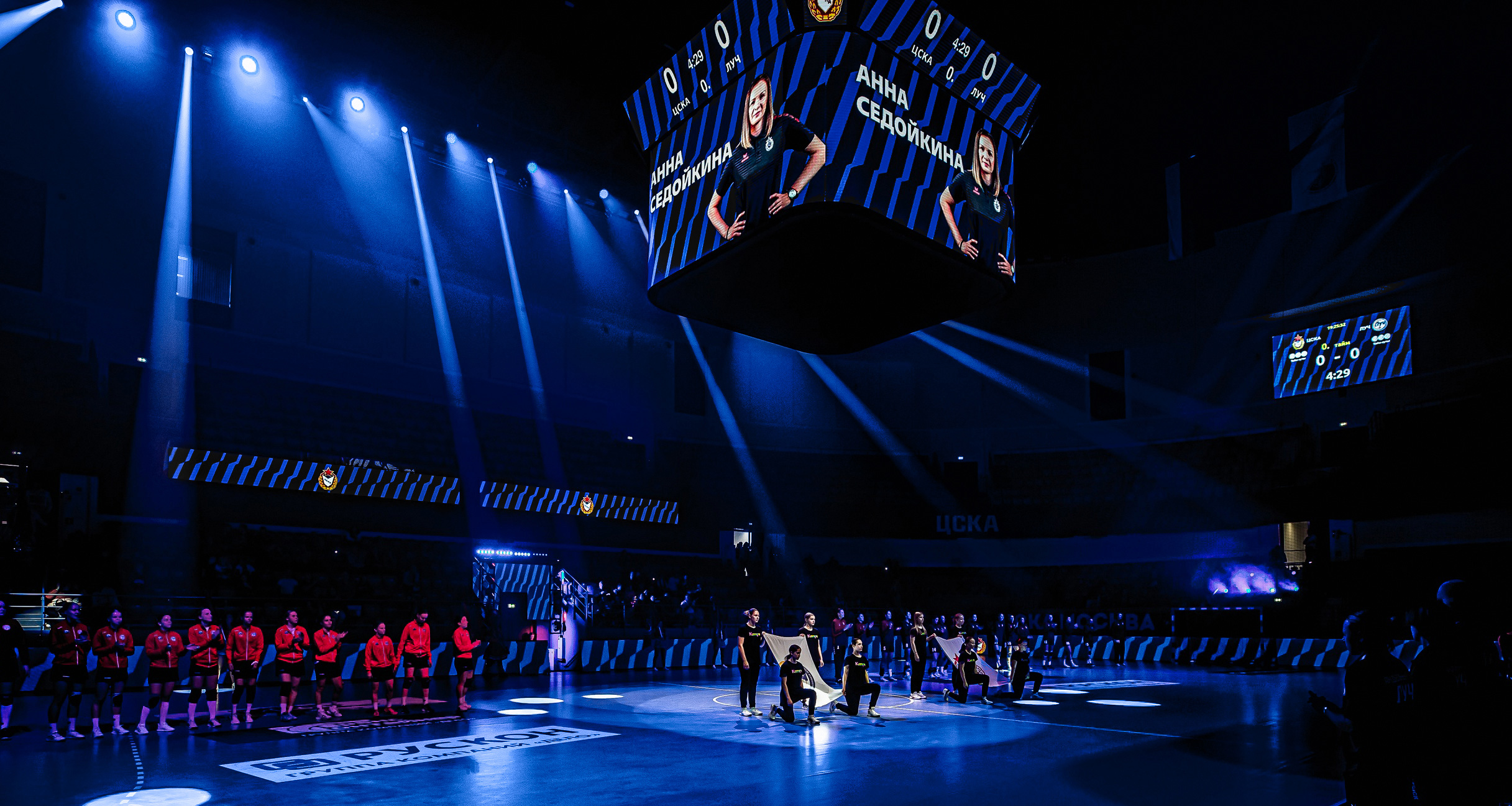
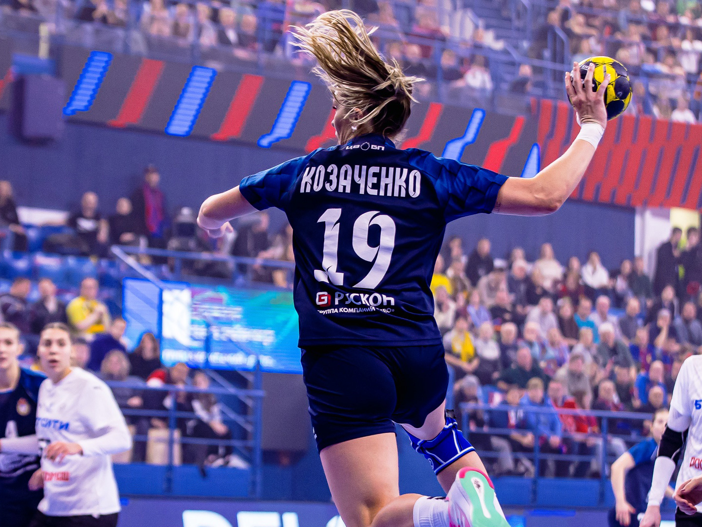
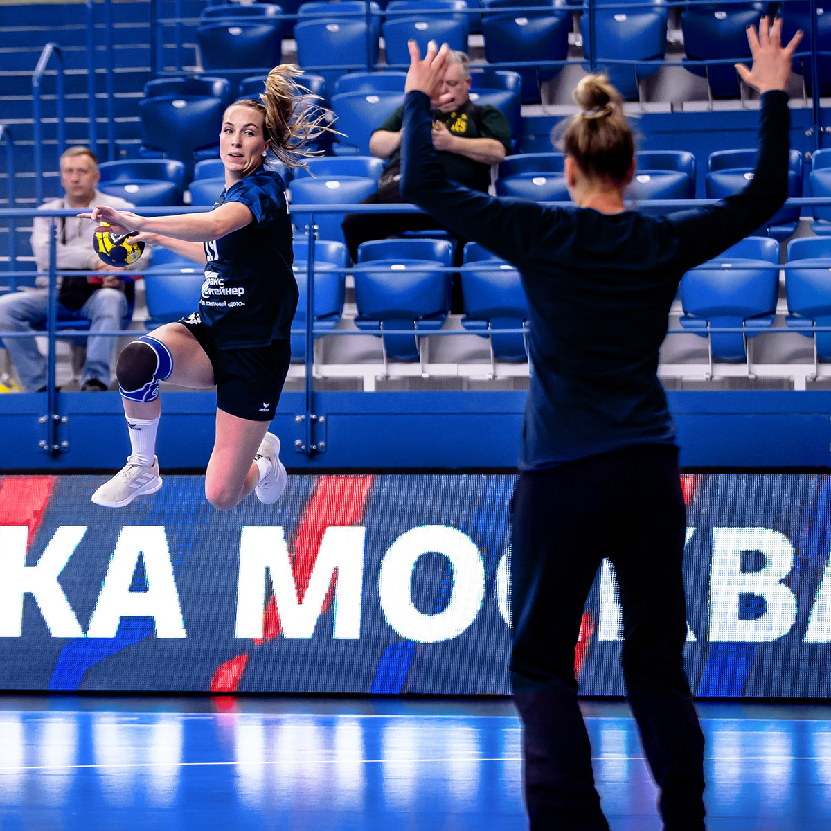
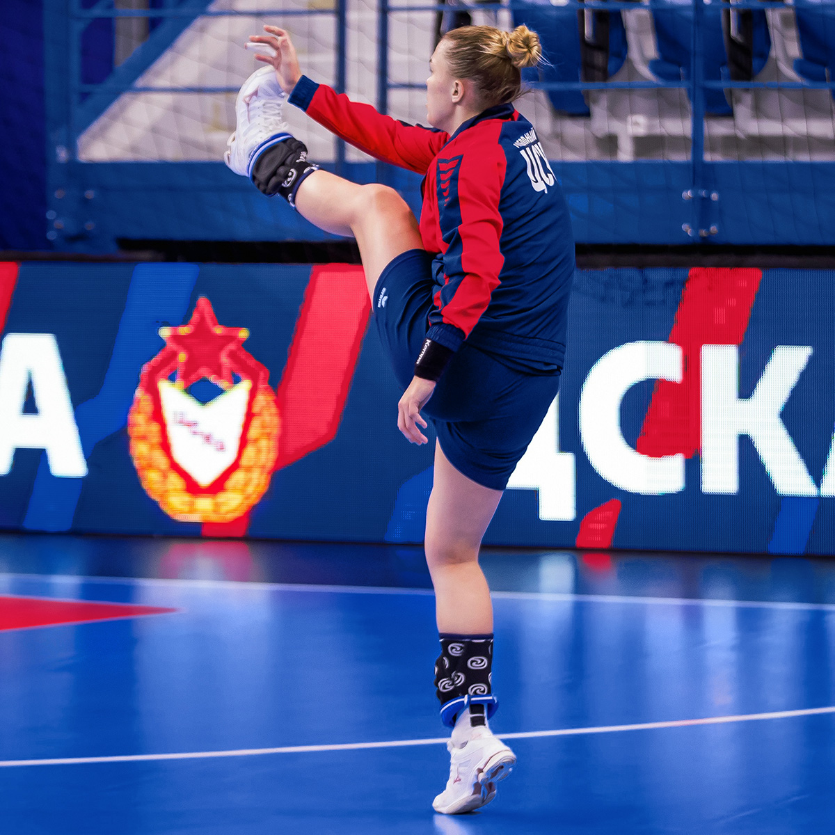
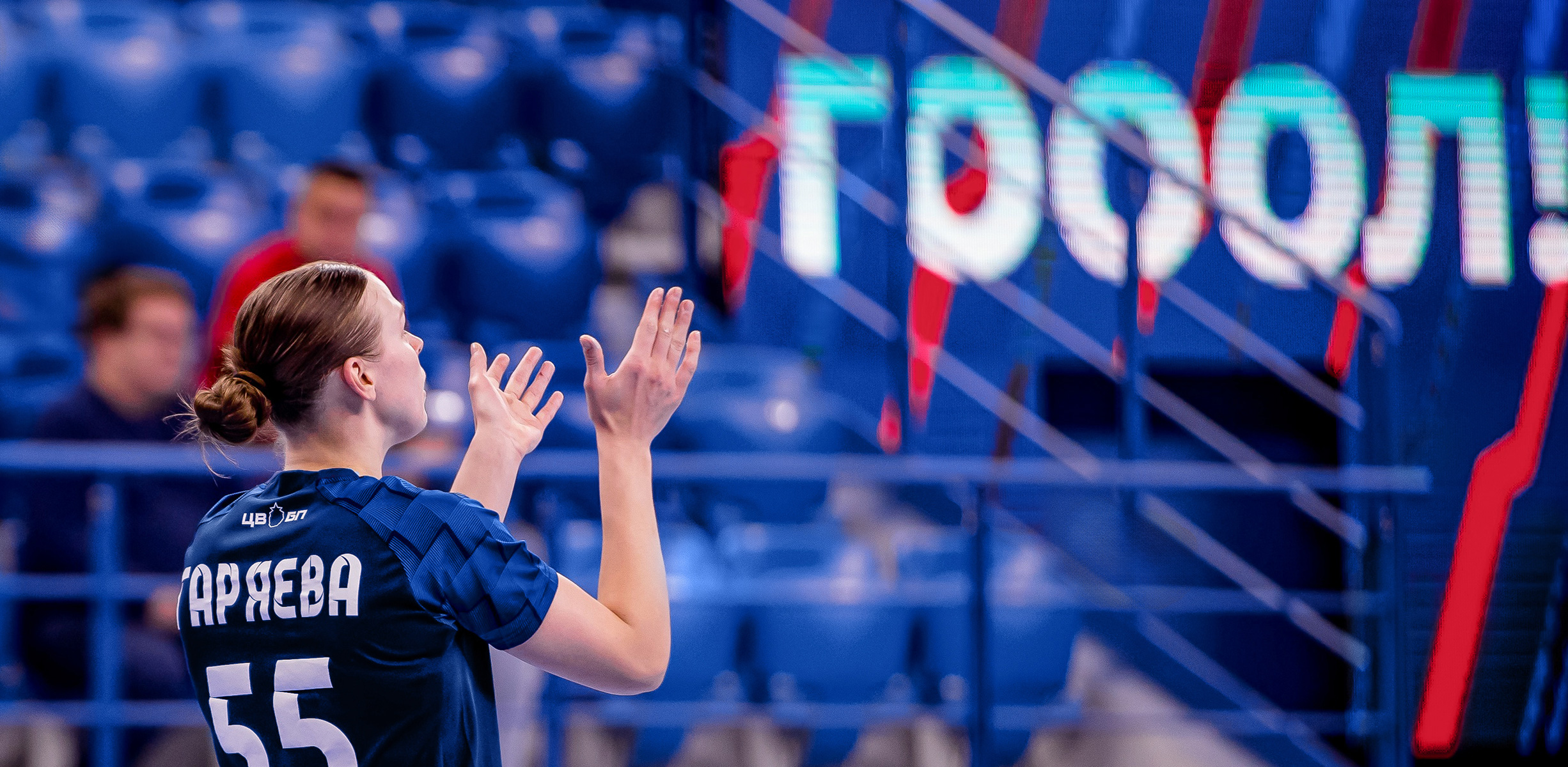
Various patterns look abstract and symbolic. For example, a pattern based on lines with an offset effect looks spectacular in a motion chart. It is actively used in the design of the arena: on the video deck, media screens and boards.
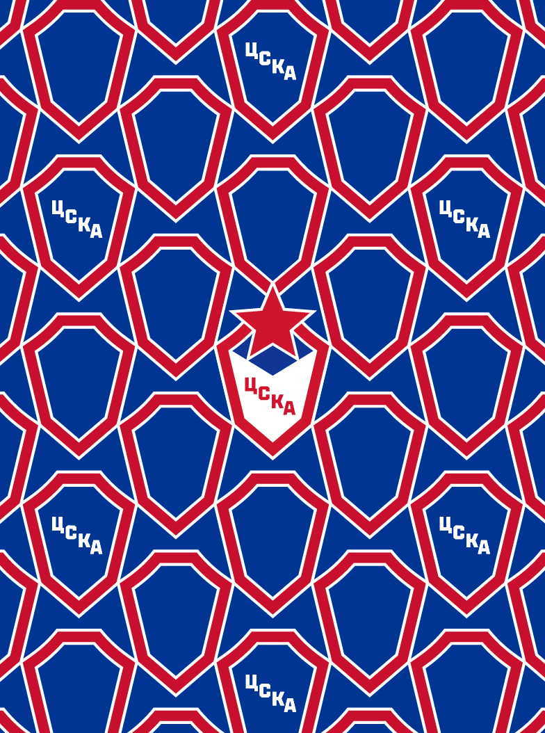
The Grandstand pattern is based on a segment of a circle, associated with the stands filled with fans. In another pattern, made up of the decomposition of the shield, the image of the warriors can be noticed. This symbolic element represents both athletes and an army of fans.
Other patterns are also created from elements that match the parts of the logo.
Медиа:
Медиа:
Медиа:

Медиа:
Медиа:
Заголовок:
SMM
Текст:
Different layout templates have been developed for the club’s social networks, as well as highlight icons and video covers.
Branded graphics interact with layouts in different ways. The color combinations vary depending on the task. For example, for the Win layout, red is selected as the background color, emphasizing the emotional charge. The templates for SMM are harmoniously adapted to the digital format thanks to their minimalistic design and effects.
Медиа:
Процесс
Медиа:
Медиа:
Медиа:
