Business Champions League. Expanding the boundaries of identity
Our friends from the Business Champions League believe that the basis of success is in the team. For 11 years of their existence, they have organized dozens of seasons in almost every sport that comes to mind, ranging from football and table tennis, to cheerleading and esports.
We live in a time of restrictions, where personal communication can come across many obstacles. The most important thing is to get employees back working with one another, uniting them with common hobbies.



Continuity of the image
When working on the identity for BCL, we had an ambitious task of updating the logo and developing sub-elements — this should add variability in the design of events, merchandise and related products.
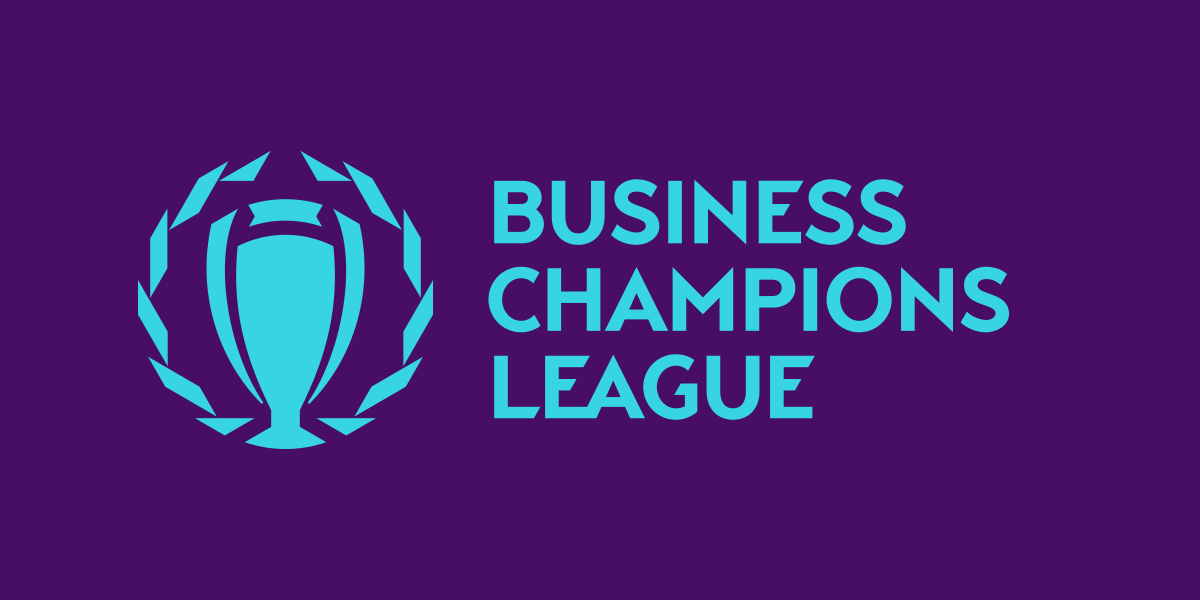
The previous logo of the BCL used to be everywhere, but when using it on a small scale, designers faced some difficulties: the sign ended up looking a bit ’noisy’. To solve this, we have rethought the logo by simplifying its shape. The main image of achievements in the team sport and the element of the emblem: the cup. So we kept it in, but took a different approach. The logo of the BCL is now more adaptive: it helps change the degree of detail at each level.
There’s also a special version with a dynamic pattern. From a certain angle on the body of the cup, due to the volume in the plane, the letters ’B’ and ’C’ can be seen, standing for ‘Business Champions’.


Typography and color palette
There are several sports and hundreds of teams within one Business Champions League. The logo is integrated into the numbers and mimics the colors of the teams, so the individuality of the teams is preserved. At the same time, we’re aware that the colors in the emblem may vary depending on the needs and sports, from classic combinations to a neon silhouette.
The chopped font repeats the principles laid down in the logo’s graphics, together with the pattern, they solve the problem of unification.




The flexibility of the new style is in the patterns
The parallelepiped effect taken as the basis of the pattern came from the image of a bay leaf. In addition to the applied ease of use in the formation of a graphic vibe, a laurel wreath in the logo and a leaf in the pattern carry an ’Easter egg’: the traditional meaning for sports — glory and victory.
The graphics of the cup emphasize the variability of its visuality and dictate the optical volume: through the arrangement of the emblem and the ’bay leaf’ in 3D, we get an almost unlimited number of angles.
The flexibility of the new visual gives the BCL the opportunity to implement itself in almost any environment, and not to mention, a lot more opportunity for potential collaborations.
Thus, the convenience of using the BCL sub-elements takes the league far beyond the narrow concept of corporate sport. Thanks to them, the company’s style becomes instantly recognizable even without a logo.


Style in classical attributes
Corporate sports is a powerful team building tool, now it has all the attributes of professional sports, despite its amateur status: a uniform style in equipment, referees, statistics and coverage in corporate media and graphics.
We have provided options for using sub-elements in the merchandise line: from team uniforms and changeable shirt fronts to snapbacks, club jackets and referee patches.
A steel cup with an engraving will look cool in any representative office, but trophies just don’t appear in offices every day. Therefore, the award range of the BCL includes, in addition to standard medals, trophies on a prismatic basis and a welcome box.
In the digital world, the most important indicator for the success of any service provider is the user’s willingness to share the company’s content on social media. In the case of BCL, the graphics are SMM-friendly: with the help of simple expressive means, any achievement of an athlete is made into a post that you want to share.


