Hockey Star Week 2017 Uniform
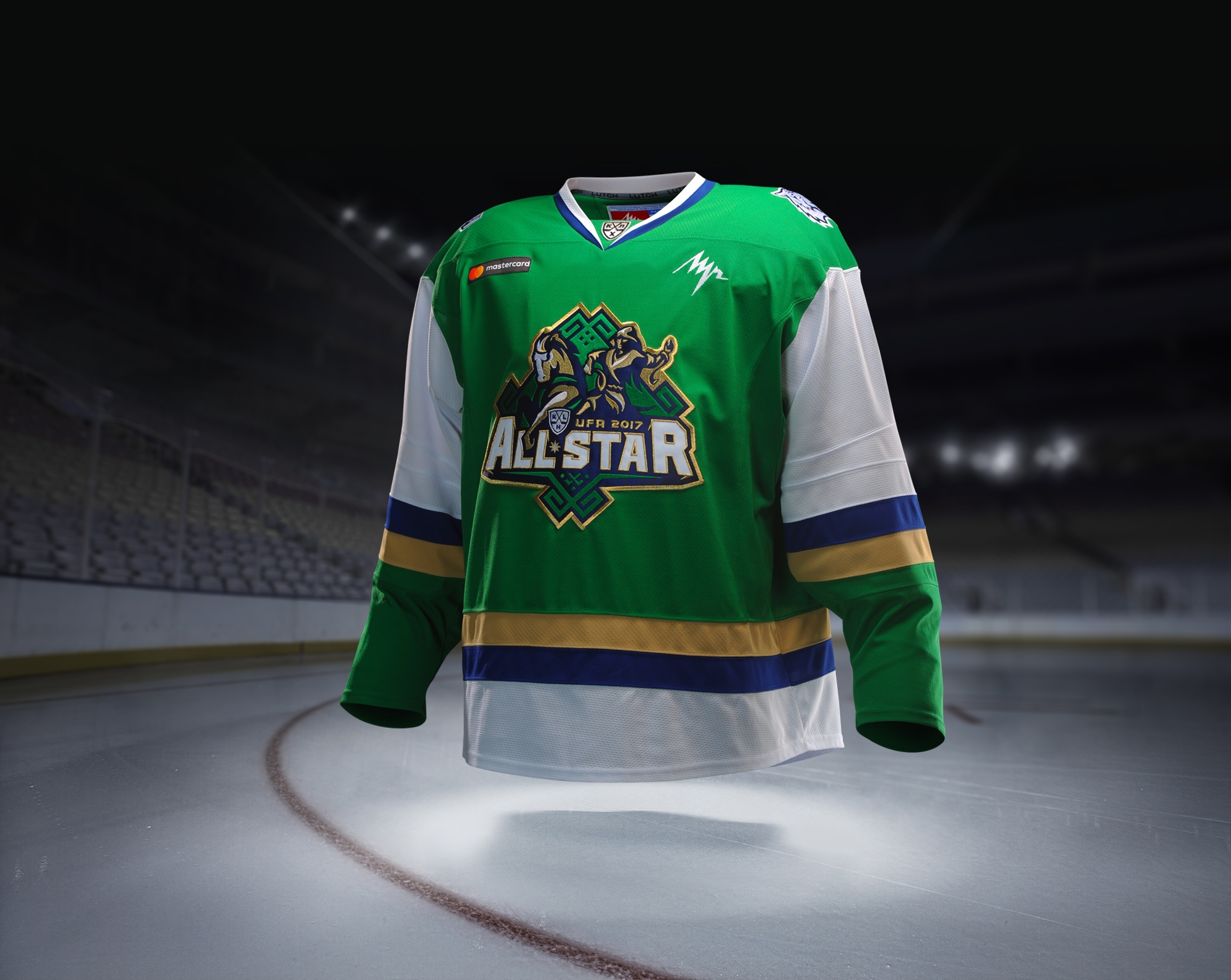
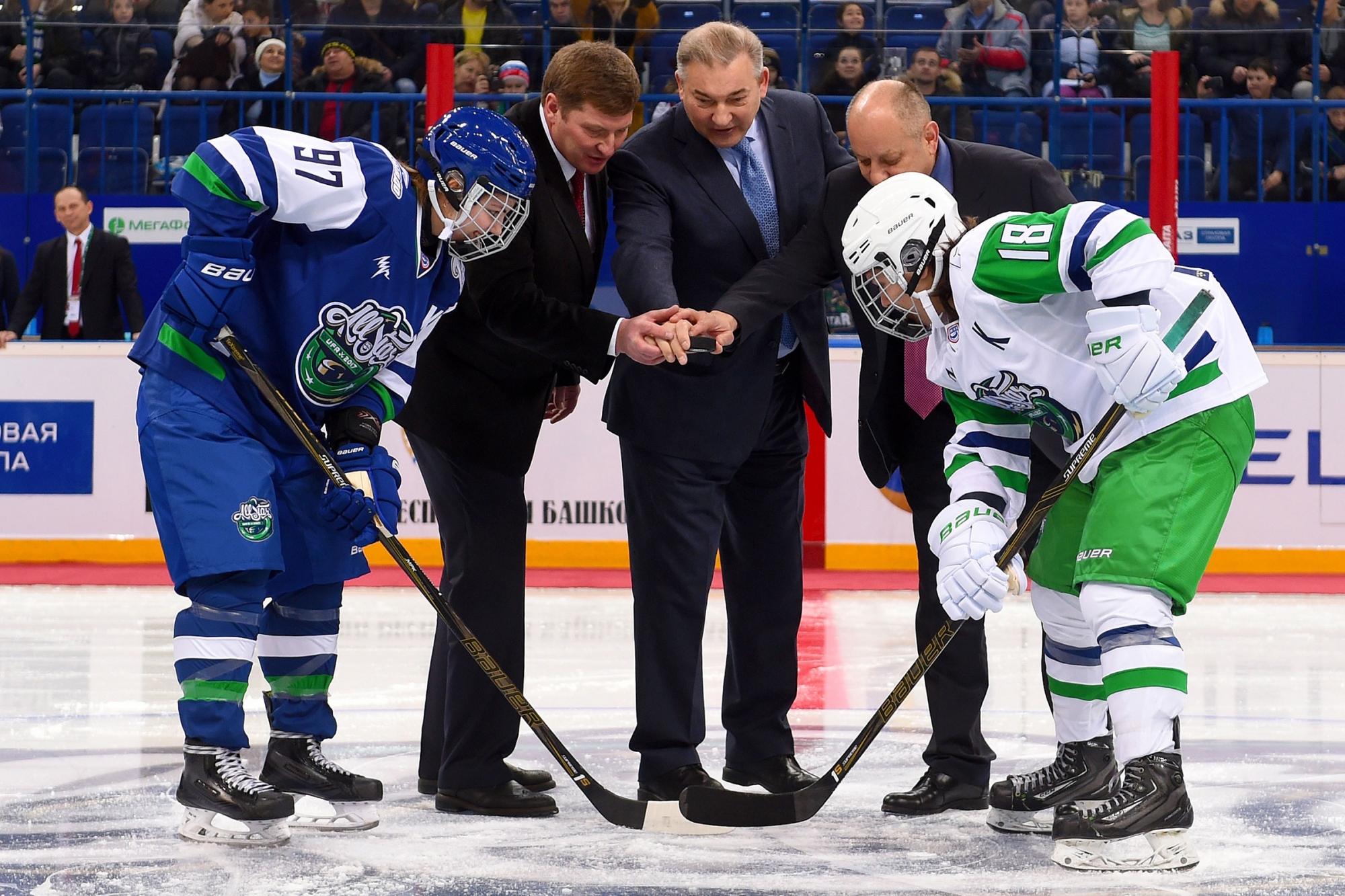
Star match is a testing ground that is meant to surprise the fans. Q10 design studio managed to apply new techniques to Hockey Star Week.
COLOURS
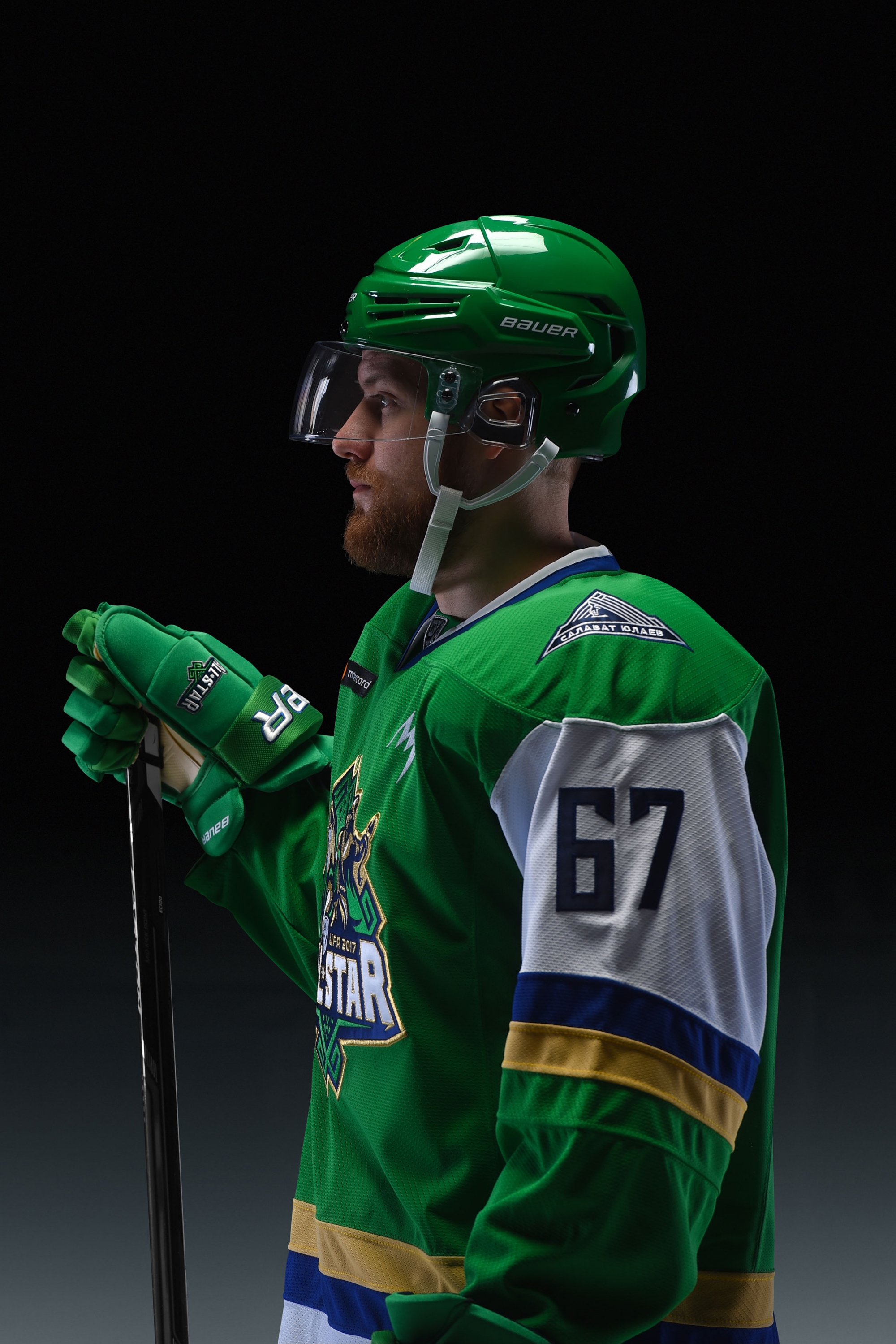
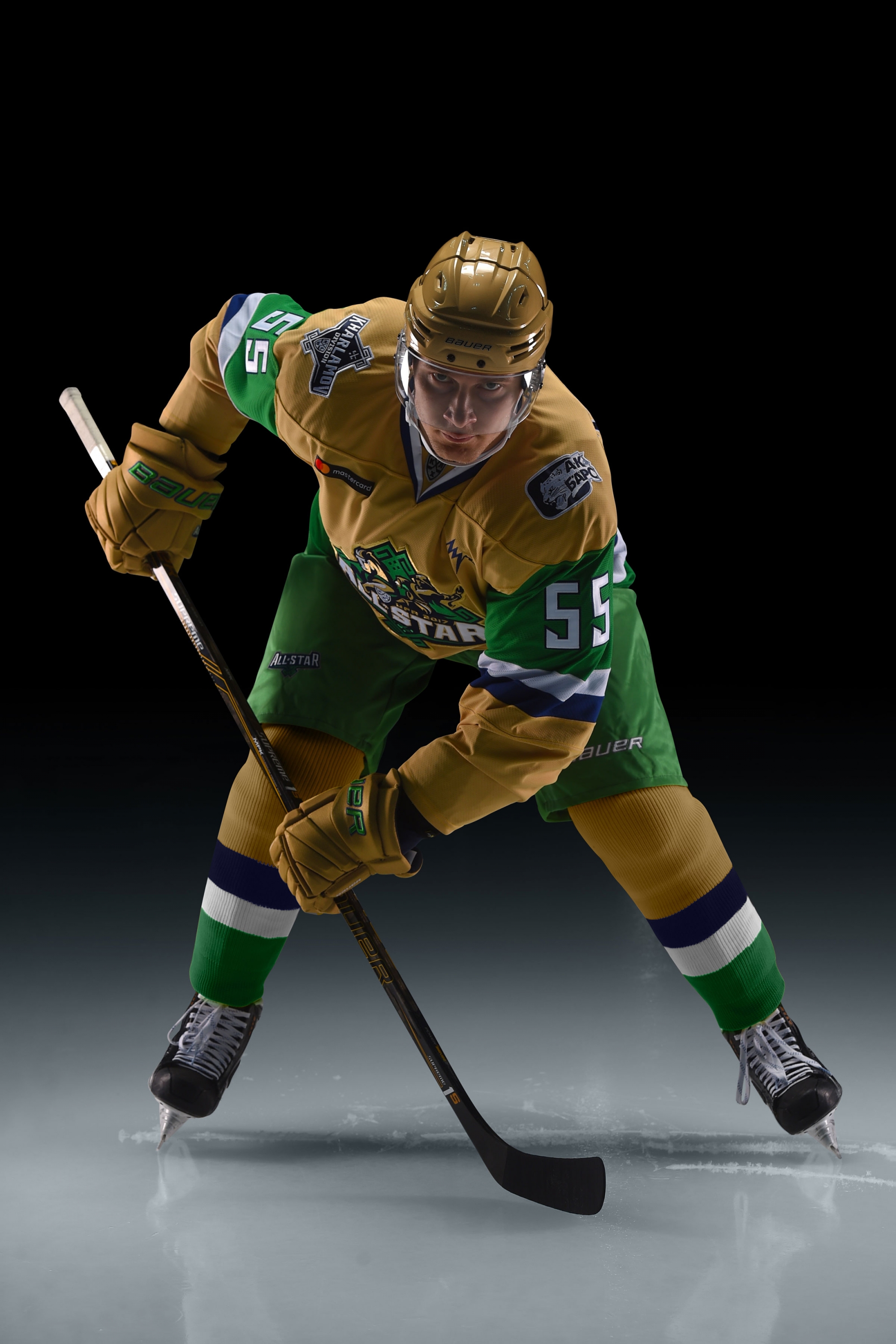
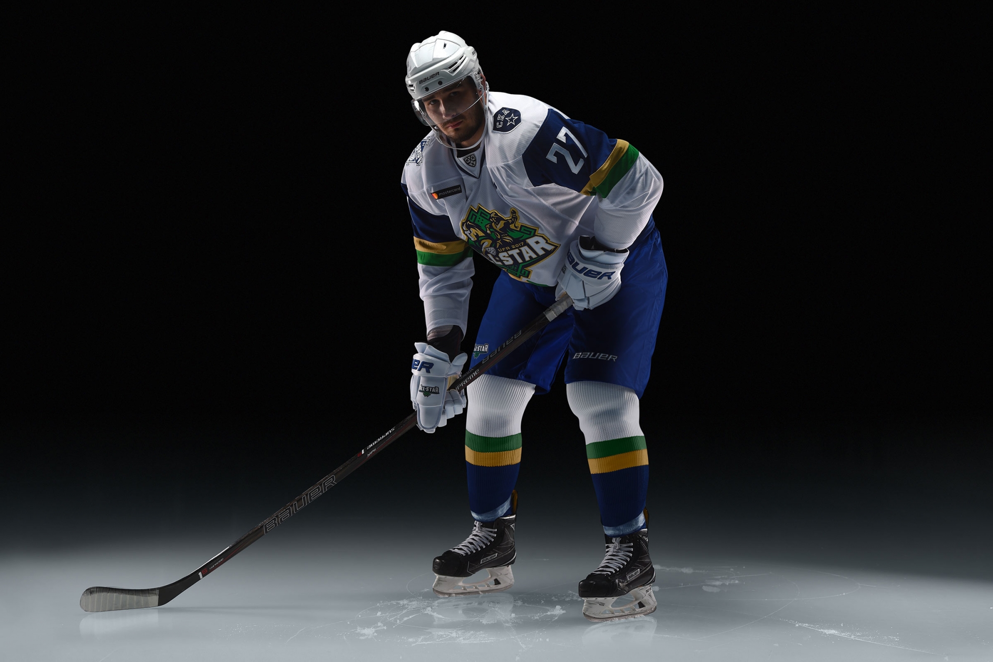
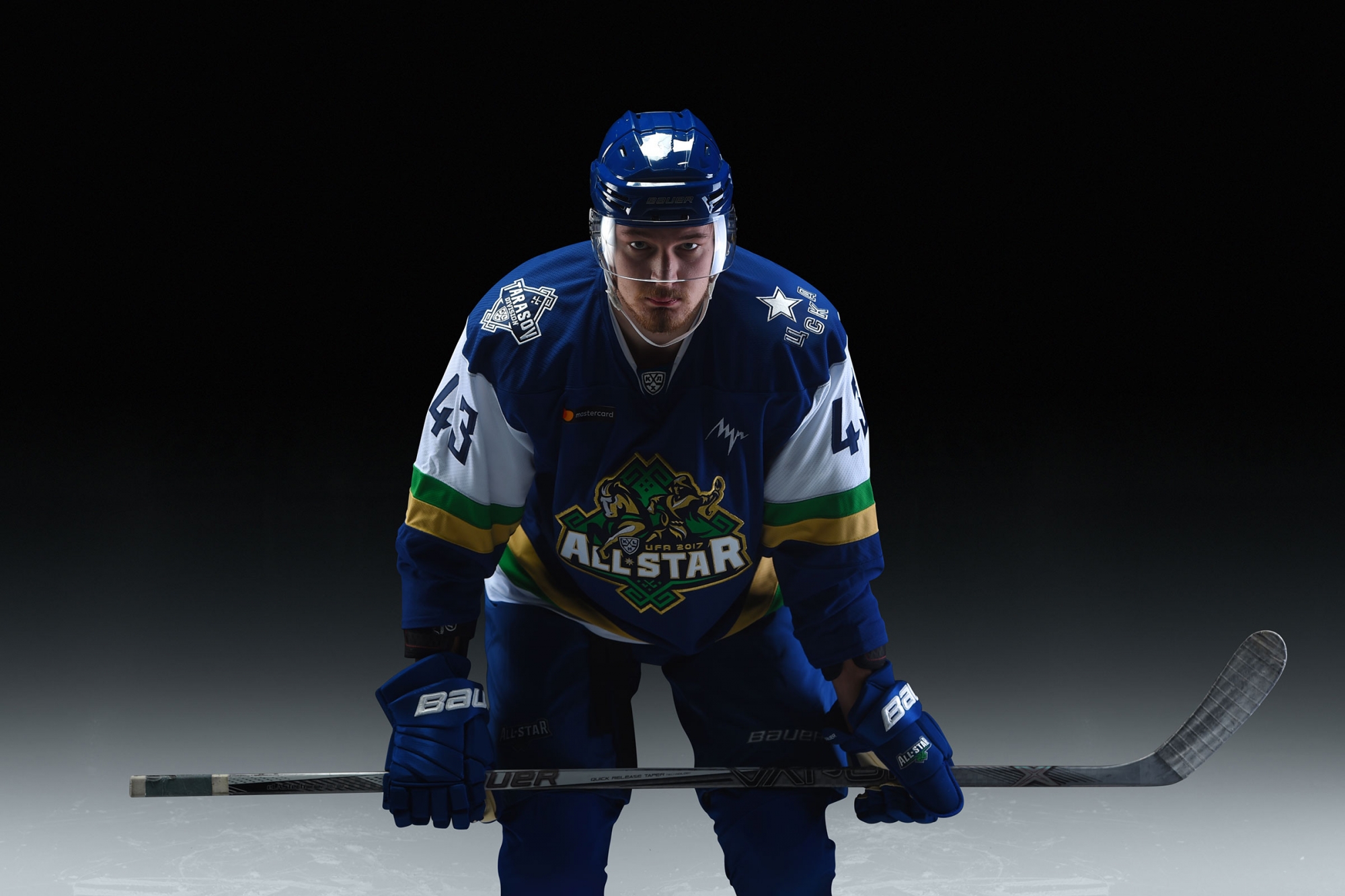
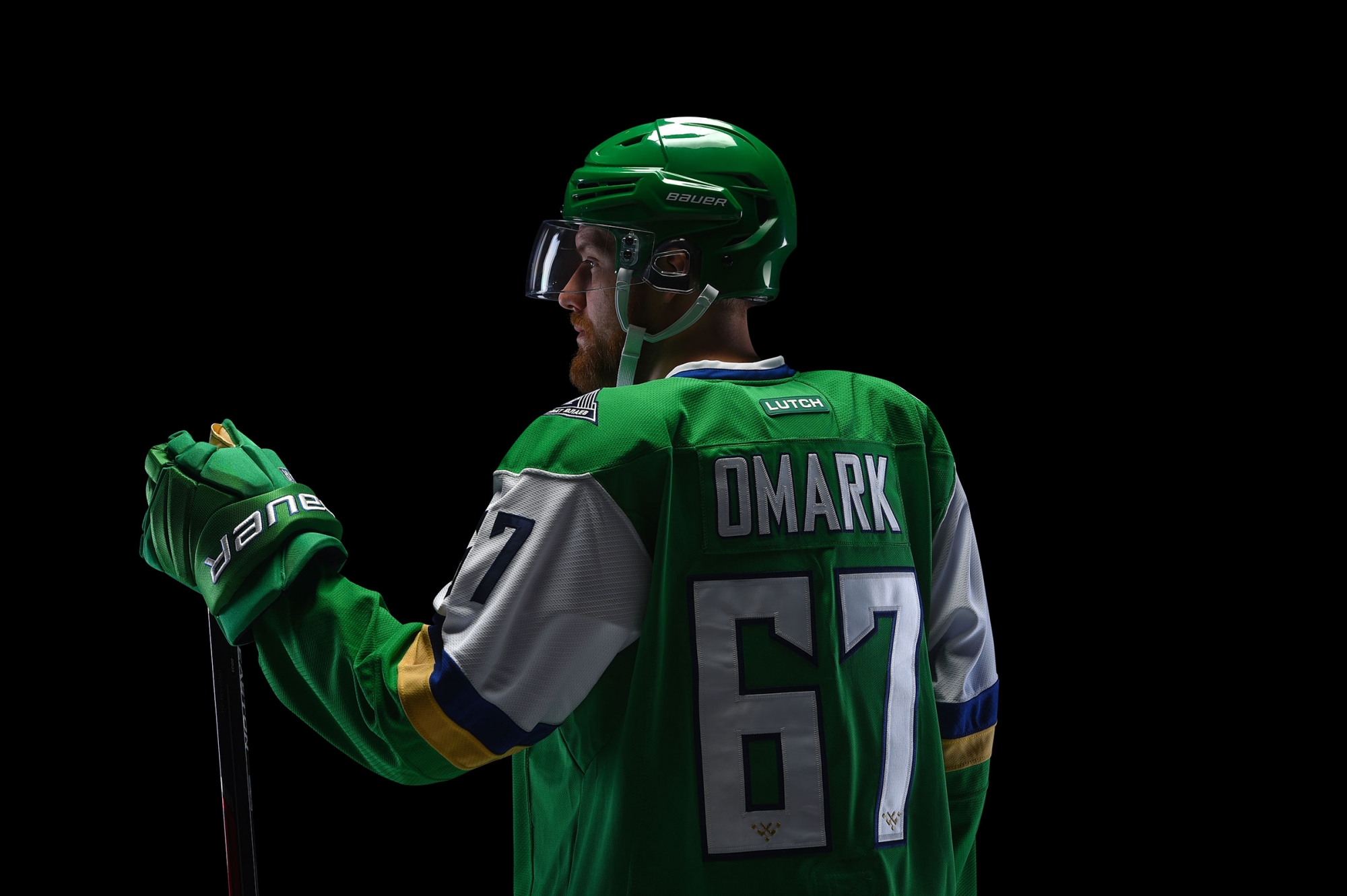
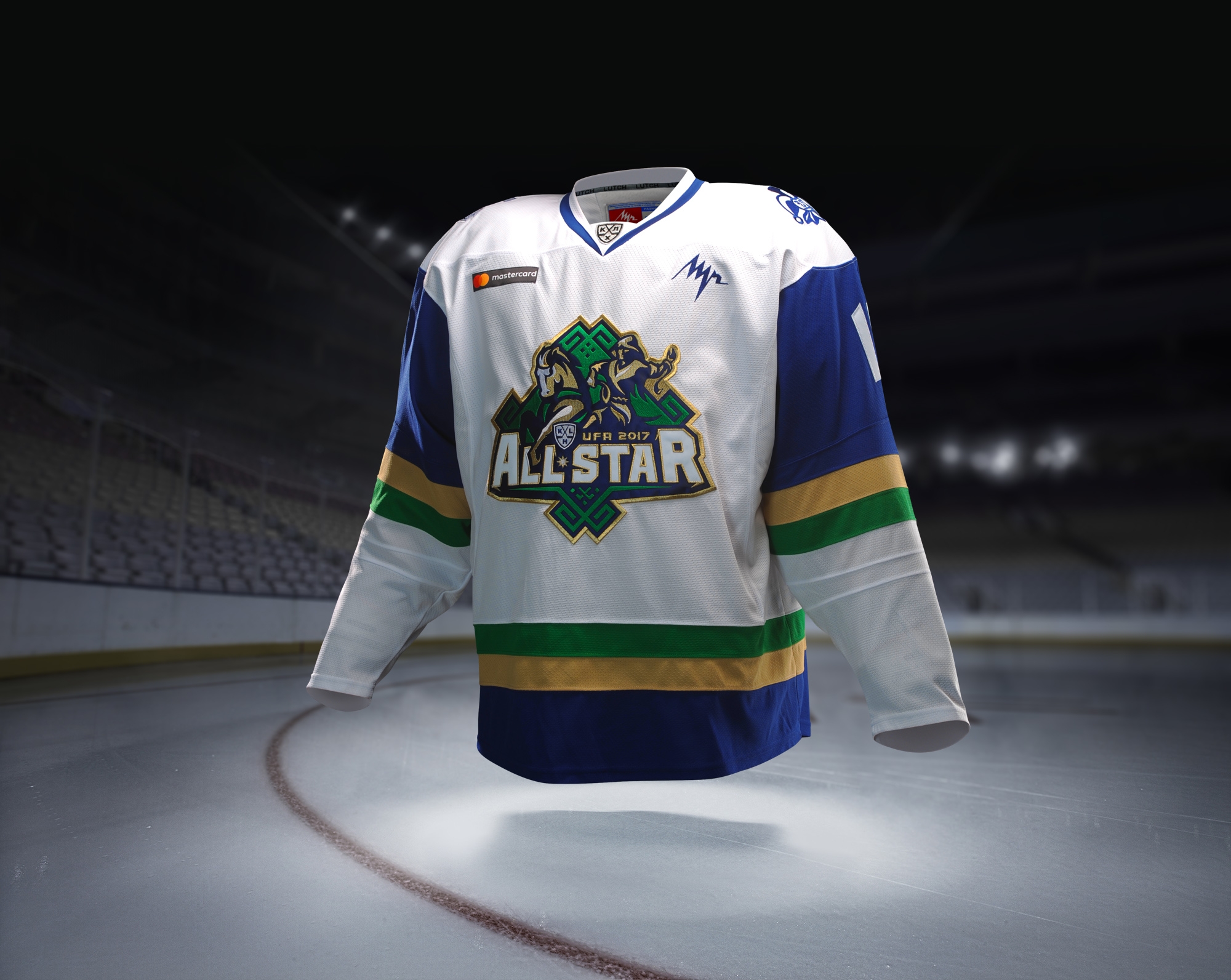
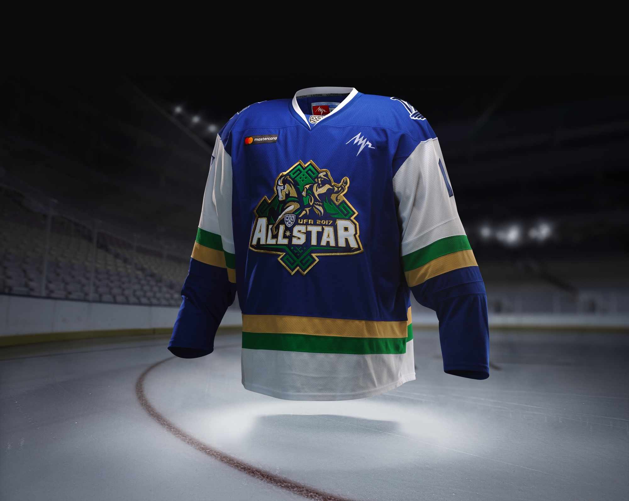
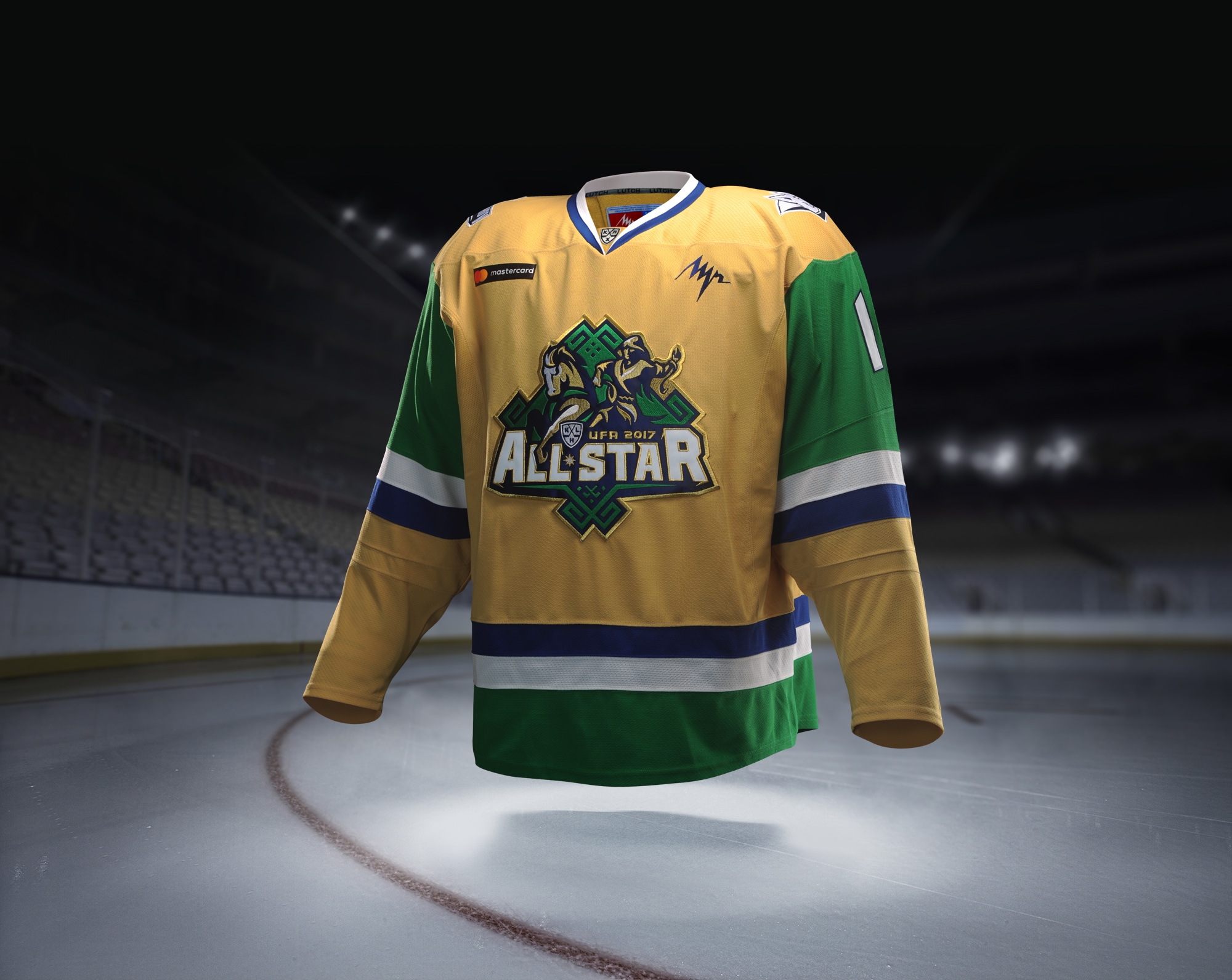
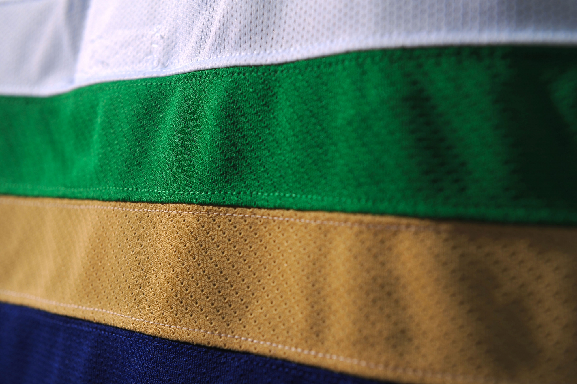
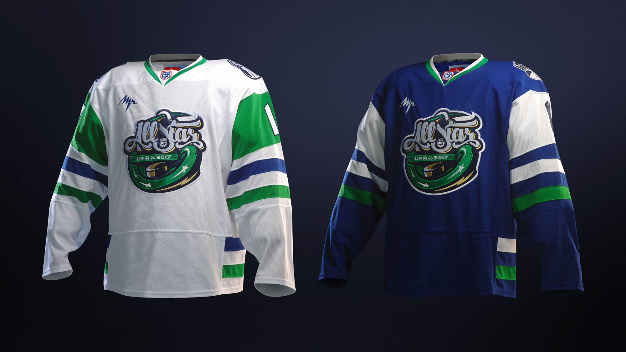
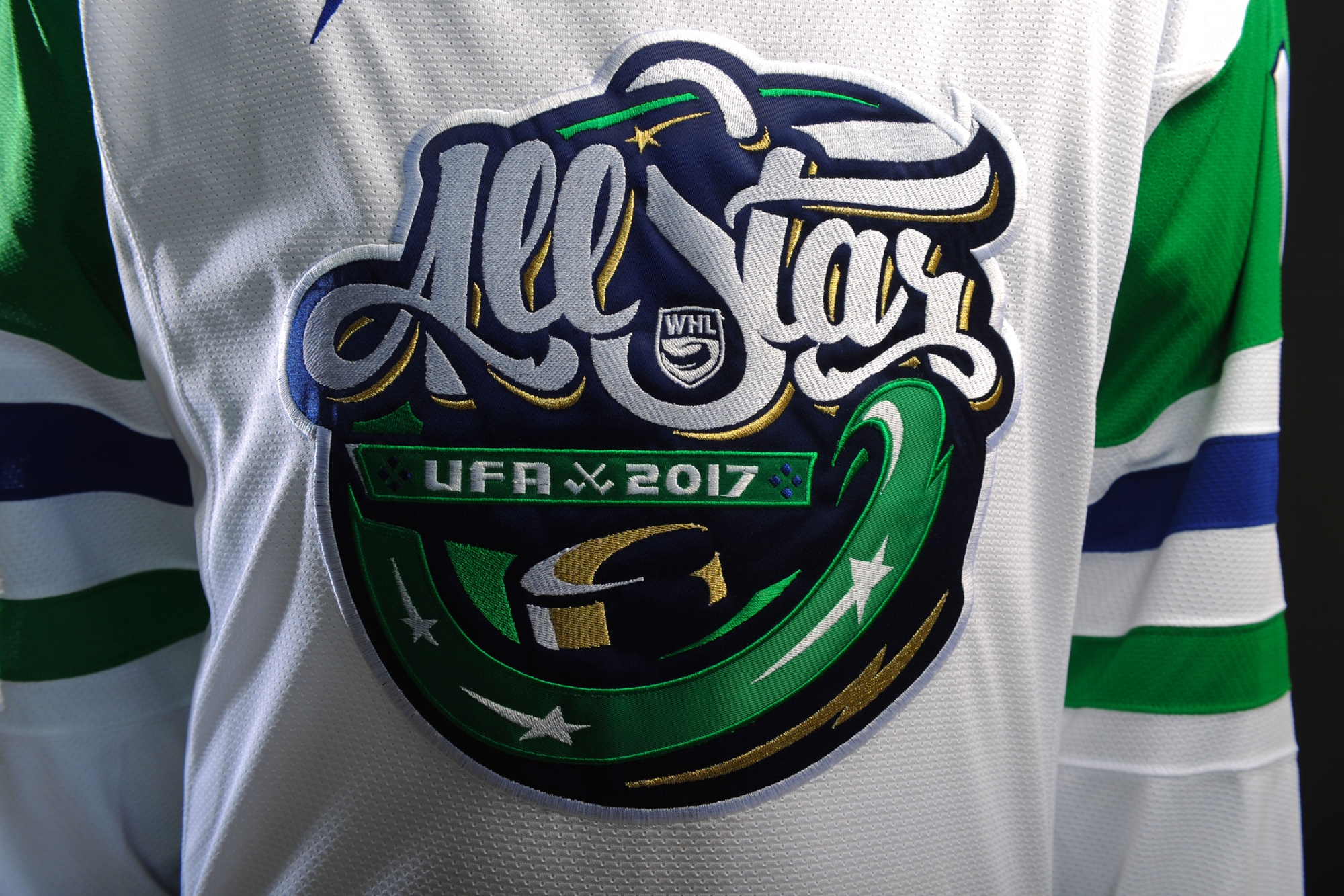
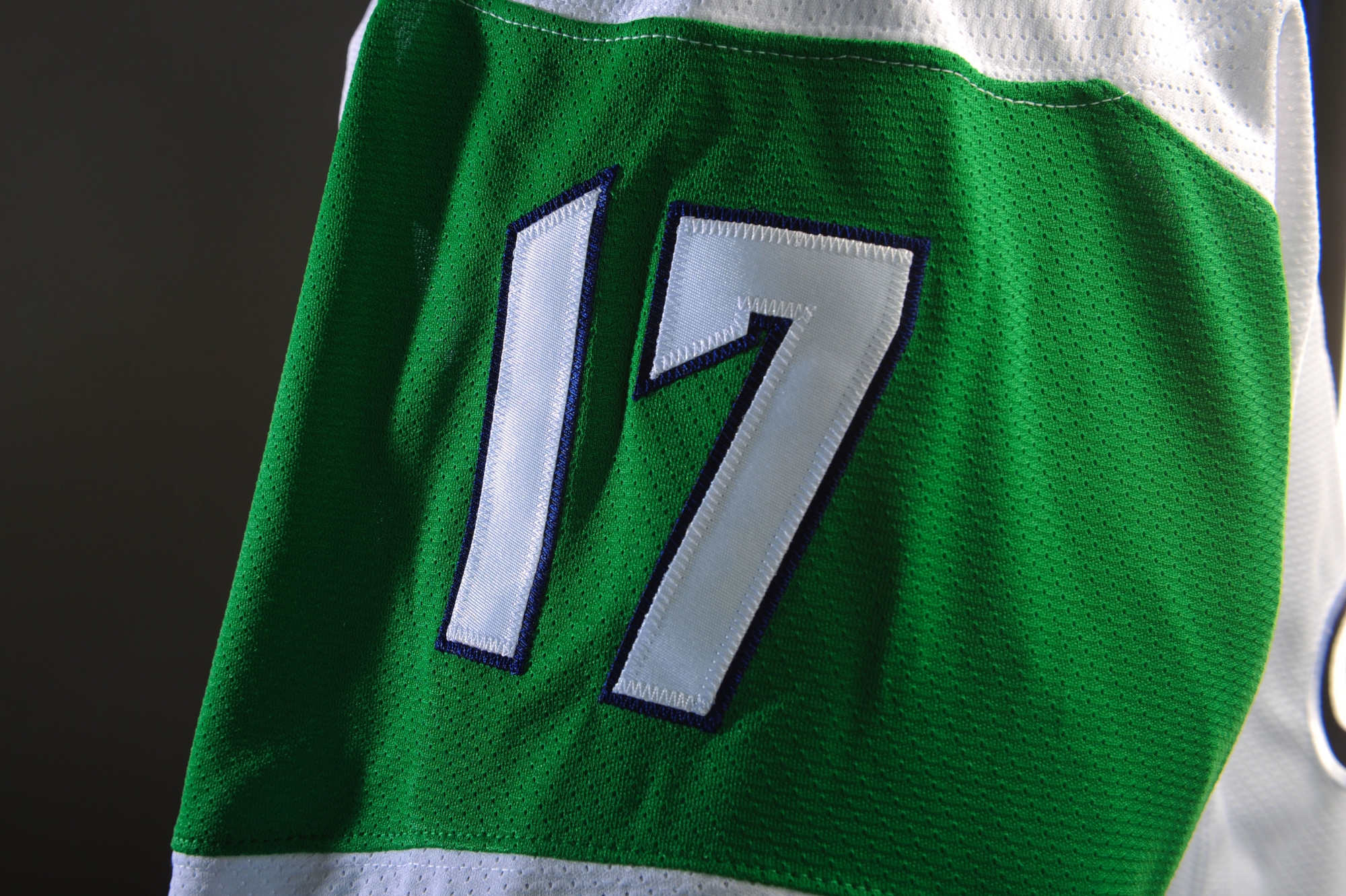
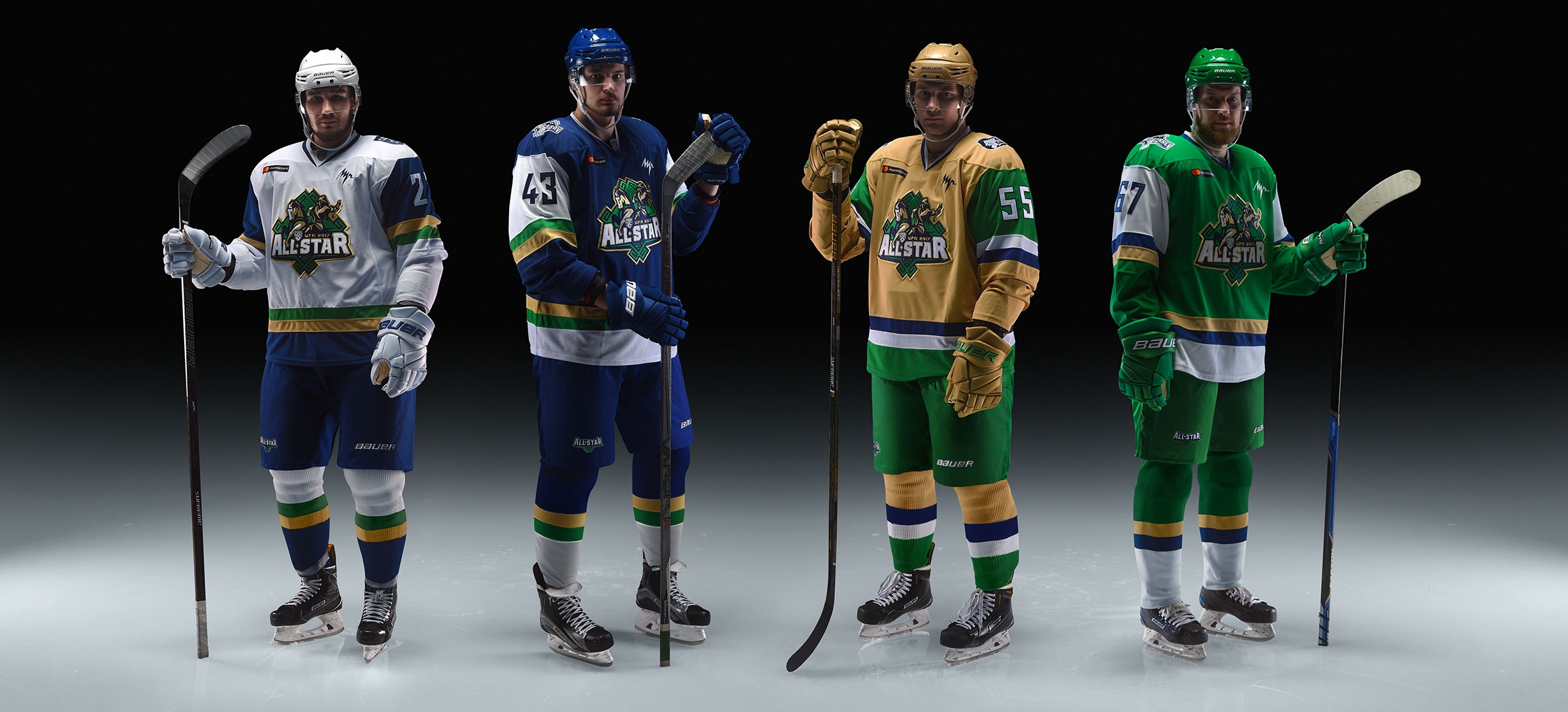
Initially white, blue, green and silver grey were the signature colors. Grey was a very questionable color: first, grey uniform didn’t fit the concept of local club colors, it actually ruined it. Second, grey doesn’t contrast with white. In the end, mustard gold color turned out to be perfect in this case.
EQUIPMENT
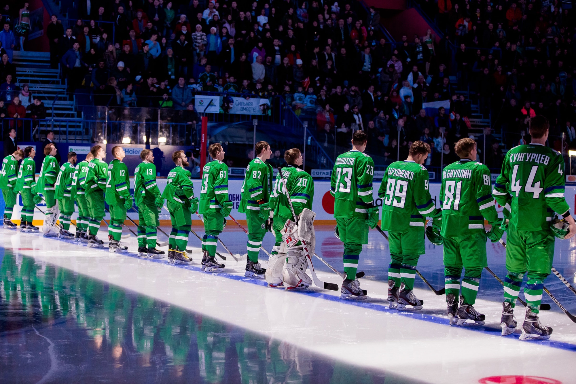
We take special pride in the equipment. It was the first time in Russian ice hockey that helmets, gloves and skate guards were specifically ordered for such an event. It is a huge step forward and there is no going back.
LOGOTYPES
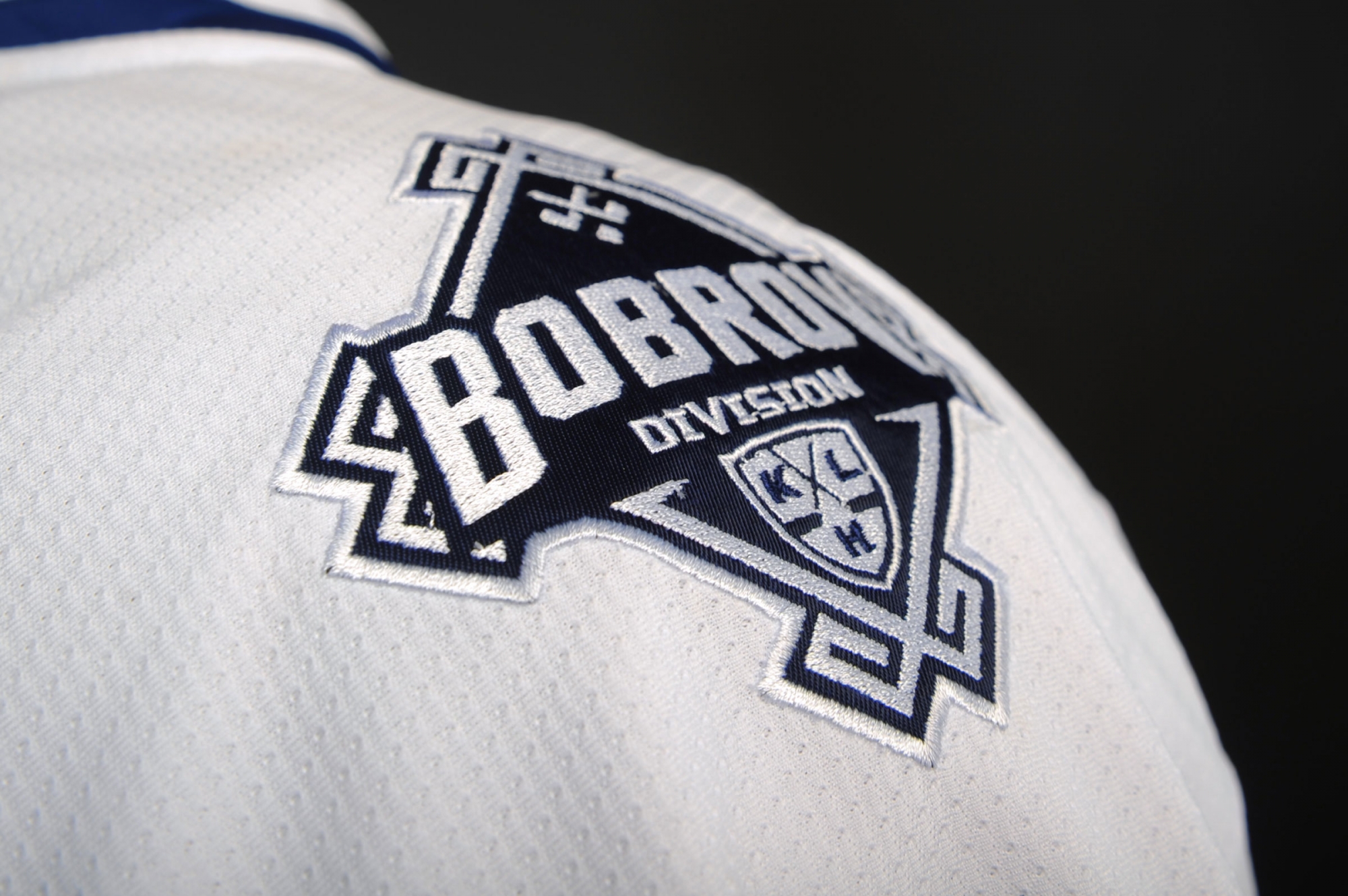
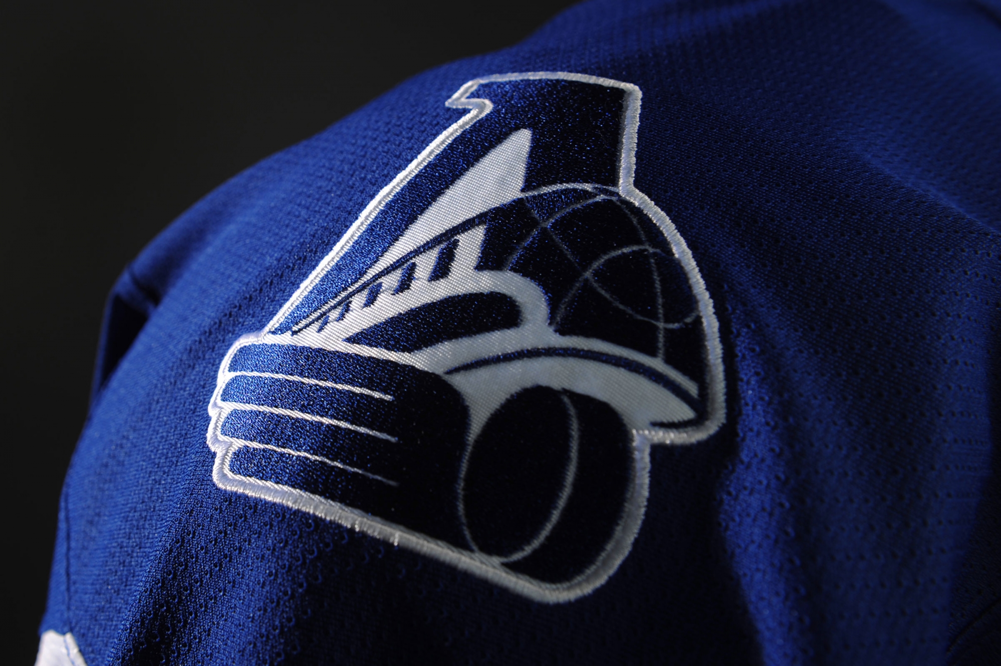
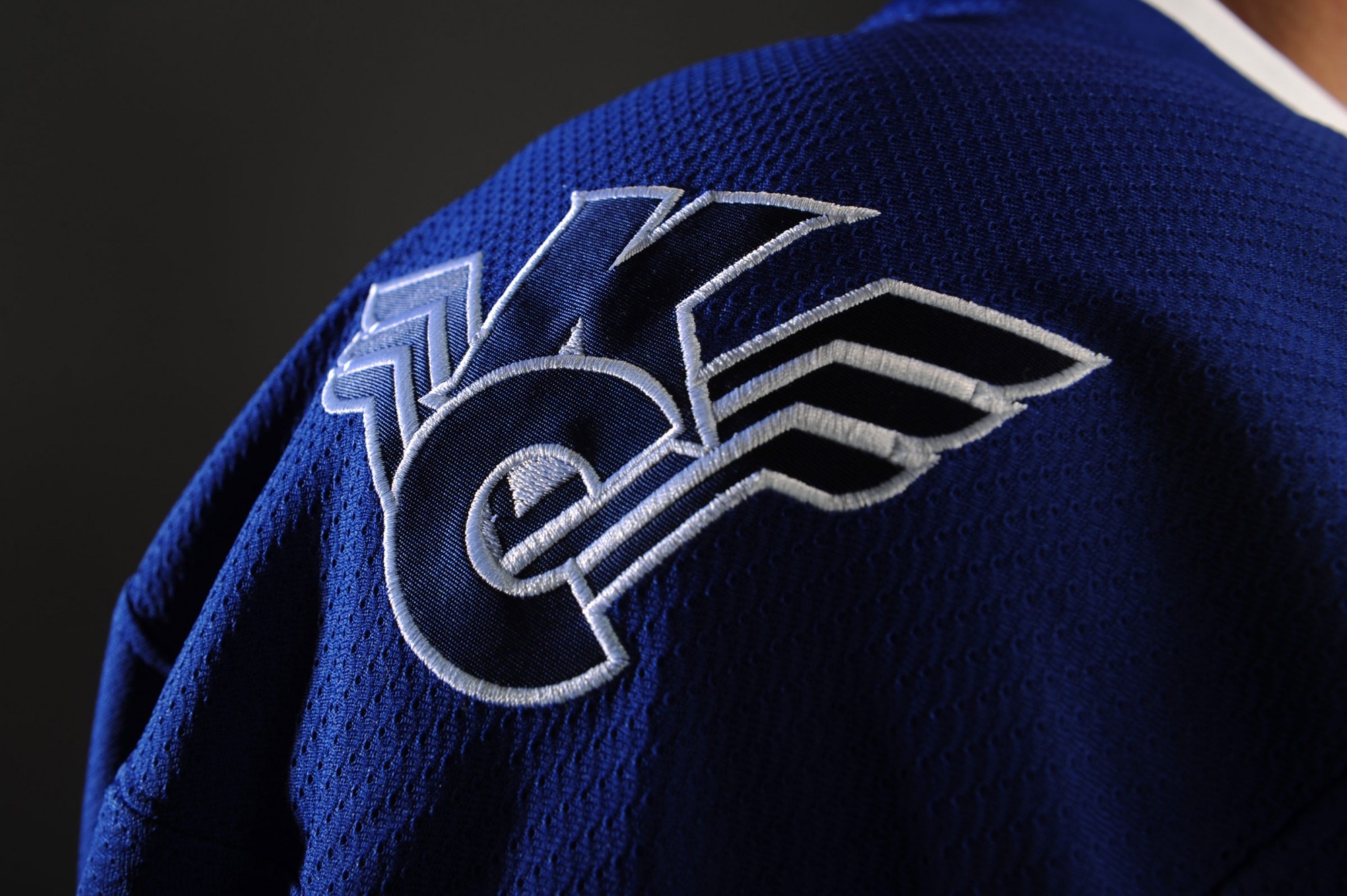
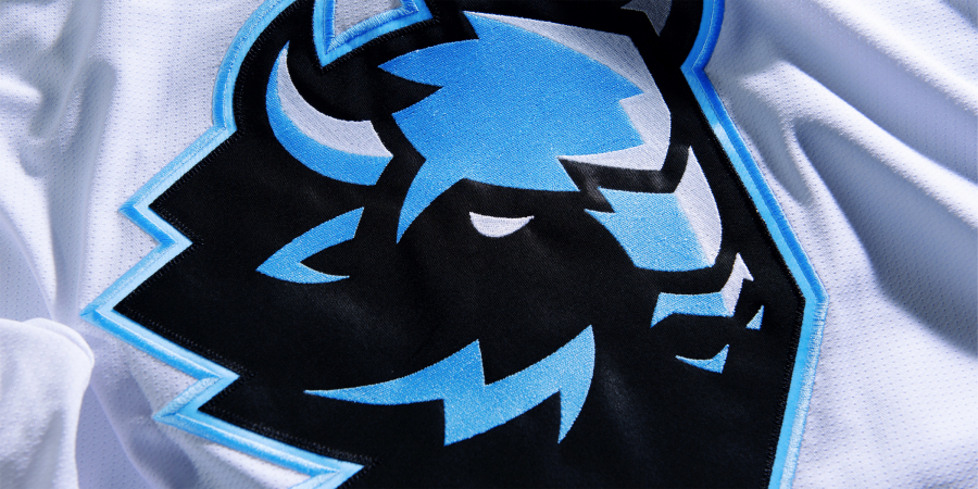
One more innovative technique: monochrome club logos on jerseys. It is typical to use colorful versions of the logos that conflict with the uniform and brand identity of the Star matches. Moreover, let’s face the truth, many club emblems do not meet modern standards. One color logotypes solve all the problems and look naturally on the uniforms.
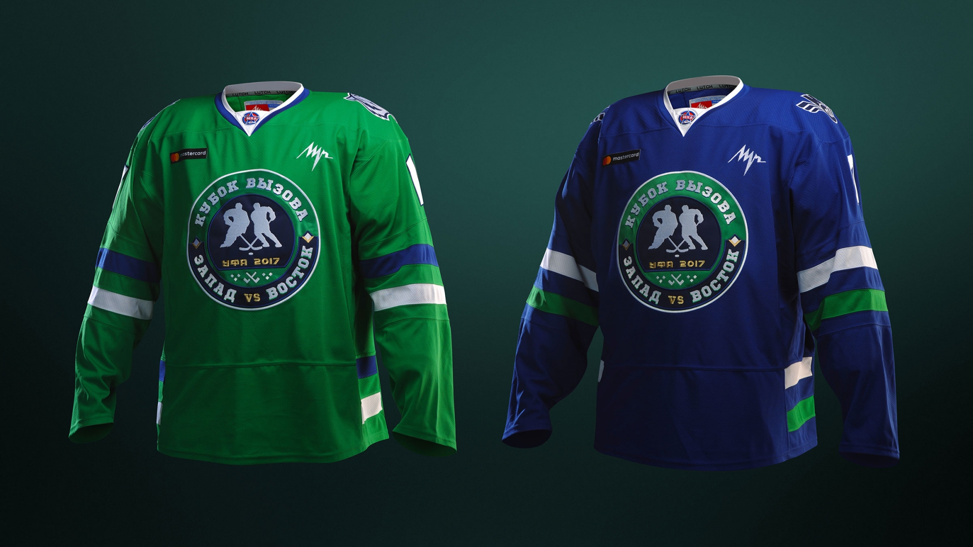
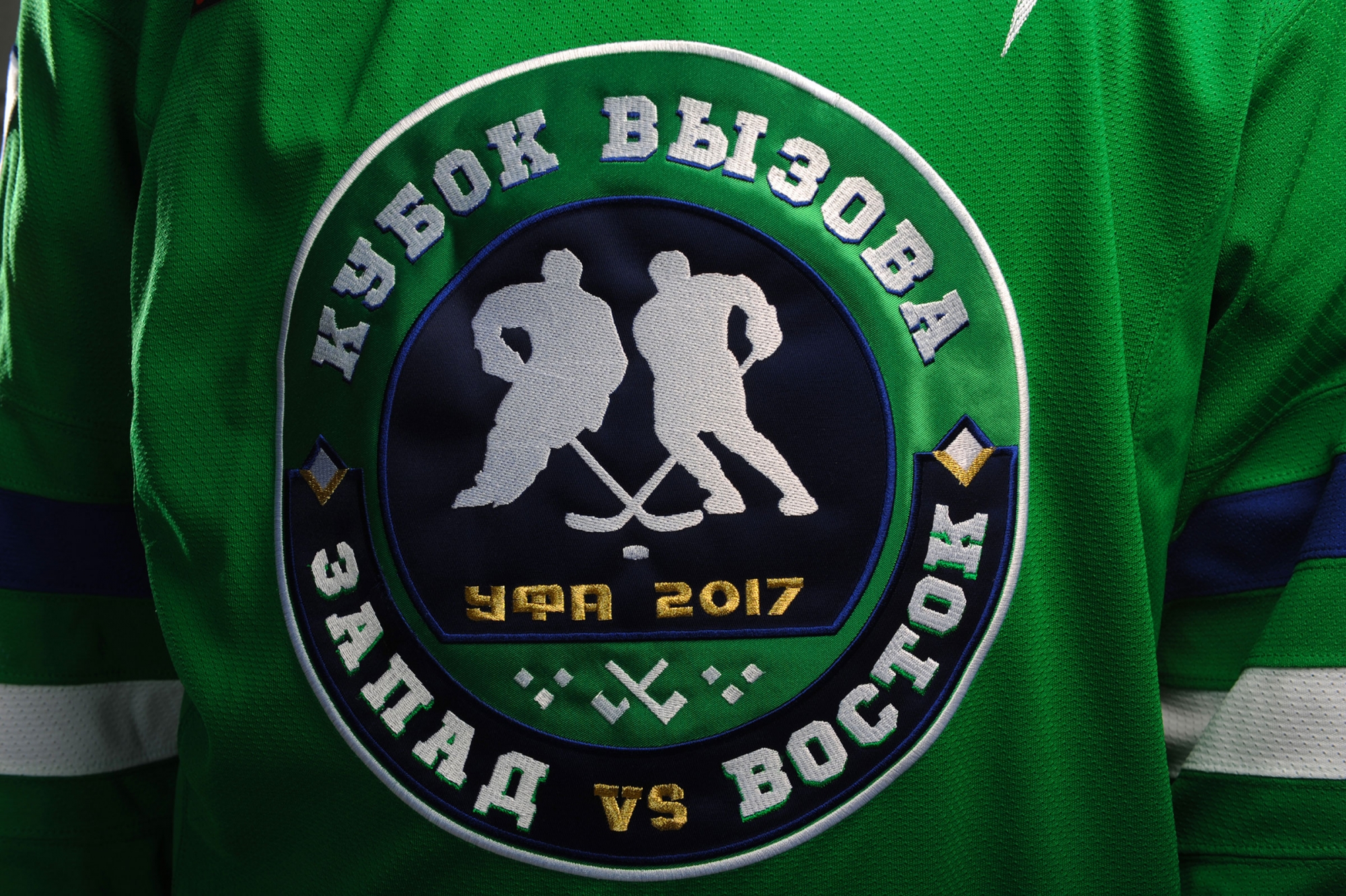
JHL CHALLENGE CUP UNIFORM
We created two dark uniforms for the Challenge Cup. The colors and even east and west shades are different. Two teams wearing dark uniforms have played against each other not once within KHL Star matches. It looks more interesting from the point of view of spectators, as both teams are colorful.


