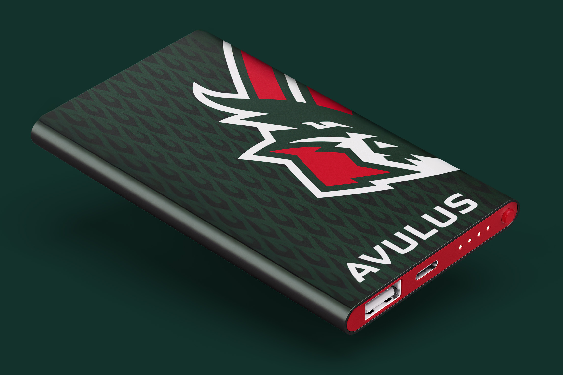
A New Dragon in Esports — The Identity of Team Avulus
In just one year of existence, the ambitious esports tag Avulus has made a loud entrance onto the scene: podium finishes at major tournaments, a rank in the global Dota 2 Top 20, and growing media attention. Their confident debut on the pro stage made one thing clear — the Dragons needed a full-scale design system that could cover every visual and media need of a modern esports organization.
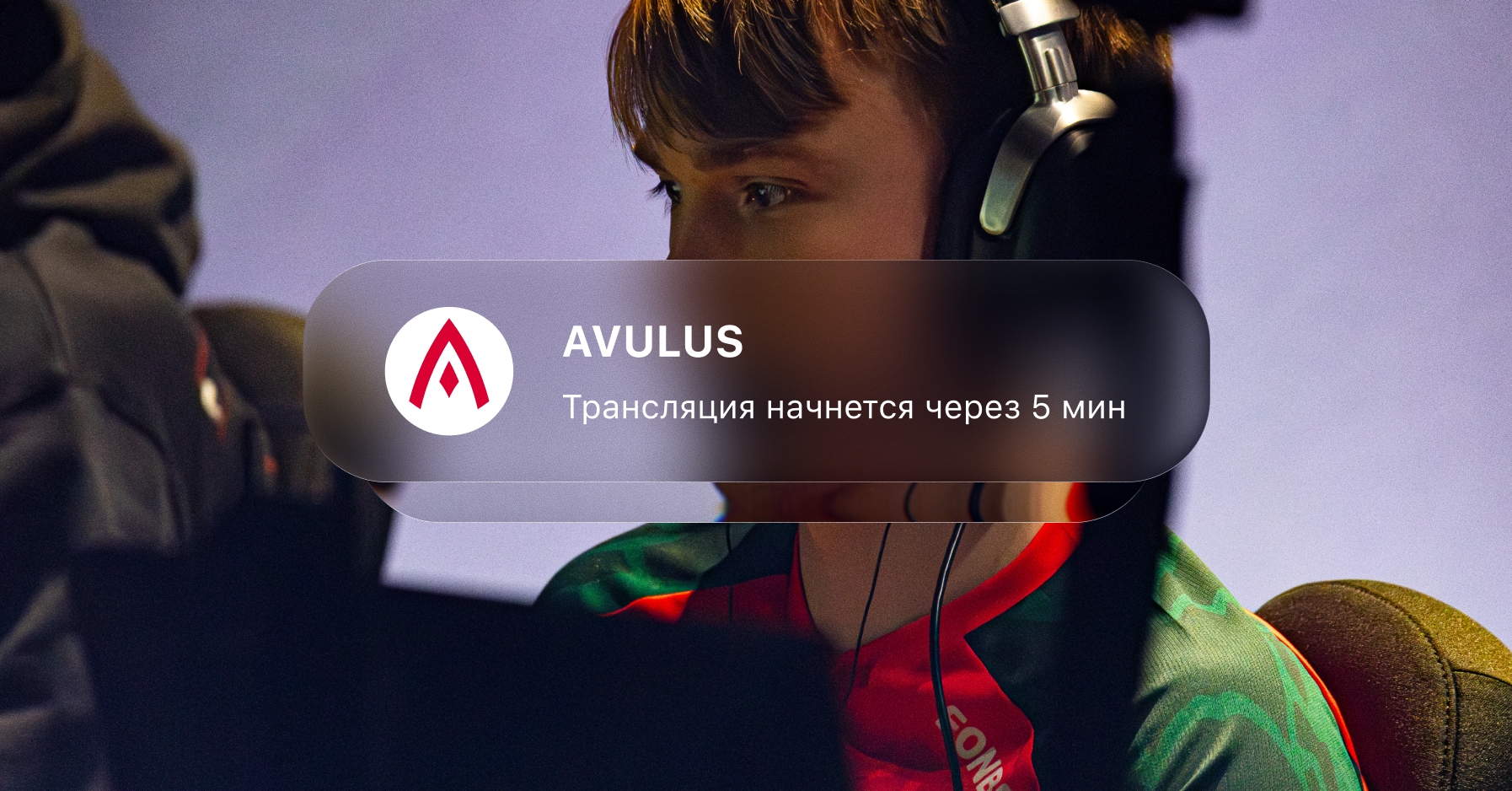
The Quberten studio created an identity that preserved the original symbol and turned it into a fully developed brand.
Медиа:
Медиа:
Медиа:
Медиа:
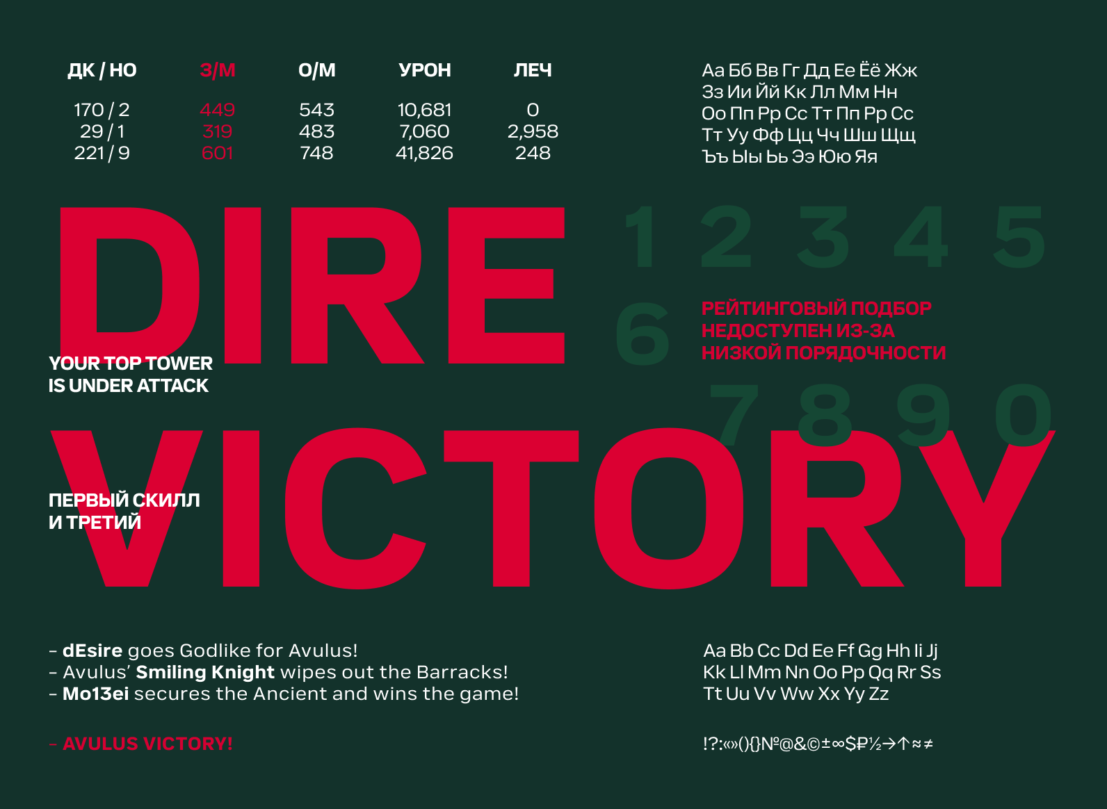
Заголовок:
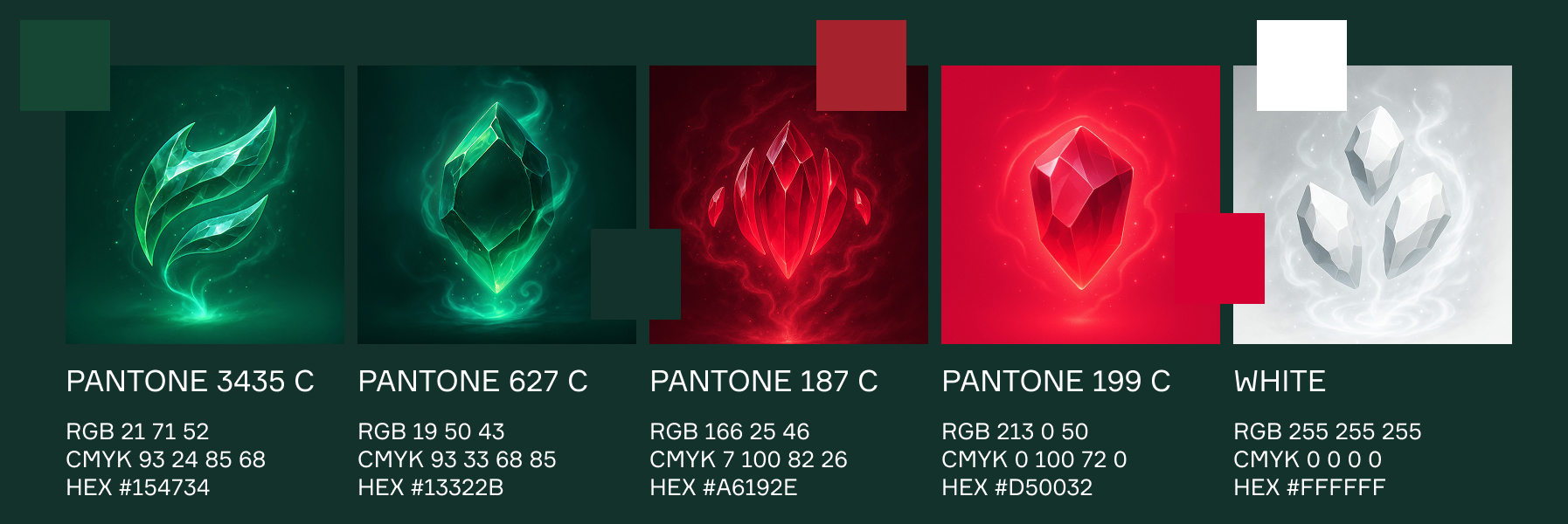
Battle Colors
Текст:
Originally, the organization used two main colors — red and grass green. The palette was refined to make it more versatile and add contrasting pairs, as well as extended with additional shades. This new color scheme immerses viewers in the fantasy world of Avulus while leaving room for creative freedom in future design work.

Медиа:
Заголовок:
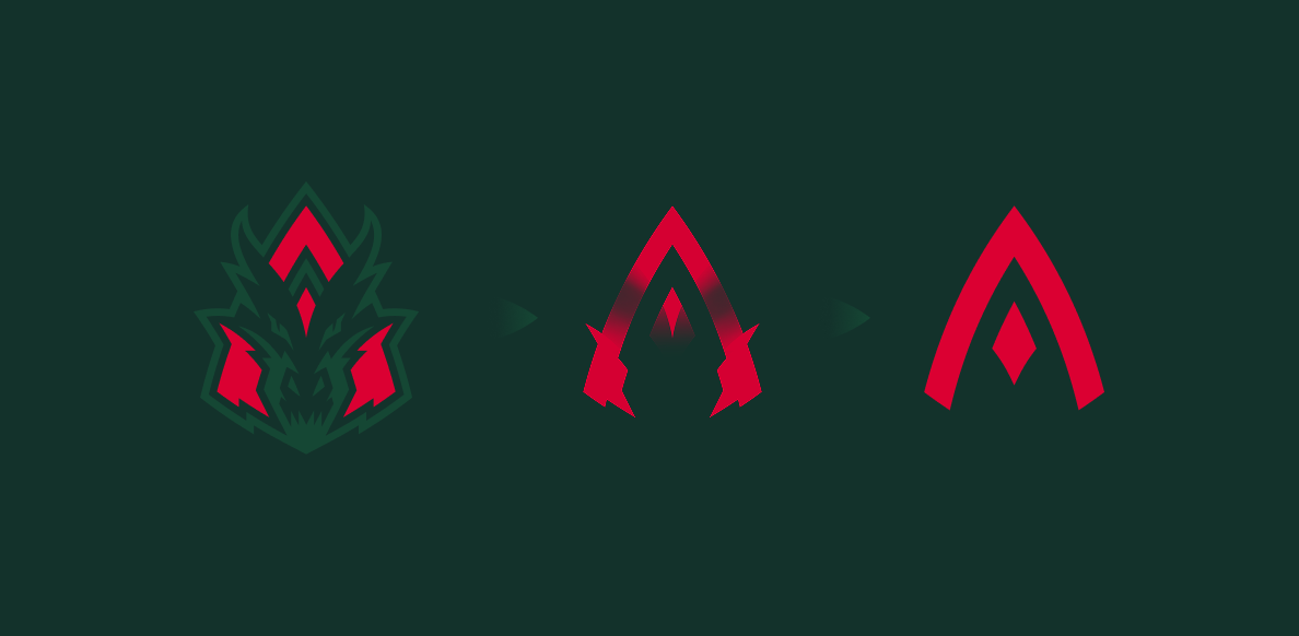
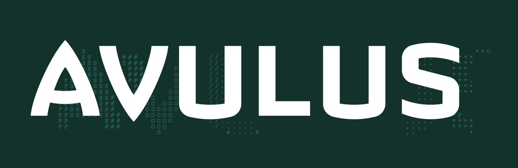
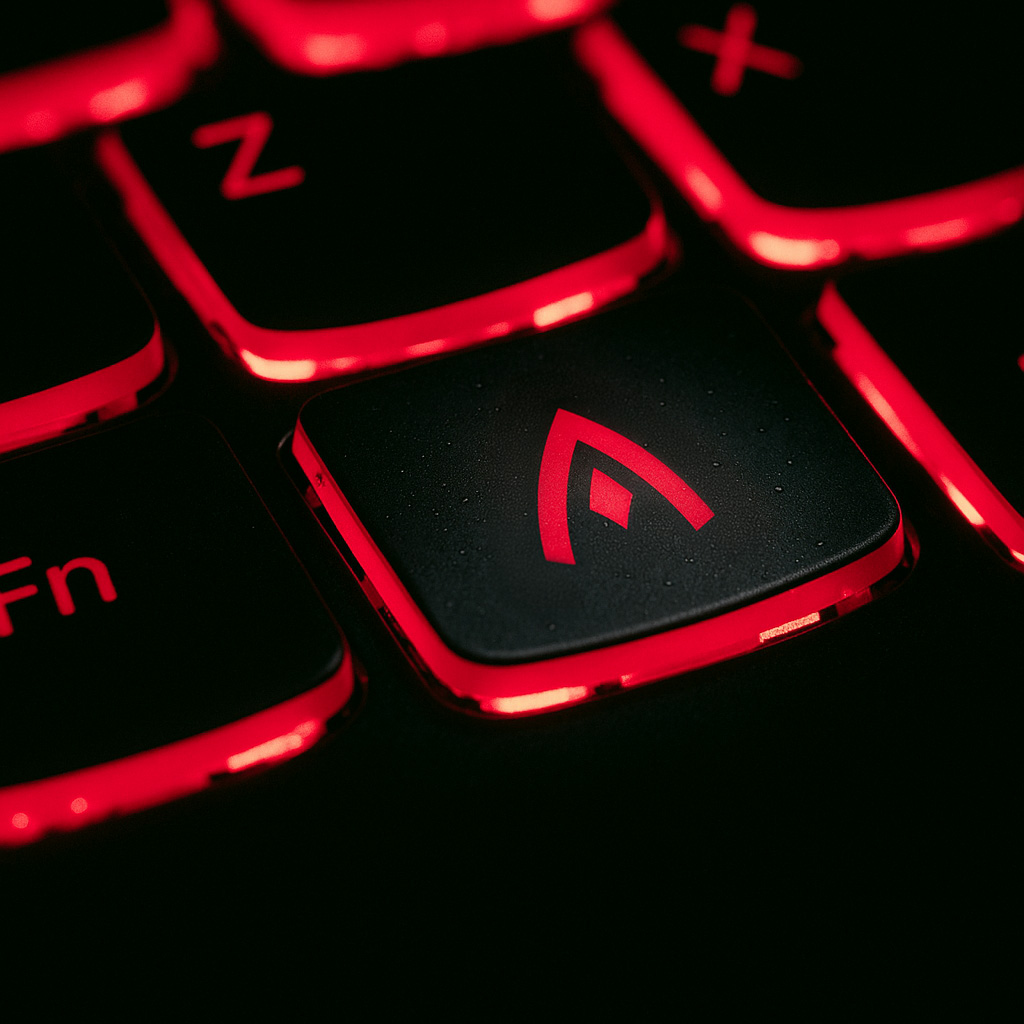
Symbol and Lettering
Текст:
Based on the original logo, the agency developed custom lettering and an alternate mark. The minimalist symbol reimagines the dragon motif: the head of the fire-breathing creature has been transformed into the letter A.

Медиа:

Медиа:

Медиа:
Медиа:
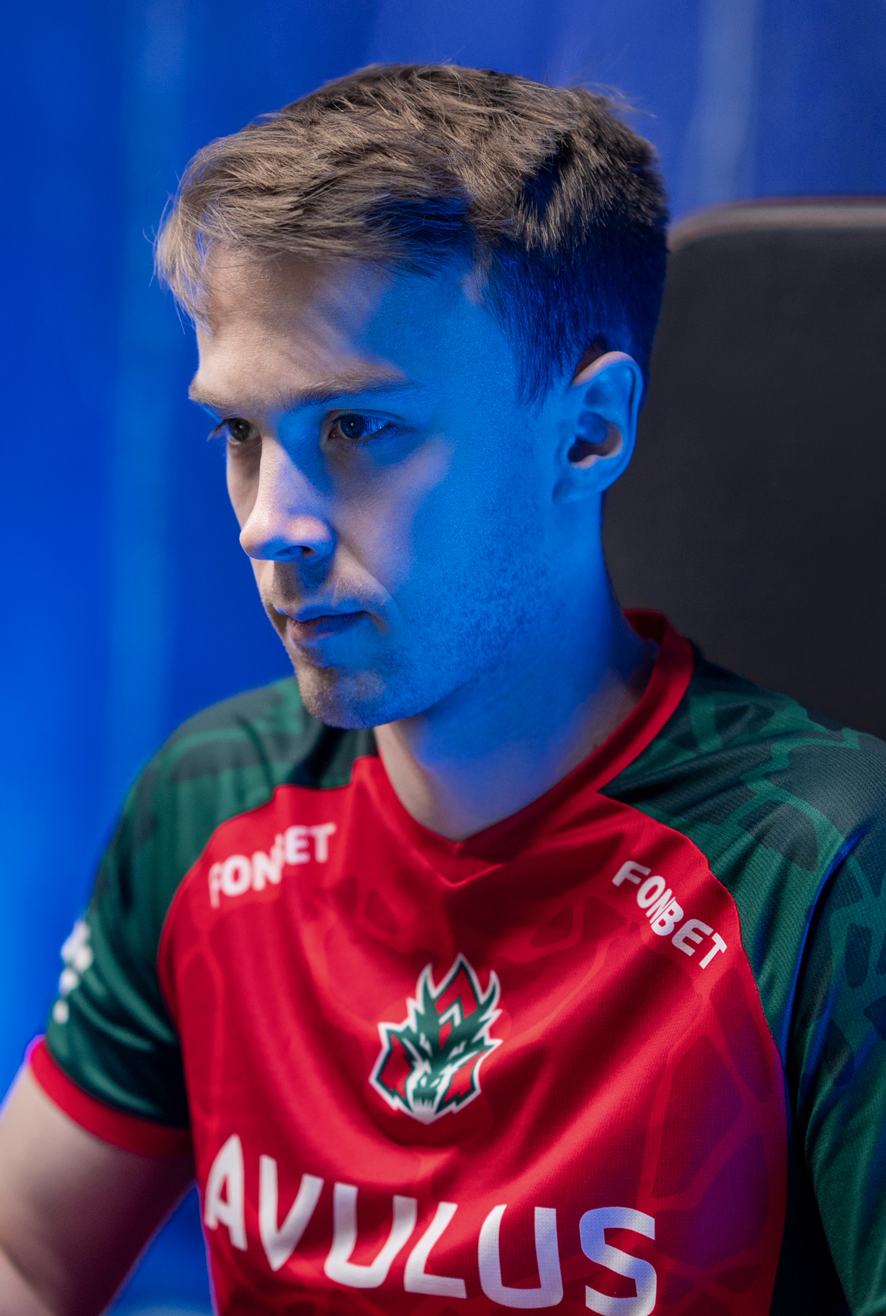
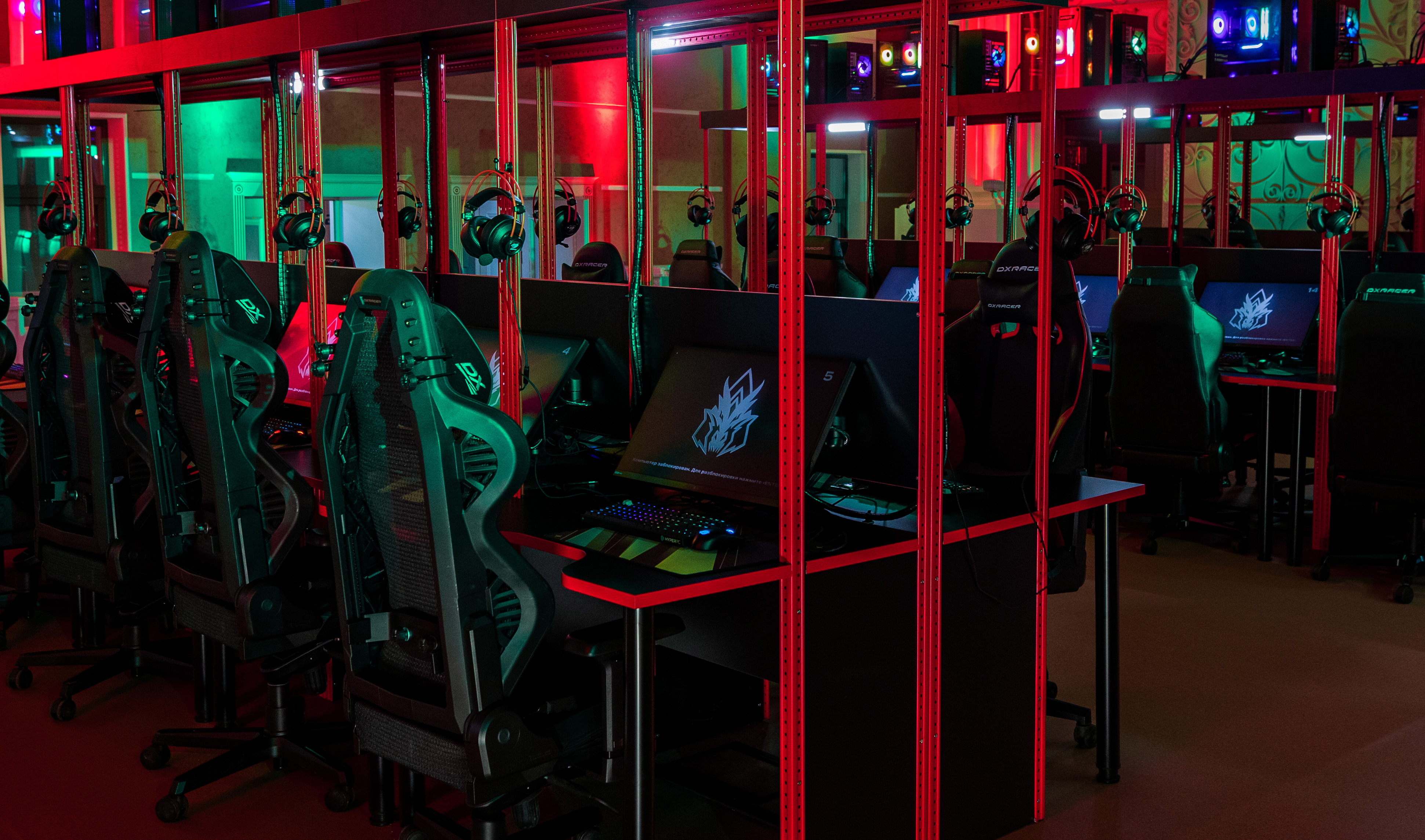
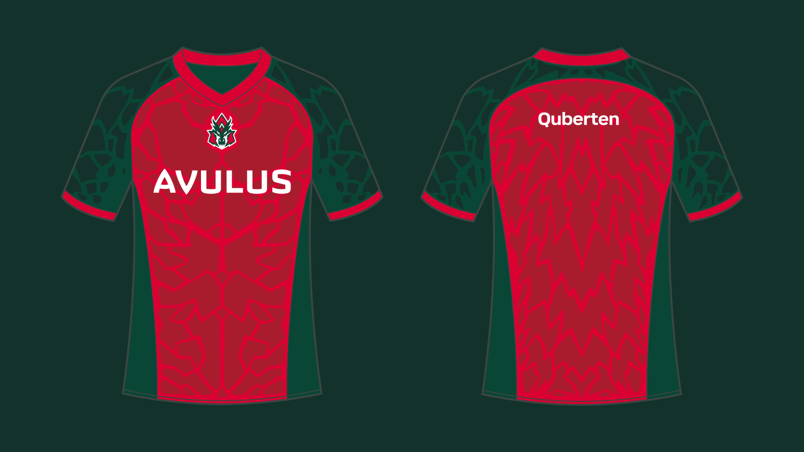
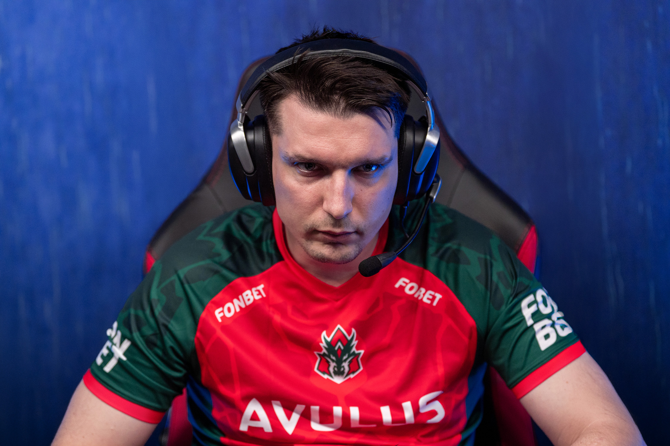
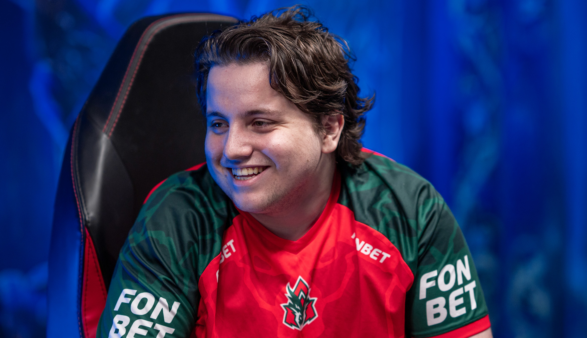
Jerseys
The new team jersey continues the main visual line of Avulus’ identity. The dragon-scale pattern evokes both protective armor and anatomical structure, giving the look an athletic feel that flatters players of any build. This design isn’t just eye-catching on LAN stages — it’s poised to become a bestseller in the team’s in-house merch store.
Медиа:
Медиа:
Медиа:
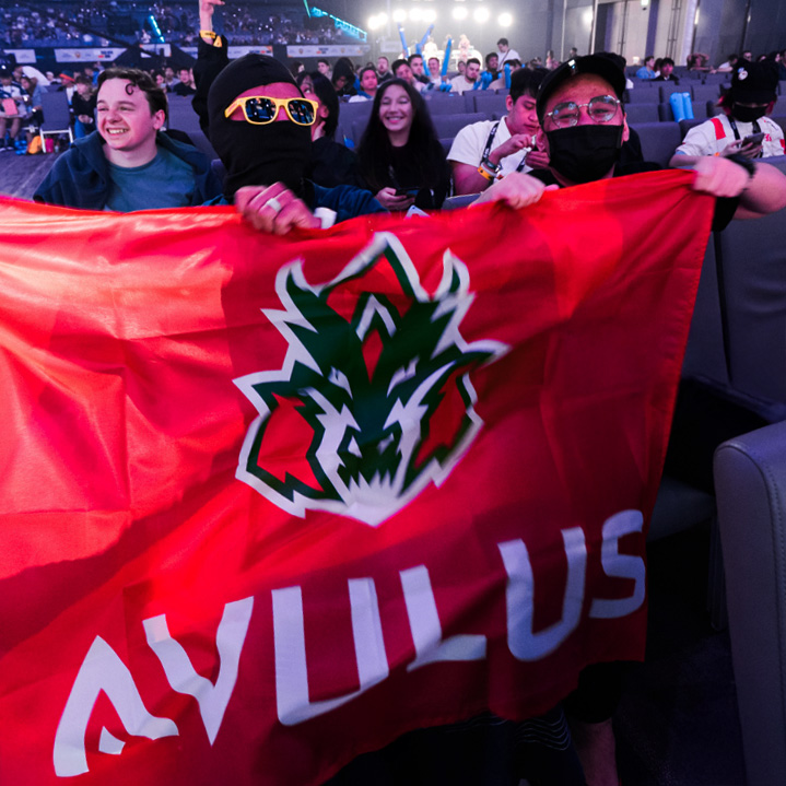
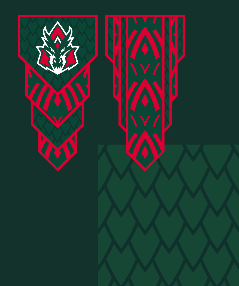
In-Game Flags
Beyond the core brand elements, Avulus now has in-game flags and banners that will accompany players and fans at every official match. Thanks to their clean design, the logo and patterns feel native to the game’s environment — as if these banners had always been part of Dota 2’s core files.
Медиа:
Медиа:
Медиа:
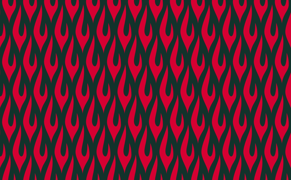
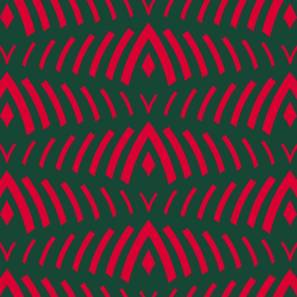
Заголовок:
Patterns
Текст:
Avulus’ visual language expands further with a set of patterns — ranging from dragon-inspired motifs to abstract graphics and signature textures. These can serve as foundations for new merch collections or for digital assets like social media banners and promotional visuals.
Медиа: