Handball club Zvezda Zvenigorod style
LOGO • STYLE • FONTS • KITS • PATTERNS • GUIDELINE
Quberten Studio is expanding its portfolio into various sports: we haven’t worked with any handball projects before, and it was interesting for us to work in a new niche. Moreover, the women’s Zvezda is the only winner of the most prestigious European tournament in the modern history of Russia: the EGF Champions League (2008). But to reach new heights, even the stars need to be updated.

The logo has acquired a character-thanks to the zipper and sharp ‘Z’
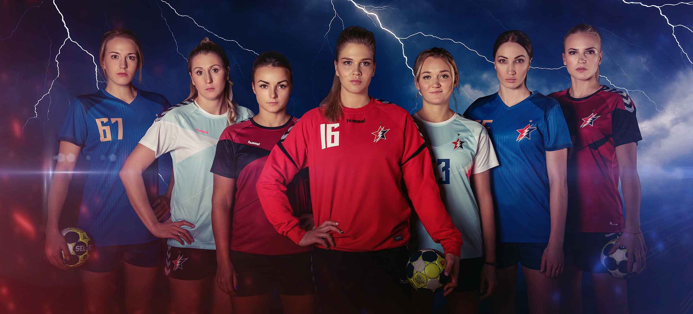
The previous style of Zvezda was extremely promiscuous: the elements were not combined either on the semantic or visual levels, and the graphics themselves needed to be rethought. We kept the red and blue star as the central element of the logo, but increased its boldness by replacing the standard player figure with a lightning bolt.
This explosive energy of the new symbol sets the right mood and makes the image complete and more understandable; the team even quickly began to be called ’Lightning Fast’.
The lightning endings help to make a seven-pointed star (in honor of the 7 handball players on the court), and in its graphic design, the letter ’Z’ and Z stand for the first letters of the name of the team and its city: Zvenigorod.
The logo geometry has changed. Previously, it was illogically directed to the left. Now, as a team with an astrological element in their name, it strives forward and upward to stress the outer space feel.
The emblem can also be supplemented with a gold star: this is an officially authorized insignia in honour of the victory in the CL.


Unity of identity: the emblem element is encrypted in lettering
Zvezda has its own lettering in the spirit of the main logo. The font supports a given vector (striving upward), and the combat character is conveyed by sharp bevels, just like with the bases of a star. There is a hidden Easter egg sewn in: the negative space between the letters ’E’ and ’Z’ forms the Latin Z, replicating lightning.
On different surfaces, from templates in social networks to press-walls in the arena, the new style will be emphasized by patterns with lightning and stars. The basic merchandise collection has also been prepared.